
*******************************
FAREWELL: This is the final issue of the DecisionPoint ALERT. We have enjoyed serving our subscribers over the past three decades, and we wish you all the best of luck.
Carl and Erin Swenlin
*******************************
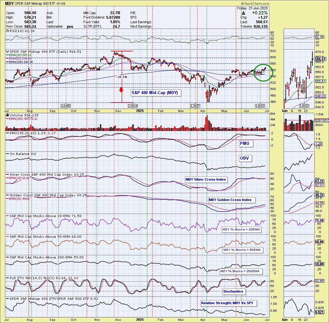
Today the S&P 500 Mid-Cap ETF (MDY) 50-day EMA crossed up through the 200-day EMA (Golden Cross), generating an LT Trend Model BUY Signal. Price is now breaking out of a congestion zone. The PMO has triggered a new Crossover BUY Signal. MDY isn't close to all-time highs yet, it has been underperforming. We do see good participation and the Silver Cross Index is rising strongly above its signal line giving us a BULLISH IT Bias. There does appear to be more room for rally.
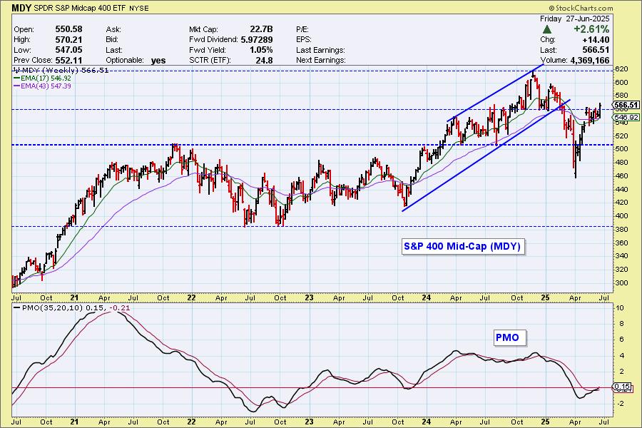
We have a bullish "V" Bottom on the weekly chart that does imply we'll get a breakout eventually to new all-time highs. The weekly PMO is rising on a Crossover BUY Signal and just hit positive territory. This breakout looks convincing.
The DecisionPoint Alert Weekly Wrap presents an end-of-week assessment of the trend and condition of the Stock Market, the U.S. Dollar, Gold, Crude Oil, and Bonds. The DecisionPoint Alert daily report (Monday through Thursday) is abbreviated and gives updates on the Weekly Wrap assessments.
Watch the latest episode of DecisionPoint on our YouTube channel here!
MARKET/SPX SECTOR/INDUSTRY GROUP INDEXES
Change Today: 
Change for the Week:
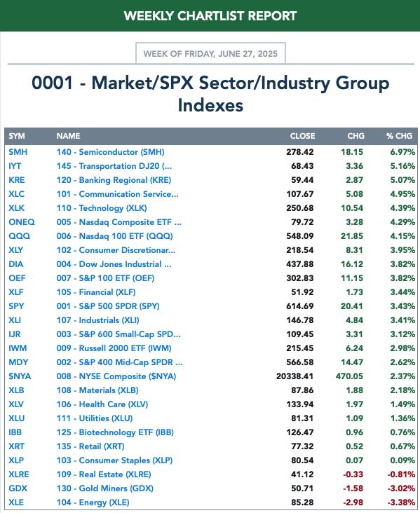
CLICK HERE for Carl's annotated Market Index, Sector, and Industry Group charts.
THE MARKET (S&P 500)
IT Trend Model: NEUTRAL as of 3/4/2025
LT Trend Model: SELL as of 4/16/2025
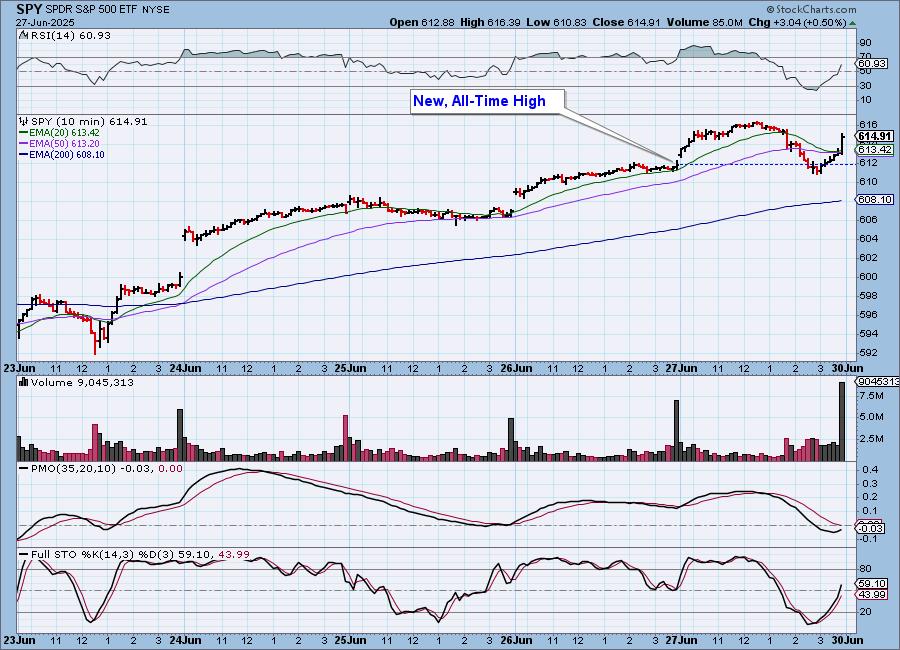
SPY 10-Minute Chart: It looked like we were finally going to see price turn over. Instead we got an end of day rally that pushed price close to prior highs. The 10-minute PMO looks very bullish, as do Stochastics so we should expect to see more rally on Monday.
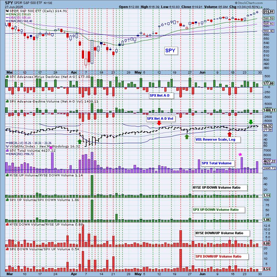
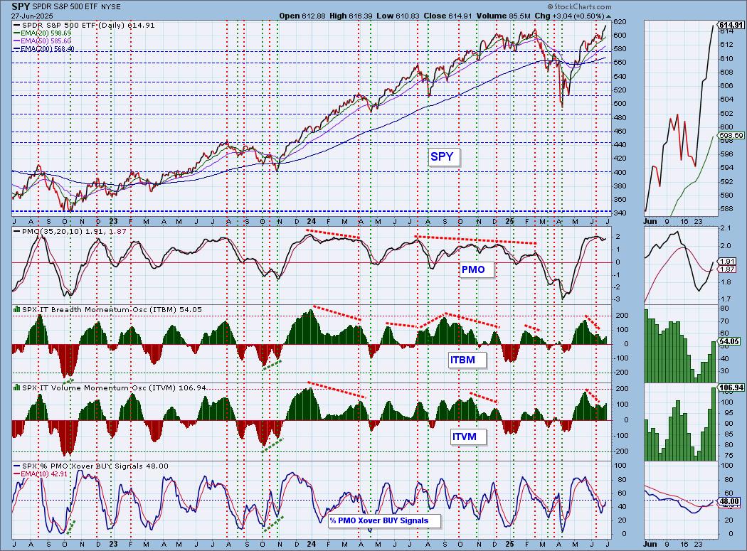
SPY Daily Chart: The market is so overvalued and now based on the RSI, it is overbought too. It is overdue for a decline. We did see a new PMO Crossover BUY Signal this week and it is flat above the zero line which implies pure strength so it wouldn't be a surprise if it continues to inch higher.
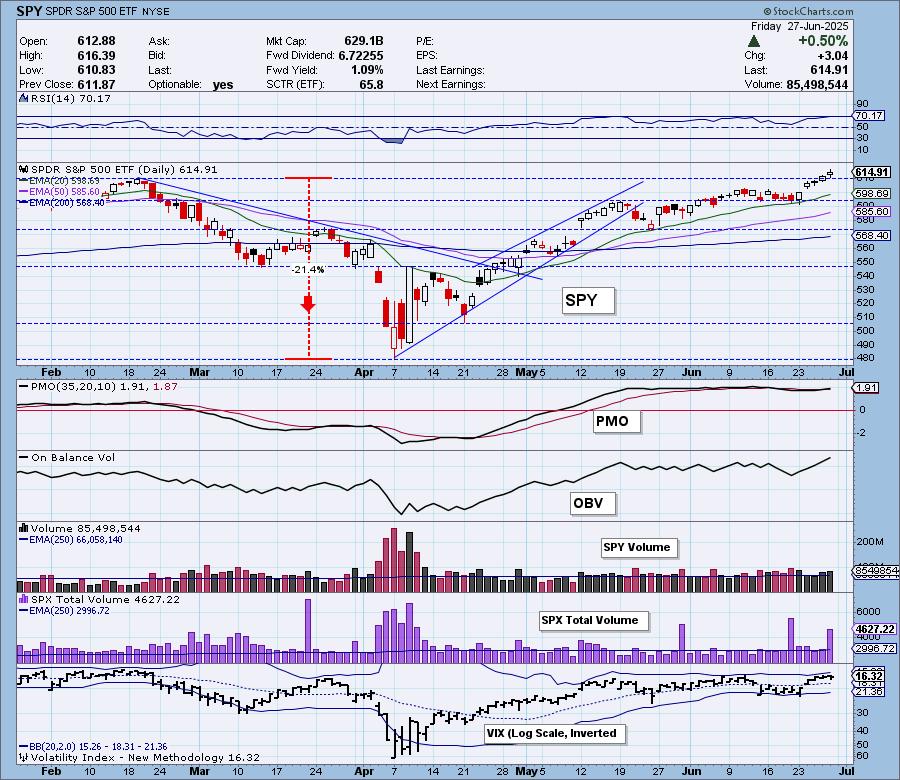
The VIX held above its moving average on the inverted scale implying strength. Stochastics are also implying internal strength as they rise above 80. Clearly mega-caps are in charge as we noted yesterday. The rising trend out of the April low on relative strength to equal-weight RSP confirms it. We saw the OBV breakout with price which is a good confirmation as well.
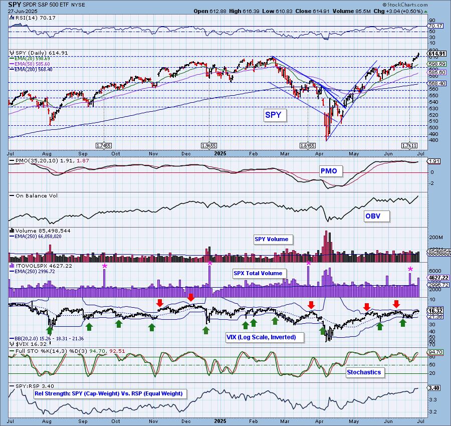
SPY Weekly Chart: The "V" Bottom fulfilled with a breakout to all-time highs. The weekly PMO is still on the rise above the zero line on a Crossover BUY Signal which is very positive.
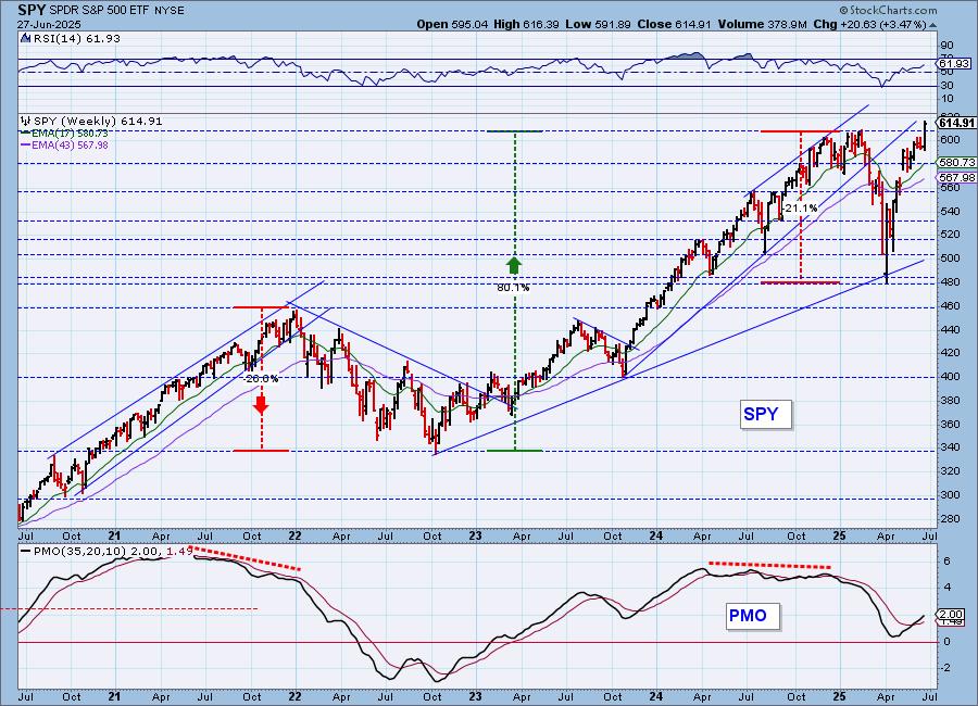
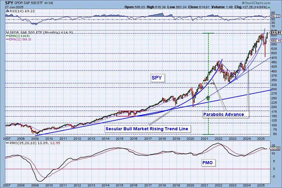
SPY Monthly Chart: We got the parabolic breakdown we expected, but since then it has made a bee line to all-time highs. The monthly PMO has reversed higher and is on a Crossover BUY Signal well above the zero line.
New 52-Week Highs/Lows: New Highs are at the highest level we've seen since the beginning of the year. This is bullish. We still show some New Lows, but ultimately the High-Low Differential is on the rise suggesting we could see higher prices.
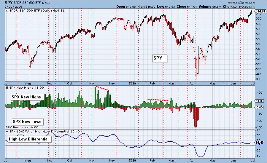
Climax Analysis: There was only one climax reading on the four relevant indicators today. SPX Total Volume was 154% of the one-year daily average volume. That definitely looks like blowoff volume, meaning that the worm could turn next week.
*A climax is a one-day event when market action generates very high readings in, primarily, breadth and volume indicators. We also include the VIX, watching for it to penetrate outside the Bollinger Band envelope. The vertical dotted lines mark climax days -- red for downside climaxes, and green for upside. Climaxes are at their core exhaustion events; however, at price pivots they may be initiating a change of trend.
Short-Term Market Indicators: The short-term market trend is UP and the condition is OVERBOUGHT.
Swenlin Trading Oscillators (STOs) are now overbought. They are relinquishing their negative divergences which is positive. We still have negative divergences on %Stocks > 20EMA and %PMOs Rising. Both of those indicators look fairly positive, but the negative divergences are troubling. We are at all-time highs and yet we don't have robust participation.
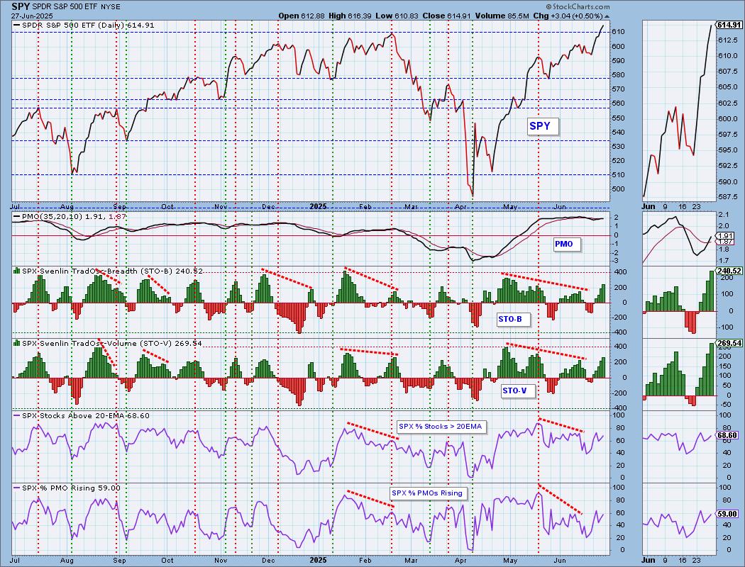
Intermediate-Term Market Indicators: The intermediate-term market trend is UP and the condition is NEUTRAL.
The ITBM is getting close to overbought territory. We'd say that the ITVM has gotten overbought. Negative divergences are still in play for these two indicators. %PMO Xover BUY Signals is rising nicely but still remains below our bullish 50% threshold. It should definitely be higher given we are at all-time highs.
_______
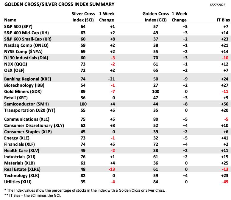
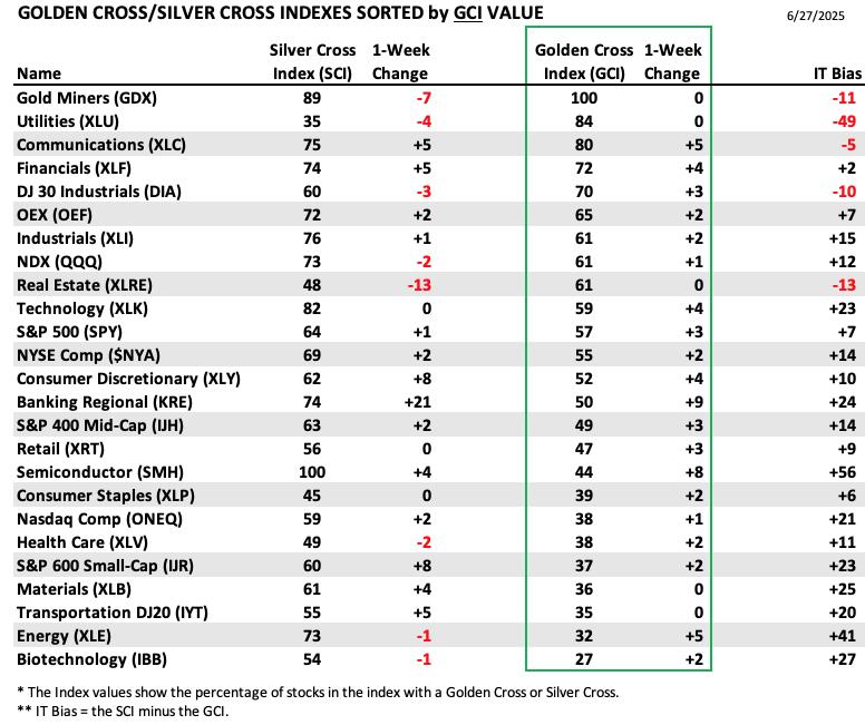
PARTICIPATION TABLES: The following tables summarize participation for the major market indexes and sectors. The 1-Week Change columns inject a dynamic aspect to the presentation. There are three groups: Major Market Indexes, Miscellaneous Industry Groups, and the 11 S&P 500 Sectors.
The strongest IT Bias is held by Semiconductors (SMH). Their recent meteoric rise pushed the Silver Cross Index to 100% which is much higher than the GCI reading. This group is on fire, but is overdue for a cooling period.
Weakest IT Bias belongs to Utilities (XLU). They have a strong foundation with the Golden Cross Index, but have seen lower readings on the SCI. The sector looks a little more bullish now, but the low SCI reading does tell us there are some problems.
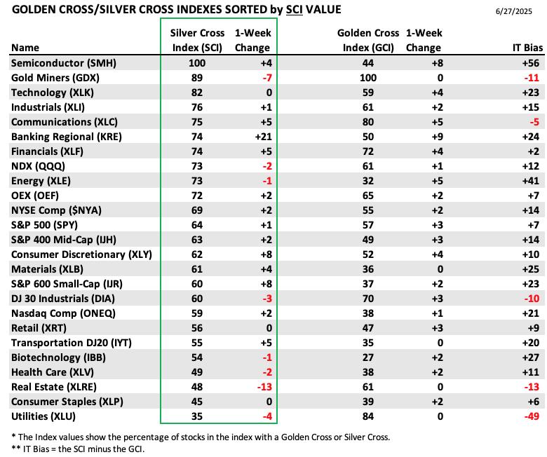
This table is sorted by SCI values. This gives a clear picture of strongest to weakest index/sector in terms of intermediate-term participation.
Regional Banks (KRE) saw an incredible 21 point gain on the SCI this week. With Financials heating up, this could be an area to explore further.
Real Estate (XLRE) is in a holding pattern right now with weakness seeping in given the large 13 point decline in the SCI.
This table is sorted by GCI values. This gives a clear picture of strongest to weakest index/sector in terms of long-term participation.
Gold Miners (GDX) top the GCI list at 100%. The group is starting to see some rollback, but the foundation is very strong. If the Dollar continues to weaken, this could be an area to exploit, but for now it is losing SCI points so it may not be the best time enter right now.
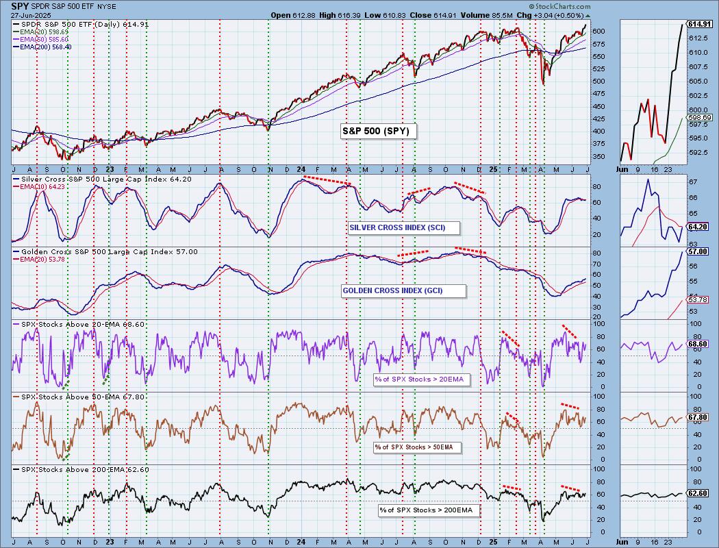
PARTICIPATION CHART (S&P 500): The following chart objectively shows the depth and trend of participation for the SPX in two time frames.
- Intermediate-Term - the Silver Cross Index (SCI) shows the percentage of SPX stocks on IT Trend Model BUY signals (20-EMA > 50-EMA). The opposite of the Silver Cross is a "Dark Cross" -- those stocks are, at the very least, in a correction.
- Long-Term - the Golden Cross Index (GCI) shows the percentage of SPX stocks on LT Trend Model BUY signals (50-EMA > 200-EMA). The opposite of a Golden Cross is the "Death Cross" -- those stocks are in a bear market.
The market bias is BEARISH in the intermediate term.
The market bias is BULLISH in the long term.
Negative divergences persist on participation indicators. Readings are at healthy levels, but they should be much higher given we are at all-time highs. The Silver Cross Index came very close to crossing above its signal line today as it reversed strongly higher. It is still below the signal line so the IT Bias is BEARISH. The Golden Cross Index looks bullish on its rise, but should also be reading higher than it is given all-time highs. It is above its signal line so the LT Bias is BULLISH.
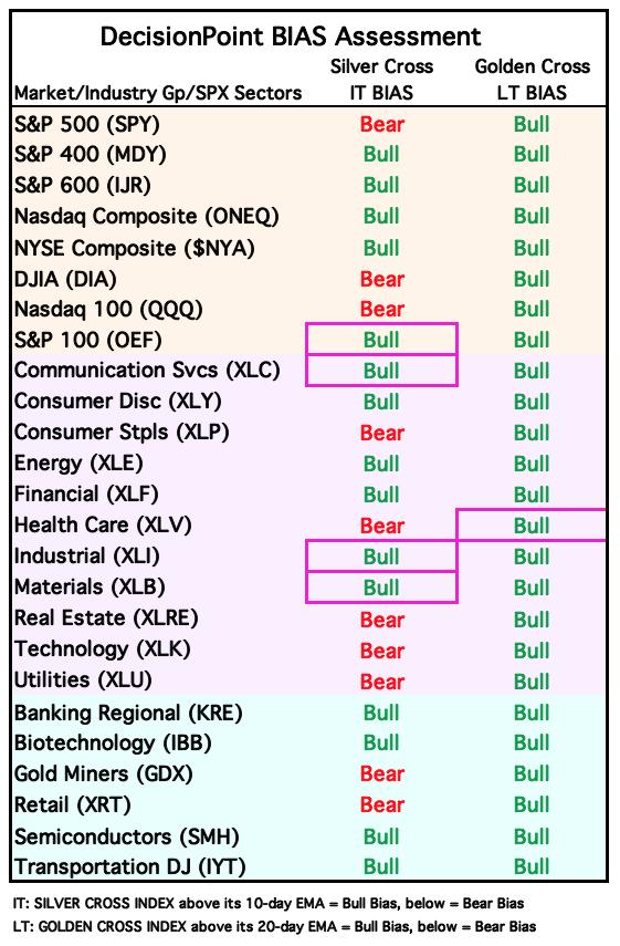
BIAS Assessment: The following table expresses the current BIAS of various price indexes based upon the relationship of the Silver Cross Index to its 10-day EMA (intermediate-term), and of the Golden Cross Index to its 20-day EMA (long-term). When the Index is above the EMA it is bullish, and it is bearish when the Index is below the EMA. The BIAS does not imply that any particular action should be taken. It is information to be used in the decision process.
The items with highlighted borders indicate that the BIAS changed today.
*****************************************************************************************************
CONCLUSION: With the market so overvalued and now overbought on the RSI, we should expect a downturn. Today's Total Volume was at blow off levels. Still the 10-minute chart looks bullish and primary indicators are on the rise. We also have a Bias Table that is slowly turning green again. We think we could see price inch a bit higher, but it is overdue for a decline so we have to stay alert. Negative divergences are the big problem. Participation should be much higher given we are at all-time highs. At this point we have to let the market lead the way. As we continue to say, set your stops and let the market take you out. Thank you again for all of your support!
Erin is 50% long, 0% short. (This is intended as information, not a recommendation.)
*****************************************************************************************************
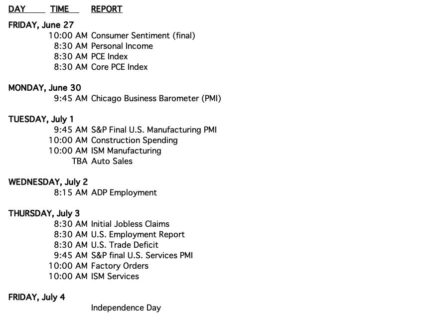
CALENDAR
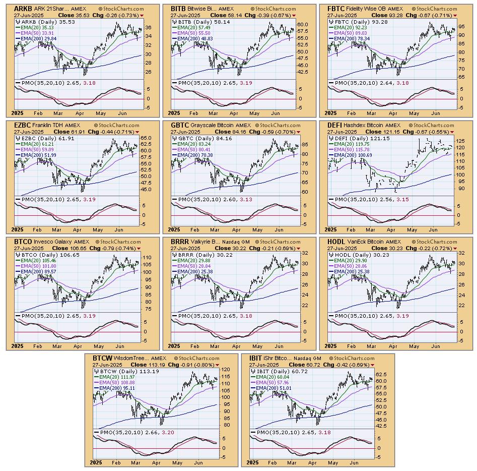
BITCOIN
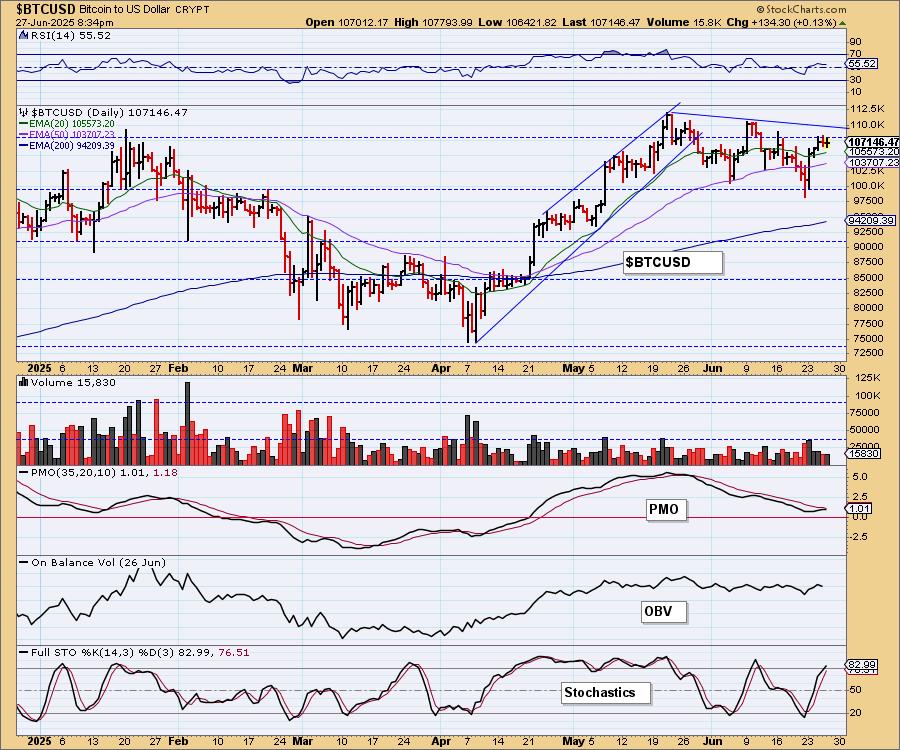
Bitcoin Daily Chart: Bitcoin is forming a bull flag, but we do notice that price is struggling at overhead resistance. We do think we'll ultimately get a breakout to all-time highs given the rising PMO and Stochastics above 80. It is doing as Bitcoin tends to--big move up and then consolidation. Time for the next big move up.
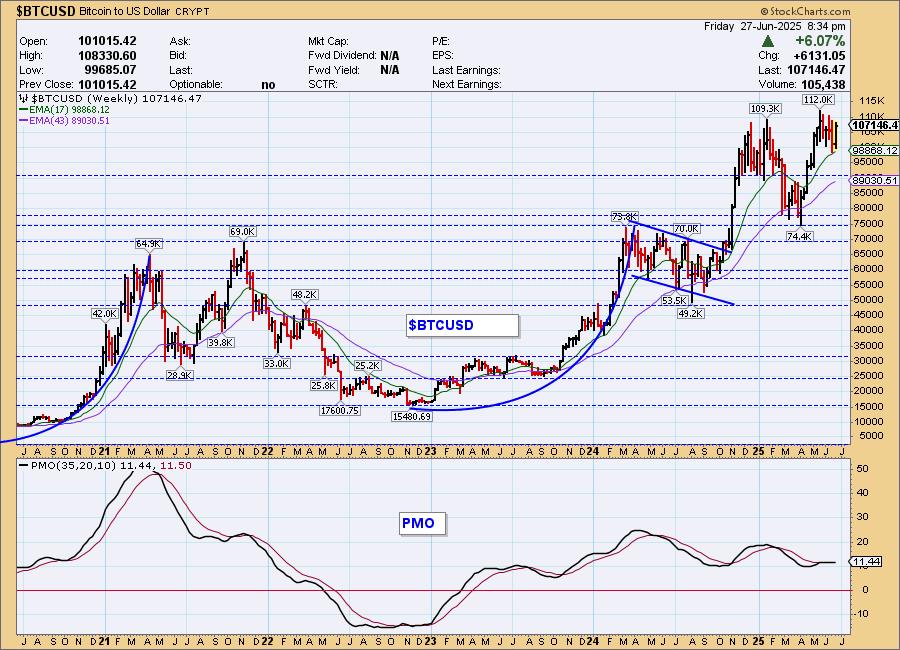
Bitcoin Weekly Chart: You can see the flag formation clearly on the weekly chart. The weekly PMO is not very helpful as it has flattened during this period of consolidation. It is still beneath its signal line. We are looking for an upside breakout from this flag.
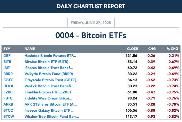
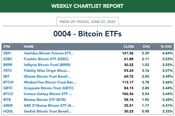
BITCOIN ETFs
Today:
This Week:
INTEREST RATES
Yields turned up today. They are still in declining trends, but we are on the lookout for an upside reversal. Maybe this is the start.
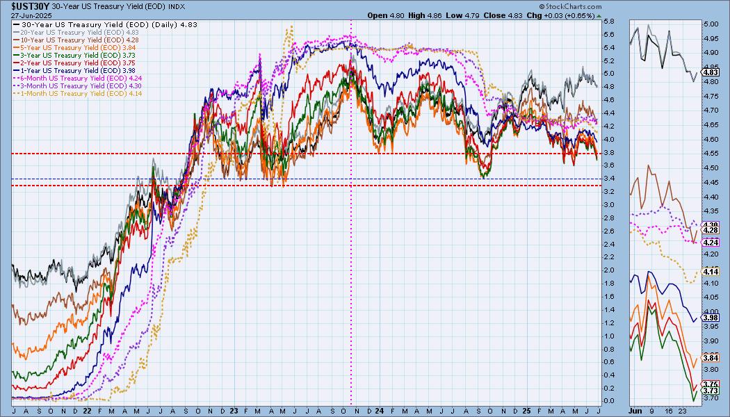
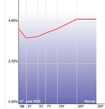
The Yield Curve Chart from StockCharts.com shows us the inversions taking place. The red line should move higher from left to right. Inversions are occurring where it moves downward.
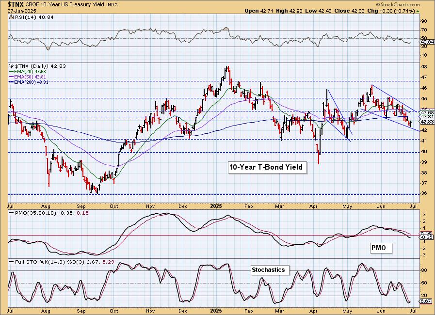
10-YEAR T-BOND YIELD
$TNX bounced off the bottom of a bullish falling wedge. This may be the reversal point. The PMO is still in decline, but Stochastics turned up. We'll see if this rally gets some legs.
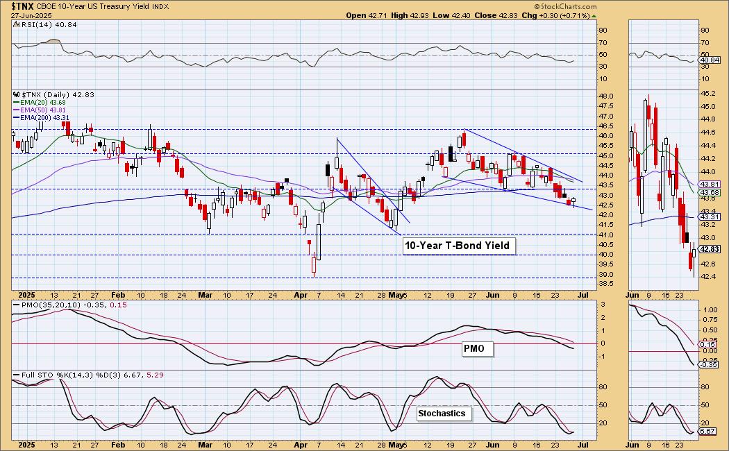
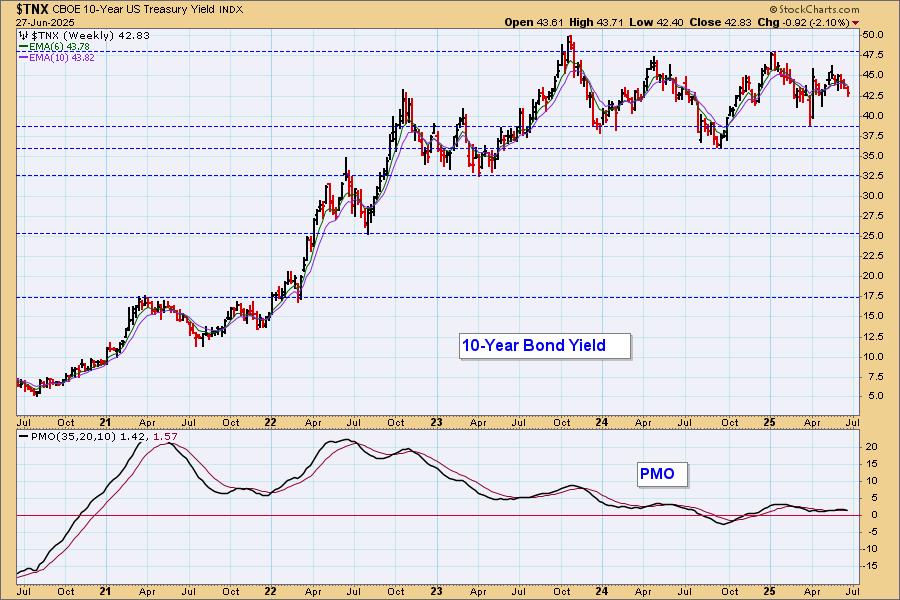
10-Year Bond Yield Weekly Chart: Overall yields are in a sideways consolidation pattern. They were unable to test the top of the zone before turning back down and that is somewhat bearish. The weekly PMO is declining on a new Crossover SELL Signal. Still, the daily chart holds some promise.
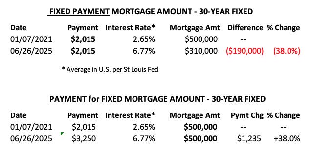
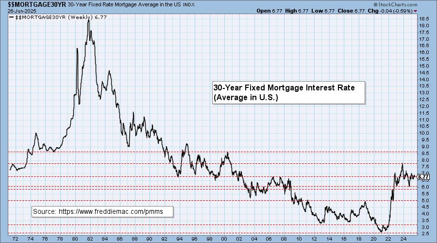
MORTGAGE INTEREST RATES (30-Yr)**
**We watch the 30-Year Fixed Mortgage Interest Rate, because, for the most part, people buy homes based upon the maximum monthly payment they can afford. As rates rise, a fixed monthly payment will carry a smaller mortgage amount, which shuts many buyers out of the market, and potential sellers will experience pressure to lower prices (to no effect so far).
--
This week the 30-Year Fixed Rate changed from 6.81 to 6.77.
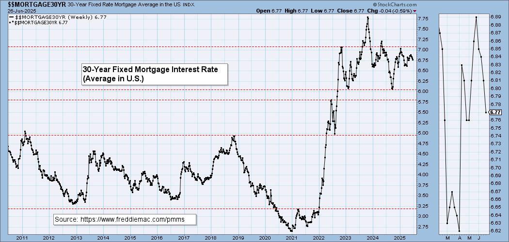
Here is a 50-year chart for better perspective.
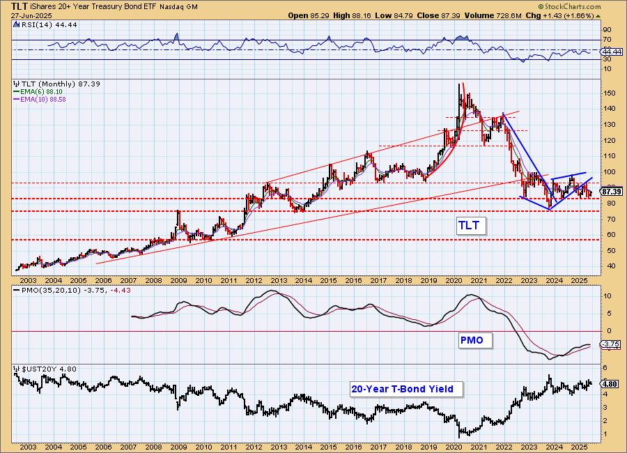
BONDS (TLT)
IT Trend Model: SELL as of 4/14/2025
LT Trend Model: SELL as of 12/13/2024
TLT Daily Chart: Bonds dropped after breaking out of the top of a bearish rising wedge. We are getting close to a Silver Cross, but this decline could catch hold based on the chart pattern. The PMO is decelerating and Stochastics have topped.
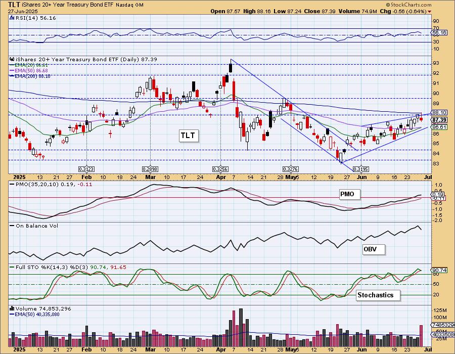
The 200-day EMA could pose a problem.
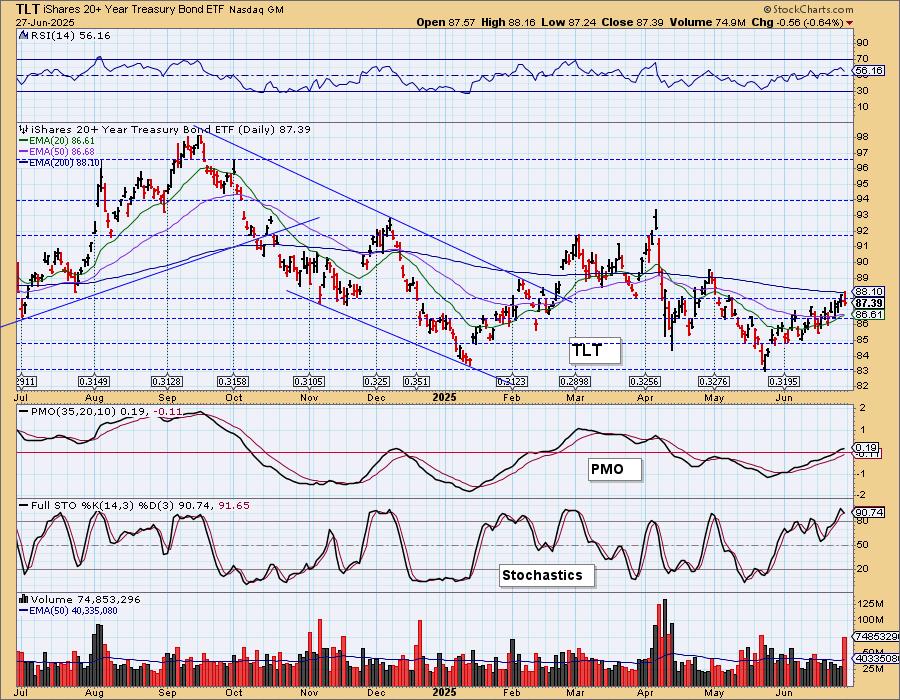
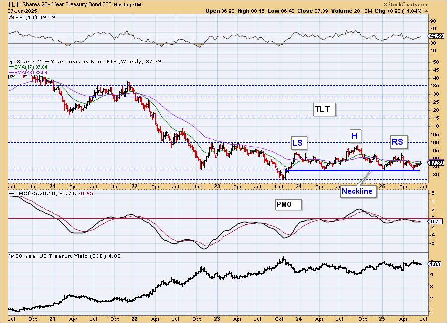
TLT Weekly Chart: We are monitoring a bearish head and shoulders on the weekly chart. However, we note that currently price is rebounding off the neckline. The weekly PMO is trying to turn back up making the pattern less potent.
TLT Monthly Chart: The monthly chart suggest that we could see more downside as price has drifted out of a bearish rising wedge. The monthly PMO looks toppy to us so we do expect more decline in the long term.
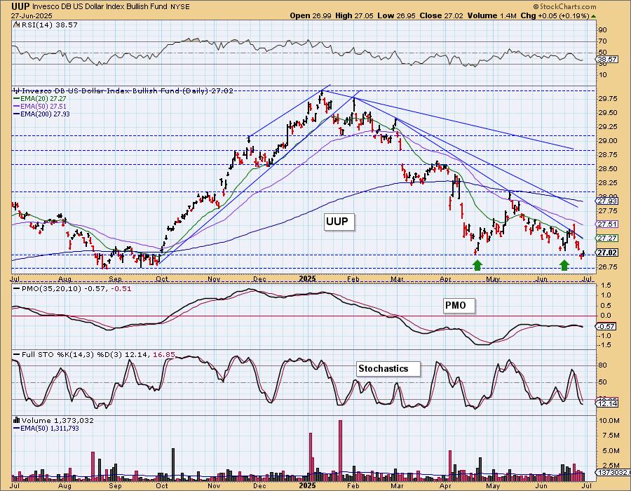
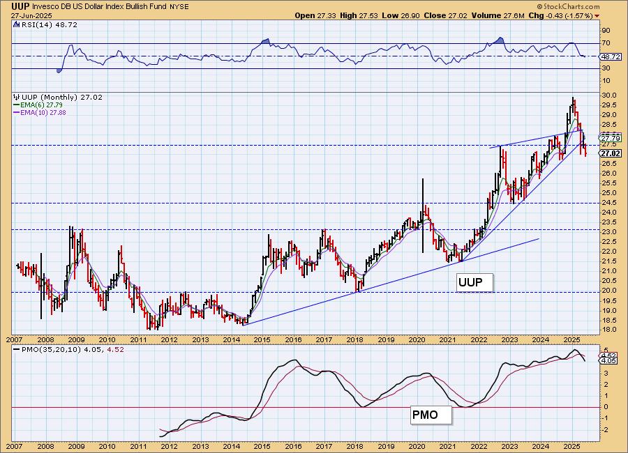
DOLLAR (UUP)
IT Trend Model: NEUTRAL as of 3/5/2025
LT Trend Model: SELL as of 4/25/2025
UUP Daily Chart: The Dollar is trying to get back above prior support. The declining trends are still very much intact and the PMO is falling on a Crossover SELL Signal. The PMO is also flat beneath the zero line implying pure weakness. Last week we thought it was ready to rally, but this week showed us that it was not. We are bearish on the Dollar.
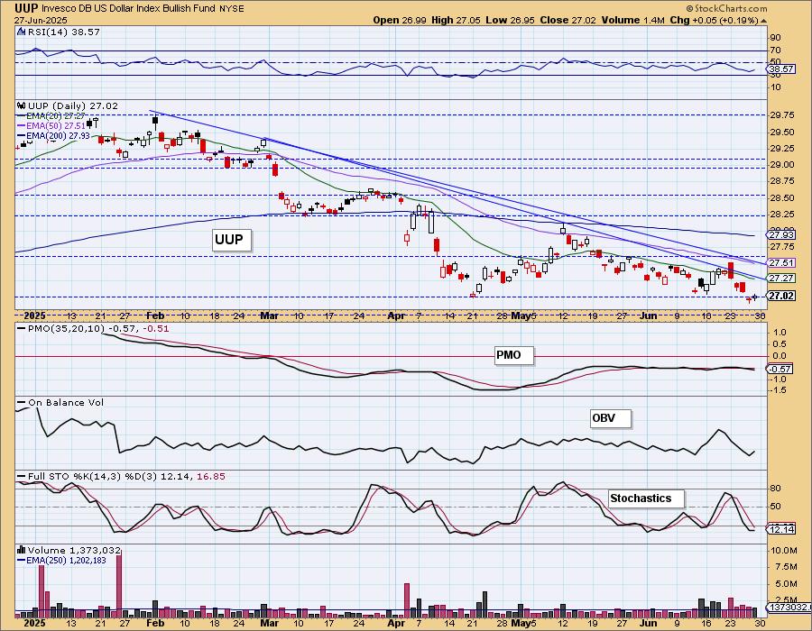
We are getting a reversal before strong support was tested at the September low and that is somewhat bullish. The declining trends are still overpowering, keeping us bearish.
UUP Weekly Chart: Price dropped out of the bearish rising wedge and continues lower. The weekly RSI is negative and the weekly PMO is falling beneath the zero line on a long-term Crossover SELL Signal. Strong support is arriving, but we aren't that optimistic.
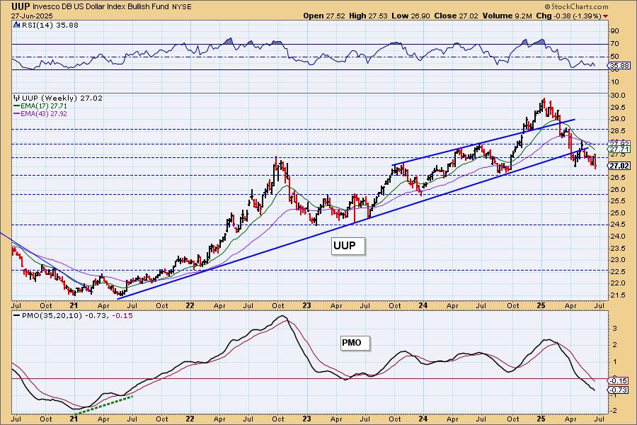
UUP Monthly Chart: The monthly RSI just dropped into negative territory and the monthly PMO is falling on a Crossover SELL Signal. The breakdown of the rising trend suggests to us there is more downside to absorb.
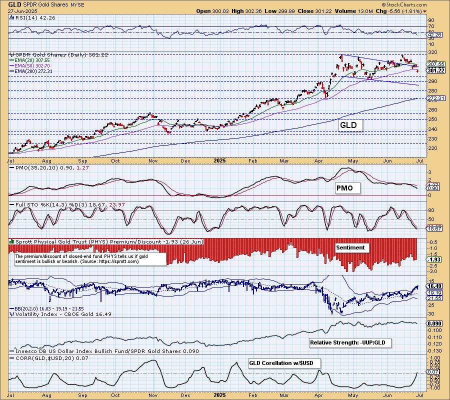
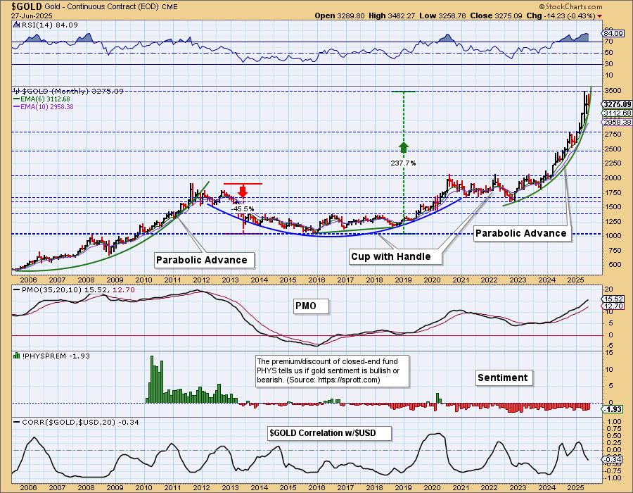
GOLD
IT Trend Model: NEUTRAL as of 12/23/2024
LT Trend Model: BUY as of 10/20/2023
GLD Daily Chart: With the Dollar looking weak, we want to get bullish on Gold, but the declining trend continues. The 50-day EMA has been lost as support. You have to look to January to see price below the 50-day EMA. This is a significant breach. Support is arriving at 290 and that is where we would look for an upside reversal. For now we think it will continue lower a bit longer. It could be saved by a failing Dollar, but for now the technicals on its chart point to lower prices.
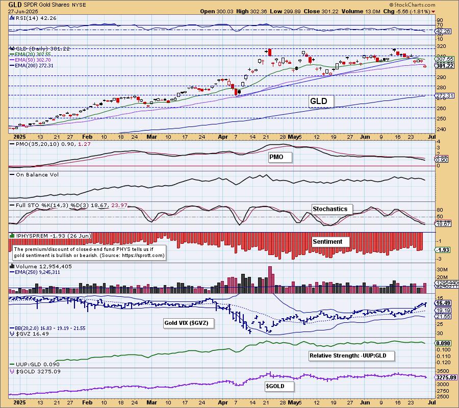
Notice that the correlation with the Dollar has disappeared so a flailing Dollar won't necessarily help Gold as they have clearly decoupled. We also note that Stochastics dropped below 20. We're short-term bearish.
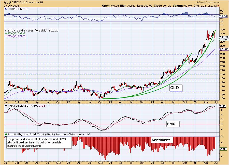
GLD Weekly Chart: The parabolic advance has been broken with this week's decline. We should expect more problems in the intermediate term. The weekly PMO has topped so we should look for more decline or if we're lucky consolidation.
$GOLD Monthly Chart: The parabola is still intact on the monthly chart and it tells us to expect a breakdown. The fundamentals are still very favorable for Gold so we could see this advance continue vertically. However, the monthly RSI is incredibly overbought. Maybe we're in for some sideways consolidation given the strongly rising monthly PMO.
GOLD MINERS Daily Chart: Gold Miners dropped out of their wedge this week. They are holding above the 50-day EMA but we think they do have more decline ahead given the double top within the rising wedge. Participation has slid with %Stocks > 20EMA tumbling to 18%. GDX is holding above the 50-day EMA, but we suspect they will lose that support soon.
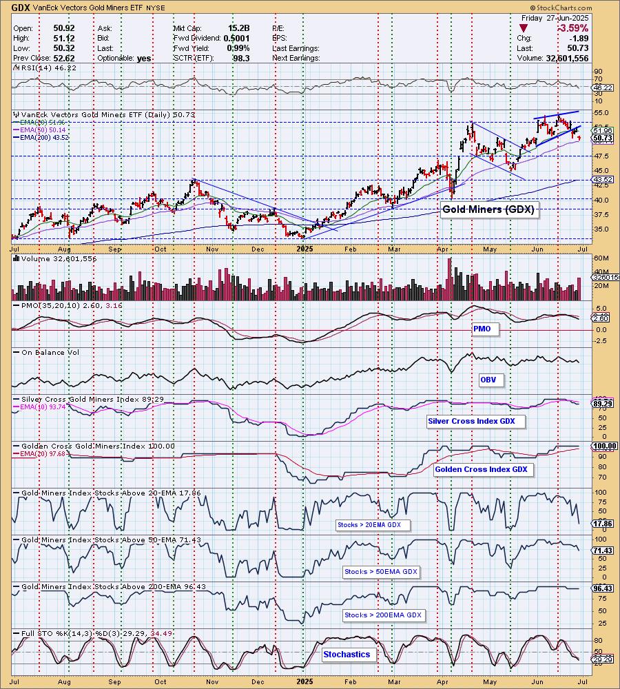
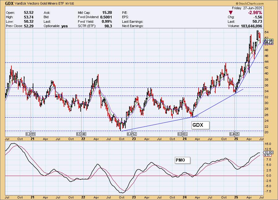
GDX Weekly Chart: It appears price is ready to go back down and test the rising bottoms trendline. The weekly PMO is topping. We're not so sure it will drop from there, but it is a steep rising trend and those are hard to maintain. We should be prepared for a bigger decline should Gold start correcting.
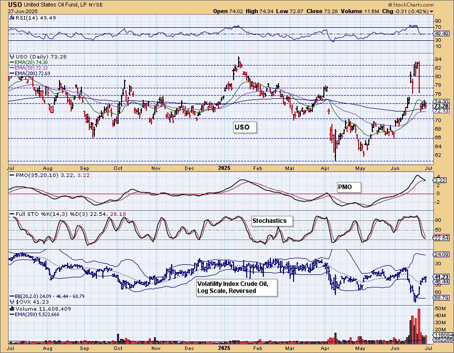
CRUDE OIL (USO)
IT Trend Model: BUY as of 6/11/2025
LT Trend Model: BUY as of 3/31/2025
USO Daily Chart: Crude Oil was down on the day and formed a bearish engulfing candlestick. The RSI has dropped into negative territory and we're seeing a PMO Crossover SELL Signal. Price is holding above the 200-day EMA, but we think it is vulnerable. We're back to "drill, baby, drill" and that will put downside pressure on price. We think it will break down soon.
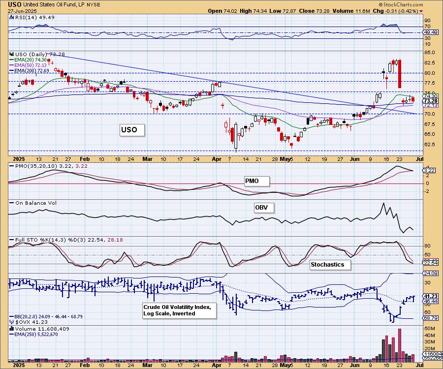
Strong support is available at 70, but we don't expect it to hold given the indicators.
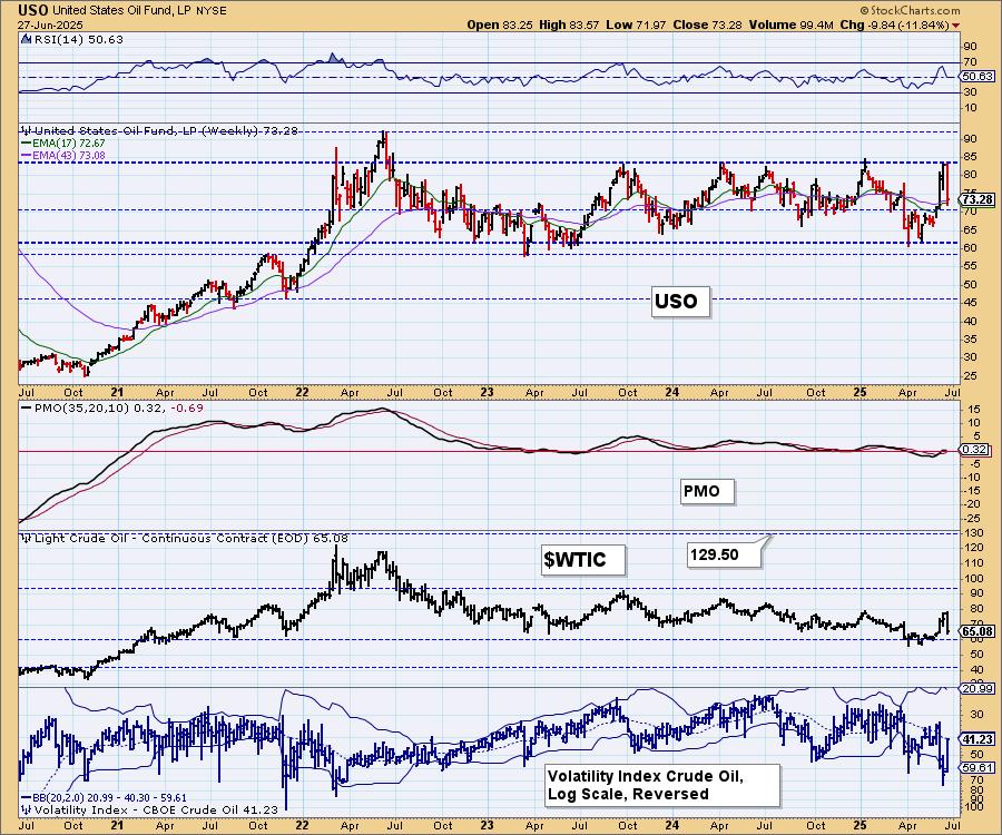
USO/$WTIC Weekly Chart: It isn't surprising that we saw a big decline this week. Price had hit very strong overhead resistance and was due to reverse. The Israel/Iran conflict pushed prices higher, but resistance was met as the conflict resolved. The weekly PMO is topping. We don't see any reason this trading range would not to hold up.
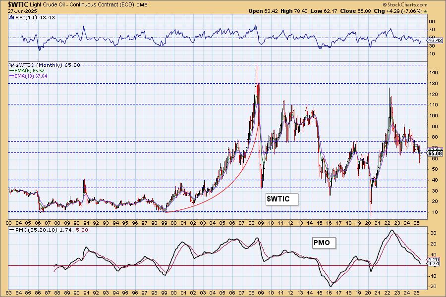
WTIC Monthly Chart: Price is in a long-term declining trend. The weekly RSI is negative and the weekly PMO is falling fast. With the administration working hard to keep Crude and Gas prices lower, it isn't surprising to see a bearish bias on this chart. We don't expect prices to go much lower than $60/barrel. While the administration wants lower prices, they don't necessarily want to push them so low that production companies start losing money.
Good Luck & Good Trading! Thank you again for being a subscriber! Signing off.
Erin Swenlin and Carl Swenlin
Technical Analysis is a windsock, not a crystal ball. --Carl Swenlin
(c) Copyright 2025 DecisionPoint.com
Disclaimer: This blog is for educational purposes only and should not be construed as financial advice. The ideas and strategies should never be used without first assessing your own personal and financial situation, or without consulting a financial professional. Any opinions expressed herein are solely those of the author, and do not in any way represent the views or opinions of any other person or entity.
DecisionPoint is not a registered investment advisor. Investment and trading decisions are solely your responsibility. DecisionPoint newsletters, blogs or website materials should NOT be interpreted as a recommendation or solicitation to buy or sell any security or to take any specific action.
NOTE: The signal status reported herein is based upon mechanical trading model signals, specifically, the DecisionPoint Trend Model. They define the implied bias of the price index based upon moving average relationships, but they do not necessarily call for a specific action. They are information flags that should prompt chart review. Further, they do not call for continuous buying or selling during the life of the signal. For example, a BUY signal will probably (but not necessarily) return the best results if action is taken soon after the signal is generated. Additional opportunities for buying may be found as price zigzags higher, but the trader must look for optimum entry points. Conversely, exit points to preserve gains (or minimize losses) may be evident before the model mechanically closes the signal.
Helpful DecisionPoint Links:
DecisionPoint Alert Chart List
DecisionPoint Golden Cross/Silver Cross Index Chart List
DecisionPoint Sector Chart List
Price Momentum Oscillator (PMO)