
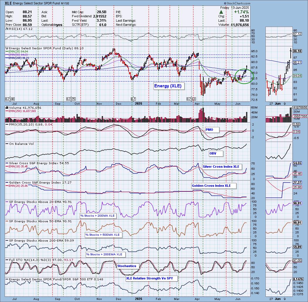
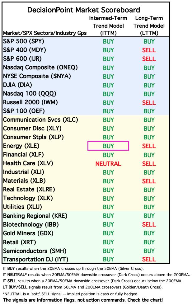
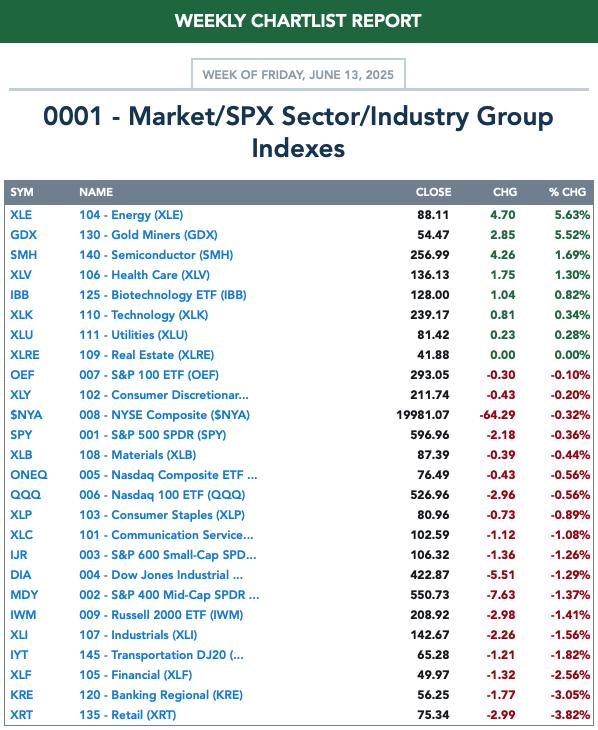
Today the Energy Sector ETF (XLE) 20-day EMA crossed up through the 50-day EMA (Silver Cross) generating an IT Trend Model BUY Signal. Middle East tensions pushed Crude much higher and this helped push XLE well above the 200-day EMA and resistance at the May top. This rally looks convincing. In spite of a lengthy rally, the RSI is not yet overbought. The PMO and OBV are confirming the rally. The Silver Cross Index is moving vertically higher and is above our bullish 50% threshold. The Golden Cross Index has some work to do so this rally may not get above overhead resistance at the November/December highs. Participation readings are very strong and should give it a good foundation to continue to build on. Stochastics are above 80 and relative strength is kicking in. This was Erin's "Sector to Watch" in DP Diamonds today.
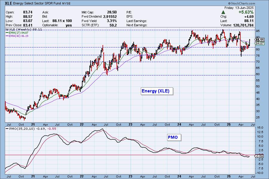
Price is essentially in a trading range and we suspect that will hold up. The weekly PMO has just turned back up, but resistance looks very sturdy.
The DecisionPoint Alert Weekly Wrap presents an end-of-week assessment of the trend and condition of the Stock Market, the U.S. Dollar, Gold, Crude Oil, and Bonds. The DecisionPoint Alert daily report (Monday through Thursday) is abbreviated and gives updates on the Weekly Wrap assessments.
MARKET/SPX SECTOR/INDUSTRY GROUP INDEXES
Change Today: 
Change for the Week:
CLICK HERE for Carl's annotated Market Index, Sector, and Industry Group charts.
THE MARKET (S&P 500)
IT Trend Model: NEUTRAL as of 3/4/2025
LT Trend Model: SELL as of 4/16/2025
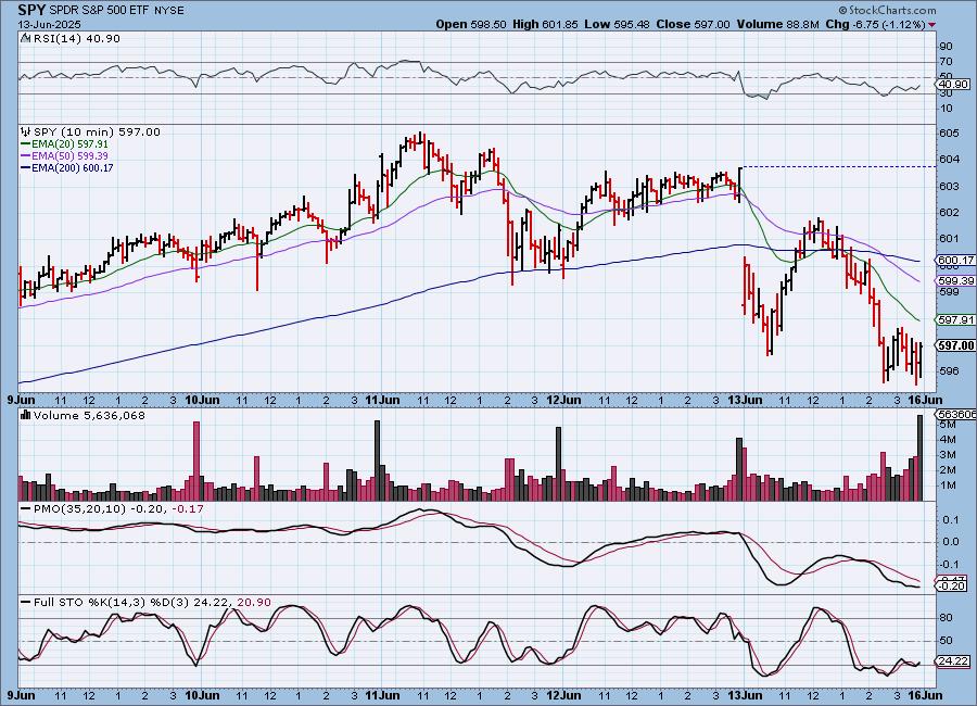
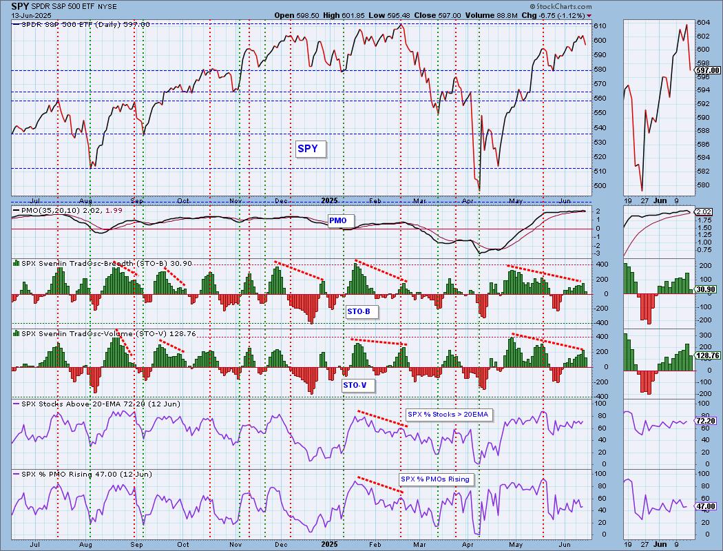
SPY 10-Minute Chart: The Israeli attack on Iran was the reason we saw the perilous drop on the open. Stocks attempted to rebound, but ultimately bad news prevailed and it closed near the lows for the day. The 10-minute PMO is flat. Stochastics are rising again, but are still in deeply negative territory. We could see the decline continue on the open tomorrow.
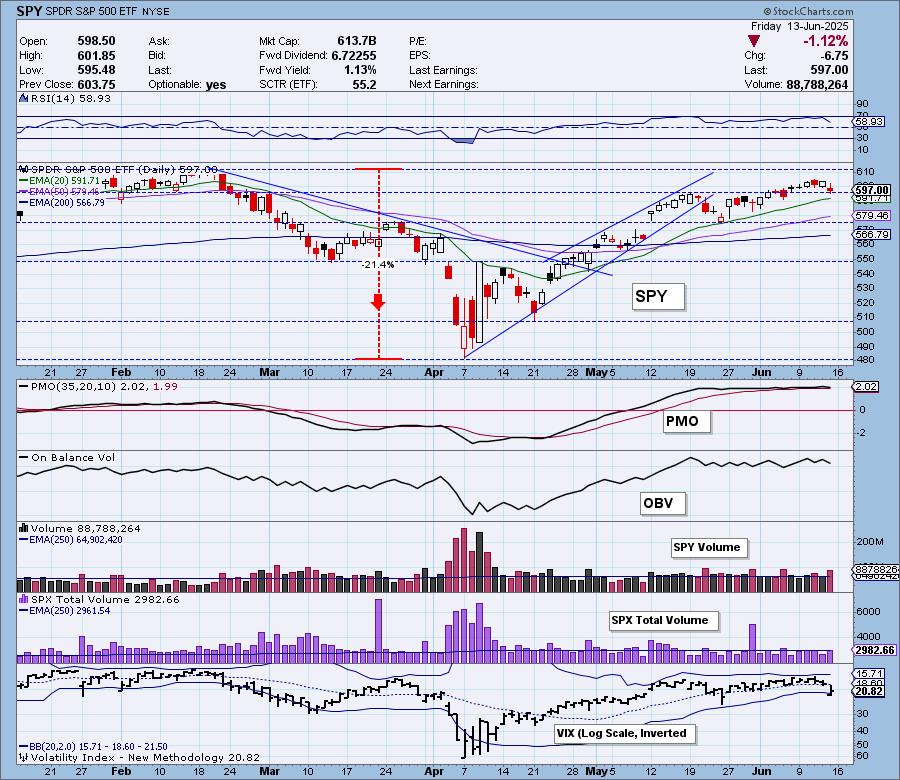
SPY Daily Chart: We have a price top that occurred before price hit overhead resistance at all-time highs. That generally is a problem when price can't get to resistance before turning down. The PMO has topped and could see a negative crossover very soon given its proximity from the signal line.
The VIX not only dropped beneath its moving average on the inverted scale, it punctured the bottom Bollinger Band. Punctures of the lower Band are usually bullish signs, but we aren't so sure this time. The Bands were very tight and a puncture was likely on any significant move. We think it will continue to puncture the lower Band. Stochastics have topped but remain above 80 so they aren't showing that much deterioration yet. Clearly mega-caps are running the show given the outperformance against equal-weight RSP.
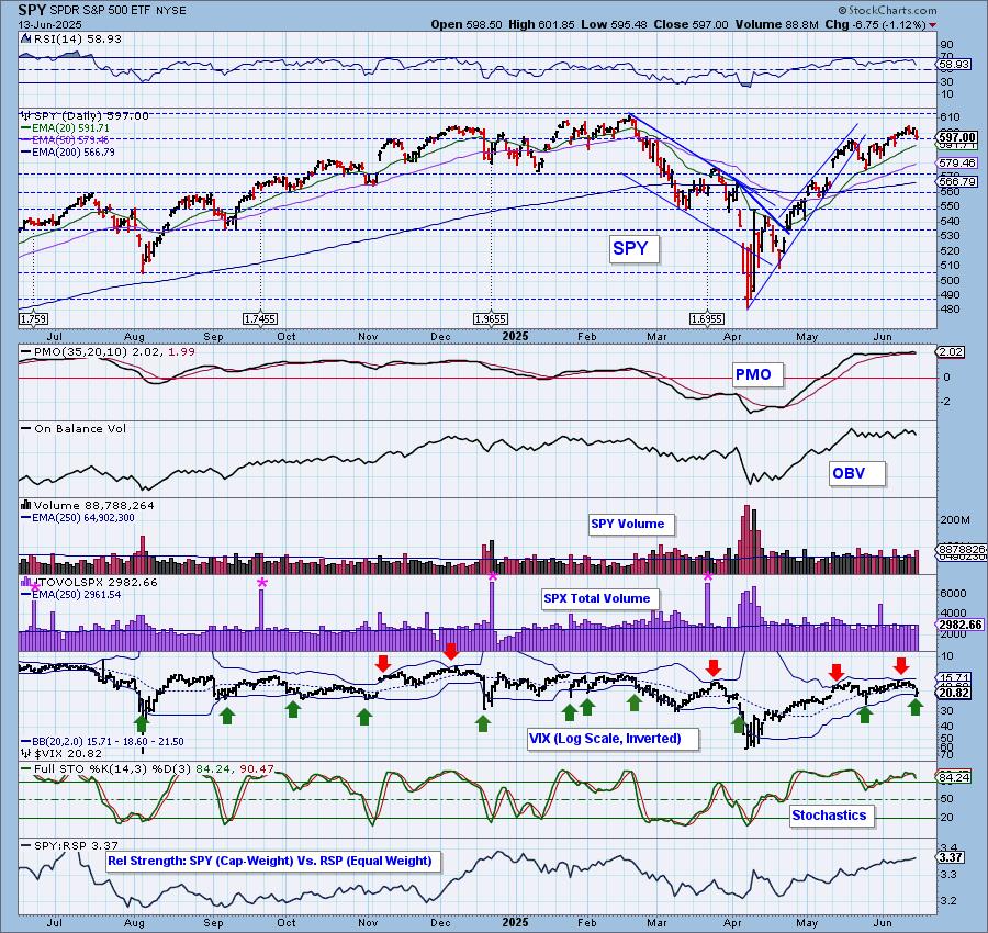
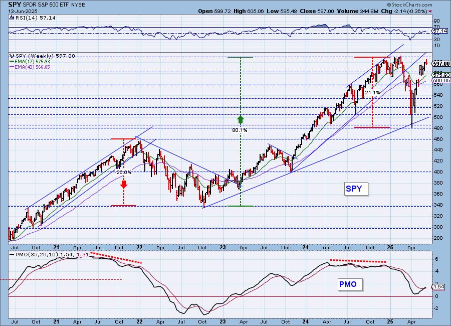
SPY Weekly Chart: We see a bullish "V" Bottom on the weekly chart that does imply that we will eventually see all-time highs again. The weekly PMO continues to rise on its new Crossover BUY Signal from last week. The chart looks pretty good in the intermediate term for now.
New 52-Week Highs/Lows: New Highs continue to pull back, but we didn't see a big decline today. We are starting to see an expansion in New Lows. For now the High-Low Differential is in decline which doesn't bode well.
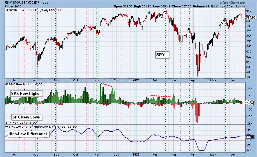
Climax Analysis: There were three climax readings on the four relevant indicators, so we have a downside initiation climax. SPX Total Volume was average and confirming.

*A climax is a one-day event when market action generates very high readings in, primarily, breadth and volume indicators. We also include the VIX, watching for it to penetrate outside the Bollinger Band envelope. The vertical dotted lines mark climax days -- red for downside climaxes, and green for upside. Climaxes are at their core exhaustion events; however, at price pivots they may be initiating a change of trend.
Short-Term Market Indicators: The short-term market trend is UP and the condition is NEUTRAL.
The Swenlin Trading Oscillators (STOs) dropped significantly today. With the recent market top and STO tops, negative divergences have now been baked in. We didn't annotate it, but we also see negative divergences on %Stocks > 20EMA and %PMOs Rising. We do see that participation is healthy and could preserve the rally, but we are not impressed with the number of rising PMOs. That is a sign of near-term deterioration.
Intermediate-Term Market Indicators: The intermediate-term market trend is UP and the condition is NEUTRAL.
Not only did the STOs top, both the ITBM and ITVM also topped. This has sealed in the negative divergences. As with %PMOs Rising, we are unimpressed with %PMO Xover BUY Signals.
_______
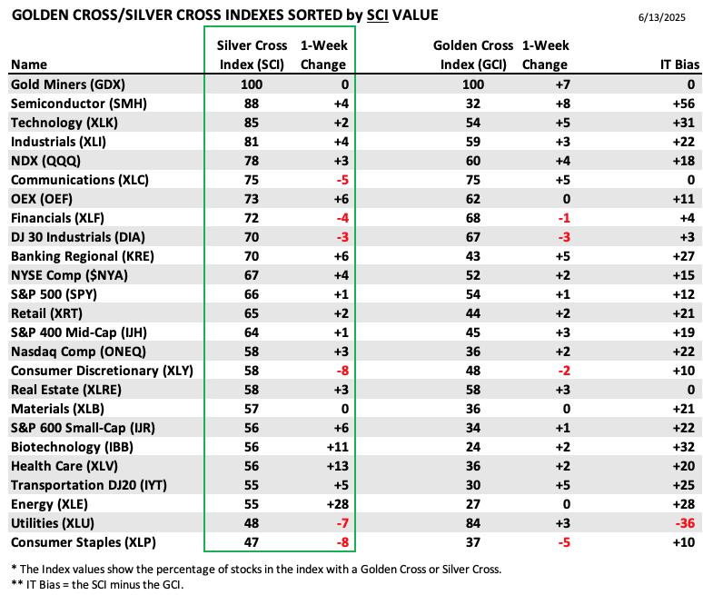
PARTICIPATION TABLES: The following tables summarize participation for the major market indexes and sectors. The 1-Week Change columns inject a dynamic aspect to the presentation. There are three groups: Major Market Indexes, Miscellaneous Industry Groups, and the 11 S&P 500 Sectors.
All IT Biases are positive right now with the exception of Utilities (XLU). XLU had a good run and that pushed the Golden Cross Index very high. The Silver Cross Index is now trying to catch back up. The sector doesn't look that promising though.
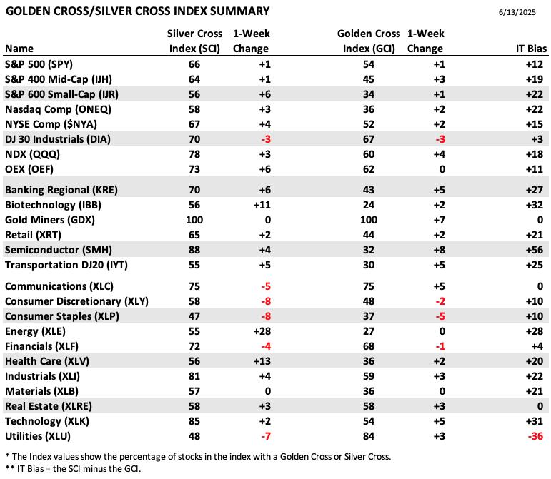
This table is sorted by SCI values. This gives a clear picture of strongest to weakest index/sector in terms of intermediate-term participation.
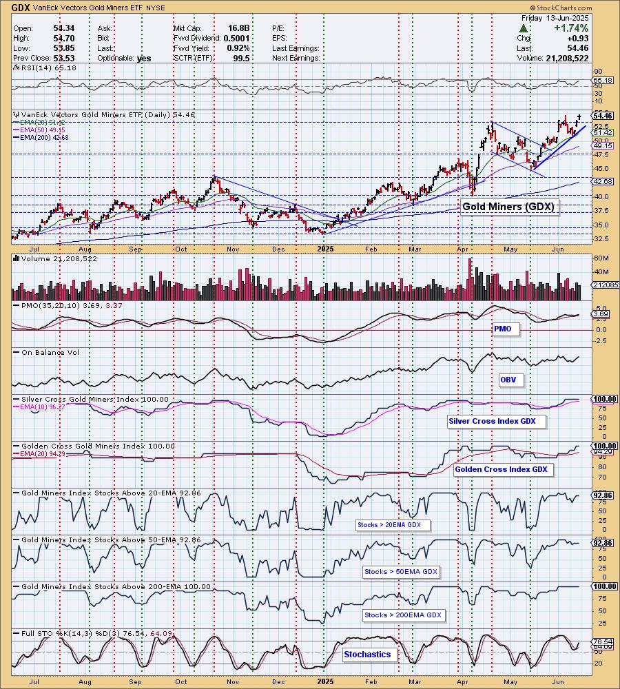
Gold Miners (GDX) is where all the strength lies. Both the Silver and Golden Cross Indexes are reading at 100%. We like this group and still see more upside ahead.
Consumer Staples (XLP) holds the lowest SCI value and it lost ground this week as well. Probably best to avoid the sector moving into next week, although if the decline gets going this defensive area of the market could rejuvenate.
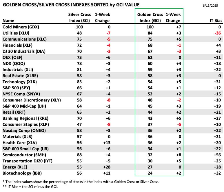
This table is sorted by GCI values. This gives a clear picture of strongest to weakest index/sector in terms of long-term participation.
Semiconductors (SMH) gained the most GCI points this week as the group has seen a resurgence of late. We aren't so sure this is going to hold up though given the market's bearish look right now.
Biotechnology (IBB) holds the lowest GCI value, but it did see some positive movement on both the Silver and Golden Cross Indexes. This group is worth a watch.
PARTICIPATION CHART (S&P 500): The following chart objectively shows the depth and trend of participation for the SPX in two time frames.
- Intermediate-Term - the Silver Cross Index (SCI) shows the percentage of SPX stocks on IT Trend Model BUY signals (20-EMA > 50-EMA). The opposite of the Silver Cross is a "Dark Cross" -- those stocks are, at the very least, in a correction.
- Long-Term - the Golden Cross Index (GCI) shows the percentage of SPX stocks on LT Trend Model BUY signals (50-EMA > 200-EMA). The opposite of a Golden Cross is the "Death Cross" -- those stocks are in a bear market.
The market bias is BULLISH in the intermediate and long terms.
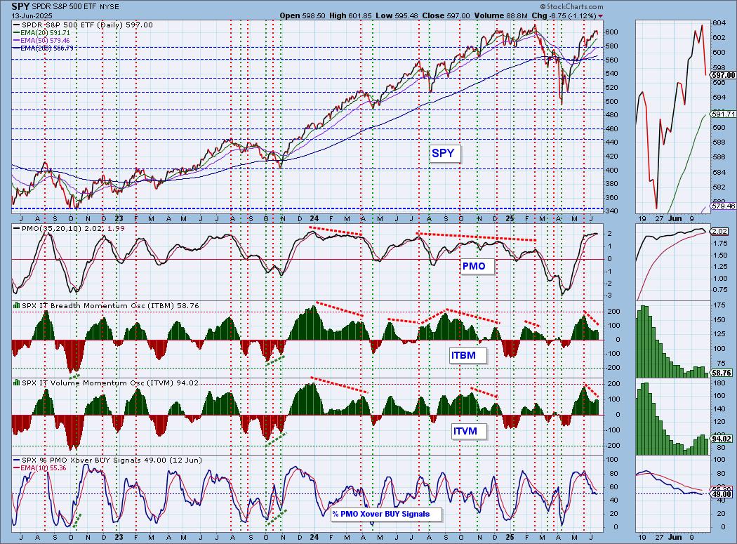
Participation is still holding at bullish levels, but today the Silver Cross Index dropped perilously. It could be headed toward a Bearish Shift across the signal line. However, given robust readings for stocks above their 20/50-day EMAs, it could still reverse higher from here. Still, this is a form of deterioration that we do not like to see. Participation holds negative divergences with price so while readings are robust, negative divergences are a problem. The Silver Cross Index is above its signal line so the IT Bias still reads as BULLISH. The Golden Cross Index also topped today, but like with the Silver Cross Index, participation of stocks above their 50/200-day EMAs are reading higher than the GCI so we could see it reverse course. It is above its signal line so the LT Bias is BULLISH.

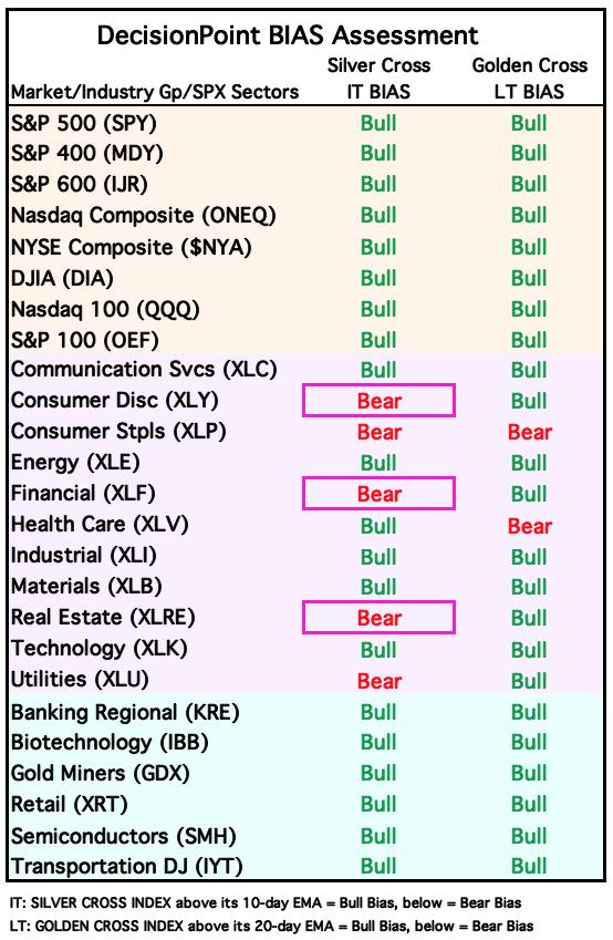
BIAS Assessment: The following table expresses the current BIAS of various price indexes based upon the relationship of the Silver Cross Index to its 10-day EMA (intermediate-term), and of the Golden Cross Index to its 20-day EMA (long-term). When the Index is above the EMA it is bullish, and it is bearish when the Index is below the EMA. The BIAS does not imply that any particular action should be taken. It is information to be used in the decision process.
The items with highlighted borders indicate that the BIAS changed today.
*****************************************************************************************************
CONCLUSION: Investors are awaiting the interest rate announcement on Wednesday. We thought we would see more inching upward or sideways movement given the anticipation of the rate announcement, but instead we saw a decline on news of the Israel/Iran conflict. This could just be the catalyst we've been waiting for to send price downward. Certainly with the STOs and ITBM/ITVM dropping on today's decline combined with the downside initiation climax, it tells us we should see more decline. PMOs within the index are sitting near 50% which is not indicative of bullish activity. The PMO has also topped. We have a strong hunch that we have hit a market top that will result in more decline. Stay cautious and stay true to your stops.
Erin is 60% long, 0% short. (This is intended as information, not a recommendation.)
*****************************************************************************************************
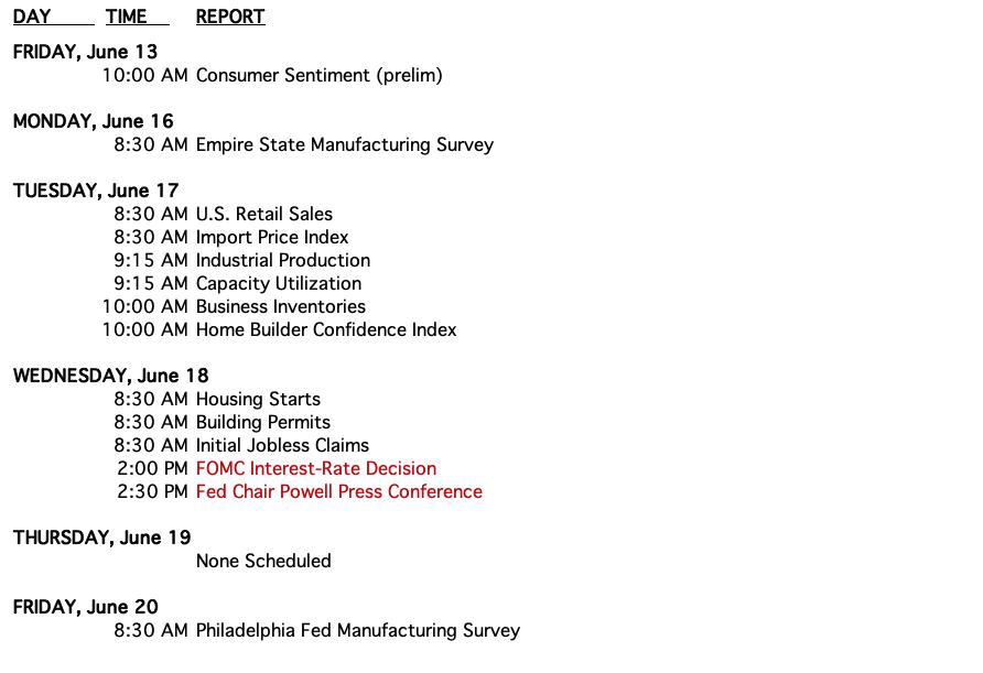
CALENDAR
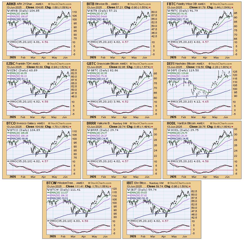
BITCOIN
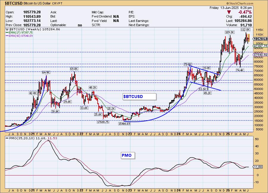
Bitcoin Daily Chart: Bitcoin really looked good to start the week and we were quite bullish. The picture has changed drastically in our minds given what looks like a double top formation on the end of the chart. We were counting on the flag formation to bring price back above all-time highs. No longer. The PMO has topped beneath the signal line and the RSI just moved into negative territory. We are not in a 'risk on' environment and this is likely to cause more trouble for crypto in general.
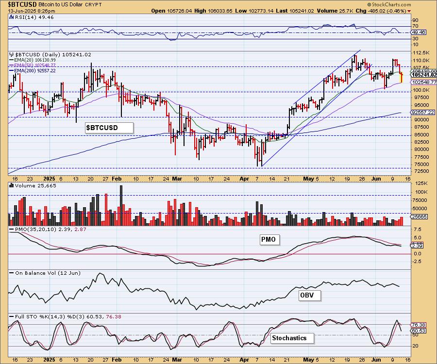
Bitcoin Weekly Chart: Bitcoin likes to rally hard then consolidate or top. We got the latest run higher on a flagpole, but now price is beginning to deteriorate again. We thought we'd get more out of this rally, but with the weekly PMO trying to top, it may be time to look toward support at 90,000.
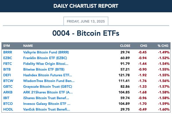
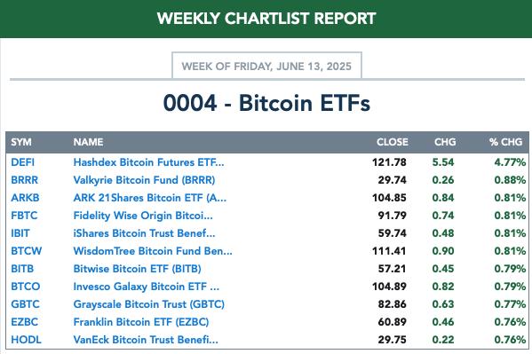
BITCOIN ETFs
Today:
This Week:
INTEREST RATES
Yields quickly reversed course and could be ready to start another run upward. Bond funds are likely to be under pressure.
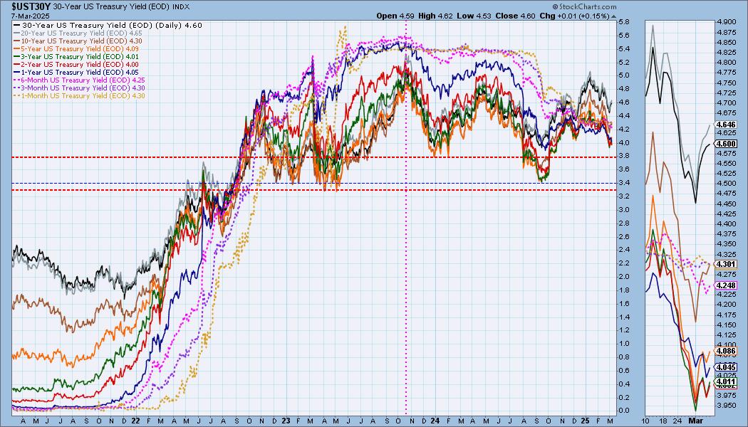
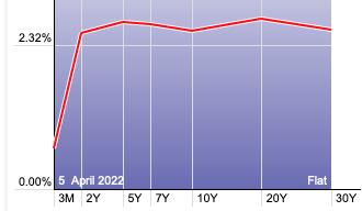
The Yield Curve Chart from StockCharts.com shows us the inversions taking place. The red line should move higher from left to right. Inversions are occurring where it moves downward.
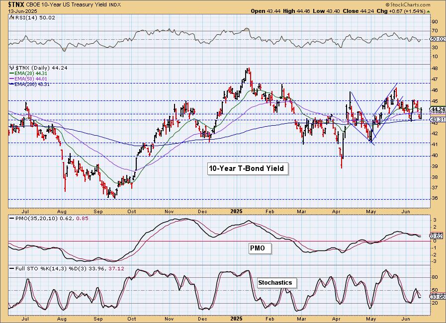
10-YEAR T-BOND YIELD
We see a new bullish falling wedge developing on $TNX and that tells us to expect an upside breakout. The PMO is still in decline but with today's bullish engulfing candlestick, we would look for it to rise again to start the week. Stochastics did tip upward and that could be a hint of more rally to come.
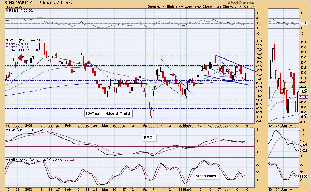
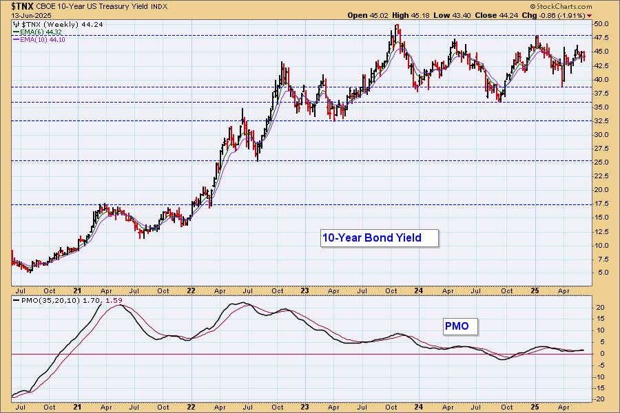
10-Year Bond Yield Weekly Chart: Ultimately yields are in a sideways trading range. It does appear with the weekly PMO turning up that we will get another test of the top of the range.
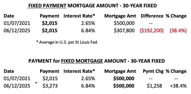
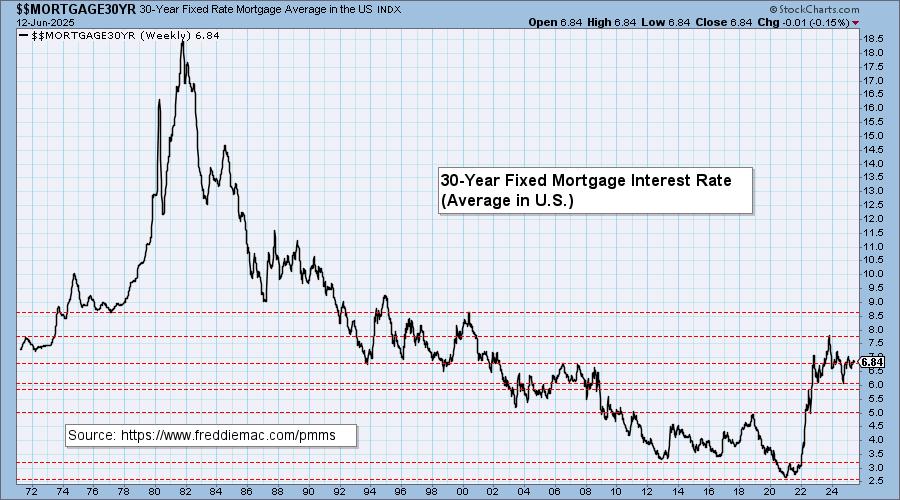
MORTGAGE INTEREST RATES (30-Yr)**
**We watch the 30-Year Fixed Mortgage Interest Rate, because, for the most part, people buy homes based upon the maximum monthly payment they can afford. As rates rise, a fixed monthly payment will carry a smaller mortgage amount, which shuts many buyers out of the market, and potential sellers will experience pressure to lower prices (to no effect so far).
--
This week the 30-Year Fixed Rate changed from 6.85 to 6.84.
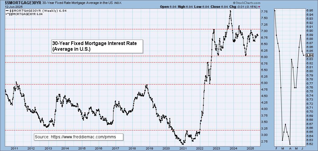
Here is a 50-year chart for better perspective.
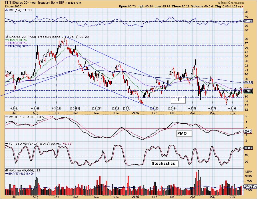
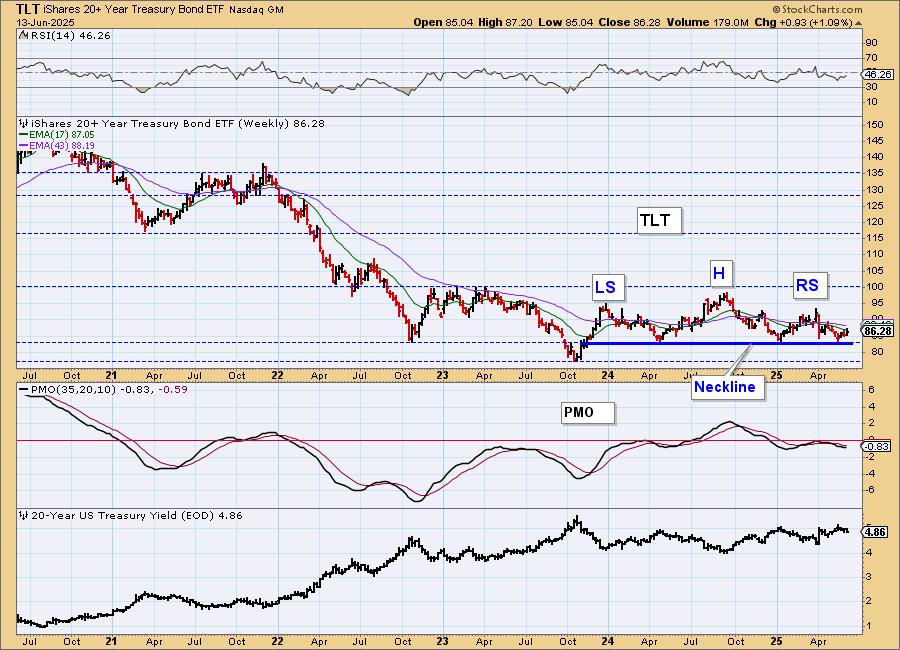
BONDS (TLT)
IT Trend Model: SELL as of 4/14/2025
LT Trend Model: SELL as of 12/13/2024
TLT Daily Chart: We've identified a bullish falling wedge on $TNX so it isn't surprising to see a bearish rising wedge on a Bond chart. The PMO is still rising, but it is below the zero line and already looks toppy. Stochastics have topped. We could still eke out a bit more upside, but this pattern does imply an upcoming breakdown. The 20-year yield is in a declining trend, but we have a feeling that will reverse soon.
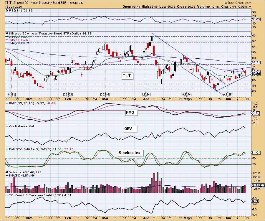
This looks like a good bottoming formation, but based on the chart above we think the rising trend will soon be broken.
TLT Weekly Chart: We have a bearish head and shoulders pattern on the weekly chart that implies an upcoming breakdown. We did get a reversal off the neckline, but we are looking for price to begin reversing soon. The weekly PMO is still in decline. Overall a bearish chart.
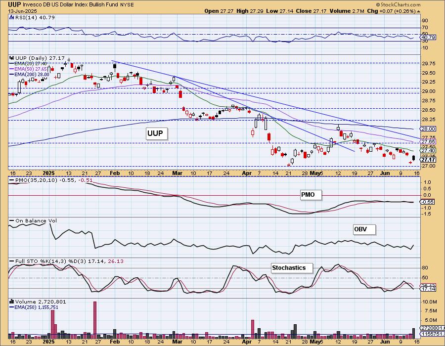
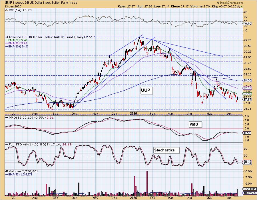
DOLLAR (UUP)
IT Trend Model: NEUTRAL as of 3/5/2025
LT Trend Model: SELL as of 4/25/2025
UUP Daily Chart: The Dollar rallied today but formed a bearish filled black candlestick that implies a decline ahead on Monday. The short-term declining trend is intact and the longer-term declining trend is also pushing price lower. The RSI is negative. The PMO is flat beneath the zero line and that implies pure weakness. Stochastics just dropped below 20 and that is very bearish.
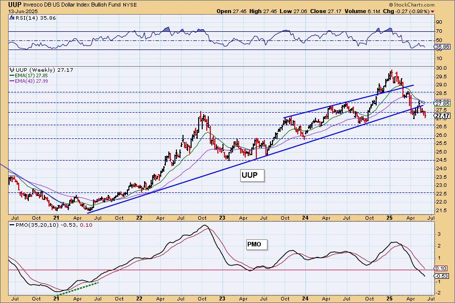
UUP Weekly Chart: UUP was unable to recapture is rising bottoms trendline. Price may be near support, but we can see the strongest level doesn't arrive until about 26.75. We expect that level to at least be tested given the declining weekly PMO.
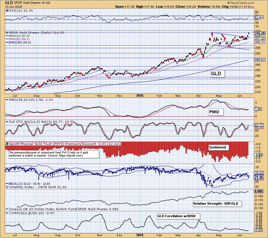
GOLD
IT Trend Model: NEUTRAL as of 12/23/2024
LT Trend Model: BUY as of 10/20/2023
GLD Daily Chart: The Dollar rallied, but so did Gold. It wasn't surprising to see Gold rally so strongly on global uncertainty. It is often considered a 'safe haven'. We doubt global tension will be resolved over the weekend, so it is likely that we will continue to see more investors roll into Gold. We have a new PMO Crossover BUY Signal.
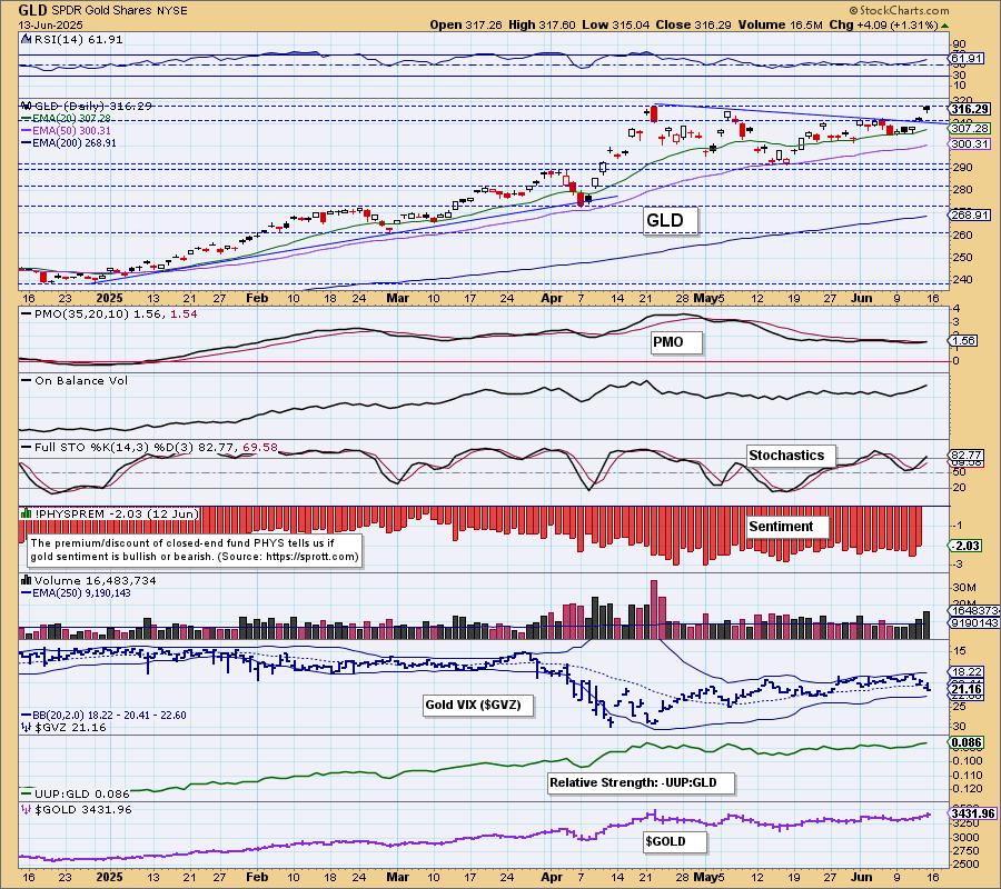
Price has broken up and out of the flag formation as expected. Stochastics have just moved back above 80. We see plenty of internal strength here and expect Gold to continue to make its way higher.
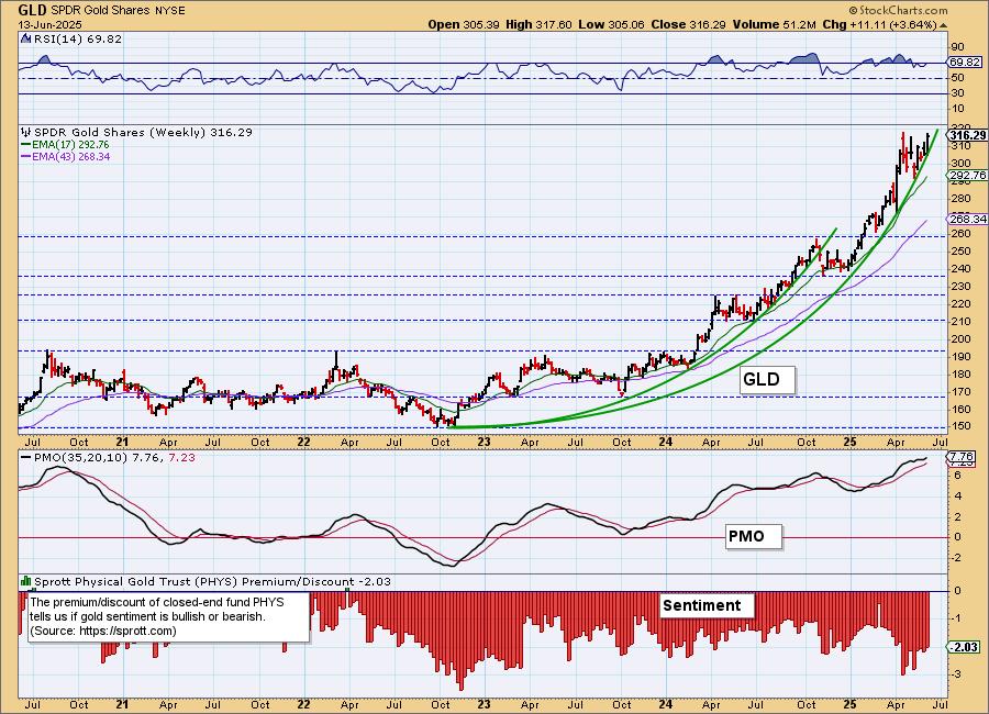
GLD Weekly Chart: We still show a parabolic advance on the weekly chart. While these beg for correction, we don't expect a big decline for Gold. We can see that it has consolidated sideways to digest the previous vertical rally. That just might be enough of a pause to see price accelerate higher once again. The weekly PMO has bottomed above the signal line.
GOLD MINERS Daily Chart: We like Gold so consequently we like Gold Miners. They enjoyed a nice rally off Gold's rally. We now have a breakout above prior tops. The RSI is not yet overbought so it could certainly move higher from here. Given the strong rising trend, rising PMO and incredible participation numbers (did we mention the Silver and Golden Cross Indexes are at 100%!) tell us to expect more upside.
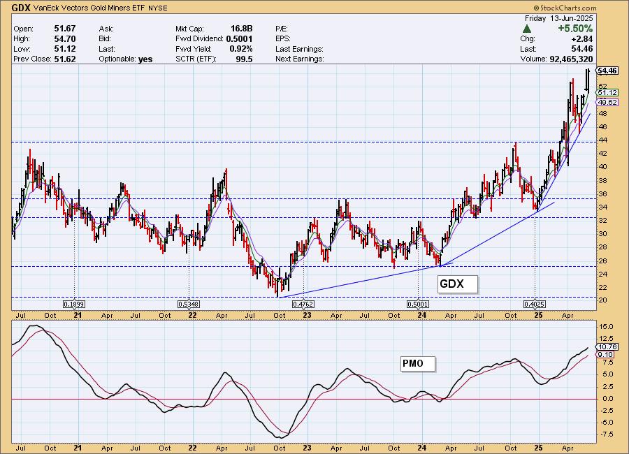
GDX Weekly Chart: The rally is steep and it is getting steeper. This could be hard to maintain, but if Gold continues to impress, GDX will move higher despite the vertical rise. The weekly PMO is rising strongly well above the zero line on a Crossover BUY Signal so more rally should materialize.
CRUDE OIL (USO)
IT Trend Model: BUY as of 6/11/2025
LT Trend Model: BUY as of 3/31/2025
USO Daily Chart: Given the Israeli strike on Iran yesterday, Crude prices soared on uncertainty of oil supplies. This will probably continue on as we find out what type of retaliation is in store from Iran. The Crude Volatility Index ($OVX) punctured the lower Bollinger Band and that could lead to more rally as well. The RSI is very overbought, but given the current climate, that condition is likely to persist.
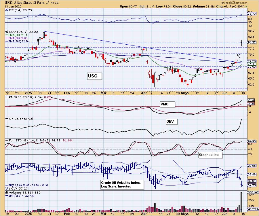
Overhead resistance at the 2025 high is arriving soon. That could be a sticking point.

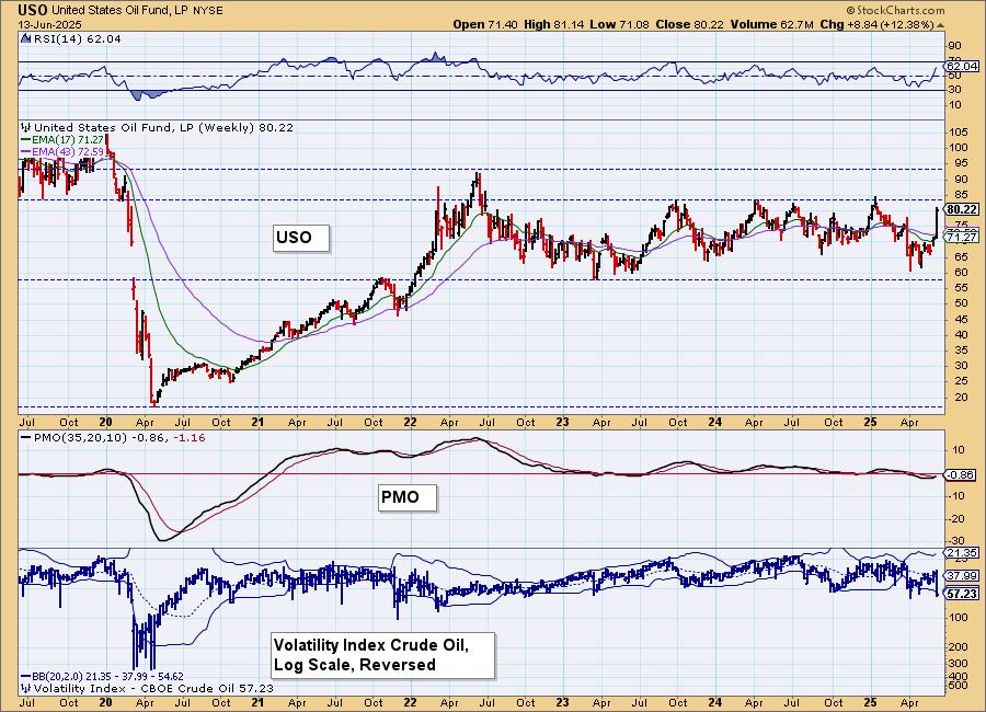
USO/$WTIC Weekly Chart: This is a long-term trading channel and we aren't so sure price will make its way out of it. Certainly this near-term resistance looks easy enough to overcome, but we suspect it won't go higher than the 2022 high. The weekly PMO is rising on a new Crossover BUY Signal, so we would look toward that 2022 high.
Good Luck & Good Trading!
Erin Swenlin and Carl Swenlin
Technical Analysis is a windsock, not a crystal ball. --Carl Swenlin
(c) Copyright 2025 DecisionPoint.com
Disclaimer: This blog is for educational purposes only and should not be construed as financial advice. The ideas and strategies should never be used without first assessing your own personal and financial situation, or without consulting a financial professional. Any opinions expressed herein are solely those of the author, and do not in any way represent the views or opinions of any other person or entity.
DecisionPoint is not a registered investment advisor. Investment and trading decisions are solely your responsibility. DecisionPoint newsletters, blogs or website materials should NOT be interpreted as a recommendation or solicitation to buy or sell any security or to take any specific action.
NOTE: The signal status reported herein is based upon mechanical trading model signals, specifically, the DecisionPoint Trend Model. They define the implied bias of the price index based upon moving average relationships, but they do not necessarily call for a specific action. They are information flags that should prompt chart review. Further, they do not call for continuous buying or selling during the life of the signal. For example, a BUY signal will probably (but not necessarily) return the best results if action is taken soon after the signal is generated. Additional opportunities for buying may be found as price zigzags higher, but the trader must look for optimum entry points. Conversely, exit points to preserve gains (or minimize losses) may be evident before the model mechanically closes the signal.
Helpful DecisionPoint Links:
DecisionPoint Alert Chart List
DecisionPoint Golden Cross/Silver Cross Index Chart List
DecisionPoint Sector Chart List
Price Momentum Oscillator (PMO)