
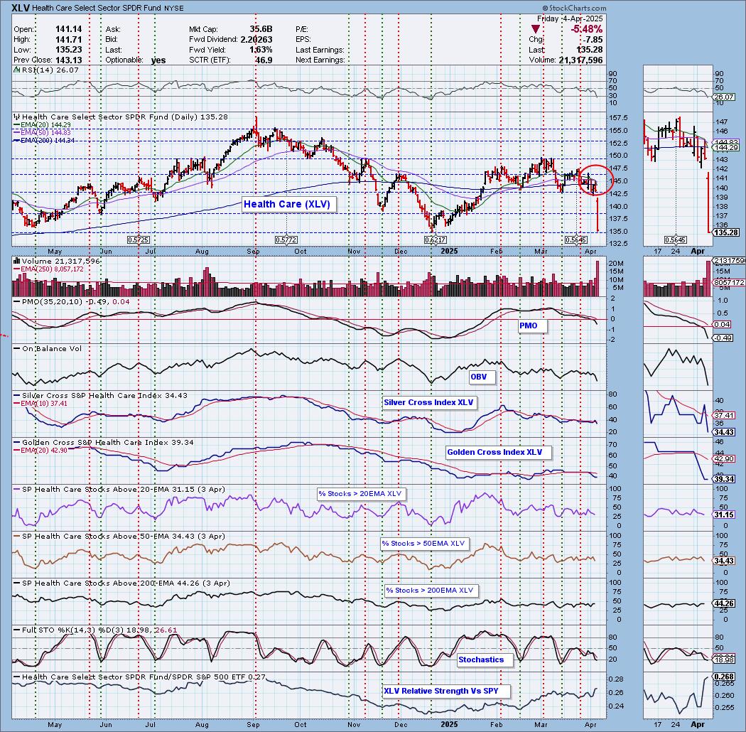
Today the Health Care ETF (XLV) 20-day EMA crossed down through the 50-day EMA (Dark Cross) above the 200-day EMA, generating an IT Trend Model NEUTRAL Signal. Price was brought all the way down to support at the 2024 low. While we would normally look for a reversal at this level, we don't think it will materialize in a meaningful way. Participation is low and not yet oversold so there is more damage that can be done. Stochastics are below 20 and the PMO is declining quickly below the zero line. This support isn't likely to hold.
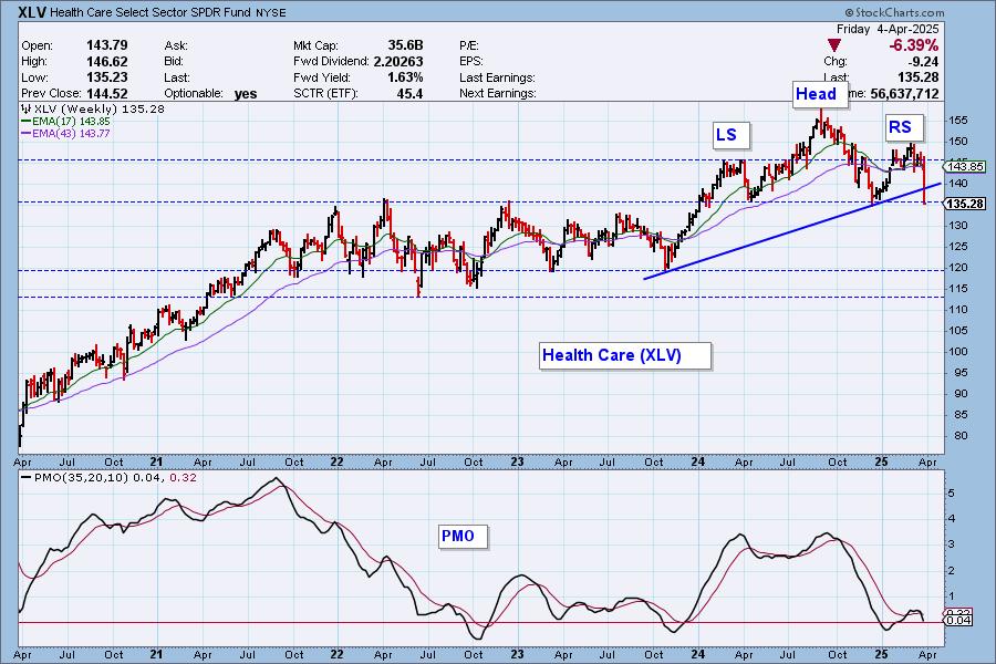
This decline took out the long-term rising bottoms trendline. It is about to confirm a large bearish head and shoulders pattern. The weekly PMO is declining vertically. If this pattern executes with a drop below the neckline, the minimum downside target would take price down to support at about 115. That's quite painful.
The DecisionPoint Alert Weekly Wrap presents an end-of-week assessment of the trend and condition of the Stock Market, the U.S. Dollar, Gold, Crude Oil, and Bonds. The DecisionPoint Alert daily report (Monday through Thursday) is abbreviated and gives updates on the Weekly Wrap assessments.
Watch the latest episode of DecisionPoint on our YouTube channel here!
MARKET/SPX SECTOR/INDUSTRY GROUP INDEXES
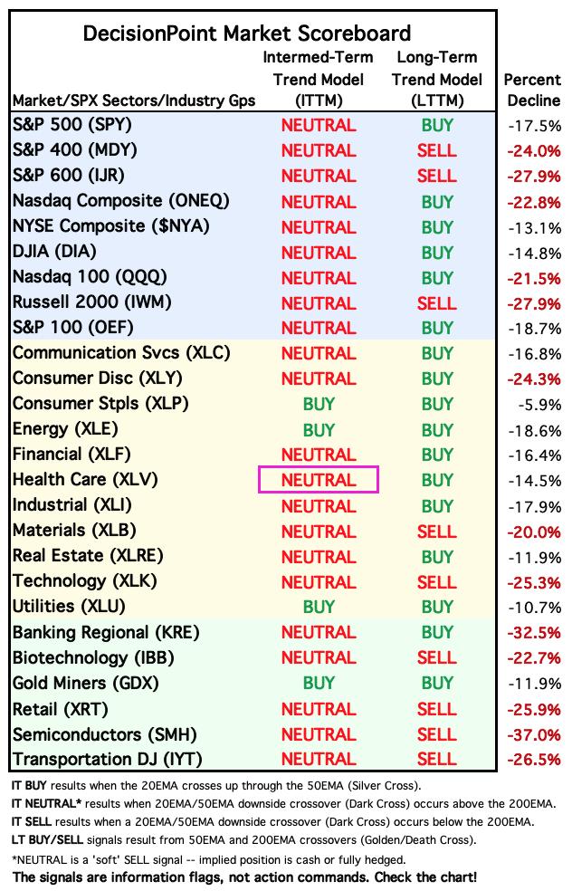
Today Carl checked to see how far these indexes have fallen from their one-year high to a recent low. Note that many have fallen into bear markets (down -20% or more), and of the remaining indexes all but one are in correction mode (down -10% or more).
Change Today: 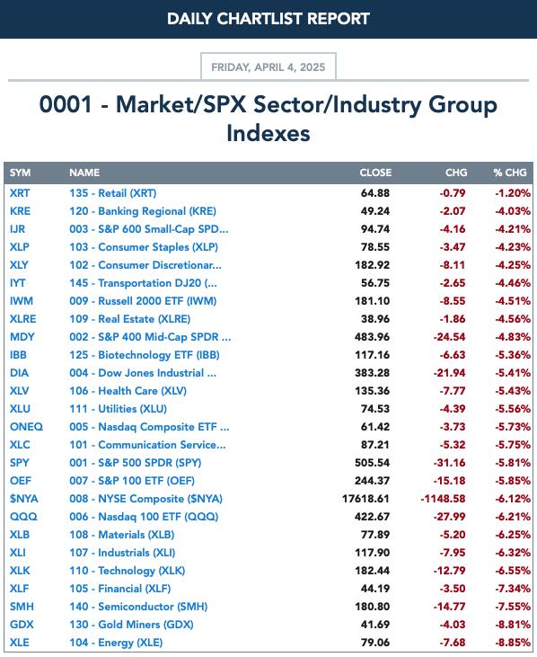
Change for the Week:
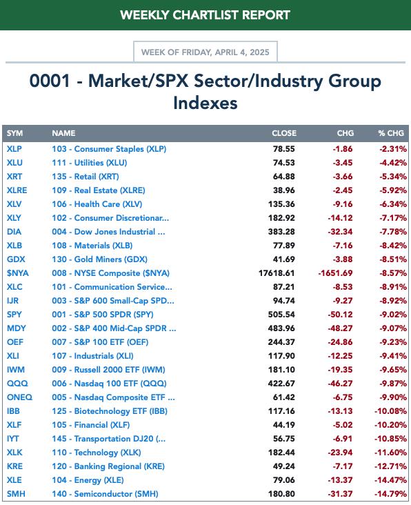
CLICK HERE for Carl's annotated Market Index, Sector, and Industry Group charts.
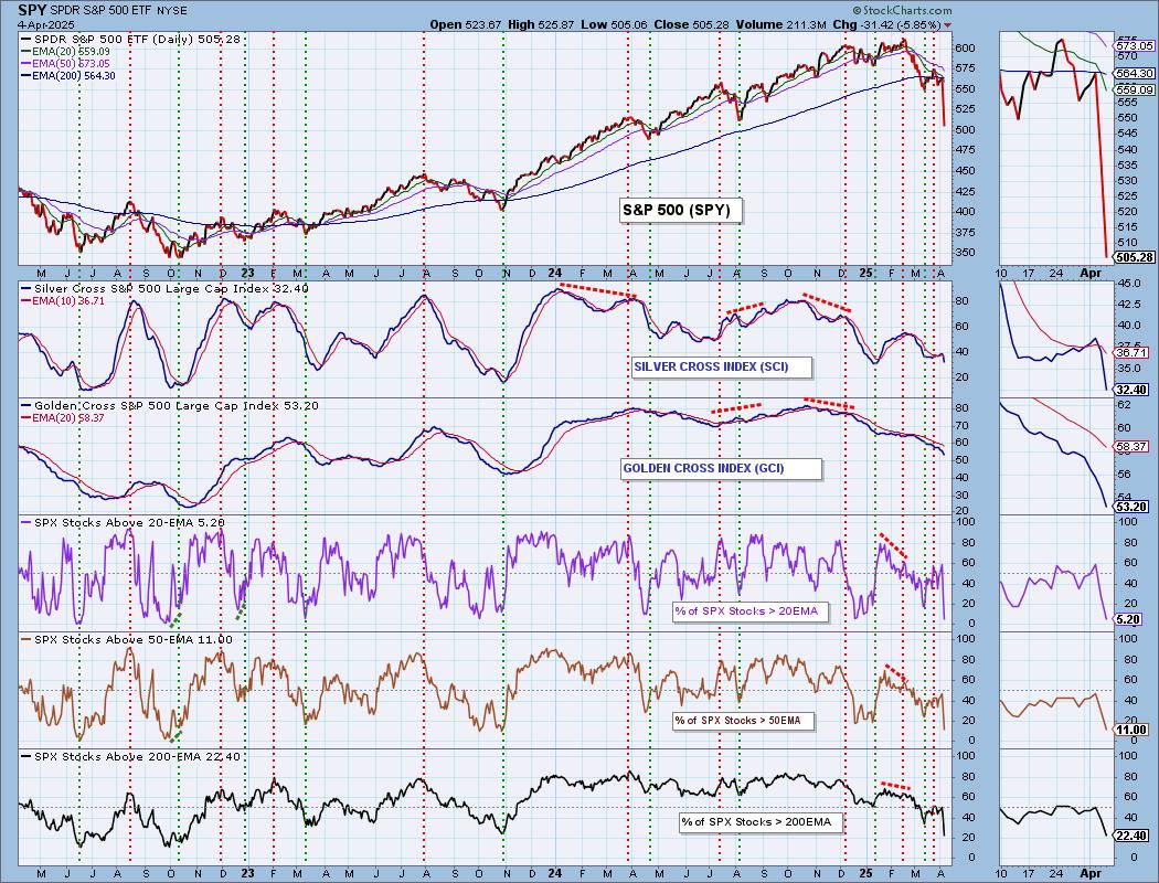
THE MARKET (S&P 500)
IT Trend Model: NEUTRAL as of 3/4/2025
LT Trend Model: BUY as of 3/29/2023
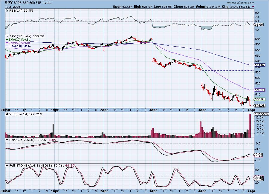
SPY 10-Minute Chart: There was a gap down to start trading and price never recuperated, setting up a declining trend channel. The 10-minute PMO has topped and Stochastics turned down in negative territory. It could be a rough week ahead.
SPY Daily Chart: Price broke down well below the already declining trend channel. Price is very close to hitting bear market territory as it is down 17.2% and bear markets are defined by 20% declines. The PMO is declining quickly now as it accelerates downward. The OBV killed its rising bottoms with today's drop.
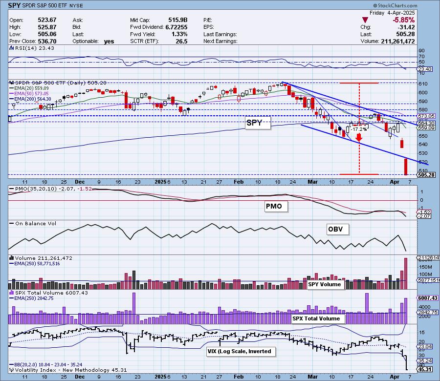
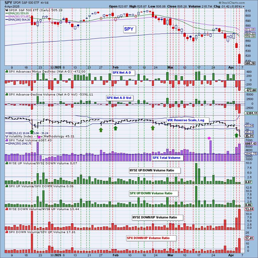
The VIX is still puncturing the bottom Bollinger Band on the inverted scale, but we aren't so sure we'll get an upside reversal out of it. Stochastics are just about to drop below 20 indicating severe internal weakness. Notice that mega-caps are taking the market down with them as the SPY is clearly underperforming equal-weight RSP.
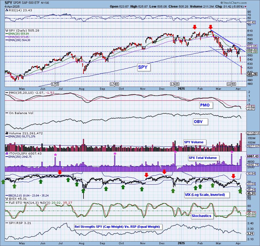
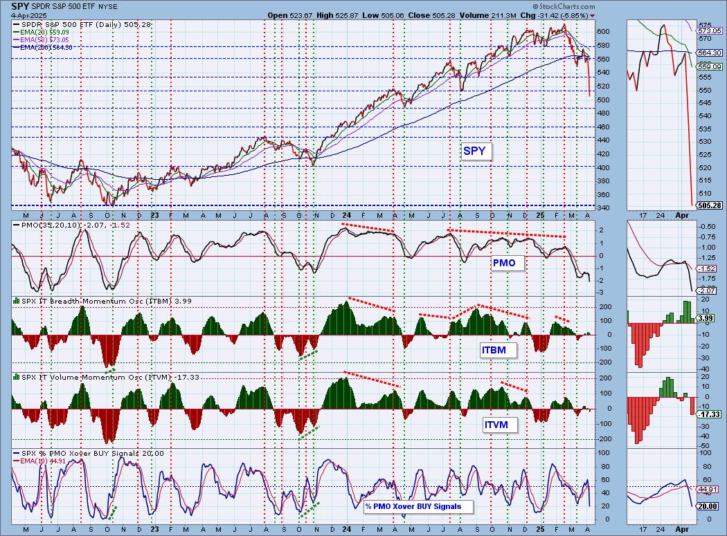
SPY Weekly Chart: Price bolted out of the bearish rising wedge. It is now ready to test the long-term rising bottoms trendline. The weekly PMO is dropping vertically so there is a high likelihood that the rising trend will not hold.
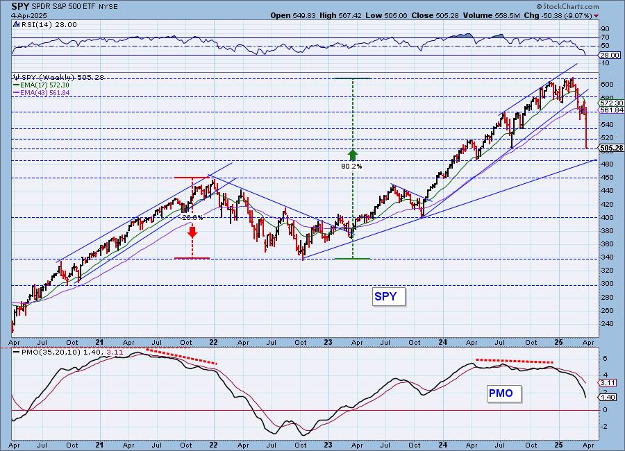
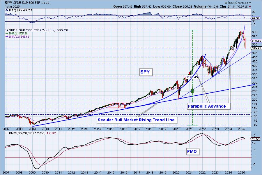
SPY Monthly Chart: We wouldn't normally show a monthly chart, but after this week, it's worth a look. The parabolic breakdown is happening in textbook fashion with a swift and painful decline. 450 looks like a pretty good level of support. The monthly PMO has triggered a Crossover SELL Signal. That signal will be confirmed at month's end if it is still there.
New 52-Week Highs/Lows: New Lows were very large today as more stocks get pummeled within the index. The High-Low Differential is highly negative as it is declining quickly beneath the zero line.
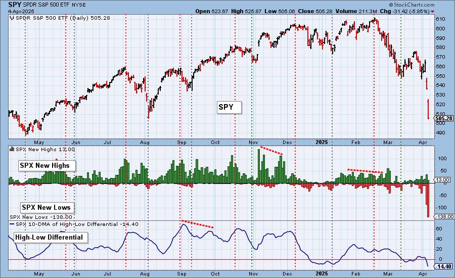
Climax Analysis: Today there were strong and unanimous climax readings on the four relevant indicators, giving us a downside exhaustion climax. SPX Total Volume was 211% of the one-year daily volume. That is definitely at blowout levels, so we could get a bounce on Monday. We will be aware of the possibility, but we're not necessarily counting on it.
*A climax is a one-day event when market action generates very high readings in, primarily, breadth and volume indicators. We also include the VIX, watching for it to penetrate outside the Bollinger Band envelope. The vertical dotted lines mark climax days -- red for downside climaxes, and green for upside. Climaxes are at their core exhaustion events; however, at price pivots they may be initiating a change of trend.
Short-Term Market Indicators: The short-term market trend is DOWN and the condition is NEUTRAL.
Swenlin Trading Oscillators (STOs) were both lower on the day which isn't a surprise. They are sitting in neutral territory and thus can accommodate much more downside before becoming oversold. Participation reached oversold levels at just 5% holding above their 20-day EMAs. We only have 3% of stocks with rising momentum within the SPX. Remember, oversold conditions can persist in a bear market.
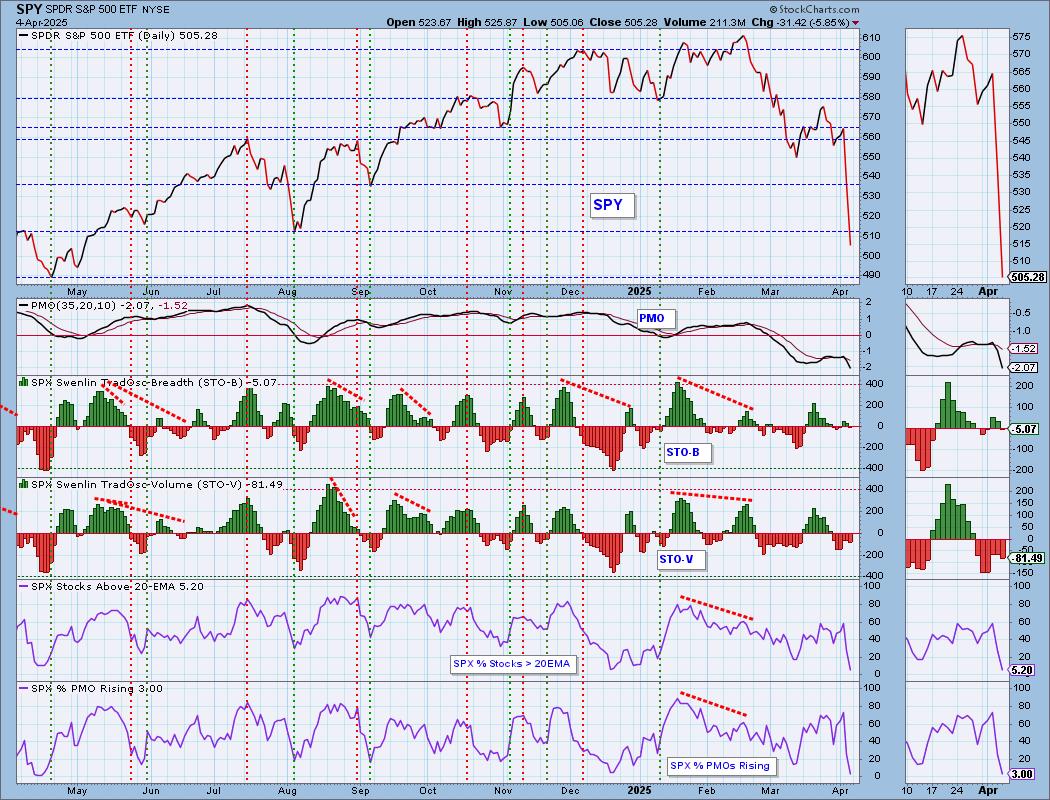
Intermediate-Term Market Indicators: The intermediate-term market trend is DOWN and the condition is NEUTRAL.
The ITBM and ITVM are also falling and are in neutral territory so they too could accommodate far more downside. PMO BUY Signals were sucked out of the market. Most of those buy signals are vulnerable given only 3% have PMOs that are rising.
_______
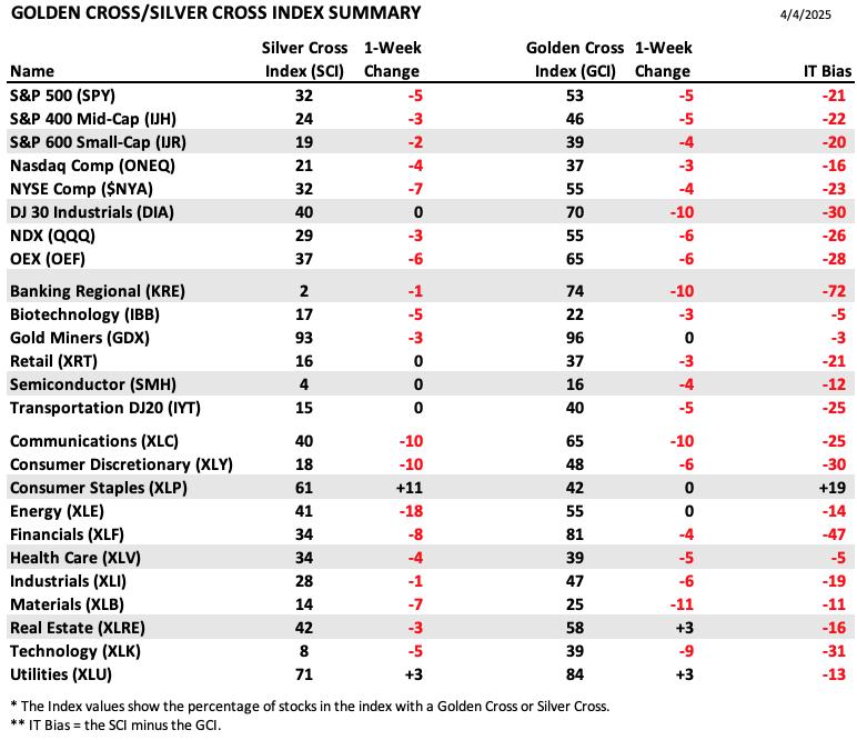
PARTICIPATION TABLES: The following tables summarize participation for the major market indexes and sectors. The 1-Week Change columns inject a dynamic aspect to the presentation. There are three groups: Major Market Indexes, Miscellaneous Industry Groups, and the 11 S&P 500 Sectors.
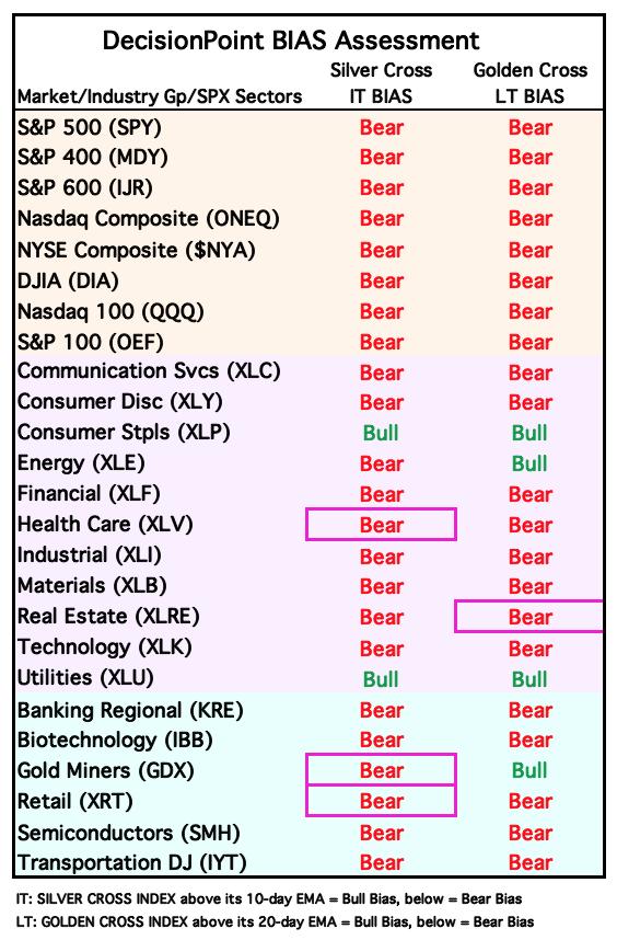
All but one of the members of our list have negative IT Biases. Consumer Staples (XLP) has a positive bias and did see an 11 point gain on the Silver Cross Index. We aren't particularly bullish on any of these including XLP.
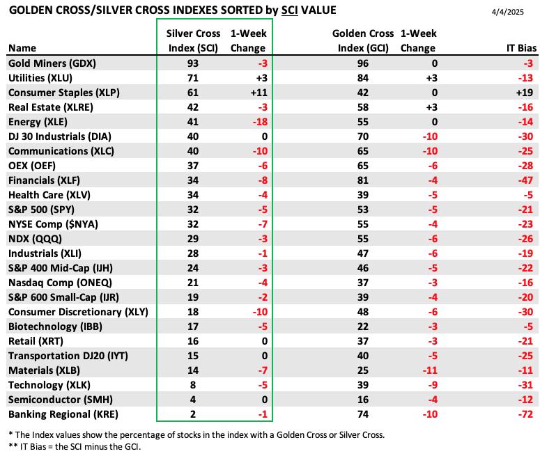
This table is sorted by SCI values. This gives a clear picture of strongest to weakest index/sector in terms of intermediate-term participation.
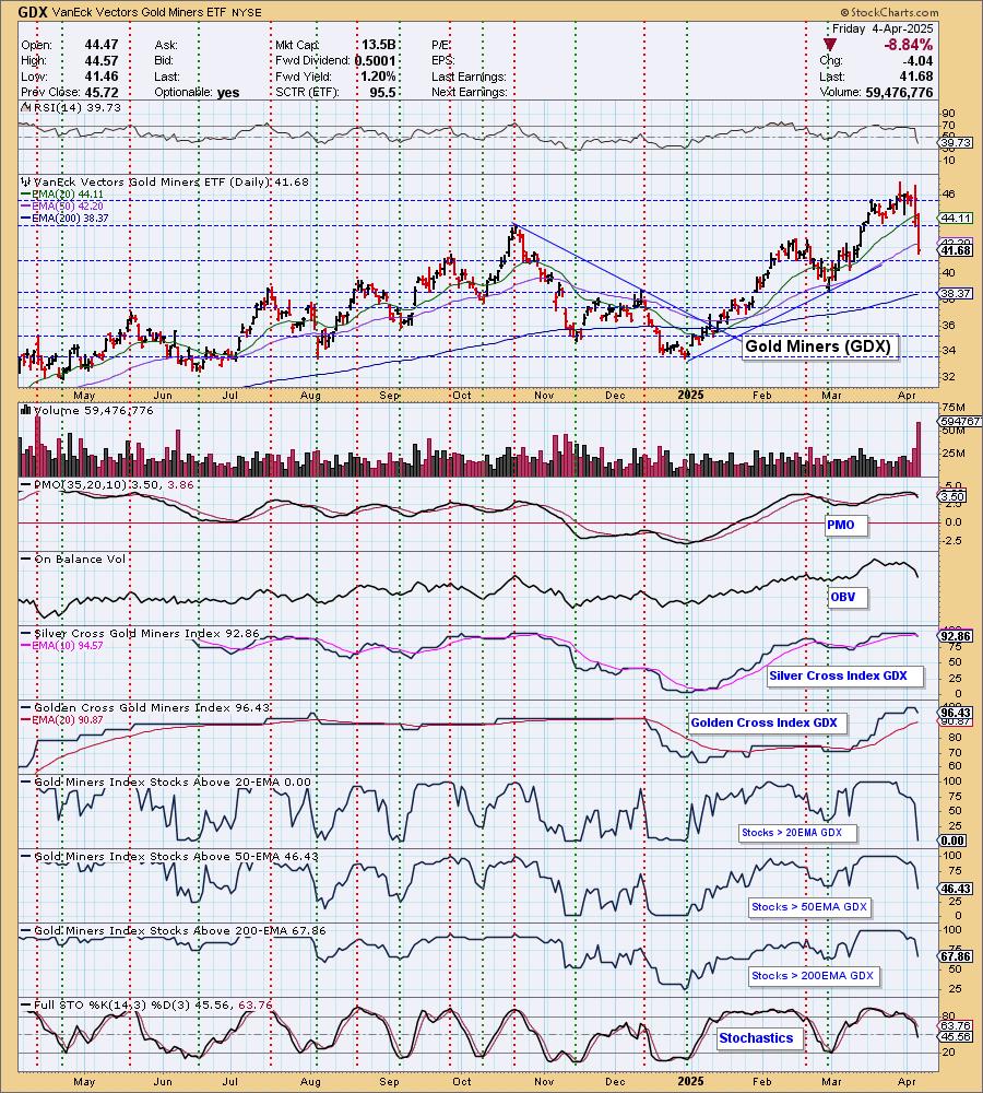
Gold Miners have been the strongest among the member as it holds the highest Silver Cross Index value with the next closest at only 71. However, they are starting to lose favor as Gold pulls back.
Regional Banks (KRE) look terrible with only 2% holding Silver Crosses. It even lost a percentage point this week.
This table is sorted by GCI values. This gives a clear picture of strongest to weakest index/sector in terms of long-term participation.
Gold Miners (GDX) hold the highest Golden Cross Index reading. The foundation is still strong, but near-term this group appears ready to turn back down.
Semiconductors (SMH) have the lowest GCI reading and it got worse this week. This is a group that is very oversold, but it is also one of the most vulnerable right now. Maybe we will see a small snapback off these oversold readings.

PARTICIPATION CHART (S&P 500): The following chart objectively shows the depth and trend of participation for the SPX in two time frames.
- Intermediate-Term - the Silver Cross Index (SCI) shows the percentage of SPX stocks on IT Trend Model BUY signals (20-EMA > 50-EMA). The opposite of the Silver Cross is a "Dark Cross" -- those stocks are, at the very least, in a correction.
- Long-Term - the Golden Cross Index (GCI) shows the percentage of SPX stocks on LT Trend Model BUY signals (50-EMA > 200-EMA). The opposite of a Golden Cross is the "Death Cross" -- those stocks are in a bear market.
The market bias is BEARISH in the intermediate and long terms.
Participation was slashed today with all readings hitting oversold territory. There is certainly a bit more room for them to fall further and that is likely if this is indeed a bear market. The Silver Cross Index dropped below its signal line this week for a Bearish Shift which moved the IT Bias to BEARISH. The Golden Cross Index continued its decline this week and seems to be picking up speed to the downside. It is below its signal line so the LT Bias is BEARISH.
BIAS Assessment: The following table expresses the current BIAS of various price indexes based upon the relationship of the Silver Cross Index to its 10-day EMA (intermediate-term), and of the Golden Cross Index to its 20-day EMA (long-term). When the Index is above the EMA it is bullish, and it is bearish when the Index is below the EMA. The BIAS does not imply that any particular action should be taken. It is information to be used in the decision process.
The items with highlighted borders indicate that the BIAS changed today.
*****************************************************************************************************
CONCLUSION: While the S&P 500 hasn't declined -20% yet (definition of a bear market), we believe we're in a bear market. The indicators are incredibly bearish with very little participation. Key indicators are still "neutral" so they could accommodate far more downside. Remember, bear market rules should apply when it comes to oversold participation. Oversold conditions can persist and those conditions are considered 'thin ice' in a bear market. The tariff issue may be resolved quickly, but we're not going to count on that. Today's downside exhaustion climax does seem to suggest that we could see a reactionary bounce, but ultimately the market is wildly overvalued and it is likely that we are finally seeing some consequences for the lack of caution. Something to keep in mind, there may be a method to this madness. In a few months $9 trillion of government debt needs to be refinanced, and look at how conveniently rates have been dropping.
Erin is 10% long, 0% short. (This is intended as information, not a recommendation.)
*****************************************************************************************************
CALENDAR

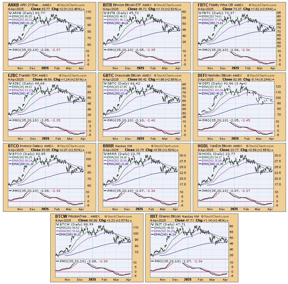
BITCOIN
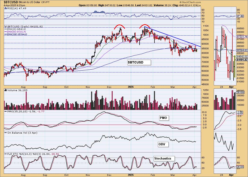
Bitcoin Daily Chart: Bitcoin remains in a declining trend. Every time it has come close to the trendline it retreats. The PMO is rising above the zero line, but the value is negative and suggesting diminishing weakness rather than new strength. Stochastics topped in negative territory so we aren't looking for a breakout.
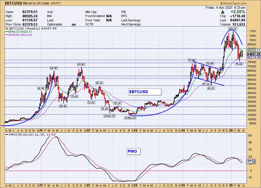
Bitcoin Weekly Chart: We saw a parabolic rise into all-time highs and that was rewarded with a rounded top and parabolic breakdown. It does seem to have found support, but given the weekly PMO is still in decline, we aren't looking for any breakouts yet.
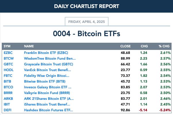
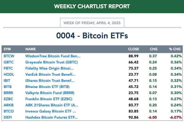
BITCOIN ETFs
Today:
This Week:
INTEREST RATES
Yields are dropping like a rock as more investors pile into the safety of Bonds. We don't see that condition changing anytime soon so we expect rates will continue to work their way lower.
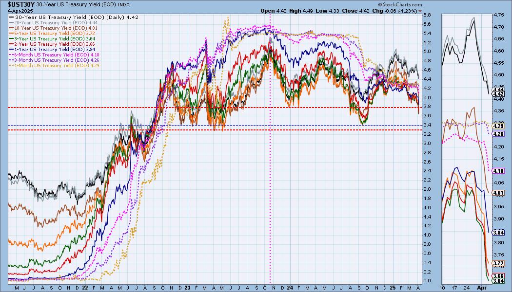
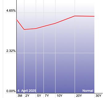
The Yield Curve Chart from StockCharts.com shows when inversions are taking place. The red line should move higher from left to right. Inversions are occurring where it moves downward.
10-YEAR T-BOND YIELD
$TNX dropped deeply with the rest of the market. It did form a bullish hollow red candlestick so we could see an upside reversal. The RSI is also getting oversold. Stochastics also tipped upward. The PMO is the big problem and what is telling us that yields will fall further. We also have the flight to safety in Bonds and that is likely to continue while the market declines.
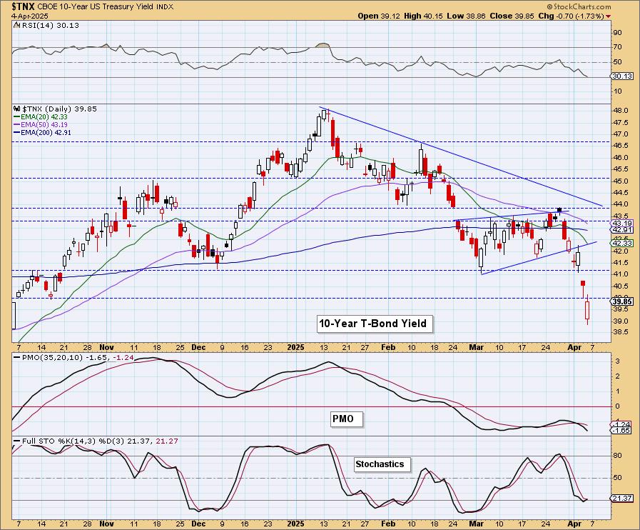
10-Year Bond Yield Weekly Chart: We have a long-term trading range and $TNX looks ready to test support at the 2024 low. The weekly PMO is in agreement on its Crossover SELL Signal.

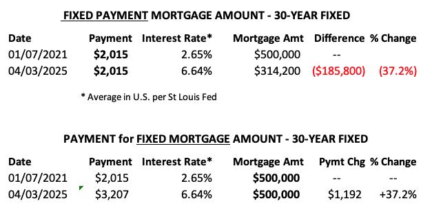
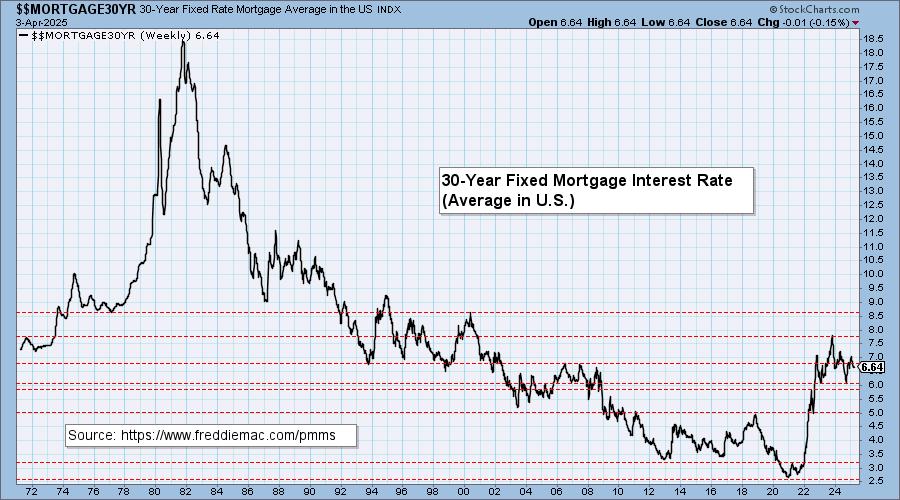
MORTGAGE INTEREST RATES (30-Yr)**
**We watch the 30-Year Fixed Mortgage Interest Rate, because, for the most part, people buy homes based upon the maximum monthly payment they can afford. As rates rise, a fixed monthly payment will carry a smaller mortgage amount, which shuts many buyers out of the market, and potential sellers will experience pressure to lower prices (to no effect so far).
--
This week the 30-Year Fixed Rate changed from 6.65 to 6.64.

Here is a 50-year chart for better perspective.
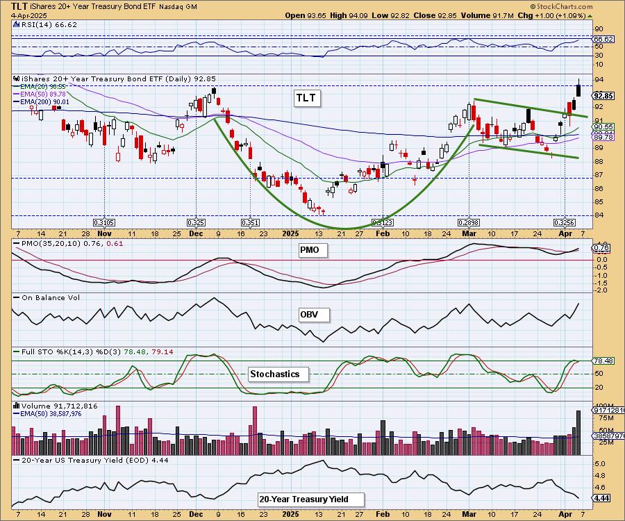
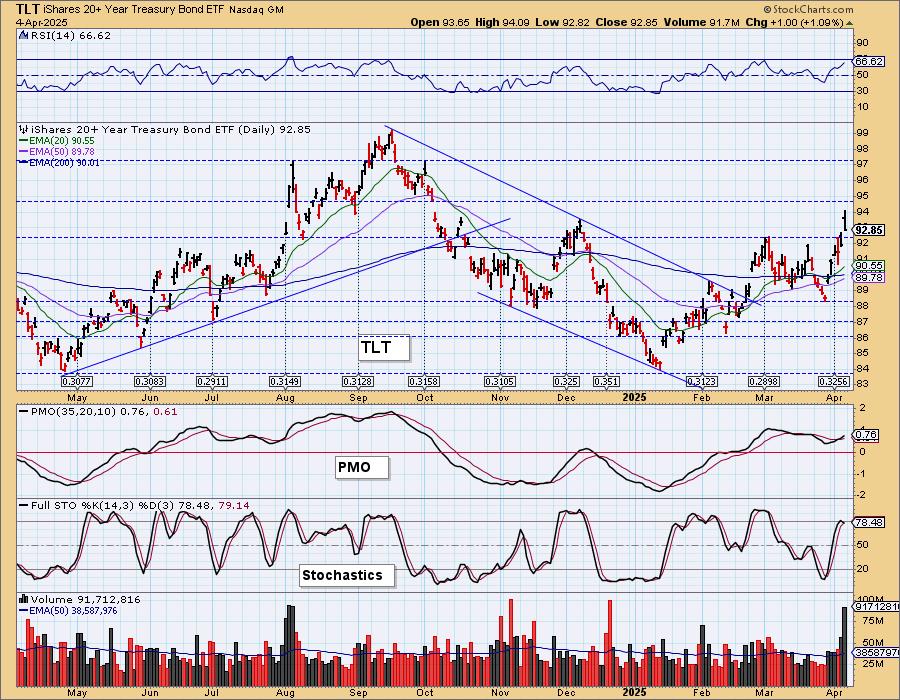
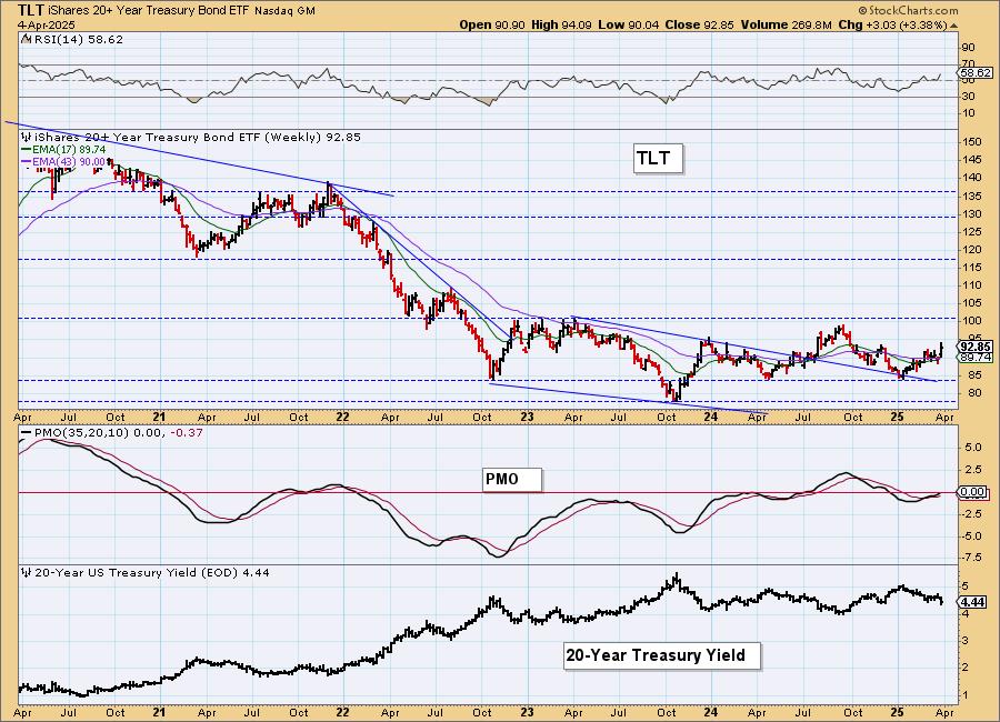
BONDS (TLT)
IT Trend Model: BUY as of 2/25/2025
LT Trend Model: SELL as of 12/13/2024
TLT Daily Chart: Price is making its way out of the bullish cup with handle pattern. It reached overhead resistance and was turned away today, but we think we'll see even higher prices with the flight to Bonds. The PMO is rising on a Crossover BUY Signal above the zero line. Stochastics did top, but look at the 20-year yield. It is declining quickly and is likely to fall further.
TLT Weekly Chart: Price has been in a trading range and it looks like it is ready to test the top of the range given this nice rally and weekly PMO rising on a Crossover BUY Signal.
DOLLAR (UUP)
IT Trend Model: NEUTRAL as of 3/5/2025
LT Trend Model: BUY as of 5/25/2023
UUP Daily Chart: The Dollar bounced strongly today and could be ready to stage a comeback. The PMO isn't in agreement yet, but this does look like a solid area of support. Price isn't above the 200-day EMA yet, so we still see a bearish bias on the chart. Stochastics are still falling despite today's rally so there is still some internal weakness to deal with.
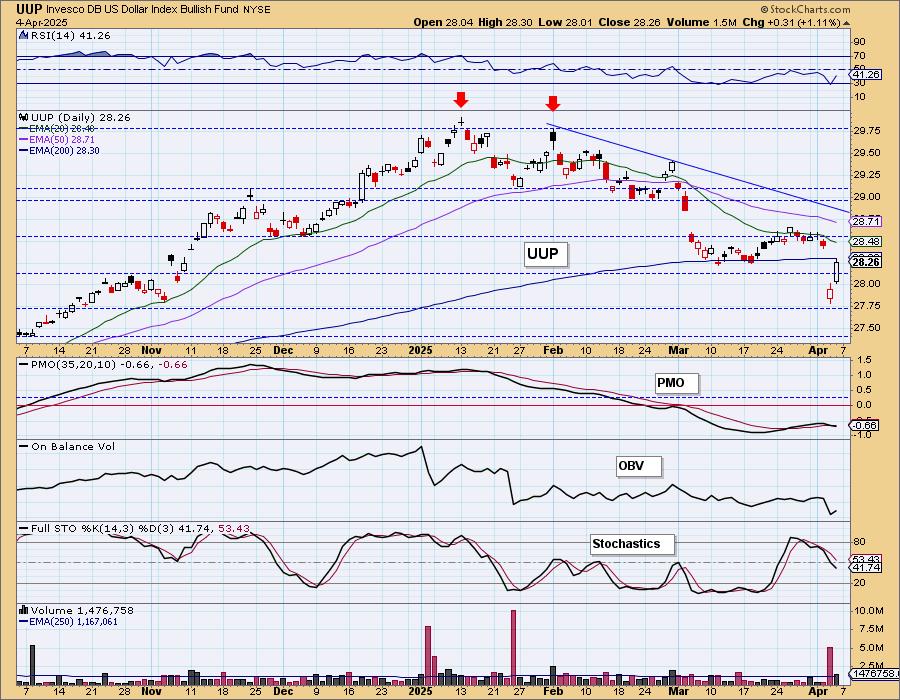
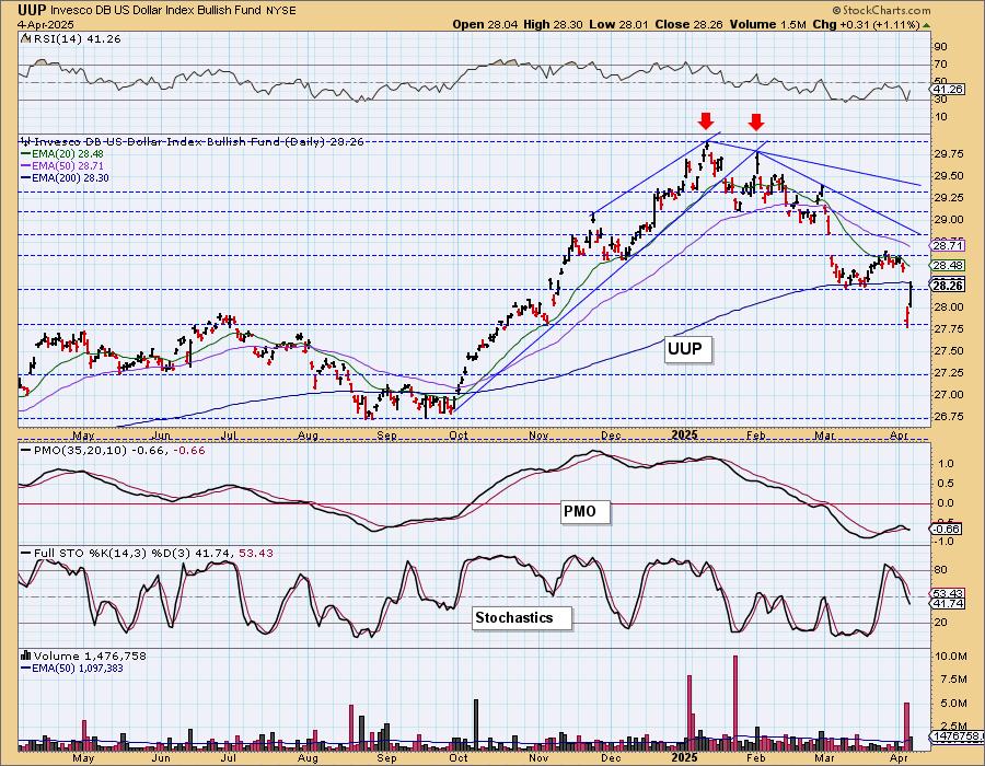
We can better see the strength of the current support level on the 1-year chart.
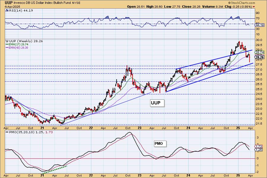
UUP Weekly Chart: This week's decline came very close to testing the rising bottoms trendline. Given the very negative looking weekly PMO, we suspect that the rising trend could be broken.
GOLD
IT Trend Model: NEUTRAL as of 12/23/2024
LT Trend Model: BUY as of 10/20/2023
GLD Daily Chart: Gold is now testing its rising bottoms trendline. We are surprised that it hasn't enjoyed the same rally that Bonds are given the destruction of the market this week. We chalk it up to it getting too overbought. The RSI is no longer overbought so we wouldn't be surprised if we get a bounce soon. For now it is in pullback mode and the PMO is nearing a negative crossover its signal line. Stochastics are falling. We would look for support to be tested at the February top.
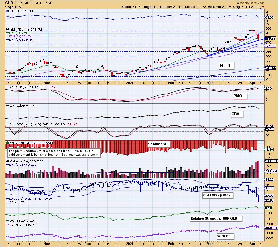
Gold and the Dollar are currently not correlated in the short term so they could conceivably travel in concert. Sentiment based on discounts isn't that bearish yet so we do think there is a bit more downside to absorb.
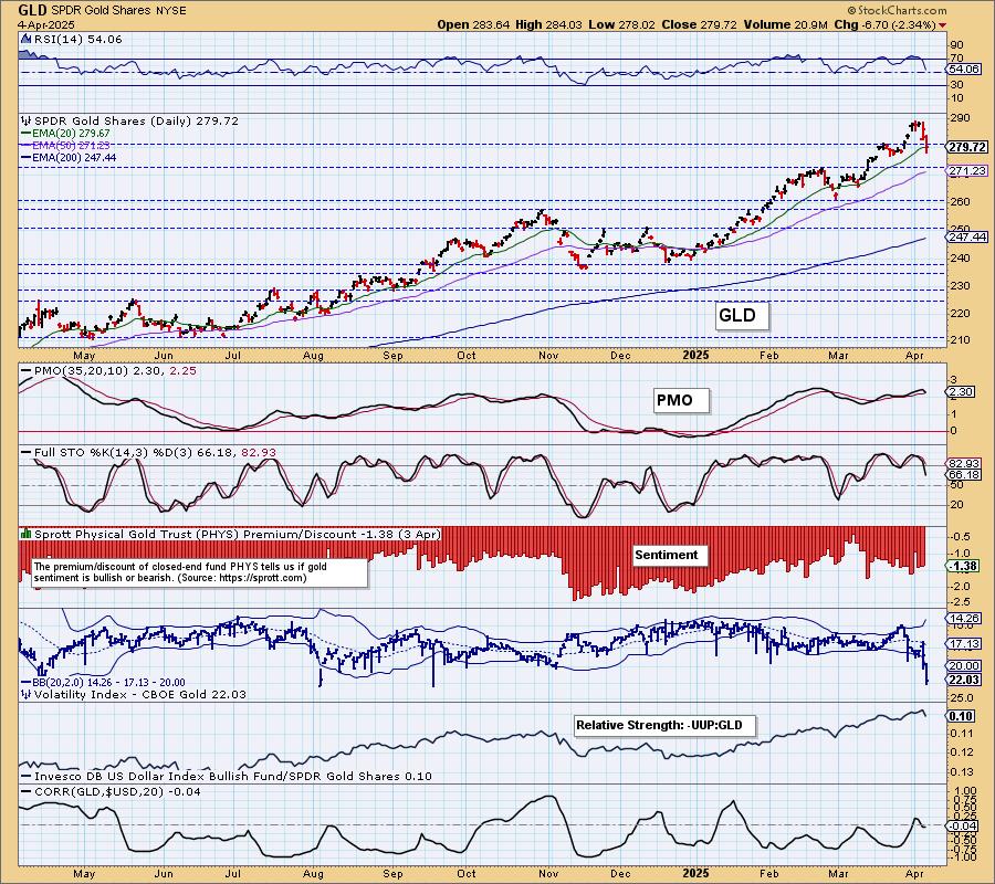
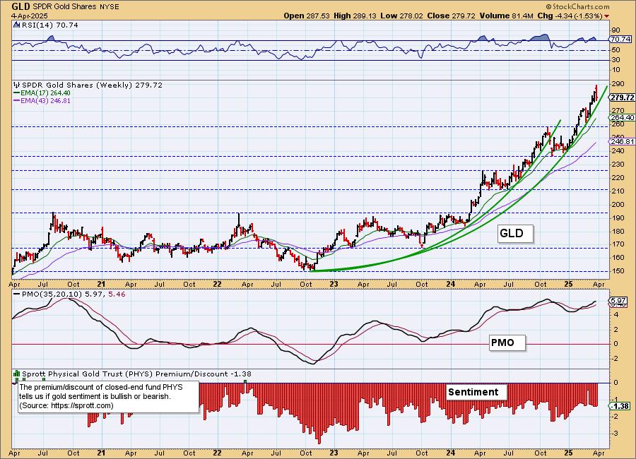
GLD Weekly Chart: Gold is in the midst of a parabolic advance so we can't rule out a more serious breakdown. For now the weekly RSI is overbought so it does suggest some more downside ahead. The weekly PMO is already trying to top. We don't think we'll get a big decline in Gold here, but it is certainly vulnerable.
GOLD MINERS Daily Chart: We were concerned about Gold Miners most of the week as they looked very toppy. Yesterday and today they crashed as Gold lost its strength. They are likely in for more decline given the new PMO Crossover SELL Signal. The RSI is not oversold yet so they could accommodate more downside. The Silver Cross Index dropped beneath its signal line and participation has been crushed by the decline. We think we could see a pullback to the 38.50 level. They got ahead of themselves, it is time for the contraction. We will be waiting patiently for the decline to subside as we think upside for Gold is still excellent in the longer term and that will mean a nice run for GDX at that time.
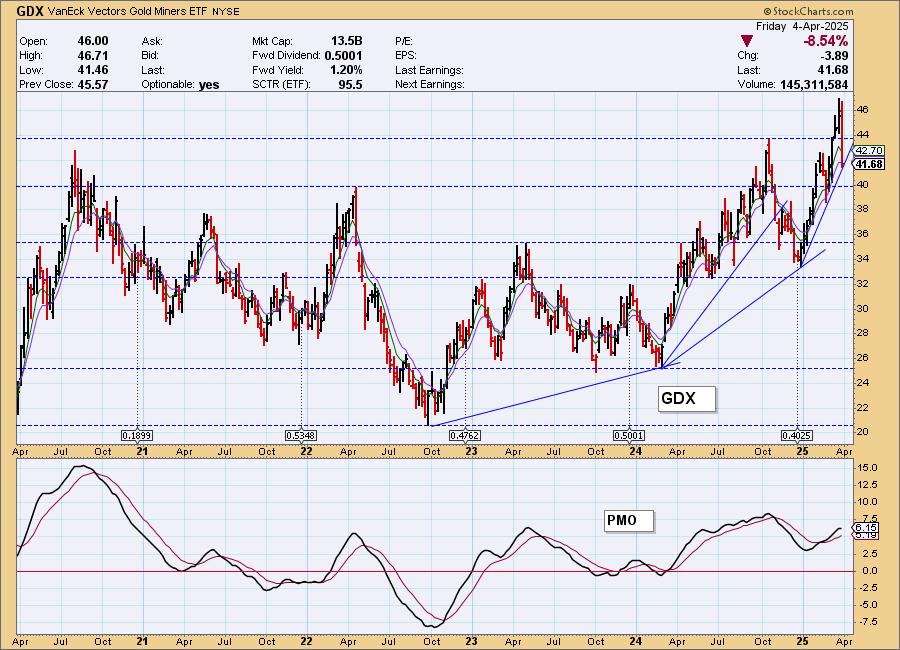
GDX Weekly Chart: The near-term rising trend is still intact, but it isn't likely to stay that way given the negative daily chart. It shows us that the 2022 high could work as support or the 2023 high. Either way it will be a difficult decline.
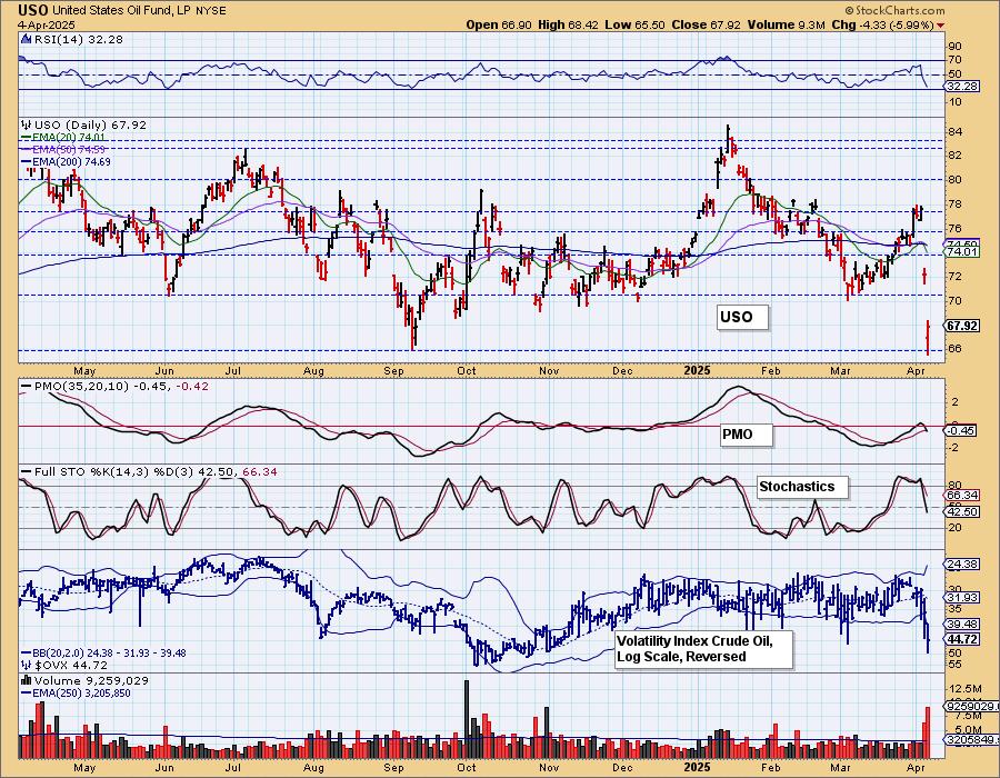
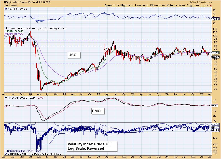
CRUDE OIL (USO)
IT Trend Model: NEUTRAL as of 2/27/2025
LT Trend Model: BUY as of 3/31/2025
USO Daily Chart: Crude Oil has tanked. It did form a bullish hollow red candlestick so we could see a bounce on Monday, but overall this doesn't look good at all. There is a PMO Crossover SELL signal below the zero line today. Stochastics are tumbling lower. One positive would be that the Crude Volatility Index ($OVX) is well below its lower Bollinger Band on the inverted scale and that could mean a short-term bounce as well.
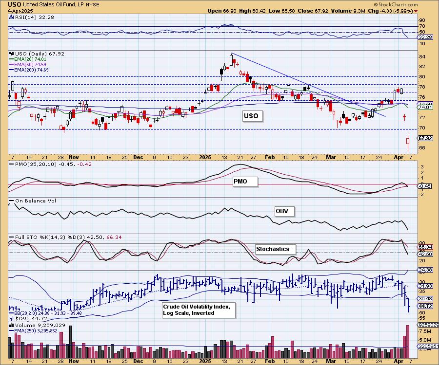
We need the 1-year chart to see support and it did move below it this week. If it's going to bounce, this is a good area to see it.
USO/$WTIC Weekly Chart: We see more support levels available for Crude on the weekly chart. The sturdiest support is at the 2023 low and we think it is likely that we will see that price level. The administration is likely to start focusing on bringing Crude prices lower, so even that level of support could be vulnerable.
Good Luck & Good Trading!
Erin Swenlin and Carl Swenlin
Technical Analysis is a windsock, not a crystal ball. --Carl Swenlin
(c) Copyright 2025 DecisionPoint.com
Disclaimer: This blog is for educational purposes only and should not be construed as financial advice. The ideas and strategies should never be used without first assessing your own personal and financial situation, or without consulting a financial professional. Any opinions expressed herein are solely those of the author, and do not in any way represent the views or opinions of any other person or entity.
DecisionPoint is not a registered investment advisor. Investment and trading decisions are solely your responsibility. DecisionPoint newsletters, blogs or website materials should NOT be interpreted as a recommendation or solicitation to buy or sell any security or to take any specific action.
NOTE: The signal status reported herein is based upon mechanical trading model signals, specifically, the DecisionPoint Trend Model. They define the implied bias of the price index based upon moving average relationships, but they do not necessarily call for a specific action. They are information flags that should prompt chart review. Further, they do not call for continuous buying or selling during the life of the signal. For example, a BUY signal will probably (but not necessarily) return the best results if action is taken soon after the signal is generated. Additional opportunities for buying may be found as price zigzags higher, but the trader must look for optimum entry points. Conversely, exit points to preserve gains (or minimize losses) may be evident before the model mechanically closes the signal.
Helpful DecisionPoint Links:
DecisionPoint Alert Chart List
DecisionPoint Golden Cross/Silver Cross Index Chart List
DecisionPoint Sector Chart List
Price Momentum Oscillator (PMO)