
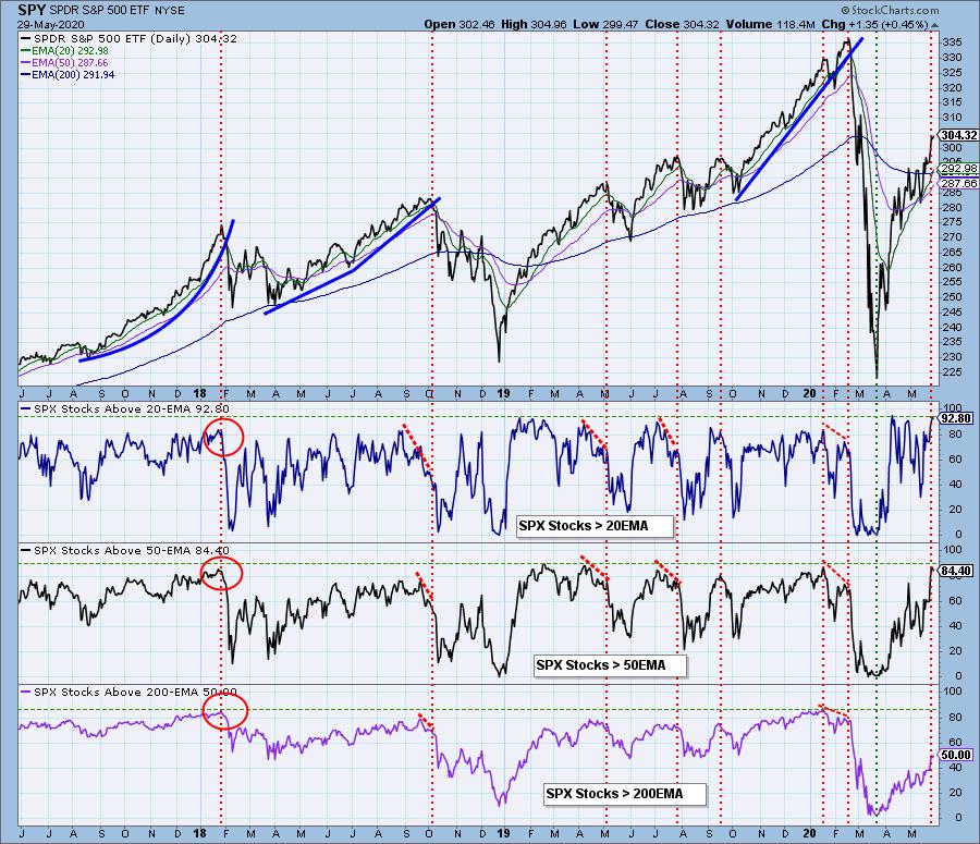
Until recently, the percentage of stocks above their 20/50/200EMAs were showing steadily lower tops, diverging against steadily rising price tops, a situation as we can see, which often precedes price declines. This week, at the most recent price top, the divergences were erased, so I can no longer complain about them. Currently, all three indicators are confirming the rally new highs, which is good, but we still can't "pack up all our cares and woes." A confirmation doesn't mean that nothing bad can happen, only that that particular warning flag is not available. And now two of the indicators are overbought, and that usually occurs at price tops. A good example of this kind of situation is the price top in early-2018, where the overbought readings were followed by a substantial decline.
The DecisionPoint Alert Weekly Wrap presents an end-of-week assessment of the trend and condition of the Stock Market, the U.S. Dollar, Gold, Crude Oil, and Bonds. The DecisionPoint Alert daily report (Monday through Thursday) is abbreviated and gives updates on the Weekly Wrap assessments.
Watch the latest episode of DecisionPoint on StockCharts TV's YouTube channel here!
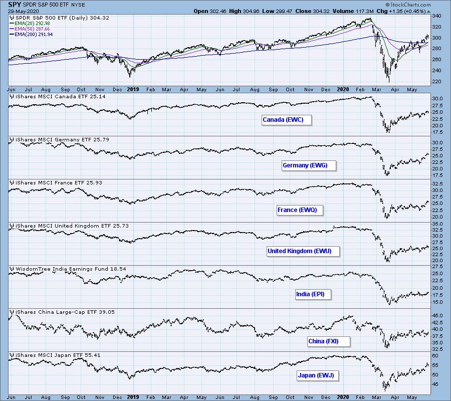
GLOBAL MARKETS
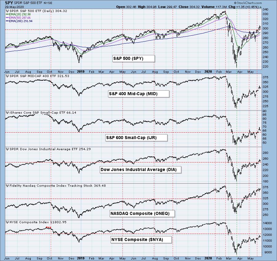
BROAD MARKET INDEXES
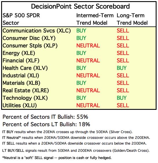
SECTORS
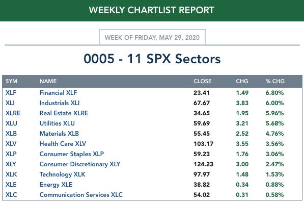
Each S&P 500 Index component stock is assigned to one, and only one, of 11 major sectors. This is a snapshot of the Intermediate-Term (Silver Cross) and Long-Term (Golden Cross) Trend Model signal status for those sectors.
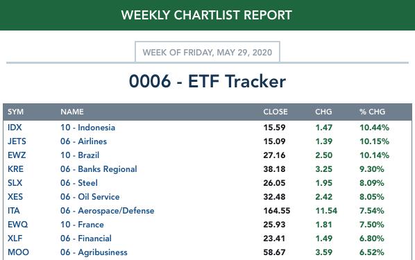
ETF TRACKER: This is a list of about 100 ETFs intended to track a wide range of U.S. market indexes, sectors, global indexes, interest rates, currencies, and commodities. StockCharts.com subscribers can acquire it in the DecisionPoint Trend and Condition ChartPack.
Top 10 . . .
. . . and bottom 10: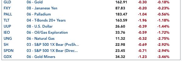
INTEREST RATES
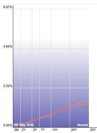
This chart is included so we can monitor interest rate trends.
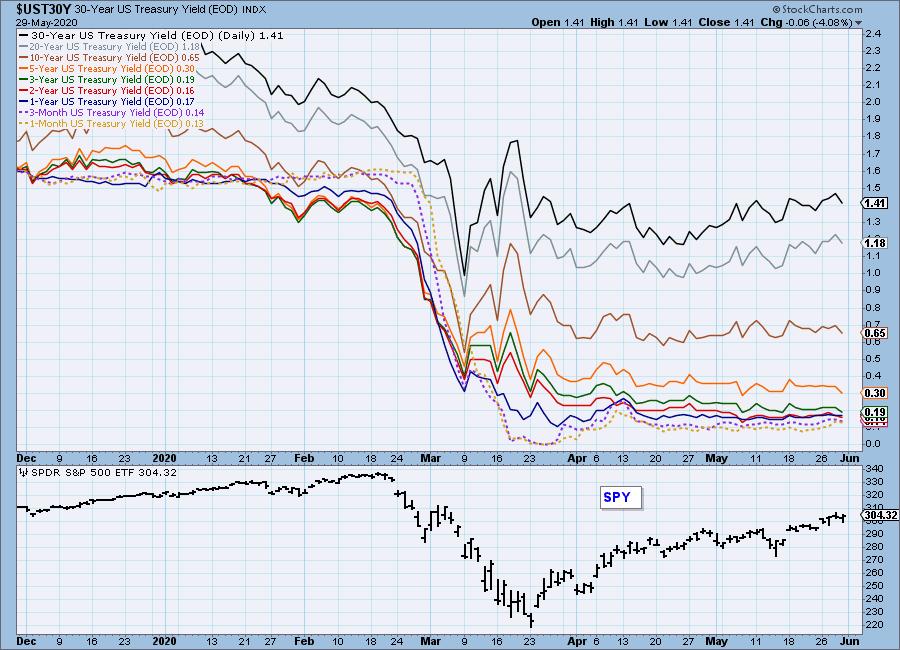
YIELD CURVE: In normal circumstances, interest rates should move higher as the term gets longer; therefore, the interest rate curve below, should rise from left to right. A down slope would indicate an inversion, which is unhealthy for stocks.
STOCKS
IT Trend Model: BUY as of 5/8/2020
LT Trend Model: SELL as of 3/19/2020
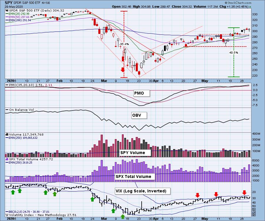
SPY Daily Chart: For the last two weeks, stocks have gapped up on the first trading day of the week, then clustered for the rest of the week. This week, price decisively broke out of the five-week consolidation range. SPX Total Volume today was higher than it has been for almost two months, so I'm wondering if that was a blowoff.
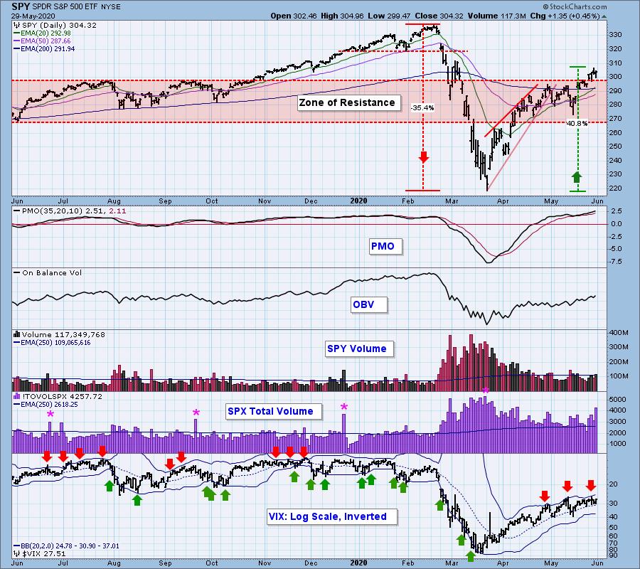
The top of the zone of resistance now serves as support. The PMO and VIX are overbought.
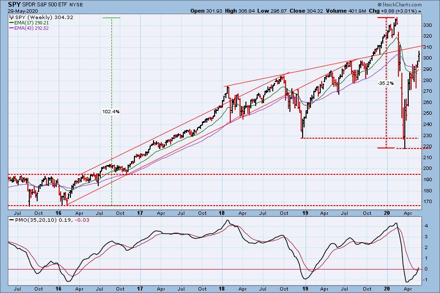
SPY Weekly Chart: The line drawn across rising tops forms a rather fanciful line of resistance. The weekly PMO has crossed up through the signal line -- bullish.
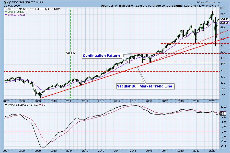
S&P 500 Monthly Chart: The secular bull market rising trend line was briefly penetrated, but it is still valid at this time.
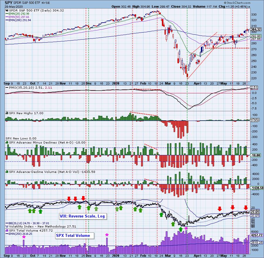
Climactic Market Indicators: Only SPX Total Volume was climactic today, possibly blowoff action.
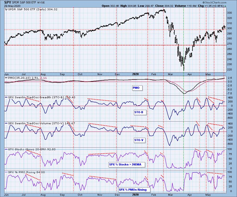
Short-Term Market Indicators: The short-term market trend is UP and the condition is OVERBOUGHT. We still have some negative divergences on these indicators.
Intermediate-Term Market Indicators: The Bullish Percent Index has a negative divergence.
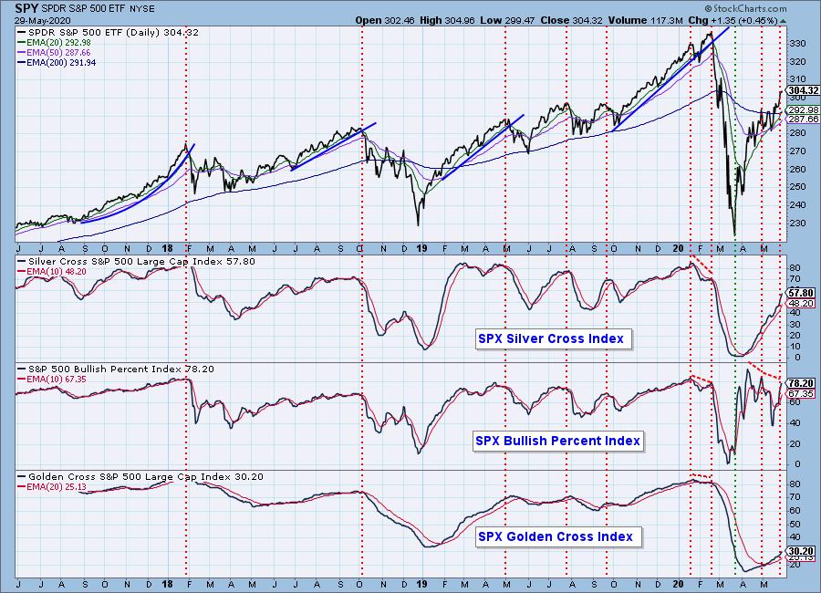
The intermediate-term market trend is UP and the condition is OVERBOUGHT. Note the negative divergences on three of the indicators.
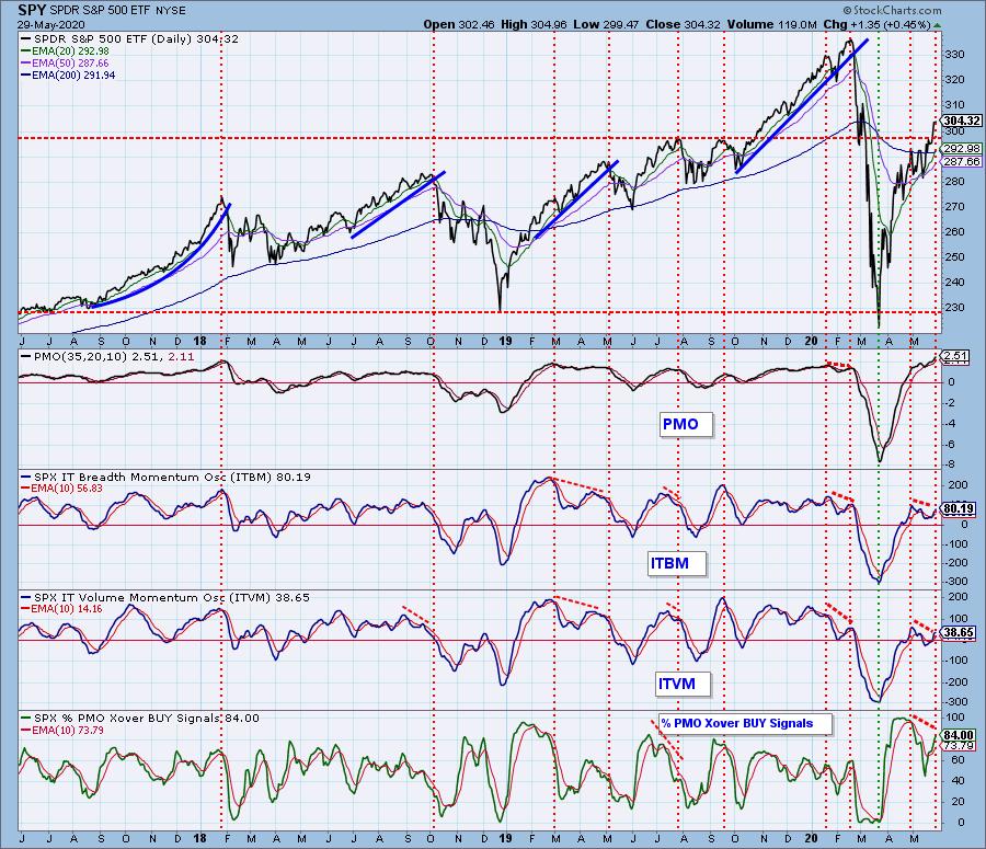
CONCLUSION: I think the market is still in a precarious situation. Some indicators are very overbought (as pointed out in my opening remarks), and others have negative divergences, such as we see on the chart immediately above. Yes, a bull surge can ignore conditions such as these, and, indeed, this has been the case for quite a while, but you can see that the indicators don't look good. Proceed with caution.
Have you subscribed the DecisionPoint Diamonds yet? DP does the work for you by providing handpicked stocks/ETFs from exclusive DP scans! Add it with a discount! Contact support@decisionpoint.com for more information!
DOLLAR (UUP)
IT Trend Model: NEUTRAL as of 5/28/2020
LT Trend Model: BUY as of 5/25/2018
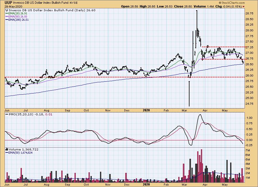
UUP Daily Chart: The dollar is drifting back down toward a support line around 26 that was defined last year.
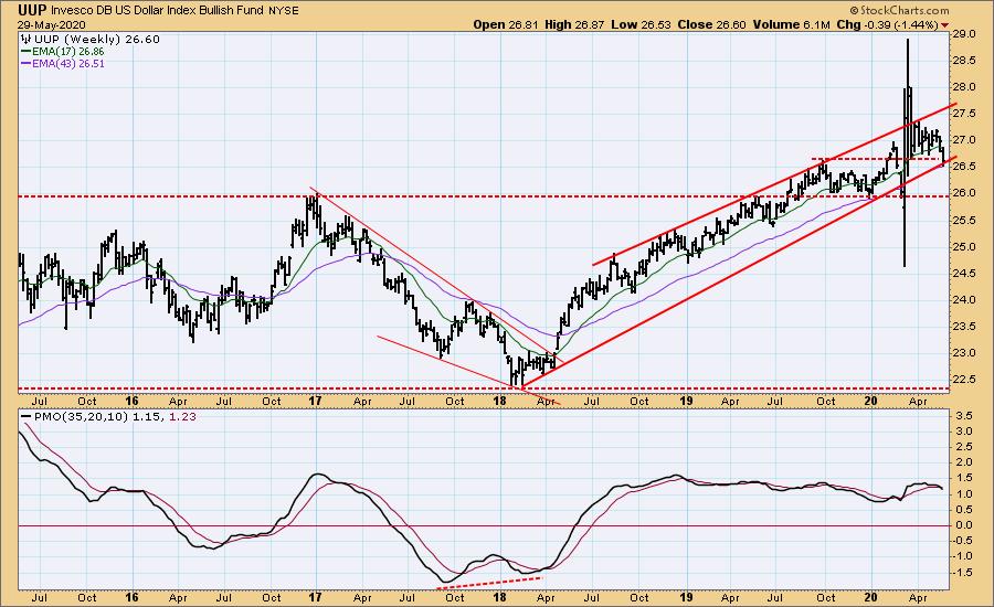
UUP Weekly Chart: The rising trend line is being challenged, and it will probably fail, as price heads back down to the support at 26.
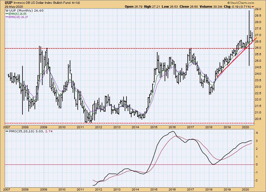
UUP Monthly Chart: The long-term horizontal support line looks even more substantial in this time frame.
GOLD
IT Trend Model: BUY as of 12/26/2019
LT Trend Model: BUY as of 1/8/2019
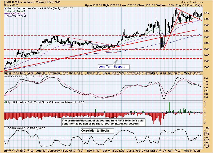
GOLD Daily Chart: In the last few weeks gold has broken out of a declining tops line, a pullback to that line, and now it is continuing higher. Sentiment has been slightly positive to neutral for about two months, which is a great improvement over its running negative for a number of years.
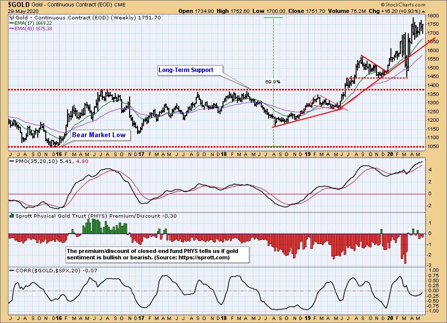
GOLD Weekly Chart: Gold has advanced +70% since the bear market low in 2015, and the sentiment chart shows that most of that advance was climbing a wall of worry. Will positive sentiment kill the advance? See the next chart.
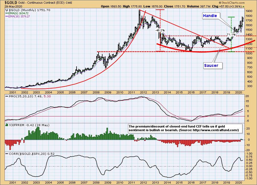
GOLD Monthly Chart: Another closed-end fund that owns physical gold is Central Fund of Canada (CEF), which we are using on this monthly chart to gauge sentiment -- it has deeper historical data. Note that sentiment was very positive for most of the period from 2002 through 2011, when price was in a parabolic advance. Sometimes sentiment is not contrarian but is right on the money. In fact, bullish sentiment faded sharply as gold was in the final upward thrust of the parabolic in 2011.
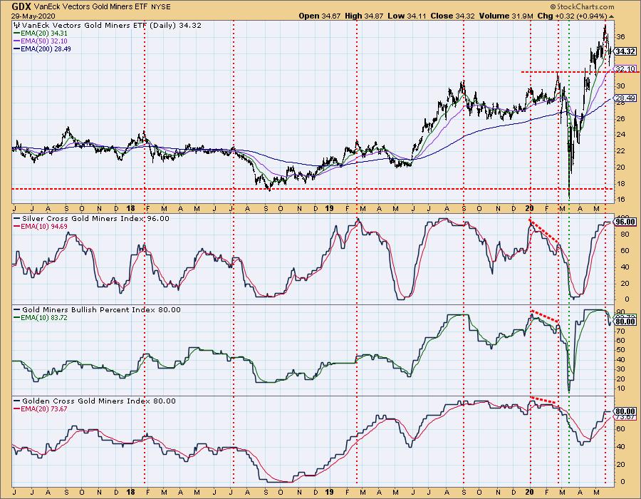
GOLD MINERS Golden and Silver Cross Indexes: Gold mining stocks (GDX) have broken above the resistance line drawn across the February top, and it appears that they have completed the technical snapback toward the line. All the indicators shown are overbought, a condition they can maintain for some time when the market is positive.
CRUDE OIL ($WTIC)
Until further notice we will use $WTIC to track the oil market. Since this is a continuous contract dataset, it doesn't "play well" with our Trend Models, and we will not report Trend Model signals for oil.
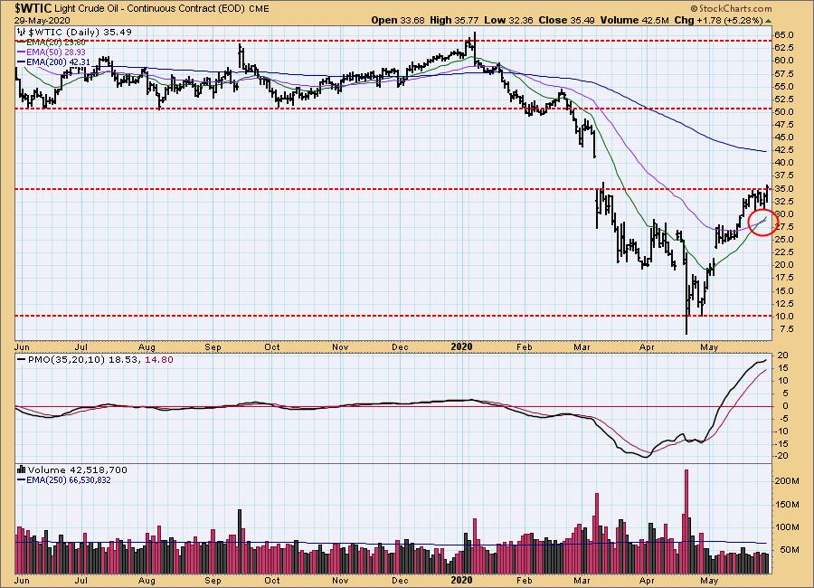
$WTIC Daily Chart: Oil has recovered from the April crash, and we can probably think of that crash as an aberration, not likely to happen again. The 20EMA has crossed up through the 50EMA, a positive sign, but price had to move a long way to accomplish that, and the daily PMO is quite overbought. My guess is that a retreat back toward $20 is more likely than a breakout.
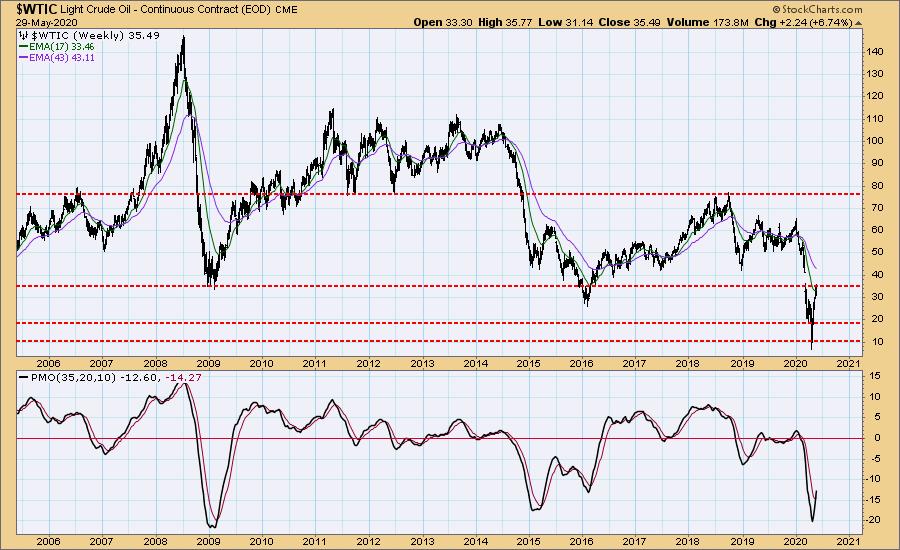
$WTIC Weekly Chart: In this time frame, the weekly PMO is rising off extremely oversold readings, but the overhead resistance for price seems formidable. Keep in mind that the PMO will default back to the zero line, as long as price remains steady.
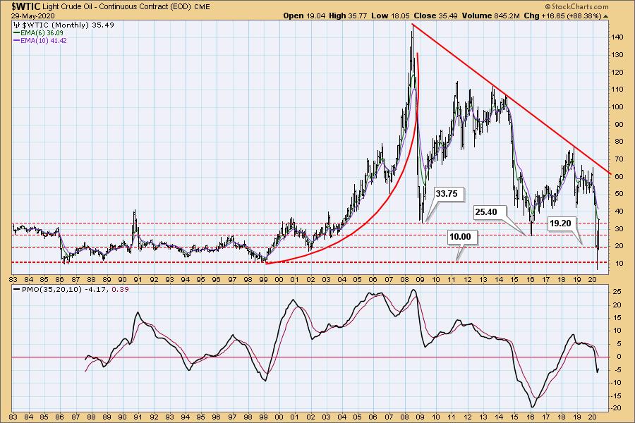
$WTIC Monthly Chart: The monthly PMO is rising, so my guess is that we won't see the price lows revisited.
BONDS (TLT)
IT Trend Model: BUY as of 1/22/2020
LT Trend Model: BUY as of 1/2/2019
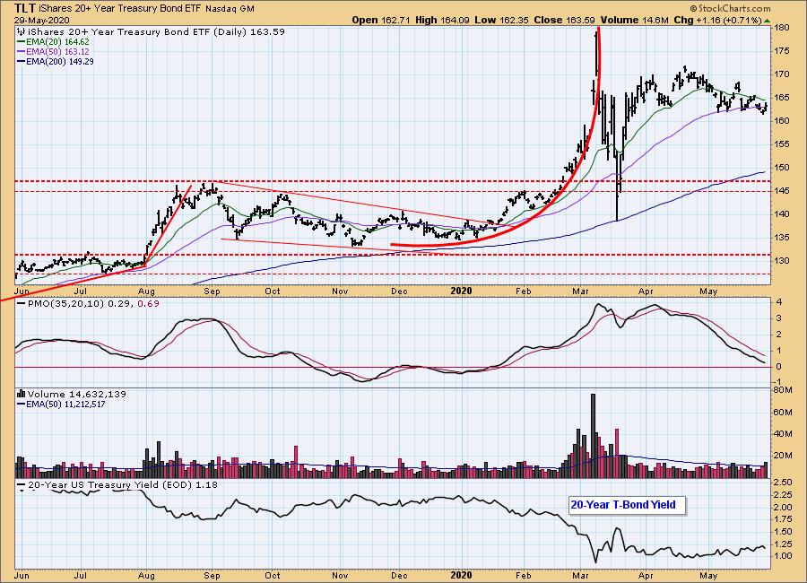
TLT Daily Chart: The yield is creeping higher, so bond prices are creeping lower; however, there is little hope that yield is going to move significantly higher, so I think bond prices are safe at these levels, as they wait for the next interest rate cut.
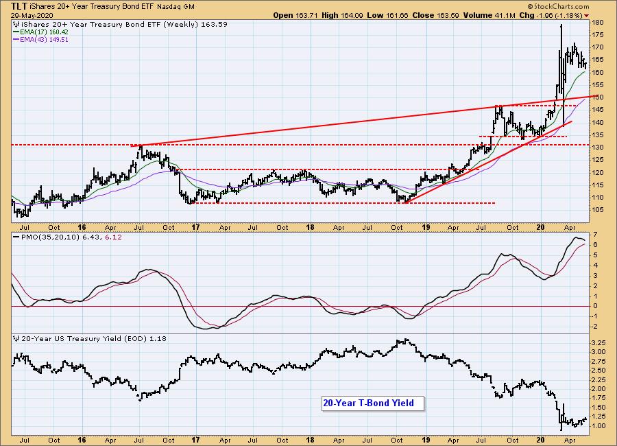
TLT Weekly Chart: The weekly PMO is very overbought and has topped. If price holds near these levels, the overbought condition will correct as the PMO drifts back to the zero line.
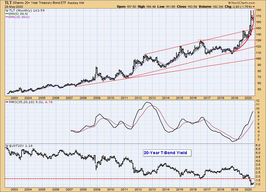
TLT Monthly Chart: Because of the potential for lower rates, the parabolic up move is most likely to result in a high-level consolidation, not a crash.
Technical Analysis is a windsock, not a crystal ball.
Happy Charting! - Carl
NOTE: The signal status reported herein is based upon mechanical trading model signals, specifically, the DecisionPoint Trend Model. They define the implied bias of the price index based upon moving average relationships, but they do not necessarily call for a specific action. They are information flags that should prompt chart review. Further, they do not call for continuous buying or selling during the life of the signal. For example, a BUY signal will probably (but not necessarily) return the best results if action is taken soon after the signal is generated. Additional opportunities for buying may be found as price zigzags higher, but the trader must look for optimum entry points. Conversely, exit points to preserve gains (or minimize losses) may be evident before the model mechanically closes the signal.
Helpful DecisionPoint Links:
DecisionPoint Alert Chart List
DecisionPoint Golden Cross/Silver Cross Index Chart List
DecisionPoint Sector Chart List
Price Momentum Oscillator (PMO)
Swenlin Trading Oscillators (STO-B and STO-V)