
As part of the DP Diamonds Recap, Erin picks a Sector to Watch. Here is her write-up from today:
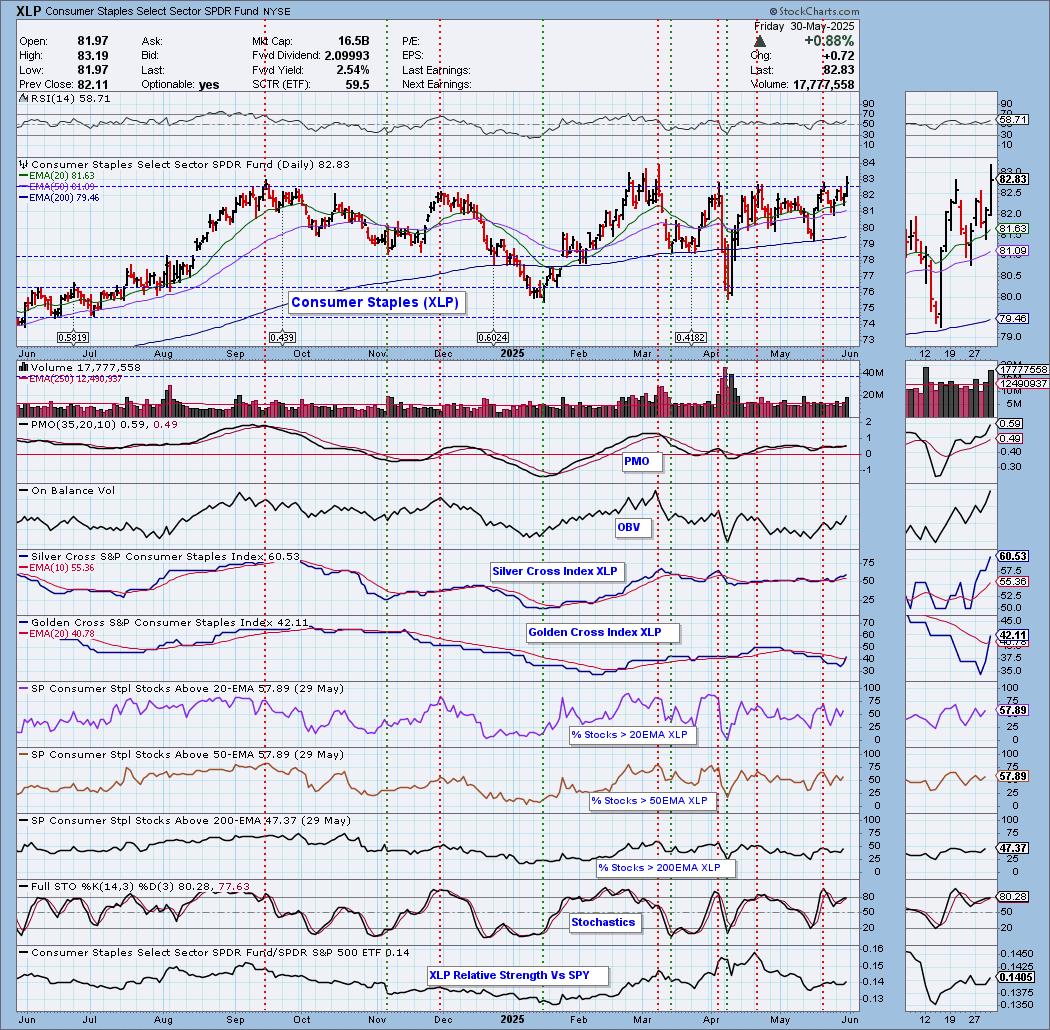
The market may be weakening and that generally means a possible flight to defensive areas of the market. Consumer Staples (XLP) fits that bill. We do have new momentum as the PMO is accelerating higher again. It surged (bottomed) above the signal line twice leading into this advance. Price did rally above near-term resistance. It should see a breakout from the next level of resistance if it can hold together its participation readings. The RSI is positive and not overbought. The OBV is rising and confirming the latest rally. The Silver Cross Index is above its signal line giving us a BULLISH IT Bias. The Golden Cross Index just had a Bullish Shift across the signal line, moving the LT Bias to BULLISH. Participation of stocks above their 20/50/200-day EMAs is at or above our bullish 50% threshold. Stochastics are above 80 and we can see relative strength to the SPY rising. Keep an eye on this sector next week.
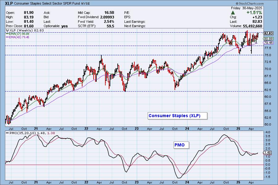
The weekly chart shows us that resistance at this level is strong, but we do have a relatively new weekly PMO Crossover BUY Signal that does seem to imply a breakout ahead to take it out of this trading range.
The DecisionPoint Alert Weekly Wrap presents an end-of-week assessment of the trend and condition of the Stock Market, the U.S. Dollar, Gold, Crude Oil, and Bonds. The DecisionPoint Alert daily report (Monday through Thursday) is abbreviated and gives updates on the Weekly Wrap assessments.
Watch the latest episode of DecisionPoint on our YouTube channel here!
MARKET/SPX SECTOR/INDUSTRY GROUP INDEXES
Change Today: 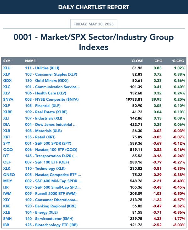
Change for the Week:
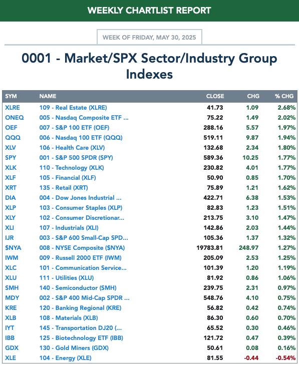
CLICK HERE for Carl's annotated Market Index, Sector, and Industry Group charts.
THE MARKET (S&P 500)
IT Trend Model: NEUTRAL as of 3/4/2025
LT Trend Model: SELL as of 4/16/2025
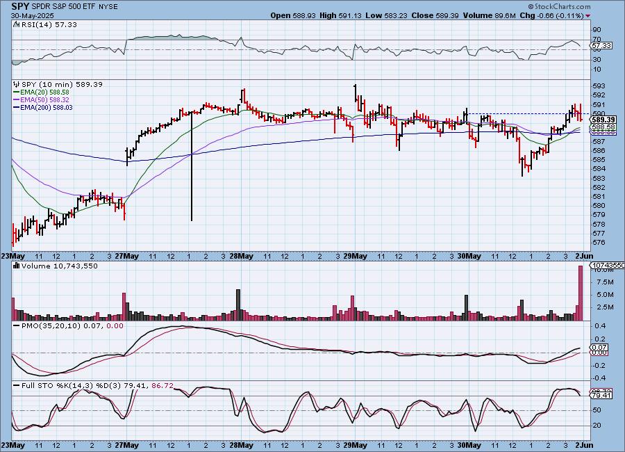
SPY 10-Minute Chart: The market was down most of the morning. It began to recover in the afternoon, paring back much of today's losses. Looking at this chart we see a consolidation zone or churn. The market hasn't decided which way it wants to go. This could be a pause before another leg up or it could be bulls trying to wrest the market out of bearish hands. The 10-minute PMO is bullish, but Stochastics are suspect. Could see more of the same next week.
SPY Daily Chart: Today's decline has set up a possible bearish double top on the daily chart. Resistance held firm. The PMO is declining again. The RSI is still positive and not overbought so there is an opportunity to bust this pattern quickly. We still don't like it.
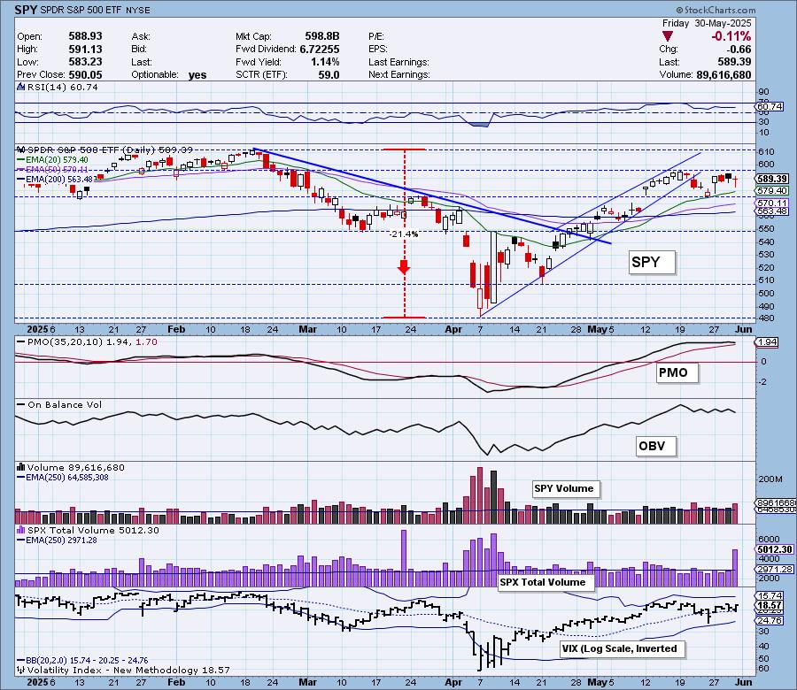
Stochastics topped this week and are below 80. They are still in positive territory, but we don't like to see this deterioration with a falling PMO. The VIX held above its moving average on the inverted scale, but it did puncture it. The Bollinger Bands are shrinking as volatility has calmed during this period of sideways trading. This means we could see a puncture of either Band sooner rather than later.
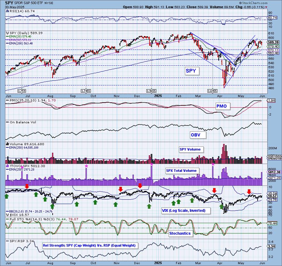
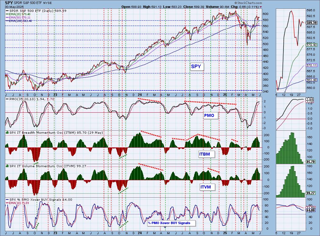
SPY Weekly Chart: We have a bullish "V" Bottom on the weekly chart that implies a breakout to new all-time highs. However, we also see an island and that could end with a gap down move. The weekly PMO is rising toward a Crossover BUY Signal which also seems to say that we'll see new all-time highs. We still need to monitor this island.
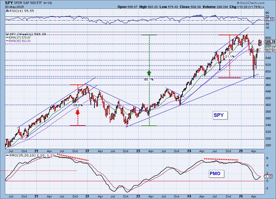
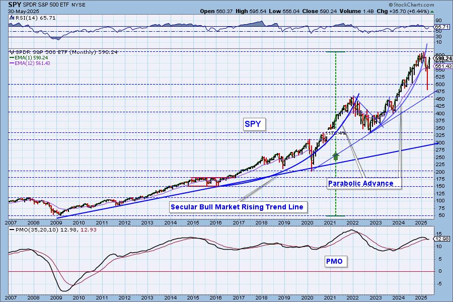
SPY Monthly Chart: Price dipped down to the rising trend and reversed before testing it which is bullish. What bothers us is the nearing monthly PMO Crossover SELL Signal. This month saw a nice gain, but we think this chart tells us to use caution in the long term.
New 52-Week Highs/Lows: New Highs gained on the day, but are in a declining trend. New Lows are starting to appear. The High-Low Differential is rising, but not that convincingly.
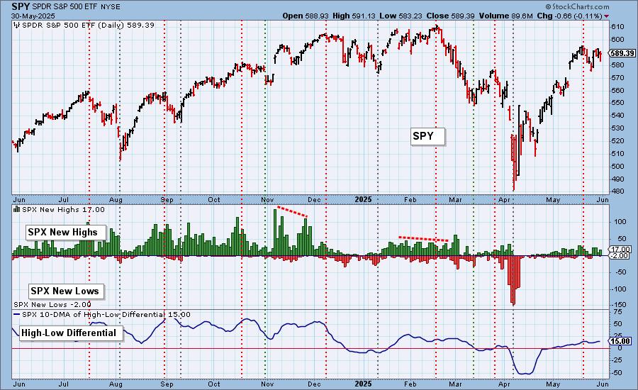
Climax Analysis: There were no climax readings today. SPX Total Volume was 169% of one-year average daily volume, which is blowoff volume, so this could be the last attempt of the market to move higher.
*A climax is a one-day event when market action generates very high readings in, primarily, breadth and volume indicators. We also include the VIX, watching for it to penetrate outside the Bollinger Band envelope. The vertical dotted lines mark climax days -- red for downside climaxes, and green for upside. Climaxes are at their core exhaustion events; however, at price pivots they may be initiating a change of trend.
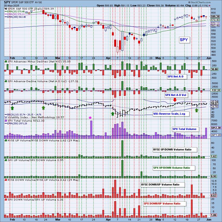
Short-Term Market Indicators: The short-term market trend is UP and the condition is NEUTRAL.
Swenlin Trading Oscillators (STOs) moved up today. They are coming out of oversold territory so we should be seeing some good movement in the short term. Instead we have churn. Participation inched lower and remains above our bullish 50% threshold. We lost a few rising PMOs as that indicators continues to deteriorate. Less than half of the index hold rising momentum. We need some strong momentum to push price higher and we're not seeing it yet.
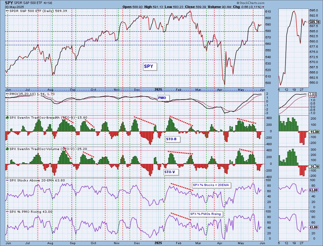
Intermediate-Term Market Indicators: The intermediate-term market trend is UP and the condition is NEUTRAL.
The ITBM and ITVM have left overbought territory. They began declining right after the price top. Price hasn't disintegrated on their decline, but it is certainly not showing strength. We lost a very slight amount of PMO BUY Signals. We have a good number of BUY Signals within the index right now, but with only 43% showing rising PMOs, that percentage is likely to slide longer. Its decline does not inspire confidence.
_______
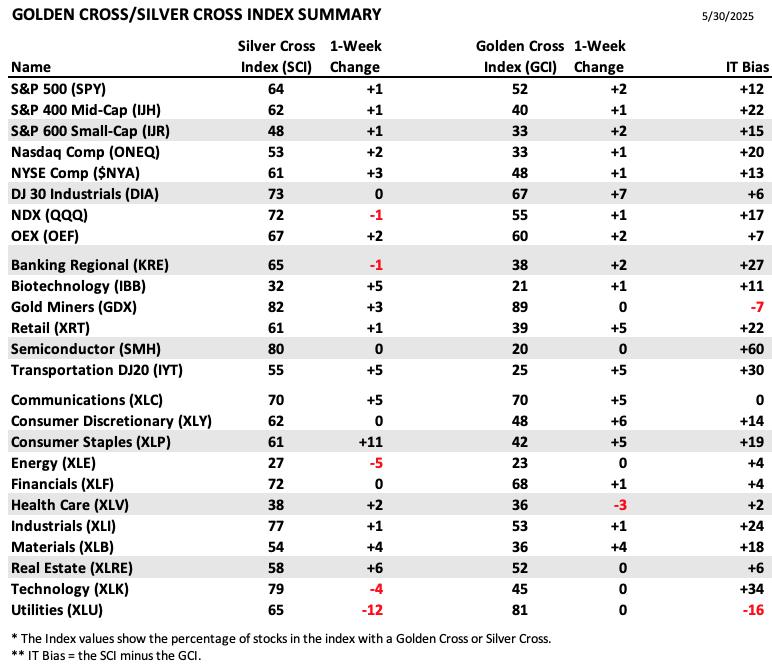
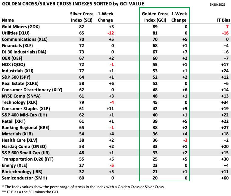
PARTICIPATION TABLES: The following tables summarize participation for the major market indexes and sectors. The 1-Week Change columns inject a dynamic aspect to the presentation. There are three groups: Major Market Indexes, Miscellaneous Industry Groups, and the 11 S&P 500 Sectors.
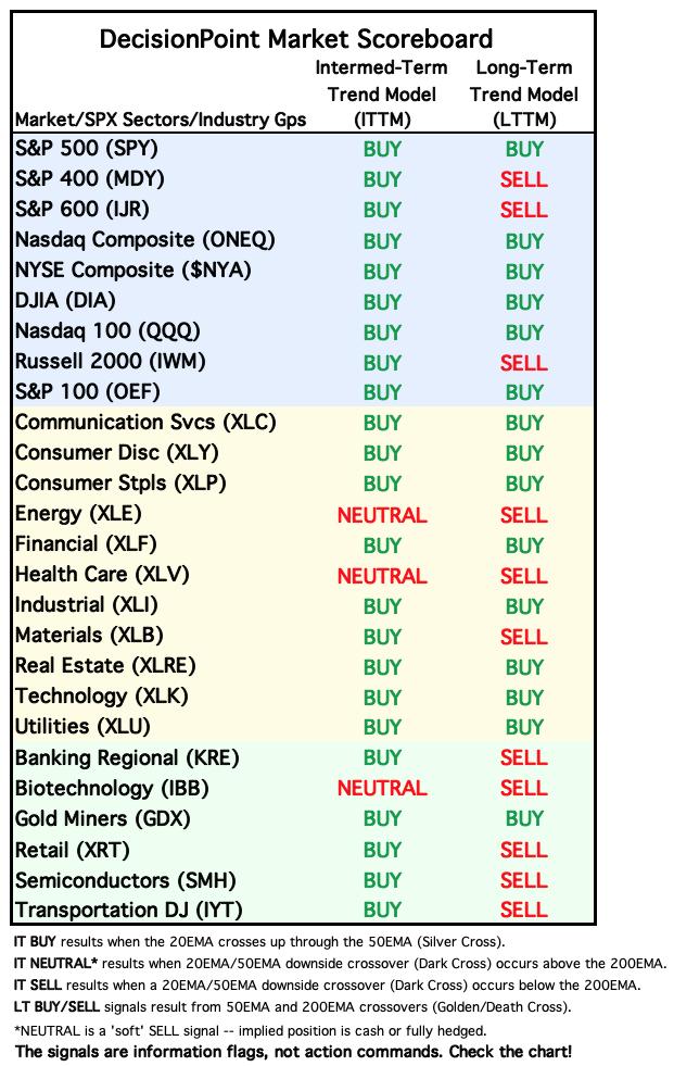
All IT Biases are reading positive except for three. That is a sign of market strength coming out of May lows.
The highest IT Bias belongs to Semiconductors (SMH) which were beat down in the long term, but have been making quite a comeback since then which pushed the Silver Cross Index much higher than the Golden Cross Index.
The lowest IT Bias goes to Utilities (XLU). In the long term, it built up a strong foundation for the Golden Cross Index. It since pulled back so the Silver Cross Index lost ground and continues to lose ground. It is a defensive area of the market and that could see some action next week. Don't write Utilities off.
This table is sorted by SCI values. This gives a clear picture of strongest to weakest index/sector in terms of intermediate-term participation.
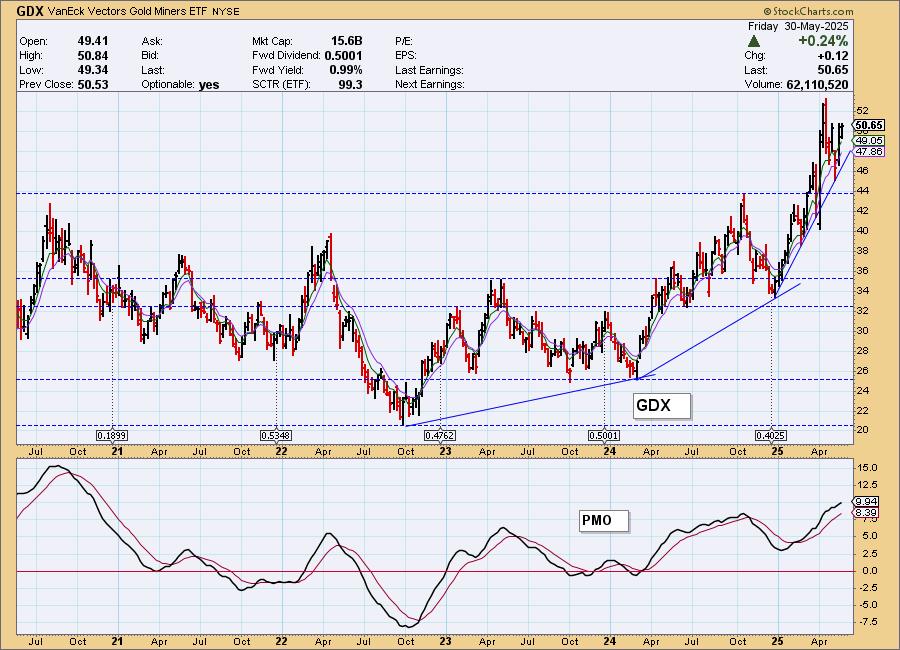
Gold Miners (GDX) holds the highest SCI reading. This is no surprise given the strength of the rally we are seeing in the intermediate term. It gained more percentage points this week. We like Gold Miners moving forward.
Energy (XLE) has really been depressed and that is evident given it holds the lowest SCI value. It continues to lose SCI points.
Another reason to like Consumer Staples (XLP) is that it saw the highest change in its SCI value.
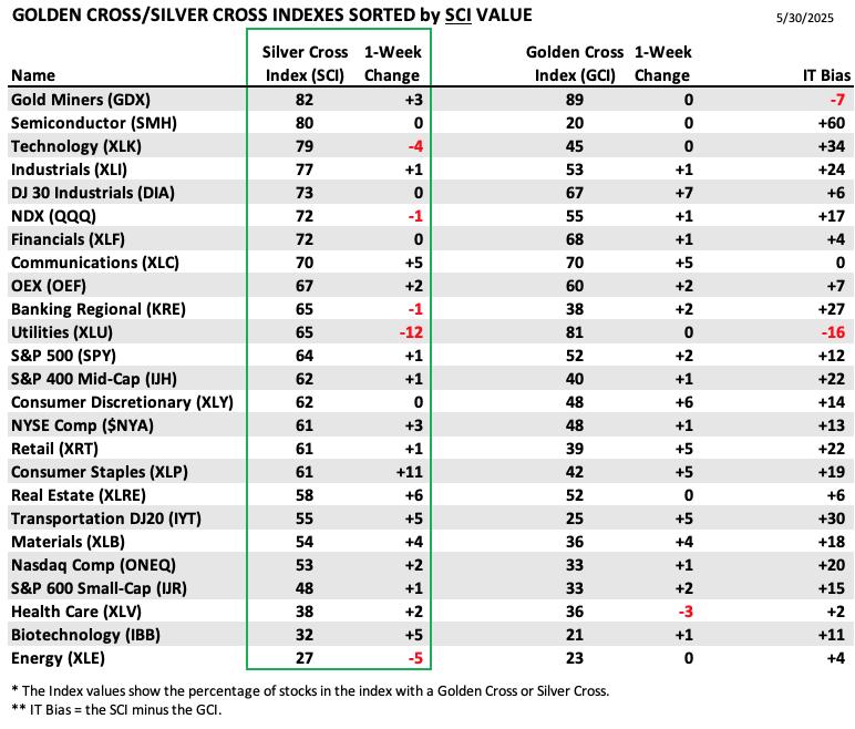
This table is sorted by GCI values. This gives a clear picture of strongest to weakest index/sector in terms of long-term participation.
Gold Miners (GDX) also leads the way on the GCI reading as well. It saw no gains, but is at a very robust 89%. Look for more strength out of this group.
The lowest GCI reading goes to Semiconductors (SMH). As noted above, it was hit hard in the long term and this brought the GCI down quite a bit. This week it didn't gain, but likewise it didn't decline.
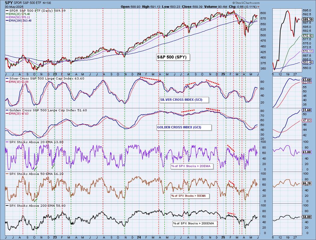
PARTICIPATION CHART (S&P 500): The following chart objectively shows the depth and trend of participation for the SPX in two time frames.
- Intermediate-Term - the Silver Cross Index (SCI) shows the percentage of SPX stocks on IT Trend Model BUY signals (20-EMA > 50-EMA). The opposite of the Silver Cross is a "Dark Cross" -- those stocks are, at the very least, in a correction.
- Long-Term - the Golden Cross Index (GCI) shows the percentage of SPX stocks on LT Trend Model BUY signals (50-EMA > 200-EMA). The opposite of a Golden Cross is the "Death Cross" -- those stocks are in a bear market.
The market bias is BULLISH in the intermediate and long terms.
Not much change in participation today. It is still at healthy levels, but given the rally out of the May low, we would have expected to see much higher readings. We have declining trends on %Stocks > 20/50/200EMAs. The Silver Cross Index has halted its decline today. It may avoid a Bearish Shift across the signal line for awhile longer, but we don't see %Stocks > 20/50EMAs reading much higher than the SCI so it isn't likely to keep rising much either. It is above its signal line still so the IT Bias is BULLISH. The Golden Cross Index is accelerating higher which is positive. It is finally above our bullish 50% threshold. It could continue to move higher given there are more stocks above their 50/200-day EMAs. The GCI is above its signal lines so the LT Bias is BULLISH.
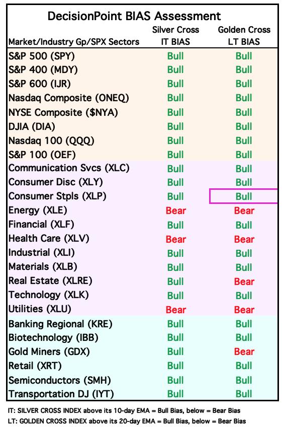
BIAS Assessment: The following table expresses the current BIAS of various price indexes based upon the relationship of the Silver Cross Index to its 10-day EMA (intermediate-term), and of the Golden Cross Index to its 20-day EMA (long-term). When the Index is above the EMA it is bullish, and it is bearish when the Index is below the EMA. The BIAS does not imply that any particular action should be taken. It is information to be used in the decision process.
The items with highlighted borders indicate that the BIAS changed today.
*****************************************************************************************************
CONCLUSION: The market has been churning along not really hinting which direction it will go after this period of consolidation. We see a new bearish double top developing on the SPY that could be a problem in the short term. Total Volume was exceedingly high today and that signals a blow off which means we should see lower prices to start trading next week. China tariff talk is getting negative and that seems to be weighing heavy on the index. That story could continue to be a problem near-term. IT indicators are in decline for the most part while the STOs are rising. Not that we should ignore STOs, but we are leaning bearish right now primarily due to the possible double top and less than impressive readings on %PMOs Rising.
Erin is 60% long, 0% short. (This is intended as information, not a recommendation.)
*****************************************************************************************************
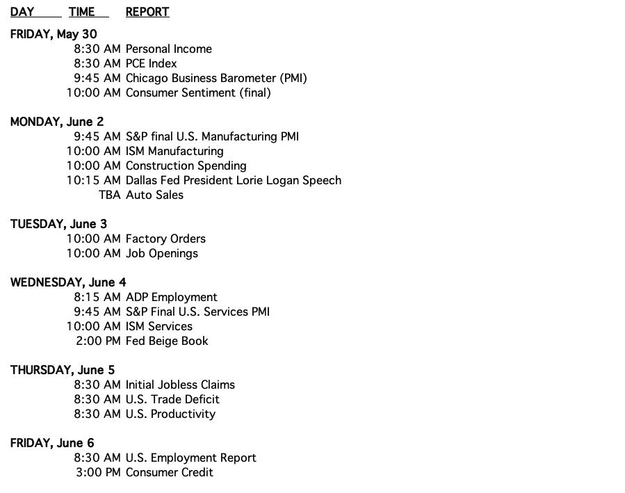
CALENDAR
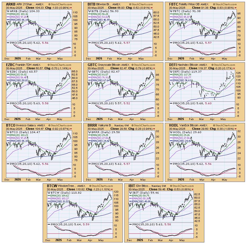
BITCOIN
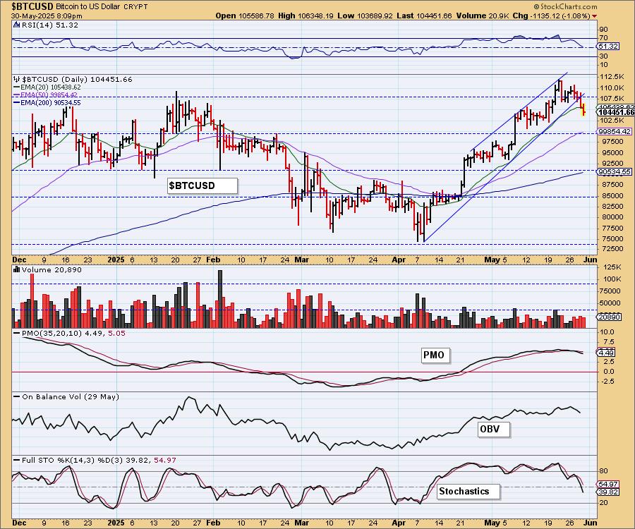
Bitcoin Daily Chart: This week Bitcoin fulfilled a bearish rising wedge with a breakdown. It does appear to be pullback time for Bitcoin given the falling PMO. Stochastics look particularly bearish as they sail lower in negative territory.
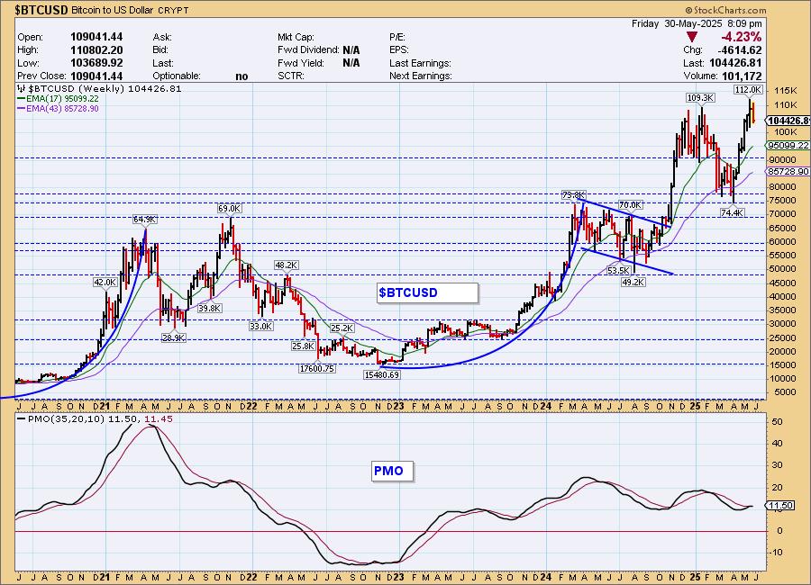
Bitcoin Weekly Chart: We can see the personality of Bitcoin is a forceful rally followed by decline. We've now seen the strong rally upward. Now it may be time for some consolidation. The weekly PMO just triggered a Crossover BUY Signal so we should look for consolidation versus a big decline. It is Bitcoin, however, and it doesn't always follow the rules.
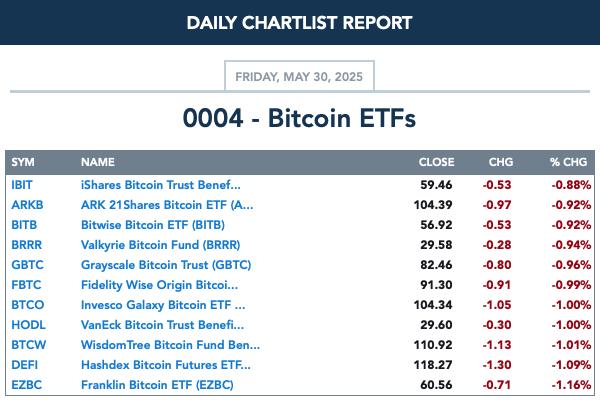
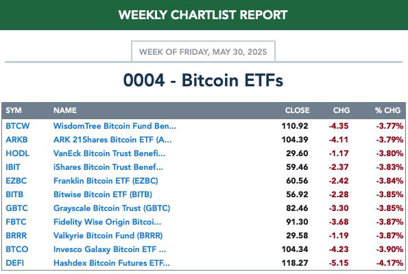
BITCOIN ETFs
Today:
This Week:
INTEREST RATES
Yields were mixed today. They do look somewhat toppy in the thumbnail so it may be time for them to retreat.
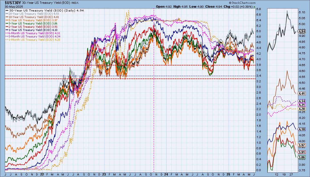
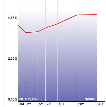
The Yield Curve Chart from StockCharts.com shows us the inversions taking place. The red line should move higher from left to right. Inversions are occurring where it moves downward.
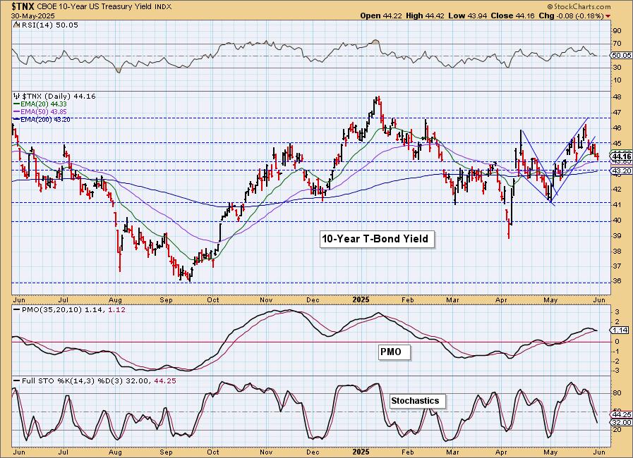
10-YEAR T-BOND YIELD
We do have a bullish falling wedge on $TNX right now, but the indicators aren't suggesting a breakout here. The PMO is about to generate a Crossover SELL Signal and Stochastics are diving lower in negative territory. We'll monitor this formation, but we aren't bullish at this point due to the indicators.
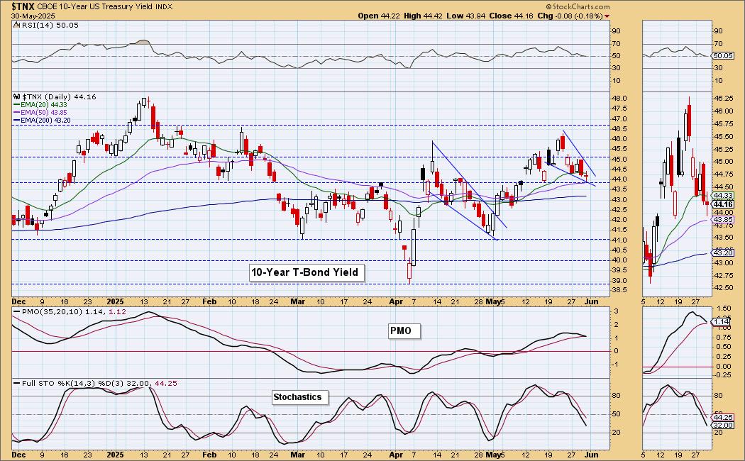
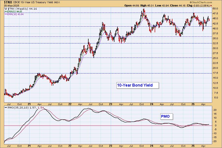
10-Year Bond Yield Weekly Chart: $TNX is in a sideways trading range. It hasn't reached resistance yet and the weekly PMO is rising on a new Crossover BUY Signal. The intermediate term looks bullish while the short term is bearish for now.
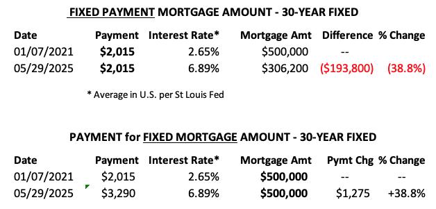
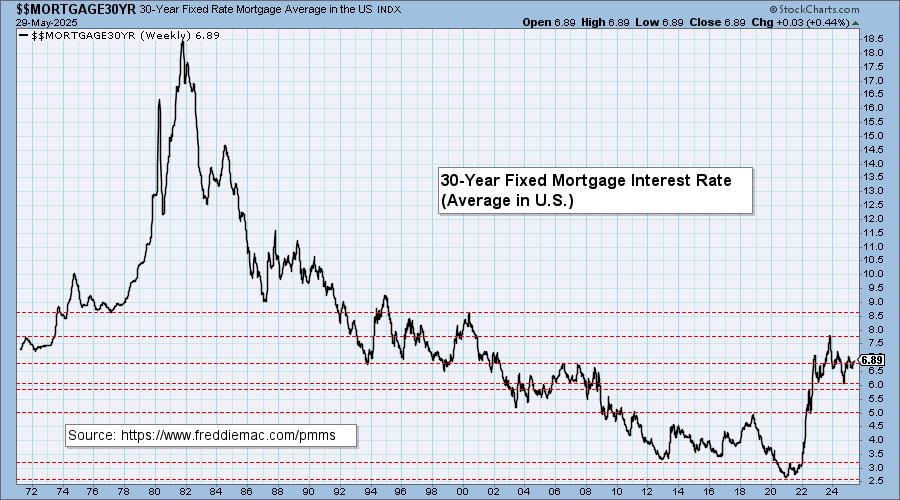
MORTGAGE INTEREST RATES (30-Yr)**
**We watch the 30-Year Fixed Mortgage Interest Rate, because, for the most part, people buy homes based upon the maximum monthly payment they can afford. As rates rise, a fixed monthly payment will carry a smaller mortgage amount, which shuts many buyers out of the market, and potential sellers will experience pressure to lower prices (to no effect so far).
--
This week the 30-Year Fixed Rate changed from 6.86 to 6.89.
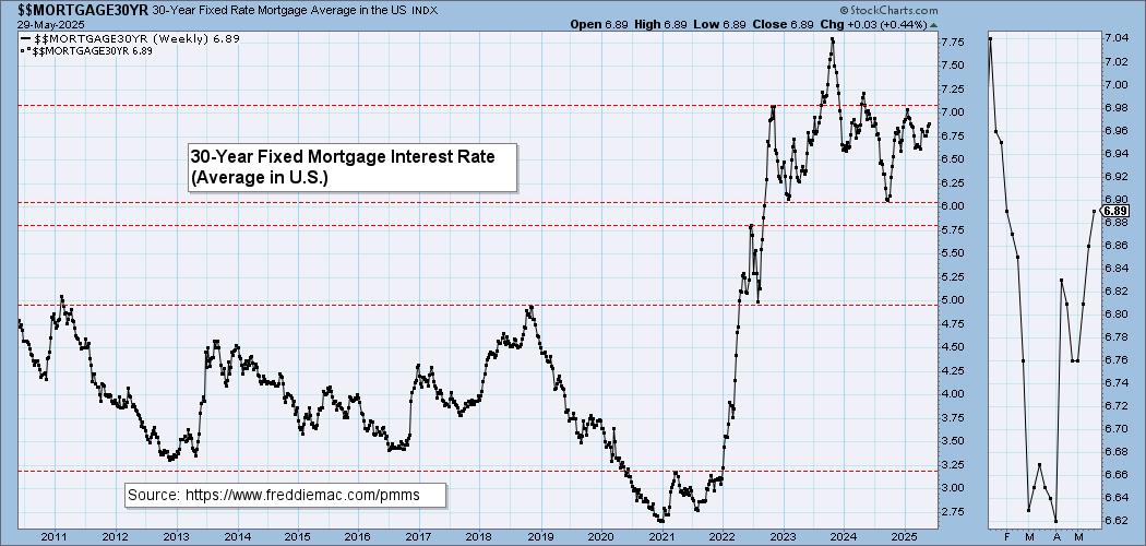
Here is a 50-year chart for better perspective.
BONDS (TLT)
IT Trend Model: SELL as of 4/14/2025
LT Trend Model: SELL as of 12/13/2024
TLT Daily Chart: Bonds have broken away from a declining trend channel. Yields are acting bearish right now so we do think we'll see more upside here. The PMO is crossing over its signal line for a BUY Signal. Stochastics are rising nicely. We would look for Bond funds to move higher for a little while longer.
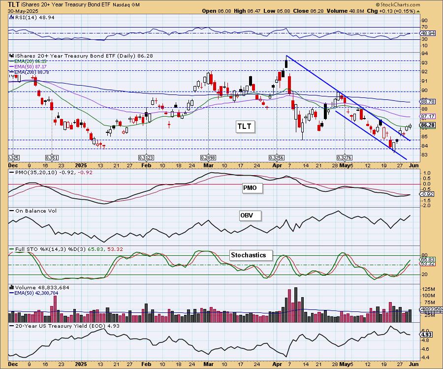
This came off a very strong level of support.

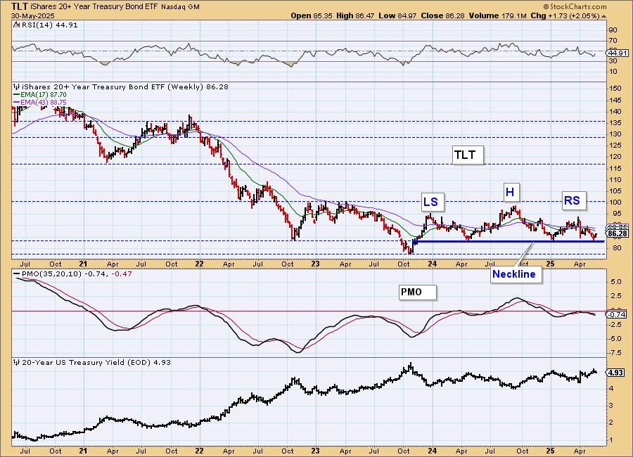
TLT Weekly Chart: We've adjusted our annotations to show a bearish head and shoulders pattern on the weekly chart. Currently it is bouncing off the neckline, but given the falling weekly PMO, we should expect the pattern to be confirmed.
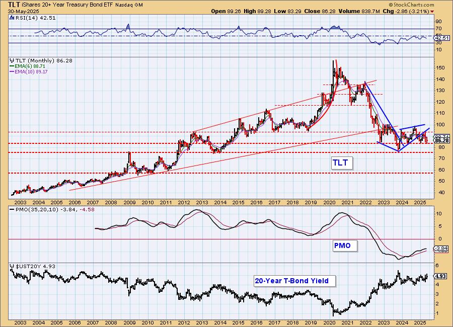
TLT Monthly Chart: The monthly chart shows price coming out of a bearish rising wedge. Support looks very vulnerable. The monthly PMO is still rising, but it is well beneath the zero line and is likely signaling diminishing weakness not new strength. We think the rally in Bonds will be short-lived.
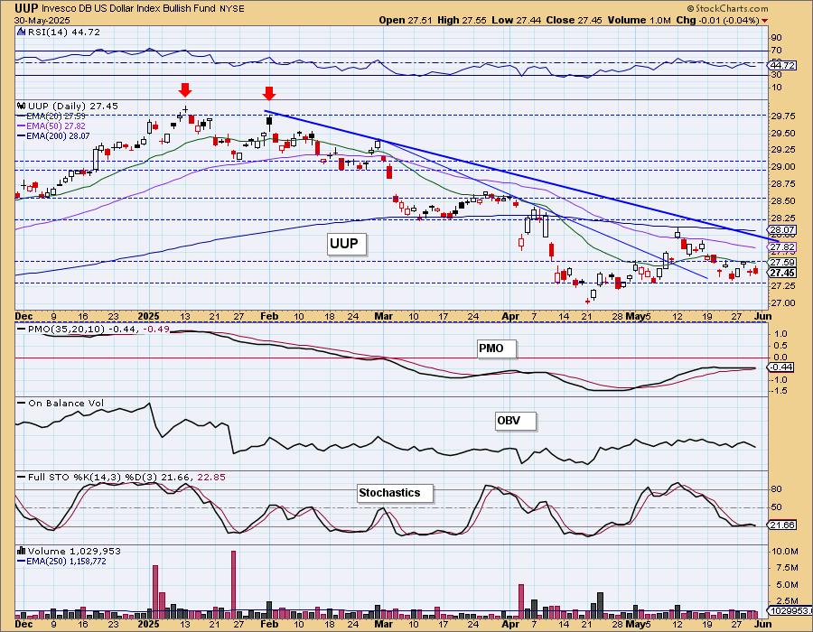
DOLLAR (UUP)
IT Trend Model: NEUTRAL as of 3/5/2025
LT Trend Model: SELL as of 4/25/2025
UUP Daily Chart: The Dollar is showing a near-term declining trend and an intermediate-term declining trend. It has spent much of this week consolidating sideways. The PMO is flat beneath the zero line and that is a sign of weakness. The RSI is negative and Stochastics are falling in negative territory. We expect the decline in the Dollar will resume shortly.
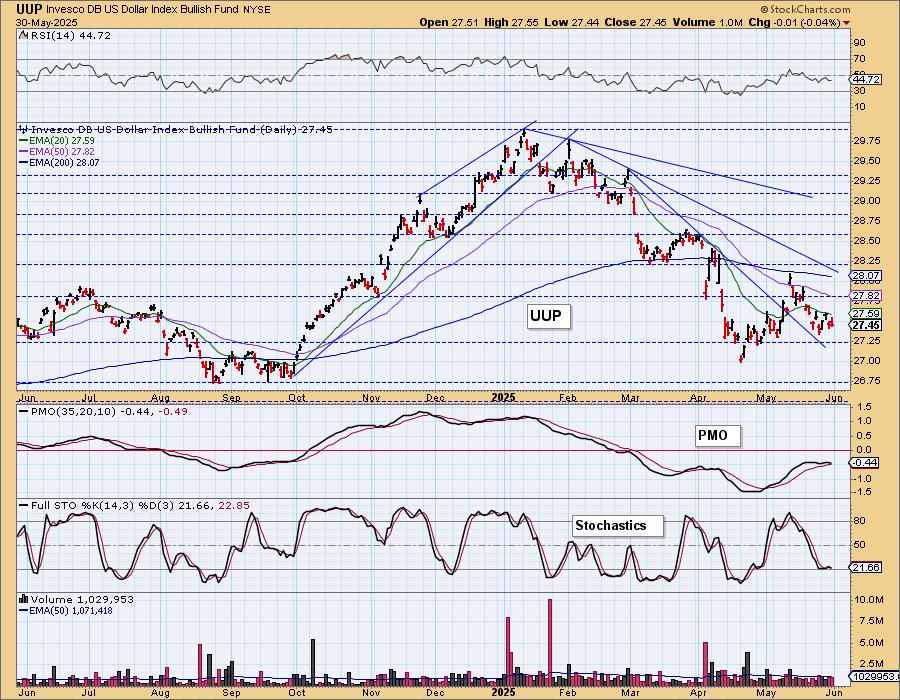
UUP Weekly Chart: UUP broke the long-term rising trend line and based on a falling negative PMO, we should expect more weakness.
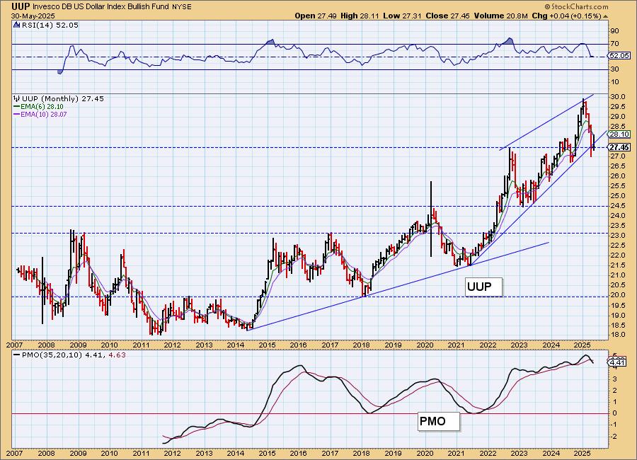
UUP Monthly Chart: We have a large bearish rising wedge that has been confirmed with the drop beneath the rising bottoms trendline that makes up the bottom of the pattern. The monthly PMO has recently triggered a Crossover SELL Signal so we expect to see price drift lower from here.
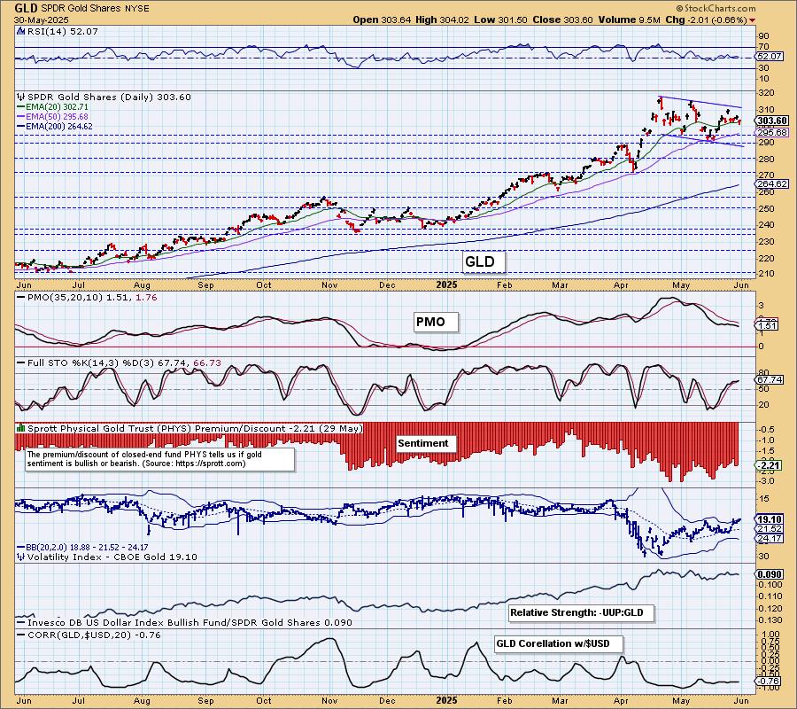
GOLD
IT Trend Model: NEUTRAL as of 12/23/2024
LT Trend Model: BUY as of 10/20/2023
GLD Daily Chart: Gold is in a bull flag, but admittedly the flag is getting quite extended in relation to the flagpole coming out of the April low. It hasn't busted, but it is beginning to look suspect. That doesn't change our view that Gold is a good place to be. Our concern right now is price looks like it wants to go down and test the bottom of this channel. However, the Dollar is weak and that will ultimately benefit Gold so a breakout from the channel seems likely. The RSI is positive and Stochastics are rising. The PMO is flat above the zero line and that usually implies strength. We do see that the PMO is losing ground a bit, but it hasn't fallen out of bed.
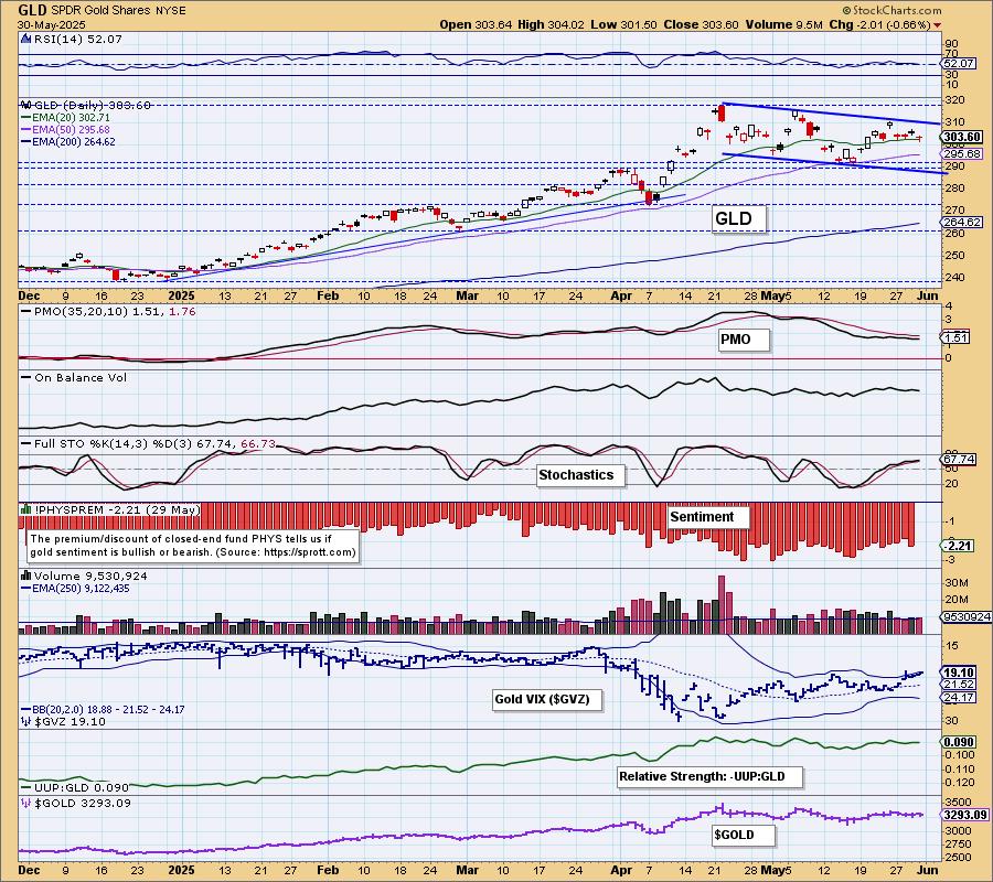
The correlation between Gold and the Dollar is very negative so a weak Dollar will help Gold. We also see a rising trend in relative strength.
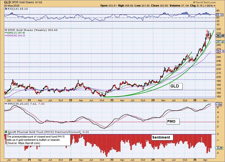
GLD Weekly Chart: We still see a parabolic advance on Gold. The rally isn't vertical yet, but it does tell us to expect some kind of pullback or correction out of this parabola. The weekly PMO is still rising and the weekly RSI is positive and not overbought so we think we'll see more upside.
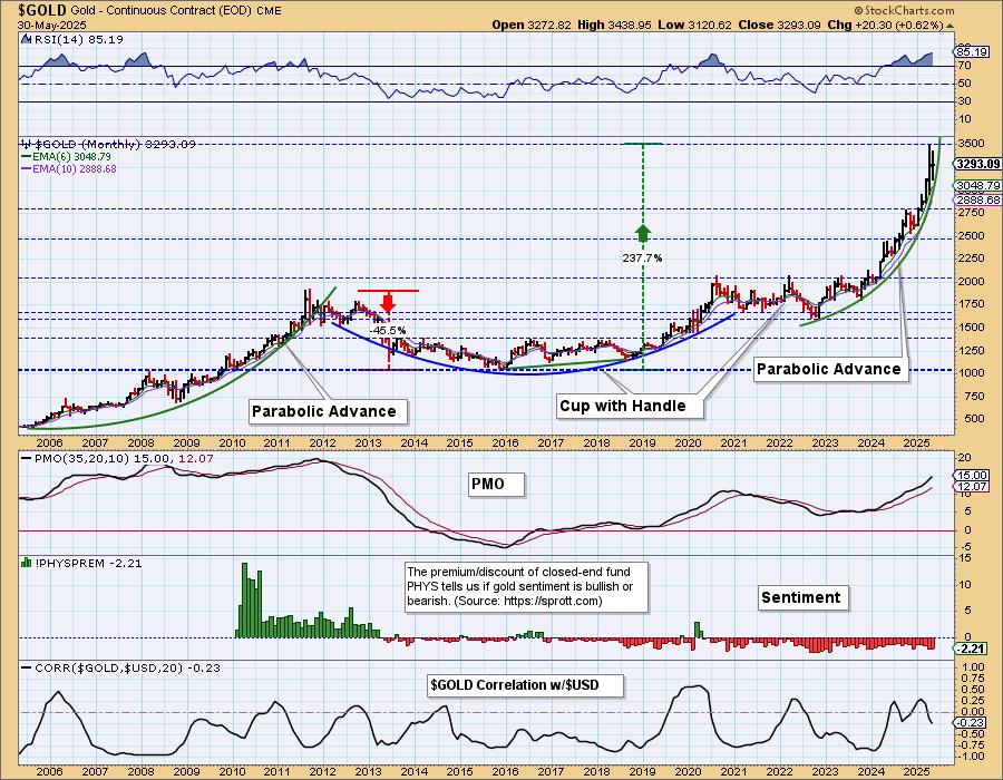
GLD Monthly Chart: The rally is almost vertical on the monthly chart and like the weekly chart it does tell us to consider a parabolic breakdown. It doesn't mean Gold would fall all the way back to 2000, we think that consolidation will do the job to clear this parabolic advance.
GOLD MINERS Daily Chart: Gold was up today and an already strong Gold Miners group took advantage with a rally of its own. The bull flag on GDX has been confirmed. Price is melting slowly upward and given the indicators we'd be looking for more of the same. The RSI is positive and not overbought. The PMO is rising on a Crossover BUY Signal. Participation and the Silver/Golden Cross Indexes are at the top of the range signaling strength.
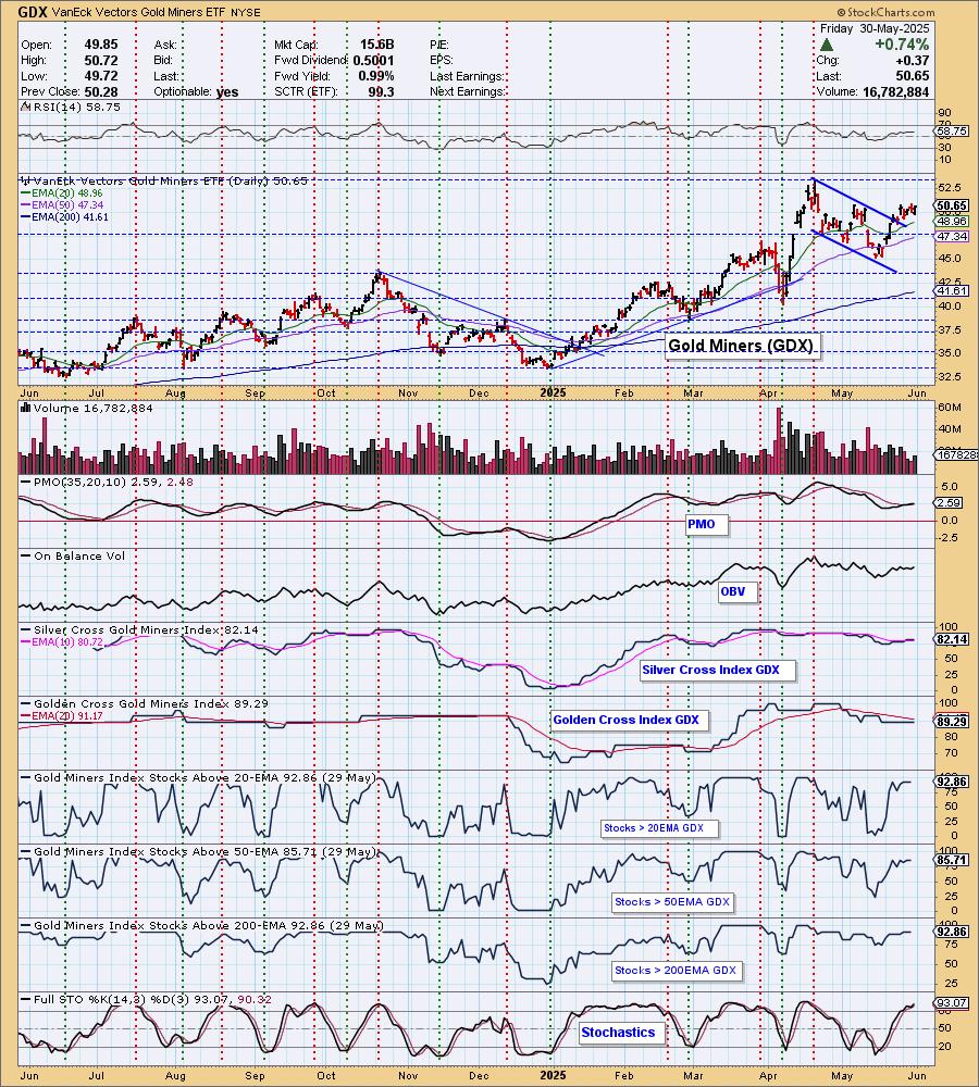
GDX Weekly Chart: We don't have a parabolic advance, but we do have a very steep rally. At this point it doesn't look vulnerable as price is bouncing off the rising trend and the weekly PMO is rising strongly.
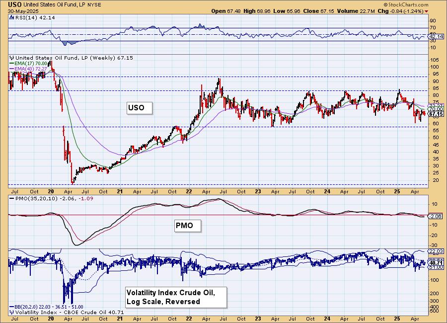
CRUDE OIL (USO)
IT Trend Model: NEUTRAL as of 2/27/2025
LT Trend Model: BUY as of 3/31/2025
USO Daily Chart: Price formed a bullish double bottom but was unable to get above the confirmation line. We don't like Crude here. It is angling lower after hitting resistance. The PMO has topped below the zero line and Stochastics are dropping in negative territory.
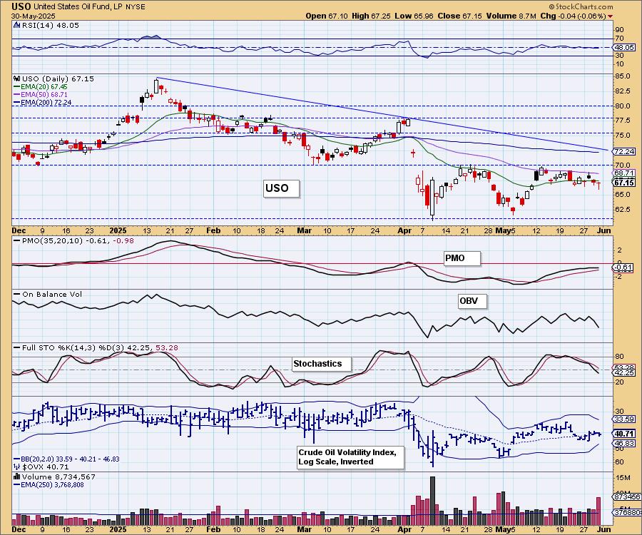
We may have a bull flag on the chart that would mean an eventual confirmation of the double bottom. We don't expect this flag to execute, at least not right now given the bearish indicators.
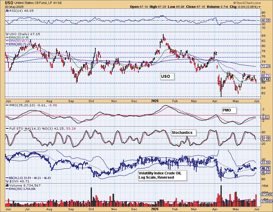
USO/$WTIC Weekly Chart: Crude is essentially in a multiyear trading range. It appears to be reversing before testing support and that is bullish. However, the weekly PMO is below zero and flat while the weekly RSI is in negative territory.
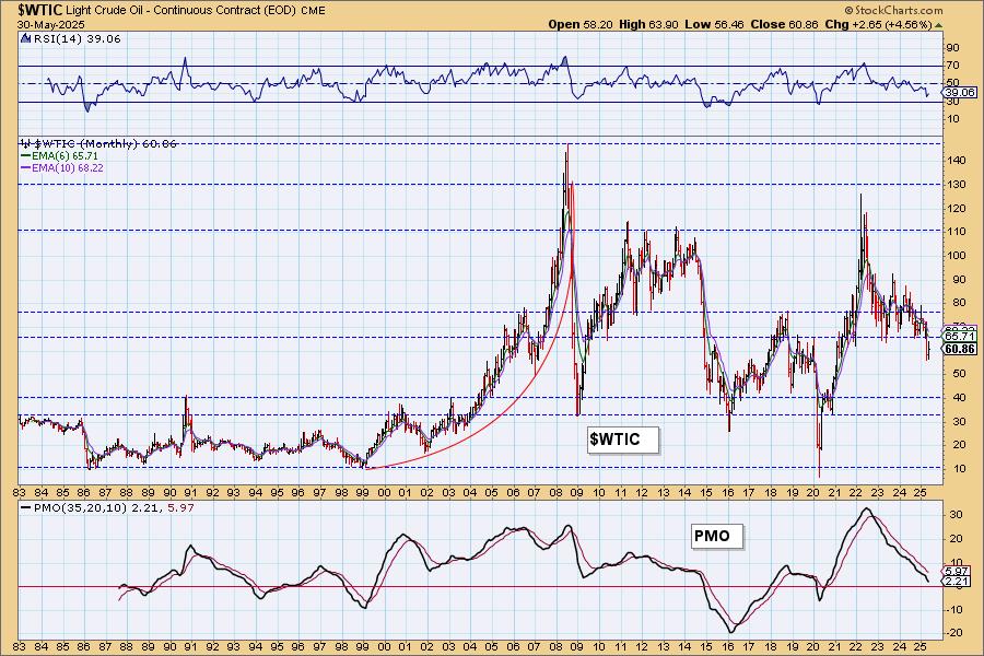
WTIC Monthly Chart: We lost support on the monthly chart and see a long-term declining trend. The monthly PMO is falling fast toward the zero line. We'd look for Crude to move lower from here.
Good Luck & Good Trading!
Erin Swenlin and Carl Swenlin
Technical Analysis is a windsock, not a crystal ball. --Carl Swenlin
(c) Copyright 2025 DecisionPoint.com
Disclaimer: This blog is for educational purposes only and should not be construed as financial advice. The ideas and strategies should never be used without first assessing your own personal and financial situation, or without consulting a financial professional. Any opinions expressed herein are solely those of the author, and do not in any way represent the views or opinions of any other person or entity.
DecisionPoint is not a registered investment advisor. Investment and trading decisions are solely your responsibility. DecisionPoint newsletters, blogs or website materials should NOT be interpreted as a recommendation or solicitation to buy or sell any security or to take any specific action.
NOTE: The signal status reported herein is based upon mechanical trading model signals, specifically, the DecisionPoint Trend Model. They define the implied bias of the price index based upon moving average relationships, but they do not necessarily call for a specific action. They are information flags that should prompt chart review. Further, they do not call for continuous buying or selling during the life of the signal. For example, a BUY signal will probably (but not necessarily) return the best results if action is taken soon after the signal is generated. Additional opportunities for buying may be found as price zigzags higher, but the trader must look for optimum entry points. Conversely, exit points to preserve gains (or minimize losses) may be evident before the model mechanically closes the signal.
Helpful DecisionPoint Links:
DecisionPoint Alert Chart List
DecisionPoint Golden Cross/Silver Cross Index Chart List
DecisionPoint Sector Chart List
Price Momentum Oscillator (PMO)