
With only one trading day left in the month, we're going to go ahead and review the monthly charts as well as the daily and weekly charts.
__________
Here's a refresher on the Silver Cross Index:
We consider a positive 20/50-day EMA crossover a "Silver Cross". If a stock has a Silver Cross it has a bullish bias. The opposite of a Silver Cross is a Dark Cross. Stocks with a Dark Cross have a bearish bias.
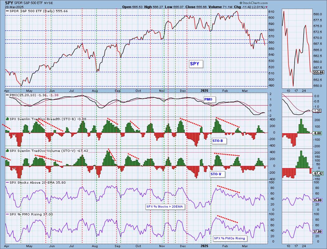
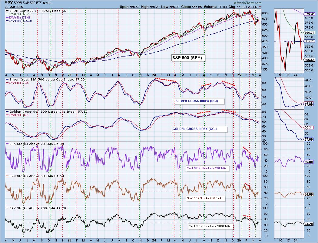
The Silver Cross Index measures the percentage of stocks holding Silver Crosses. The current percentage on the Silver Cross Index is just 37% so this tells us that 63% have bearish biases. This condition suggests to us that the market has more downside to absorb.
The Silver Cross Index was nearing a Bullish Shift across its signal line, but instead has topped. It is likely to continue declining given less stocks are above their 20/50-day EMAs versus the Silver Cross Index percentage.
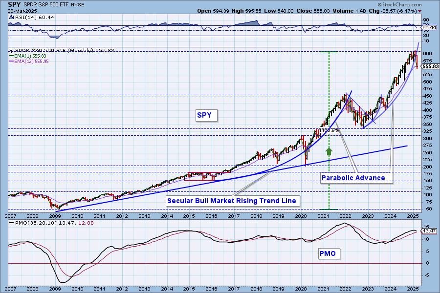
Participation measured by the percent of stocks above their key moving averages are all below our bullish 50% threshold. Stochastics have topped and the PMO topped Friday. The short-term rising trend has been broken. This looks like a textbook reverse flag formation that was confirmed with Friday's decline. The minimum downside target of the pattern would put price near 480. This sure has the earmarks of a failed bear market rally.
Conclusion: The Silver Cross Index is at a very low 37% and has now topped beneath its signal line. Participation, as measured by the %Stocks > 20/50EMAs, is mediocre at best and reading below the Silver Cross Index. This looks like the end of a bear market rally based on the bear flag that was confirmed on Friday.
The DecisionPoint Alert Weekly Wrap presents an end-of-week assessment of the trend and condition of the Stock Market, the U.S. Dollar, Gold, Crude Oil, and Bonds. The DecisionPoint Alert daily report (Monday through Thursday) is abbreviated and gives updates on the Weekly Wrap assessments.
Watch the latest episode of DecisionPoint on our YouTube channel here!
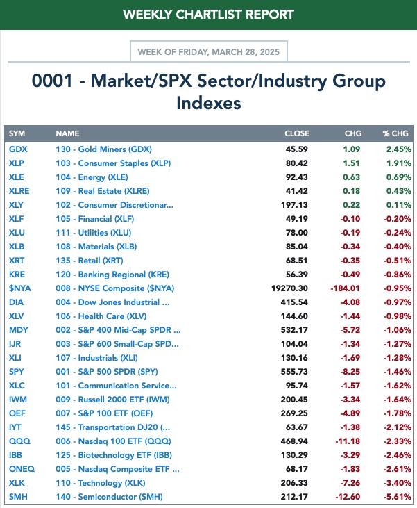
MARKET/SPX SECTOR/INDUSTRY GROUP INDEXES
Change Today: 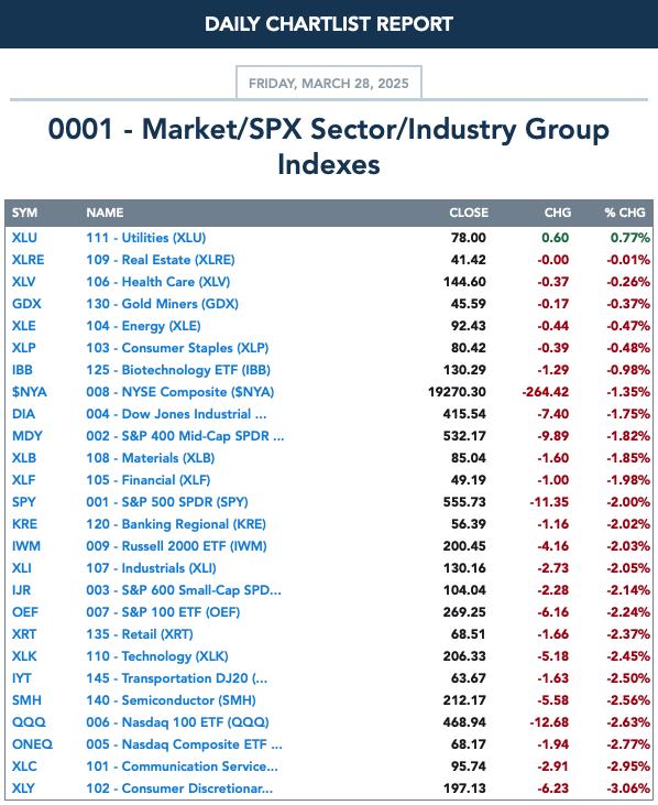
Change for the Week:
CLICK HERE for Carl's annotated Market Index, Sector, and Industry Group charts.
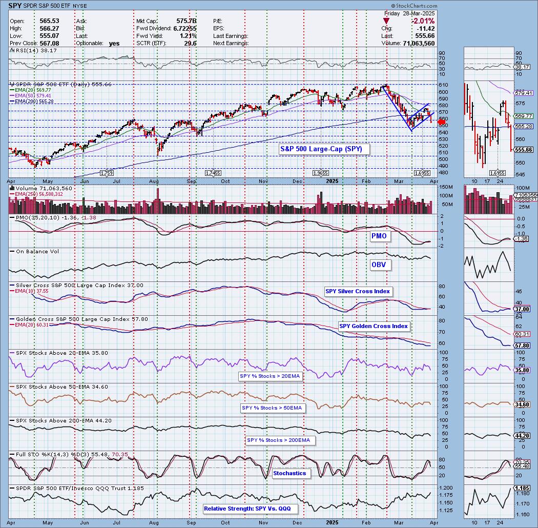
THE MARKET (S&P 500)
IT Trend Model: NEUTRAL as of 3/4/2025
LT Trend Model: BUY as of 3/29/2023
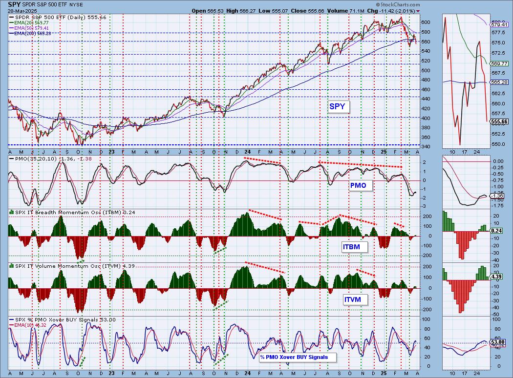
SPY 10-Minute Chart: Price dove lower on the open but did seem to find some support to end the day. We do see that the 10-minute PMO is back on the rise, but it is below the zero line so we may not get much out of it. Stochastics turned up but are still in negative territory.
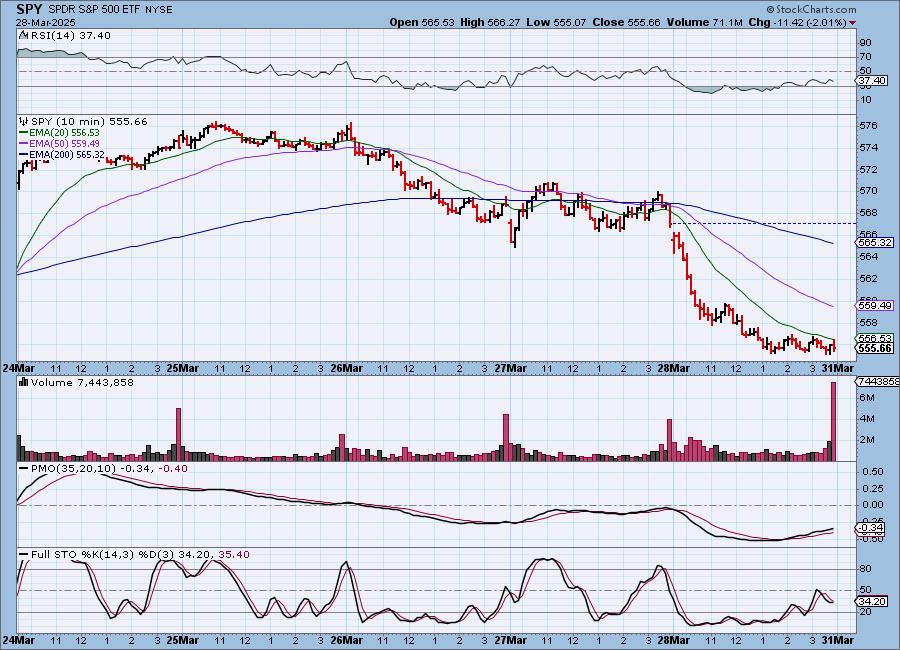
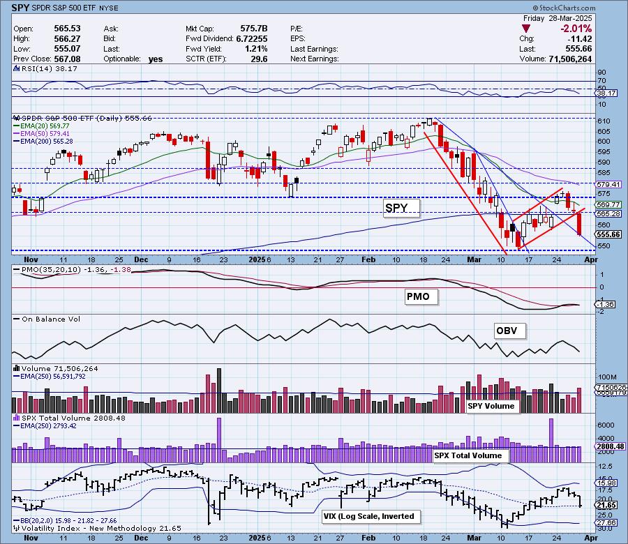
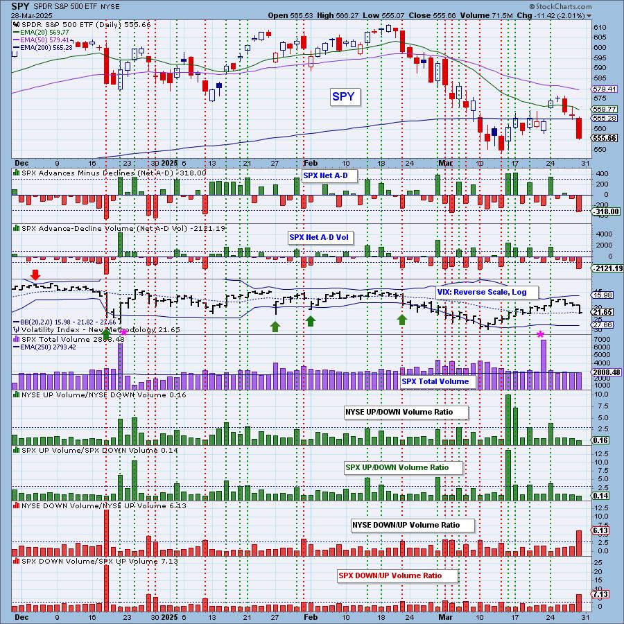
SPY Daily Chart: We have a confirmed bear flag on the SPY. It was confirmed by today's decline out of the formation. Price is about ready to drop back in the prior declining trend. The PMO has now topped and is very close to a Crossover SELL Signal.
The VIX nearly dropped below its moving average on the inverted scale and that does signify weakness. Stochastics have topped and are headed lower toward negative territory. Note that mega-caps are currently underperforming equal-weight RSP and that always spells trouble for the market.

Here is the latest recording from 3/24. Click HERE to get the link to video library.
SPY Weekly Chart: Price broke down from the bearish rising wedge that defines the bull market rally. There is a double top formation that does imply more downside. Price is below the 43-week EMA and the weekly PMO is declining rapidly.
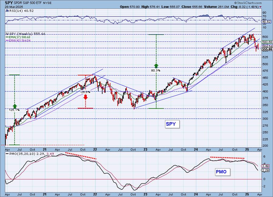
SPY Monthly Chart: This chart suggests to us that we are indeed in a bear market move. Price has broken down out of the parabolic advance. It closed beneath the 12-month EMA. The monthly PMO has also topped in response to the breakdown. Maybe we get lucky with high level consolidation out of this formation. It doesn't look very good though.
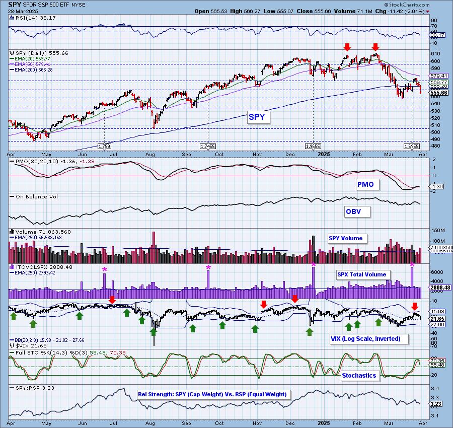
New 52-Week Highs/Lows: New Lows expanded greatly on today's big decline. New Highs were still prevalent but did contract. The High-Low Differential looks as though it wants to top.
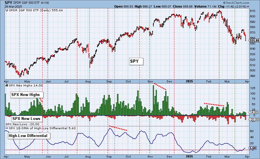
Climax Analysis: Today there were four strong climax readings on the four relevant indicators, giving us a downside initiation climax. SPX Total Volume was solid, but nowhere near blowout levels.
*A climax is a one-day event when market action generates very high readings in, primarily, breadth and volume indicators. We also include the VIX, watching for it to penetrate outside the Bollinger Band envelope. The vertical dotted lines mark climax days -- red for downside climaxes, and green for upside. Climaxes are at their core exhaustion events; however, at price pivots they may be initiating a change of trend.
Short-Term Market Indicators: The short-term market trend is DOWN and the condition is NEUTRAL.
It's hard to tell, but the Swenlin Trading Oscillator for Breadth (STO-B) moved lower and below the zero line. The Swenlin Trading Oscillator for Volume (STO-V) also hit negative territory today. They look bearish indeed. Participation was much lower as more stocks lost support at their 20-day EMAs. Rising PMOs were decimated today moving that percentage well below our bullish 50% threshold.
Intermediate-Term Market Indicators: The intermediate-term market trend is DOWN and the condition is NEUTRAL.
Given we now have a top beneath a top, we are marking the intermediate-term trend as "down" today. Both the ITBM and ITVM are moving lower suggesting this decline could get ugly. %PMO Xover BUY Signals turned down today and will continue lower given only 37% have rising PMOs.
_______
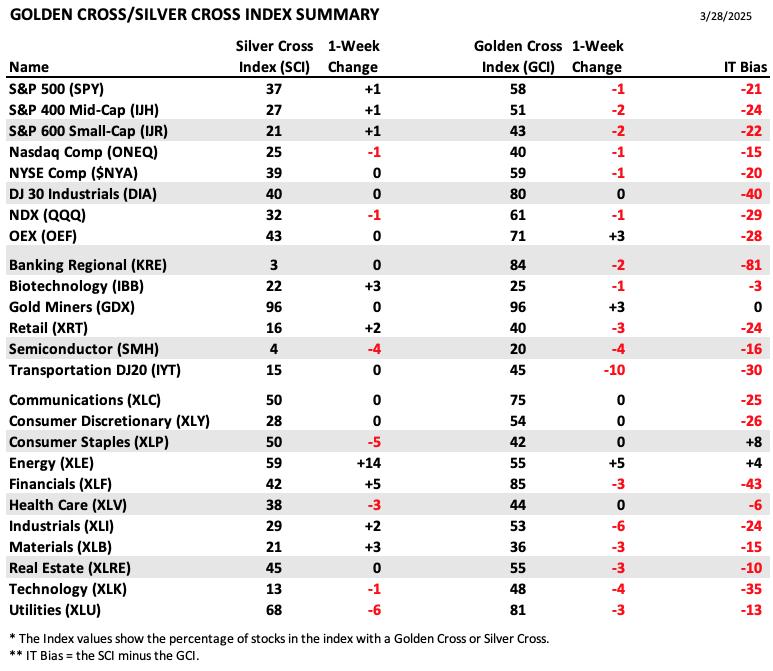
PARTICIPATION TABLES: The following tables summarize participation for the major market indexes and sectors. The 1-Week Change columns inject a dynamic aspect to the presentation. There are three groups: Major Market Indexes, Miscellaneous Industry Groups, and the 11 S&P 500 Sectors.
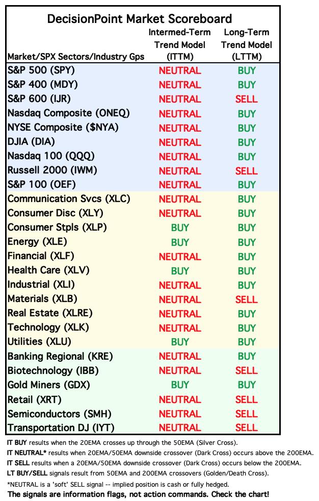
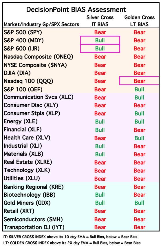
Nearly all IT Biases are listed in the red. This is due to the SCI readings being below GCI readings. The former strong foundation is still holding up based on the GCI, but near-term weakness has taken SCI readings lower.
Consumer Staples (XLP) holds the highest IT Bias and looking at its chart, it does appear this defensive sector will start to outperform again as the market weakens.
Regional Banks (KRE) hold the lowest IT Bias as they have been creamed near-term which pushed the SCI reading to a very low 3%.
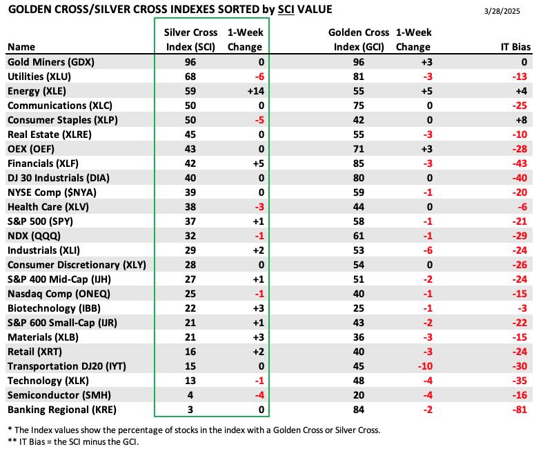
This table is sorted by SCI values. This gives a clear picture of strongest to weakest index/sector in terms of intermediate-term participation.
Gold Miners (GDX) are showing incredible strength as it they hold the highest SCI value by a mile. The market is clearly unhealthy given the highest from there is only 68%.
Energy gained an incredible 14 points on the SCI this week. They are beginning to pull back right now, so this SCI reading seems to be late to the party.
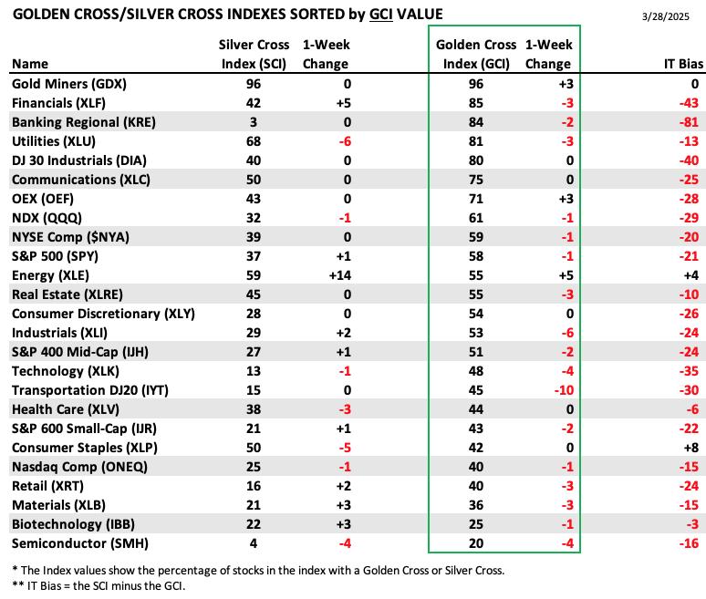
This table is sorted by GCI values. This gives a clear picture of strongest to weakest index/sector in terms of long-term participation.
GDX also holds the highest GCI reading which isn't surprising given their incredible run higher. They are showing significant strength and will likely continue to given the strength of Gold right now.
Semiconductors (SMH) hold the lowest GCI reading. They continue to lose important support levels and they also lost more SCI and GCI points this week. They are still weakening based on both the SCI and GCI.
PARTICIPATION CHART (S&P 500): The following chart objectively shows the depth and trend of participation for the SPX in two time frames.
- Intermediate-Term - the Silver Cross Index (SCI) shows the percentage of SPX stocks on IT Trend Model BUY signals (20-EMA > 50-EMA). The opposite of the Silver Cross is a "Dark Cross" -- those stocks are, at the very least, in a correction.
- Long-Term - the Golden Cross Index (GCI) shows the percentage of SPX stocks on LT Trend Model BUY signals (50-EMA > 200-EMA). The opposite of a Golden Cross is the "Death Cross" -- those stocks are in a bear market.
The market bias is BEARISH in the intermediate and long terms.
We thought we'd be writing about a new Bullish Shift on the Silver Cross Index but instead it topped. Participation is bleeding out of the market right now. The Silver Cross Index is below its signal line so the IT Bias is BEARISH. The Golden Cross Index continues lower and is also below its signal line so the LT Bias is also BEARISH.
BIAS Assessment: The following table expresses the current BIAS of various price indexes based upon the relationship of the Silver Cross Index to its 10-day EMA (intermediate-term), and of the Golden Cross Index to its 20-day EMA (long-term). When the Index is above the EMA it is bullish, and it is bearish when the Index is below the EMA. The BIAS does not imply that any particular action should be taken. It is information to be used in the decision process.
The items with highlighted borders indicate that the BIAS changed today.
*****************************************************************************************************
CONCLUSION: Today's confirmed bear flag formation tells us to expect lower prices next week. Weekend chatter like we saw last weekend on "narrowing" tariffs could prevent a strong decline, but we don't think so. Tariffs will hit home next week and will likely shake up the market. All of our primary indicators including the PMO and Stochastics are headed lower. We have a downside initiation climax today that also tells us to expect lower prices ahead. We don't see much for the bulls to hang their hat on right now. Maybe it would be that we are still seeing some New Highs or that the High-Low Differential is rising, but both those indicators aren't reading at high levels. Best to prepare for more downside next week.
Erin is 15% long, 0% short. (This is intended as information, not a recommendation.)
*****************************************************************************************************
CALENDAR
Have you subscribed the DecisionPoint Diamonds yet? DP does the work for you by providing handpicked stocks/ETFs from exclusive DP scans! Add it with a discount! Contact support@decisionpoint.com for more information!
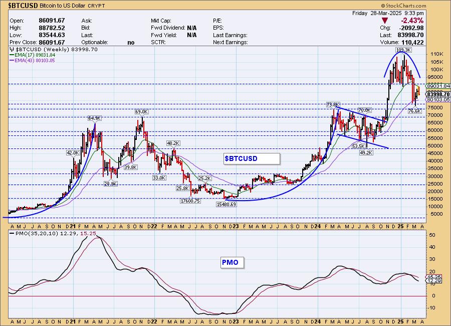
BITCOIN
Bitcoin Daily Chart: Bitcoin was making its way out of the declining trend, or at least it was trying to. Now the rising trend is in jeopardy and the PMO has topped. Stochastics have also turned down in a hurry. We would look for lower prices ahead for Bitcoin. It is especially bearish that it has topped before testing the declining tops trendline.
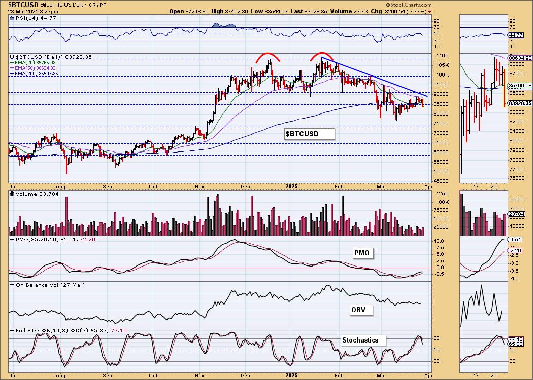
Bitcoin Weekly Chart: This was a great place to see Bitcoin bounce, but as noted above the rally is beginning to fade. The weekly PMO is still headed lower. We think that support at 75,000 looks strong, but resistance at 90,000 looks very strong too. Look for price to consolidate in this channel.
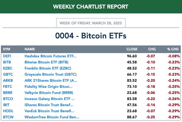
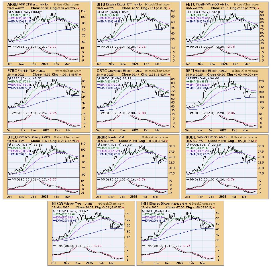
BITCOIN ETFs
Today:
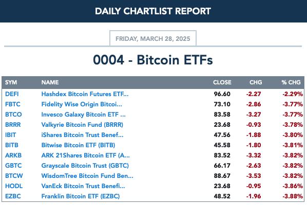
This Week:
INTEREST RATES
We're still somewhat bullish on long-term yields given the rising trends, but the 10-year yield chart does have us wondering if they will rise much further. Short-term yields are consolidating sideways and at this point we expect that to continue.
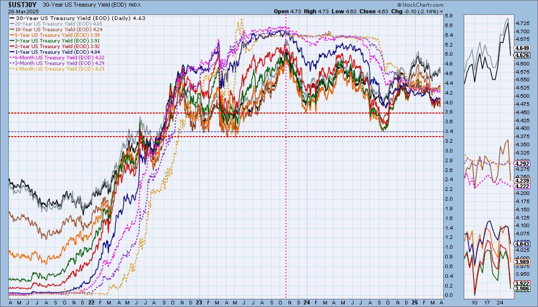
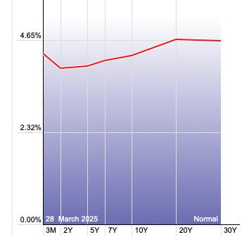
The Yield Curve Chart from StockCharts.com shows us the inversions taking place. The red line should move higher from left to right. Inversions are occurring where it moves downward.
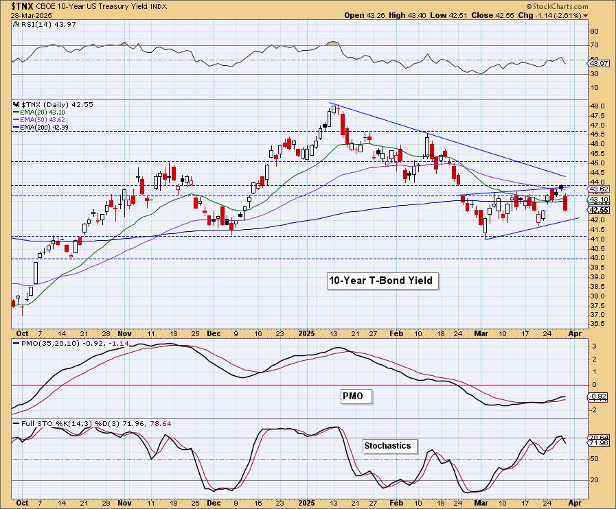
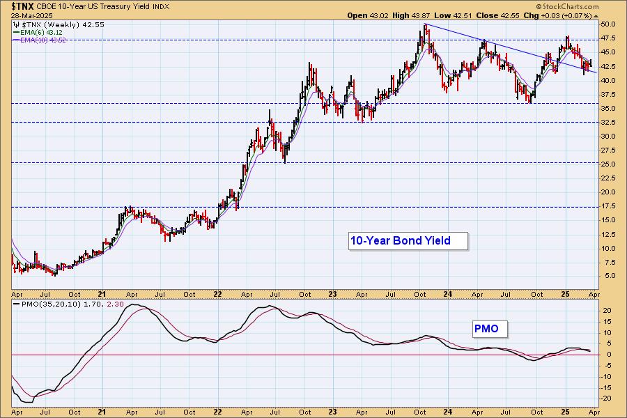
10-YEAR T-BOND YIELD
$TNX dove lower and is now close to the bottom of a bearish rising wedge. The pattern suggests we'll get a breakdown there. The PMO has topped as have Stochastics. The declining trend is still holding up as well. $TNX did not reach that declining tops trendline before turning back down and that is also bearish.
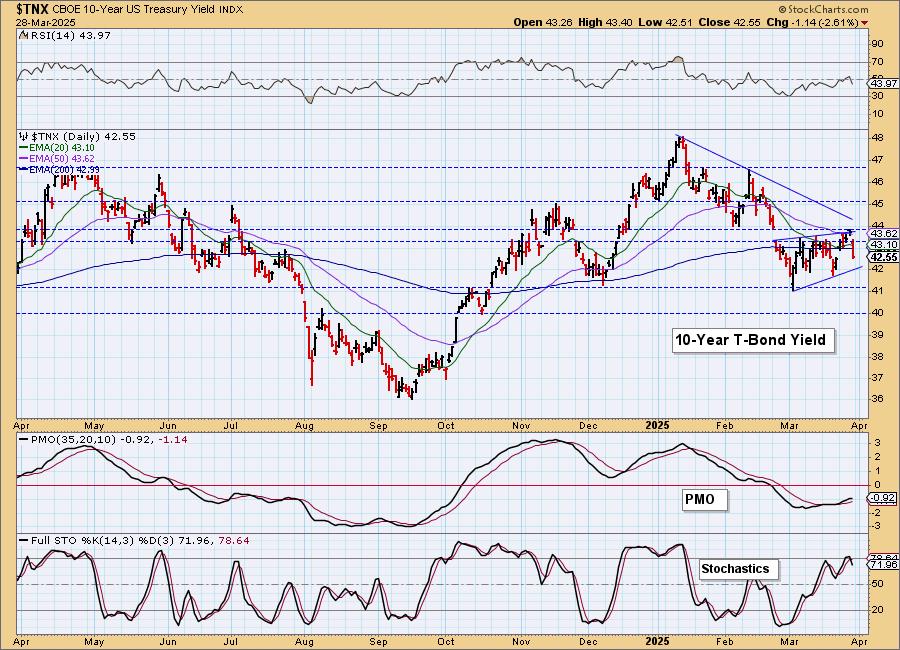
10-Year Bond Yield Weekly Chart: Ultimately the yield is in a sideways trading range. It does look like it could be headed lower to test the bottom of the range. It could also be in the process of creating a bearish head and shoulders top. The weekly PMO is on a Crossover SELL Signal.
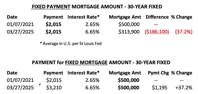
MORTGAGE INTEREST RATES (30-Yr)**
**We watch the 30-Year Fixed Mortgage Interest Rate, because, for the most part, people buy homes based upon the maximum monthly payment they can afford. As rates rise, a fixed monthly payment will carry a smaller mortgage amount, which shuts many buyers out of the market, and potential sellers will experience pressure to lower prices (to no effect so far).
--
This week the 30-Year Fixed Rate changed from 6.67 to 6.65.
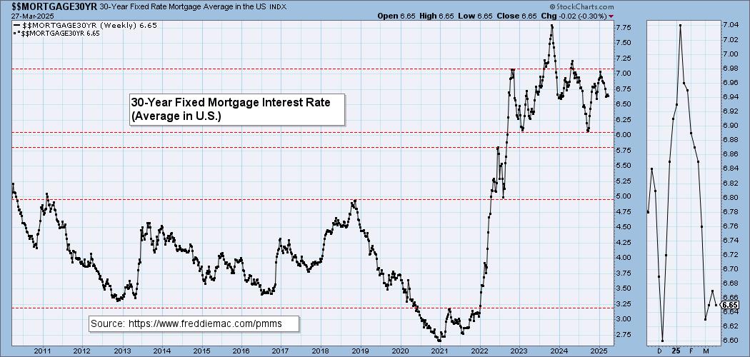
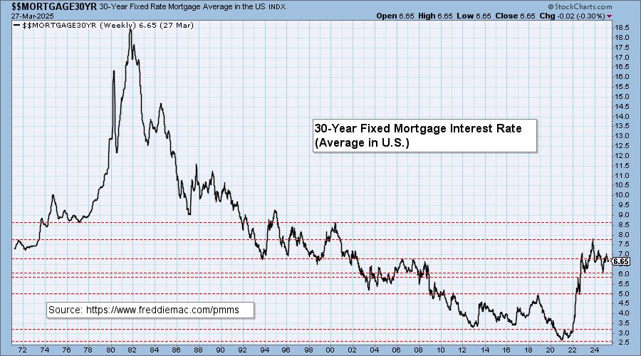
Here is a 50-year chart for better perspective.
BONDS (TLT)
IT Trend Model: BUY as of 2/25/2025
LT Trend Model: SELL as of 12/13/2024
TLT Daily Chart: We're starting to think that the handle on this bullish cup with handle pattern has simply extended so we do have a bullish appearance in the intermediate term. However, there is still a bearish double top within the handle that is annotated on the second chart below. With yields looking more bearish again, we think that the cup with handle pattern will win out and we'll see an upside breakout. The RSI just moved into positive territory and the PMO is rising again.
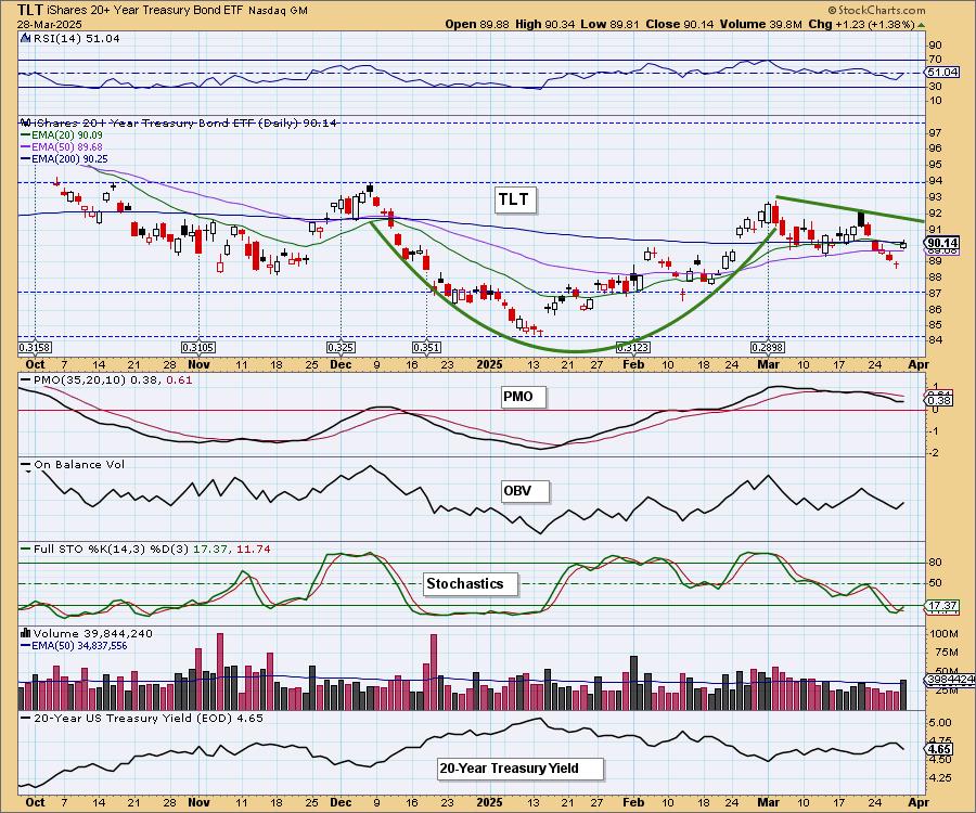
There's the double top that could become a problem. For now, we will look for higher prices.
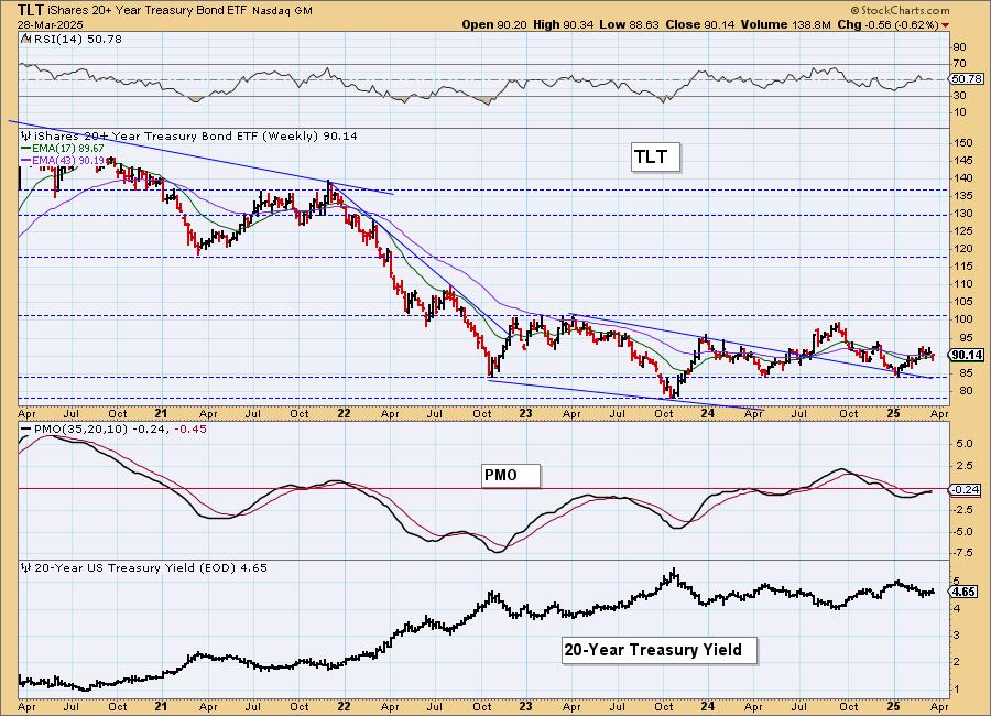
TLT Weekly Chart: Price bounced off support and does look like it could start making its way higher again as the weekly PMO is still rising on a Crossover BUY Signal. It is flattening out though so maybe we'll see more sideways type movement out of yields and Bonds coming up.
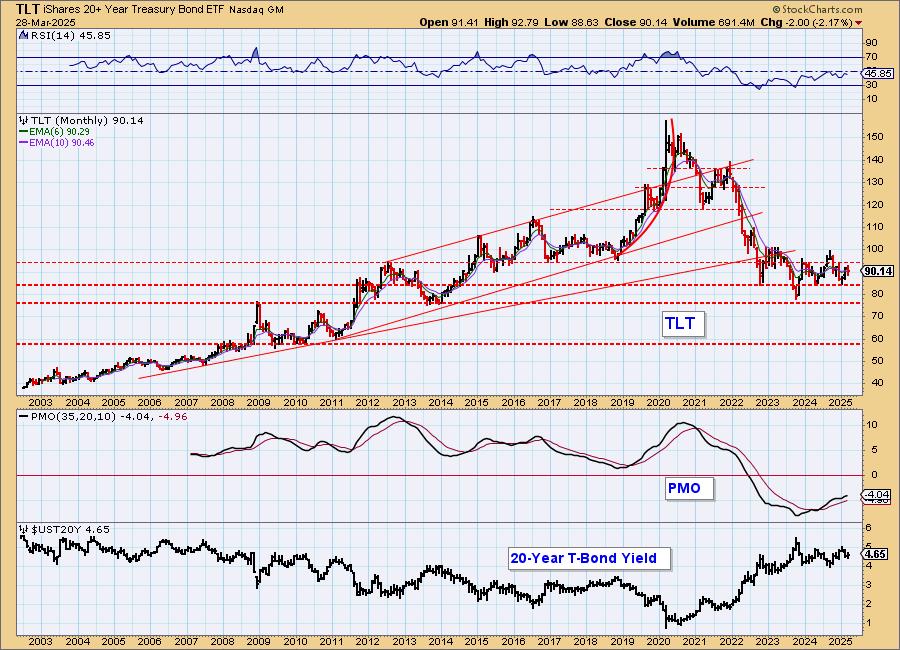
TLT Monthly Chart: This looks like a good bottoming formation on the monthly chart. The monthly PMO is rising on a Crossover BUY signal so long-term we should see Bonds rise higher.
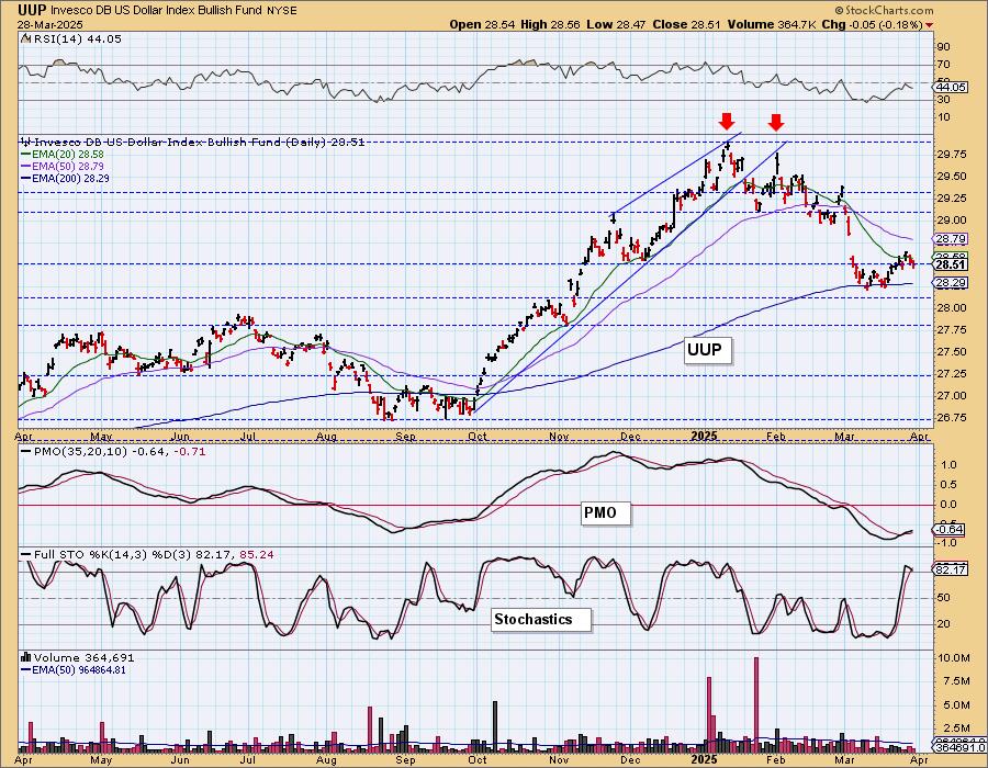
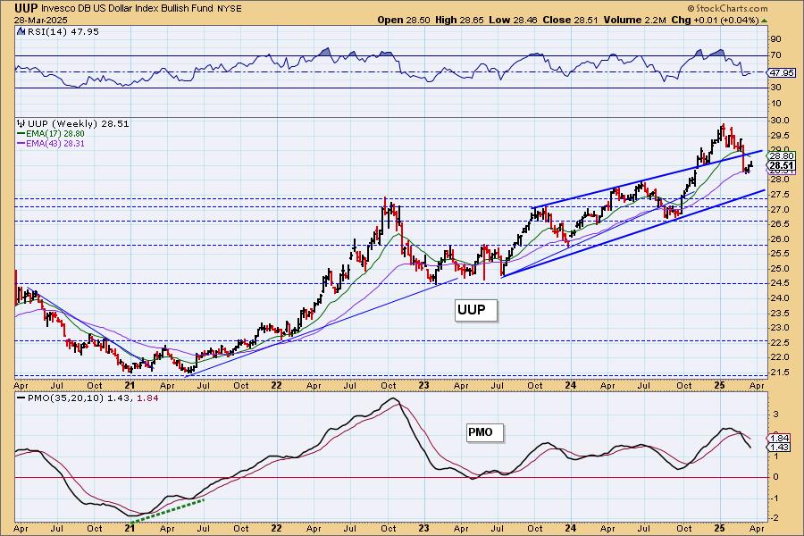
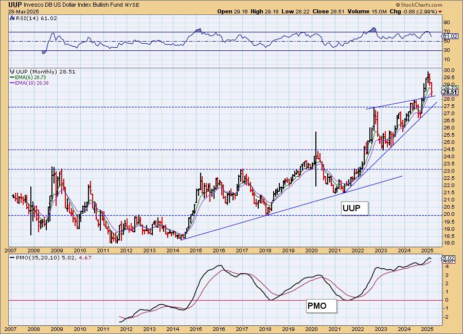
DOLLAR (UUP)
IT Trend Model: NEUTRAL as of 3/5/2025
LT Trend Model: BUY as of 5/25/2023
UUP Daily Chart: The Dollar was looking pretty good to start the week, but the rally is now failing. The RSI is now negative again and Stochastics have topped. We would say that the PMO is flashing diminishing weakness not new strength so we would look for sideways movement above the 200-day EMA for now. It doesn't look like this is the beginning of a good rally anymore.
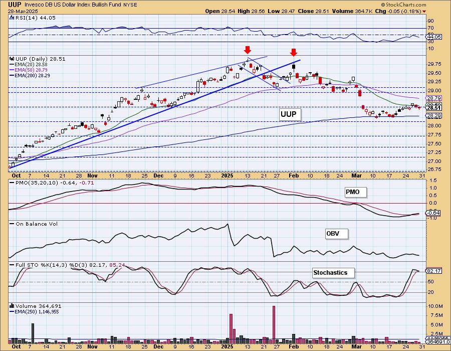
We had a small double bottom formation. The height was small so this last little rally essentially hit the upside target.
UUP Weekly Chart: We had a very bullish breakout from a bearish rising wedge, but price has retreated back into the pattern. The weekly PMO is falling fast suggesting we will see more downside on the Dollar in the intermediate term.
UUP Monthly Chart: This is a strong breakdown on the monthly chart. The monthly PMO has now topped. We would look for the long-term rising trend to be tested.
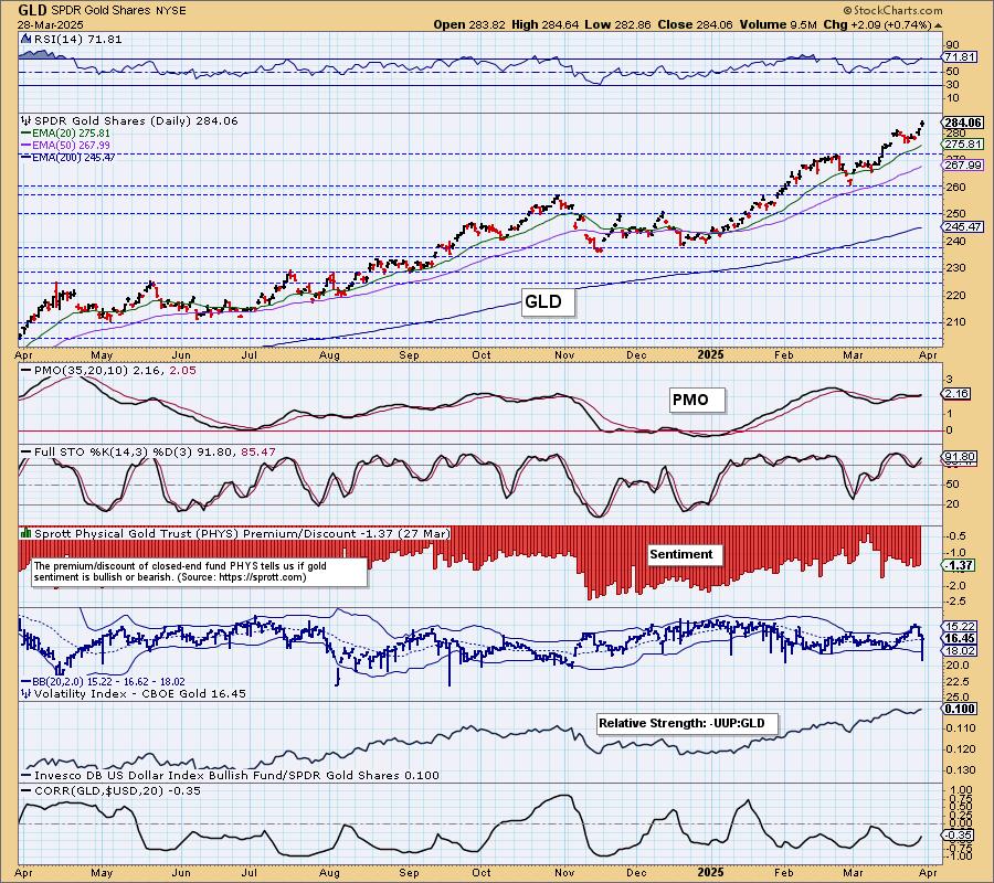
GOLD
IT Trend Model: NEUTRAL as of 12/23/2024
LT Trend Model: BUY as of 10/20/2023
GLD Daily Chart: We had another fresh all-time high on Gold. With market so weak it appears that investors are rightly moving to the store of value of Gold rather than Bitcoin which we had seen previously. The fundamentals and technicals are very strong for Gold right now. One problem would be an overbought RSI, but we would point you to early February where Gold stayed overbought for weeks. The PMO is rising again.
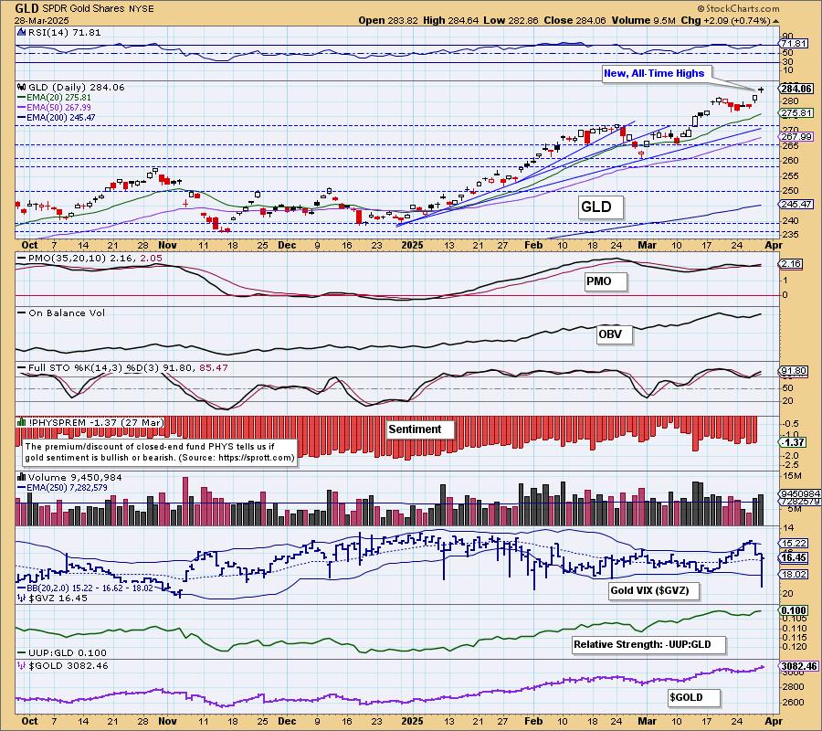
The Gold volatility index ($GVZ) saw a puncture of the lower Bollinger Band and that can often times lead to higher prices. We also have Gold's rising relative strength to the Dollar. The Dollar looks weak right now and that will also work in Gold's favor.
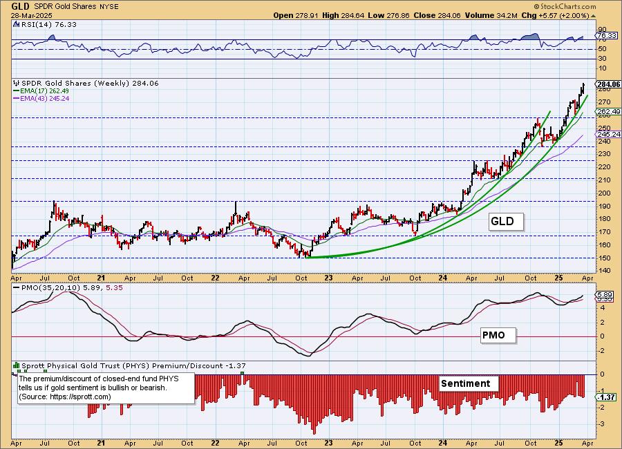
GLD Weekly Chart: We do see a bearish parabolic advance on Gold that does tell us to look for an upcoming breakdown, but the rally isn't completely vertical yet and even if Gold does fall out of the parabola, we expect it to be more of a consolidation or small pullback like we saw last time.
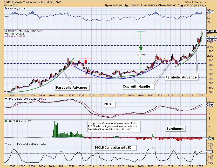
GLD Monthly Chart: The rally looks more vertical on the monthly chart, but we think it will hold up longer. The monthly RSI is completely overbought, but again it isn't out of the question that it can hold that condition longer. We are aware of these parabolic arcs, but at this point Gold just looks too good to look for a correction.
GOLD MINERS Daily Chart: Gold Miners didn't enjoy a rally today even with Gold being up. We think all of the selling in the market in general caused the problem. We still see more upside to go on GDX. The RSI is not yet overbought and participation while it took a bit of hit today, is still extremely strong. Gold looks great too so we have to expect more upside ahead. The market's troubles could put downside pressure on the group, but support isn't far away and should hold barring a big decline in Gold.
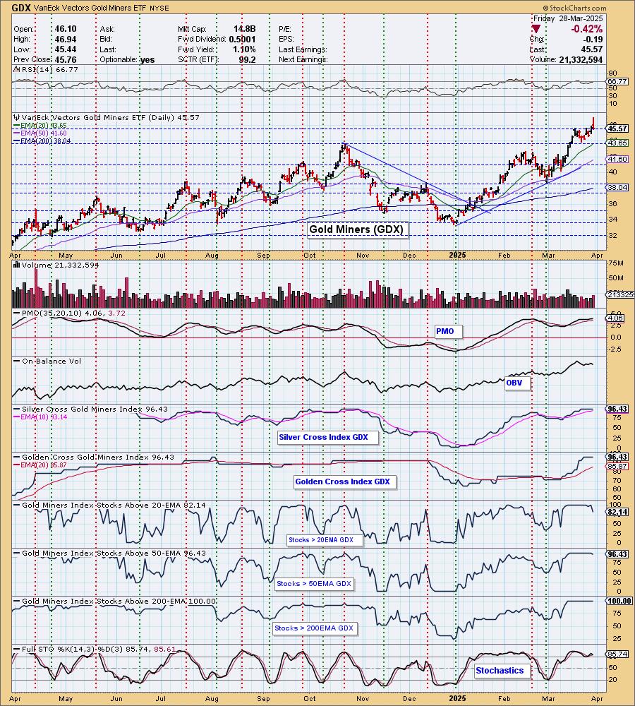
GDX Weekly Chart: We have a very bullish breakout from a long-term trading range. The weekly PMO is rising on a Crossover BUY Signal well above the zero line. The worst we can say is that we have a near vertical rally that does beg for a correction, but as noted above with Gold looking so bullish, we don't expect to get much downside on Gold Miners.

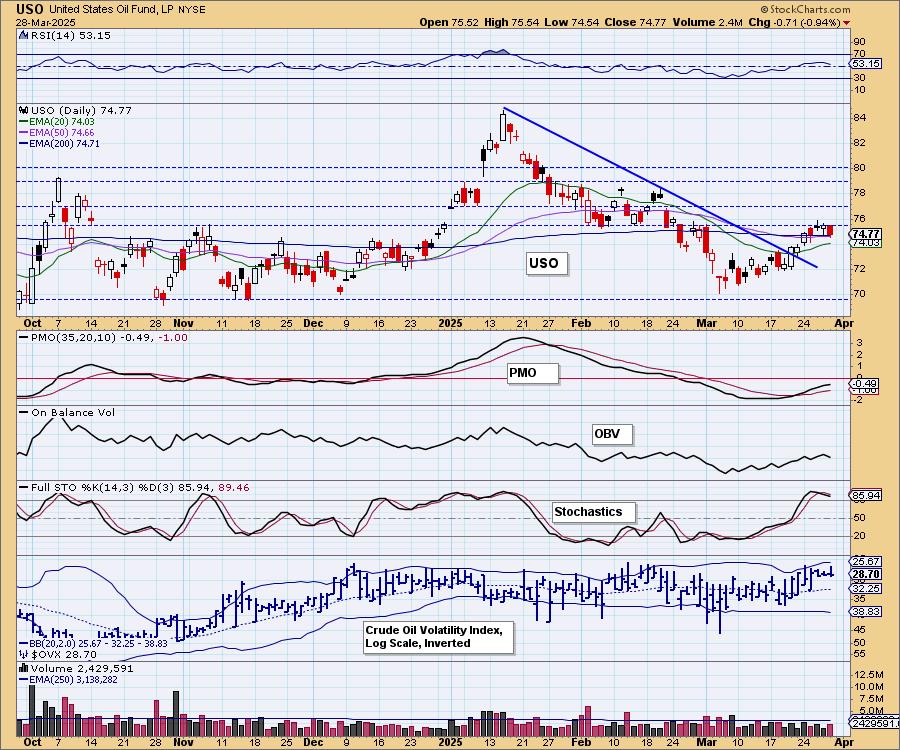
CRUDE OIL (USO)
IT Trend Model: NEUTRAL as of 2/27/2025
LT Trend Model: SELL as of 3/18/2025
USO Daily Chart: Crude Oil looks fairly bullish but it is now having trouble getting over resistance. The PMO is still rising and Stochastics are holding above 80 so we will look for a breakout here.
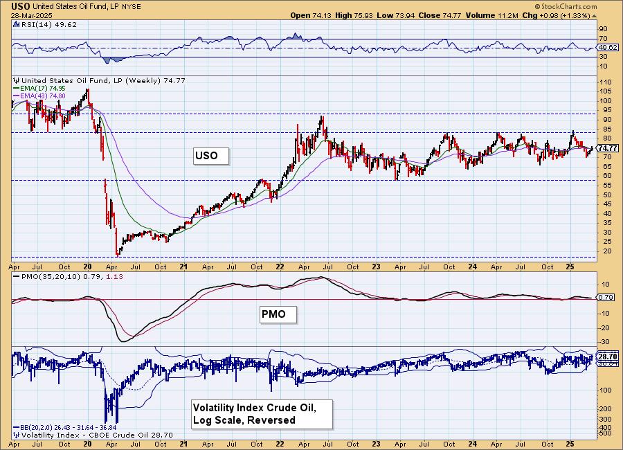
USO/$WTIC Weekly Chart: We have a long-term trading range on the weekly chart and we don't see anything on the charts to tell us that it will change. It appears price is ready to go test the top of the range again. The weekly PMO is rather unhelpful as it is so flat, but it is currently below the signal line.
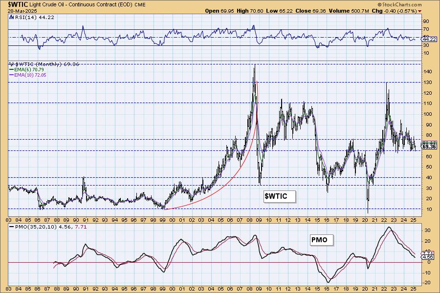
WTIC Monthly Chart: Support is holding on the monthly chart, but the monthly PMO is very negative and it does suggest that a breakdown in the long term seems likely. The administration will be working overtime soon to bring energy prices down so expecting a long-term breakdown is prudent.
Good Luck & Good Trading!
Erin Swenlin and Carl Swenlin
Technical Analysis is a windsock, not a crystal ball. --Carl Swenlin
(c) Copyright 2025 DecisionPoint.com
Disclaimer: This blog is for educational purposes only and should not be construed as financial advice. The ideas and strategies should never be used without first assessing your own personal and financial situation, or without consulting a financial professional. Any opinions expressed herein are solely those of the author, and do not in any way represent the views or opinions of any other person or entity.
DecisionPoint is not a registered investment advisor. Investment and trading decisions are solely your responsibility. DecisionPoint newsletters, blogs or website materials should NOT be interpreted as a recommendation or solicitation to buy or sell any security or to take any specific action.
NOTE: The signal status reported herein is based upon mechanical trading model signals, specifically, the DecisionPoint Trend Model. They define the implied bias of the price index based upon moving average relationships, but they do not necessarily call for a specific action. They are information flags that should prompt chart review. Further, they do not call for continuous buying or selling during the life of the signal. For example, a BUY signal will probably (but not necessarily) return the best results if action is taken soon after the signal is generated. Additional opportunities for buying may be found as price zigzags higher, but the trader must look for optimum entry points. Conversely, exit points to preserve gains (or minimize losses) may be evident before the model mechanically closes the signal.
Helpful DecisionPoint Links:
DecisionPoint Alert Chart List
DecisionPoint Golden Cross/Silver Cross Index Chart List
DecisionPoint Sector Chart List
Price Momentum Oscillator (PMO)