
One thing to understand about sentiment measures is that they are contrarian. If investors are too bullish or too bearish, everyone has jumped on the bandwagon and now it is time for the wheels to fall off. Right now we are seeing extraordinarily bearish sentiment coming out of the American Association of Individual Investors (AAII).
We have well over 50% of participants bearish on the market. As you can see that is a comparatively high reading, something we don't see very often. This has brought the Bull/Bear Ratio down to 0.34! That is extremely low!
What does this mean? It means we may be arriving at an inflection point. You can see from past readings how the market does tend to turn back up when sentiment gets too bearish. Could this be what is setting up after the big declines that we've seen on the major indexes?
We do think that we'll see some upside next week after Friday's comeback rally and the fact that price is now sitting on important support and reversing. However, we don't think that this pullback, almost correction, is over. There is still too much confusion and uncertainty over tariff talks and geopolitical concerns. The market hates uncertainty.
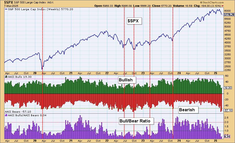
Conclusion: We have bearish extremes being hit on the AAII sentiment chart that does imply that we could see an upcoming rally. However, we don't believe it will amount to much given the overall geopolitical environment. The market is still highly overvalued and that is a problem too.
The DecisionPoint Alert Weekly Wrap presents an end-of-week assessment of the trend and condition of the Stock Market, the U.S. Dollar, Gold, Crude Oil, and Bonds. The DecisionPoint Alert daily report (Monday through Thursday) is abbreviated and gives updates on the Weekly Wrap assessments.
Watch the latest episode of DecisionPoint on our YouTube channel here!
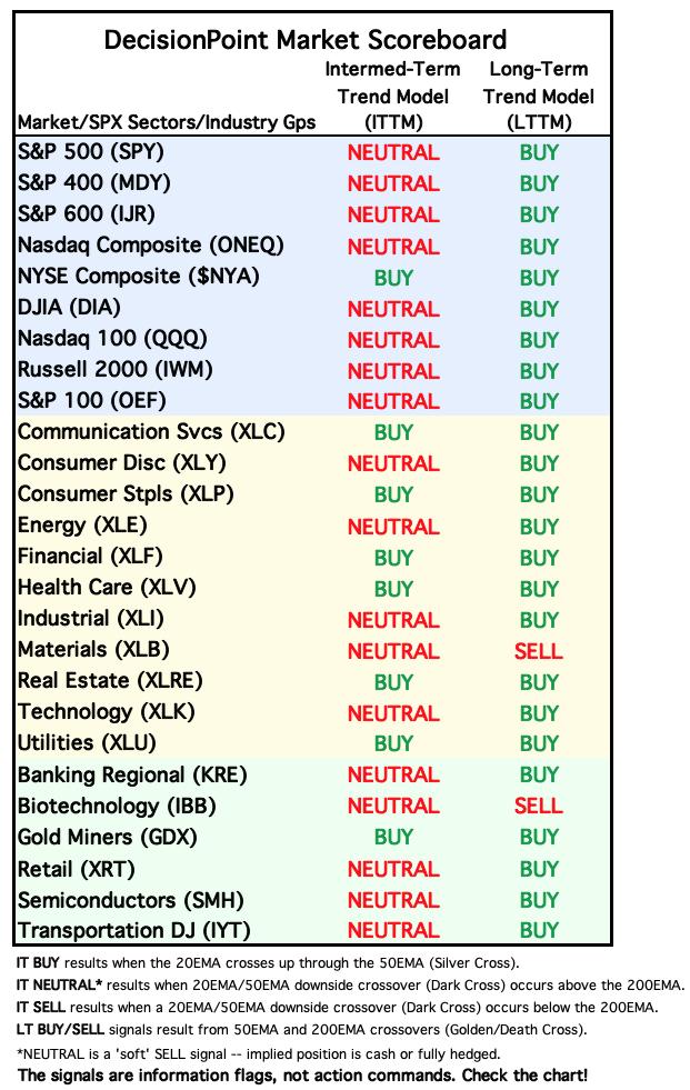
MARKET/SPX SECTOR/INDUSTRY GROUP INDEXES
Change Today: 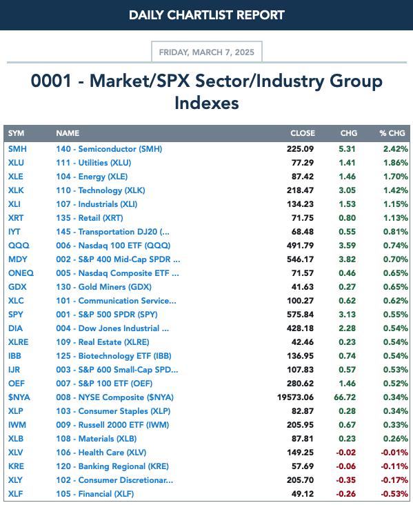
Change for the Week:
CLICK HERE for Carl's annotated Market Index, Sector, and Industry Group charts.
THE MARKET (S&P 500)
IT Trend Model: NEUTRAL as of 3/4/2025
LT Trend Model: BUY as of 3/29/2023
SPY 10-Minute Chart: The market had a difficult morning, but by lunch the tables had turned and we saw a nice rally to bring price back into positive territory. We could see some followthrough based on the surge by the 10-minute PMO to end the day. However, Stochastics are falling so it's not a sure thing.
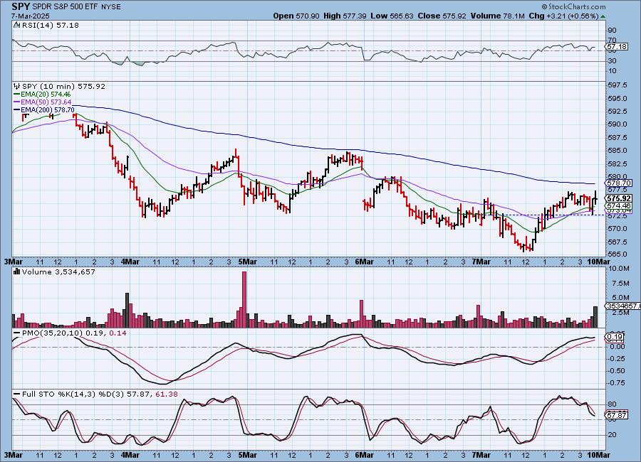
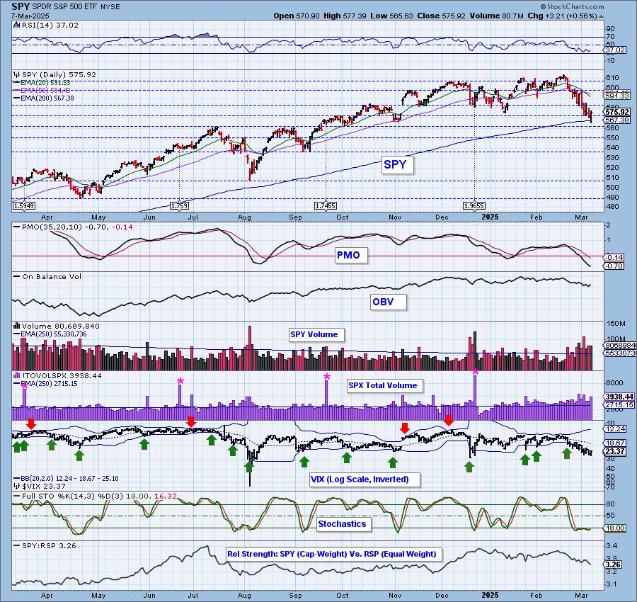
SPY Daily Chart: Price has now hit strong support at the November low and the 200-day EMA. It managed to close above both. The PMO is still declining and the RSI is still negative so there is work to do.
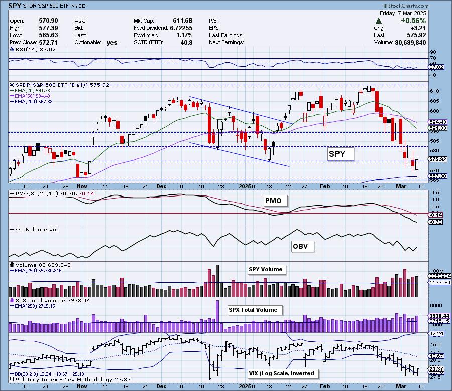
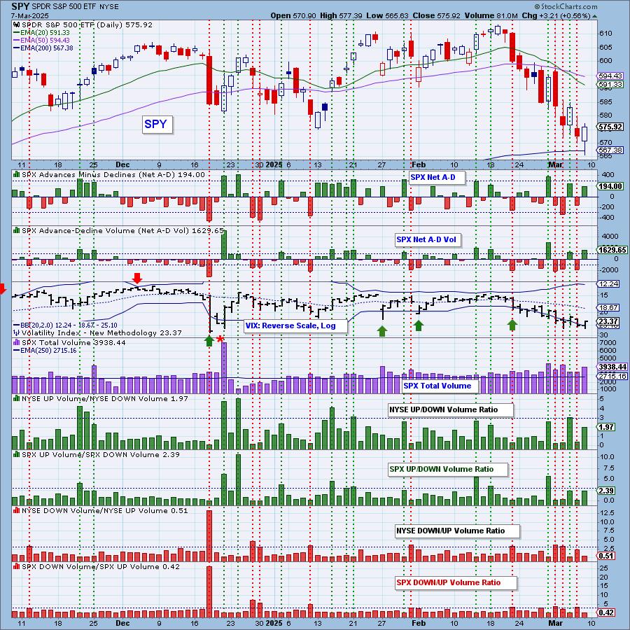
The VIX has hit oversold territory and continues to puncture its lower Bollinger Band on the inverted scale. This calls for an upside reversal. Stochastics however are still below 20 which is a sign of severe internal weakness so any upside will likely be short lived. The relative strength line to equal-weight RSP continues to decline and that will continue to pose problems for the index.

Here is the latest recording from 3/3. Click HERE to get the link to video library.
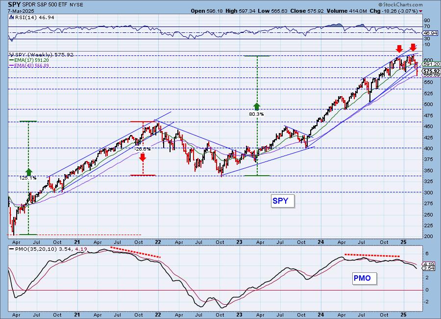
SPY Weekly Chart: The decline has now broken two rising bottoms trendlines. It has reached support at the 43-week EMA, but that bearish double top looks ominous for the intermediate term.
New 52-Week Highs/Lows: New Highs and New Lows were even on the day. We like seeing more New Highs on the rally. Unfortunately, the High-Low Differential continues lower in bearish fashion.
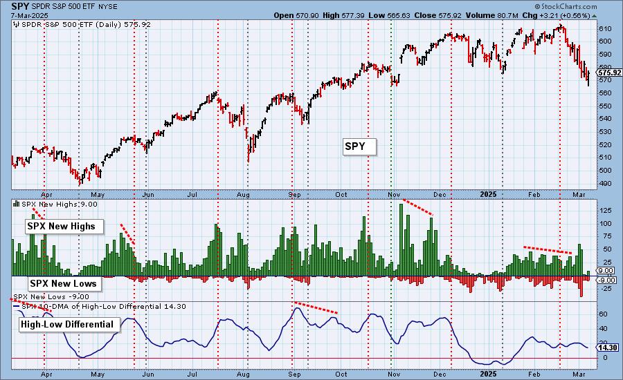
Climax Analysis: There was only one climax reading among the four relevant indicators, so we don't have a climax day.
*A climax is a one-day event when market action generates very high readings in, primarily, breadth and volume indicators. We also include the VIX, watching for it to penetrate outside the Bollinger Band envelope. The vertical dotted lines mark climax days -- red for downside climaxes, and green for upside. Climaxes are at their core exhaustion events; however, at price pivots they may be initiating a change of trend.
Short-Term Market Indicators: The short-term market trend is DOWN and the condition is NEUTRAL.
Both Swenlin Trading Oscillators (STOs) turned down in spite of the rally today. That we definitely don't like. As we've been saying though, these indicators have been choppy and so we need to take their directional moves with a grain of salt. Participation did expand but remains below our bullish 50% threshold. We got more rising PMOs but the percentage is still under 50%. Declining trends continue on both those indicators.
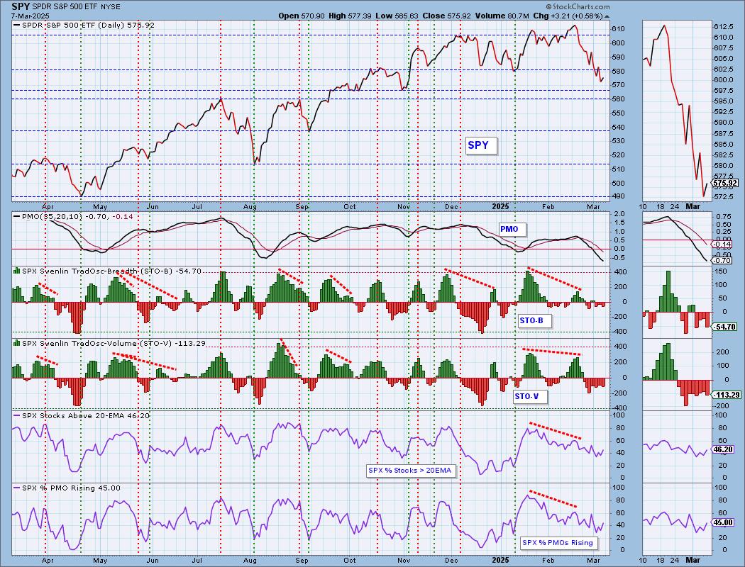
Intermediate-Term Market Indicators: The intermediate-term market trend is DOWN and the condition is NEUTRAL.
Both the ITBM and ITVM declined all week long. The ITVM has even hit negative territory. We've switched the listing of the IT Trend to being "DOWN" since rising bottoms trendline has been violated. We did see a rise in the number of PMO BUY Signals. Given we have 45% with rising PMOs, that indicator should see more expansion next week.

_______
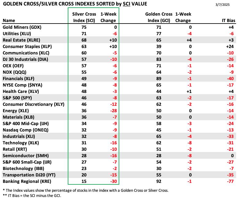
PARTICIPATION TABLES: The following tables summarize participation for the major market indexes and sectors. The 1-Week Change columns inject a dynamic aspect to the presentation. There are three groups: Major Market Indexes, Miscellaneous Industry Groups, and the 11 S&P 500 Sectors.
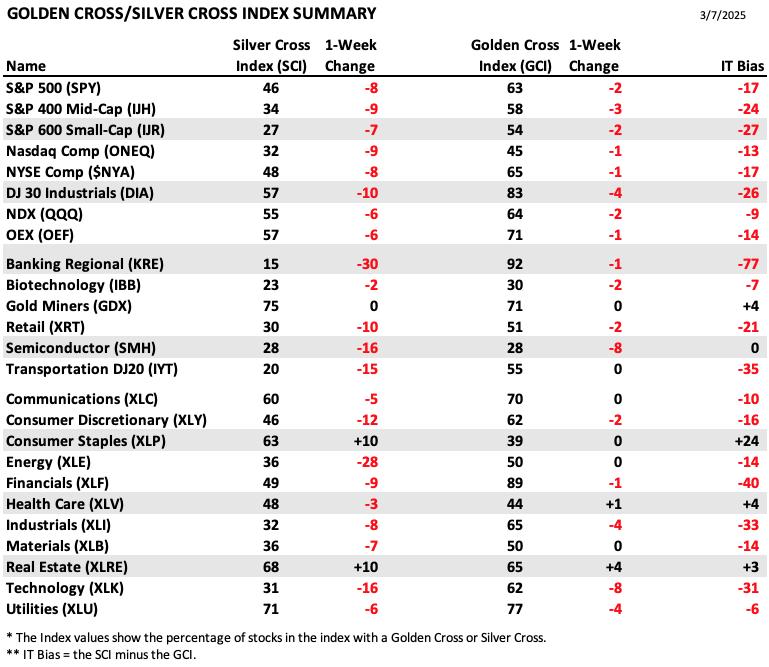
The majority of members have bearish IT Biases which is a symptom of the current decline.
Consumer Staples (XLP) has a very positive bias as it continues to see increases in the Silver Cross Index. That Index is higher than the Golden Cross Index which is why it has such a bullish bias.
Regional Banks (KRE) have a significant bearish bias right now. It had a great move in the long term which brought the Golden Cross Index to a very high level. However, now it is pulling back and has lost the most Silver Cross Index points as it suffers.
This table is sorted by SCI values. This gives a clear picture of strongest to weakest index/sector in terms of intermediate-term participation.
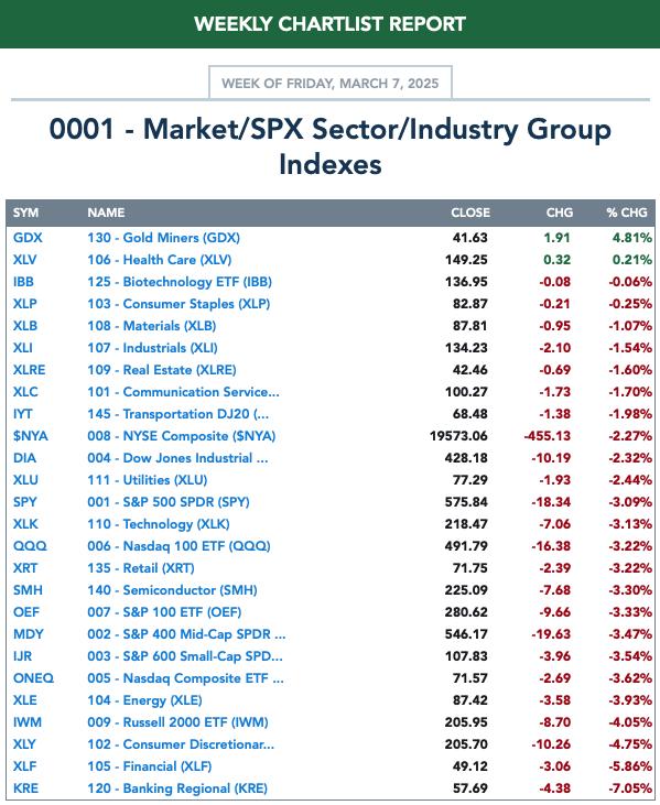
All but two members saw decreases to their Silver Cross Index with KRE losing the most.
Real Estate (XLRE) and Consumer Staples (XLP) have seen nice rising trends and that pushed up their SCI values.
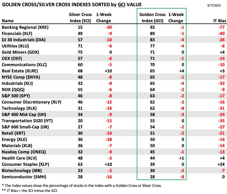
This table is sorted by GCI values. This gives a clear picture of strongest to weakest index/sector in terms of long-term participation.
Real Estate (XLRE) saw the most GCI points added, but we do note that the sector is pulling back somewhat right now.
Semiconductors (SMH) hold the lowest GCI value and they continued to lose a great deal of points this week just making matters worse for it. It lost 16 SCI points as well. Strong support was lost by this group and given these SCI and GCI values it is highly vulnerable to more decline.
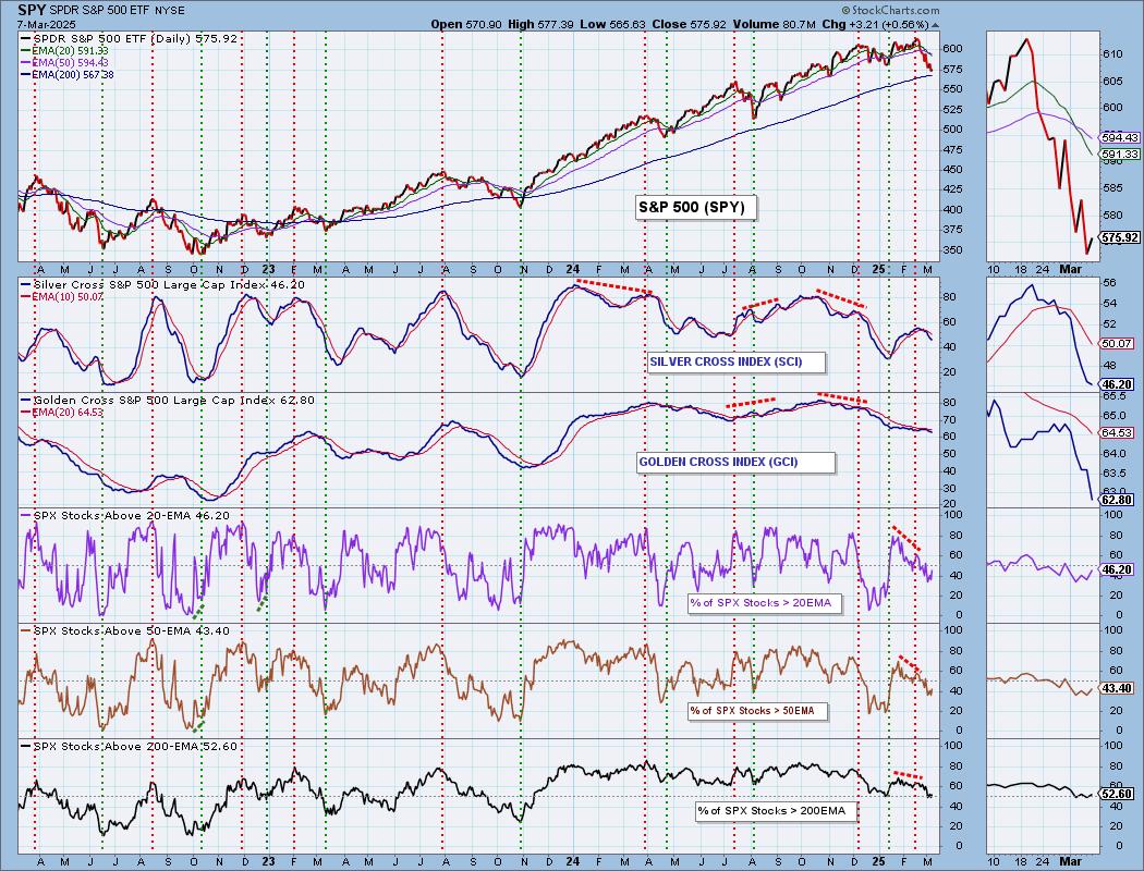
PARTICIPATION CHART (S&P 500): The following chart objectively shows the depth and trend of participation for the SPX in two time frames.
- Intermediate-Term - the Silver Cross Index (SCI) shows the percentage of SPX stocks on IT Trend Model BUY signals (20-EMA > 50-EMA). The opposite of the Silver Cross is a "Dark Cross" -- those stocks are, at the very least, in a correction.
- Long-Term - the Golden Cross Index (GCI) shows the percentage of SPX stocks on LT Trend Model BUY signals (50-EMA > 200-EMA). The opposite of a Golden Cross is the "Death Cross" -- those stocks are in a bear market.
The market bias is BEARISH in the intermediate and long term timeframes.
Participation continued in its declining trends this week and none of the readings are oversold yet. All of those readings are below our bullish 50% threshold so there continue to be internal problems. Both the Silver Cross Index and Golden Cross Index declined all week. The SCI is now below the 50% bullish threshold. The Silver Cross Index is below its signal line so the IT Bias is BEARISH. The Golden Cross Index is falling fast now. It is below its signal line as well so the LT Bias is also BEARISH.
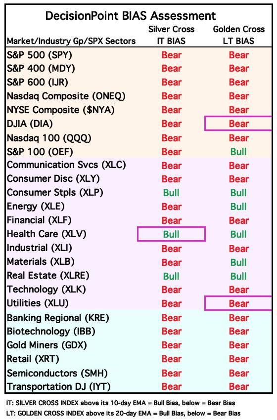
BIAS Assessment: The following table expresses the current BIAS of various price indexes based upon the relationship of the Silver Cross Index to its 10-day EMA (intermediate-term), and of the Golden Cross Index to its 20-day EMA (long-term). When the Index is above the EMA it is bullish, and it is bearish when the Index is below the EMA. The BIAS does not imply that any particular action should be taken. It is information to be used in the decision process.
The items with highlighted borders indicate that the BIAS changed today.
*****************************************************************************************************
CONCLUSION: The market is still internally weak based on low participation. There are also problems with the STOs and ITBM/ITVM which are declining. The Bias Table above is almost exclusively bearish in the intermediate term. This is a sign of near-term weakness. However, today's late day rally has us looking toward next week with some bullishness. Price has rebounded off support and could see some followthrough to the upside. We wouldn't look for a new rally to all-time highs, more of a last gasp before the decline continues. Erin's Diamond Dog Scan which finds shorting opportunities was nearly empty today and yesterday which also suggests to us we could be in for a small bounce off this current support level. We don't see this as an opportunity to go long yet.
Erin is 10% long, 0% short. (This is intended as information, not a recommendation.)
*****************************************************************************************************
CALENDAR
Have you subscribed the DecisionPoint Diamonds yet? DP does the work for you by providing handpicked stocks/ETFs from exclusive DP scans! Add it with a discount! Contact support@decisionpoint.com for more information!
BITCOIN
Bitcoin Daily Chart: Bitcoin is still working its way out of the double top formation. It did come close to hitting the minimum downside target of the pattern before reversing higher. There is a rising trend on price right now and the PMO is getting close to a Crossover BUY Signal. We see the PMO as signaling diminishing weakness not new strength so for now we will look for price to consolidate sideways below current resistance.
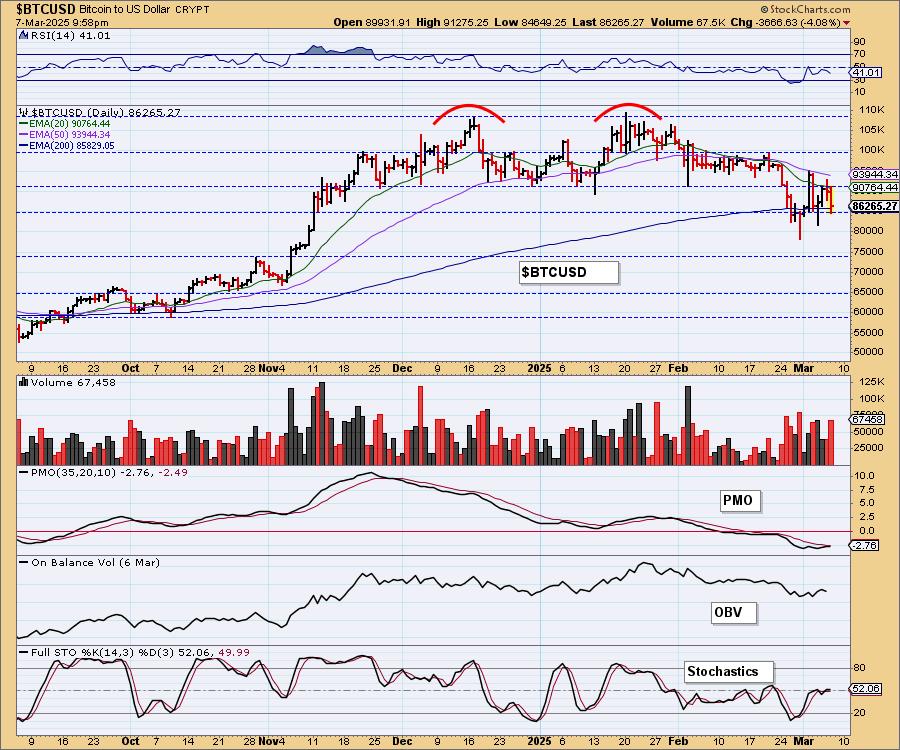
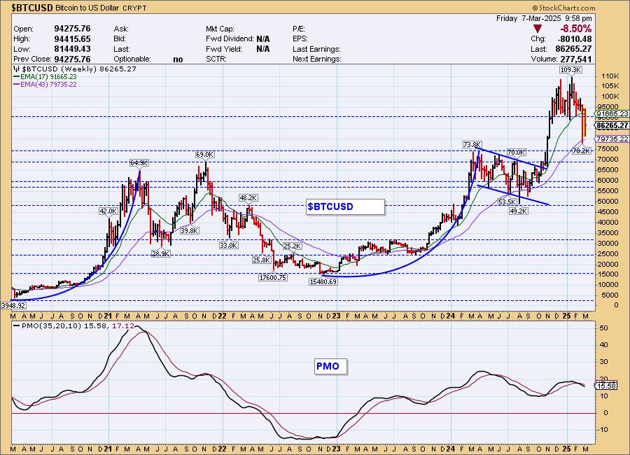
Bitcoin Weekly Chart: You can see that the double top executed as expected with a deep decline. Now price is trying to recapture prior support. It doesn't look that good given the decline in the weekly PMO which is why we aren't looking for a trip to all-time highs yet.
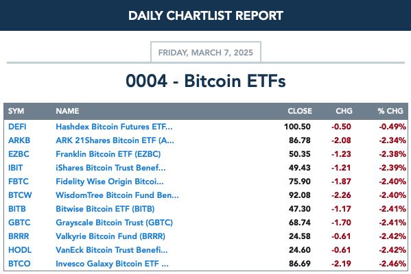
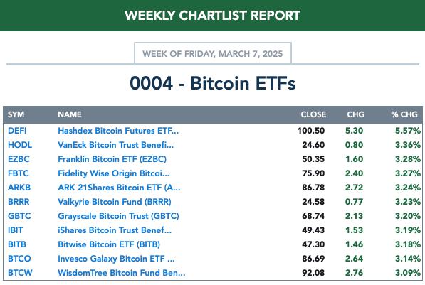
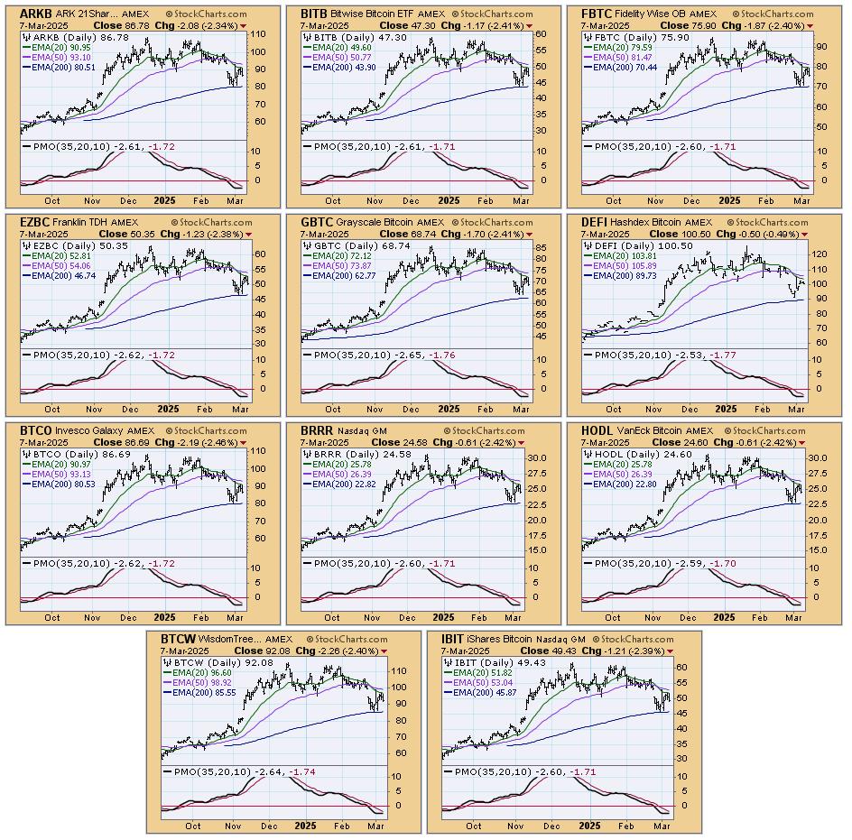
BITCOIN ETFs
Today:
This Week:
INTEREST RATES
Yields were higher on the day. We are watching carefully for a new advance in yields as they've pulled back quite a bit on the last decline.
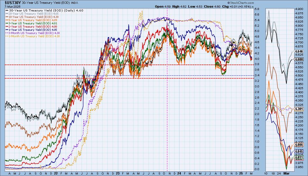
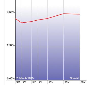
The Yield Curve Chart from StockCharts.com shows us the inversions taking place. The red line should move higher from left to right. Inversions are occurring where it moves downward.
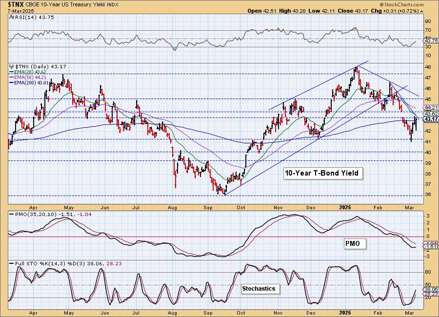
10-YEAR T-BOND YIELD
$TNX is still in a declining trend in the short and intermediate terms. This bounce looks pretty good. The PMO has turned back up and Stochastics are rising strongly so we will look for more upside and a test of the intermediate-term declining tops trendline.
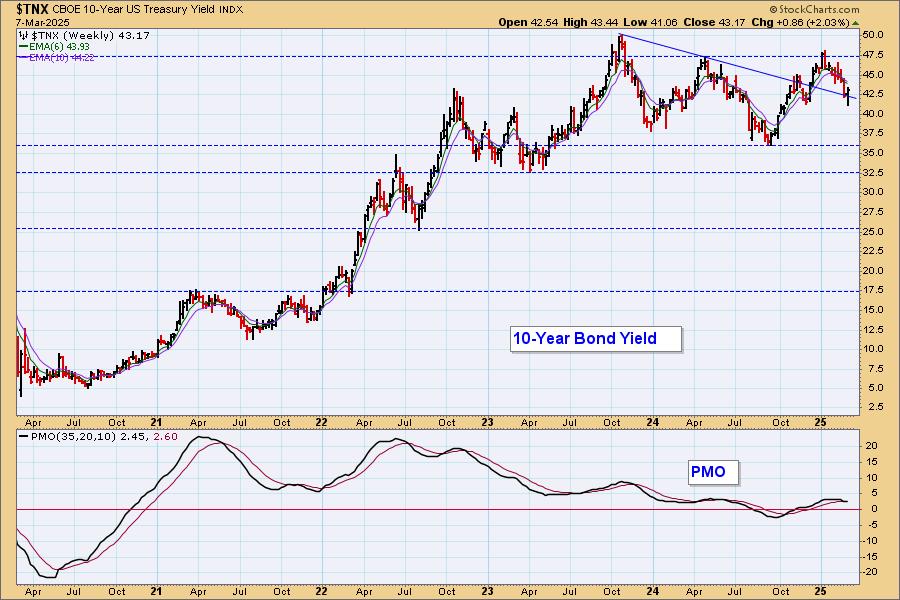
10-Year Bond Yield Weekly Chart: This does look like a good area to get a bounce now that it has reached the declining tops trendline. The weekly PMO is on a Crossover SELL Signal however so more decline isn't out of the question.
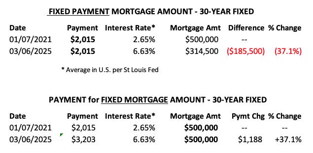
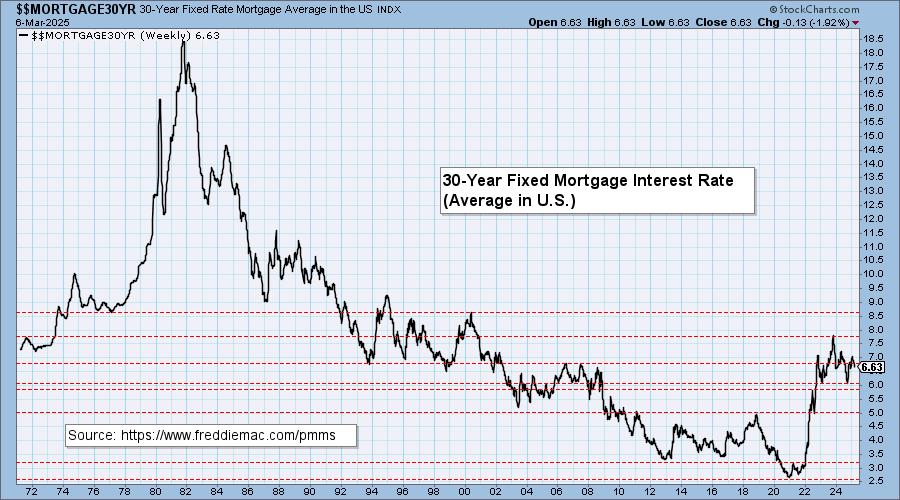
MORTGAGE INTEREST RATES (30-Yr)**
**We watch the 30-Year Fixed Mortgage Interest Rate, because, for the most part, people buy homes based upon the maximum monthly payment they can afford. As rates rise, a fixed monthly payment will carry a smaller mortgage amount, which shuts many buyers out of the market, and potential sellers will experience pressure to lower prices (to no effect so far).
--
This week the 30-Year Fixed Rate changed from 6.85 to 6.76.
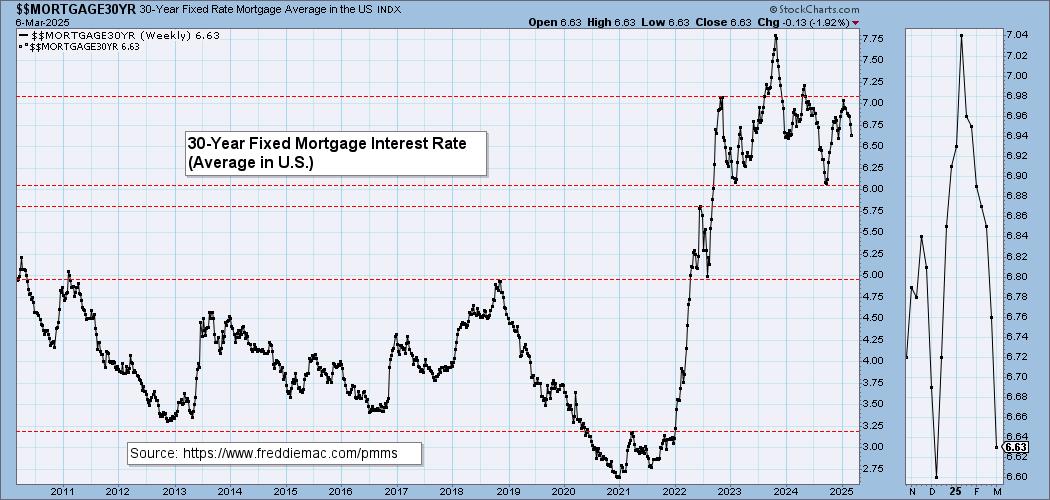
Here is a 50-year chart for better perspective.
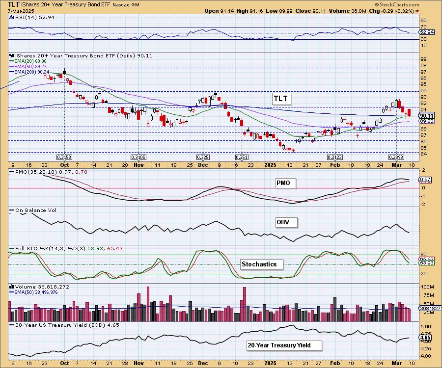
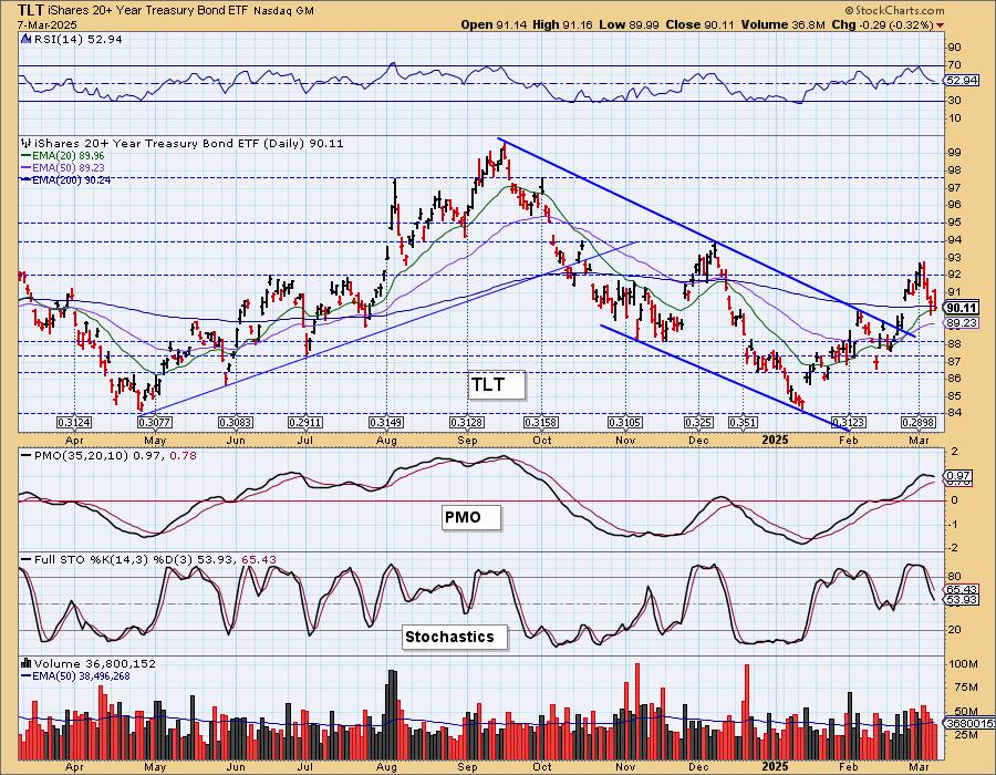
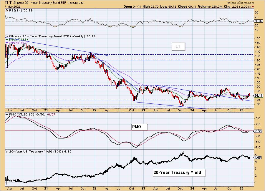
BONDS (TLT)
IT Trend Model: BUY as of 2/25/2025
LT Trend Model: SELL as of 12/13/2024
TLT Daily Chart: This does look like a bullish cup with handle pattern, but indicators suggest to us that the handle is not done forming. The PMO is in decline still and Stochastics are declining toward negative territory. Yields are looking more bullish right now too. Today's big bearish engulfing candlestick suggests a down day ahead on Monday.
TLT Weekly Chart: The weekly PMO is on a new Crossover BUY Signal which does suggest we'll see more upside in the intermediate term. Short-term it looks bearish but intermediate-term it looks optimistic.
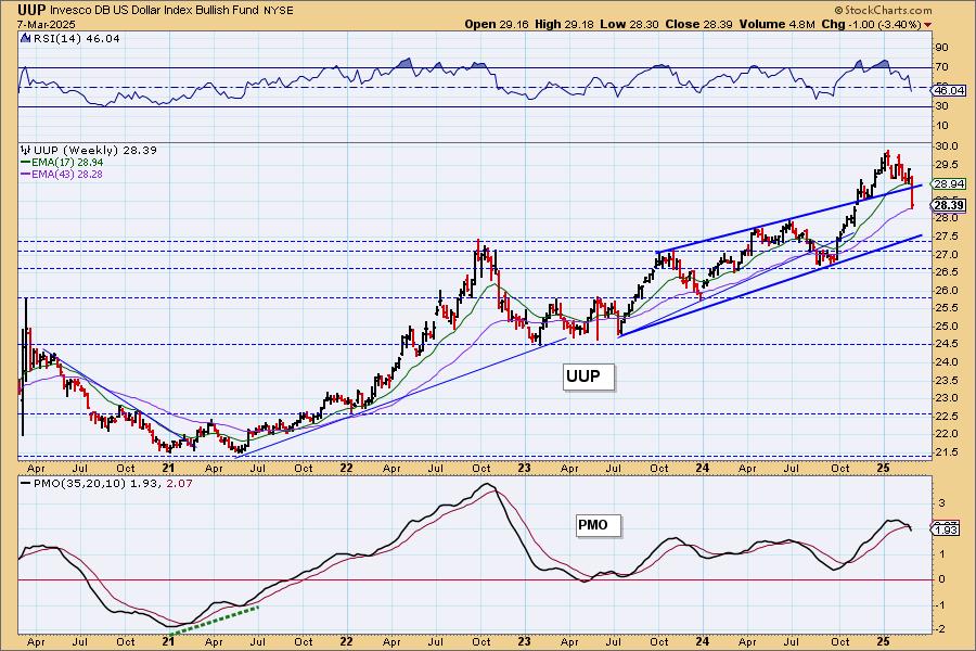
DOLLAR (UUP)
IT Trend Model: NEUTRAL as of 3/5/2025
LT Trend Model: BUY as of 5/25/2023
UUP Daily Chart: The Dollar had a terrible week finally dropping down to the minimum downside target of the double top pattern. This is an area of strong support at the October high and 200-day EMA. The RSI is getting oversold and Stochastics are rising so a bounce could be setting up. We wouldn't expect much to come of it given the very negative PMO.
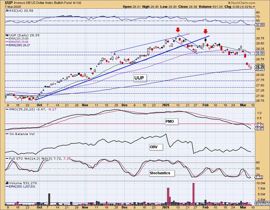
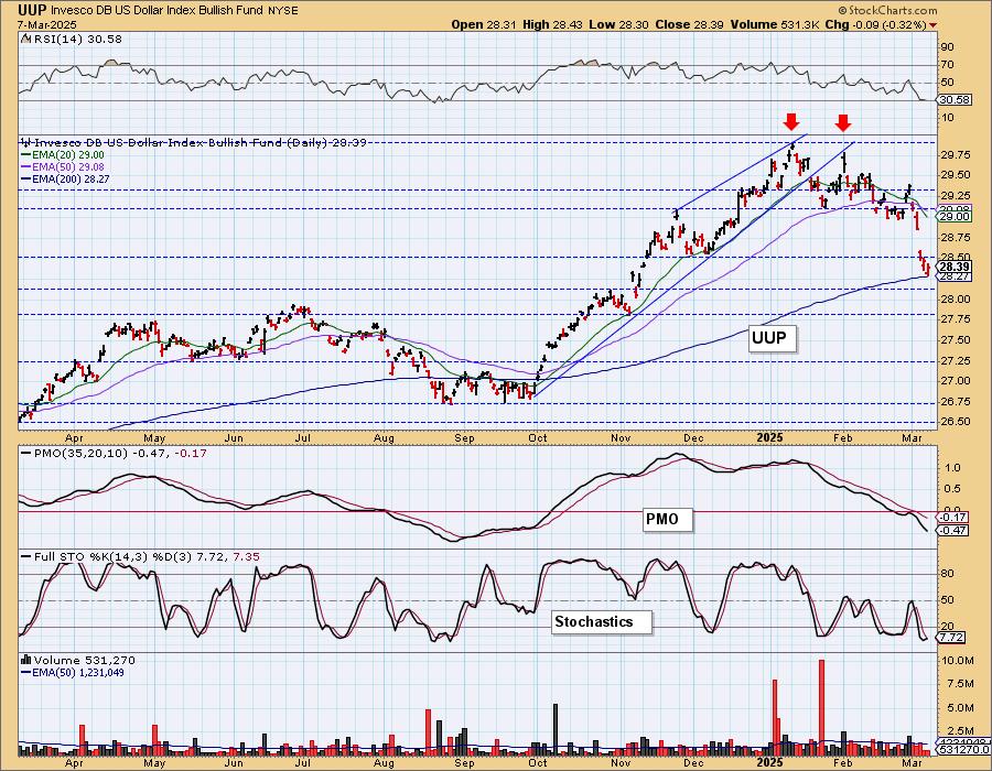
UUP Weekly Chart: Price dropped back into the bearish rising wedge and the weekly PMO has just given us a Crossover SELL Signal. If we get a bounce it isn't likely to last long with this bearish weekly chart.
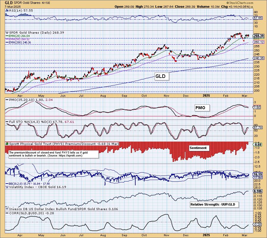
GOLD
IT Trend Model: NEUTRAL as of 12/23/2024
LT Trend Model: BUY as of 10/20/2023
GLD Daily Chart: Considering the Dollar has dropped steeply, it hasn't really done much for Gold. It was barely up today. The PMO is still declining so we see diminishing strength. Stochastics have topped. We'd look for some downside next week, particularly if the Dollar rebounds.
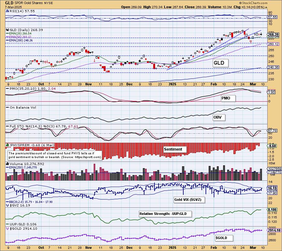
Sentiment got very bullish this week on declining discounts. This will often mark tops for Gold. Indicators aren't going Gold's way and now sentiment is not going its way.
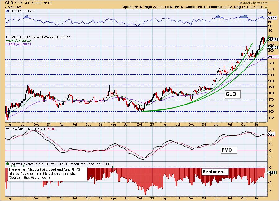
GLD Weekly Chart: We still see a parabolic advance on Gold and those do beg for a breakdown. However, the rally hasn't gotten vertical yet. The weekly PMO has decelerated but it is still rising so we won't look for a big breakdown, probably will see some near-term weakness, but intermediate-term it still looks fairly healthy.
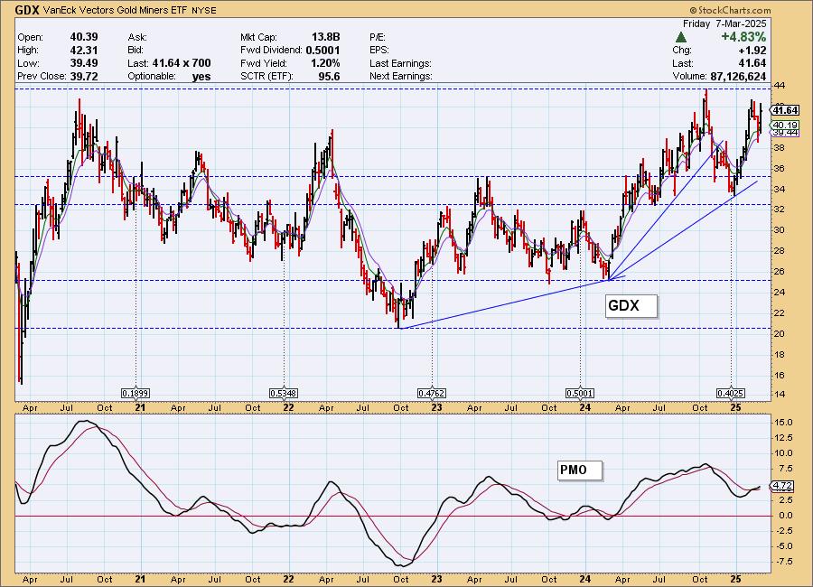
GOLD MINERS Daily Chart: Gold Miners are taking advantage of the falling Dollar unlike Gold. Participation is strong but getting a bit overbought. The RSI is positive, the PMO and Stochastics are rising. We think we could see a bit more upside, but with Gold looking a little precarious we wouldn't be jumping in on GDX. Overhead resistance is nearing. We still see a bearish double top, but the pattern could be busted if the rally continues. It would bust if price were to get above at least one of the two tops. It's getting close. We're monitoring the bull flag leading into this rally.
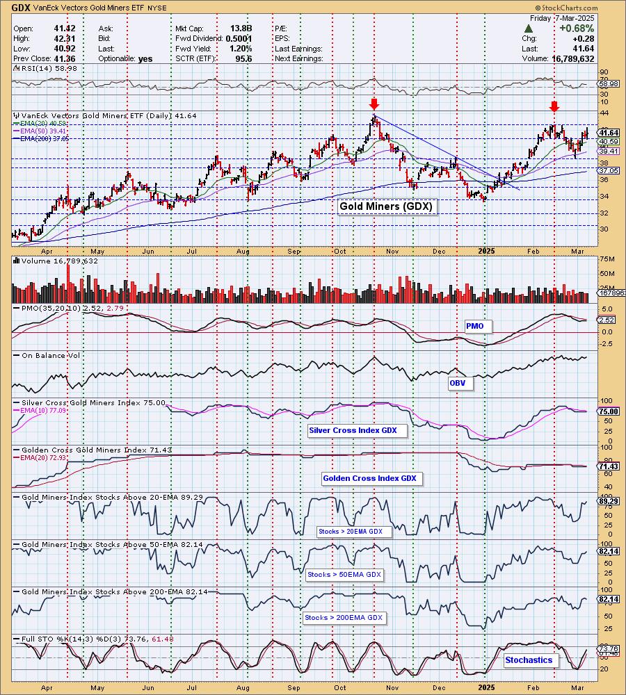
GDX Weekly Chart: The biggest problem we see is that very strong overhead resistance is nearing. Other than that the chart is bullish with its rising weekly PMO.
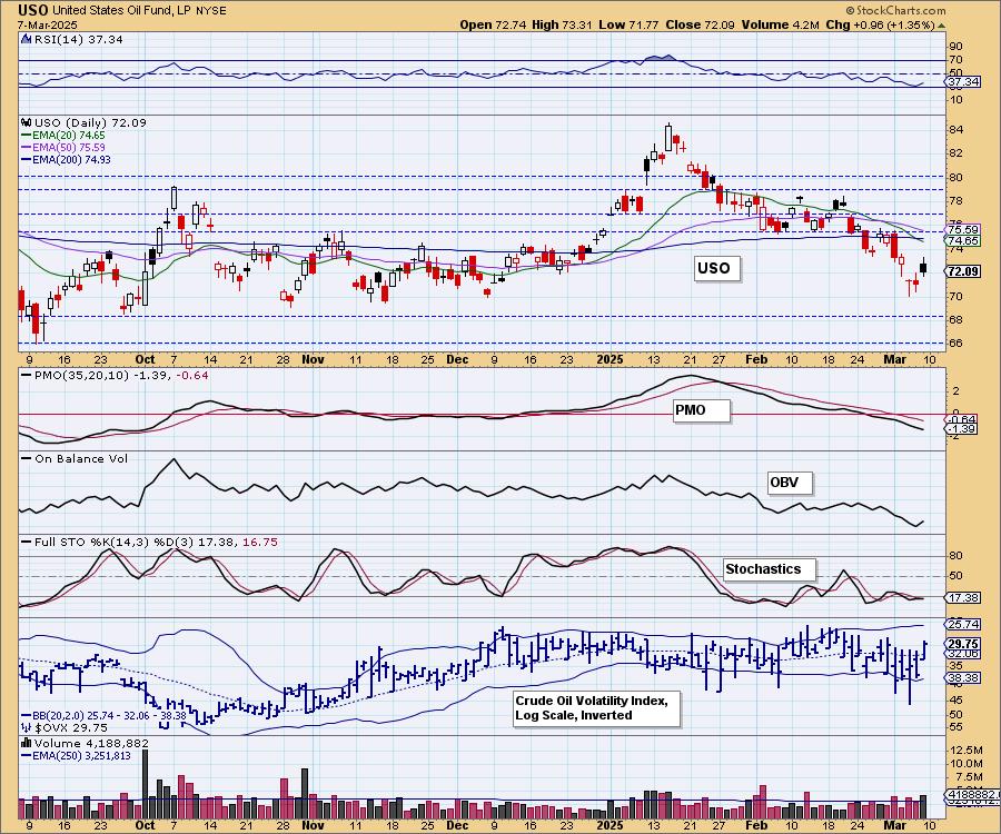
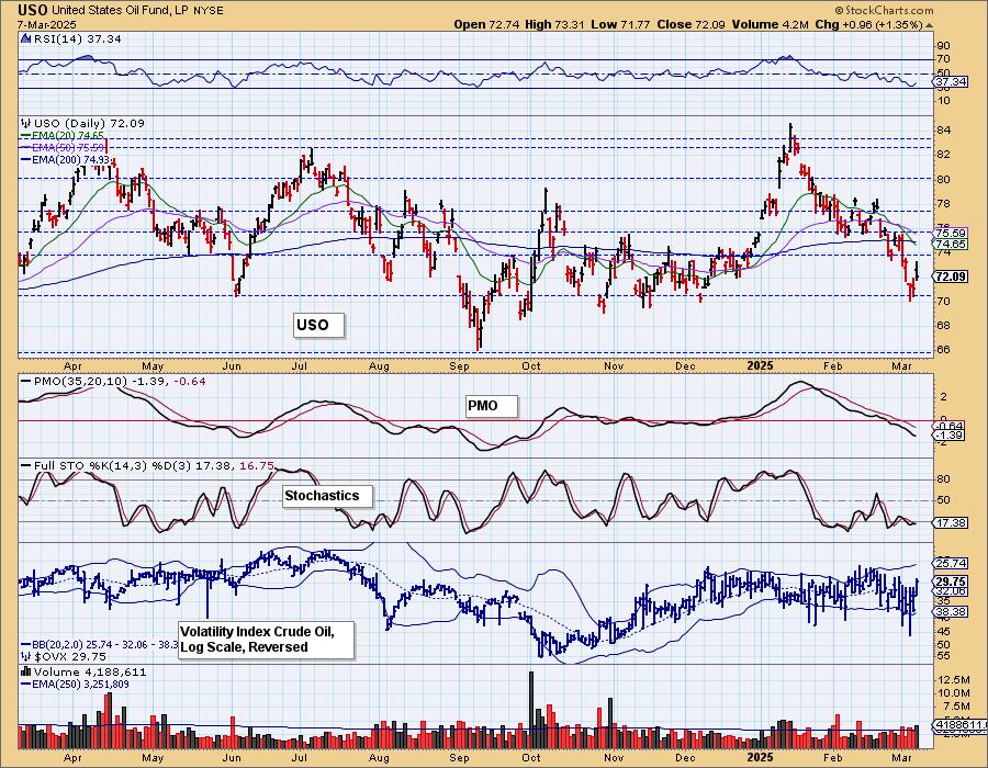
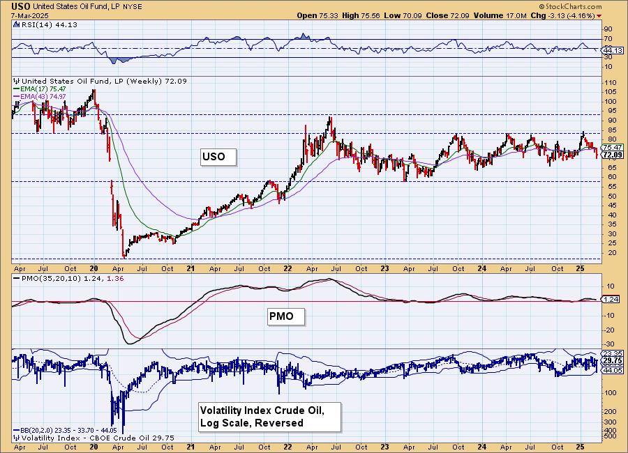
CRUDE OIL (USO)
IT Trend Model: BUY as of 12/24/2024
LT Trend Model: BUY as of 1/10/2025
USO Daily Chart: Crude is reversing higher but we think this is very temporary. The declining trend is still in force. We have a negative RSI and the PMO is declining below the zero line. Stochastics topped below 20. We believe the declining trend will hold.
USO Weekly Chart: Price hit the top of a trading range and has been headed lower ever since. With OPEC+ production staying high and the Trump administration's goal of bring energy prices down, we'd look for a test of the 2024 low at a minimum.
Good Luck & Good Trading!
Erin Swenlin and Carl Swenlin
Technical Analysis is a windsock, not a crystal ball. --Carl Swenlin
(c) Copyright 2025 DecisionPoint.com
Disclaimer: This blog is for educational purposes only and should not be construed as financial advice. The ideas and strategies should never be used without first assessing your own personal and financial situation, or without consulting a financial professional. Any opinions expressed herein are solely those of the author, and do not in any way represent the views or opinions of any other person or entity.
DecisionPoint is not a registered investment advisor. Investment and trading decisions are solely your responsibility. DecisionPoint newsletters, blogs or website materials should NOT be interpreted as a recommendation or solicitation to buy or sell any security or to take any specific action.
NOTE: The signal status reported herein is based upon mechanical trading model signals, specifically, the DecisionPoint Trend Model. They define the implied bias of the price index based upon moving average relationships, but they do not necessarily call for a specific action. They are information flags that should prompt chart review. Further, they do not call for continuous buying or selling during the life of the signal. For example, a BUY signal will probably (but not necessarily) return the best results if action is taken soon after the signal is generated. Additional opportunities for buying may be found as price zigzags higher, but the trader must look for optimum entry points. Conversely, exit points to preserve gains (or minimize losses) may be evident before the model mechanically closes the signal.
Helpful DecisionPoint Links:
DecisionPoint Alert Chart List
DecisionPoint Golden Cross/Silver Cross Index Chart List
DecisionPoint Sector Chart List
Price Momentum Oscillator (PMO)