
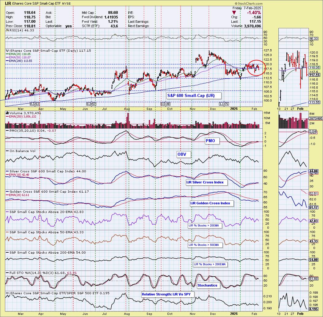
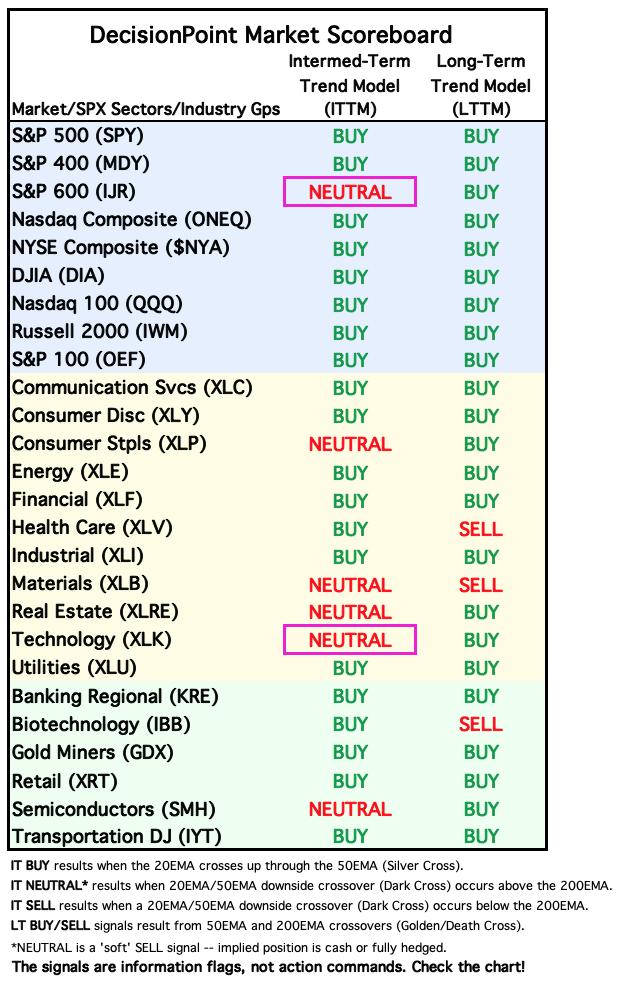
Today we had two ETFs that had new BUY Signals yesterday switch back to NEUTRAL. First the S&P 600 Small-Cap (IJR) 20-day EMA crossed down through the 50-day EMA (Dark Cross), above the 200-day EMA, generating an IT Trend Model NEUTRAL Signal. Note that the moving averages are so close together that whipsaw could continue. The PMO has topped so we suspect this signal will stick around.
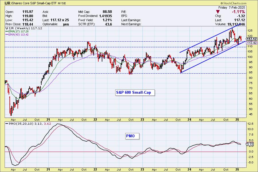
On the weekly chart it appears that IJR may be heading to the bottom of the rising trend channel. It did not test the top of the channel on the last rally and that is bearish. The weekly PMO is still declining.
___________
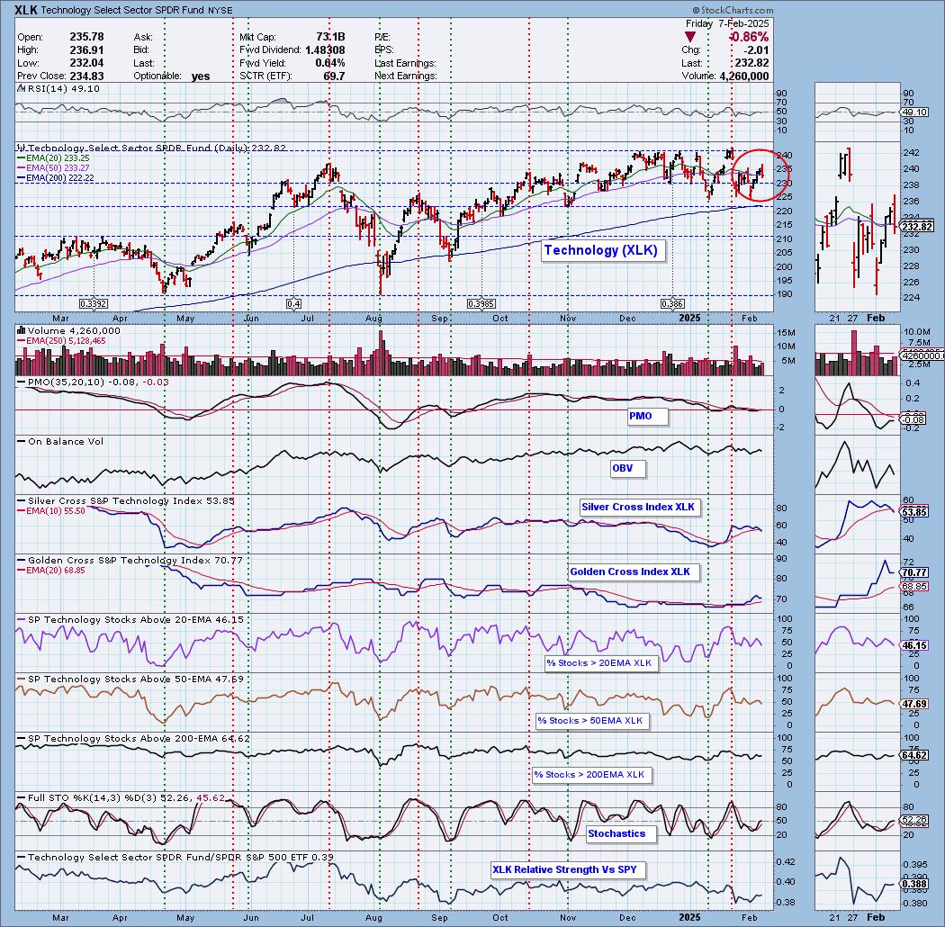
Second, the Technology Sector ETF (XLK) 20-day EMA crossed down through the 50-day EMA (Dark Cross), above the 200-day EMA, generating an IT Trend Model NEUTRAL Signal. Same story here with moving averages literally sharing the same space. No clear direction given by the new signal.
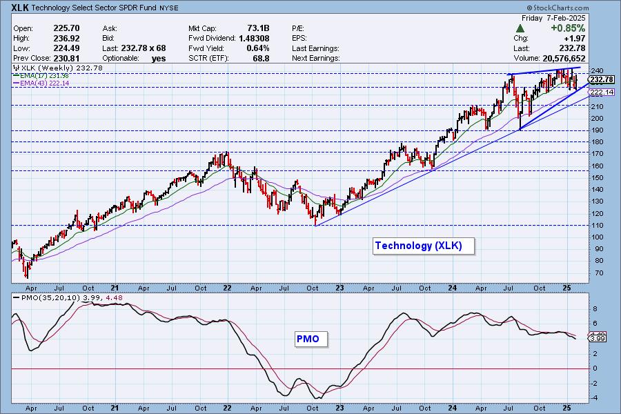
As was true yesterday, XLK is in a bearish rising wedge. The weekly PMO is moving lower on a Crossover SELL Signal.
The DecisionPoint Alert Weekly Wrap presents an end-of-week assessment of the trend and condition of the Stock Market, the U.S. Dollar, Gold, Crude Oil, and Bonds. The DecisionPoint Alert daily report (Monday through Thursday) is abbreviated and gives updates on the Weekly Wrap assessments.
Watch the latest episode of DecisionPoint on our YouTube channel here!
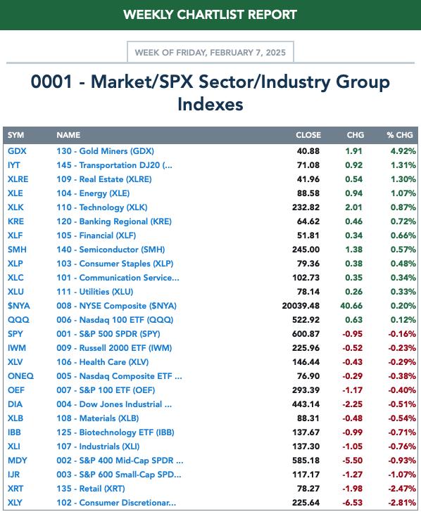
MARKET/SPX SECTOR/INDUSTRY GROUP INDEXES
Change Today: 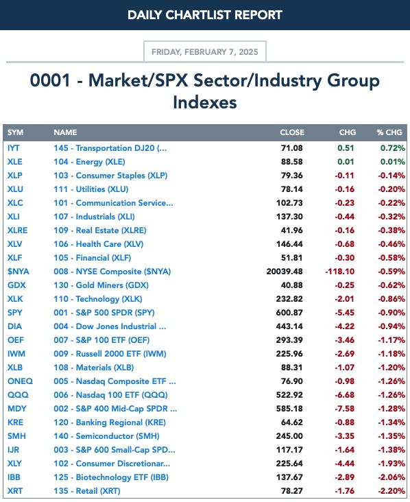
Change for the Week:
CLICK HERE for Carl's annotated Market Index, Sector, and Industry Group charts.
THE MARKET (S&P 500)
IT Trend Model: BUY as of 8/14/2024
LT Trend Model: BUY as of 3/29/2023
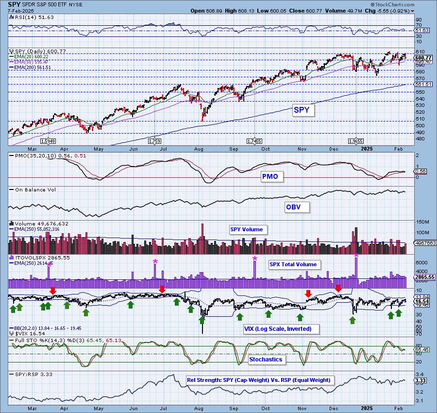
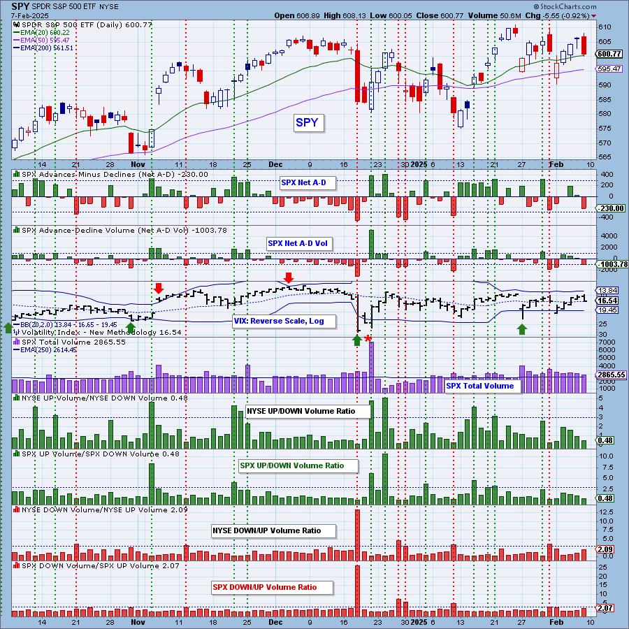
SPY 10-Minute Chart: The market was up briefly on the open but spent the rest of the day working its way lower to close near the low of the day. The 10-minute PMO is flat below the zero line indicating weakness.
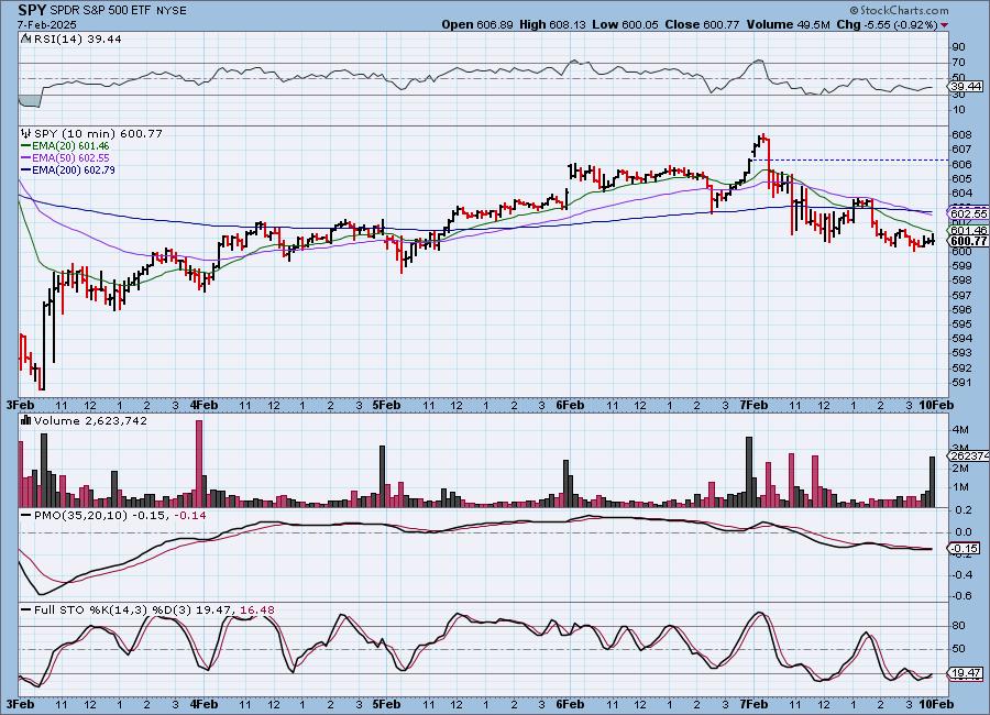
SPY Daily Chart: We briefly saw price move above the declining tops trendline, but ultimately it closed well beneath. A declining trend is still visible. The PMO did top today, but is still holding a Crossover BUY Signal for now. We have declining tops on the OBV which confirms the declining trend.
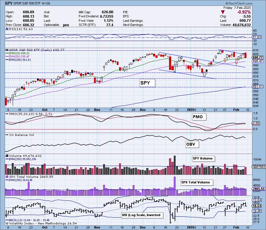
This is the third time that the VIX has avoided puncturing the upper Bollinger Band. It is beginning to see higher readings so investors are nervous right now. Stochastics have topped again.

Here is the latest recording from 2/3. Click HERE to get the link to video library.
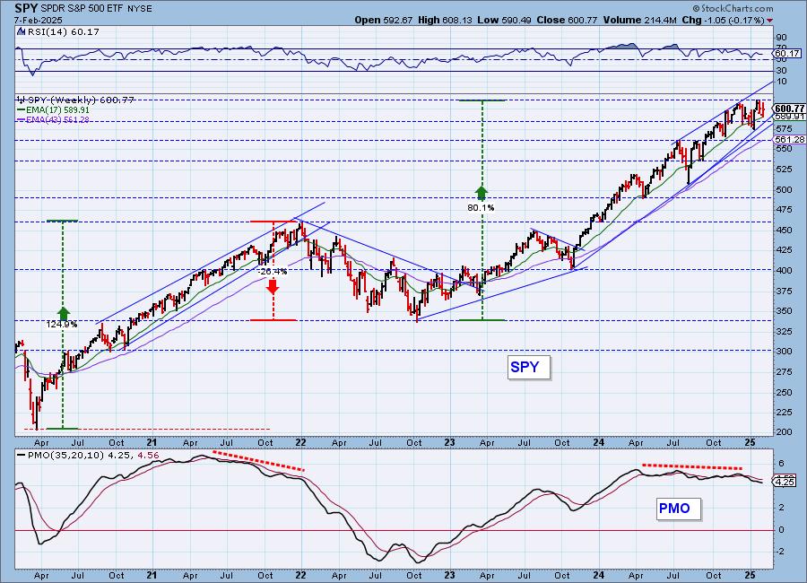
SPY Weekly Chart: We continue to monitor a large bearish rising wedge on the weekly chart that implies we will see a break of the bottom of the wedge. There is still a rising trendline still available if it breaks down from the wedge. If that rising trend is compromised we would look for some serious downside. The weekly PMO is falling.
New 52-Week Highs/Lows: What strikes us on this chart today is the expansion in New Lows. New Highs were fairly strong, but underlying weakness is there. The High-Low Differential does look like it is turning up.
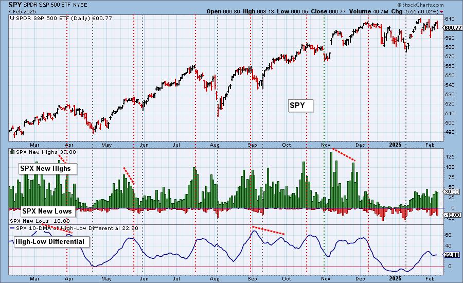
Climax Analysis: There were no climax readings today. Total Volume was solid on today's decline.
*A climax is a one-day event when market action generates very high readings in, primarily, breadth and volume indicators. We also include the VIX, watching for it to penetrate outside the Bollinger Band envelope. The vertical dotted lines mark climax days -- red for downside climaxes, and green for upside. Climaxes are at their core exhaustion events; however, at price pivots they may be initiating a change of trend.
Short-Term Market Indicators: The short-term market trend is DOWN and the condition is NEUTRAL.
Interestingly today the Swenlin Trading Oscillator for Volume (STO-V) turned up on today's decline. We aren't putting much emphasis on this turn of events as participation continued to thin and more rising PMOs were lost on the decline. The Swenlin Trading Oscillator for Breadth (STO-B) did continue to move lower.
Intermediate-Term Market Indicators: The intermediate-term market trend is UP and the condition is NEUTRAL.
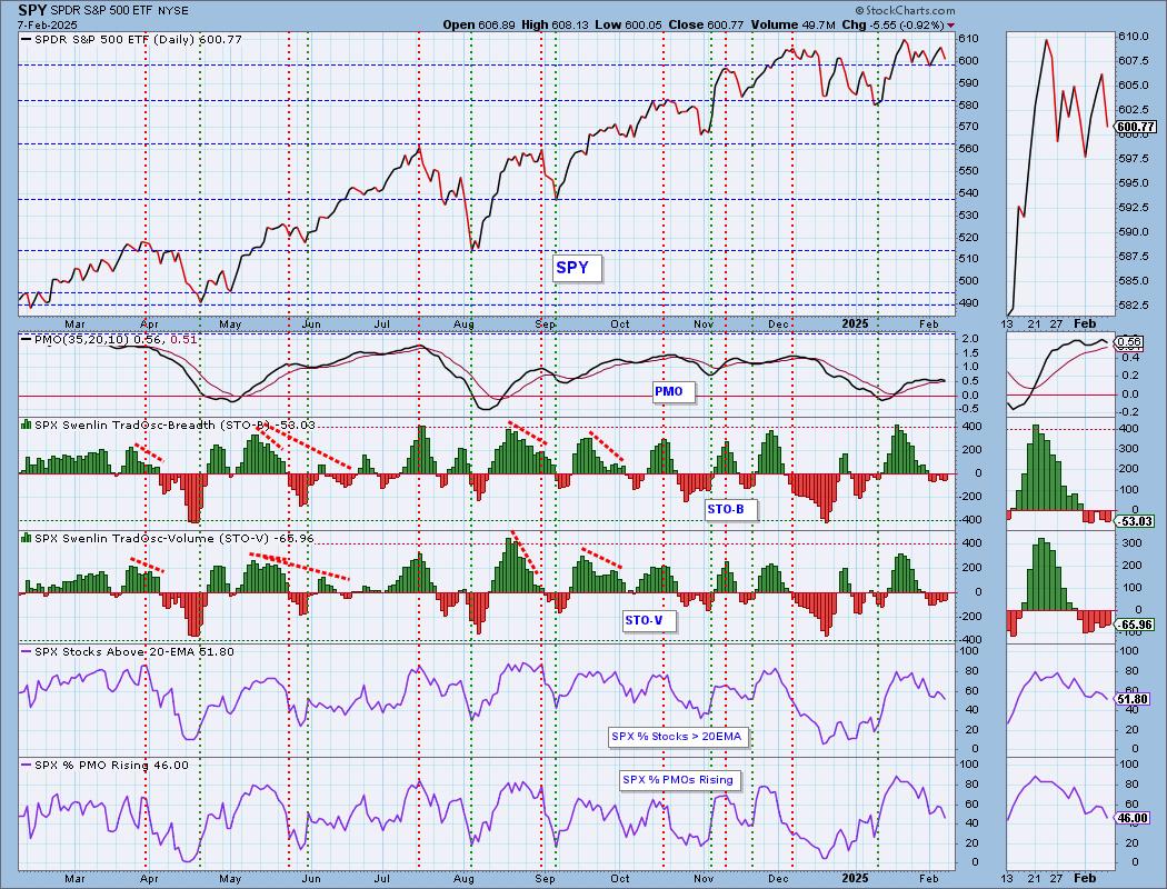
Both the IT Breadth Momentum (ITBM) and IT Volume Momentum (ITVM) both continued lower today. They topped before hitting overbought territory. We can see that at the beginning of the December decline, they topped at about the same height. %PMO Xover BUY Signals continue to bleed out of the index. 62% is a decent reading, but it will continue much lower given only 46% have rising momentum. Many PMO BUY Signals are vulnerable right now.
_______
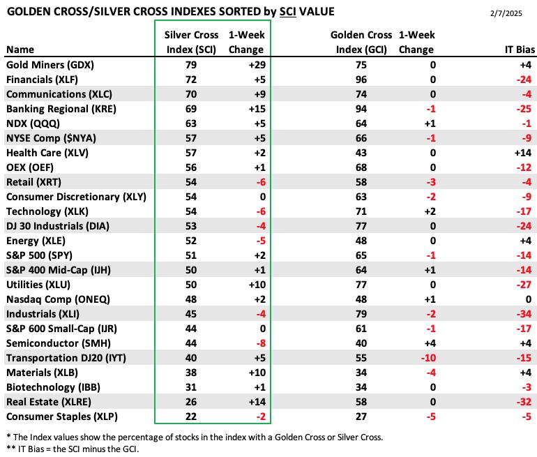
PARTICIPATION TABLES: The following tables summarize participation for the major market indexes and sectors. The 1-Week Change columns inject a dynamic aspect to the presentation. There are three groups: Major Market Indexes, Miscellaneous Industry Groups, and the 11 S&P 500 Sectors.
The highest IT Bias belongs to Health Care (XLV) which is seeing some positive action out of the Silver Cross Index. In the long term it had fallen quite a bit which is why the Golden Cross Index reading is so low. That is contributing to this bullish IT Bias reading.
Industrials (XLI) hold the lowest IT Bias reading. Both the Silver and Golden Cross Indexes lost ground this week. We may want to avoid this sector moving forward.
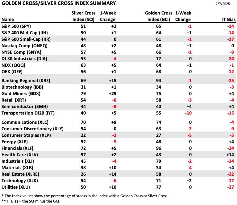
This table is sorted by SCI values. This gives a clear picture of strongest to weakest index/sector in terms of intermediate-term participation.
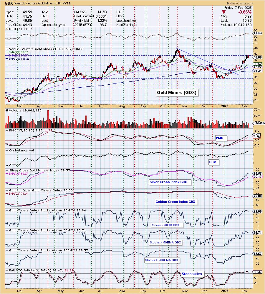
Gold Miners (GDX) saw a huge gain on the Silver Cross Index which put it at the top of the table. This group still looks very bullish but is due for a pause.
Semiconductors (SMH) lost eight percentage points on the Silver Cross Index, the most this week. Technology (XLK) wasn't far behind. These are both going nowhere right now and the outlook doesn't look very bullish.
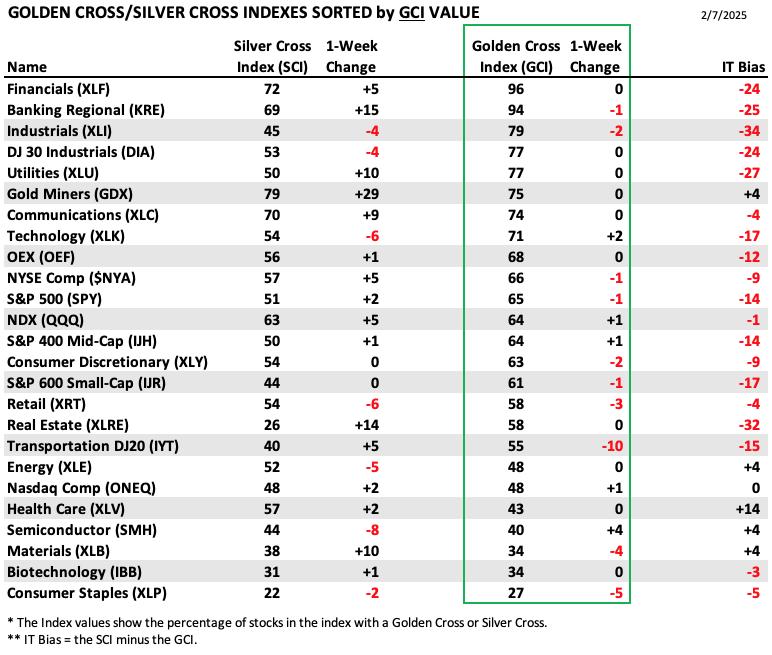
This table is sorted by GCI values. This gives a clear picture of strongest to weakest index/sector in terms of long-term participation.
Financials (XLF) are on fire and that is clear when you look at the Golden Cross Index value. This sector could continue to move higher, but a weak market will likely cause it problems in spite of the high GCI reading.
Consumer Staples (XLP) hold the lowest Golden Cross Index value and things are getting worse as it lost more ground this week. It is defensive so it could see some upside, but overall it is one of the weakest sectors.
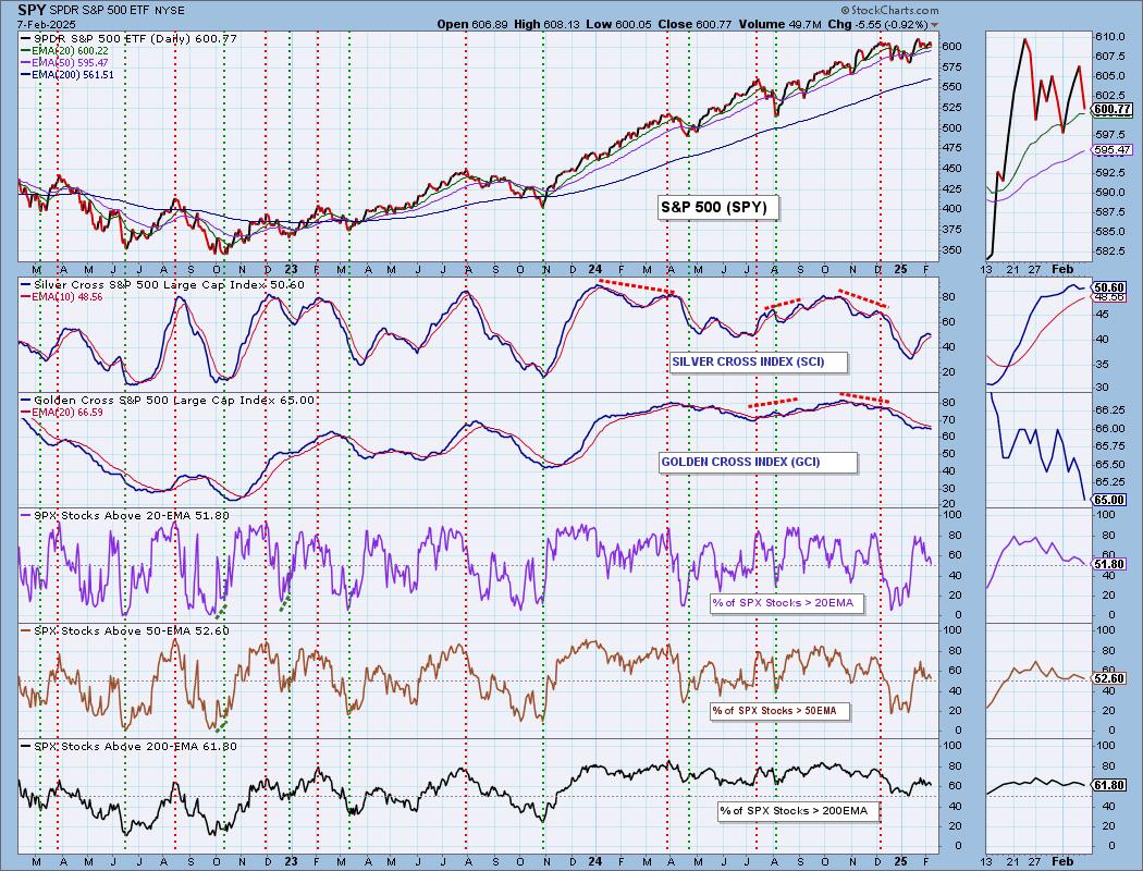
PARTICIPATION CHART (S&P 500): The following chart objectively shows the depth and trend of participation for the SPX in two time frames.
- Intermediate-Term - the Silver Cross Index (SCI) shows the percentage of SPX stocks on IT Trend Model BUY signals (20-EMA > 50-EMA). The opposite of the Silver Cross is a "Dark Cross" -- those stocks are, at the very least, in a correction.
- Long-Term - the Golden Cross Index (GCI) shows the percentage of SPX stocks on LT Trend Model BUY signals (50-EMA > 200-EMA). The opposite of a Golden Cross is the "Death Cross" -- those stocks are in a bear market.
The market bias is BULLISH in the intermediate term.
The market bias is BEARISH in the long term.
Participation continues to leak out of the index as more stocks lose support at key moving averages. It won't be long before we see readings less than our bullish 50% threshold. The Silver Cross Index did turn up today and it could continue higher given there are fewer Silver Crosses than stocks above their 50-day EMAs. Price must be above an EMA for it to rise so the Silver Cross Index only expand as long as there are more stocks above their 50-day EMAs. It is holding above its signal line for now so the IT Bias is BULLISH.
The Golden Cross Index is still in decline and given we have fewer stocks above their 200-day EMA, it is going to continue to decline. It was very bearish to see it top beneath its signal line. Because it is below its signal line, the LT Bias is BEARISH.
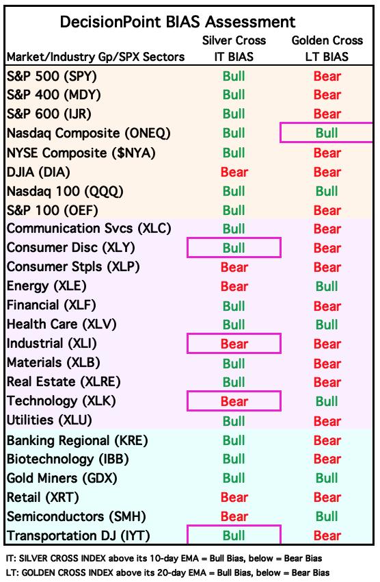
BIAS Assessment: The following table expresses the current BIAS of various price indexes based upon the relationship of the Silver Cross Index to its 10-day EMA (intermediate-term), and of the Golden Cross Index to its 20-day EMA (long-term). When the Index is above the EMA it is bullish, and it is bearish when the Index is below the EMA. The BIAS does not imply that any particular action should be taken. It is information to be used in the decision process.
The items with highlighted borders indicate that the BIAS changed today.
*****************************************************************************************************
CONCLUSION: Today wasn't all bad as far as the indicators go. The High-Low Differential turned up and so did the STO-V. However, it isn't enough to make us bullish. The PMO and Stochastics are falling, but most importantly we continue to lose PMO BUY Signals and participation in general. There is still concern over tariffs and the FOMC is not planning on lowering rates anytime soon. Investors are getting more nervous based on the VIX and they should be as far as we're concerned. We expect next week to be difficult. Erin is tightening stops and lightening her exposure in preparation.
Erin is 15% long, 0% short. (This is intended as information, not a recommendation.)
*****************************************************************************************************
CALENDAR
Have you subscribed the DecisionPoint Diamonds yet? DP does the work for you by providing handpicked stocks/ETFs from exclusive DP scans! Add it with a discount! Contact support@decisionpoint.com for more information!
BITCOIN
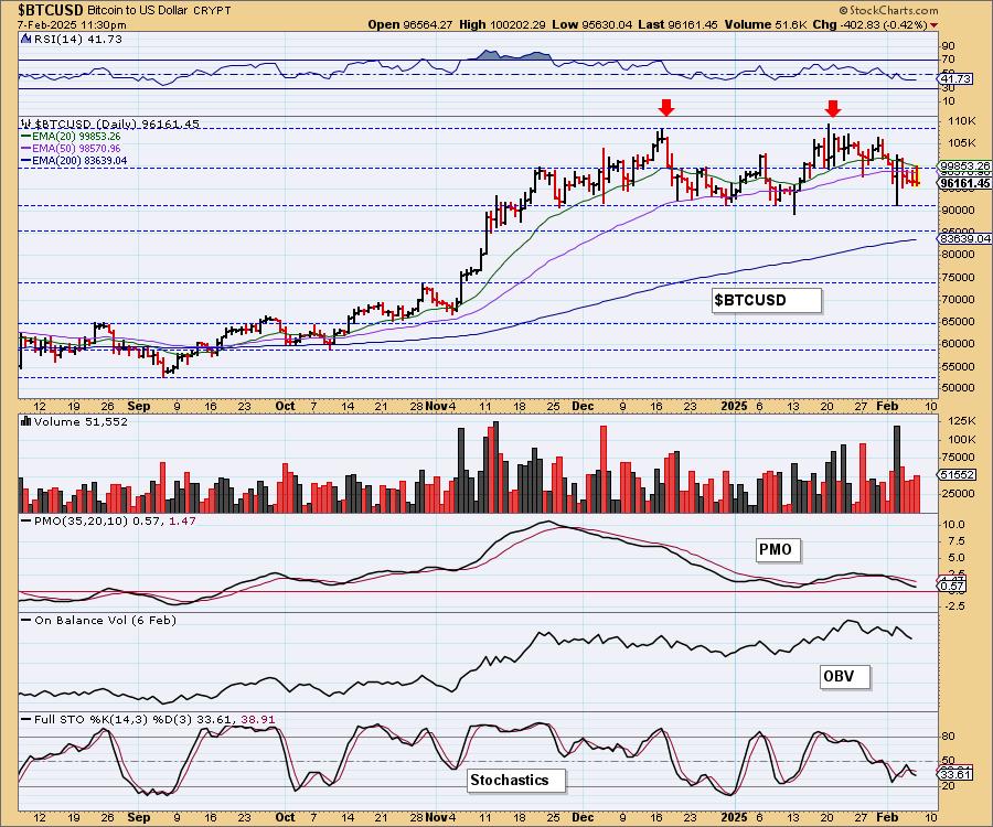
Bitcoin Daily Chart: We don't like what we're seeing on Bitcoin. There is a large bearish double top and price is in a declining trend headed to support. While this has held up, the indicators are configured very negatively and do seem to suggest this time around Bitcoin will break down. The PMO and Stochastics are in decline and the RSI is currently negative below net neutral (50).
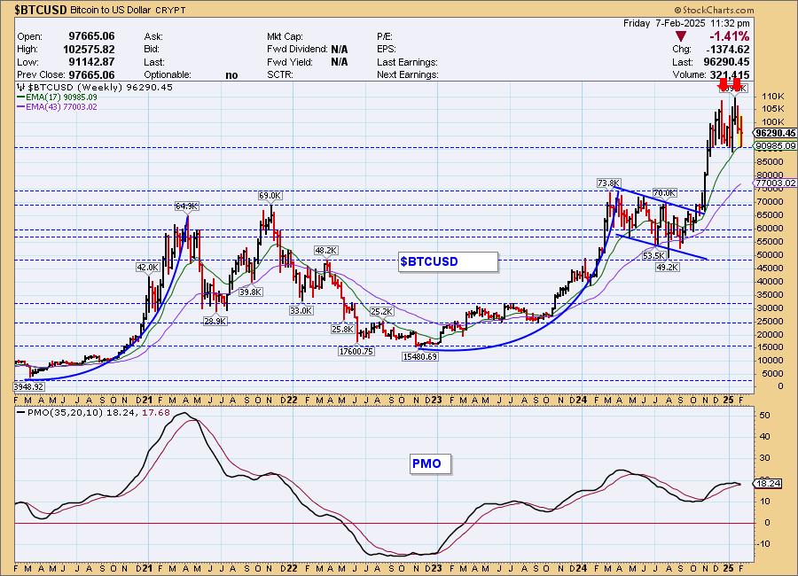
Bitcoin Weekly Chart: It is not a good look on the weekly chart. There is another parabolic, vertical price rise and it is now being followed up by a bearish double top. Parabolic rises often end in despair. The weekly PMO is about to trigger a Crossover SELL Signal.
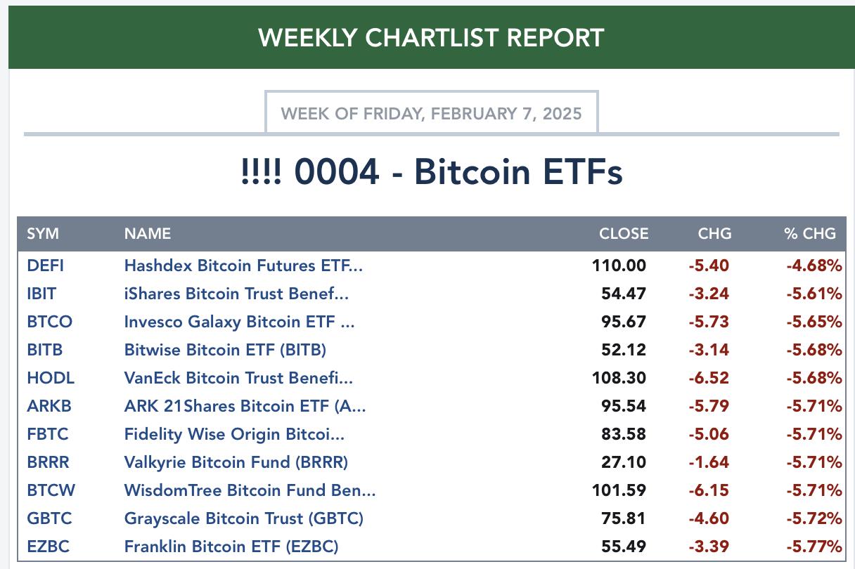
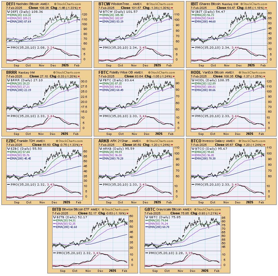
BITCOIN ETFs
Today:
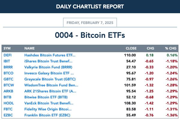
This Week:
INTEREST RATES
Yields rose today but declining trends are still in force suggesting to us that they are still headed lower.
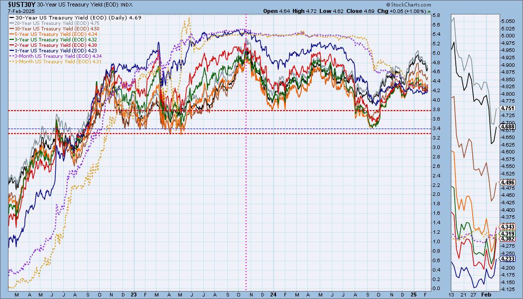
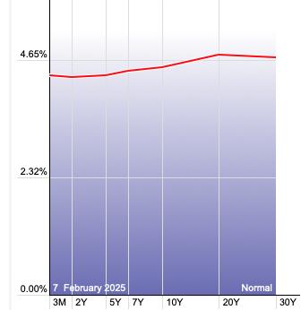
The Yield Curve Chart from StockCharts.com shows us the inversions taking place. The red line should move higher from left to right. Inversions are occurring where it moves downward.
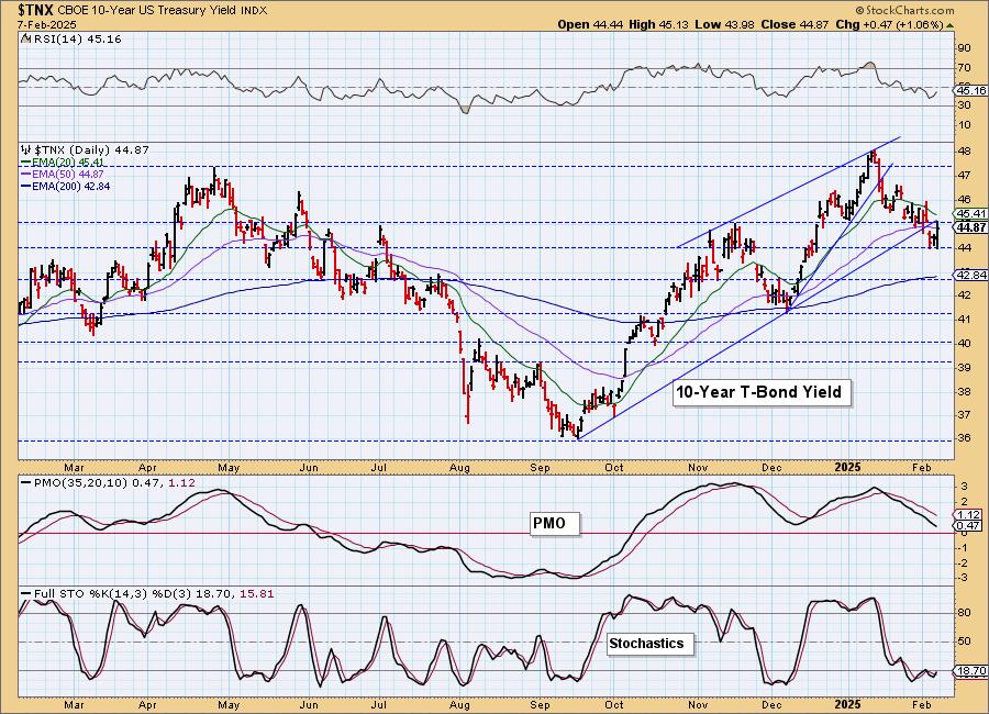
10-YEAR T-BOND YIELD
$TNX rallied, but it didn't take price out of the current declining trend. Stochastics did turn up but they remain below 20 which is very weak. The PMO continues to decline and the RSI is negative so we do expect this declining trend will hold up and $TNX will move lower from here. Should the short-term declining trend be broken, we'll reevaluate our bearish stance.
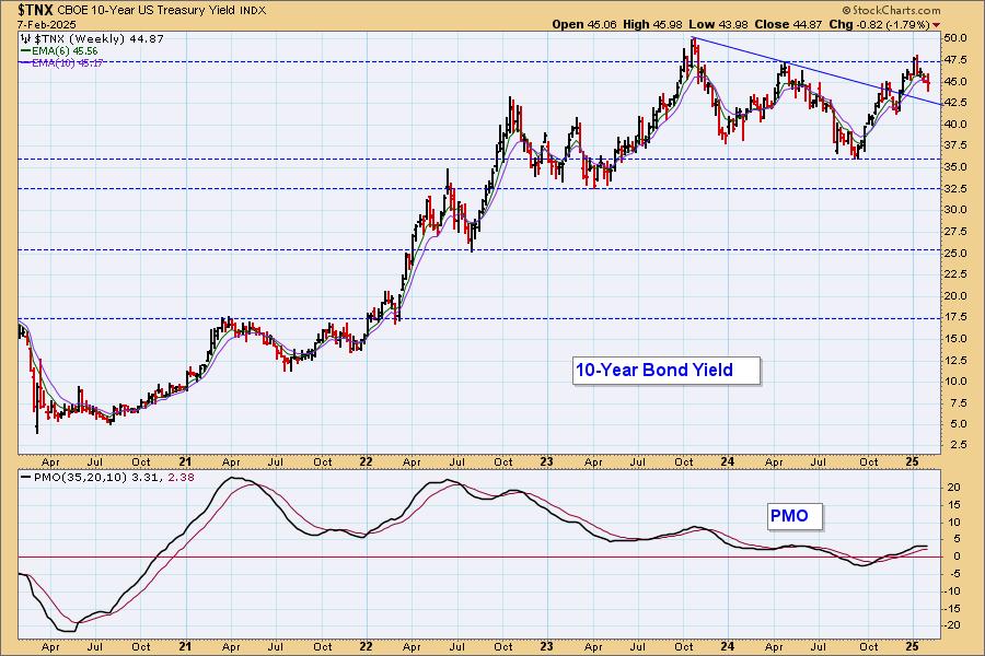
10-Year Bond Yield Weekly Chart: Strong overhead resistance was met on the weekly chart so a decline here isn't surprising. It did break out above the declining tops trendline, but it is weakening. The weekly PMO has topped.
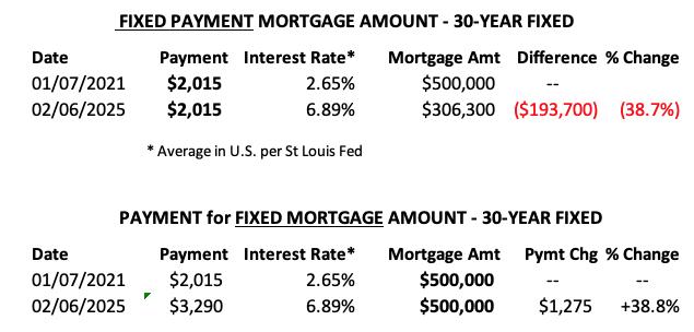
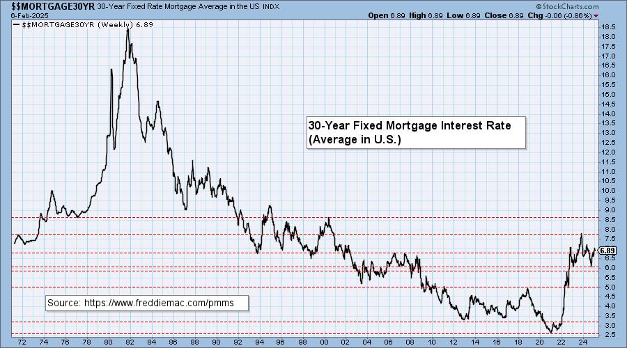
MORTGAGE INTEREST RATES (30-Yr)**
**We watch the 30-Year Fixed Mortgage Interest Rate, because, for the most part, people buy homes based upon the maximum monthly payment they can afford. As rates rise, a fixed monthly payment will carry a smaller mortgage amount, which shuts many buyers out of the market, and potential sellers will experience pressure to lower prices (to no effect so far).
--
This week the 30-Year Fixed Rate changed from 6.95 to 6.89.
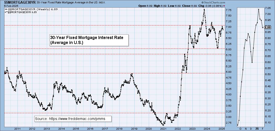
Here is a 50-year chart for better perspective.
BONDS (TLT)
IT Trend Model: NEUTRAL as of 11/10/2024
LT Trend Model: SELL as of 12/13/2024
TLT Daily Chart: TLT is pulling back as the 20-year yield has managed to rise the past two days. The PMO indicates new strength arriving as it is almost above the zero line. This should push price higher from here. The 200-day EMA may pose a problem, but for now we will look for it to at least test that level. The reverse head and shoulders pattern tells us that we could see a rally to about 92.00.
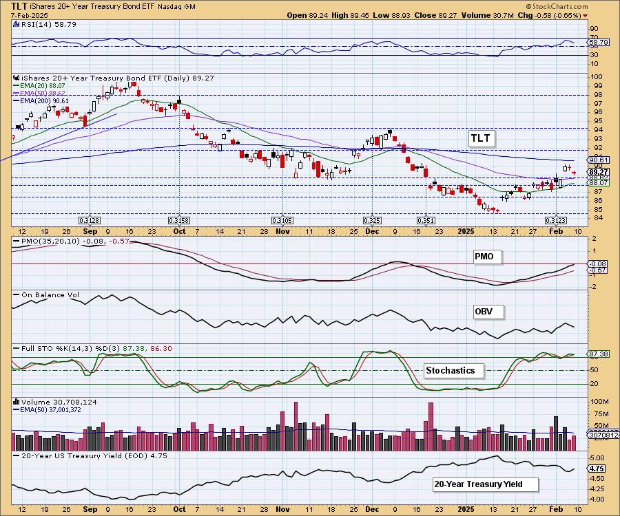
We do have a large declining trend channel and price has reached the top so we wouldn't be surprised if it does pull back a bit more. We'll need to be on the lookout for a reversal in yields.
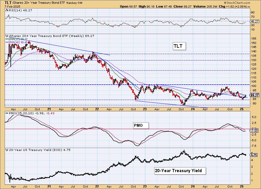
TLT Weekly Chart: Price is bouncing off support and the weekly PMO is trying to turn up. The big problem is that declining trend. With the improvement on the PMO we do see a high likelihood that we'll get a breakout move rather than a big decline.
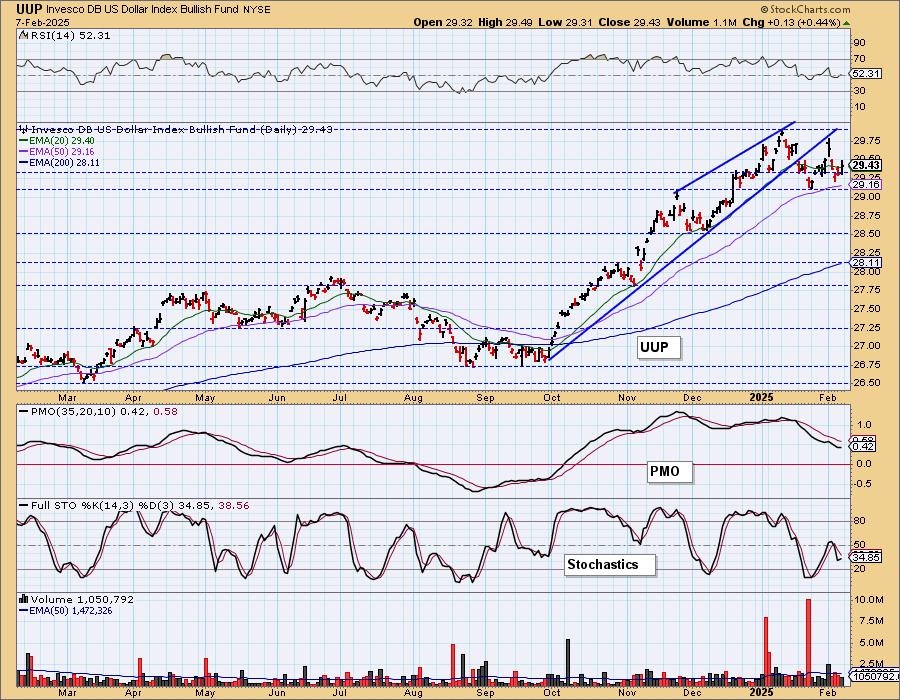
DOLLAR (UUP)
IT Trend Model: BUY as of 10/9/2024
LT Trend Model: BUY as of 5/25/2023
UUP Daily Chart: We have a bearish double top on the Dollar chart that suggests we will see the Dollar begin to fall, but for now it is rising off support. We think overall that the Dollar will continue to decline out of this bearish pattern, but we're mindful of the bottom in Stochastics and the now positive RSI which may prevent a deep decline. Price is reversing off the 50-day EMA so it isn't over for the Dollar.
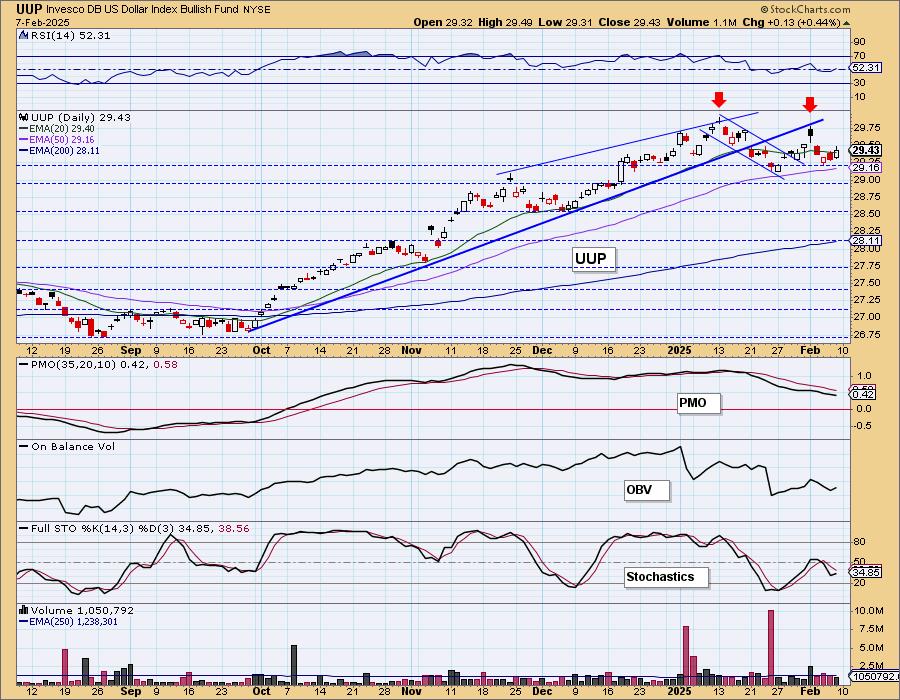
Price broke down from a bearish rising wedge. It's holding its own right now but that double top does look rather ominous.
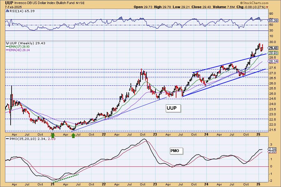
UUP Weekly Chart: In very bullish fashion, price broke out from a bearish rising wedge which tells us that maybe we shouldn't worry so hard about the double top on the daily chart. The weekly PMO has topped however so we could see more downside from here as it pulls back toward the pattern.
GOLD
IT Trend Model: NEUTRAL as of 12/23/2024
LT Trend Model: BUY as of 10/20/2023
GLD Daily Chart: We saw another all-time high intraday on Gold. It is overdue for some consolidation based on the overbought RSI and today's bearish filled black candlestick implies we will see a decline on Monday. The PMO is decelerating somewhat and Stochastics did top. Still, we don't expect a big decline. This rising trend is too bullish, as are the indicators overall.
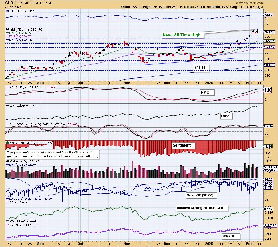
Discounts have been paring back since the beginning of this rally and that makes complete sense. The lower the discounts the less bearish investors are. If discounts get much lower though we should start looking for a reversal as too much bullish (or much less bearish) sentiment would imply a decline given sentiment is contrarian. So far so good.
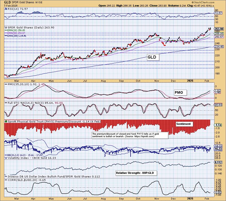
GLD Weekly Chart: We do have a parabolic rise on the weekly chart and as we often say, these patterns beg for a correction. The rally isn't that vertical yet, but it is getting there. The weekly RSI is overbought so both the daily and weekly charts call for some consolidation. The weekly PMO is nearing a Crossover BUY Signal so for now it looks good for Gold.

GOLD MINERS Daily Chart: Gold Miners (GDX) hit overhead resistance and pulled back. We foresee oncoming weakness for Gold so we should expect GDX to experience the same. Participation is still very strong but we note it is declining. Look for consolidation or a small pullback.
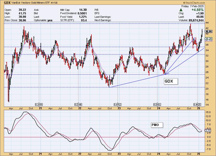
GDX Weekly Chart: We have a vertical rally on the weekly chart and that begs for a correction. We aren't bearish enough to look for a big decline particularly given the weekly PMO is rising, but we do need to be cautious.
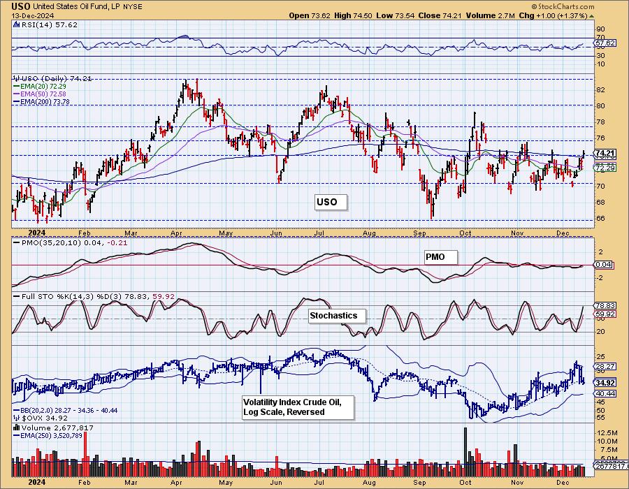
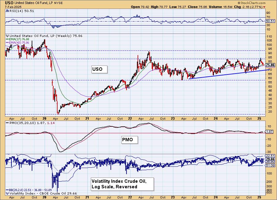
CRUDE OIL (USO)
IT Trend Model: BUY as of 12/24/2024
LT Trend Model: BUY as of 1/10/2025
USO Daily Chart: The pressure is on for Crude Oil as this new administration is working hard to lower energy prices as the precursor to taming inflation. Price has made it to the 200-day EMA and horizontal support at the November top so it could conceivably hold here and rally, but the indicators look terrible. The RSI is negative and the PMO is in decline. Stochastics are falling well below 20 indicating pure weakness. We expect a breakdown.
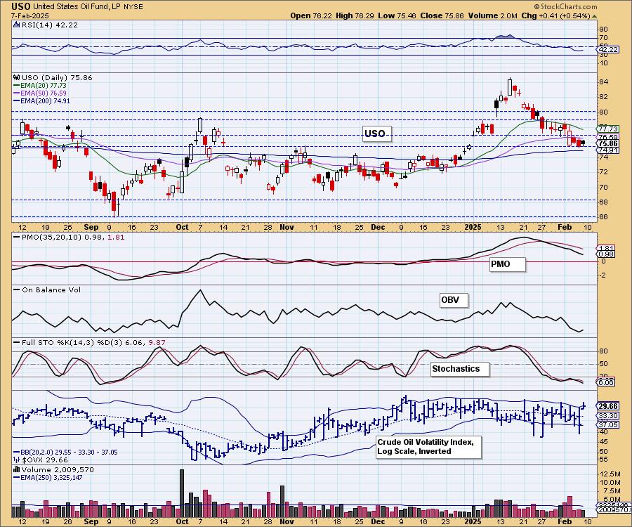
USO/$WTIC Weekly Chart: It was time for Crude to pull back anyway in spite of the energy policies of the new administration. It had reached very strong overhead resistance. There is a rising bottoms trendline to test but we suspect that trend will be broken. The weekly PMO has topped. With a go nowhere price pattern we can see how the PMO has flattened along the zero line.
Good Luck & Good Trading!
Erin Swenlin and Carl Swenlin
Technical Analysis is a windsock, not a crystal ball. --Carl Swenlin
(c) Copyright 2025 DecisionPoint.com
Disclaimer: This blog is for educational purposes only and should not be construed as financial advice. The ideas and strategies should never be used without first assessing your own personal and financial situation, or without consulting a financial professional. Any opinions expressed herein are solely those of the author, and do not in any way represent the views or opinions of any other person or entity.
DecisionPoint is not a registered investment advisor. Investment and trading decisions are solely your responsibility. DecisionPoint newsletters, blogs or website materials should NOT be interpreted as a recommendation or solicitation to buy or sell any security or to take any specific action.
NOTE: The signal status reported herein is based upon mechanical trading model signals, specifically, the DecisionPoint Trend Model. They define the implied bias of the price index based upon moving average relationships, but they do not necessarily call for a specific action. They are information flags that should prompt chart review. Further, they do not call for continuous buying or selling during the life of the signal. For example, a BUY signal will probably (but not necessarily) return the best results if action is taken soon after the signal is generated. Additional opportunities for buying may be found as price zigzags higher, but the trader must look for optimum entry points. Conversely, exit points to preserve gains (or minimize losses) may be evident before the model mechanically closes the signal.
Helpful DecisionPoint Links:
DecisionPoint Alert Chart List
DecisionPoint Golden Cross/Silver Cross Index Chart List
DecisionPoint Sector Chart List
Price Momentum Oscillator (PMO)