
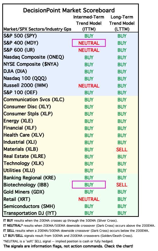
Today the S&P 400 Mid-Cap ETF (MDY) 20-day EMA crossed down through the 50-day EMA (Dark Cross), above the 200-day EMA, generating an IT Trend Model NEUTRAL Signal. Support is near but with a drop of this magnitude we think it will lose this support level. The PMO is now in negative territory and we can see very little participation of stocks above key moving averages. Stochastics topped in negative territory as well.
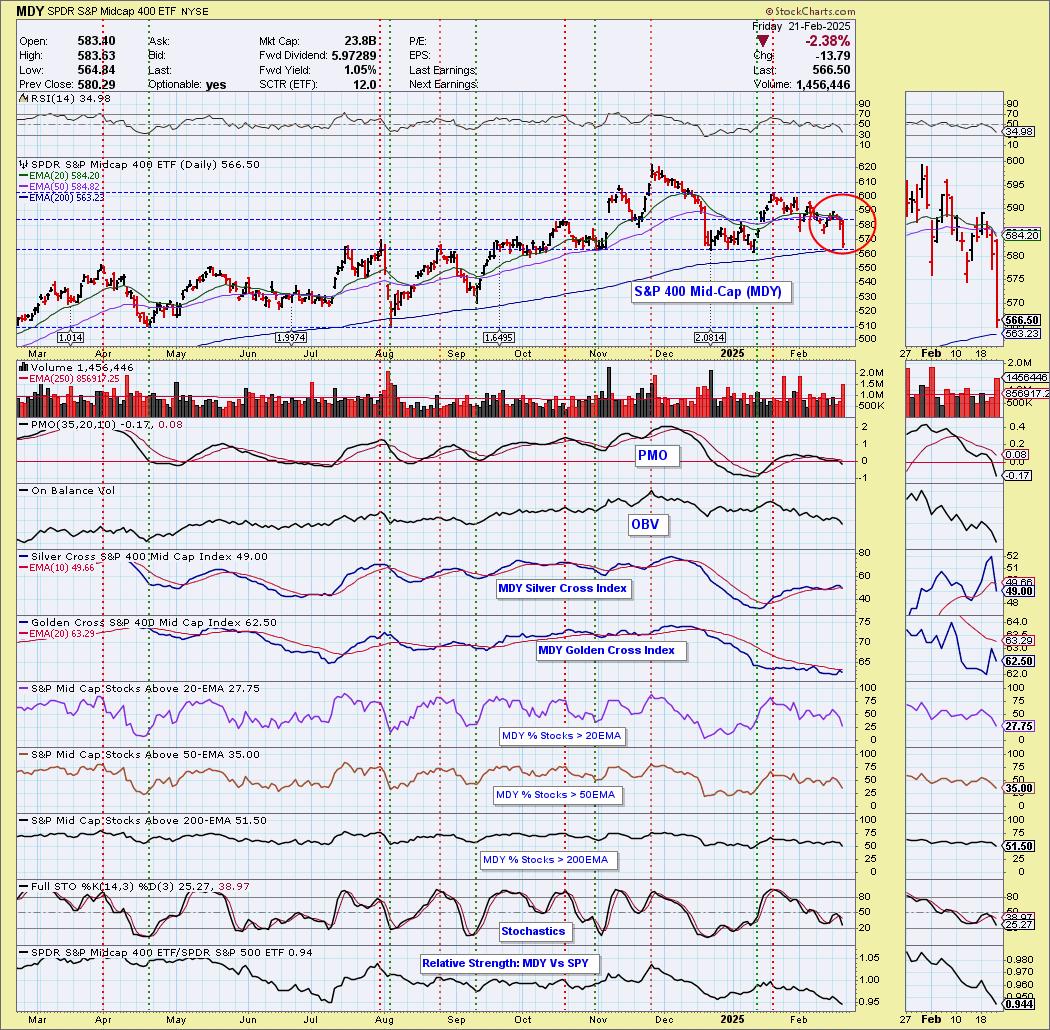
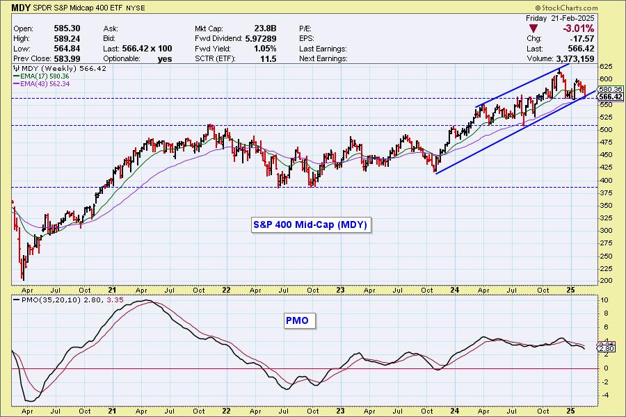
The rising trend channel is close to being violated. The weekly PMO is in decline suggesting this rising trend is very vulnerable.
______________
Also today the Biotechnology ETF (IBB) 20-day EMA crossed up through the 50-day EMA (Silver Cross), generating an IT Trend Model BUY Signal. This looks encouraging, but overhead resistance is arriving soon. Participation is inching lower which doesn't suggest we'll get much more upside. The Silver Cross Index is nearing a Bearish Shift and the Golden Cross Index has already seen one.
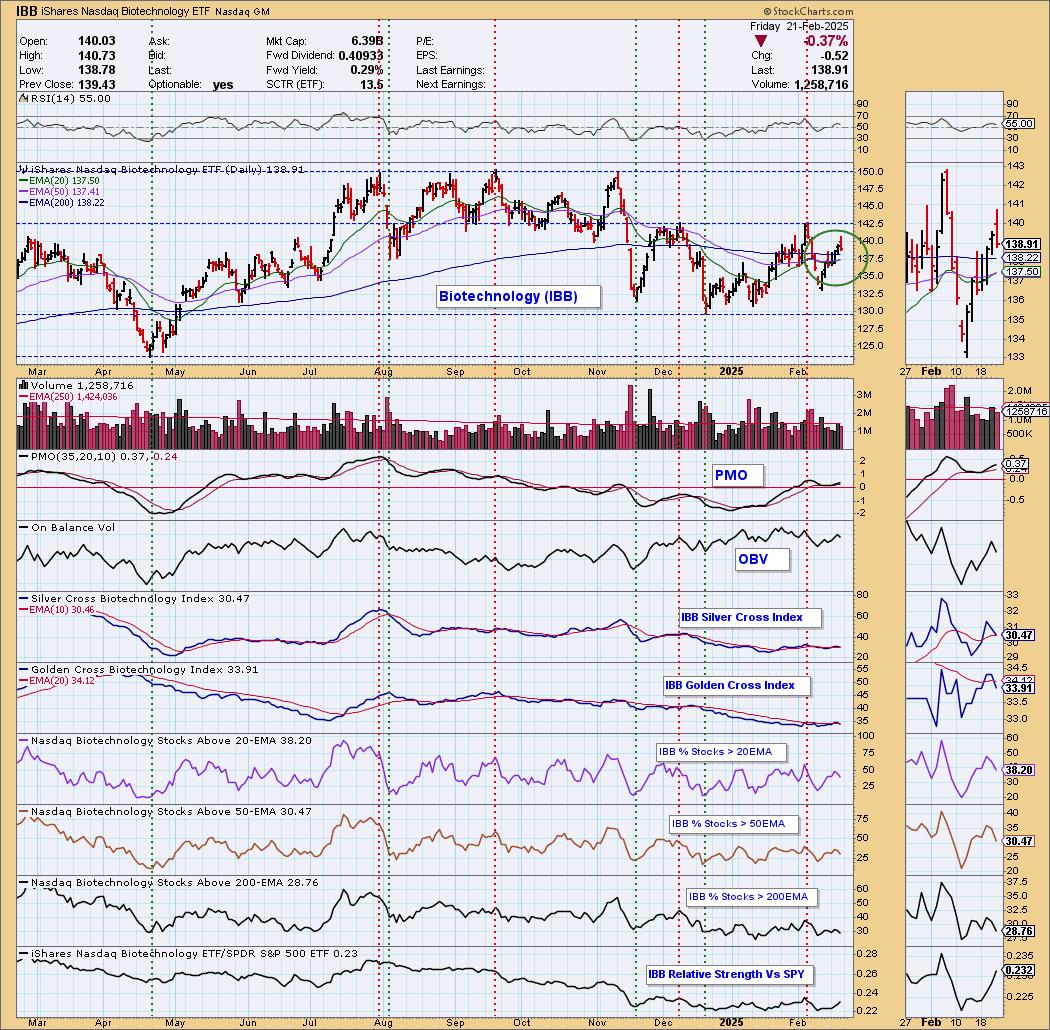
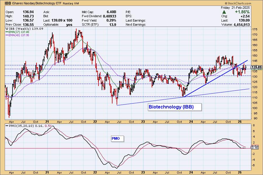
Price broke down from a rising trend and is essentially moving sideways. This is a strong area of overhead resistance. The weekly PMO is basically neutral sitting on the zero line and moving sideways. We don't expect much out of today's Silver Cross.
The DecisionPoint Alert Weekly Wrap presents an end-of-week assessment of the trend and condition of the Stock Market, the U.S. Dollar, Gold, Crude Oil, and Bonds. The DecisionPoint Alert daily report (Monday through Thursday) is abbreviated and gives updates on the Weekly Wrap assessments.
Watch the latest episode of DecisionPoint on our YouTube channel here!
MARKET/SPX SECTOR/INDUSTRY GROUP INDEXES
Change Today: 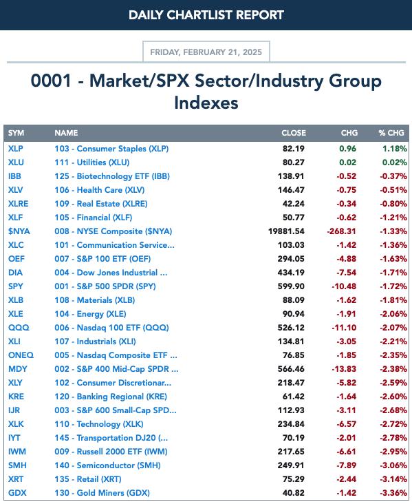
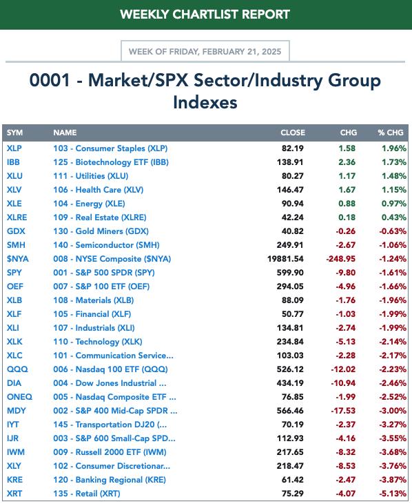
Change for the Week:
CLICK HERE for Carl's annotated Market Index, Sector, and Industry Group charts.
THE MARKET (S&P 500)
IT Trend Model: BUY as of 8/14/2024
LT Trend Model: BUY as of 3/29/2023
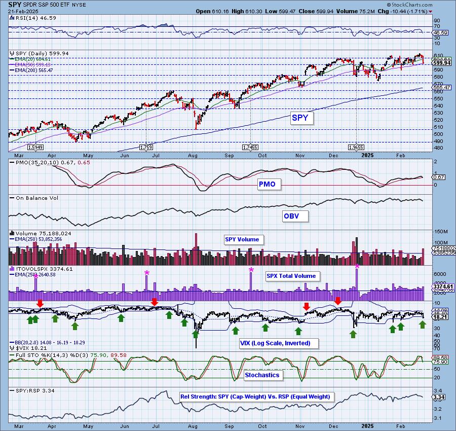
SPY 10-Minute Chart: Price basically declined all day with a pause to finish the day. The 10-minute PMO is rising toward a Crossover BUY Signal, but we see this as diminishing weakness not new strength. Stochastics topped near 20.
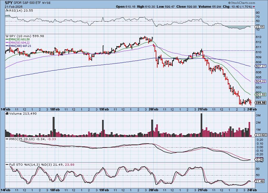
SPY Daily Chart: Price is back below the declining tops trendline. The decline pushed price down to the 50-day EMA in one fell swoop. This caused the RSI to move into negative territory and pushed the PMO lower toward a Crossover SELL Signal.
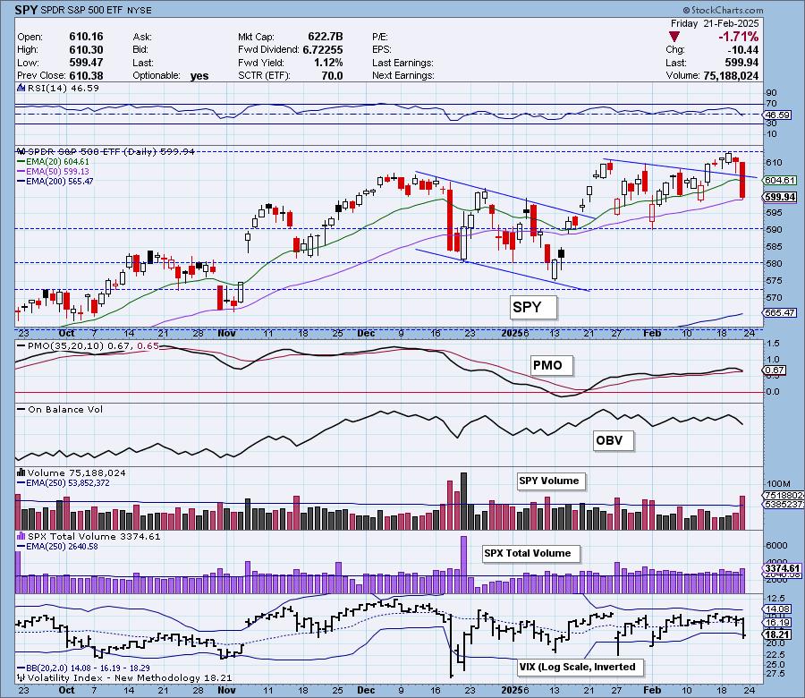
The VIX finally showed signs of strain as investors were clearly shook by today's big decline. It did puncture the lower Bollinger Band and that can often times lead to some upside, but given the Bands were so close together, we don't think this will result in higher prices. We see this more as weakness as the VIX is now below its moving average on the inverted scale. Stochastics topped and dropped below 80.

Here is the latest recording from 2/10 (No trading room on 2/17). Click HERE to get the link to video library.
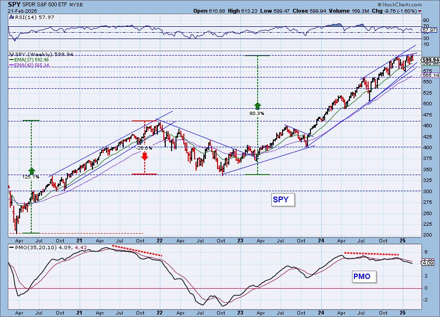
SPY Weekly Chart: The rising wedge on the weekly chart has become more pronounced with the recent declining trend. This pattern suggests we could see a breakdown below the rising bottoms trendlines. The weekly PMO is in decline which doesn't inspire confidence.
New 52-Week Highs/Lows: Interestingly New Highs expanded on the decline which is a positive divergence. Still, there weren't that many New Highs overall. New Lows also expanded as we would expect on a decline. The High-Low Differential is declining and is also in a declining trend which does set up a negative divergence with price tops.
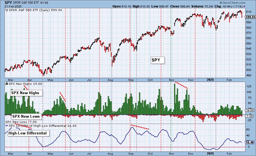
Climax Analysis: Today there were three climax readings (and an "almost") on the four relevant indicators, which gives us a downside initiation climax. Total Volume was solid. We should expect more follow through next week.
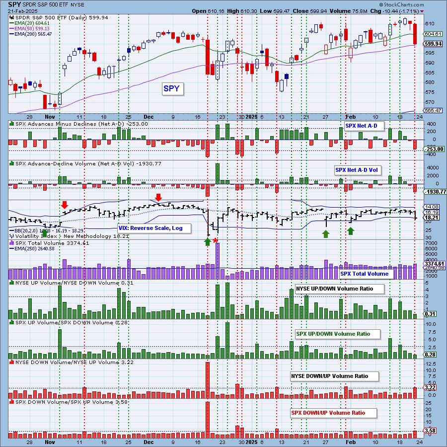
*A climax is a one-day event when market action generates very high readings in, primarily, breadth and volume indicators. We also include the VIX, watching for it to penetrate outside the Bollinger Band envelope. The vertical dotted lines mark climax days -- red for downside climaxes, and green for upside. Climaxes are at their core exhaustion events; however, at price pivots they may be initiating a change of trend.
Short-Term Market Indicators: The short-term market trend is DOWN and the condition is NEUTRAL.
The Swenlin Trading Oscillators (STOs) reversed strongly on the decline which also suggests we will see followthrough to the downside. Participation of stocks above their 20-day EMA dropped below our bullish 50% threshold and more rising PMOs were lost, putting that indicator below our bullish 50% threshold as well.
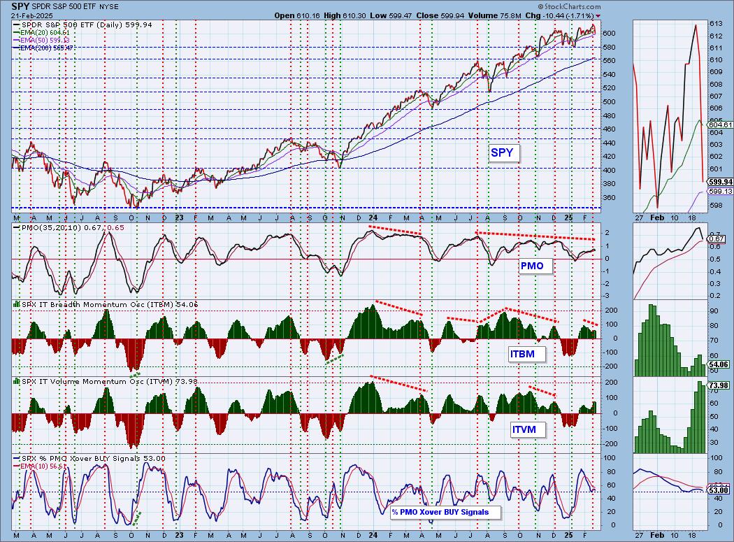
Intermediate-Term Market Indicators: The intermediate-term market trend is UP and the condition is NEUTRAL.
Both the ITBM and ITVM dropped a great deal today essentially confirming what we saw on STOs. We have a negative divergence between ITBM tops and price tops. %PMO Xover BUY Signals topped beneath the signal line.
_______
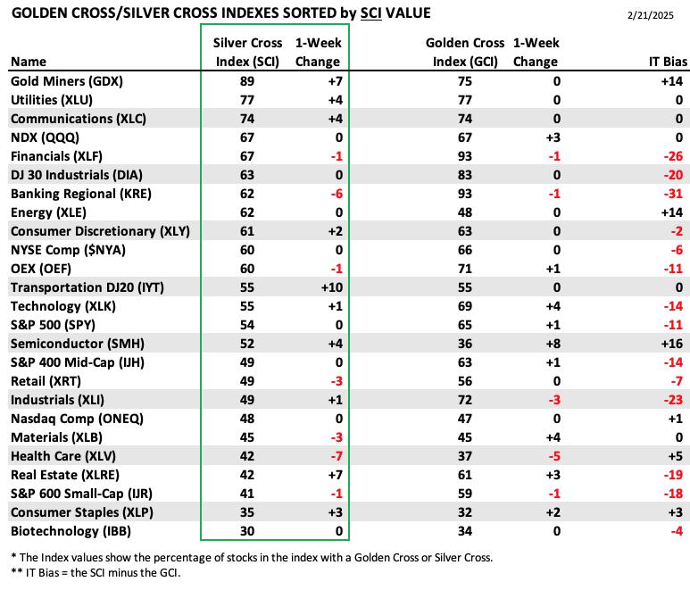
PARTICIPATION TABLES: The following tables summarize participation for the major market indexes and sectors. The 1-Week Change columns inject a dynamic aspect to the presentation. There are three groups: Major Market Indexes, Miscellaneous Industry Groups, and the 11 S&P 500 Sectors.
IT Biases are mostly negative now. Semiconductors (SMH) hold the highest IT Bias primarily because the Golden Cross Index is lower than the Silver Cross Index. We did see gains on both the SCI and GCI, but with this new decline, we are likely to see this group struggle.
The most negative IT Bias belongs to Regional Banks (KRE). It is losing ground on both the SCI and GCI so this is a group to avoid.
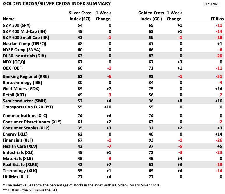
This table is sorted by SCI values. This gives a clear picture of strongest to weakest index/sector in terms of intermediate-term participation.
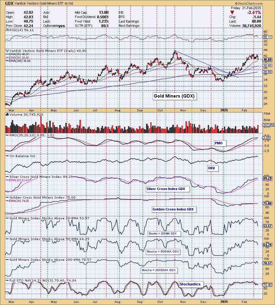
Gold Miners (GDX) have had quite a run and that has put them at the top of the SCI table. They did continue to gain SCI points, but the group now looks vulnerable to decline despite Gold's rally.
Biotechnology (IBB) holds the lowest SCI value and based on the daily chart we reviewed at the open, it doesn't look that bullish.
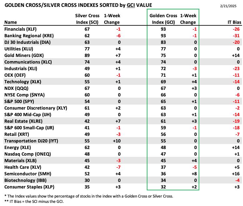
This table is sorted by GCI values. This gives a clear picture of strongest to weakest index/sector in terms of long-term participation.
Financials (XLF) and Regional Banks (KRE) top the GCI table, but both are now looking ready for a pullback. Note that each lost a GCI percentage point this week. We expect more losses next week.
Consumer Staples (XLP) holds the lowest GCI value, but it did see expansion. The daily chart for XLP looks bullish right now so it may be at the bottom of the list now, but it is likely to see gains next week as defensive sectors usually do alright during market downturns.
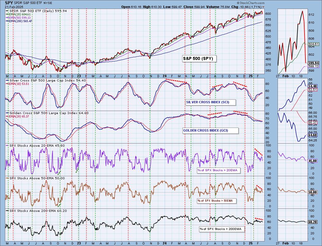
PARTICIPATION CHART (S&P 500): The following chart objectively shows the depth and trend of participation for the SPX in two time frames.
- Intermediate-Term - the Silver Cross Index (SCI) shows the percentage of SPX stocks on IT Trend Model BUY signals (20-EMA > 50-EMA). The opposite of the Silver Cross is a "Dark Cross" -- those stocks are, at the very least, in a correction.
- Long-Term - the Golden Cross Index (GCI) shows the percentage of SPX stocks on LT Trend Model BUY signals (50-EMA > 200-EMA). The opposite of a Golden Cross is the "Death Cross" -- those stocks are in a bear market.
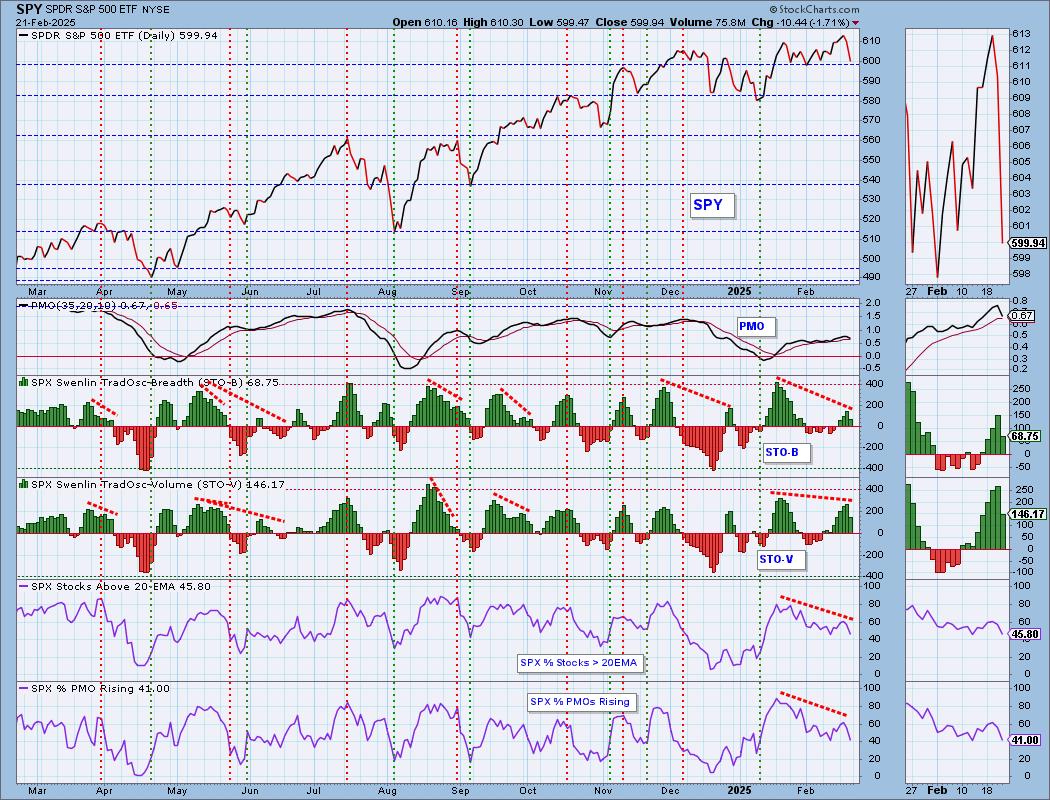
The market bias is BULLISH in the intermediate term.
The market bias is BEARISH in the long term.
Participation is being leached out of the market again setting up new declining trends. %Stocks > 20EMA fell below our bullish 50% threshold and %Stocks > 50EMA are sitting on it. These are not good readings. The Silver Cross Index topped today and is headed toward a Bearish Shift across the signal line. It should continue lower based on lower percentages on %Stocks > 20/50EMAs. It is currently holding above its signal line so the IT Bias is still BULLISH. The Golden Cross Index is rising, but it isn't likely to continue to given there are so many stocks below their 200-day EMAs. It is below its signal line so the LT Bias is BEARISH.
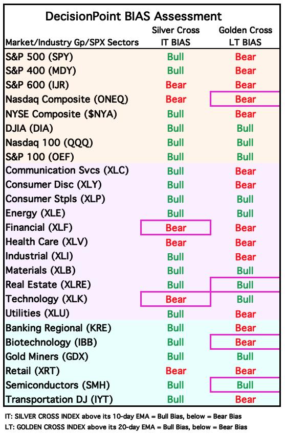
BIAS Assessment: The following table expresses the current BIAS of various price indexes based upon the relationship of the Silver Cross Index to its 10-day EMA (intermediate-term), and of the Golden Cross Index to its 20-day EMA (long-term). When the Index is above the EMA it is bullish, and it is bearish when the Index is below the EMA. The BIAS does not imply that any particular action should be taken. It is information to be used in the decision process.
The items with highlighted borders indicate that the BIAS changed today.
*****************************************************************************************************
CONCLUSION: Today's decline shook up the market and in turn shook up investors as the VIX saw a big gain today. The decline changed the complexion of our indicators which are now decidedly bearish. We had just begun to see gains in participation, but those percentages were cut on the decline setting up new declining trends. The only bullish indication today was an increase in New Highs, but it wasn't that impressive. We have a clear downside initiation climax that certainly calls for more downside next week. Mega-caps are weakening further as seen in Erin's free article today. We should honor our stops and reevaluate portfolio positions as we are likely headed lower.
Erin is 10% long, 0% short. (This is intended as information, not a recommendation.)
*****************************************************************************************************
CALENDAR
Have you subscribed the DecisionPoint Diamonds yet? DP does the work for you by providing handpicked stocks/ETFs from exclusive DP scans! Add it with a discount! Contact support@decisionpoint.com for more information!
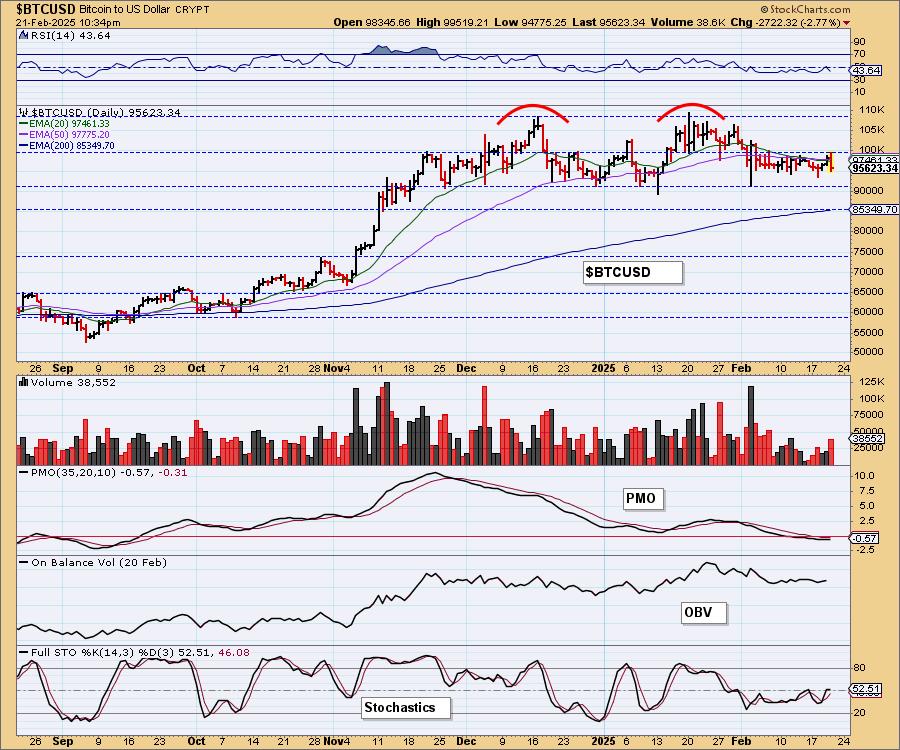
BITCOIN
Bitcoin Daily Chart: Bitcoin broke slightly from its declining trend but is immediately falling back. The RSI is no longer positive and Stochastics have stalled. The PMO is very neutral as it moves sideways along the zero line so we suspect rather than a bullish breakout, we will see price move sideways within the current tight trading range.
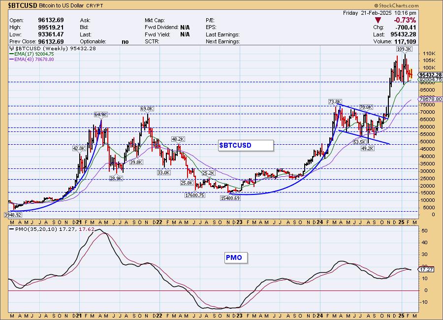
Bitcoin Weekly Chart: The double top looks ominous on the weekly chart and has us concerned. Rather than consolidation like last time out of the parabolic advance, this is a clear topping formation. The weekly PMO has triggered a Crossover SELL Signal. Be careful with Bitcoin.
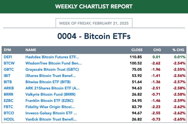
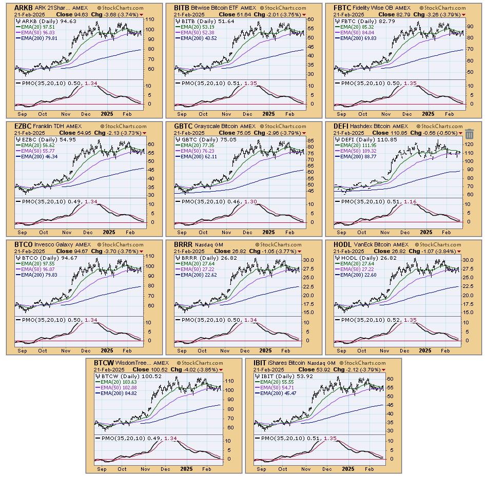
BITCOIN ETFs
Today:
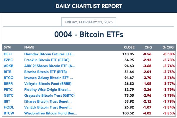
This Week:
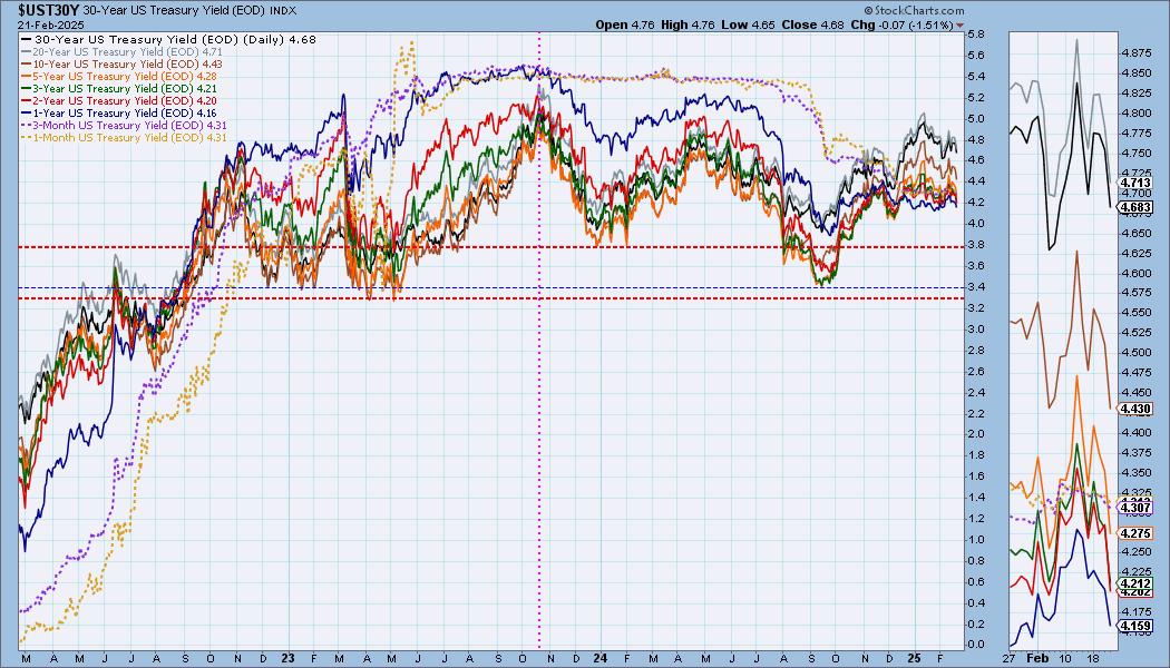
INTEREST RATES
With inflation worries at the forefront today off poor consumer sentiment and PMI, we would've expected rates to rise, but instead they fell. Declining trends are intact so at this point we should expect them to fall further unless the Bond market gets on board regarding inflation worries.
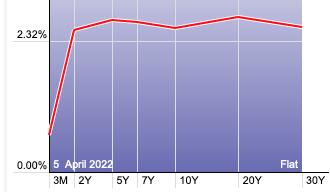
The Yield Curve Chart from StockCharts.com shows us the inversions taking place. The red line should move higher from left to right. Inversions are occurring where it moves downward.
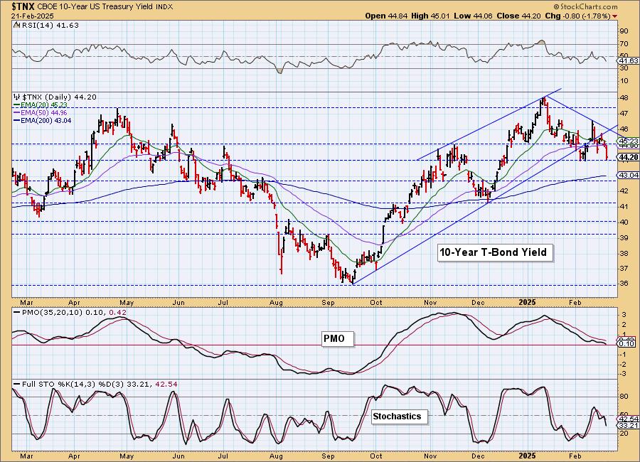
10-YEAR T-BOND YIELD
$TNX dropped perilously down to support at 4.4%. This looks very toppy with the declining trend. The indicators are very bearish so we would expect to see a move down to test the 200-day EMA around 4.3%. The PMO is nearly below zero and Stochastics are falling vertically.
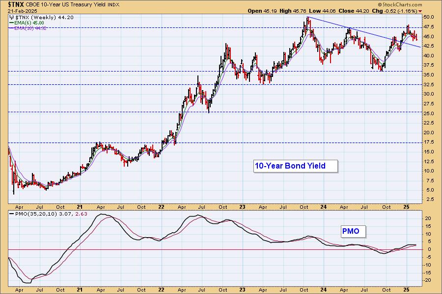
10-Year Bond Yield Weekly Chart: We aren't surprised to see this decline as $TNX had reached overhead resistance. The weekly PMO is topping so we should expect the decline to continue.
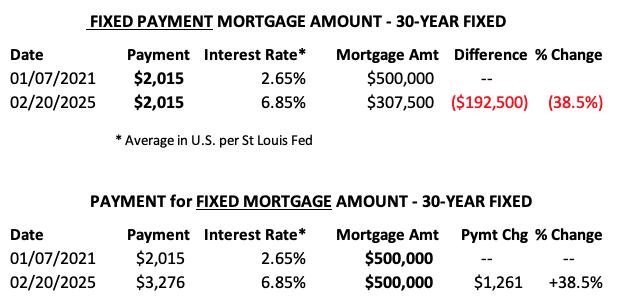
MORTGAGE INTEREST RATES (30-Yr)**
**We watch the 30-Year Fixed Mortgage Interest Rate, because, for the most part, people buy homes based upon the maximum monthly payment they can afford. As rates rise, a fixed monthly payment will carry a smaller mortgage amount, which shuts many buyers out of the market, and potential sellers will experience pressure to lower prices (to no effect so far).
--
This week the 30-Year Fixed Rate changed from 6.87 to 6.85.

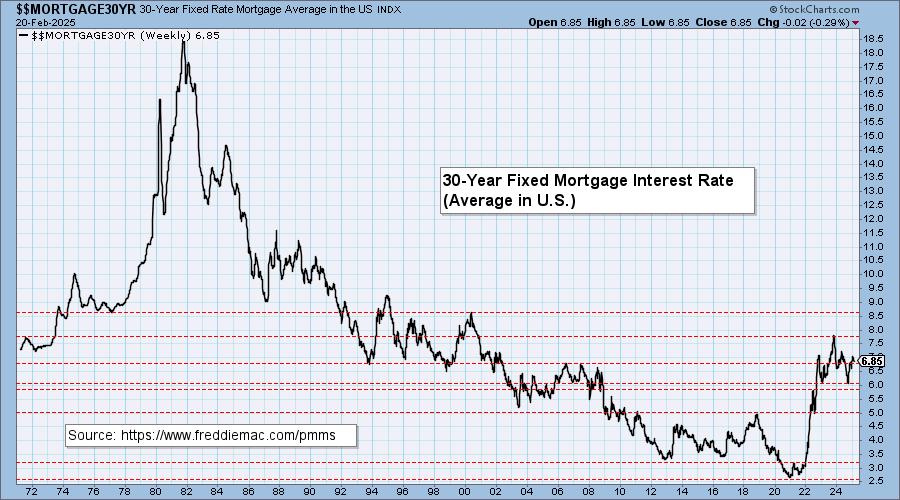
Here is a 50-year chart for better perspective.
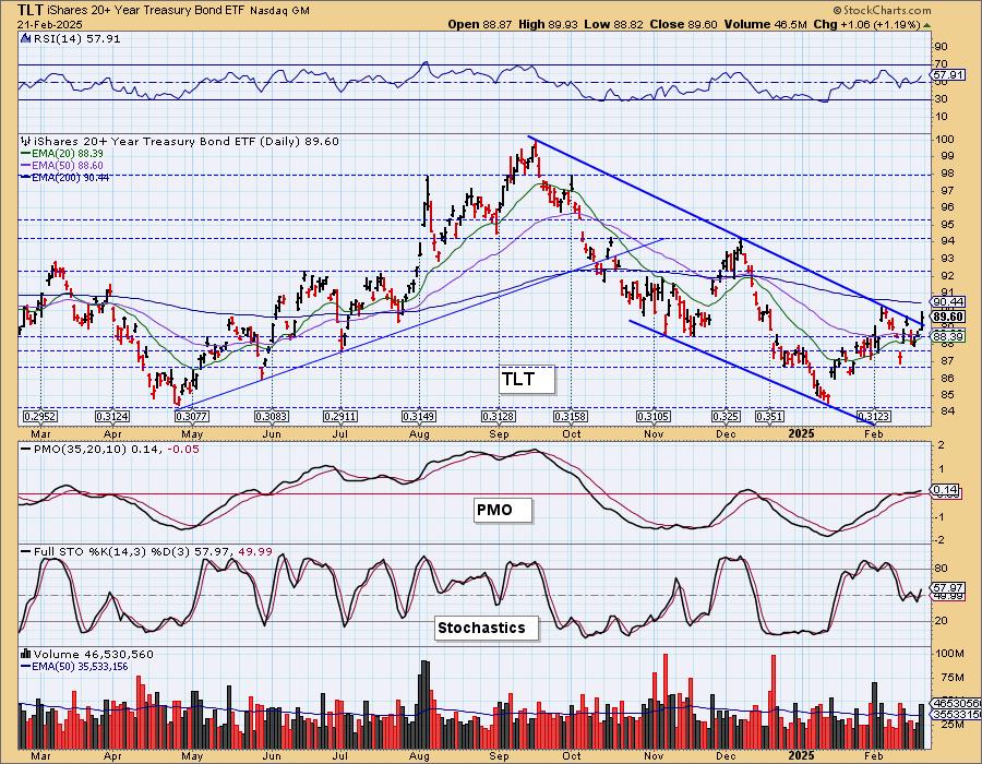
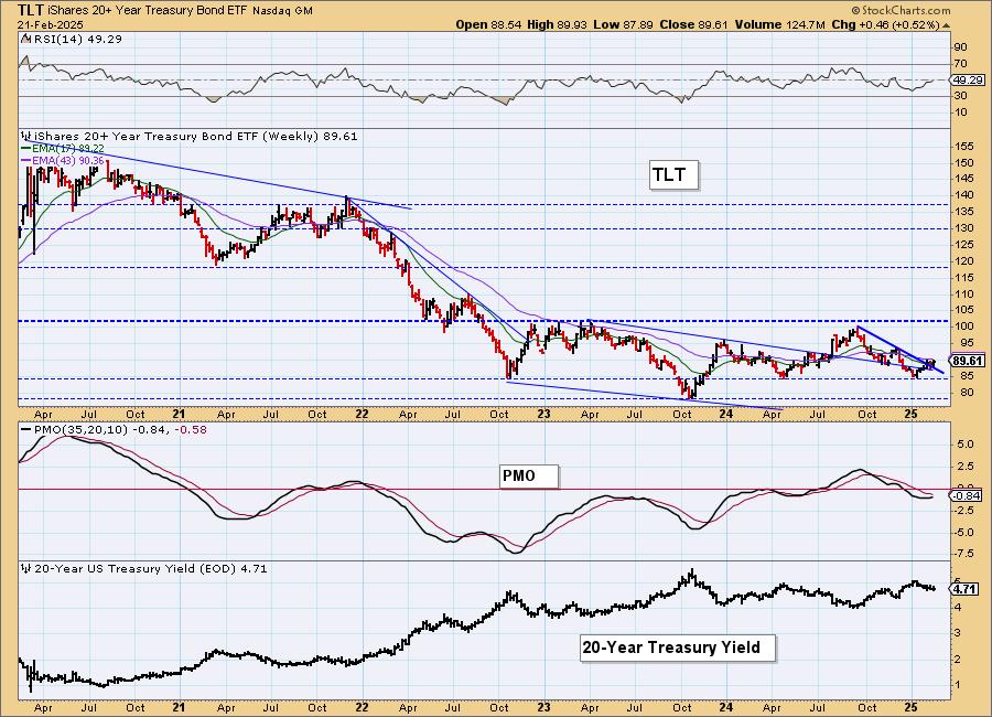
BONDS (TLT)
IT Trend Model: NEUTRAL as of 11/10/2024
LT Trend Model: SELL as of 12/13/2024
TLT Daily Chart: The rising trend on the 20-year yield has been broken and that is good news for Bonds in general. Today saw a nice rally that lifted the PMO higher above the zero line. Stochastics are moving up in positive territory so we do expect higher prices for TLT going into next week.
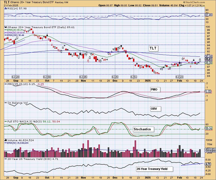
Today saw a breakout from the declining trend channel and that also suggests we'll see more upside out of TLT.
TLT Weekly Chart: The declining trend on the weekly chart has been broken. The weekly RSI is nearly positive and the weekly PMO is turning back up. It seems a bit strange that yields are declining given a not so positive outlook on inflation so we should be ready to pivot.
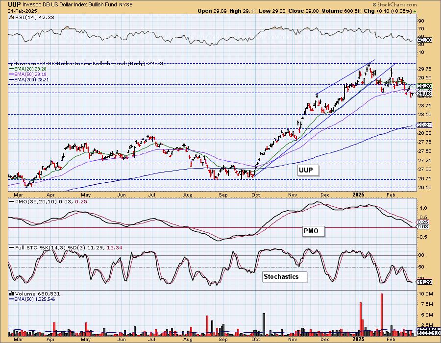
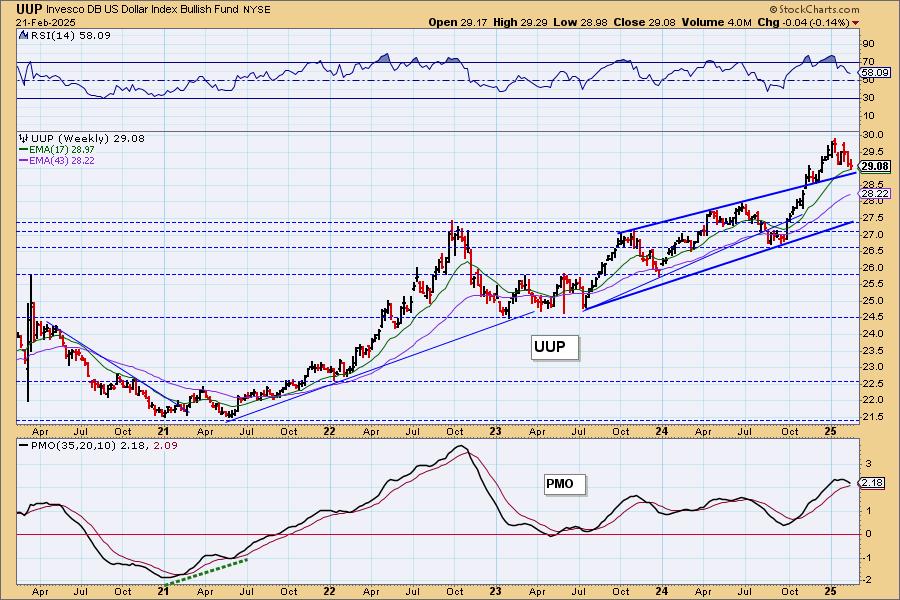
DOLLAR (UUP)
IT Trend Model: BUY as of 10/9/2024
LT Trend Model: BUY as of 5/25/2023
UUP Daily Chart: The double top dominates the Dollar chart and suggests we will see lower prices ahead since the confirmation line of the pattern was broken this week. The PMO is nearing negative territory and Stochastics are falling below 20 indicating internal weakness.
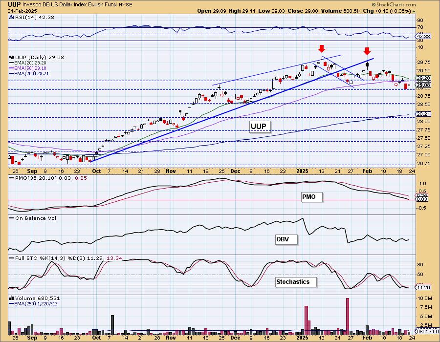
UUP Weekly Chart: We got a very bullish breakout from a bearish rising wedge, but price is failing and should move back within the wedge soon. The weekly PMO has topped which also confirms what we are seeing with price right now. We would be looking toward 28.50 as support.
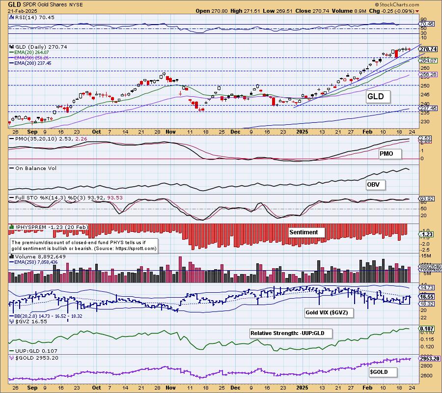
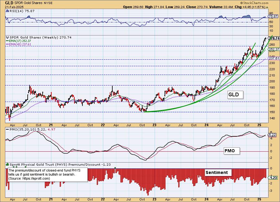
GOLD
IT Trend Model: NEUTRAL as of 12/23/2024
LT Trend Model: BUY as of 10/20/2023
GLD Daily Chart: Gold was down slightly today but it wasn't enough to take the RSI out of overbought territory. That suggests to us that Gold is likely to top out or consolidate here. It is testing the more accelerated rising bottoms trendline and we think it will fail to hold. A bearish Dollar is likely to prevent a deep decline. We are looking toward 265 for GLD. The PMO is still very positive as are Stochastics which are camped out above 80. We like Gold overall, but just think it is time for a pause or slight pullback.
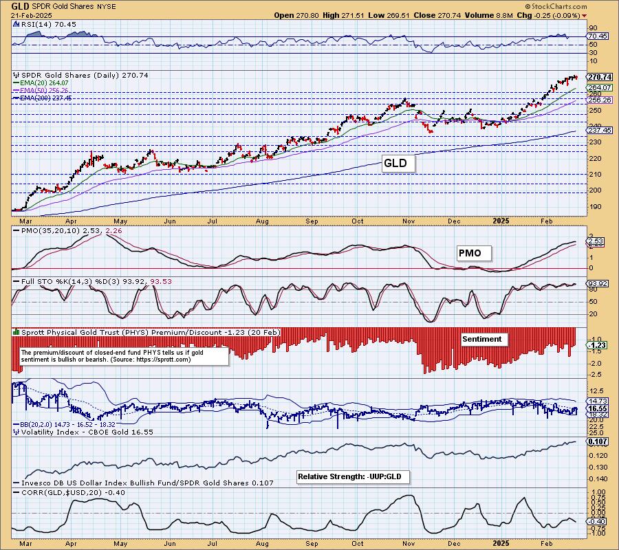
GLD Weekly Chart: We have parabolic advance on the weekly chart. Price hasn't gone vertical yet, but it is getting close. Remember parabolic formations beg for a correction. Given the weekly PMO is on a new Crossover BUY Signal, we aren't looking for a correction at this point, but more likely a pause or small pullback. If the market decline accelerates, Gold is often a place investors park to ride it out.
GOLD MINERS Daily Chart: Gold Miners have been looking toppy and we had already warned against more decline. The PMO is now topping and support was lost. Look at the damage done to %Stocks > 20/50EMAs. Stochastics have also topped and look bearish. With Gold looking to consolidate or pause, we would expect GDX to continue to show weakness. They could pull back hard on a decline in Gold. We'll be watching for an opportunity to reenter this group on a corrective move.
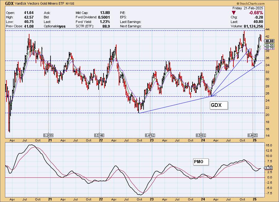
GDX Weekly Chart: The weekly chart is bullish except that price is moving almost vertically higher. That is a condition that is nearly impossible to maintain. With price so close to overhead resistance it makes sense that we would see a pullback. The weekly PMO looks very bullish, but given the bearish daily chart, we expect a pullback not more rally.
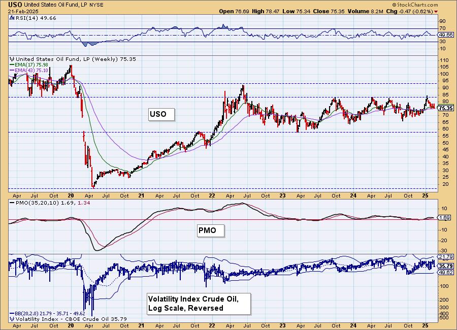
CRUDE OIL (USO)
IT Trend Model: BUY as of 12/24/2024
LT Trend Model: BUY as of 1/10/2025
USO Daily Chart: Crude Oil didn't make up much ground this week. It did set up a double bottom that never was confirmed. If we do see a rally here it would set up a triple bottom. However, we see this support level as highly vulnerable given the PMO's top beneath the signal line. Stochastics are also in decline. We had been looking for more sideways action, but now it looks like a decline is likely ahead.
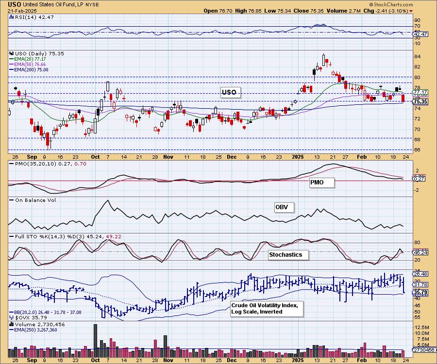

USO/$WTIC Weekly Chart: Price is in a sideways trading range. It hit overhead resistance and was turned away for a fourth time. The weekly PMO is flat along the zero line which is about as neutral as you can get. Not surprise given the sideways trading. The weekly PMO has topped and is near a Crossover SELL Signal so both the daily and weekly chart suggest more downside for Crude Oil ahead.
Good Luck & Good Trading!
Erin Swenlin and Carl Swenlin
Technical Analysis is a windsock, not a crystal ball. --Carl Swenlin
(c) Copyright 2025 DecisionPoint.com
Disclaimer: This blog is for educational purposes only and should not be construed as financial advice. The ideas and strategies should never be used without first assessing your own personal and financial situation, or without consulting a financial professional. Any opinions expressed herein are solely those of the author, and do not in any way represent the views or opinions of any other person or entity.
DecisionPoint is not a registered investment advisor. Investment and trading decisions are solely your responsibility. DecisionPoint newsletters, blogs or website materials should NOT be interpreted as a recommendation or solicitation to buy or sell any security or to take any specific action.
NOTE: The signal status reported herein is based upon mechanical trading model signals, specifically, the DecisionPoint Trend Model. They define the implied bias of the price index based upon moving average relationships, but they do not necessarily call for a specific action. They are information flags that should prompt chart review. Further, they do not call for continuous buying or selling during the life of the signal. For example, a BUY signal will probably (but not necessarily) return the best results if action is taken soon after the signal is generated. Additional opportunities for buying may be found as price zigzags higher, but the trader must look for optimum entry points. Conversely, exit points to preserve gains (or minimize losses) may be evident before the model mechanically closes the signal.
Helpful DecisionPoint Links:
DecisionPoint Alert Chart List
DecisionPoint Golden Cross/Silver Cross Index Chart List
DecisionPoint Sector Chart List
Price Momentum Oscillator (PMO)