
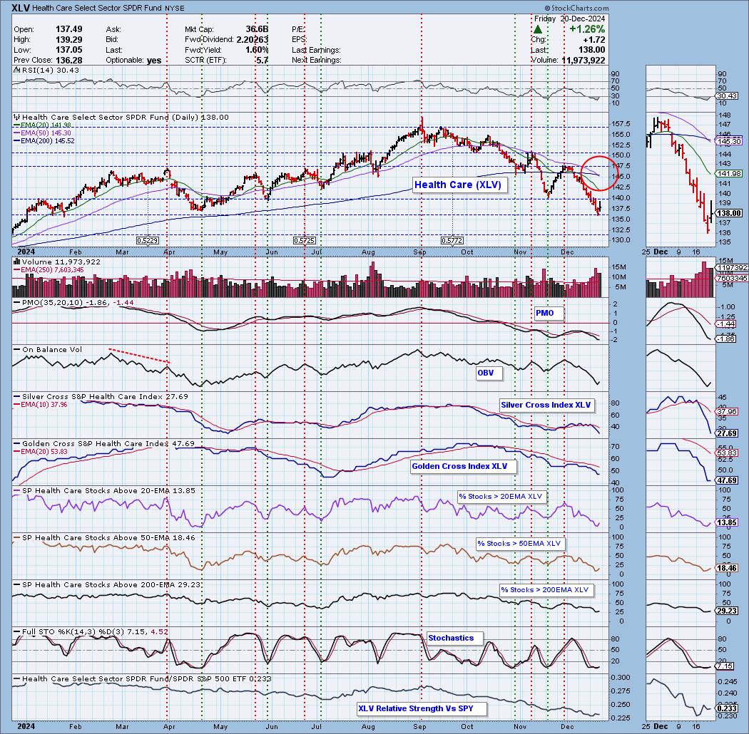
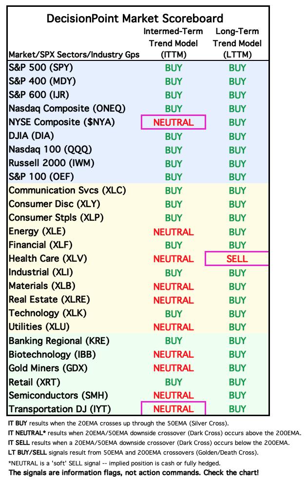
Today the Health Care Sector (XLV) 50-day EMA crossed down through the 200-day EMA (Death Cross), generating an LT Trend Model SELL Signal. Today's rally did come off support, but this sector has been in decline for some time which is why we see such poor participation readings. This signal puts XLV in a bear market configuration.
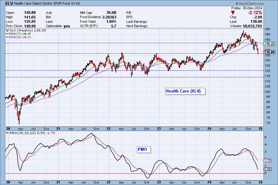
On the weekly chart, XLV has managed to stay above a long-term support line, but the decline has become accelerated. Support is very vulnerable especially given the near vertical drop in the weekly PMO.
_________
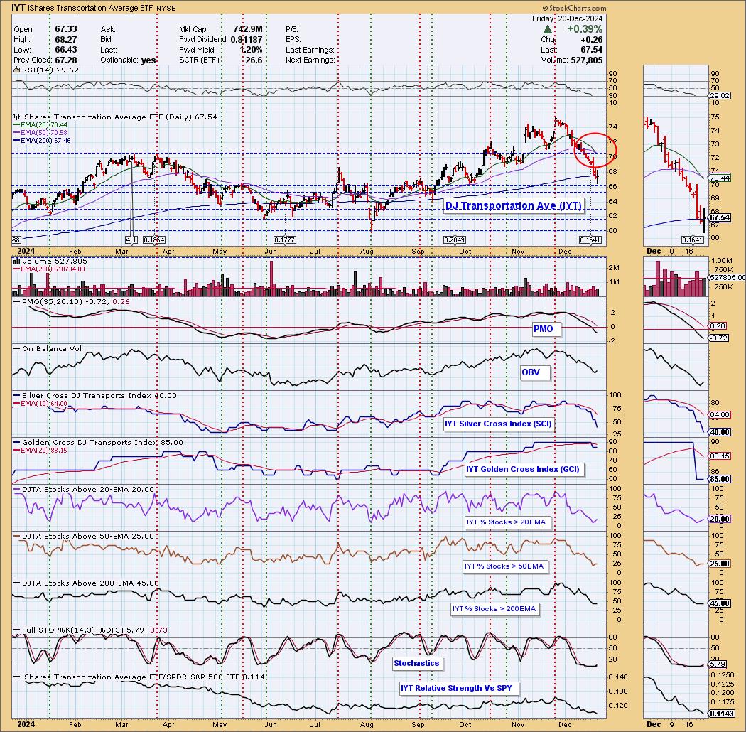
Today the Dow Jones Transportation ETF (IYT) 20-day EMA crossed down through the 50-day EMA (Dark Cross), below the 200-day EMA, generating an IT Trend Model SELL Signal. The decline has been sharp out of the bearish double top. Support has arrived, but the 200-day EMA has been broken.
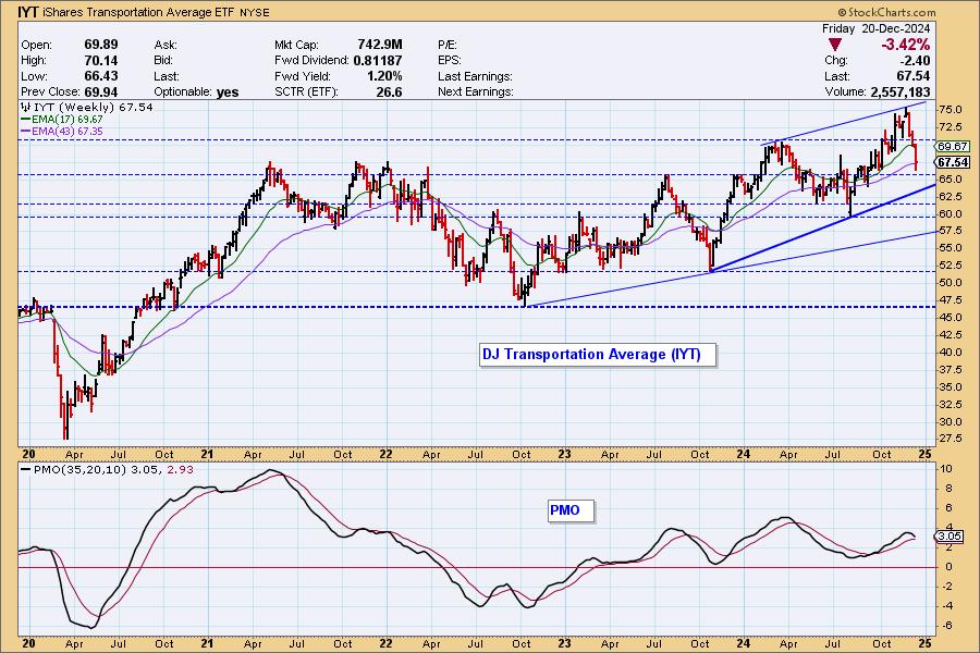
The weekly chart also shows IYT in an accelerated decline within a bearish rising wedge. Price looks destined to at least test the bottom of the wedge. The wedge implies a breakdown ahead, but for now the rising trend is intact.
_________
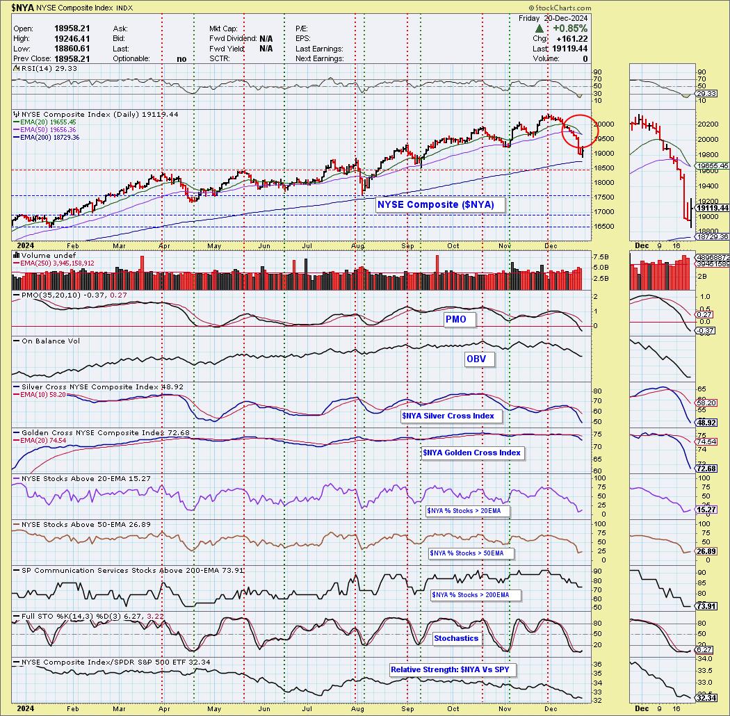
Finally, the NYSE Composite Index ($NYA) 20-day EMA crossed down through the 50-day EMA (Dark Cross), above the 200-day EMA, generating an IT Trend Model NEUTRAL Signal. Today saw a nice rally off the 200-day EMA. The PMO is in negative territory and declining and participation is thin. Stochastics have turned up but we still see a bearish bias on the chart.
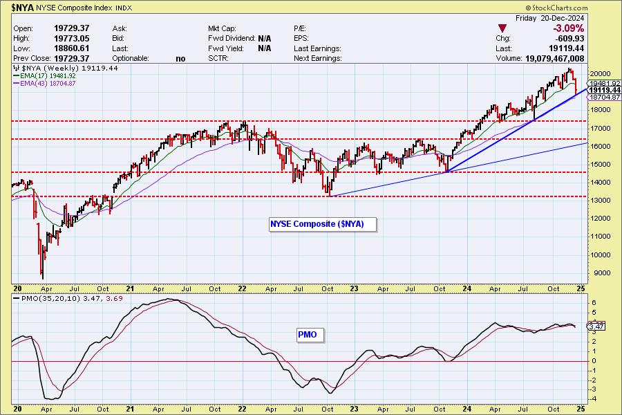
The weekly chart shows that $NYA found support on a one-year rising trend line. If it's going to bounce, this is the place for it to happen. The new weekly PMO SELL Signal tells us the rising trend is in jeopardy.
The DecisionPoint Alert Weekly Wrap presents an end-of-week assessment of the trend and condition of the Stock Market, the U.S. Dollar, Gold, Crude Oil, and Bonds. The DecisionPoint Alert daily report (Monday through Thursday) is abbreviated and gives updates on the Weekly Wrap assessments.
Watch the latest episode of DecisionPoint on our YouTube channel here!
MARKET/SPX SECTOR/INDUSTRY GROUP INDEXES
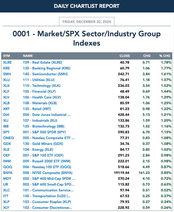
Change Today:
Change for the Week:
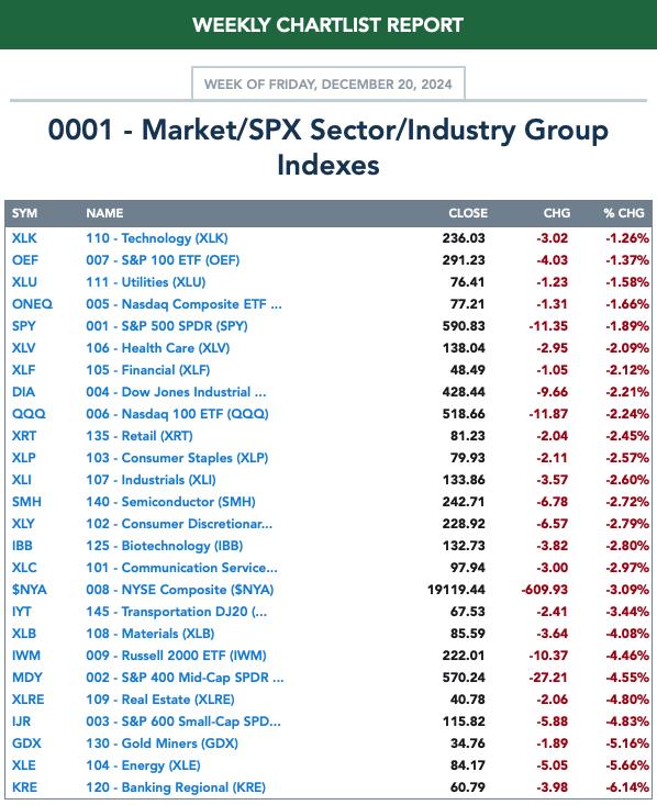
CLICK HERE for Carl's annotated Market Index, Sector, and Industry Group charts.
THE MARKET (S&P 500)
IT Trend Model: BUY as of 8/14/2024
LT Trend Model: BUY as of 3/29/2023
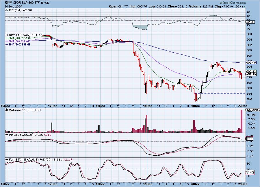
SPY 10-Minute Chart: The PCE (Personal Consumption Expenditures) Index came in lower than expected today, indicating cooling of inflation, which the market absolutely loved. We do note that exuberance was tempered by midday as the market started to take back almost half of today's gains.
SPY Daily Chart: Price did compromise support today but closed comfortably above it. The PMO is still in decline. The decline was heavy this week, but today's market action helped subside some fear.
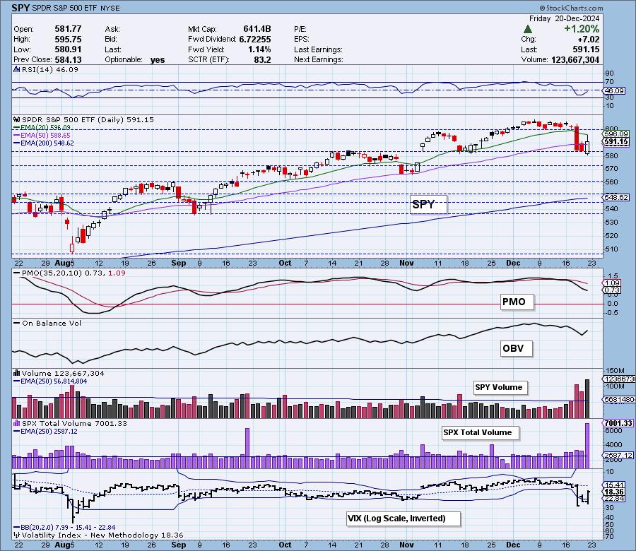
The VIX shows us that investors did get less fearful today as the VIX reading was much lower on the day. It is still below its moving average so there is still some weakness visible. Stochastics were unimpressed by today's rally and declined below 20 indicating internal price weakness.
Here is the latest recording from 12/16. Click HERE to get the link to video library.
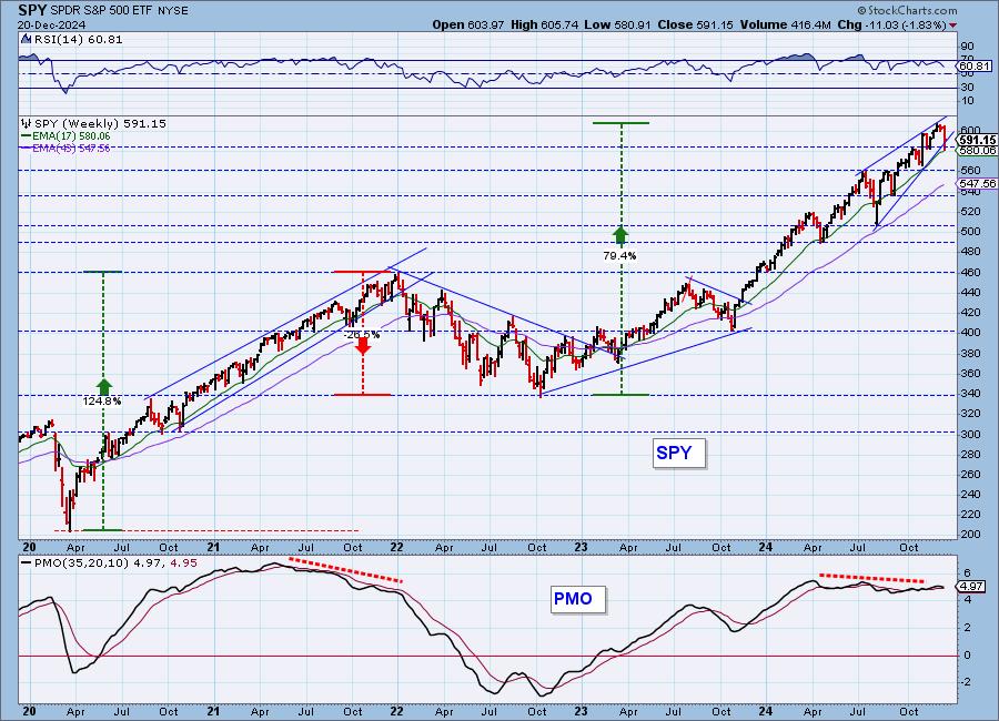
SPY Weekly Chart: We finally saw a breakdown of the bearish rising wedge, but price did manage to close back within the pattern. The weekly PMO has topped and is nearing a Crossover SELL Signal. We should prepare for some weakness ahead as the pattern should see a more decisive decline in time.
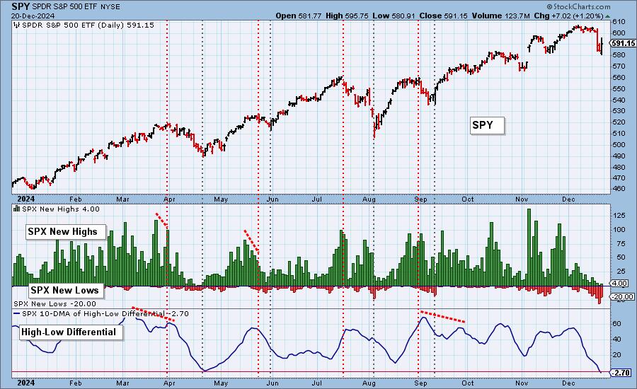
New 52-Week Highs/Lows: New Lows pared back on the rally, but were still reading fairly high. The High-Low Differential has dropped beneath the zero line. It is oversold at present but could fall further.
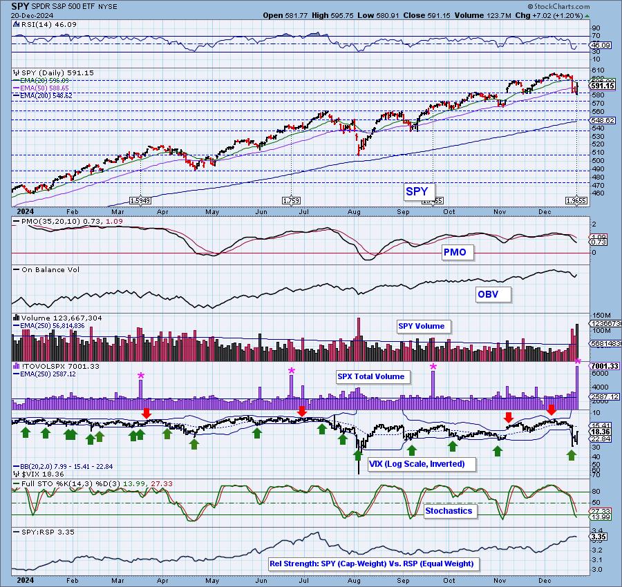
Climax Analysis: There were strong, unanimous climax readings on the four relevant indicators today, giving us an upside initiation climax. SPX Total Volume was 171% of the one-year daily average, BUT it has nothing to do with today's price action. Today was the last trading day prior to options expiration, and that is what caused the high volume. Or in other words, the high volume does not represent confidence in today's rally. To be sure, today's volume attributed to trading was solid, but it was not climactic.
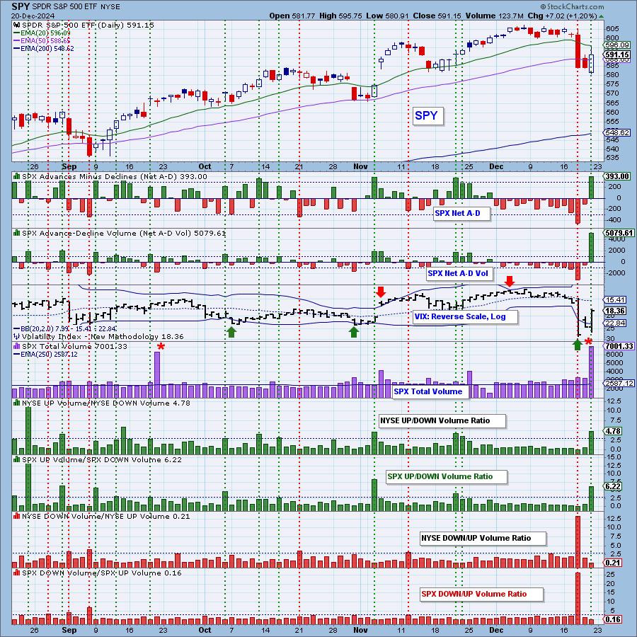
*A climax is a one-day event when market action generates very high readings in, primarily, breadth and volume indicators. We also include the VIX, watching for it to penetrate outside the Bollinger Band envelope. The vertical dotted lines mark climax days -- red for downside climaxes, and green for upside. Climaxes are at their core exhaustion events; however, at price pivots they may be initiating a change of trend.
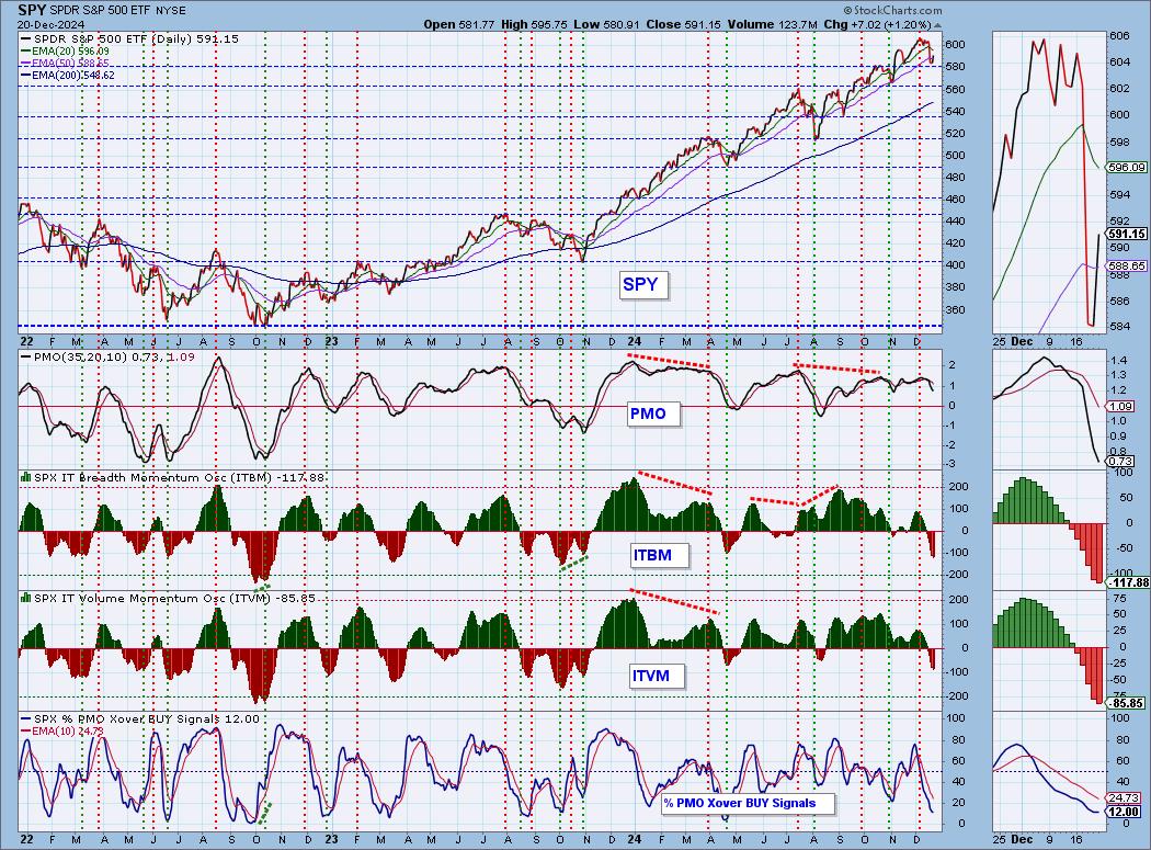
Short-Term Market Indicators: The short-term market trend is DOWN and the condition is OVERSOLD.
We've been waiting for the Swenlin Trading Oscillators (STOs) to turn back up as they had gotten very oversold. This is a bullish turn of events, but we can't assign too much confidence to the signals as it was natural for them to revert back toward zero as they are oscillators and oscillators must oscillate. Still, this is at least somewhat bullish and coming off a strong rally it is certainly encouraging. Participation improved slightly but remains at anemic levels.
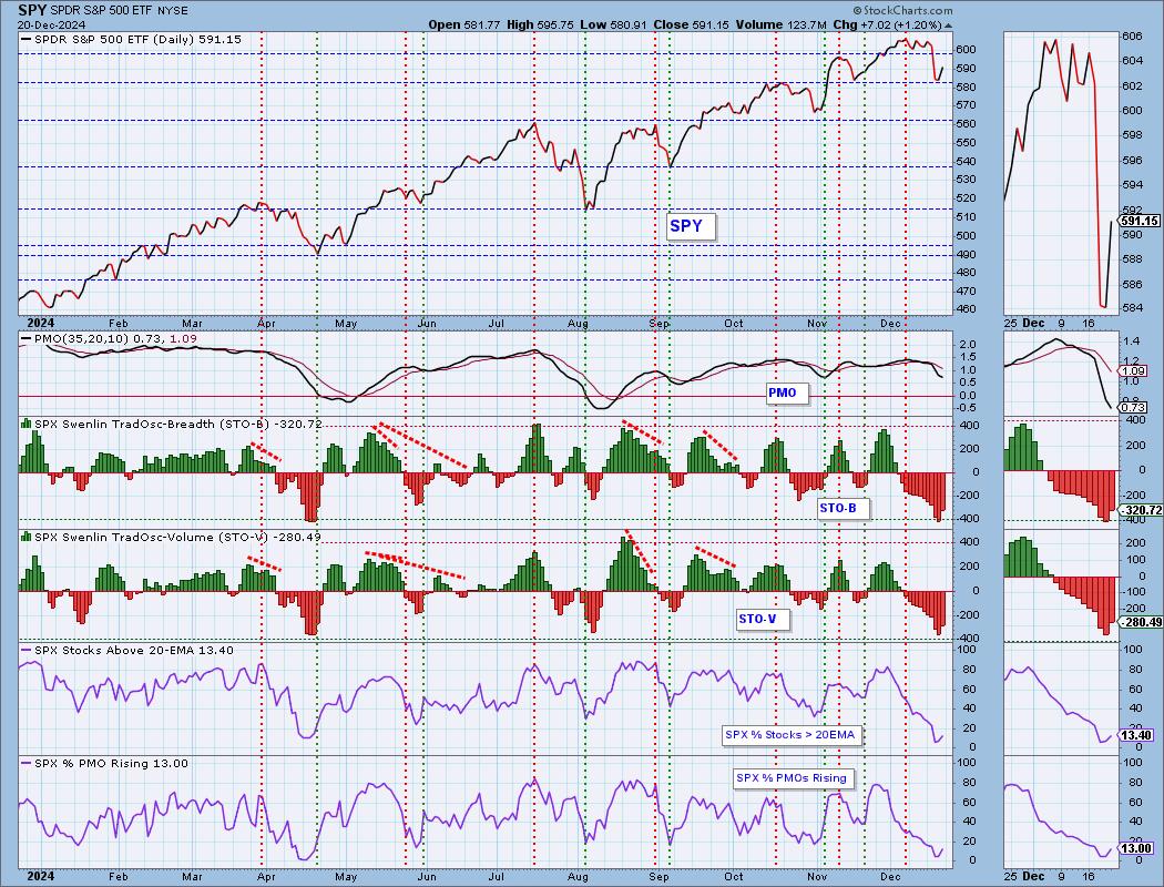
Intermediate-Term Market Indicators: The intermediate-term market trend is UP and the condition is OVERSOLD.
The ITBM and ITVM are still declining so we didn't get a confirmation on the rising STOs, however, they do move much more slowly. %PMO Xover BUY Signals was stagnant today so the rally did not improve under the hood indicators by much. The indicators is very oversold, but if this decline starts up again, those conditions will persist.
_______
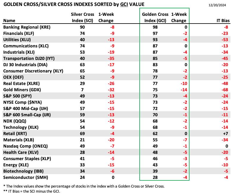
PARTICIPATION TABLES: The following tables summarize participation for the major market indexes and sectors. The 1-Week Change columns inject a dynamic aspect to the presentation. There are three groups: Major Market Indexes, Miscellaneous Industry Groups, and the 11 S&P 500 Sectors.
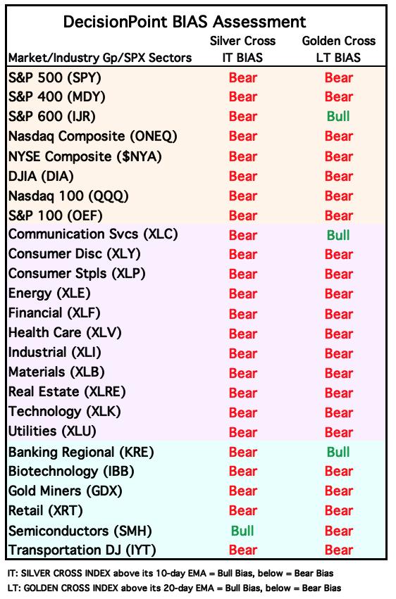
Only one of the entities we cover has a positive IT Bias. The market is weak as bearish biases continue to pervade the index. Retail (XRT) holds a positive IT Bias, but did lose ground on the Silver Cross Index.
We have a very negative bias on Gold Miners (GDX). This group was decimated by the decline in Gold. This week it lost 32 percentage points on the Silver Cross Index. Clearly a weak group, but at least getting oversold.
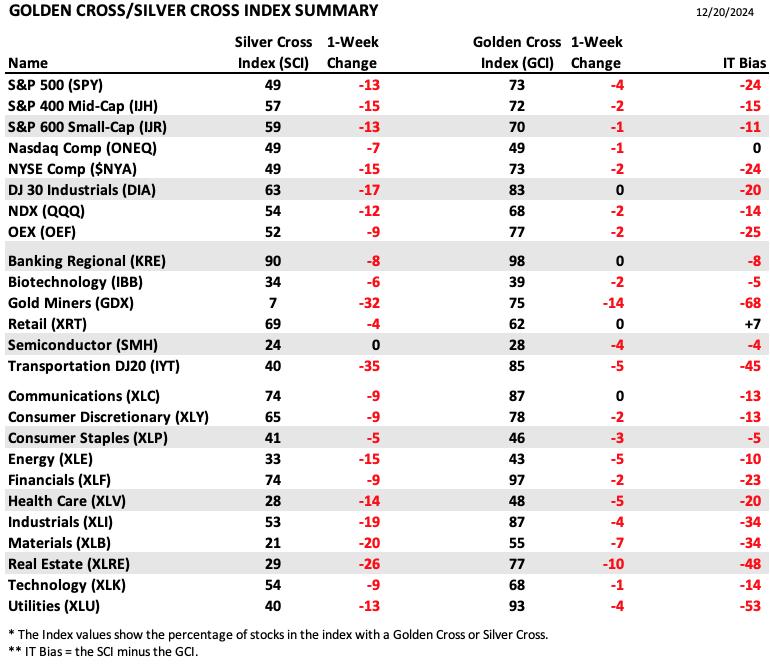
This table is sorted by SCI values. This gives a clear picture of strongest to weakest index/sector in terms of intermediate-term participation.
Semiconductors (SMH) held steady on the Silver Cross Index but all others lost ground. The market is very weak.
Transports (IYT) are on the ropes. They lost a whopping 35 percentage points on the Silver Cross Index, but as noted in the opening, they are sitting on interesting support.
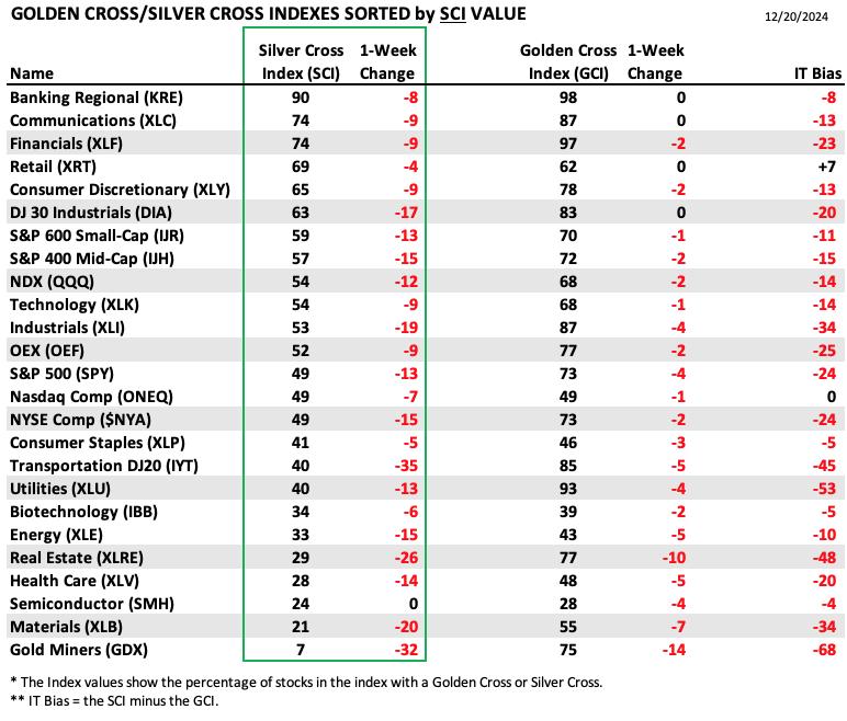
This table is sorted by GCI values. This gives a clear picture of strongest to weakest index/sector in terms of long-term participation.
None of the indexes/sectors/groups we follow saw increases to the Golden Cross Index, another sign of internal weakness. Not surprisingly, Gold Miners (GDX) had the worst losses to the GCI.
Regional Banks (KRE) holds the top spot on both the SCI and GCI. The group is still looking fairly bullish. Its internals are clearly strong.
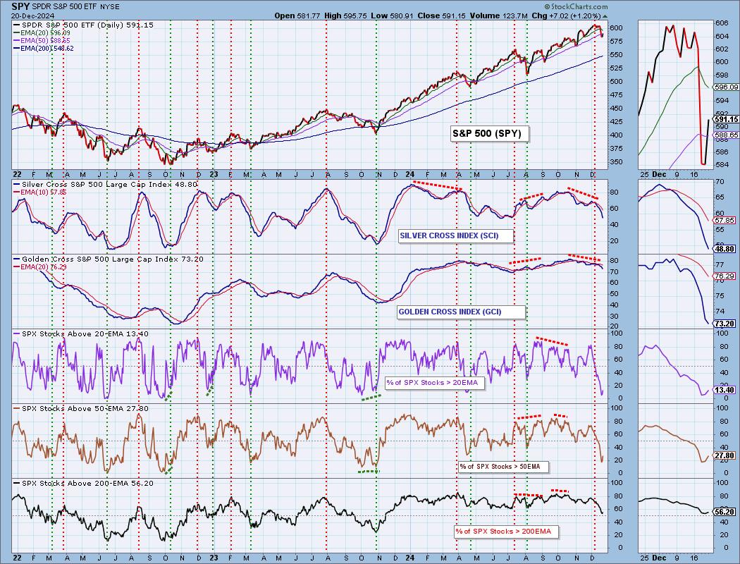
PARTICIPATION CHART (S&P 500): The following chart objectively shows the depth and trend of participation for the SPX in two time frames.
- Intermediate-Term - the Silver Cross Index (SCI) shows the percentage of SPX stocks on IT Trend Model BUY signals (20-EMA > 50-EMA). The opposite of the Silver Cross is a "Dark Cross" -- those stocks are, at the very least, in a correction.
- Long-Term - the Golden Cross Index (GCI) shows the percentage of SPX stocks on LT Trend Model BUY signals (50-EMA > 200-EMA). The opposite of a Golden Cross is the "Death Cross" -- those stocks are in a bear market.
The market bias is BEARISH in the intermediate and long terms.
Participation is very oversold but it also means there is extreme internal weakness. This is where we can look for a possible upside reversal, but if this decline resumes, those oversold conditions will continue on. Still, oversold conditions are encouraging. The Silver Cross Index and Golden Cross Index are in decline and are below their signal lines so the IT and LT Bias is BEARISH.
BIAS Assessment: The following table expresses the current BIAS of various price indexes based upon the relationship of the Silver Cross Index to its 10-day EMA (intermediate-term), and of the Golden Cross Index to its 20-day EMA (long-term). When the Index is above the EMA it is bullish, and it is bearish when the Index is below the EMA. The BIAS does not imply that any particular action should be taken. It is information to be used in the decision process.
The items with highlighted borders indicate that the BIAS changed today.
*****************************************************************************************************
CONCLUSION: There is no doubt about it, the market condition is oversold. We are currently in a bull market configuration so oversold conditions could be very good for the market. Santa could indeed hold things together. Yet, we still aren't convinced that the weakness we experienced on Wednesday won't see followthrough. Right now we do have a new upside initiation climax that would imply we will see the rally continue, but internals are so weak right now. Where will strength be found? We reviewed the Magnificent Seven this morning in the Diamond Mine trading room. The outlook is mixed so a rally continuation isn't a slam dunk. We are cautious and not particularly bullish.
Erin is 35% long, 0% short. (This is intended as information, not a recommendation.)
*****************************************************************************************************
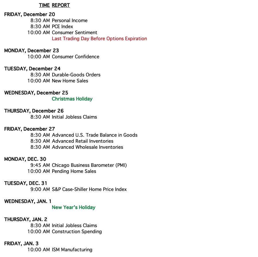
CALENDAR
Have you subscribed the DecisionPoint Diamonds yet? DP does the work for you by providing handpicked stocks/ETFs from exclusive DP scans! Add it with a discount! Contact support@decisionpoint.com for more information!
BITCOIN
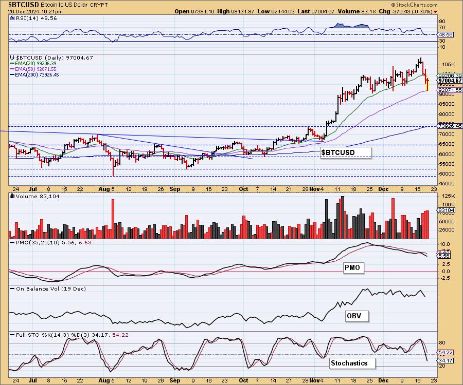
Bitcoin Daily Chart: Bitcoin is in pullback mode, but it has landed on the 50-day EMA. The rising trend was broken and the PMO is continuing to decline but this does look fairly good for support at those prior November/December lows. Stochastics certainly aren't in line for a rally here, but Bitcoin is good at surprising the indicators. We should prepare for a drop to 85,000, but that level of support looks very strong and should see an upside reversal by then. Sentiment is too bullish to expect this decline to get out of hand.
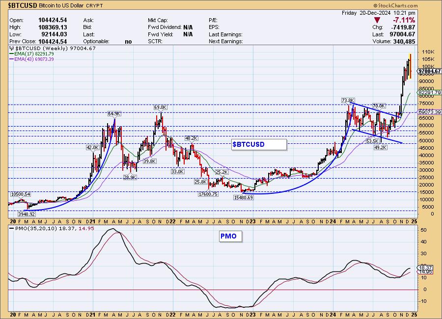
Bitcoin Weekly Chart: The rising trend is softening somewhat but the rally is still essentially vertical and does beg for a pullback or correction. The weekly PMO has decelerated but is still rising bullishly.
BITCOIN ETFs
Today:
This Week:
INTEREST RATES
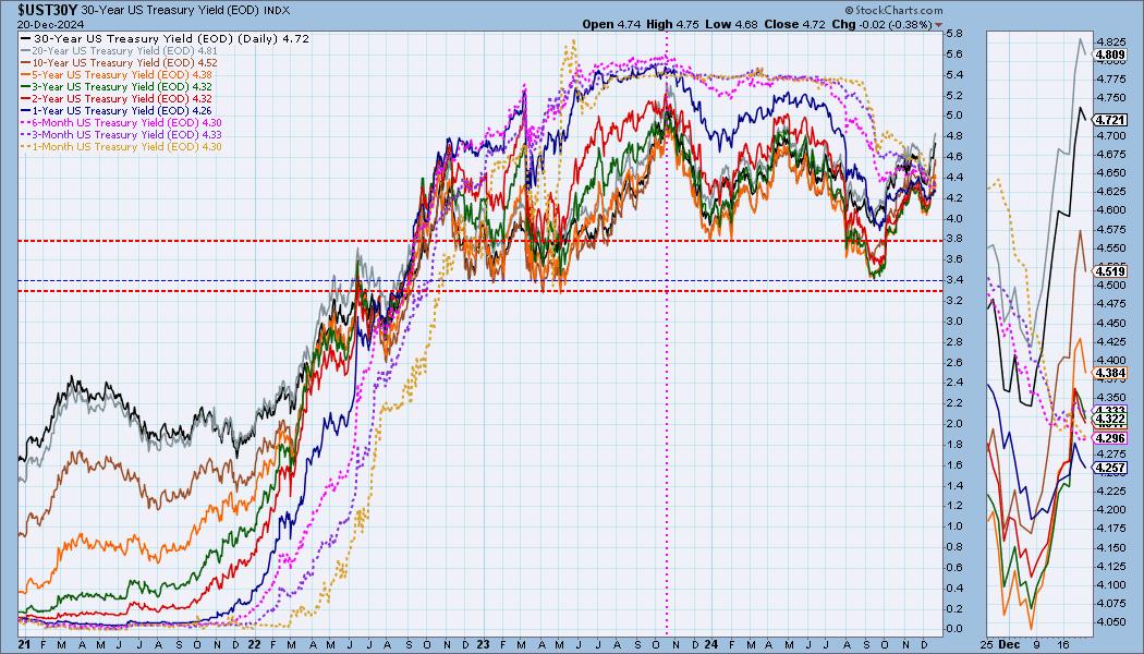
Yields took a break today and were lower. The bull flags still suggest to us that we'll see yields continue to rise toward 2024 highs. Treasuries are getting attractive.
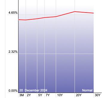
The Yield Curve Chart from StockCharts.com shows us the inversions taking place. The red line should move higher from left to right. Inversions are occurring where it moves downward.
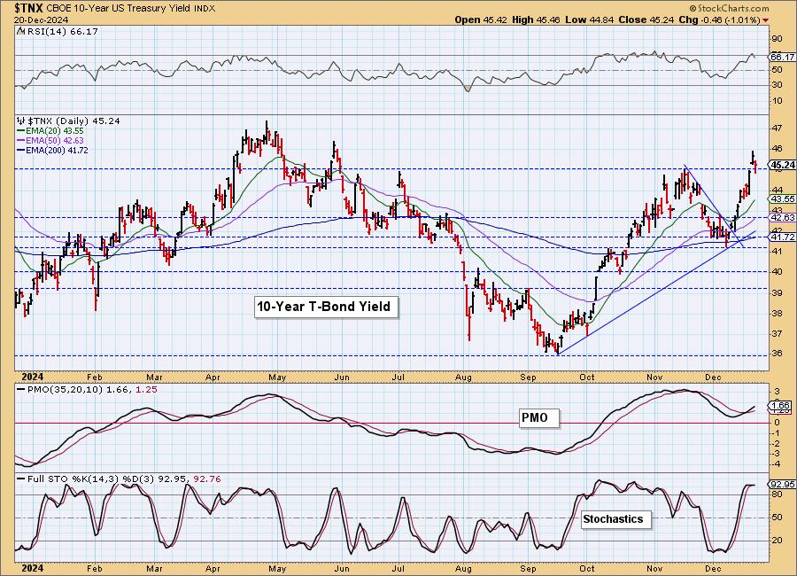
10-YEAR T-BOND YIELD
$TNX pulled back after rallying strongly this week. It did drop below support, but ultimately closed above it. This was good as it did bring the RSI out of overbought territory. The PMO and Stochastics look very bullish and suggest we could see $TNX challenge this year's high.
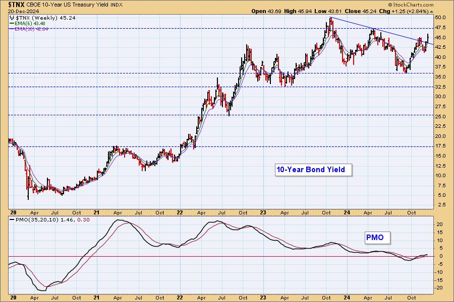
10-Year Bond Yield Weekly Chart: We have a very bullish breakout on the weekly chart that does suggest we will see followthrough. The weekly PMO is rising in confirmation.
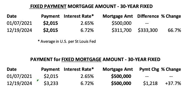
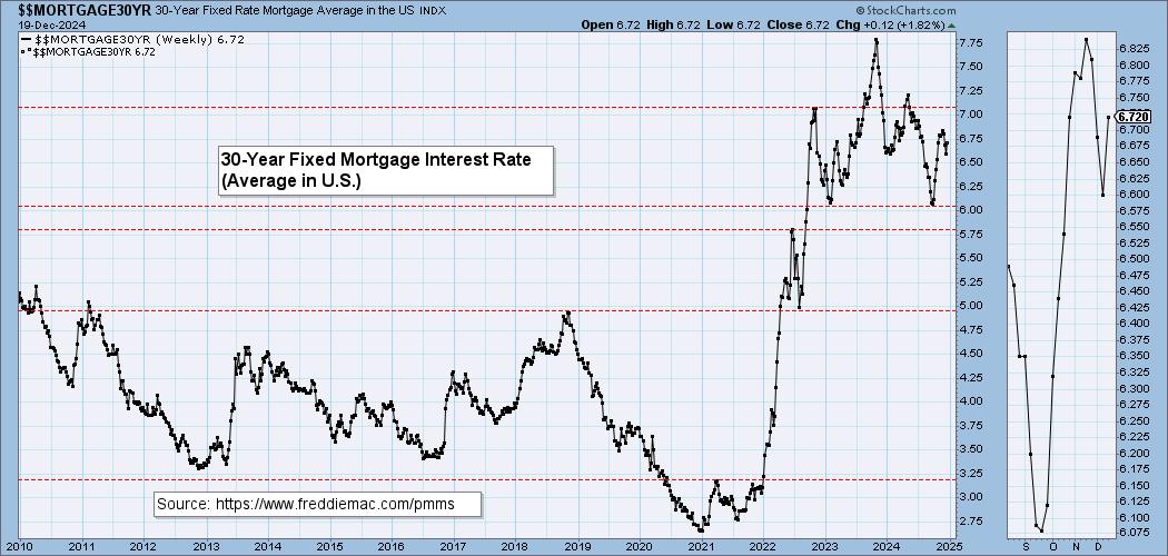
MORTGAGE INTEREST RATES (30-Yr)**
**We watch the 30-Year Fixed Mortgage Interest Rate, because, for the most part, people buy homes based upon the maximum monthly payment they can afford. As rates rise, a fixed monthly payment will carry a smaller mortgage amount, which shuts many buyers out of the market, and potential sellers will experience pressure to lower prices (to no effect so far).
--
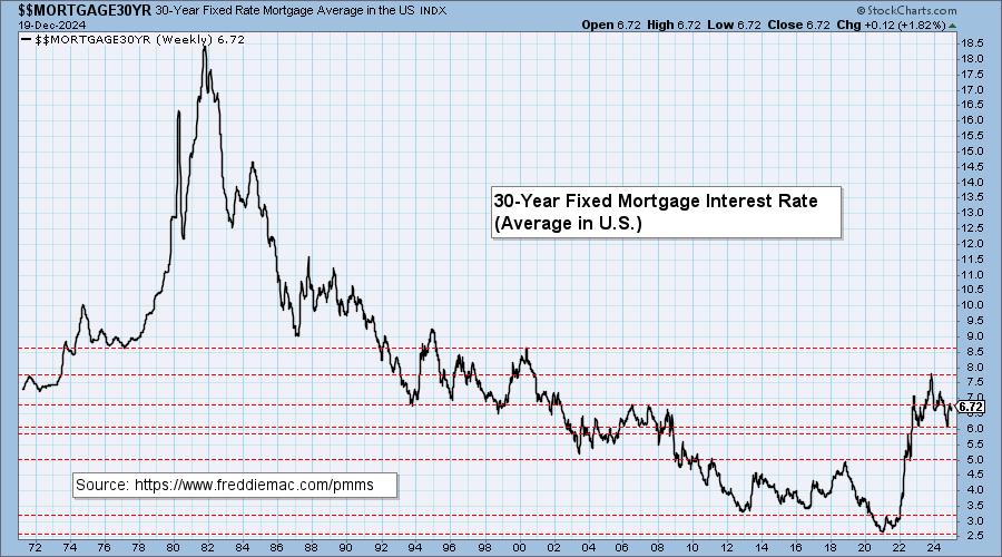
This week the 30-Year Fixed Rate changed from 6.60 to 6.72.
Here is a 50-year chart for better perspective.
BONDS (TLT)
IT Trend Model: NEUTRAL as of 11/10/2024
LT Trend Model: SELL as of 12/13/2024
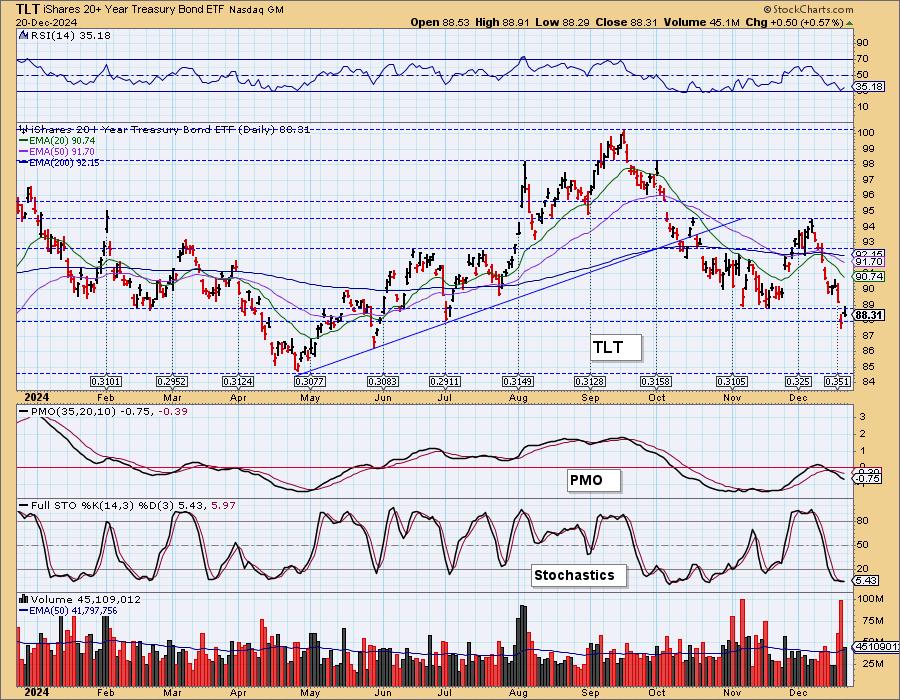
TLT Daily Chart: TLT lost support this week but is trying to rebound. Yields look very bullish right now, but we could see a small rally continue from here given the strength of this support zone. We don't see this as a likely profitable entry as we do expect the decline will resume after a pause.
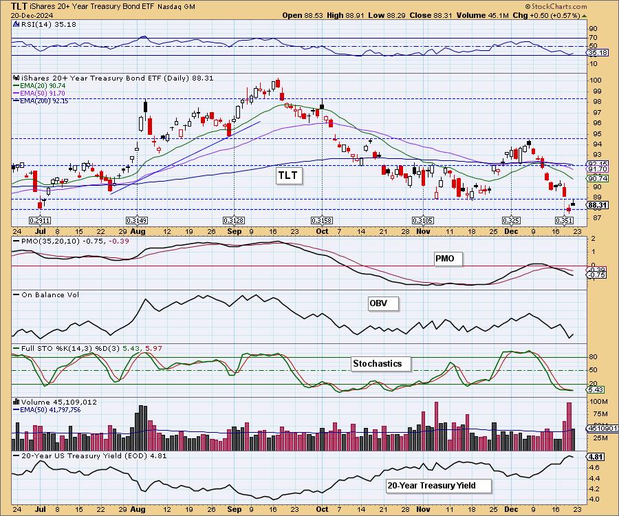
The next level of strong support doesn't arrive until 84.50. With yields so bullish, it isn't out of the question that price could reach that level.
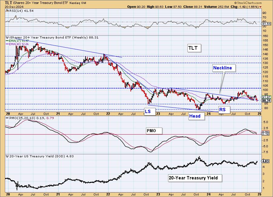
TLT Weekly Chart: The bullish reverse head and shoulders is barely intact. A drop below the neckline of the pattern would bust it. That is likely to happen given price is already sitting on the neckline. The weekly PMO topped beneath its signal line which is especially bearish.
DOLLAR (UUP)
IT Trend Model: BUY as of 10/9/2024
LT Trend Model: BUY as of 5/25/2023
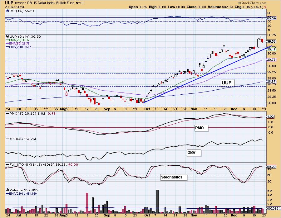
UUP Daily Chart: It may be time for the Dollar to take a breather. We saw a decline today and it is due for another test of the rising bottoms trendline. The PMO is already trying to top and Stochastics have topped. The chart is still very bullish given the strong rising trend.
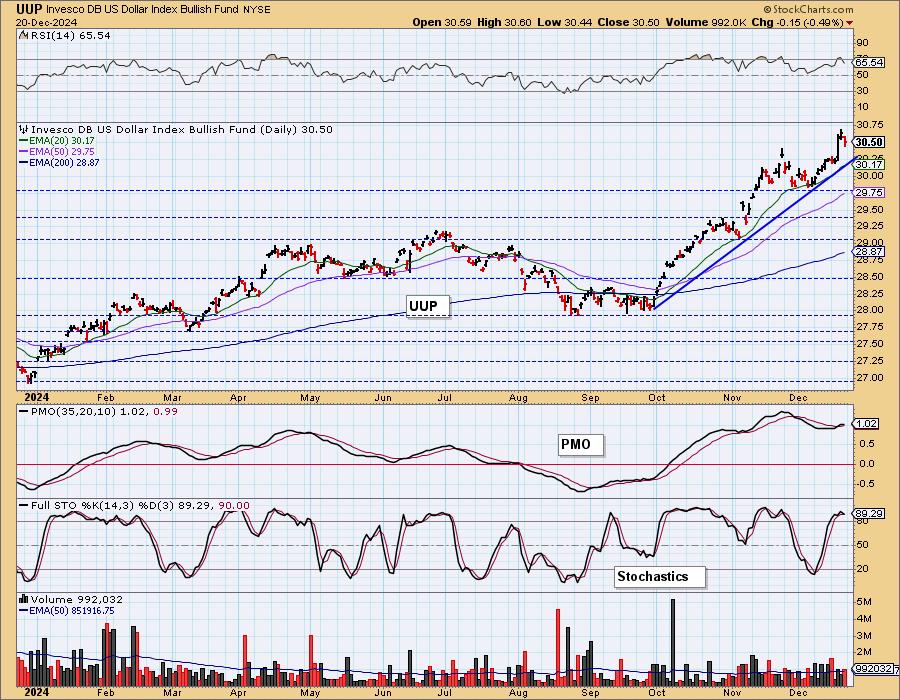
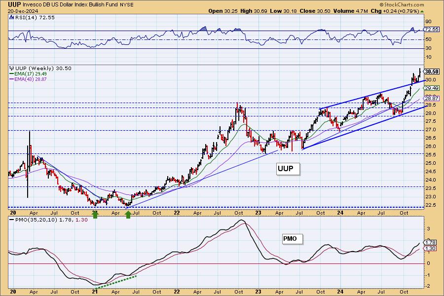
UUP Weekly Chart: The Dollar broke from a bearish rising wedge. A bullish conclusion to a bearish chart pattern is especially bullish. Price is bouncing off the top of the busted rising wedge. The weekly PMO is rising strongly. The intermediate-term outlook for the Dollar is still quite bullish.
GOLD
IT Trend Model: BUY as of 10/23/2023
LT Trend Model: BUY as of 10/20/2023
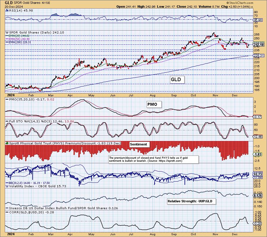
GLD Daily Chart: Gold is basically in a holding pattern, traveling sideways since the November low. The Dollar is showing signs of stress so Gold may have an opportunity here. The relative strength line is still showing a declining trend so it won't be easy. The PMO and Stochastics are already trying to turn back up so maybe we'll see a test of the top of this trading range. That would be inline with a near-term weak Dollar.
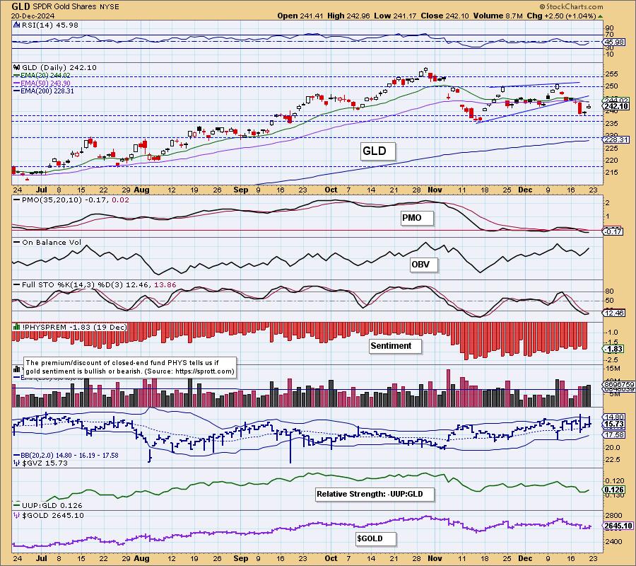
Discounts are still very high as investors are very bearish on Gold. This could work to its advantage as bearish extremes in sentiment often lead to upside reversals. It hasn't done much for it of late, but if the condition persists, we could see a rally catch hold.
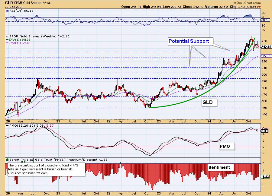
GLD Weekly Chart: Price is in the midst of high level consolidation following a parabolic breakdown. The weekly PMO is on a Crossover SELL Signal and falling which does suggest we'll see more sideways movement at a minimum.
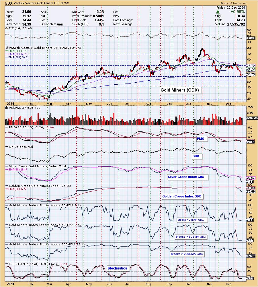
GOLD MINERS Daily Chart: Gold looks a bit more bullish than it has and that would give Gold Miners an opportunity to recover from the latest decline. We aren't extraordinarily bullish on Gold, we just see some near-term opportunity for it to rise based on the possible weakening of the Dollar. We could see some more upside here, but don't think it will turn into a lasting rally. Participation is still very weak with a Silver Cross Index of only 7%.
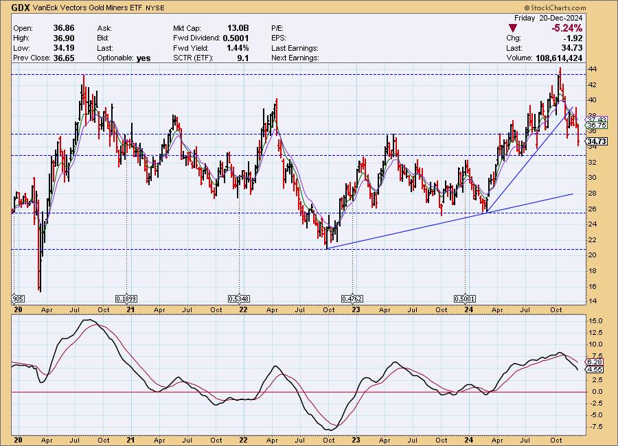
GDX Weekly Chart: GDX broke its intermediate-term rising trend and is headed to test support at 33. Price this week dropped beneath support at the 2023 high. The weekly PMO is in decline suggesting we will see more downside.
CRUDE OIL (USO)
IT Trend Model: SELL as of 10/17/2024
LT Trend Model: SELL as of 9/10/2024
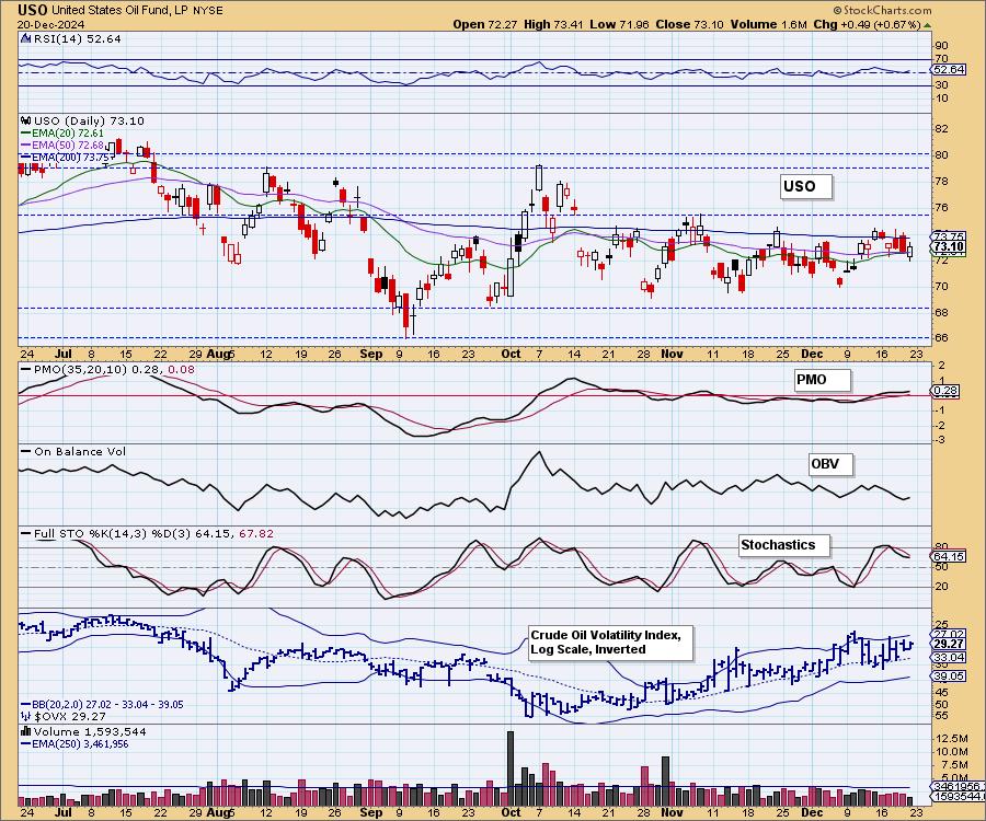
USO Daily Chart: Crude Oil is in a holding pattern, weaving its way sideways in a trading range. The 200-day EMA has now become overhead resistance, not the November high. We do see the PMO trying to rise and Stochastics are trying to bottom, but ultimately the PMO is flat against the zero line so we don't see anything that would imply an upside breakout. Conversely, we don't see any major negatives on the chart either. We're probably going to see more of the same.
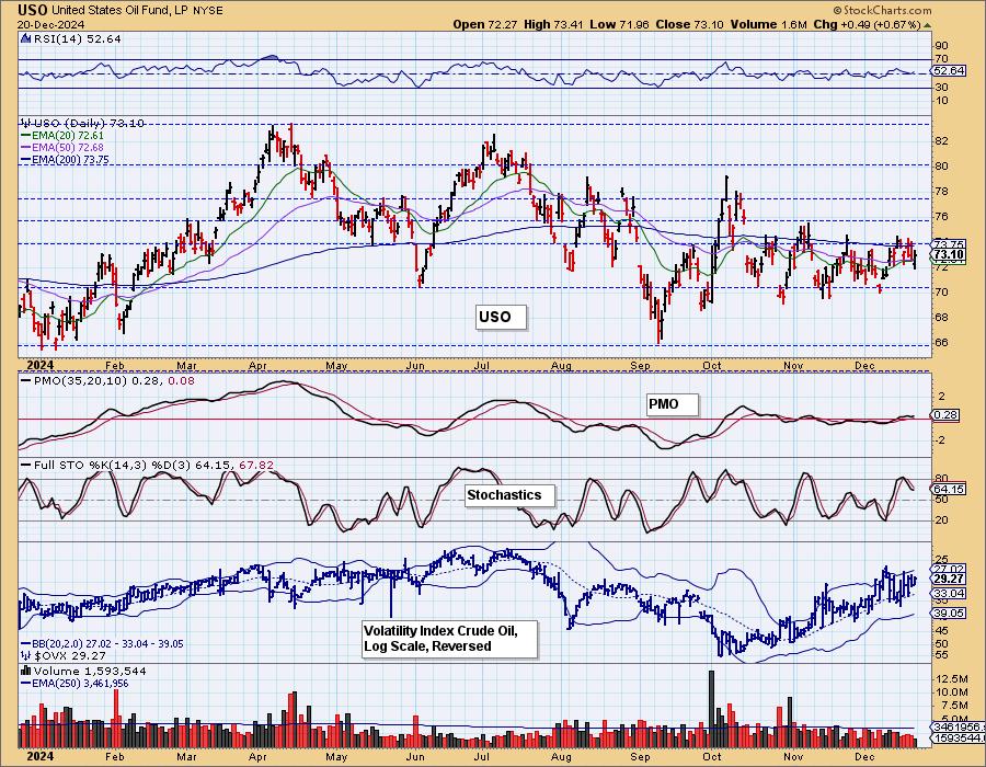
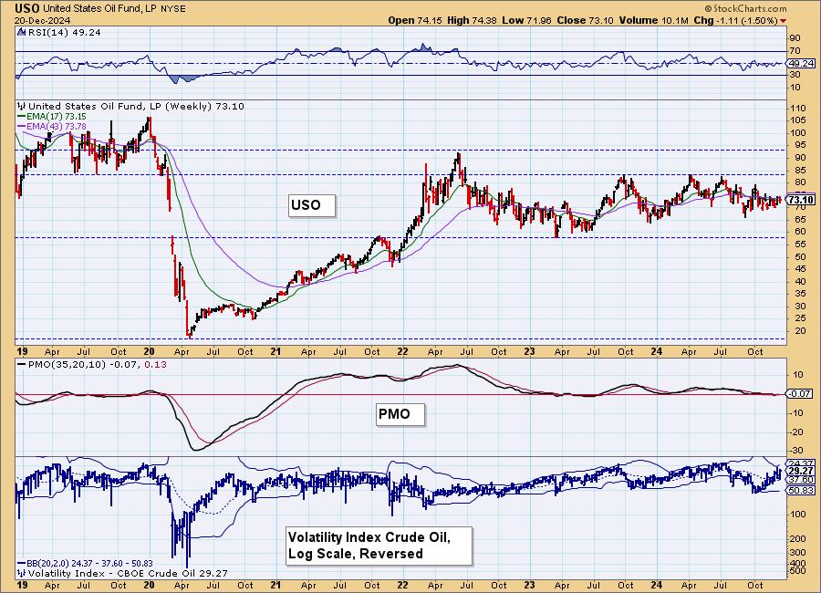
USO/$WTIC Weekly Chart: Crude Oil is also in a trading range on the weekly chart with a weekly PMO flat along the zero line. We should expect more sideways movement.
Good Luck & Good Trading!
Erin Swenlin and Carl Swenlin
Technical Analysis is a windsock, not a crystal ball. --Carl Swenlin
(c) Copyright 2024 DecisionPoint.com
Disclaimer: This blog is for educational purposes only and should not be construed as financial advice. The ideas and strategies should never be used without first assessing your own personal and financial situation, or without consulting a financial professional. Any opinions expressed herein are solely those of the author, and do not in any way represent the views or opinions of any other person or entity.
DecisionPoint is not a registered investment advisor. Investment and trading decisions are solely your responsibility. DecisionPoint newsletters, blogs or website materials should NOT be interpreted as a recommendation or solicitation to buy or sell any security or to take any specific action.
NOTE: The signal status reported herein is based upon mechanical trading model signals, specifically, the DecisionPoint Trend Model. They define the implied bias of the price index based upon moving average relationships, but they do not necessarily call for a specific action. They are information flags that should prompt chart review. Further, they do not call for continuous buying or selling during the life of the signal. For example, a BUY signal will probably (but not necessarily) return the best results if action is taken soon after the signal is generated. Additional opportunities for buying may be found as price zigzags higher, but the trader must look for optimum entry points. Conversely, exit points to preserve gains (or minimize losses) may be evident before the model mechanically closes the signal.
Helpful DecisionPoint Links:
DecisionPoint Alert Chart List
DecisionPoint Golden Cross/Silver Cross Index Chart List
DecisionPoint Sector Chart List
Price Momentum Oscillator (PMO)
