
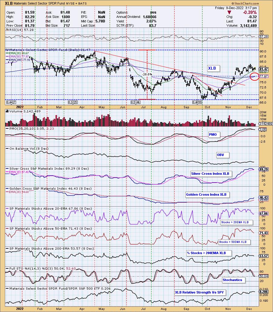
Today the Materials Sector (XLB) 50-day EMA crossed up through the 200-day EMA (Golden Cross), generating an LT Trend Model "Golden Cross" BUY Signal. Don't be fooled, alongside this golden cross is a PMO crossover SELL signal. The short-term rising trend is holding up, but it is also the bottom of a bearish rising wedge. The Silver Cross Index (SCI) remains above its signal line, but not for long. We have fewer stocks with price above their 20/50-day EMAs than stocks with silver crosses.
None of the sectors have rising momentum and PMO tops are all in overbought territory. We see this as confirmation that the market overall will see a stronger decline next week.
The DecisionPoint Alert Weekly Wrap presents an end-of-week assessment of the trend and condition of the Stock Market, the U.S. Dollar, Gold, Crude Oil, and Bonds. The DecisionPoint Alert daily report (Monday through Thursday) is abbreviated and gives updates on the Weekly Wrap assessments.
Watch the latest episode of DecisionPoint on StockCharts TV's YouTube channel here!
MAJOR MARKET INDEXES
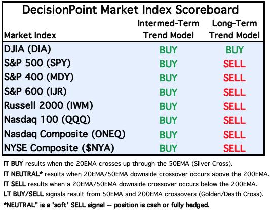
For Today: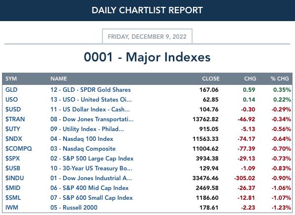
For the Week: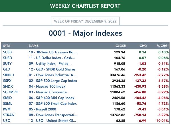
SECTORS
Each S&P 500 Index component stock is assigned to one of 11 major sectors. This is a snapshot of the Intermediate-Term (Silver Cross) and Long-Term (Golden Cross) Trend Model signal status for those sectors.
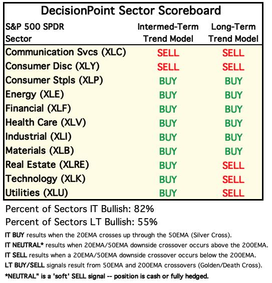
For Today: 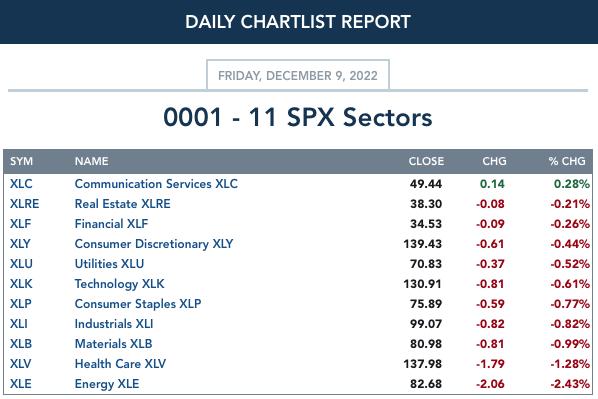
For the Week: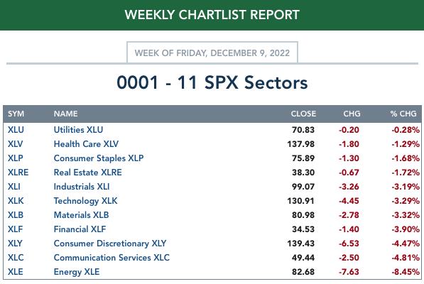
CLICK HERE for Carl's annotated Sector charts.
THE MARKET (S&P 500)
IT Trend Model: BUY as of 11/15/2022
LT Trend Model: SELL as of 5/5/2022
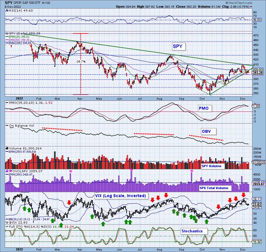
SPY Daily Chart: Price is consolidating above support at $390 and the 50-day EMA. Bulls are fighting tooth and nail to keep price stable, but the now negative RSI and PMO SELL signal suggest it is a losing battle.
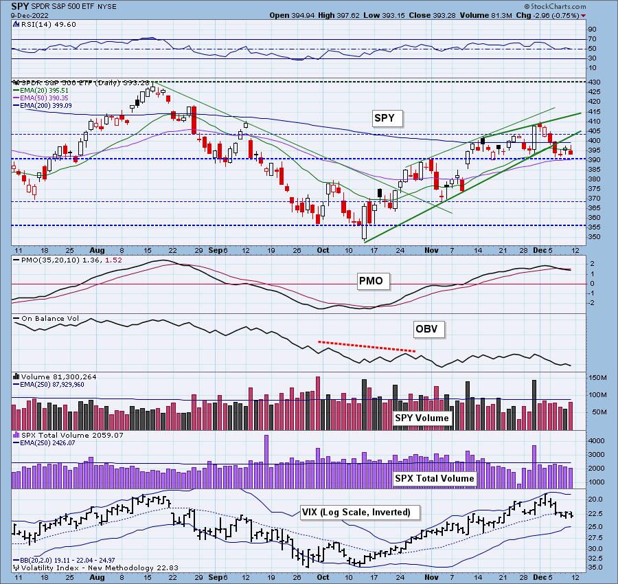
The VIX remains below its moving average which implies internal weakness. Speaking of internal weakness, Stochastics are negative and falling.
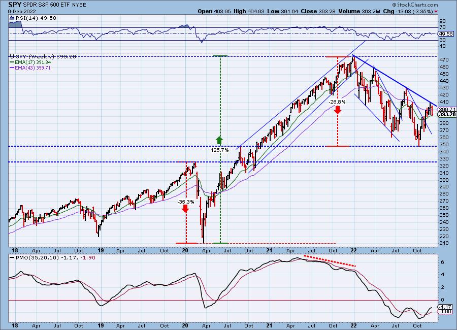
SPY Weekly Chart: In this morning's Diamond Mine trading room for Diamonds subscribers only, Erin pointed out the large broadening or bugle shaped pattern on the weekly chart. These formations are dangerous. They tell us that volatility is getting worse. Volatility is rarely our friend. The weekly PMO has decelerated. Another week or two of decline and it should top.
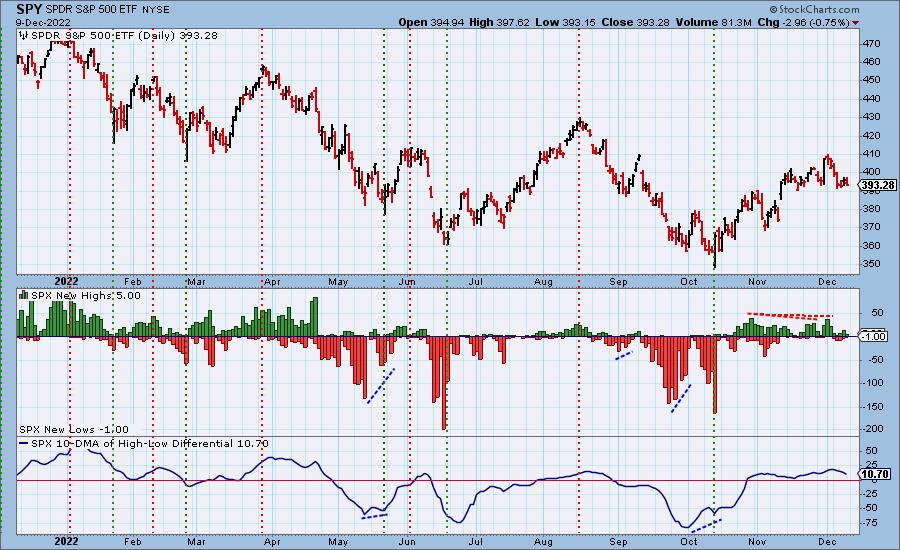
New 52-Week Highs/Lows: New Highs pared back significantly on the recent decline, but we didn't see much expansion in New Lows. This is likely a function of the bear market rally, that rising tide lifted nearly all boats so it may take a bit longer to see the kind of New Lows readings we had back in September. The 10-DMA of the High-Low Differential turned down this week and continues lower. This is generally indicative of a longer-term decline ahead.
Climax Analysis: There were no climax readings today, although some were pretty close. Note that, since the downside exhaustion climax on Tuesday, prices have churned in a narrow range, probably a continuation pattern.
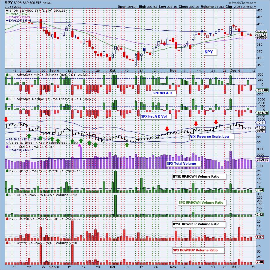
*A climax is a one-day event when market action generates very high readings in, primarily, breadth and volume indicators. We also include the VIX, watching for it to penetrate outside the Bollinger Band envelope. The vertical dotted lines mark climax days -- red for downside climaxes, and green for upside. Climaxes are at their core exhaustion events; however, at price pivots they may be initiating a change of trend.
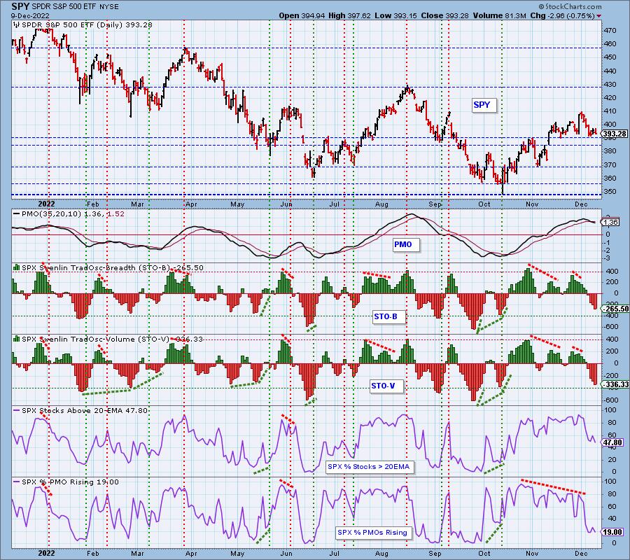
Short-Term Market Indicators: The short-term market trend is DOWN and the condition is OVERSOLD.
The bad news is that STOs continued lower and more stocks lost support at their 20-day EMAs. The good news is that STOs are now in oversold territory. We know they can get even more oversold so don't throw a party yet. The other piece of good news is that we didn't lose any rising momentum internally. Again nothing to get overly excited about given the reading is only 19%.
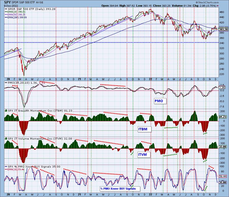
Intermediate-Term Market Indicators: The intermediate-term market trend is UP and the condition is OVERBOUGHT.
The ITBM/ITVM are still overbought despite their pullback this week. Not surprisingly heavy damage was done to the amount of PMO BUY signals. Unfortunately, the carnage isn't likely over given only 19% have rising momentum. This indicator should continue to decline. It isn't oversold yet.
PARTICIPATION and BIAS Assessment: The following chart objectively shows the depth and trend of participation in two time frames.
- Intermediate-Term - the Silver Cross Index (SCI) shows the percentage of SPX stocks on IT Trend Model BUY signals (20-EMA > 50-EMA). The opposite of the Silver Cross is a "Dark Cross" -- those stocks are, at the very least, in a correction.
- Long-Term - the Golden Cross Index (GCI) shows the percentage of SPX stocks on LT Trend Model BUY signals (50-EMA > 200-EMA). The opposite of a Golden Cross is the "Death Cross" -- those stocks are in a bear market.
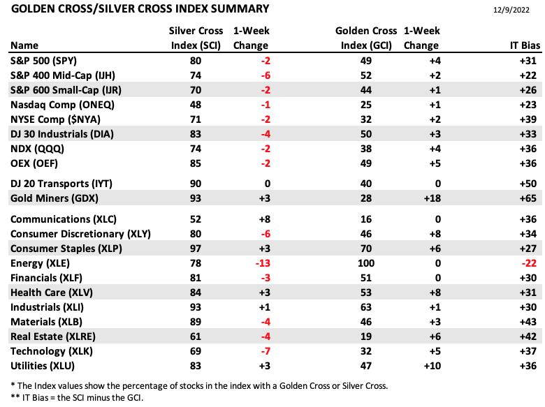
The following table summarizes participation for the major market indexes and sectors. The 1-Week Change columns inject a dynamic aspect to the presentation.
The strongest bullish bias belongs to Gold Miners (GDX). This group has been hanging tough and rising in spite of a weak market. It also holds the biggest one-week change as it continues to rally.
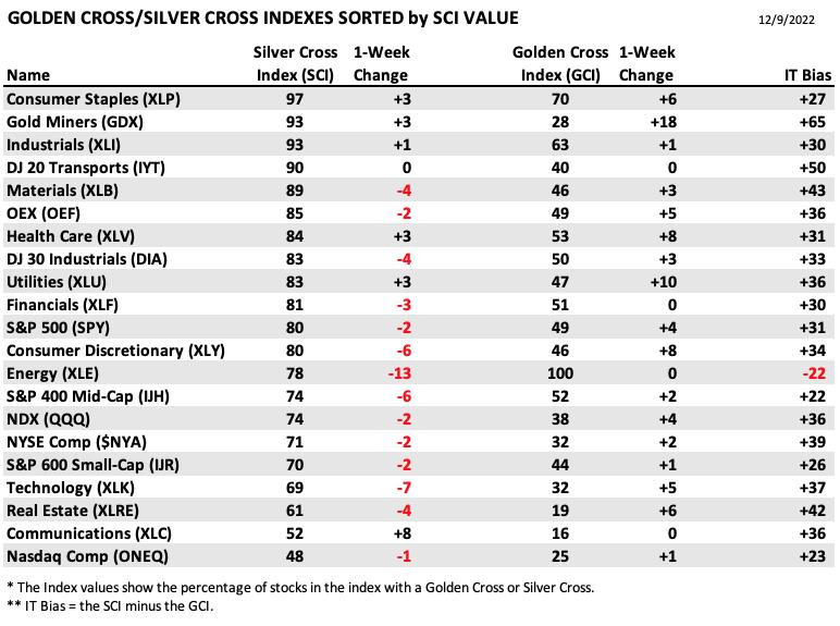
This table is sorted by SCI values. This gives a clear picture of strongest to weakest index/sector in terms of participation.
Energy has tumbled and currently is the only component holding a negative bias. Consumer Staples (XLP) has the strongest participation given it has a 97 reading on the SCI. The chart doesn't look particularly appetizing given it saw a new PMO SELL Signal today.
PARTICIPATION and BIAS Assessment: The following chart objectively shows the depth and trend of participation in two time frames.
- Intermediate-Term - the Silver Cross Index (SCI) shows the percentage of SPX stocks on IT Trend Model BUY signals (20-EMA > 50-EMA). The opposite of the Silver Cross is a "Dark Cross" -- those stocks are, at the very least, in a correction.
- Long-Term - the Golden Cross Index (GCI) shows the percentage of SPX stocks on LT Trend Model BUY signals (50-EMA > 200-EMA). The opposite of a Golden Cross is the "Death Cross" -- those stocks are in a bear market.
The short-term bias is BEARISH. We continue to lose participation of stocks above their 20/50-day EMAs.
The intermediate-term bias is BEARISH. Given there are far fewer stocks above their 20/50-day EMAs in comparison to those with silver crosses, the overbought SCI will likely top again and see a negative crossover. It's so far managed to avoid it, but we aren't comfortable listing the IT bias as bullish.
The long-term bias is BULLISH. The GCI is now accelerating upward. While that appears very bullish, look back up at the XLB chart. It just had a golden cross and its chart is not compelling. Still with more stocks above their 50/200-day EMAs than the GCI, it should continue to expand and trigger golden crosses across the index. But again, a golden cross in this market doesn't always mean the chart is bullish.
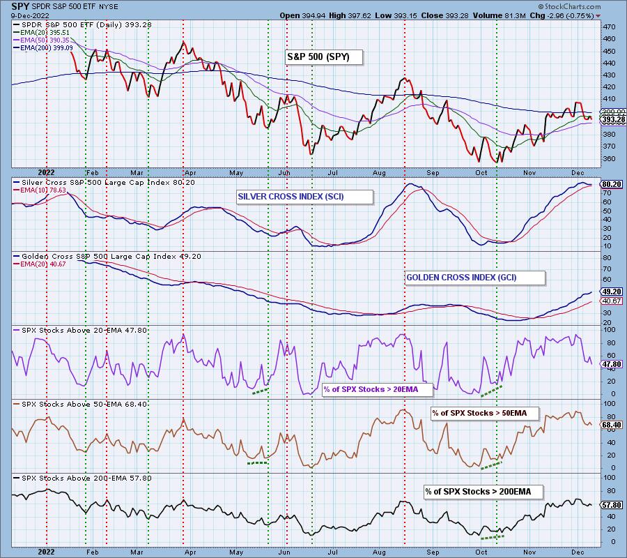
CONCLUSION: Support at $390 and the 50-day EMA may have held this week, but the bearish indicators do not suggest a new leg up. Internals are particularly weak. Participation is thinning and this week saw a PMO SELL signal on the SPY. Of the 11 sectors, none have rising PMOs. Sector PMOs are all overbought and have triggered SELL signals or are about to. If there is no sector strength, there is no market strength. We don't see Santa Claus arriving next week. More than likely he arrived early with this bear market rally and has already headed back to the North Pole. Batten down the hatches and prepare yourself with stops, hedges or limited exposure. We doubt you'll regret it.
Calendar: Wednesday of next week is the Fed announcement. A 50 basis point interest rate increase is expected.
Next week is also options expiration. It is an end-of-quarter expiration, so we should expect very high volume on Friday and low volatility toward the end of the week.
Erin is 10% exposed including a 5% hedge.
Have you subscribed the DecisionPoint Diamonds yet? DP does the work for you by providing handpicked stocks/ETFs from exclusive DP scans! Add it with a discount! Contact support@decisionpoint.com for more information!
BITCOIN
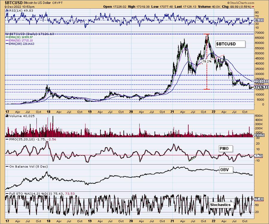
Bitcoin has been a yawner over the past two weeks as it moves sideways in a very tight trading range. The PMO has been gently rising, but so far no breakout has occurred. The RSI is neutral. Stochastics are in positive territory so there is at least a small bullish bias.
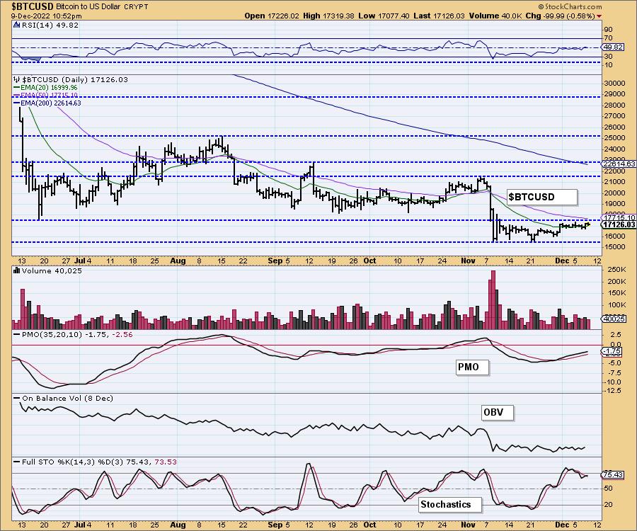
This chart shows where some of the support/resistance lines come from.
INTEREST RATES
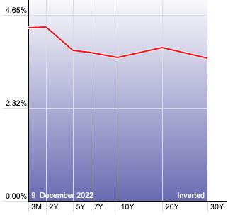
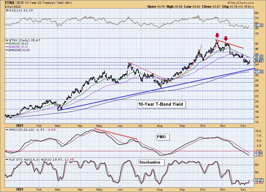
The correction continued for yields this week. While it seems overdone, we can't get bullish on yields until some of these declining trends have been broken.
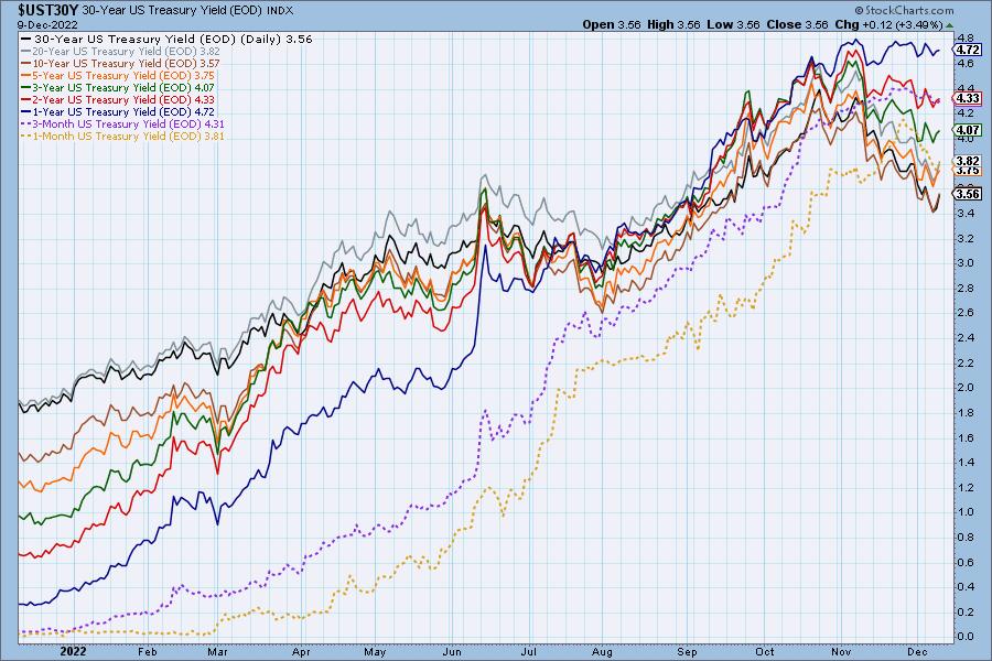
The Yield Curve Chart from StockCharts.com shows us the inversions taking place. The red line should move higher from left to right. Inversions are occurring where it moves downward.
10-YEAR T-BOND YIELD
So far $TNX remains in a declining trend. As noted on the yield array, we wouldn't look for the correction in yields to stop until we see the declining tops trendline broken. Strong support is available at nearby 3.4%. There is also support at 3.3% and the 200-day EMA. A strong move by Stochastics into positive territory would likely signal the end of the correction.
MORTGAGE INTEREST RATES (30-Yr)**
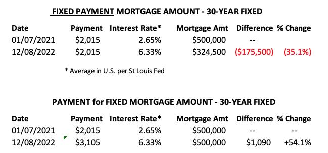
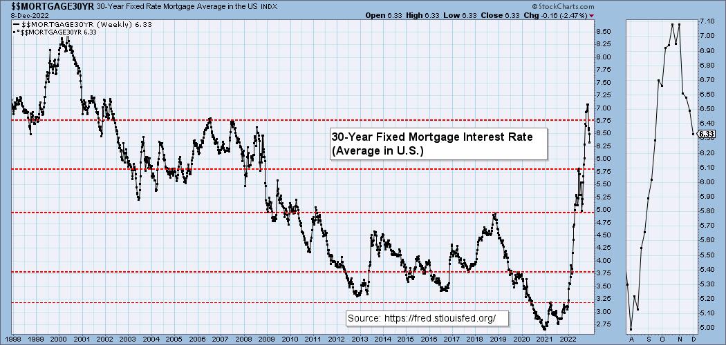
**We watch the 30-Year Fixed Mortgage Interest Rate, because, for the most part, people buy homes based upon the maximum monthly payment they can afford. As rates rise, a fixed monthly payment will carry a smaller mortgage amount. As buying power has been shrinking, home prices have come under pressure.
--
This week the 30-Year Fixed Rate fell from 6.49 to 6.33.
DOLLAR (UUP)
IT Trend Model: NEUTRAL as of 11/14/2022
LT Trend Model: BUY as of 8/19/2021
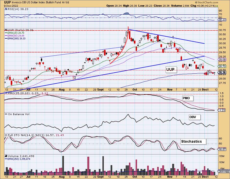
UUP Daily Chart: The Dollar reinforced its tiny trading range this week. The 200-day EMA isn't exactly holding as support, but the June high is. It's a thin support level in our eyes so we are looking for a decline to $28 or the August low.
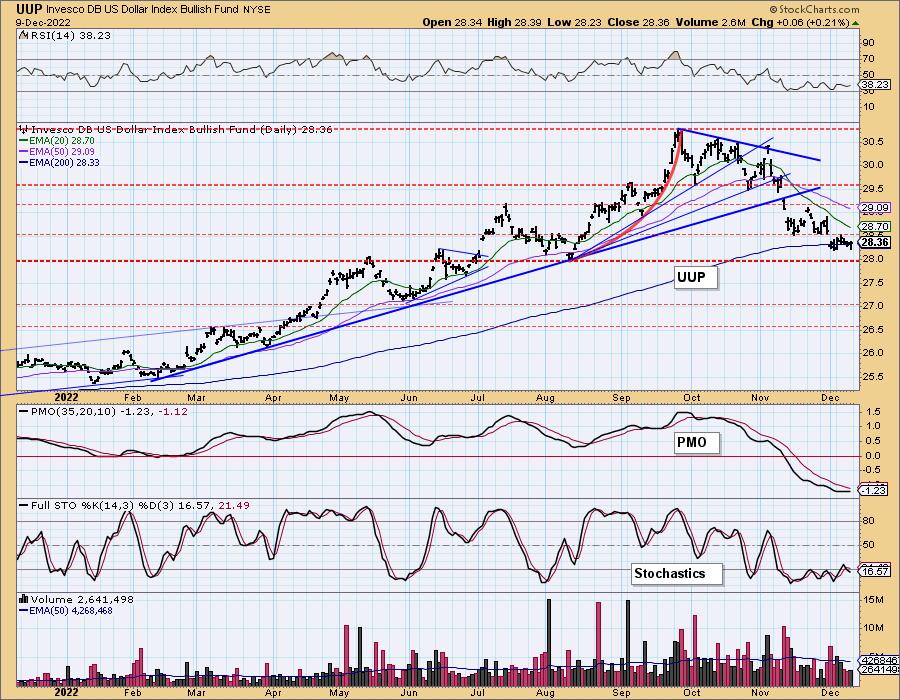
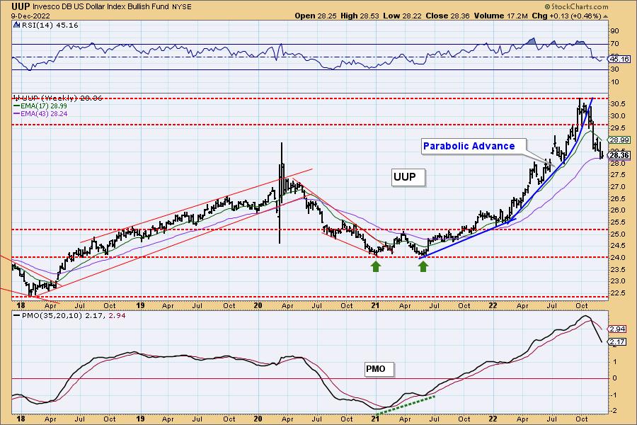
UUP Weekly Chart: We aren't surprised that the Dollar finally dropped. The parabolic rise was intense and therefore, the collapse should be intense. Based on the weekly PMO, we should see the Dollar fall further. Right now it has the advantage of support on the daily chart and support at the 43-week EMA on the weekly chart. Ultimately we expect a breakdown.
GOLD
IT Trend Model: BUY as of 11/14/2022
LT Trend Model: SELL as of 6/30/2022
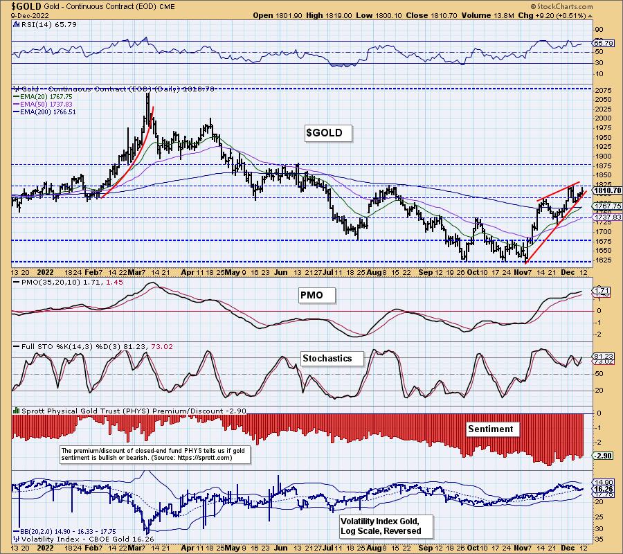
GOLD Daily Chart: Gold is traveling in a bearish rising wedge. The indicators show a bullish bias given the positive RSI, rising Stochastics which remain in positive territory and a gently rising PMO. Still, the expectation is a breakdown. If the Dollar holds its ground, we could see a small pullback on Gold. The chart isn't negative enough to expect a correction just yet.
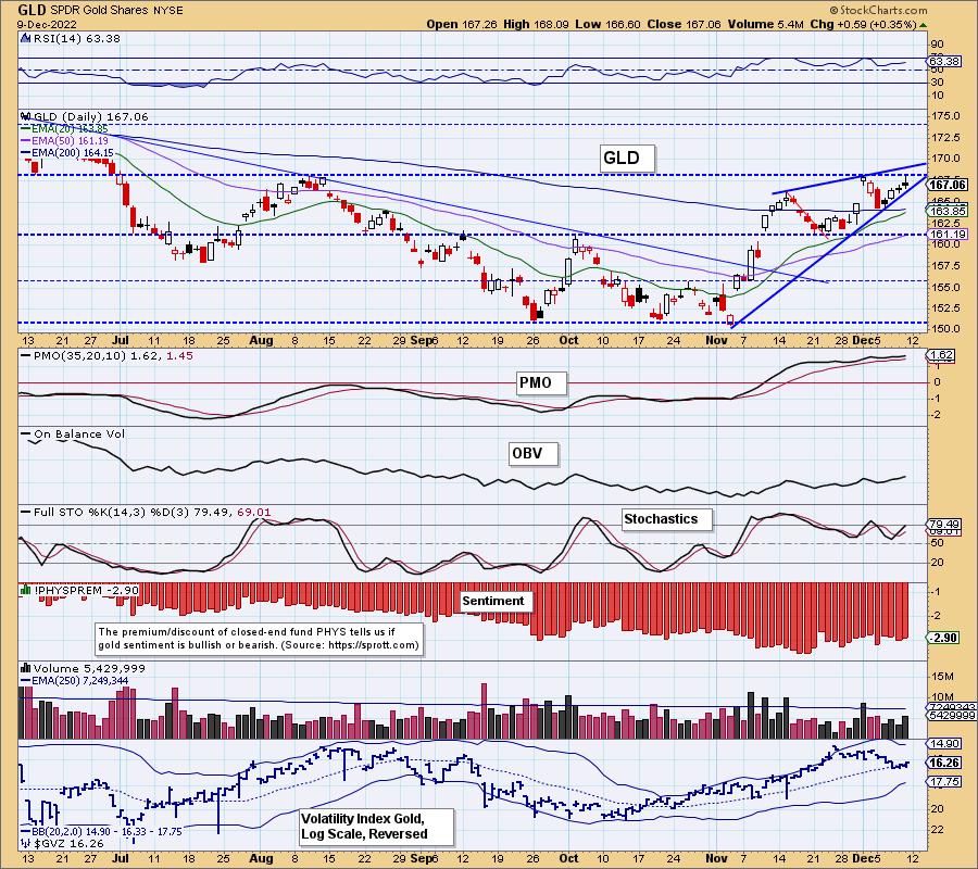
$GOLD's chart shows us that the PMO, while overbought, isn't at overbought extremes. It can accommodate more upside. $GOLD's Stochastics are now above 80.
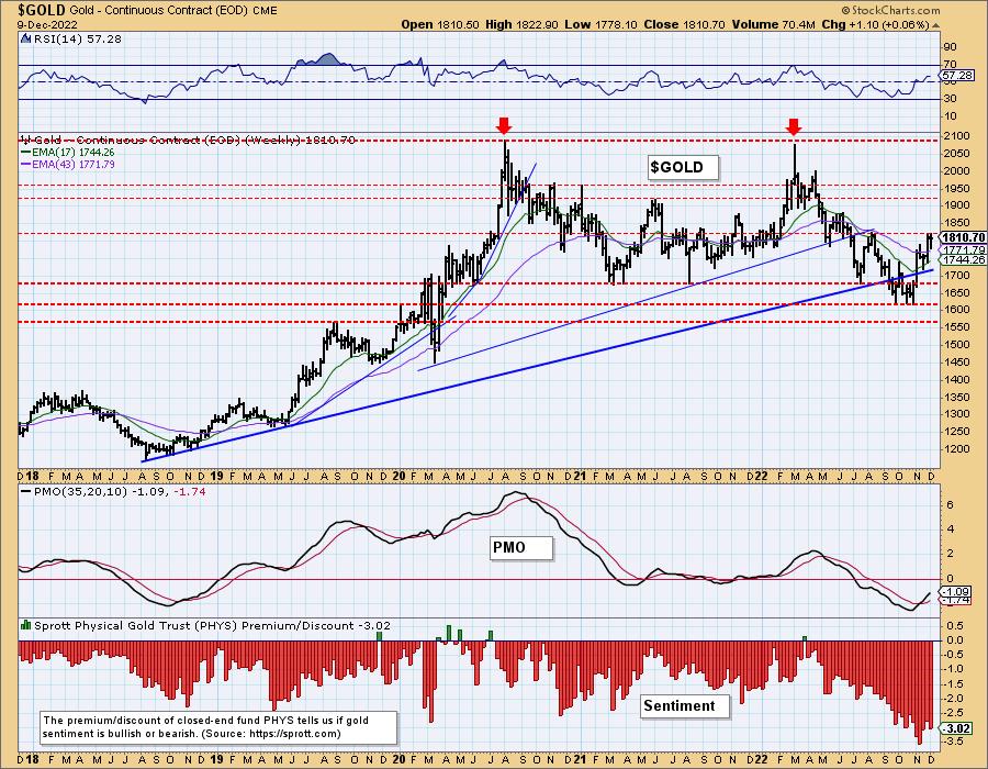
GOLD Weekly Chart: Overall Gold was unchanged this week. Discounts remain in historically high territory. You'll note that when these discounts get inordinately large, Gold tends to rally. Given the positive weekly RSI and rising weekly PMO on an oversold BUY signal, we would expect Gold to breakout above resistance.
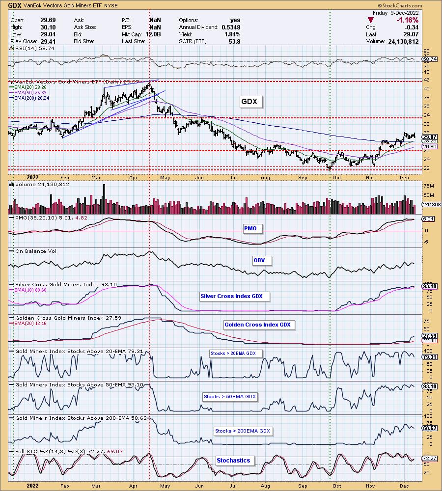
GOLD MINERS Golden and Silver Cross Indexes: Gold Miners pulled back today. This industry group has held up fairly well, but the decline in the market overpowered the rally. We would be careful here. The PMO is very overbought and about to trigger a crossover SELL signal. Participation is beginning to wane as more stocks lose support at their 20-day EMAs. Our sense is that the rally is about finished. A rally in Gold could prop up GDX; however, a major breakdown in the market will likely tear it down quickly. Be very careful with this group.
CRUDE OIL (USO)
IT Trend Model: NEUTRAL as of 11/21/2022
LT Trend Model: SELL as of 12/6/2022
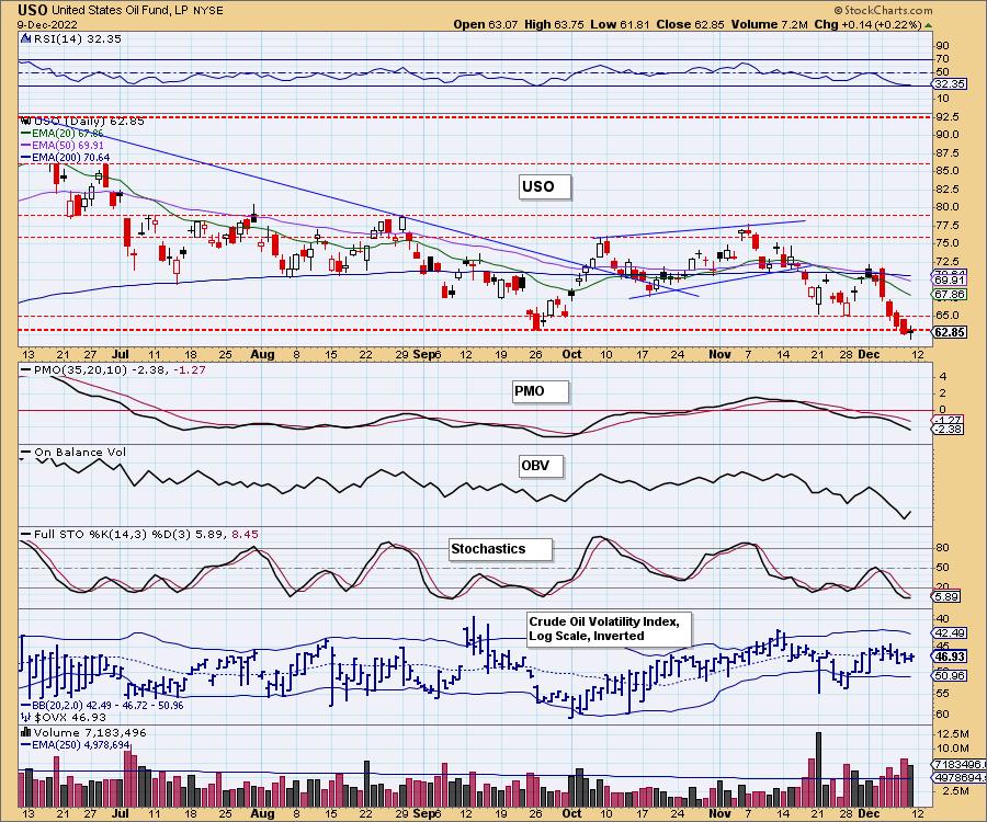
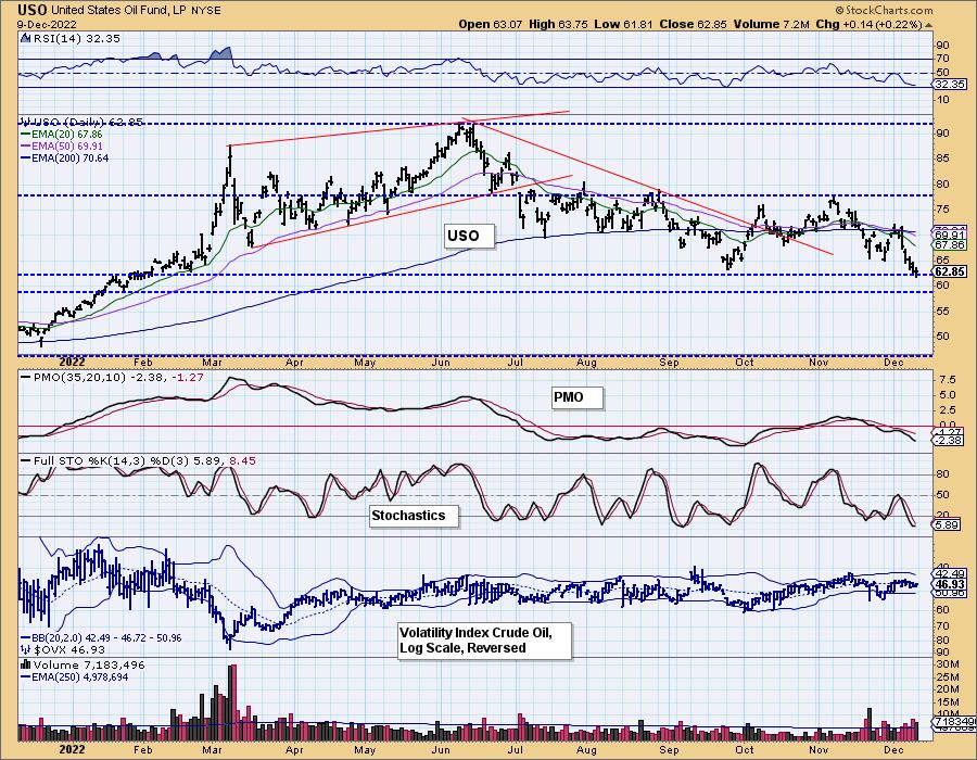
USO Daily Chart: USO managed a positive close, but it didn't recapture prior support at the September low. It also formed a bearish filled black candlestick. The RSI is negative, the PMO is still headed south and Stochastics aren't helpful. We see the Energy sector as well as all oil related stocks/ETFs moving lower.
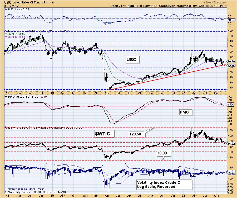
USO/$WTIC Weekly Chart: Notice the dangerous breakdown below the long-term rising trend. We do have strong support available at around $59. The indicators are very negative on the weekly chart. The weekly RSI is falling in negative territory and the weekly PMO is falling after topping below its signal line. The PMO will likely hit negative territory in the next week or two. We expect a breakdown at $59.
BONDS (TLT)
IT Trend Model: BUYas of 12/2/2022
LT Trend Model: SELL as of 1/19/2022
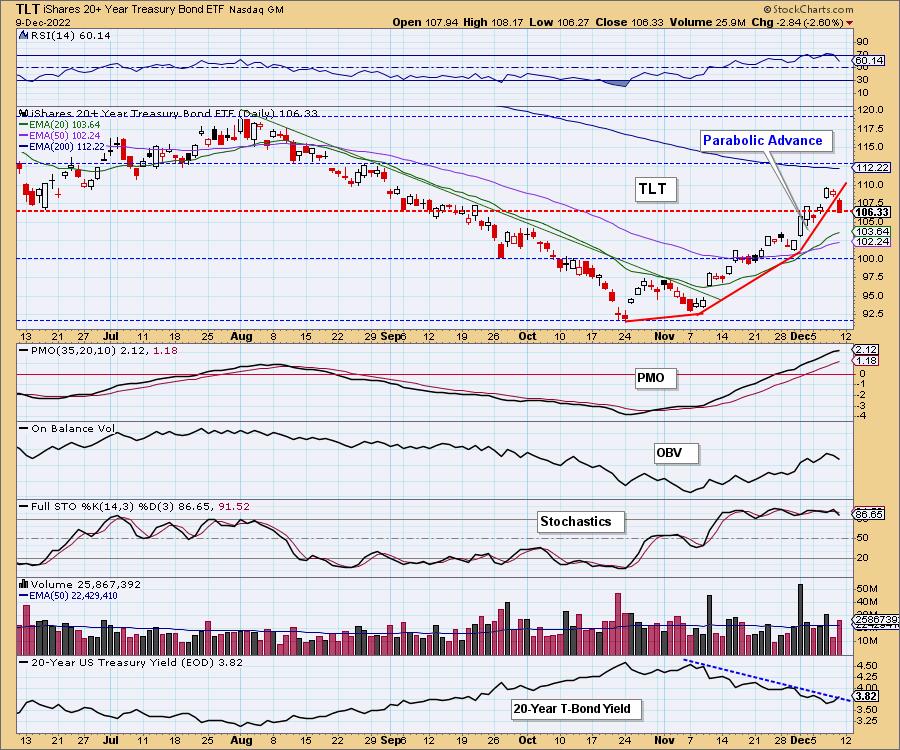
TLT Daily Chart: Yesterday we highlighted the parabolic advance and pointed out that parabolics will normally break down. Today that happened. Since it is on a daily chart, the implications are not as catastrophic as they would be on a monthly chart, but a fall back to the low 90s would not be out of the question. This could mark the end of the bond rally. Watch for the 20-year yield to break its declining trend. That would confirm our conclusion.
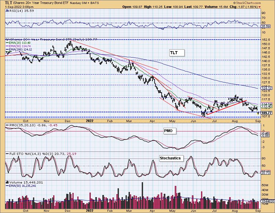
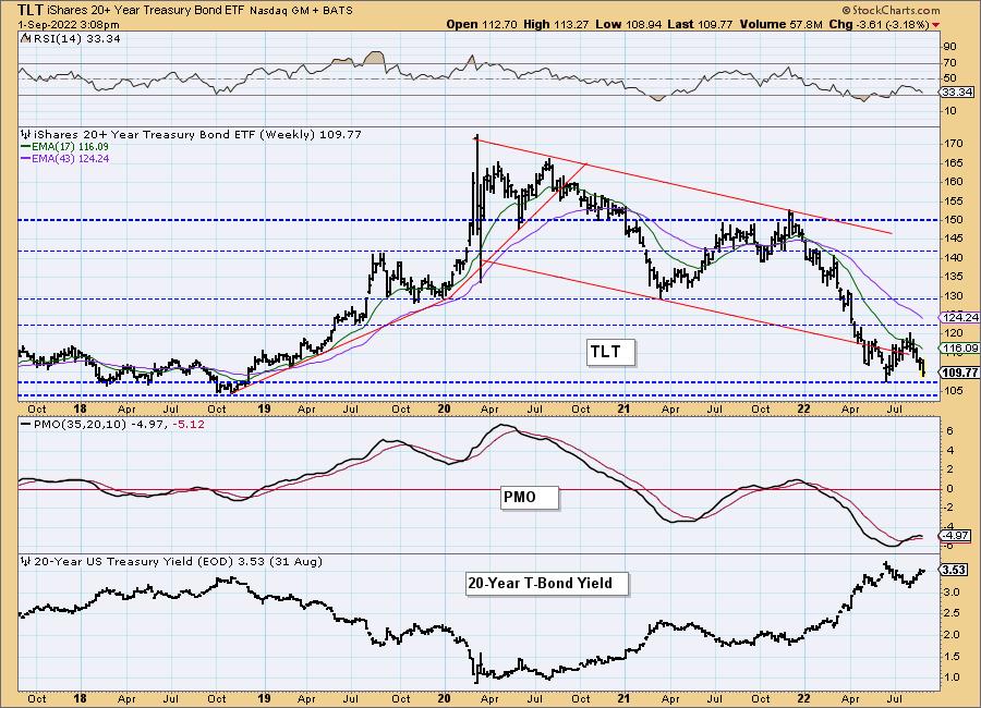
TLT Weekly Chart: This week the weekly PMO turned down. That certainly is evidence that Bonds are done rallying. We do note support is available. We also note a bullish flag formation on the 20-year yield. There is a strong support zone arriving. If yields do back off or consolidate that would prevent a big breakdown. Unfortunately they do look ready to make the turn back up.
Good Luck & Good Trading!
Erin Swenlin And Carl Swenlin
Technical Analysis is a windsock, not a crystal ball. --Carl Swenlin
(c) Copyright 2022 DecisionPoint.com
Disclaimer: This blog is for educational purposes only and should not be construed as financial advice. The ideas and strategies should never be used without first assessing your own personal and financial situation, or without consulting a financial professional. Any opinions expressed herein are solely those of the author, and do not in any way represent the views or opinions of any other person or entity.
NOTE: The signal status reported herein is based upon mechanical trading model signals, specifically, the DecisionPoint Trend Model. They define the implied bias of the price index based upon moving average relationships, but they do not necessarily call for a specific action. They are information flags that should prompt chart review. Further, they do not call for continuous buying or selling during the life of the signal. For example, a BUY signal will probably (but not necessarily) return the best results if action is taken soon after the signal is generated. Additional opportunities for buying may be found as price zigzags higher, but the trader must look for optimum entry points. Conversely, exit points to preserve gains (or minimize losses) may be evident before the model mechanically closes the signal.
Helpful DecisionPoint Links:
DecisionPoint Alert Chart List
DecisionPoint Golden Cross/Silver Cross Index Chart List
DecisionPoint Sector Chart List
Price Momentum Oscillator (PMO)
Swenlin Trading Oscillators (STO-B and STO-V)
DecisionPoint is not a registered investment advisor. Investment and trading decisions are solely your responsibility. DecisionPoint newsletters, blogs or website materials should NOT be interpreted as a recommendation or solicitation to buy or sell any security or to take any specific action.
