
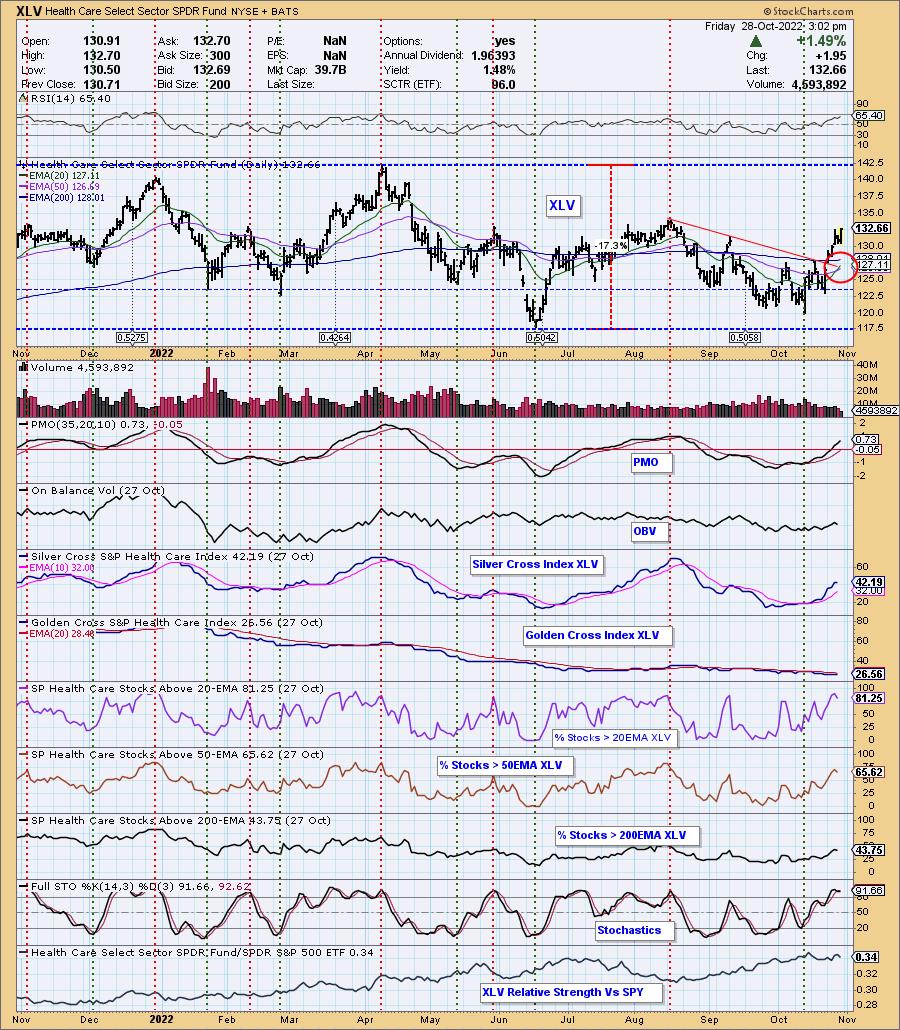
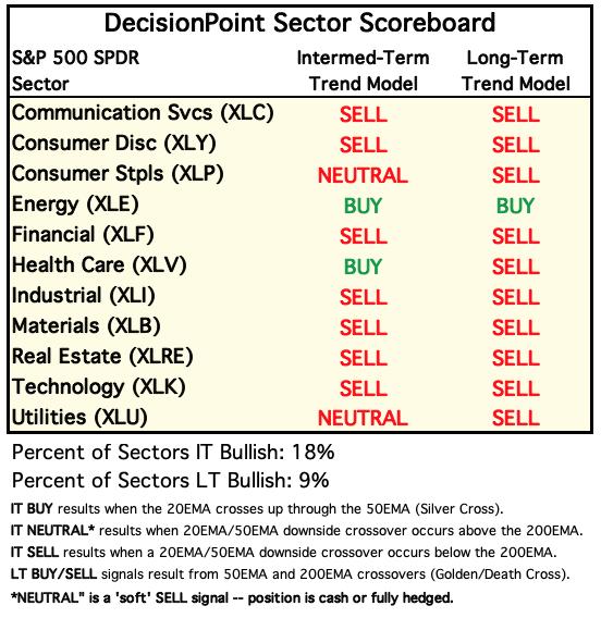
The Health Care Sector (XLV) 20-day EMA has crossed up through the 50-day EMA (Silver Cross), generating an IT Trend Model BUY signal. Price pushed past resistance at the September price high and will now come against the August price top. Given indicator strength and participation of stocks above their 20/50/200-day EMAs alongside a rising SCI, we would expect the sector to continue to see more inflows. We'll discuss the RRG later, but on the weekly RRG, Healthcare has moved into a bullish northeast heading that would take it out of the Lagging quadrant.
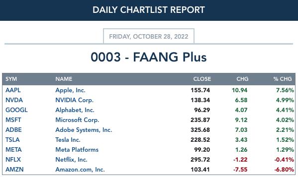
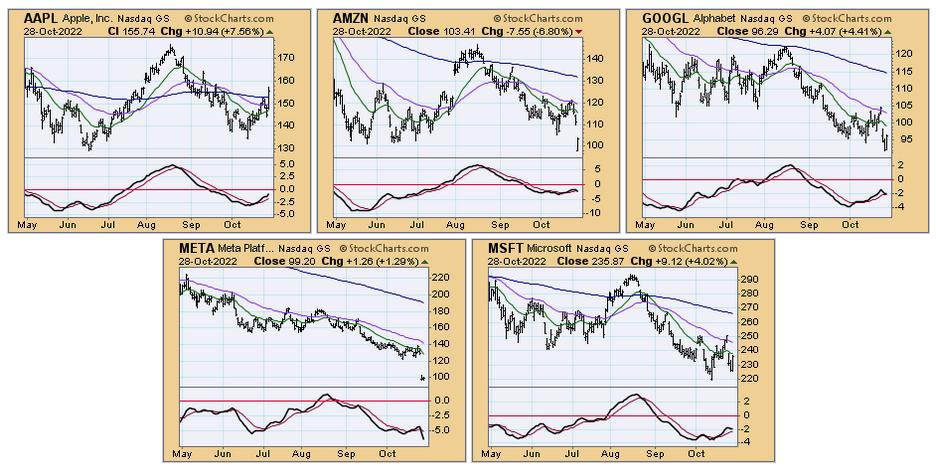
Mega-Cap tech stocks were in the news again today, but in a positive light for the most part. They were up strongly, having much to do with today's strong advance. The exception was AMZN, which was down -6.8%. With the exception of Apple, all of the FAANG stocks carry declining PMOs. They still have work to do. How strange that the market will likely carry them higher versus what we normally see--FAANG stocks leading the market higher. This is a testament to the strength of the current bear market rally.
The DecisionPoint Alert Weekly Wrap presents an end-of-week assessment of the trend and condition of the Stock Market, the U.S. Dollar, Gold, Crude Oil, and Bonds. The DecisionPoint Alert daily report (Monday through Thursday) is abbreviated and gives updates on the Weekly Wrap assessments.
Watch the latest episode of DecisionPoint on StockCharts TV's YouTube channel here!
MAJOR MARKET INDEXES
For Today: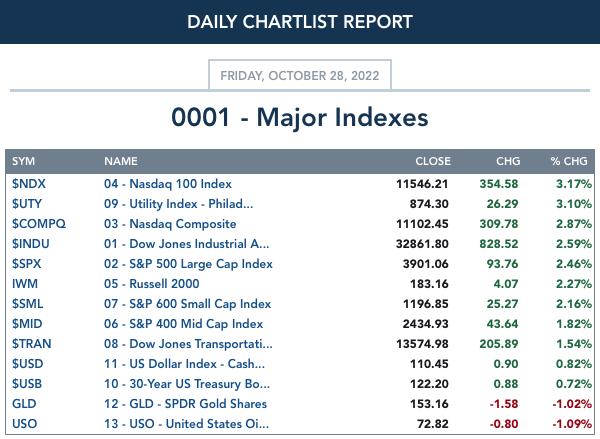
For the Week: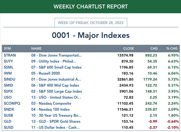
SECTORS
Each S&P 500 Index component stock is assigned to one of 11 major sectors. This is a snapshot of the Intermediate-Term (Silver Cross) and Long-Term (Golden Cross) Trend Model signal status for those sectors.
For Today: 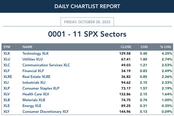
For the Week: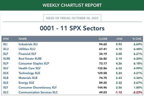
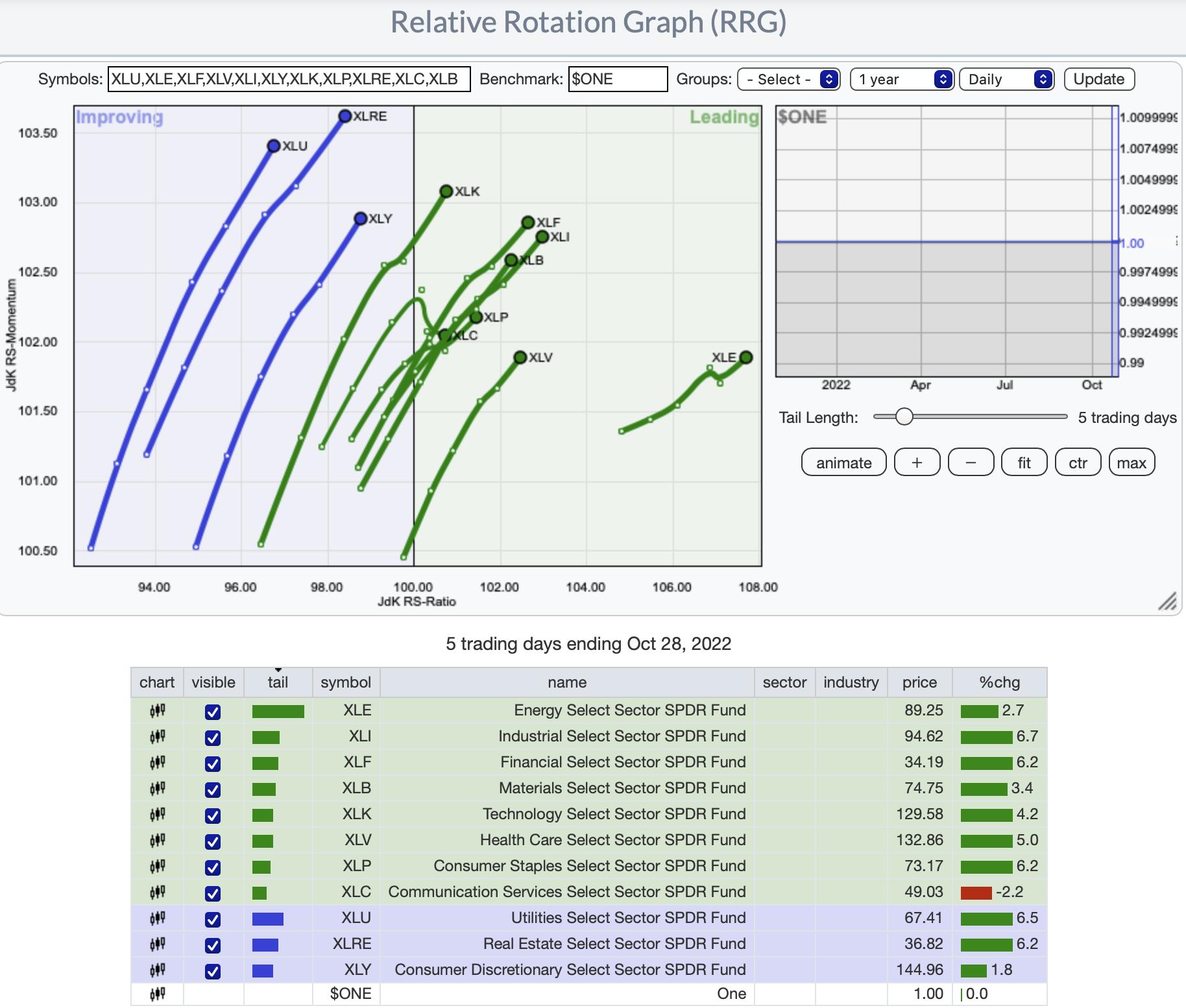
RRG® Daily Chart ($ONE Benchmark):
There is a clear short-term bullish bias based on absolute performance of these sectors. All of them but XLC have bullish northeast headings. XLC is still in the Leading quadrant so while the deterioration of its heading isn't a good thing, it isn't that bad either particularly given it has an eastward component to its heading.
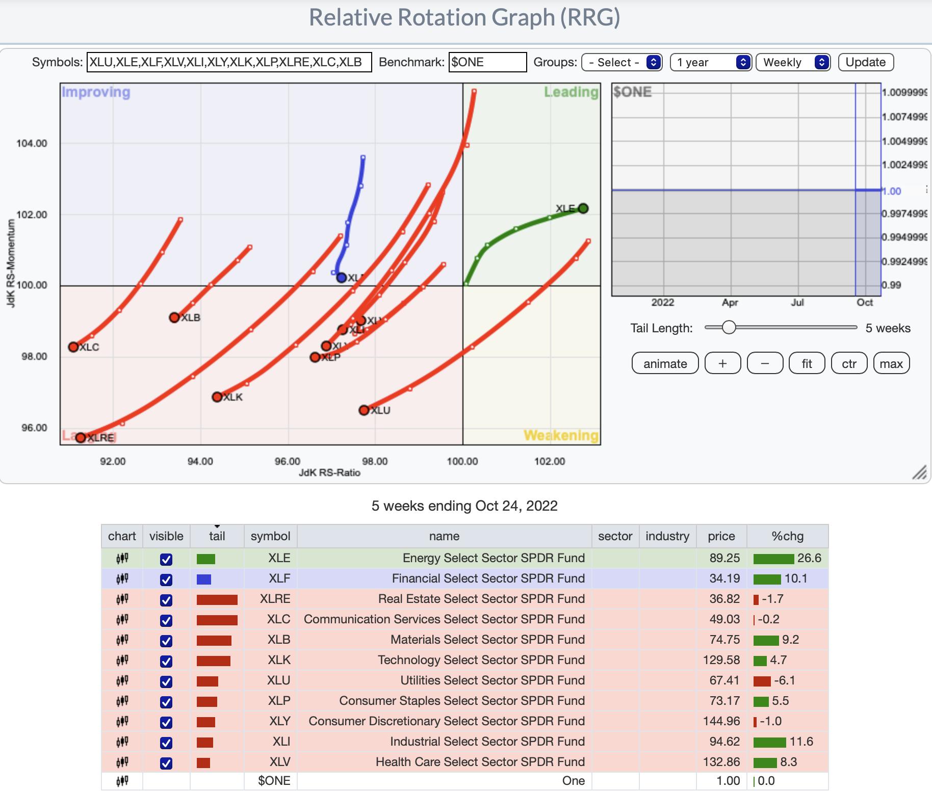
RRG® Weekly Chart ($ONE Benchmark):
The intermediate-term picture shows there are still problems. It's hard to see, but XLV has made an about-face and has a new northeast heading. This is very good news for the sector. Might be time to throw a fishing line into this sector if you don't have exposure already. Biotechs and Pharma look excellent right now.
XLF is about to reach the Lagging quadrant, but it is trying to avoid it as it now has an eastward component. Nonetheless, we believe it will get caught in Lagging.
XLE is a clear intermediate-term winner; however, we note that rotation seems to be slipping somewhat.
RRG® charts show you the relative strength and momentum for a group of stocks. Stocks with strong relative strength and momentum appear in the green Leading quadrant. As relative momentum fades, they typically move into the yellow Weakening quadrant. If relative strength then fades, they move into the red Lagging quadrant. Finally, when momentum starts to pick up again, they shift into the blue Improving quadrant.
CLICK HERE for an animated version of the RRG chart.
CLICK HERE for Carl's annotated Sector charts.
THE MARKET (S&P 500)
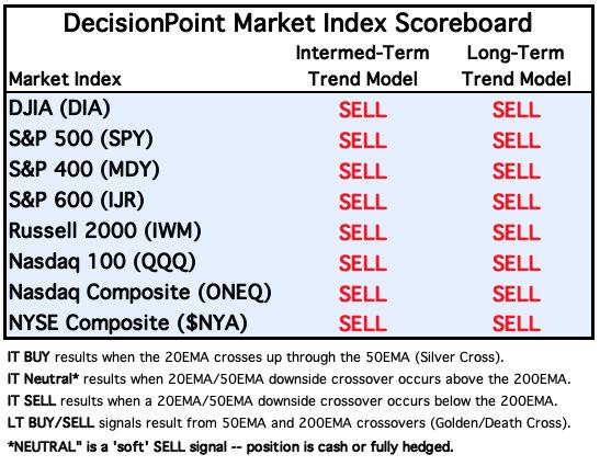
IT Trend Model: SELL as of 9/8/2022
LT Trend Model: SELL as of 5/5/2022
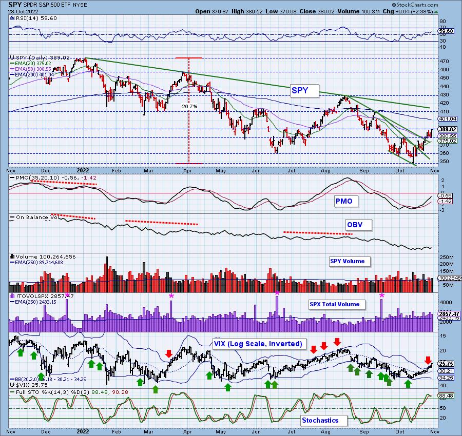
SPY Daily Chart: The market roared back to life today. Despite the last two days of decline, support at the 50-day EMA continues to hold. The issue is it hasn't overcome resistance at $390. Given the indicators we expect it will. We do see a bump in the road. A bearish rising wedge has formed and that would imply support at $380 will break down. We are expecting the wedge to be nullified and instead become a rising trend channel with an upside breakout. Stay tuned.
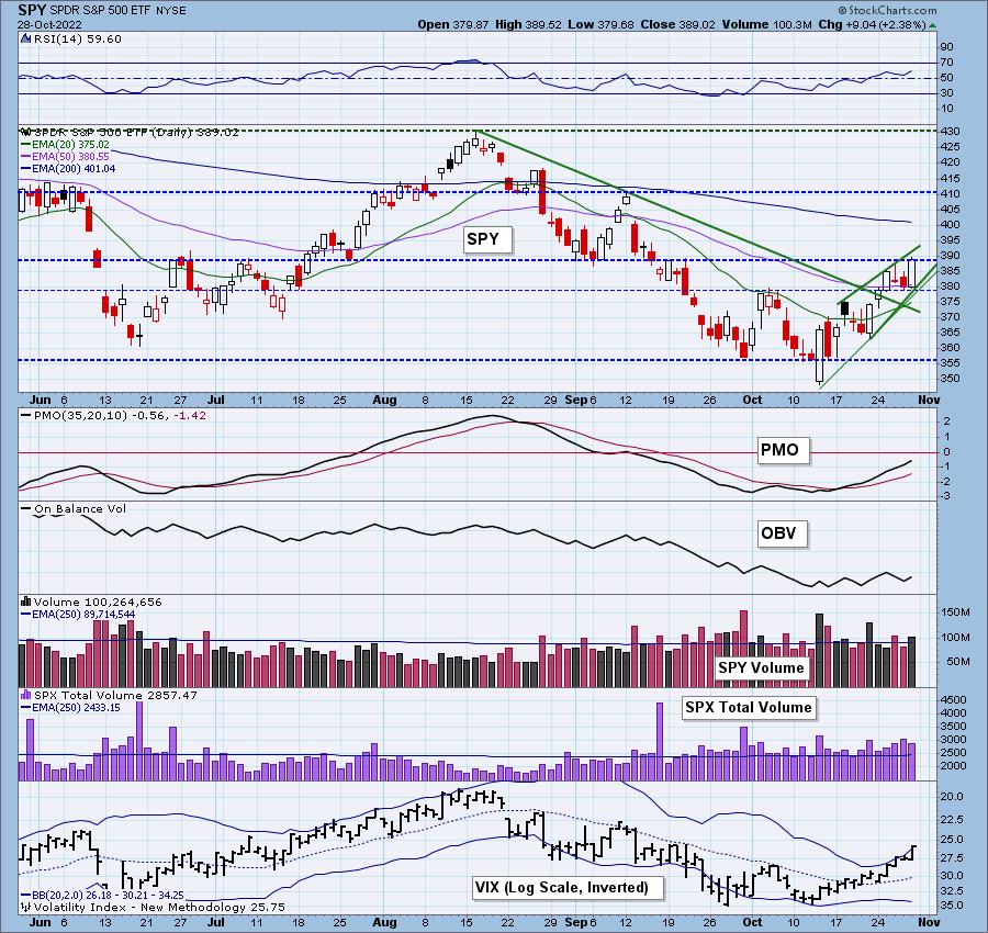
The VIX penetrated the upper Bollinger Band on our inverted scale once again. Typically we will see a decline after these punctures as we did Wednesday and Thursday. Support wasn't violated on those declines. We'll think optimistically.
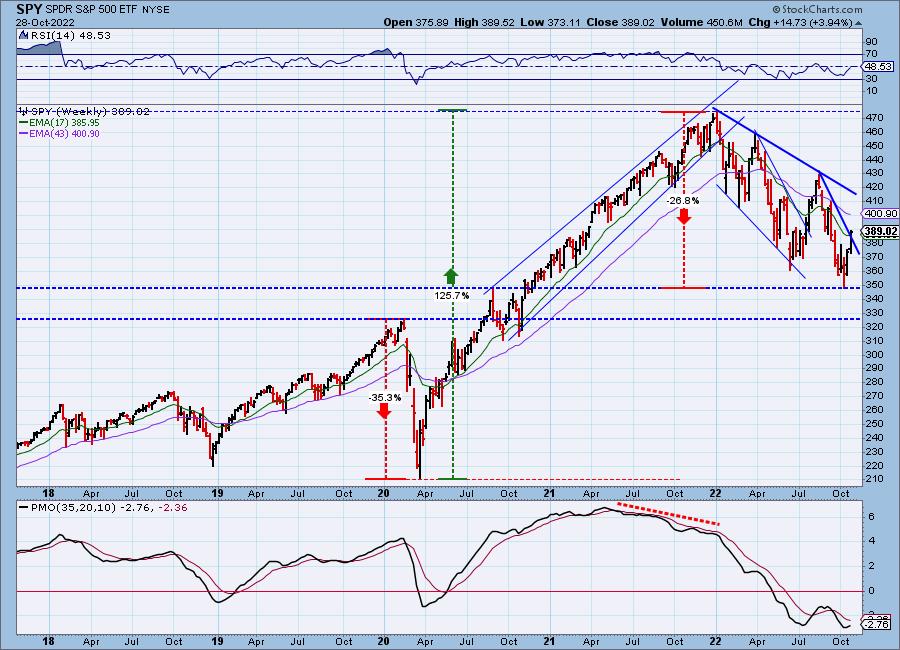
SPY Weekly Chart: SPY broke above the declining tops line and has plenty of room to run before the next serious resistance becomes an issue. The weekly PMO has turned up -- very bullish.
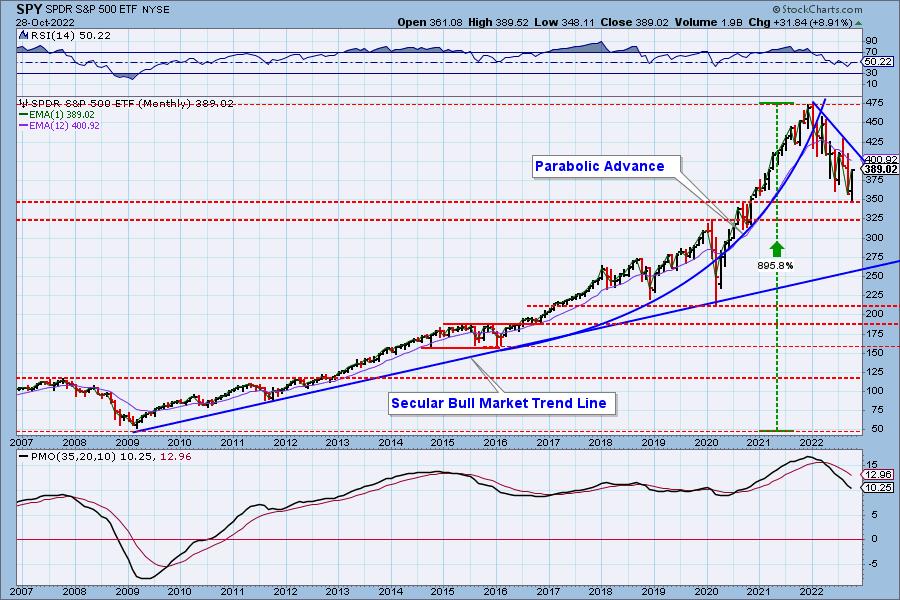
SPY Monthly Chart: There is only one trading day left in the month, so we'll cover the monthly charts also. Similar to the weekly chart, the rally has plenty of room; however, the monthly PMO is not likely to turn up any time soon. Evidence that the bear market is still in force.
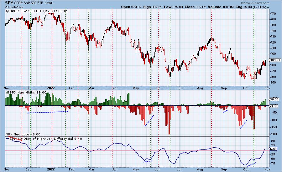
New 52-Week Highs/Lows: New Highs continue to expand, confirming the rally. The 10-DMA of the High-Low Differential moved into positive territory this week, also confirming the rally.
Climax Analysis: There were climax readings on all but the NYSE UP/DOWN Volume Ratio, and we think today was another upside initiation climax. SPX Total Volume backed off from yesterday, but still confirms. This all implies more upside price movement next week, but we need to take our final queue from Monday morning futures and the market open.
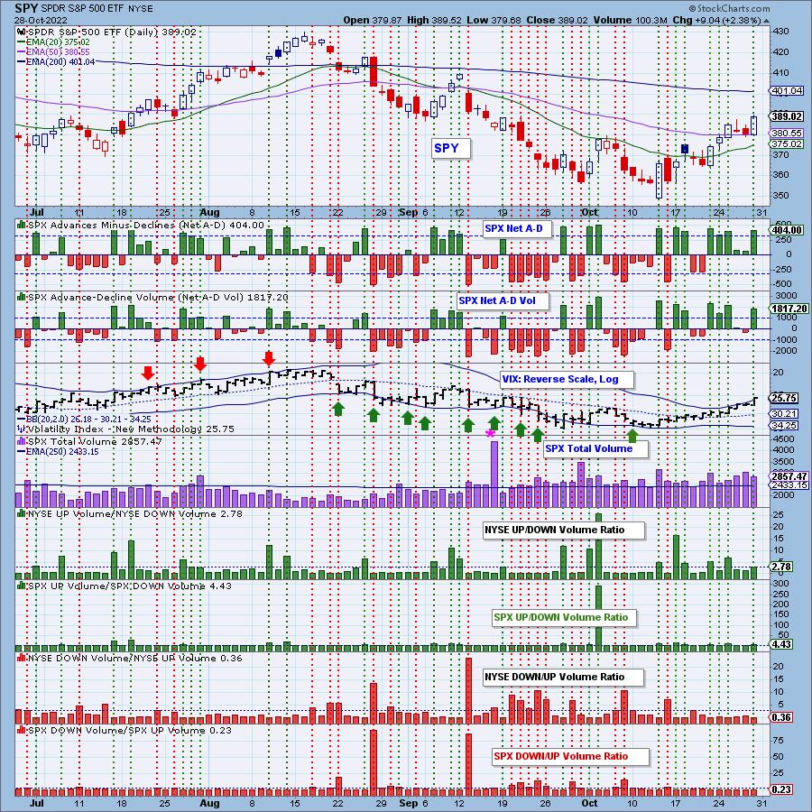
*A climax is a one-day event when market action generates very high readings in, primarily, breadth and volume indicators. We also include the VIX, watching for it to penetrate outside the Bollinger Band envelope. The vertical dotted lines mark climax days -- red for downside climaxes, and green for upside. Climaxes are at their core exhaustion events; however, at price pivots they may be initiating a change of trend.
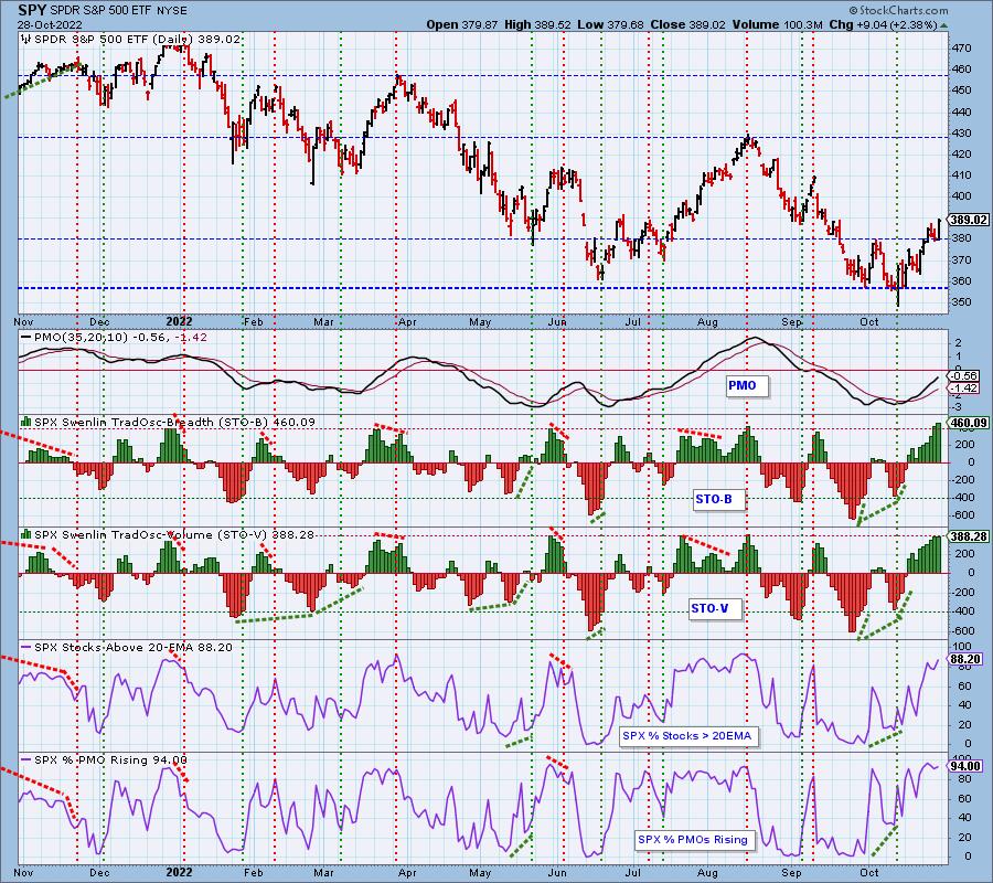
Short-Term Market Indicators: The short-term market trend is UP and the condition is OVERBOUGHT.
All but the STO-V continue higher. These indicators need to clear overbought conditions. Consolidation or pause would help them to do just that. %PMOs Rising can remain overbought so we aren't as concerned about those readings.
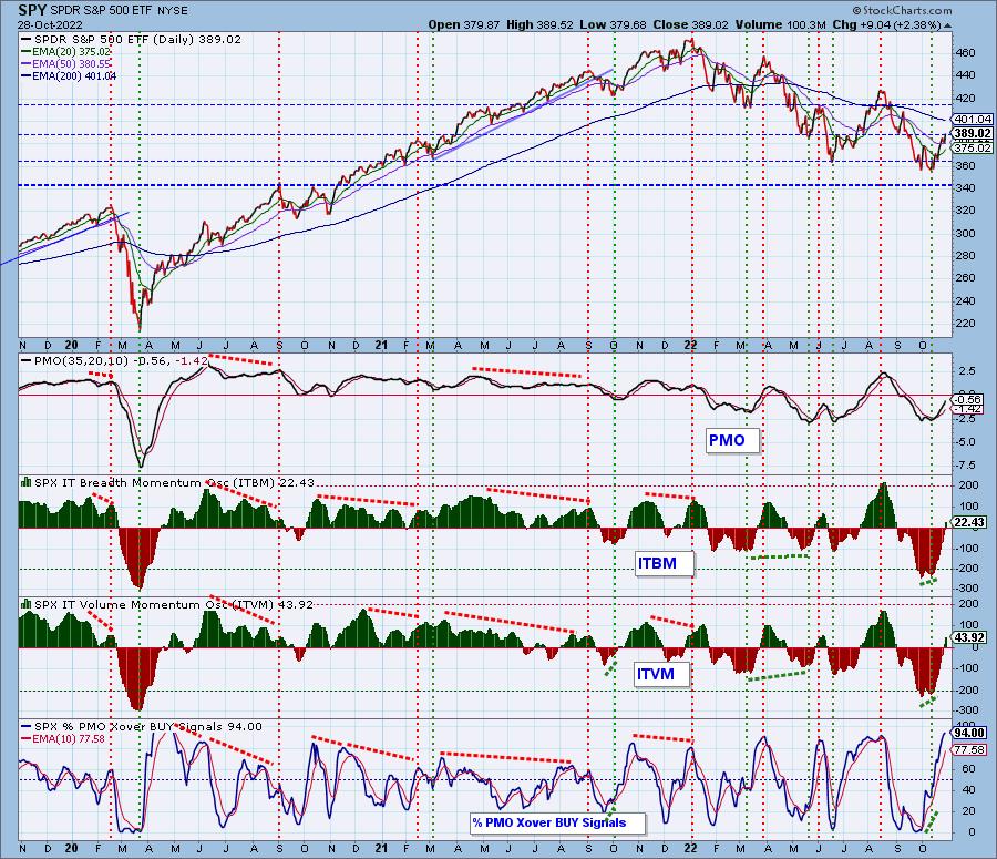
Intermediate-Term Market Indicators: The intermediate-term market trend is DOWN and the condition is NEUTRAL.
The condition of the ITBM/ITVM is Neutral, but %PMO BUY Signals is clearly overbought. They usually don't spend that much time in overbought territory. When that indicator begins to slide, we will heed its warning. For now it is safe.
PARTICIPATION and BIAS Assessment: The following chart objectively shows the depth and trend of participation in two time frames.
- Intermediate-Term - the Silver Cross Index (SCI) shows the percentage of SPX stocks on IT Trend Model BUY signals (20-EMA > 50-EMA). The opposite of the Silver Cross is a "Dark Cross" -- those stocks are, at the very least, in a correction.
- Long-Term - the Golden Cross Index (GCI) shows the percentage of SPX stocks on LT Trend Model BUY signals (50-EMA > 200-EMA). The opposite of a Golden Cross is the "Death Cross" -- those stocks are in a bear market.
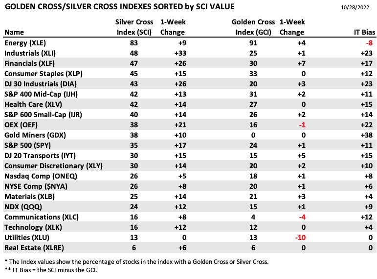
The following table summarizes participation for the major market indexes and sectors. The 1-Week Change columns inject a dynamic aspect to the presentation.
There was great improvement on the Silver Cross Indexes this week, and the IT Bias is very bullish.
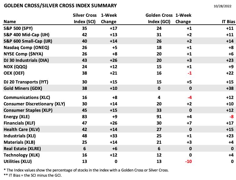
This table is sorted by SCI values. This gives a clear picture of strongest to weakest index/sector in terms of participation.
The IT Bias is slipping on Energy (XLE), but overall it still holds the highest SCI reading. We should watch rotation as this sector could be left out in the cold if the investors start moving into growth areas like Technology.
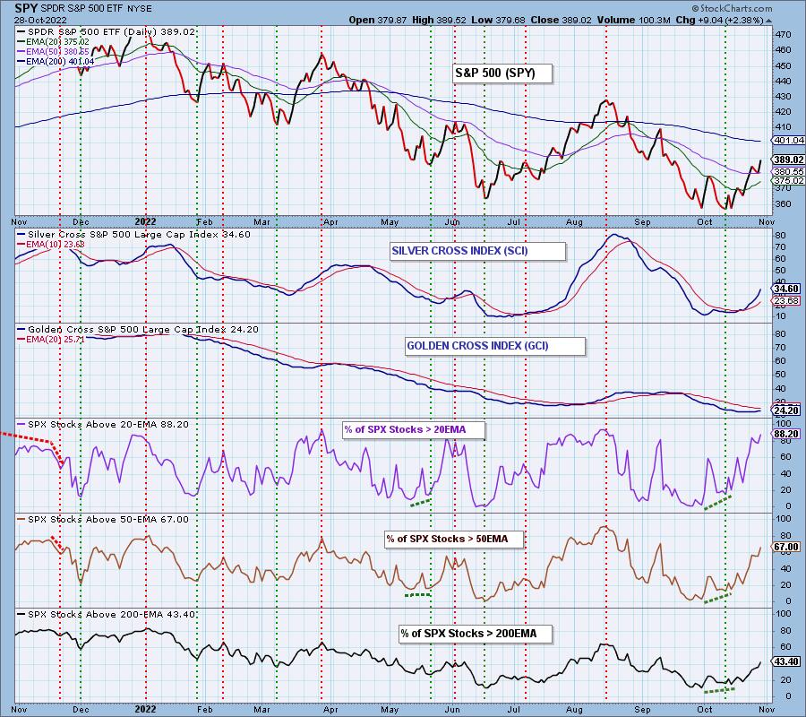
PARTICIPATION and BIAS Assessment: The following chart objectively shows the depth and trend of participation in two time frames.
- Intermediate-Term - the Silver Cross Index (SCI) shows the percentage of SPX stocks on IT Trend Model BUY signals (20-EMA > 50-EMA). The opposite of the Silver Cross is a "Dark Cross" -- those stocks are, at the very least, in a correction.
- Long-Term - the Golden Cross Index (GCI) shows the percentage of SPX stocks on LT Trend Model BUY signals (50-EMA > 200-EMA). The opposite of a Golden Cross is the "Death Cross" -- those stocks are in a bear market.
The SCI is rising strongly. Erin will be publishing an article soon that shows how prescient the SCI crossovers have been for the markets. They would certainly have gotten you back into this rally earlier in October.
The short-term bias is BULLISH. We have far more stocks with price above their 20/50-day EMAs. That strength will continue to pull the SCI higher.
The intermediate-term bias is BULLISH. With the SCI accelerating higher, we have to consider this timeframe bullish even though the reading of the SCI is relatively low. This looks a lot like the follow-through we had after the crossover in July; only the acceleration is more pronounced.
The long-term bias is BEARISH. We'd like to say "neutral" but aren't seeing enough of a rise in the GCI. Additionally, we don't have an upside crossover above its signal line. We are seeing more participation of stocks above their 50/200-day EMAs so the GCI should get going again. It's obviously a slow mover.
CONCLUSION: After pausing Wednesday and Thursday, the market kicked into high gear today. Overhead resistance wasn't broken on today's pop, but indicators suggest we will see that occur next week. Today's upside initiation climax suggests on Monday we will see price move higher. However, overbought conditions on short-term indicators need to be relieved. The usual muted price action going into the Fed announcement on Wednesday would be a welcomed opportunity to relieve those conditions. So rather than a big rally next week, we would look for more churn that angles price higher as it did this week.
Calendar: Fed meeting is Tuesday, and comments on Wednesday. Observers are mostly expecting a 75 basis point increase. Optimists are hoping that subsequent increases will be lower than 75 basis points.
Have you subscribed the DecisionPoint Diamonds yet? DP does the work for you by providing handpicked stocks/ETFs from exclusive DP scans! Add it with a discount! Contact support@decisionpoint.com for more information!
BITCOIN
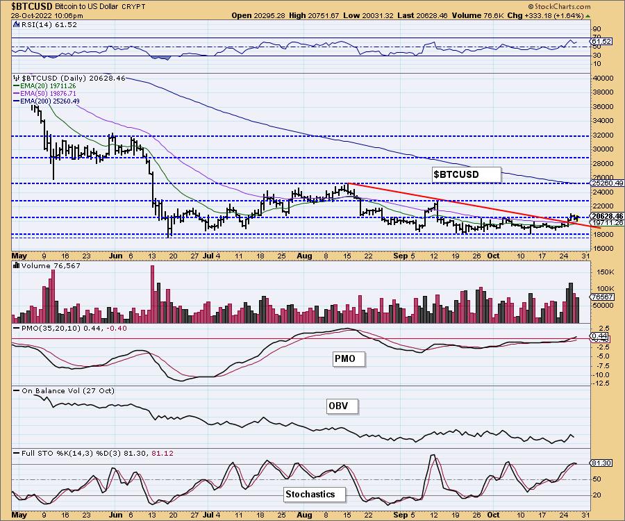
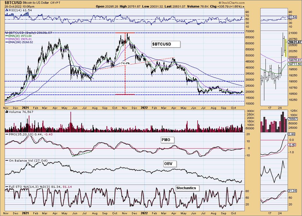
Bitcoin broke out this week, but has pulled back slightly. Indicators are quite positive and suggest this is just a textbook pullback toward the breakout area.
This chart is to show where some of the support/resistance lines come from.
INTEREST RATES
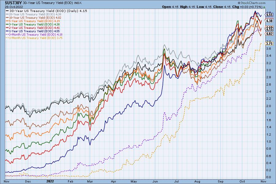
We saw a pivot in interest rates after a week of lower yields. We expected more of a corrective move, but rates are relentlessly rising and putting downward pressure on the market and Bonds.
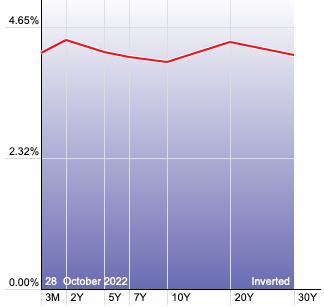
The Yield Curve Chart from StockCharts.com shows us the inversions taking place. The red line should move higher from left to right. Inversions are occurring where it moves downward.
---
10-YEAR T-BOND YIELD
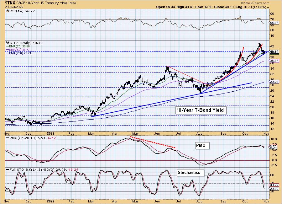
$TNX corrected this week but appears ready to rebound off strong support at the 20-day EMA, September top and rising bottoms trendline. The RSI remains positive, but the PMO suggests a breakdown ahead. Stochastics are very negative, but are reaching oversold territory. We will watch that indicator in particular to flag a new bottom.
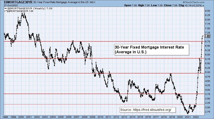
MORTGAGE INTEREST RATES (30-Yr)**
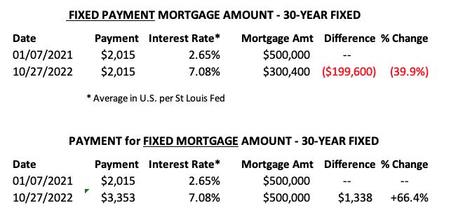
**We watch the 30-Year Fixed Mortgage Interest Rate, because, for the most part, people buy homes based upon the maximum monthly payment they can afford. As rates rise, a fixed monthly payment will carry a smaller mortgage amount. As buying power shrinks, home prices will come under pressure.
--
This week the 30-Year Fixed Rate rose from 6.94 to 7.08.
DOLLAR (UUP)
IT Trend Model: BUY as of 6/22/2021
LT Trend Model: BUY as of 8/19/2021
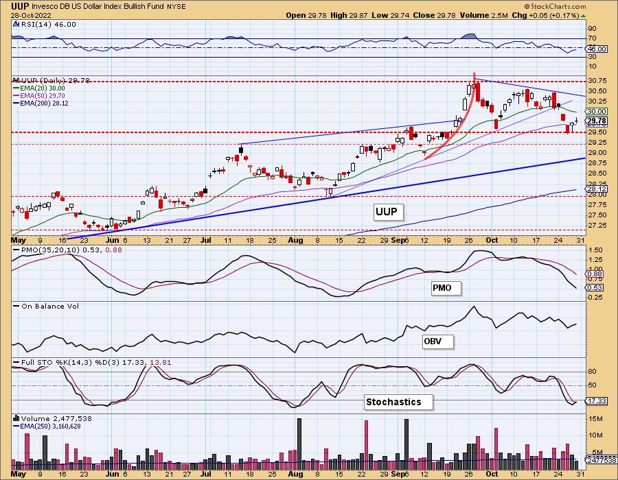
UUP Daily Chart: The Dollar continues to tease. This week it appeared it was going to execute a bearish double-top. Instead it managed to find support along the confirmation line of the pattern. The RSI and PMO are quite negative, but Stochastics suggest we could see a bit more upside. For now we will follow the PMO and look for this small rally to fail.
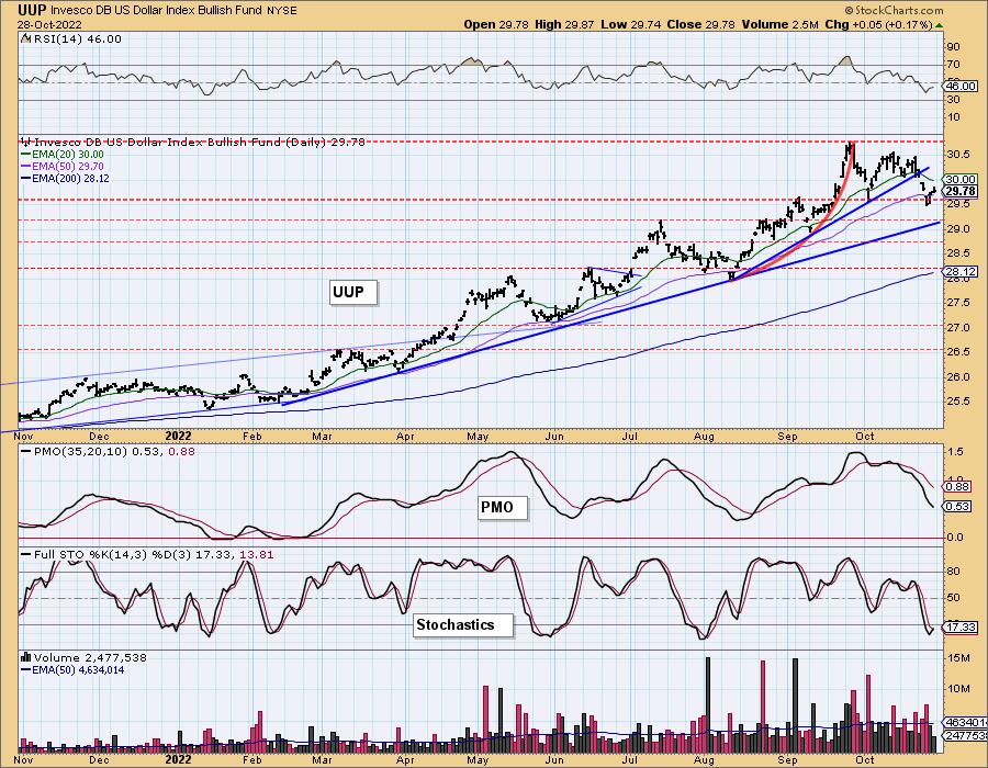
UUP Weekly Chart: This week's decline broke the steep rising bottoms trendline. Additionally, the weekly PMO has topped. This bearish backdrop tells us that the double-top on the daily chart should win out.
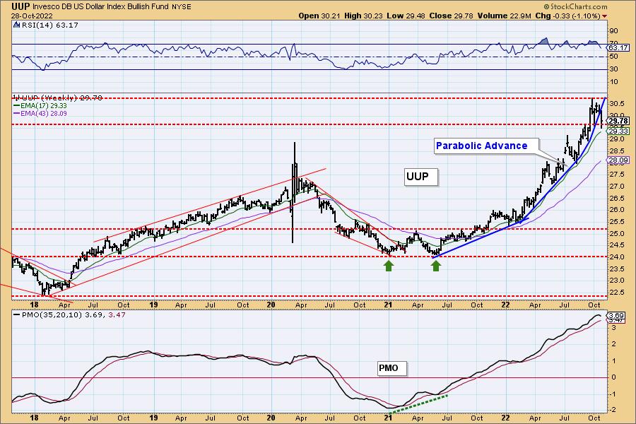
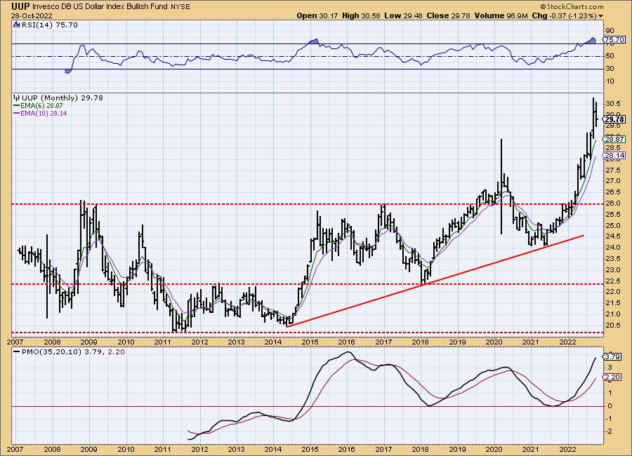
UUP Monthly Chart: The monthly chart is still quite bullish. We do note that monthly PMO while rising, is now getting very overbought. Long term, the Dollar still looks strong.
GOLD
IT Trend Model: NEUTRAL as of 5/3/2022
LT Trend Model: SELL as of 6/30/2022
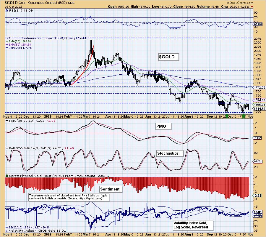
GOLD Daily Chart: The Dollar's mini rally this week put the brakes on a developing bullish double-bottom pattern. Instead we now have a bearish descending triangle (flat bottoms, declining tops) that implies not only a test of the September/October lows, but a breakdown there.
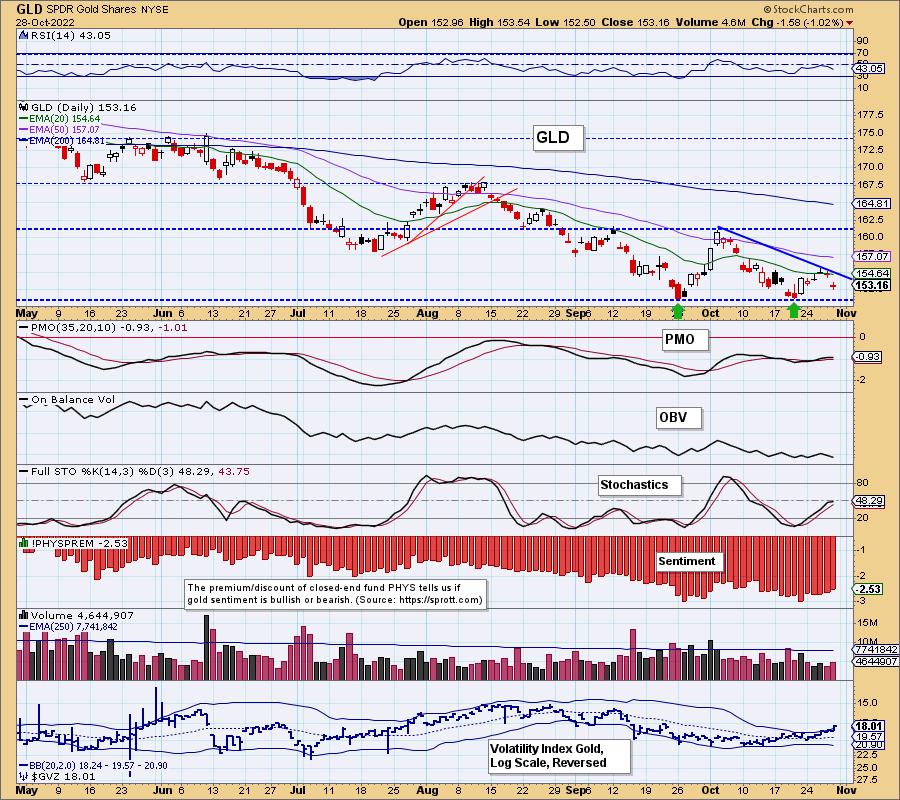
$GVZ has moved well above the upper Bollinger Band on our inverted scale and that is bearish for Gold. Discounts are paring back somewhat but remain historically high. Eventually this bearish sentiment should play out with a more prolonged rally, but so far nothing.
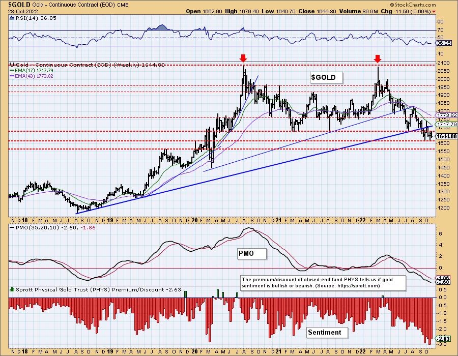
GOLD Weekly Chart: The double-top is still looming. Technically it was confirmed with the breakdown in September, but Gold continues to cling to the support zone between $1560 and $1620. The weekly PMO is still declining but is very oversold.
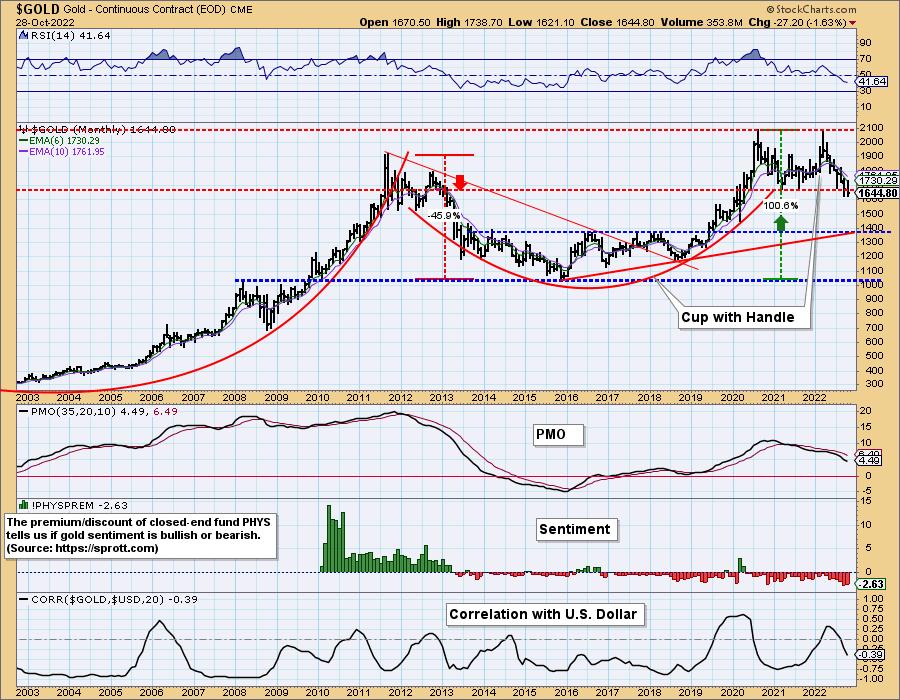
GOLD Monthly Chart: In the longer term, you can make a case for a bullish cup and handle. The handle could extend as low as $1400, but we do see the monthly PMO decelerating. You can see more clearly here how Discounts are extremely high.
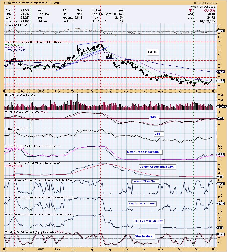
GOLD MINERS Golden and Silver Cross Indexes: Gold Miners started the week off with a bang, but with Gold fizzling, so did the rally. The bullish reverse head and shoulders pattern is disintegrating. It isn't all that bad. The RSI is positive, Stochastics are rising above 80 and the PMO is still technically rising on a crossover BUY signals. Participation took a hit, but not a big one. There is still hope for GDX, but Gold really needs to cooperate.
CRUDE OIL (USO)
IT Trend Model: NEUTRAL as of 7/8/2022
LT Trend Model: BUY as of 3/9/2021
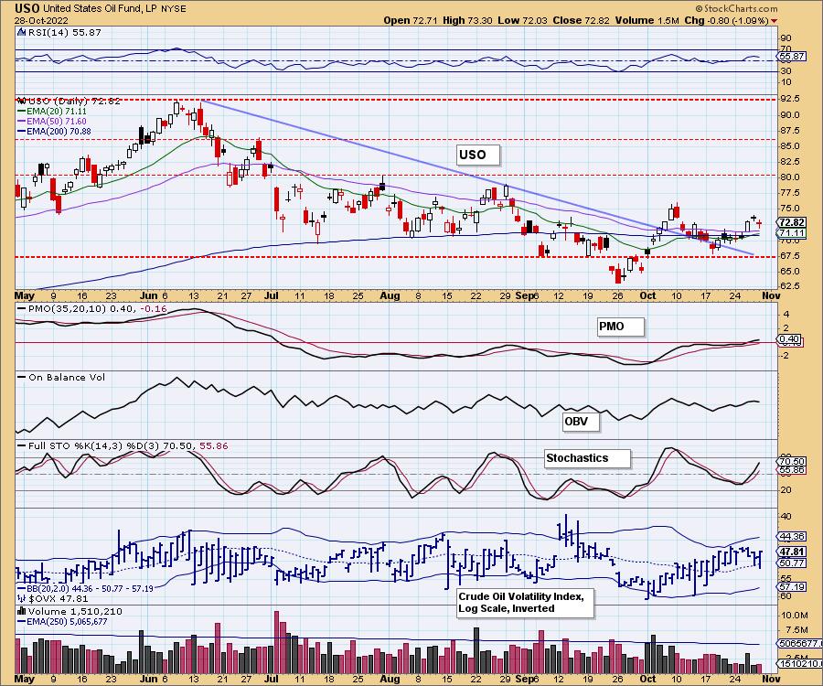
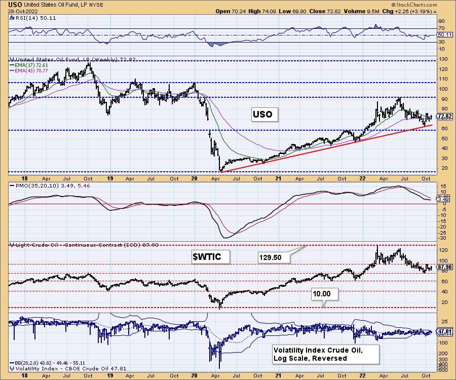
USO Daily Chart: Crude Oil finally broke above the 50-day EMA and yesterday it saw follow-through. Today it paused. We should see prices continue higher based on the positive RSI, rising PMO and rising Stochastics. The $OVX remains above its moving average on the inverted scale, suggesting internal strength. This is an excellent opportunity for Oil to execute the reverse head and shoulders that's formed over the past two months. Maybe we have to wait for the election to be over.
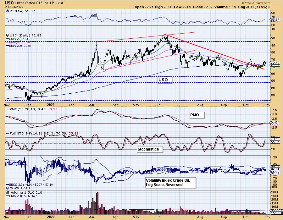
USO/$WTIC Weekly Chart: The weekly RSI just pushed into positive territory above net neutral (50). The weekly PMO is decelerating but hasn't technically bottomed yet.
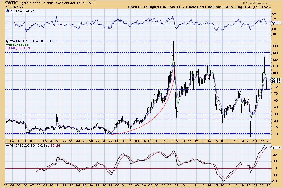
WTIC Monthly Chart: The monthly chart is a problem. While price bounced off long-term support at the 2018 high, the monthly PMO has topped ominously. While the technicals suggest a major decline, we know supply and demand issues will likely prevent that for now.
BONDS (TLT)
IT Trend Model: SELLas of 8/19/2022
LT Trend Model: SELL as of 1/19/2022
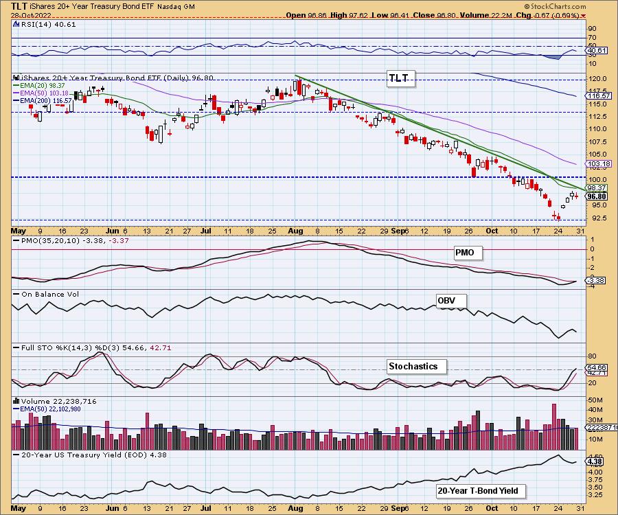
TLT Daily Chart: With yields backing off this week, Bonds had a chance to rally. Price topped below resistance at the 20-day EMA and before reaching the intermediate-term declining tops trendline. That suggests the rally will end. On the other hand, the PMO is about to trigger a crossover BUY signal and Stochastics are above net neutral (50). We believe the Fed announcement will likely push yields higher and those positive indicators will turn back down quickly.
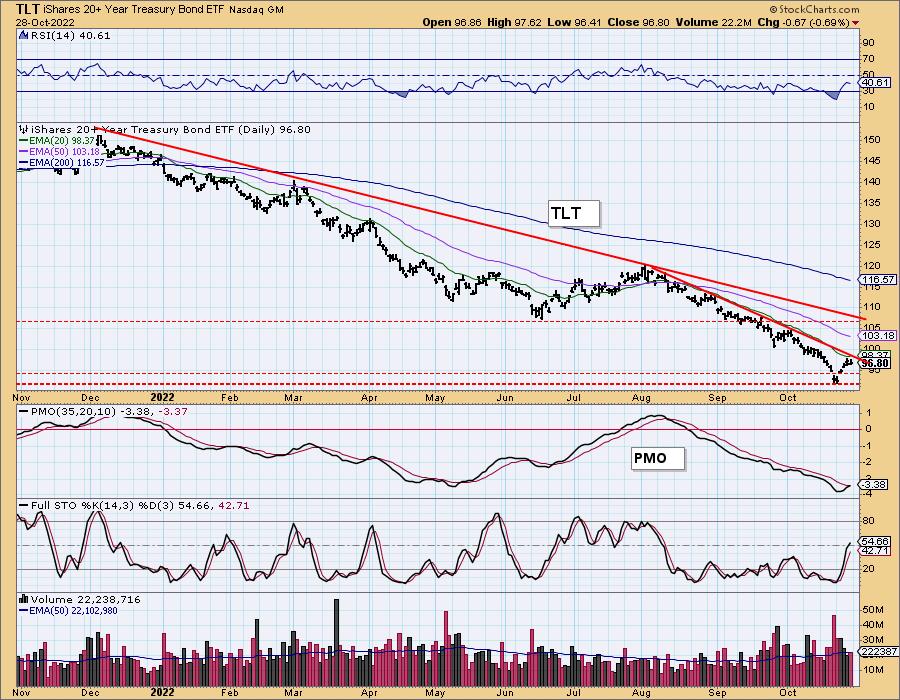
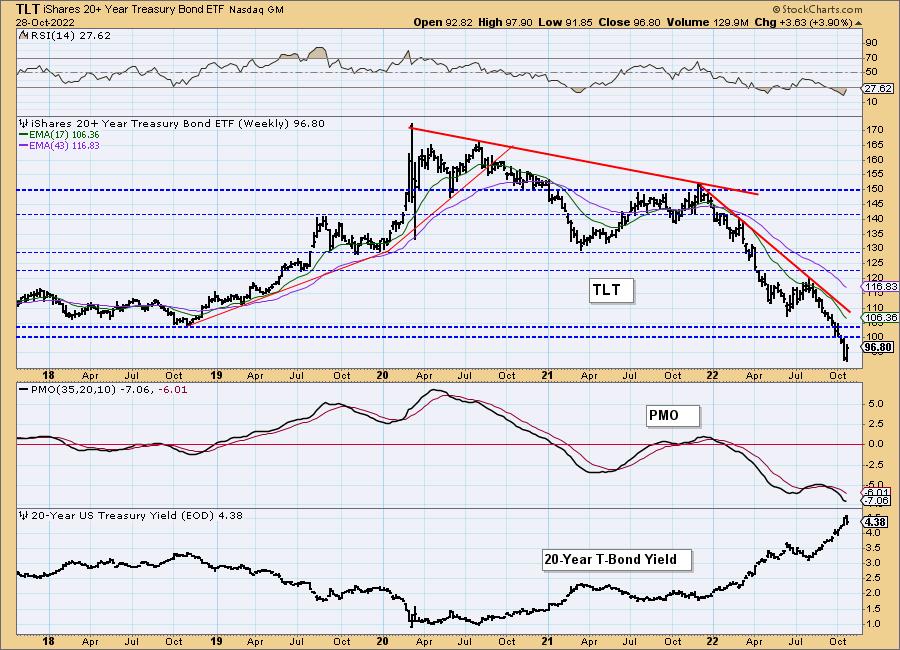
TLT Weekly Chart: We have a reverse parabolic or waterfall decline given declining trends are getting steeper. This week's rally did help the weekly PMO decelerate, but as noted earlier we think this rally will be short-lived or has already ended.
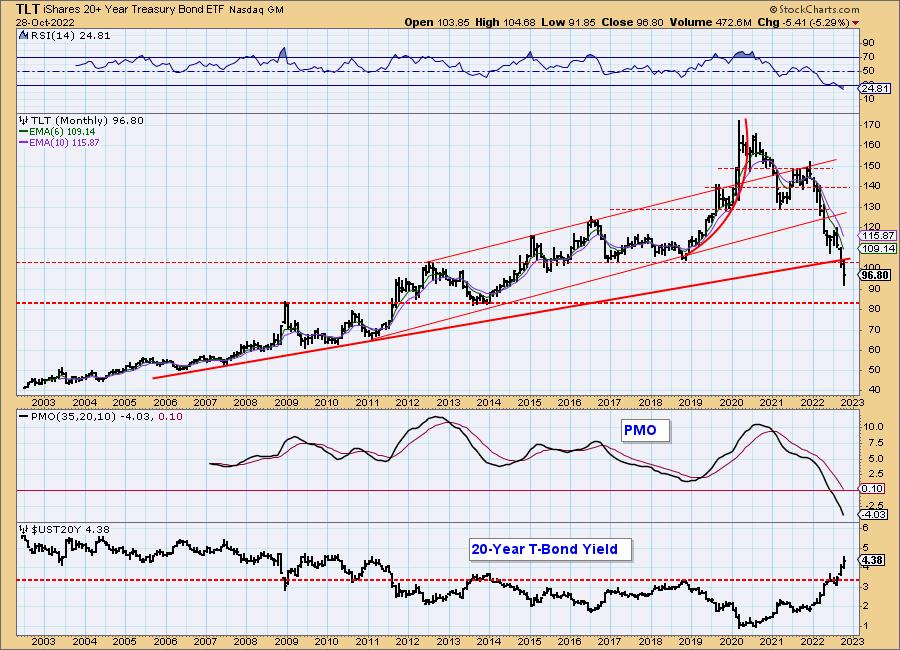
TLT Monthly Chart: The long-term rising trend drawn from the 2006 low was challenged last month. This month price fell like a rock. The monthly PMO and monthly RSI are extraordinarily oversold, but neither is interested in decelerating their decline. A drop to $85 appears imminent.
Good Luck & Good Trading!
Erin Swenlin And Carl Swenlin
Technical Analysis is a windsock, not a crystal ball. --Carl Swenlin
(c) Copyright 2022 DecisionPoint.com
Disclaimer: This blog is for educational purposes only and should not be construed as financial advice. The ideas and strategies should never be used without first assessing your own personal and financial situation, or without consulting a financial professional. Any opinions expressed herein are solely those of the author, and do not in any way represent the views or opinions of any other person or entity.
NOTE: The signal status reported herein is based upon mechanical trading model signals, specifically, the DecisionPoint Trend Model. They define the implied bias of the price index based upon moving average relationships, but they do not necessarily call for a specific action. They are information flags that should prompt chart review. Further, they do not call for continuous buying or selling during the life of the signal. For example, a BUY signal will probably (but not necessarily) return the best results if action is taken soon after the signal is generated. Additional opportunities for buying may be found as price zigzags higher, but the trader must look for optimum entry points. Conversely, exit points to preserve gains (or minimize losses) may be evident before the model mechanically closes the signal.
Helpful DecisionPoint Links:
DecisionPoint Alert Chart List
DecisionPoint Golden Cross/Silver Cross Index Chart List
DecisionPoint Sector Chart List
Price Momentum Oscillator (PMO)
Swenlin Trading Oscillators (STO-B and STO-V)
DecisionPoint is not a registered investment advisor. Investment and trading decisions are solely your responsibility. DecisionPoint newsletters, blogs or website materials should NOT be interpreted as a recommendation or solicitation to buy or sell any security or to take any specific action.
