
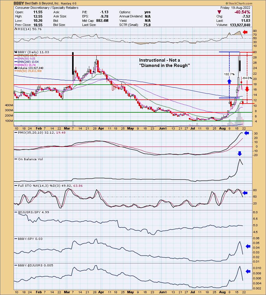
It was quite a week for Bed Bath & Beyond (BBBY). A subscriber of DP Diamonds presented this stock for review on Wednesday as a selection for Reader Request Thursday. What is interesting is that on Sunday Erin was talking to her stepson about "meme" stocks since his older brother had asked her about Gamestop (GME) the exact day before it went ballistic and created the meme stock craze. Older brother is a computer engineer and at that time, frequented Reddit. We chuckled about that timing and then younger brother informed her that the latest meme stock was BBBY. It was quite fortuitous as she was able to warn the subscriber Wednesday night to beware. Although a look at this chart would've told you something was definitely not right here even if you didn't know it was a meme stock.
We don't have it marked, but BBBY was up over 530% from the July low. This week it proceeded to build the parabolic even further. It was up from last Friday's close by almost 132% at the intraday high Wednesday. The giant filled black candlestick was good warning that this trade was going to go south in a big way. From the intraday high on Wednesday, BBBY was down 64% on today's close. The PMO didn't react very quickly as it only turned down today so recognizing these patterns is important.
The moral of the story? Always understand what you are investing in. Meme stocks are dangerous. Yes, as with all parabolic patterns, you can make a killing. However, ultimately, a parabolic will break down. When it does, it will almost always be swift and painful. Erin often uses trailing stops when she is fortunate enough to find herself in a parabolic climb.
The DecisionPoint Alert Weekly Wrap presents an end-of-week assessment of the trend and condition of the Stock Market, the U.S. Dollar, Gold, Crude Oil, and Bonds. The DecisionPoint Alert daily report (Monday through Thursday) is abbreviated and gives updates on the Weekly Wrap assessments.
Watch the latest episode of DecisionPoint on StockCharts TV's YouTube channel here!
MAJOR MARKET INDEXES
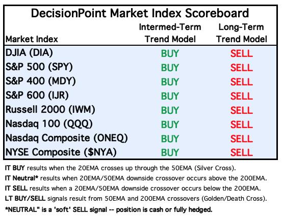
For Today: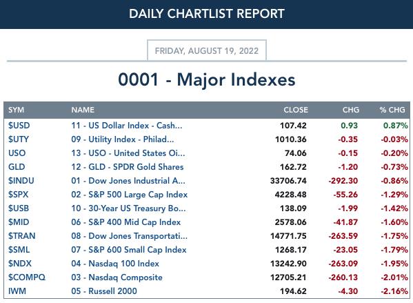
For the Week:
SECTORS
Each S&P 500 Index component stock is assigned to one of 11 major sectors. This is a snapshot of the Intermediate-Term (Silver Cross) and Long-Term (Golden Cross) Trend Model signal status for those sectors.
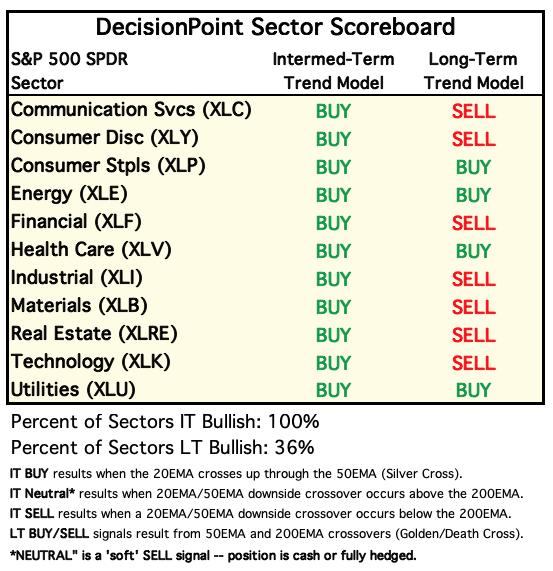
For Today: 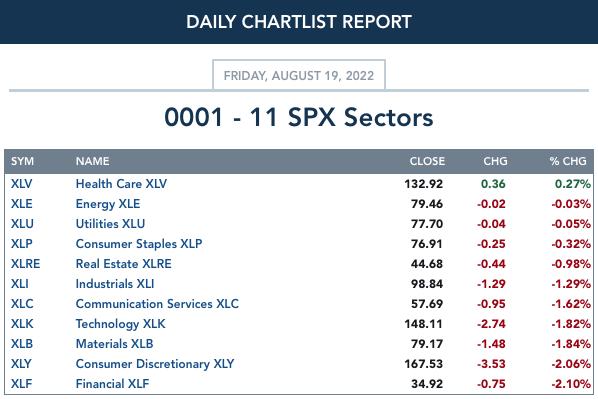
For the Week: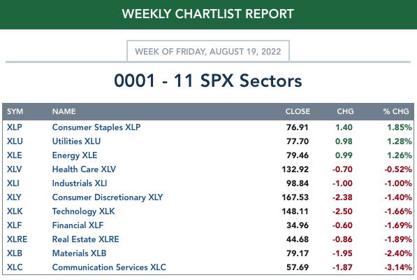
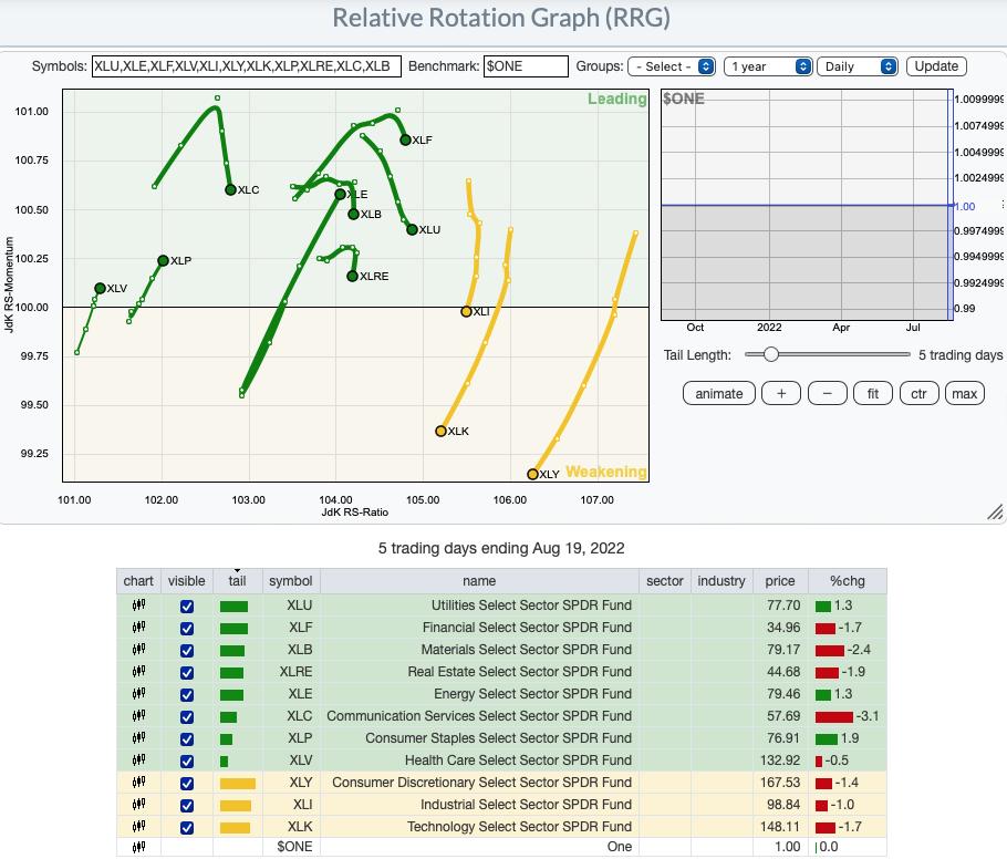
RRG® Daily Chart ($ONE Benchmark):
There is a changing of the guard on the daily RRG. Defensive sectors XLP and XLV are showing new strength and XLE has made an incredible recovery. These three sectors are the only ones with bullish northeast headings.
The aggressive sectors, XLK and XLY have plummeted in performance. XLI isn't far behind as it has now entered the Weakening quadrant to join them.
The remainder, XLC, XLB, XLF, XLU and XLRE, have curled around in the Leading quadrant and are headed for the Weakening quadrant. Overall, next week, we should keep an eye on XLE, XLP and XLV.
RRG® Weekly Chart ($ONE Benchmark):
The weekly RRG shows us that the market is in a strong rising trend in the intermediate term. All sectors with the exception of XLE and XLB have bullish northeast headings and are headed to the Leading quadrant, or in the case of XLU, in the Leading quadrant.
XLE hasn't recuperated on the weekly RRG, but given its rapid improvement on the daily RRG, we would expect it to start at least moving northward as XLB is.
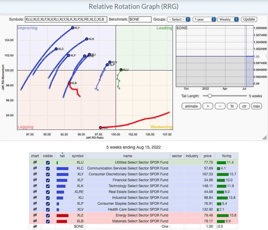
RRG® charts show you the relative strength and momentum for a group of stocks. Stocks with strong relative strength and momentum appear in the green Leading quadrant. As relative momentum fades, they typically move into the yellow Weakening quadrant. If relative strength then fades, they move into the red Lagging quadrant. Finally, when momentum starts to pick up again, they shift into the blue Improving quadrant.
CLICK HERE for an animated version of the RRG chart.
CLICK HERE for Carl's annotated Sector charts.
THE MARKET (S&P 500)
IT Trend Model: BUY as of 8/2/2022
LT Trend Model: SELL as of 5/5/2022
SPY Daily Chart: With options expiration this week, we were looking for low volatility today and yesterday. We think that expectation was met. The chart is breaking down. The big problem is the confirmation of the bearish rising wedge that occurred with today's breakdown. We aren't altogether surprised given the OBV negative divergence.
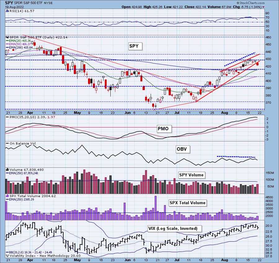
The PMO has now topped in extremely overbought territory and Stochastics fell below 80. Total Volume was elevated on today's decline, but we can't put much emphasis on that given today was options expiration. The VIX remains above its moving average on our inverted scale which is bullish, but another decline like today and we expect the VIX to spike.
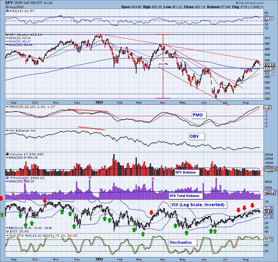
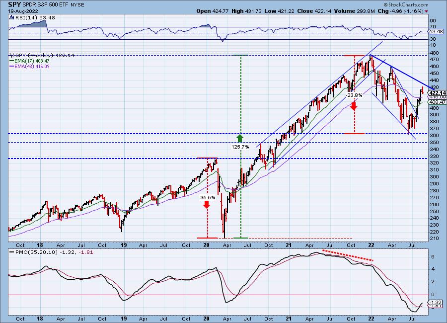
SPY Weekly Chart: The bullish falling wedge was confirmed on the breakout last month. The question on everyone's mind is whether the bear market is over. We would consider this should the longer-term declining trend were broken. Price got close, but ultimately was turned away this week.
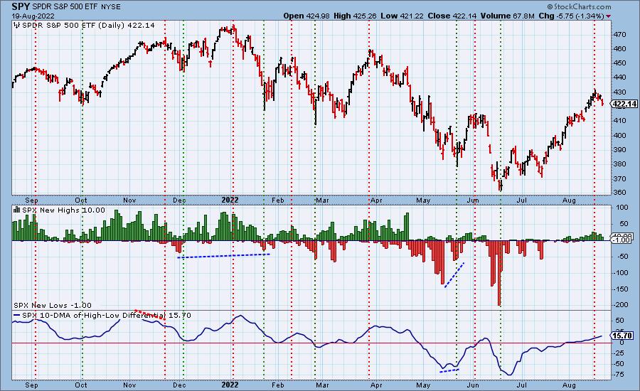
New 52-Week Highs/Lows: New Highs began tapering off after price topped. We still see a rising 10-DMA of the High-Low Differential, but it is now in near-term overbought territory. If this is the end of the bear market, we should see this indicator at least overcome the June top.
Climax Analysis: There were unanimous climax readings today, though they were all modest. We have to designate today as a downside exhaustion climax. Wednesday's downside initiation climax took an extra day to deliver.
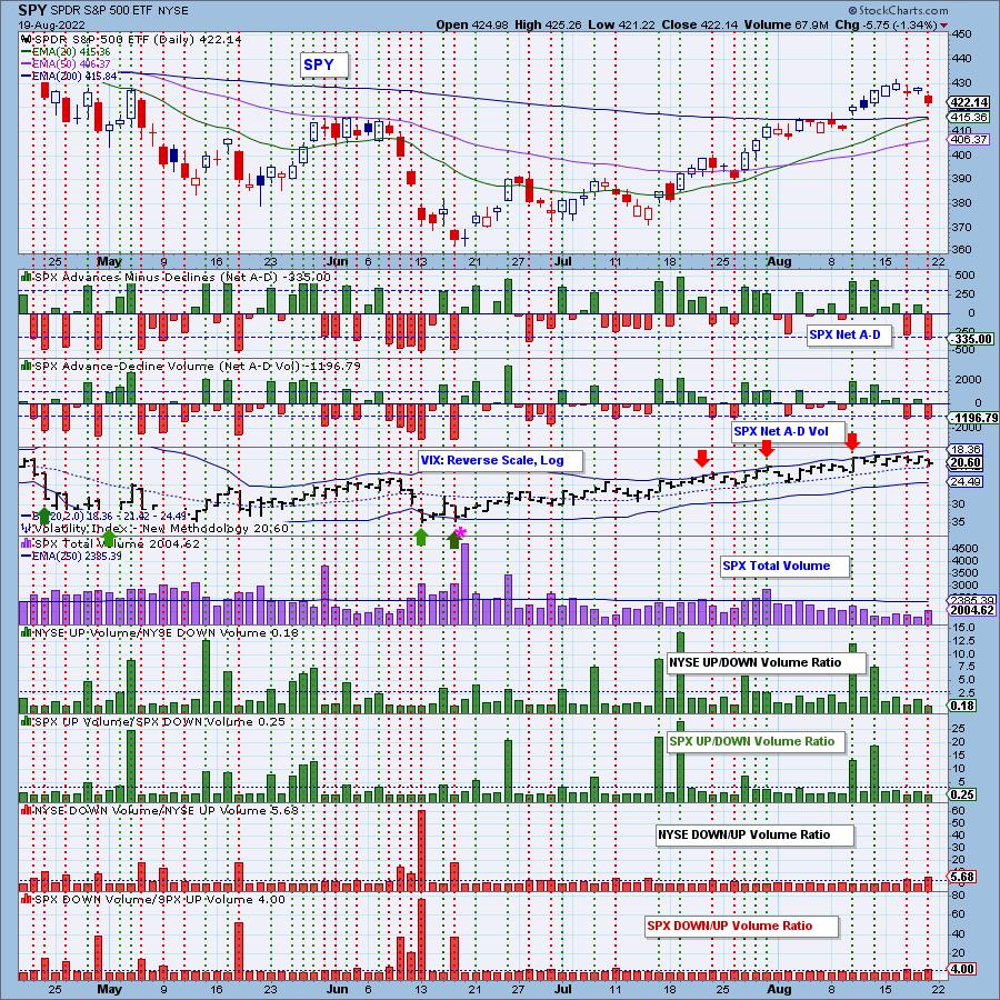
*A climax is a one-day event when market action generates very high readings in, primarily, breadth and volume indicators. We also include the VIX, watching for it to penetrate outside the Bollinger Band envelope. The vertical dotted lines mark climax days -- red for downside climaxes, and green for upside. Climaxes are at their core exhaustion events; however, at price pivots they may be initiating a change of trend.
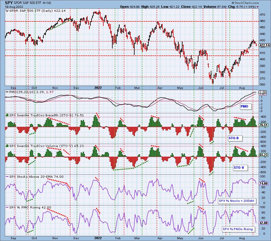
Short-Term Market Indicators: The short-term market trend is UP and the condition is NEUTRAL.
STOs turned down on Wednesday sparking caution regarding the rally that preceded. Participation took a huge hit as far as %PMOs Rising. More than half of the SPX have declining momentum. That is a recipe for further decline.
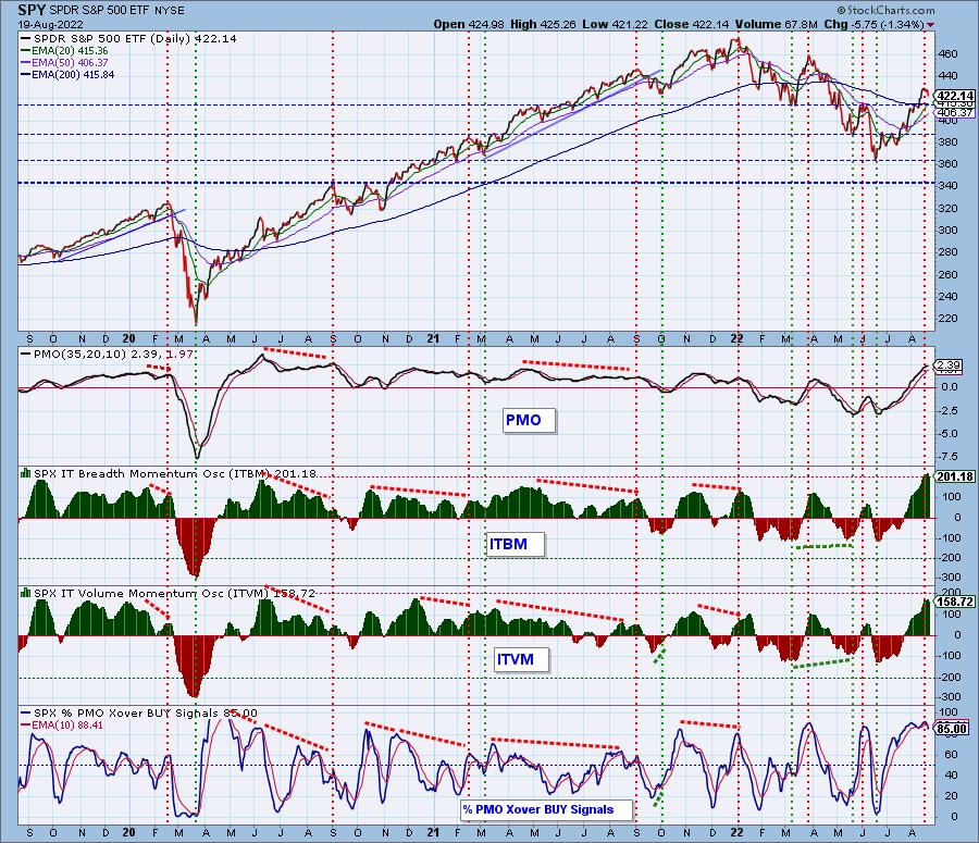
Intermediate-Term Market Indicators: The intermediate-term market trend is UP and the condition is EXTREMELY OVERBOUGHT.
Today was the first time since mid-July that these indicators turned down. We are still marveling at the overbought condition of %PMO BUY signals. This indicator spends very little time in overbought territory so its persistence tells us there is still a bullish bias in the intermediate term.
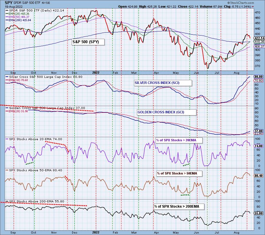
PARTICIPATION and BIAS Assessment: The following chart objectively shows the depth and trend of participation in two time frames.
- Intermediate-Term - the Silver Cross Index (SCI) shows the percentage of SPX stocks on IT Trend Model BUY signals (20-EMA > 50-EMA). The opposite of the Silver Cross is a "Dark Cross" -- those stocks are, at the very least, in a correction.
- Long-Term - the Golden Cross Index (GCI) shows the percentage of SPX stocks on LT Trend Model BUY signals (50-EMA > 200-EMA). The opposite of a Golden Cross is the "Death Cross" -- those stocks are in a bear market.
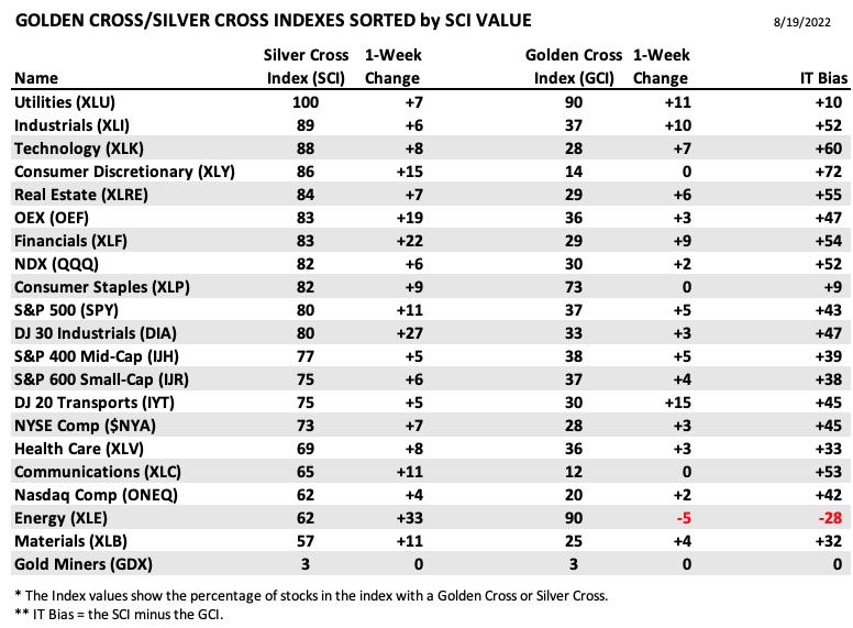
The following table summarizes participation for the major market indexes and sectors. The 1-Week Change columns inject a dynamic aspect to the presentation.
The following table summarizes participation for the major market indexes and sectors. The 1-Week Change columns inject a dynamic aspect to the presentation.
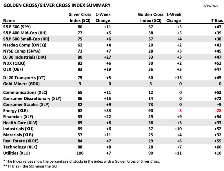
This table is sorted by SCI values. This gives a clear picture of strongest to weakest index/sector in terms of participation.
While XLE is listed near the bottom, its SCI made the biggest improvement this week. Not far behind was the Dow 30. XLU hit new all-time highs this week so it isn't a surprise to see it sitting at the top of the list.
The short-term bias is NEUTRAL. We are starting to see %Stocks above their 20/50-day EMAs tumble. Note we have 74.0% of stocks above their 20-day and 80.4% above their 50-day EMAs. These percentages are lower than the SCI reading of 80.8%. If this relationship doesn't change next week, we will consider the short term to have a bearish bias.
The intermediate-term bias is BULLISH. The SCI is above 70% which is bullish. However, note that the SCI is very overbought now and appears to be pausing. We also know that we have a smaller percentage of stocks with price above their 20/50-day EMAs, meaning the SCI is likely to top soon.
The long-term bias is NEUTRAL to BULLISH. We have 55.8% of stocks with price above their 200-day EMA and that is higher than the GCI reading of 35.8%.
CONCLUSION: Today we got a downside exhaustion climax. Is it really exhaustion and the end of this tiny, tiny decline? Could be. The market has been behaving like a bull market, and short declines are common for bulls. On the other hand, we have been waiting for the bull to fizzle. Given extraordinarily overbought conditions across the board, now is as good a time as any for that to happen. Our intermediate-term ITBM and ITVM have topped today, so there is a strong probability that the the decline set in motion by the short-term STO-B and STO-V will continue.
Erin is 60% exposed to the market.
Have you subscribed the DecisionPoint Diamonds yet? DP does the work for you by providing handpicked stocks/ETFs from exclusive DP scans! Add it with a discount! Contact support@decisionpoint.com for more information!
BITCOIN
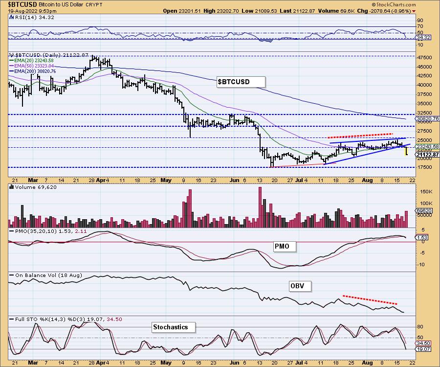
We've been talking about a breakdown from this bearish rising wedge for weeks with particular emphasis this week given the short-term rising trend (bottom of wedge) was going to be tested. Indicators were already breaking down. However, we didn't expect a decline that would carry price so low so fast. There is support at $20,000, but with a swift decline like today's we would look for a test of the June low at $17,500.
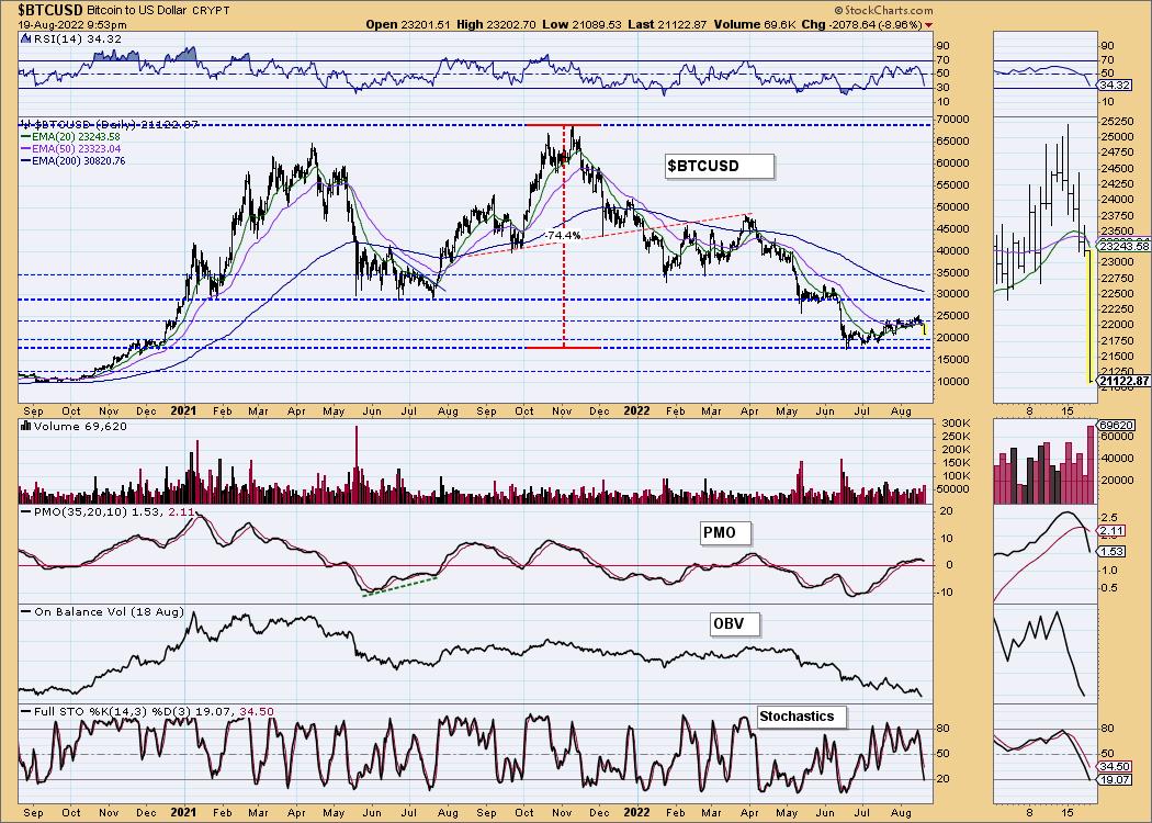
This chart is to show where some of the support/resistance lines come from.
INTEREST RATES
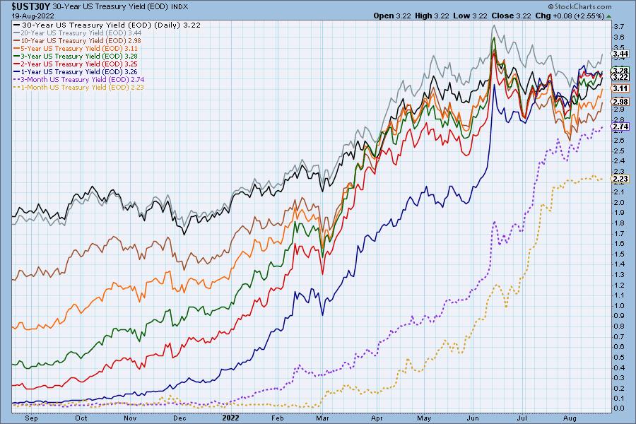
Interest rates continued in their rising trends this week. The 1-month yield did cool and is traveling sideways, but the remaining yields are likely to continue to push higher.
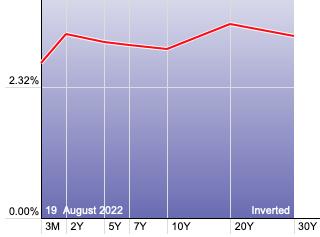
The Yield Curve Chart from StockCharts.com shows us the inversions taking place. The red line should move higher from left to right. Inversions are occurring where it moves downward.
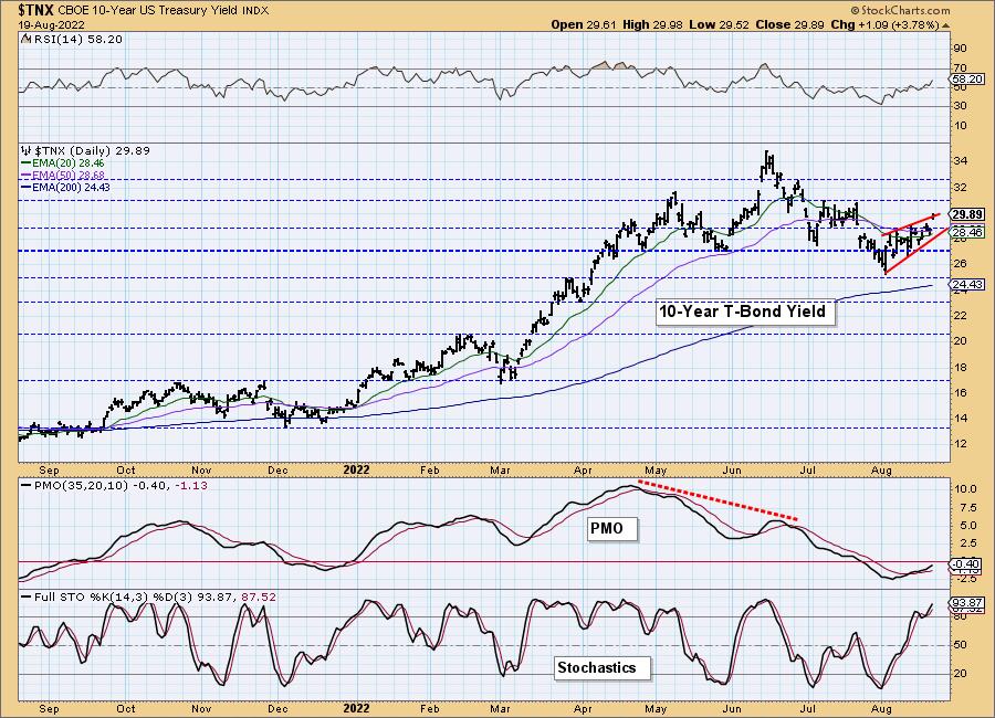
10-YEAR T-BOND YIELD
We annotated a bearish rising wedge, but $TNX is preparing to have an upside breakout instead of the expected breakdown. A bullish conclusion to a bearish chart pattern is especially bullish. The indicators are very bullish with the RSI back in positive territory, the PMO rising on an oversold BUY signal and Stochastics moving vertically higher above 80. We expect the yield to move higher.
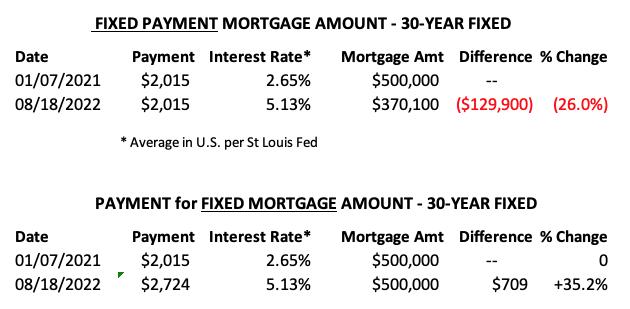
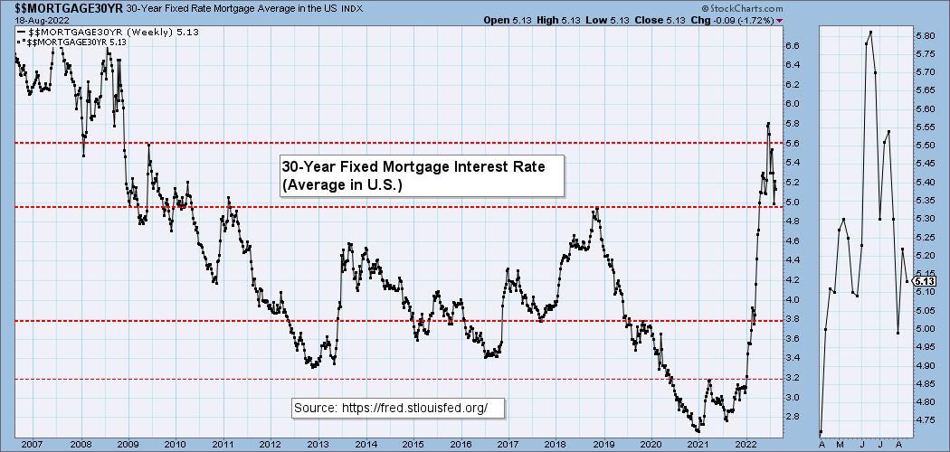
MORTGAGE INTEREST RATES (30-Yr)**
**We watch the 30-Year Fixed Mortgage Interest Rate, because, for the most part, people buy homes based upon the maximum monthly payment they can afford. As rates rise, a fixed monthly payment will carry a smaller mortgage amount. As buying power shrinks, home prices will come under pressure.
--
This week the 30-Year Fixed Rate fell from 5.22 to 5.13.
DOLLAR (UUP)
IT Trend Model: BUY as of 6/22/2021
LT Trend Model: BUY as of 8/19/2021
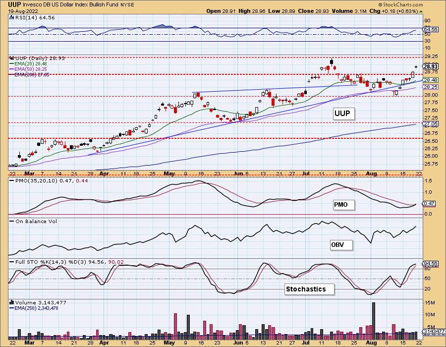
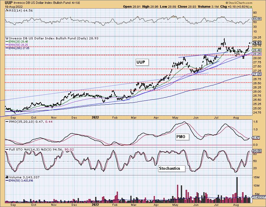
UUP Daily Chart: The Dollar rallied strongly this week. We do note a small bearish filled black candlestick so this could turn into a reverse island, meaning a gap down on Monday. However, the PMO just triggered a crossover BUY signal, the RSI is positive and Stochastics are above 80. Unfortunately for Gold, the Dollar looks very bullish.
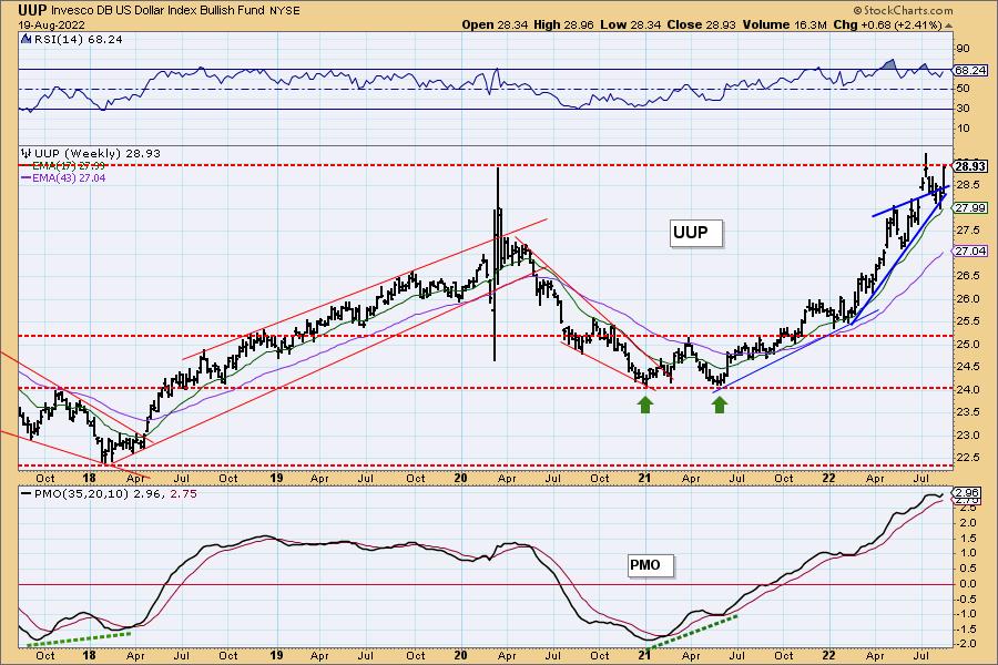
UUP Weekly Chart: One important note is that overhead resistance is arriving at the 2020 intraweek high. UUP turned down the last time this level was hit. The weekly PMO is overbought, but it also formed a bottom above the signal line. The weekly RSI is positive. The Dollar looks ready to breakout.
GOLD
IT Trend Model: NEUTRAL as of 5/3/2022
LT Trend Model: SELL as of 6/30/2022
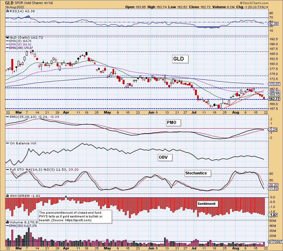
GOLD Daily Chart: A rising Dollar threw a wrench into the rally in Gold. The indicators look ugly, but this could be a bullish cup with handle pattern on GLD. Not wise to bank on that pattern resolving higher given the very bullish Dollar chart. The PMO top below the zero line is ominous.
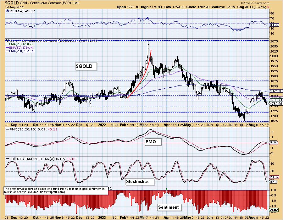
$GOLD has been looking slightly different from GLD of late. Notice that the PMO on $GOLD is still in positive territory. Stochastics are oversold but sharply declining. Discounts are now at levels that show extreme bearishness among investors. Generally that is when we look for a bottom, but we have seen even deeper discounts.
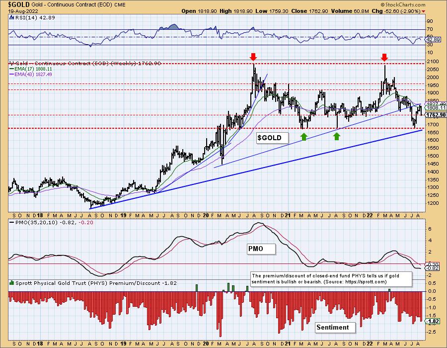
GOLD Weekly Chart: On the weekly chart, we see that discounts have definitely been higher. The long-term rising trend and support held last month, but the declining trend out of the 2022 top is still very much intact. The weekly RSI just turned lower in negative territory. The weekly PMO had been flat but has decided to move lower rather than higher. Overall the picture is bearish for Gold.
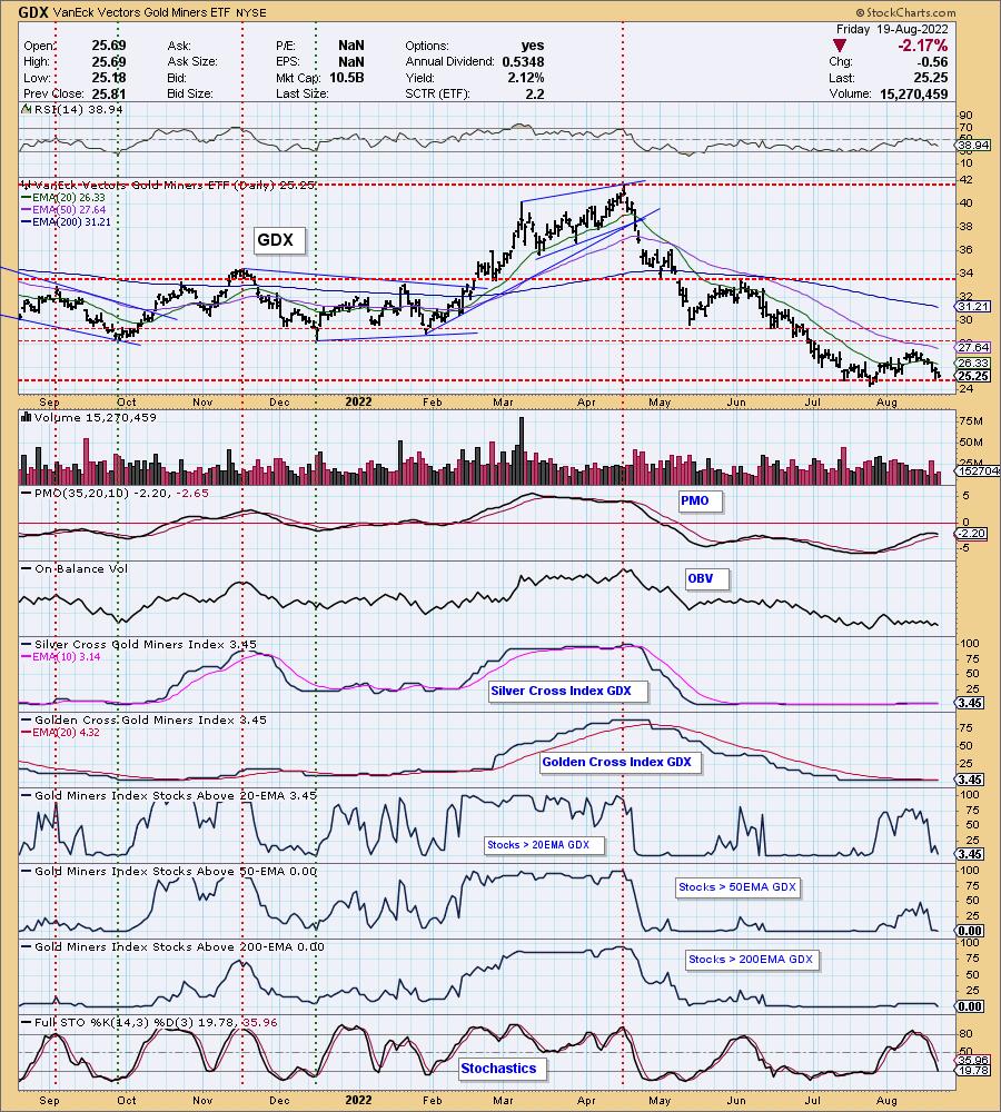
GOLD MINERS Golden and Silver Cross Indexes: Gold Miners fell apart this week as the Dollar rallied and Gold declined. It was a great set-up with participation improving. Now there is barely a heartbeat as only 3.45% have price above their 20-day EMA. There zero stocks above their 50/200-day EMAs. The PMO's top beneath the signal line implies support is about to be broken.
CRUDE OIL (USO)
IT Trend Model: NEUTRAL as of 7/8/2022
LT Trend Model: BUY as of 3/9/2021
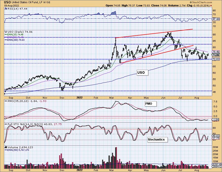
USO Daily Chart: The Energy sector (XLE) came back to life, but Crude Oil didn't participate. It was down -1.23% on the week while XLE was up +1.26%. The chart patterns are mixed. One could make a case for a bullish double-bottom or a bearish descending triangle (flat bottom, declining tops). Given the energy sector's surge, we believe USO will get on board.
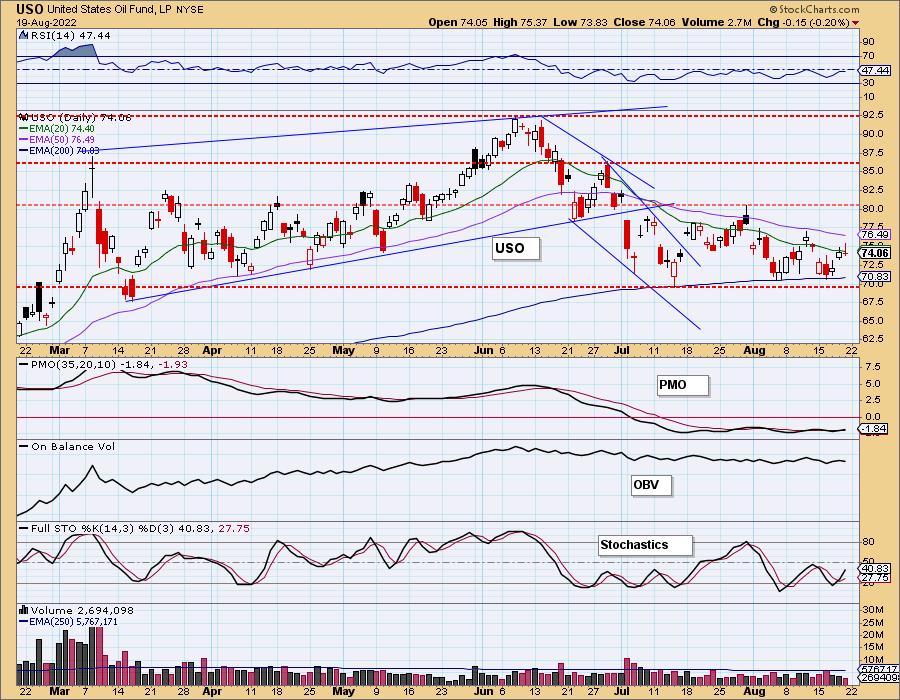
The RSI is still negative, but Stochastics are rising alongside the new PMO BUY signal. We do take the PMO BUY signal with a grain of salt. It has been flip flopping for over a month. We favor a breakout here.
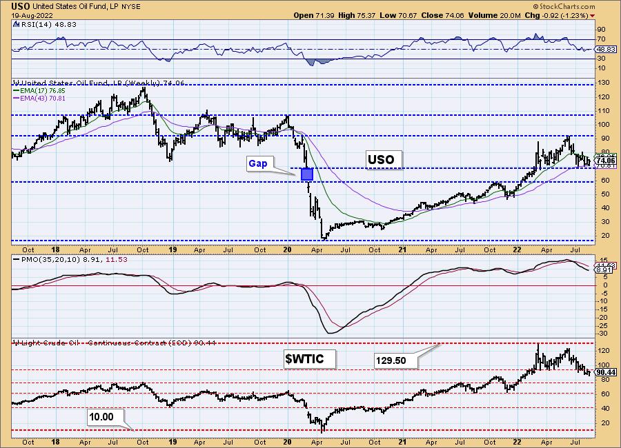
USO/$WTIC Weekly Chart: The weekly chart is not particularly healthy. The most positive characteristic is that support is holding at the 43-week EMA. The weekly RSI did turn down in negative territory and the weekly PMO is in decline. This is a good place for USO to reverse given it is holding that support as well as gap support and the 2018 low.
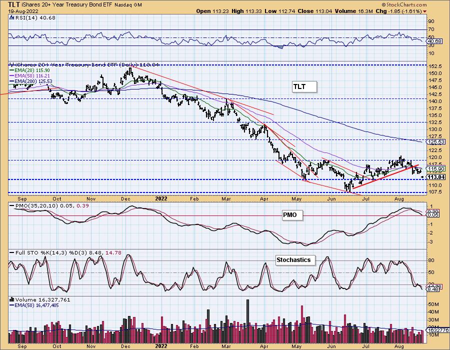
BONDS (TLT)
IT Trend Model: SELL as of 8/19/2022
LT Trend Model: SELL as of 1/19/2022
TLT Daily Chart: With the new rising trend in yields, Bonds have been slowly sinking. Today support was lost on a gap down. The indicators remain very negative with the RSI below net neutral (50), the PMO about to cross below the zero line and Stochastics declining. The 20/50-day EMAs have been braiding. Wednesday we got a "Silver Cross", but today we have a "Dark Cross" that triggered an IT Trend Model SELL signal.
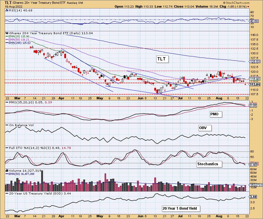
Price is now sitting on support at the May low. This is the perfect place for a rebound. It would set up a bullish reverse head and shoulders. Unfortunately indicators suggest price will continue lower.
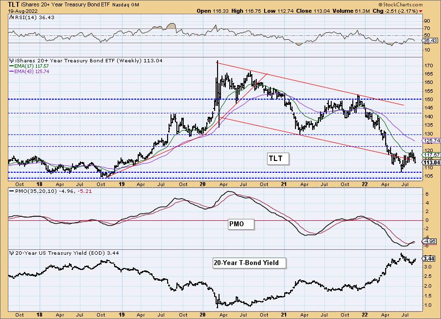
TLT Weekly Chart: The weekly chart is breaking down with a very negative and falling RSI, and a weekly PMO that is trying to top. You can see more clearly on the weekly chart the possibility of a reverse head and shoulders. We do not have a right shoulder yet, but it is something to consider.
Good Luck & Good Trading!
Erin Swenlin And Carl Swenlin
Technical Analysis is a windsock, not a crystal ball. --Carl Swenlin
(c) Copyright 2022 DecisionPoint.com
Disclaimer: This blog is for educational purposes only and should not be construed as financial advice. The ideas and strategies should never be used without first assessing your own personal and financial situation, or without consulting a financial professional. Any opinions expressed herein are solely those of the author, and do not in any way represent the views or opinions of any other person or entity.
NOTE: The signal status reported herein is based upon mechanical trading model signals, specifically, the DecisionPoint Trend Model. They define the implied bias of the price index based upon moving average relationships, but they do not necessarily call for a specific action. They are information flags that should prompt chart review. Further, they do not call for continuous buying or selling during the life of the signal. For example, a BUY signal will probably (but not necessarily) return the best results if action is taken soon after the signal is generated. Additional opportunities for buying may be found as price zigzags higher, but the trader must look for optimum entry points. Conversely, exit points to preserve gains (or minimize losses) may be evident before the model mechanically closes the signal.
Helpful DecisionPoint Links:
DecisionPoint Alert Chart List
DecisionPoint Golden Cross/Silver Cross Index Chart List
DecisionPoint Sector Chart List
Price Momentum Oscillator (PMO)
Swenlin Trading Oscillators (STO-B and STO-V)
DecisionPoint is not a registered investment advisor. Investment and trading decisions are solely your responsibility. DecisionPoint newsletters, blogs or website materials should NOT be interpreted as a recommendation or solicitation to buy or sell any security or to take any specific action.
