
Erin here! I wanted to speak in "first person" for the opening. The rest of the letter is a combined effort.
This morning I was at my parent's house and my Dad chatted with me before I left. He said in so many words that I was probably a bit too bearish right now. It was likely in response to yesterday's free article (and DP Alert opening) about the diverging short- and intermediate-term indicators. I told him I was cautiously bullish, but that something didn't sit well with me after this week's trading, but I couldn't put my finger on it.
Carl told me that he was looking at the top ten capitalized stocks in the S&P (they are below) and the charts looked bullish. These heavy hitters lead the market and if they are doing well, the market tends to follow. I looked at the CandleGlance below and I was struck by the same thoughts. Other than META, the charts were all bullish. All but META have garnered IT Trend Model "Silver Cross" BUY signals (20-day EMA crosses above the 50-day EMA) and all are in rising short-term and even intermediate-term trends in some cases. Overhead resistance has been overcome by a handful (MSFT, AMZN and AAPL) and those that haven't overcome resistance levels, the indicators suggest they will.
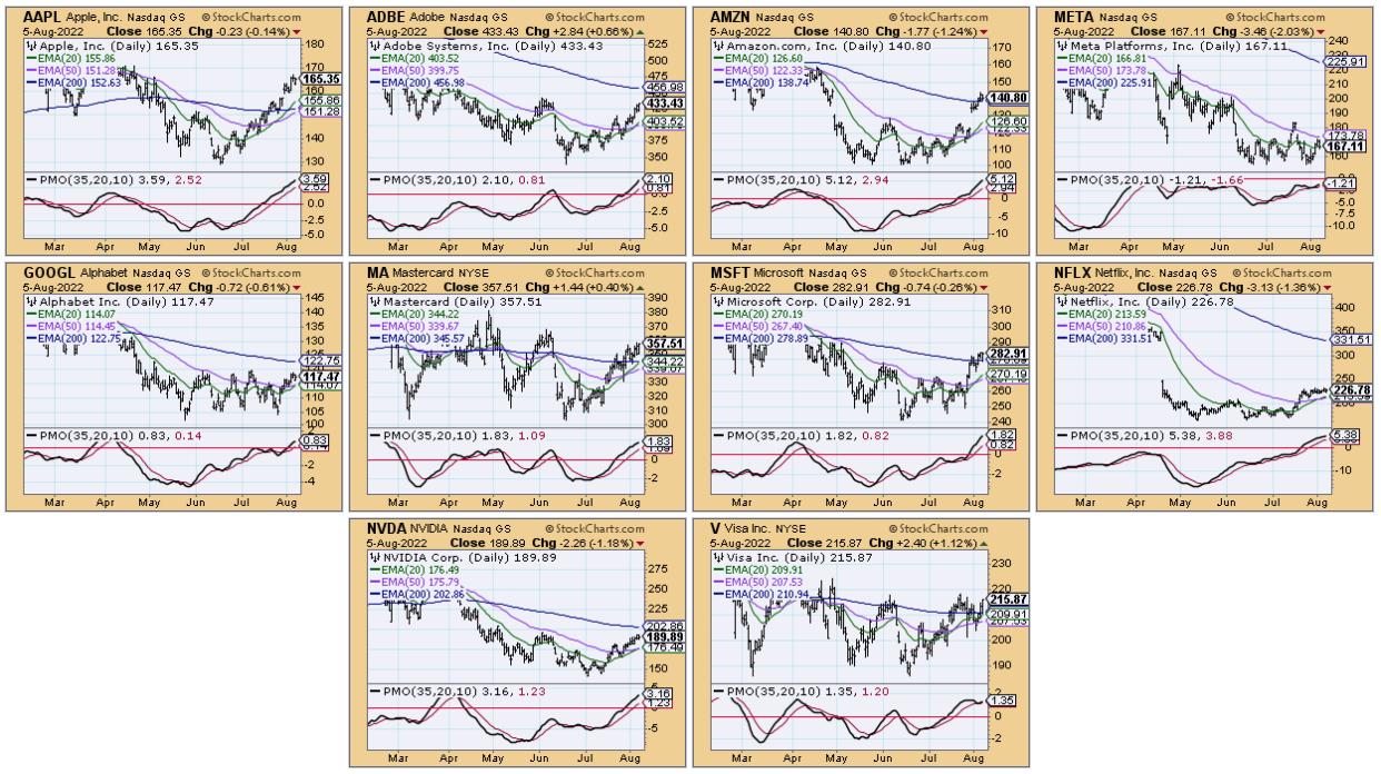
Don't get me wrong, we both agree that the bear market isn't likely over, but this looks like the rally should continue. After reviewing the charts, I realized my sticking point: the SPY's inability to overcome resistance this week alongside Swenlin Trading Oscillators (STOs) that are pulling back. Yet, participation and momentum are still bullish, reading above 70%.
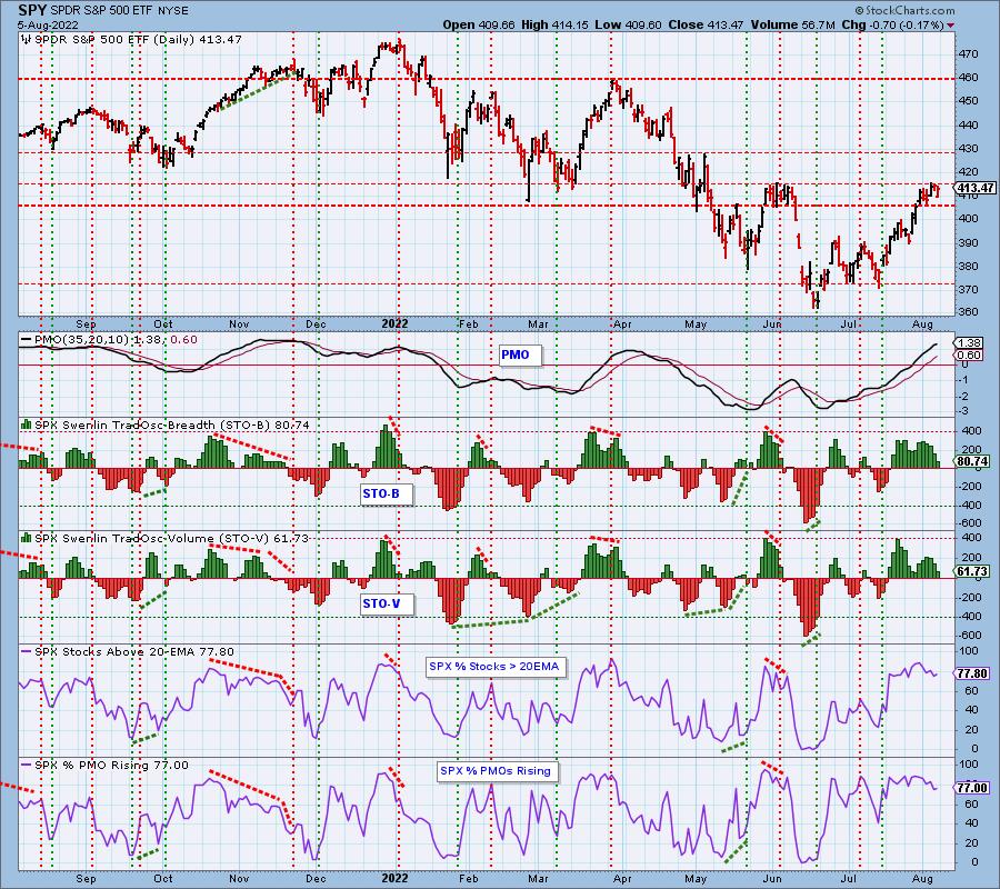
Often times, indicators will pullback out of overbought territory, basically unwinding overbought conditions while price consolidates. This could be exactly what is happening. I am reminded of the saying, "Climbing the Wall of Worry".
-Erin
The DecisionPoint Alert Weekly Wrap presents an end-of-week assessment of the trend and condition of the Stock Market, the U.S. Dollar, Gold, Crude Oil, and Bonds. The DecisionPoint Alert daily report (Monday through Thursday) is abbreviated and gives updates on the Weekly Wrap assessments.
Watch the latest episode of DecisionPoint on StockCharts TV's YouTube channel here!
MAJOR MARKET INDEXES
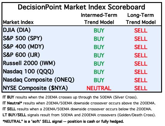
For Today: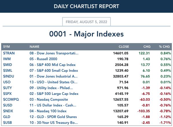
For the Week: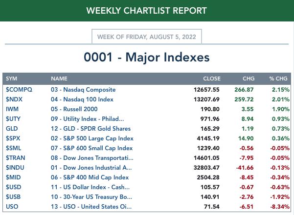
SECTORS
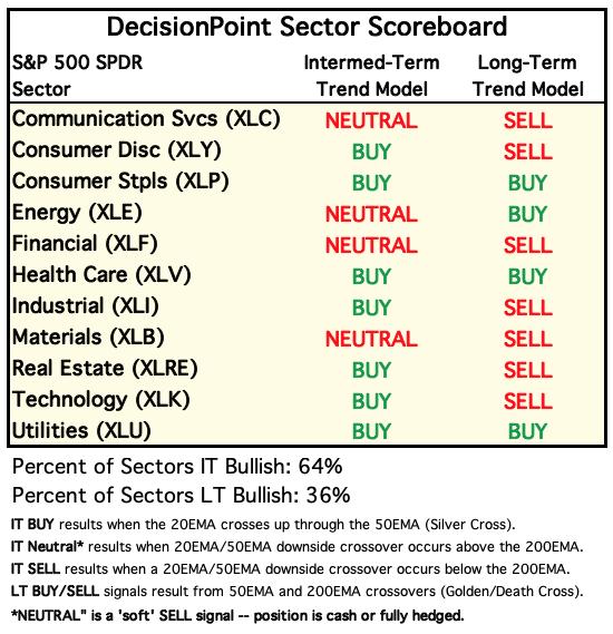
Each S&P 500 Index component stock is assigned to one of 11 major sectors. This is a snapshot of the Intermediate-Term (Silver Cross) and Long-Term (Golden Cross) Trend Model signal status for those sectors.
For Today: 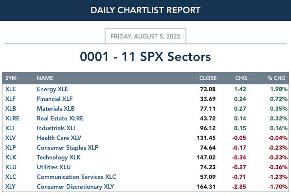
For the Week: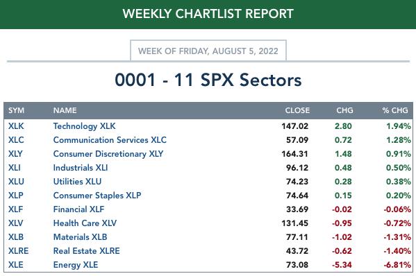
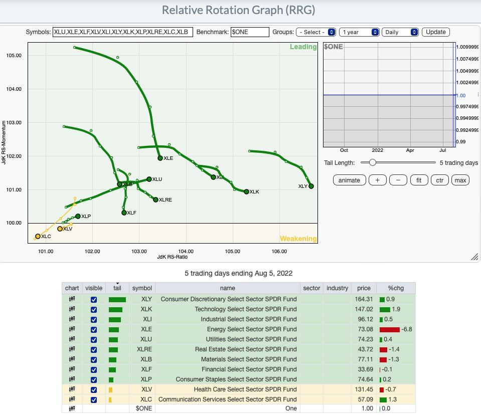
RRG® Daily Chart ($ONE Benchmark):
All but XLC and XLV are in the Leading quadrant. XLV still has a somewhat bearish heading, but XLC has reversed into a bullish northeast heading.
Of those in the Leading quadrant, XLU and XLP are the only two with bullish northeast headings. All others have neutral to bearish southeast headings. Overall, there is clearly some weakness pervading the market, but overall there is still internal strength given the mostly bullish daily RRG.
RRG® Weekly Chart ($ONE Benchmark):
The weekly RRG is bullish. Only two sectors have bearish southwest headings, XLB and XLE. XLU is likely to enter the Lagging quadrant, but its northerly component in its heading means it isn't likely to stay there. If you consider that the center point on the graph is "neutral". If a sector were right on that center point on a $ONE RRG, it would mean that it has neither gained nor lost. So those sectors furthest from the center are the strongest gainers. That would be the three most aggressive sectors, XLC, XLK and XLY. If these sectors continue to outperform, the market has a high likelihood of moving higher.
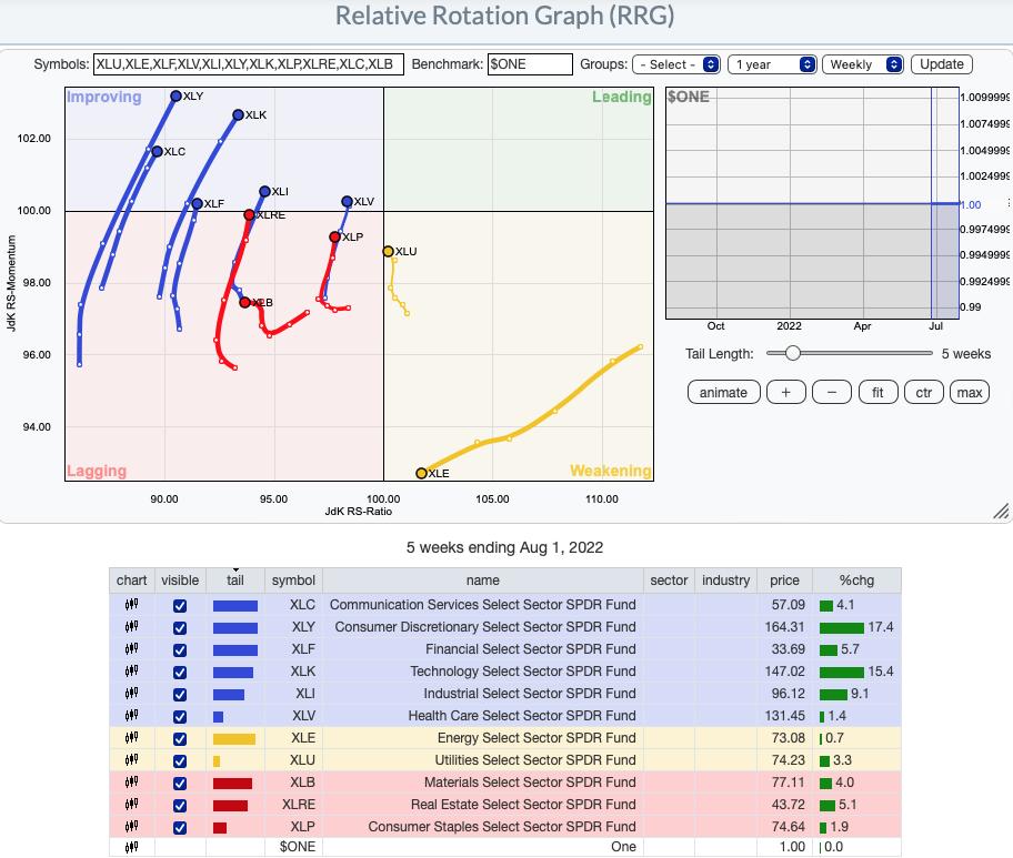
RRG® charts show you the relative strength and momentum for a group of stocks. Stocks with strong relative strength and momentum appear in the green Leading quadrant. As relative momentum fades, they typically move into the yellow Weakening quadrant. If relative strength then fades, they move into the red Lagging quadrant. Finally, when momentum starts to pick up again, they shift into the blue Improving quadrant.
CLICK HERE for an animated version of the RRG charts.
CLICK HERE for Carl's annotated Sector charts.
THE MARKET (S&P 500)
IT Trend Model: BUY as of 8/2/2022
LT Trend Model: SELL as of 5/5/2022
SPY Daily Chart: The SPY spent the week consolidating last week's rally. Overhead resistance at the 200-day EMA and June tops is still holding, but the short-term rising trend is intact.
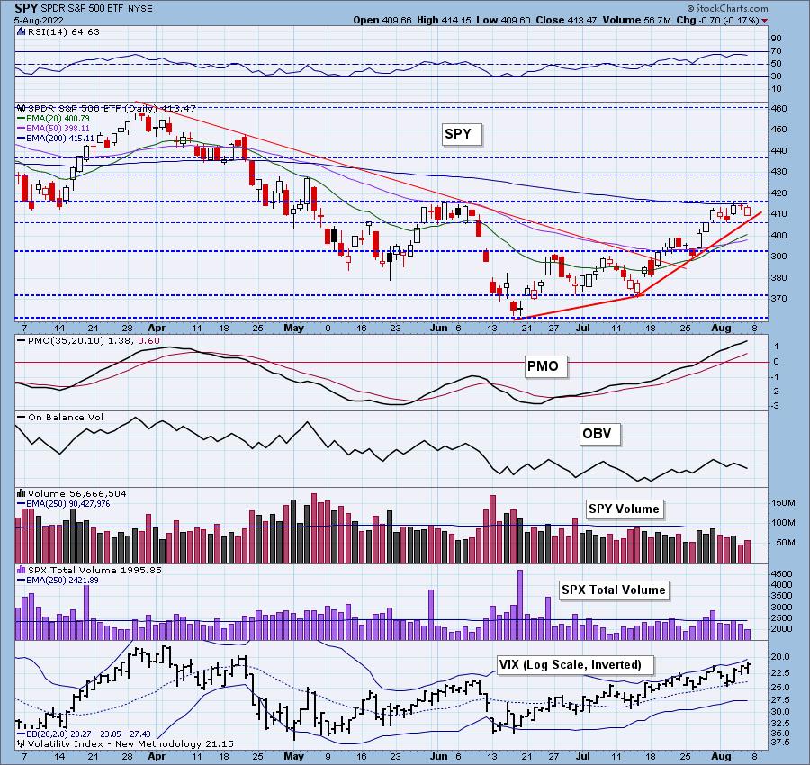
Indicators are bullish. The RSI is in positive territory, the PMO is rising, the VIX is oscillating above its moving average on the inverted scale and Stochastics are holding strong above 80.
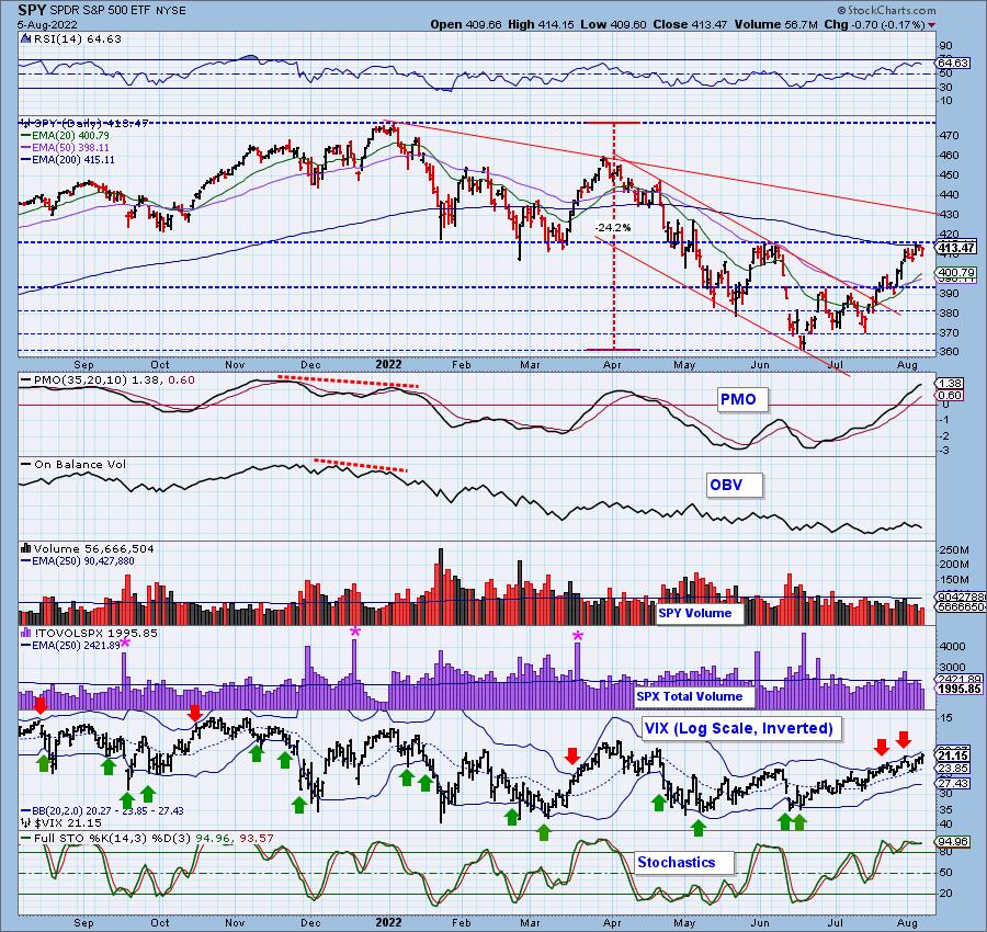
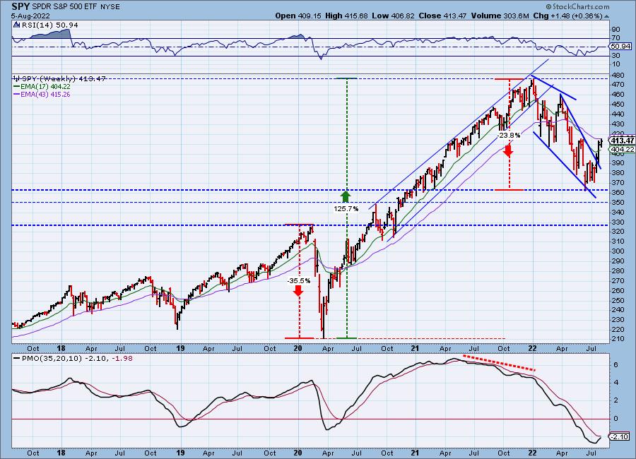
SPY Weekly Chart: The weekly chart shows a strong breakout from a bullish falling wedge. Additionally, the weekly PMO continues to rise. We could see a crossover BUY signal very soon.
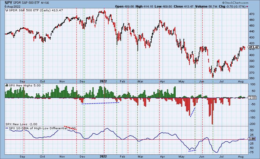
New 52-Week Highs/Lows: Not much in the way of New Highs or New Lows this week. The 10-DMA of the High-Low Differential was mostly unchanged this week. It is currently rising.
Climax Analysis: There were no climax readings today.
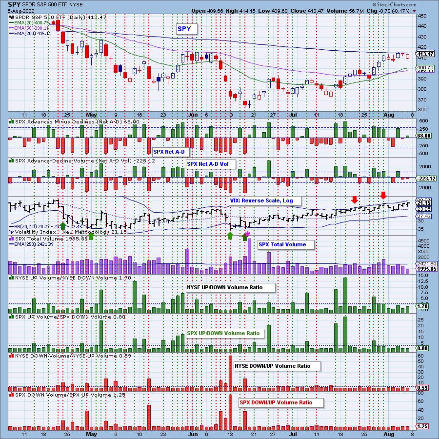
*A climax is a one-day event when market action generates very high readings in, primarily, breadth and volume indicators. We also include the VIX, watching for it to penetrate outside the Bollinger Band envelope. The vertical dotted lines mark climax days -- red for downside climaxes, and green for upside. Climaxes are at their core exhaustion events; however, at price pivots they may be initiating a change of trend.
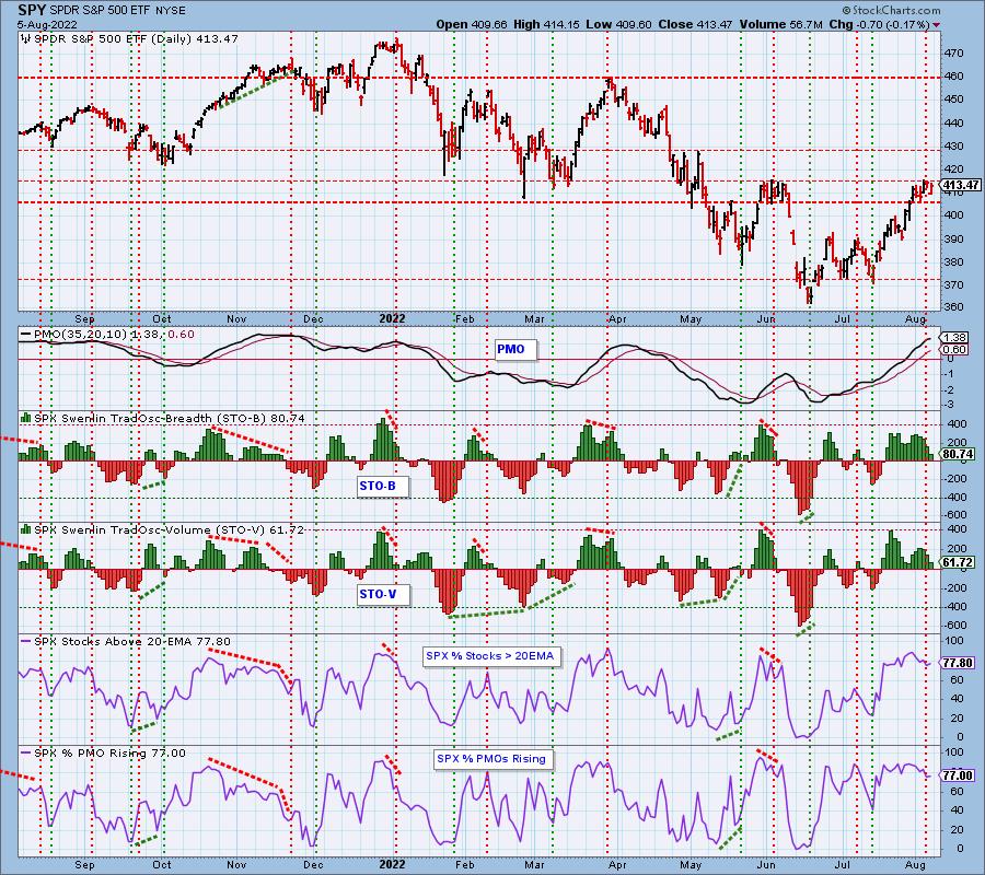
Short-Term Market Indicators: The short-term market trend is UP and the condition is NEUTRAL.
These indicators could very well be pulling back to relieve overbought conditions. As mentioned in the opening, it doesn't always take a decline to clear overbought conditions. Consolidation can do the job too.
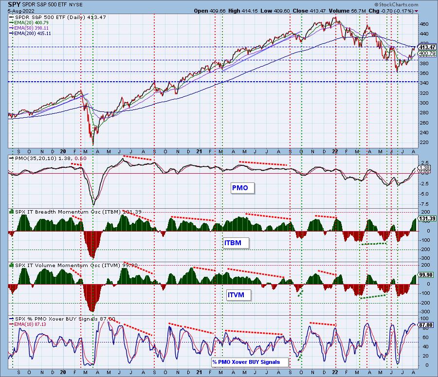
Intermediate-Term Market Indicators: The intermediate-term market trend is UP and the condition is OVERBOUGHT.
All of these indicators are overbought, but the ITBM and ITVM continue to move higher. We did see a small loss in %PMO BUY signals, but the reading itself is strong.
PARTICIPATION and BIAS Assessment: The following chart objectively shows the depth and trend of participation in two time frames.
- Intermediate-Term - the Silver Cross Index (SCI) shows the percentage of SPX stocks on IT Trend Model BUY signals (20-EMA > 50-EMA). The opposite of the Silver Cross is a "Dark Cross" -- those stocks are, at the very least, in a correction.
- Long-Term - the Golden Cross Index (GCI) shows the percentage of SPX stocks on LT Trend Model BUY signals (50-EMA > 200-EMA). The opposite of a Golden Cross is the "Death Cross" -- those stocks are in a bear market.
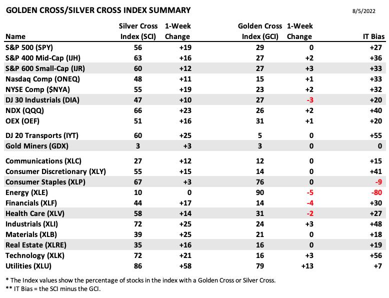
The following table summarizes participation for the major market indexes and sectors. The 1-Week Change columns inject a dynamic aspect to the presentation.
The following table summarizes participation for the major market indexes and sectors. The 1-Week Change columns inject a dynamic aspect to the presentation.
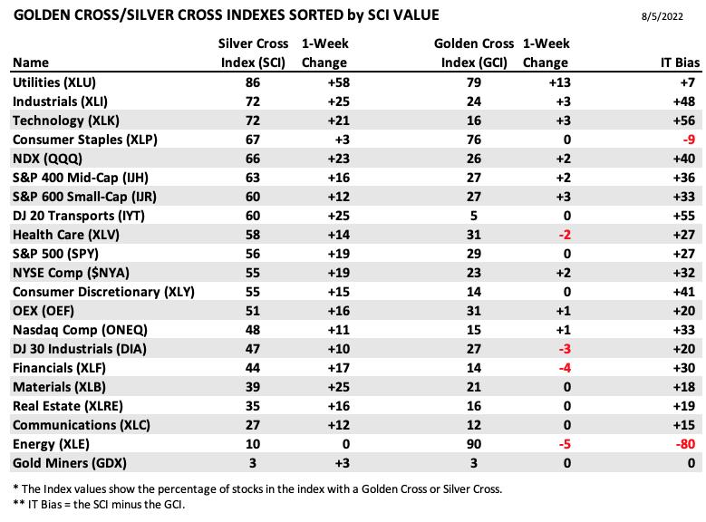
This table is sorted by SCI values. This gives a clear picture of strongest to weakest index/sector in terms of participation.
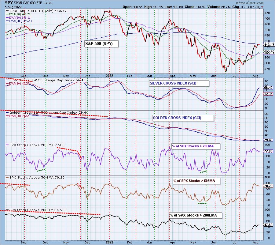
This week, the market bias in all three timeframes improved.
The short-term bias is bullish. There are far more stocks with price above their 20/50-day EMAs than there are stocks with "Silver Crosses". This implies the SCI will rise even higher as more stocks see 20-day EMAs pulled upward and through the 50-day EMAs.
The intermediate-term bias is bullish. The SCI is rising nicely and had a fairly healthy reading of 56.4%.
The long-term bias is neutral to bullish. There is a higher percentage of stocks with price above their 50/200-day EMAs than the percentage of stocks with "Golden Crosses". This implies that the GCI will begin to move more quickly out of oversold territory. This will take some time. Most stocks have EMA configurations that are similar to the SPY. With that much margin between the 50/200-day EMAs, it will take a long time for the GCI to begin ascending quickly.
CONCLUSION: We have mixed feelings about the market. STOs are falling and the ITBM/ITVM are very overbought. However, there is a solid foundation for the market to move higher given the SCI is moving higher and %PMOs Rising is 77% and we have 89% with PMO BUY signals. There is no arguing there is a short-term bullish bias. We will combine opinions and say that we are bullish overall, but it's good idea to have hard stops versus mental ones.
Erin is 55% exposed to the market.
Have you subscribed the DecisionPoint Diamonds yet? DP does the work for you by providing handpicked stocks/ETFs from exclusive DP scans! Add it with a discount! Contact support@decisionpoint.com for more information!
BITCOIN
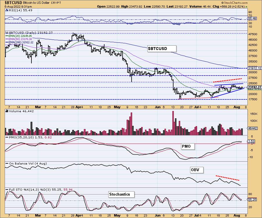
Bitcoin is bouncing off the bottom of a bearish rising wedge. Just when you think Bitcoin is down for the count, it reverses. Indicators are shifting bullish, but the OBV negative divergence tells us that a breakdown isn't out of the question next week.
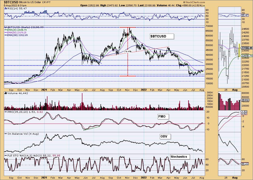
This chart is to show where some of the support/resistance lines come from.
INTEREST RATES
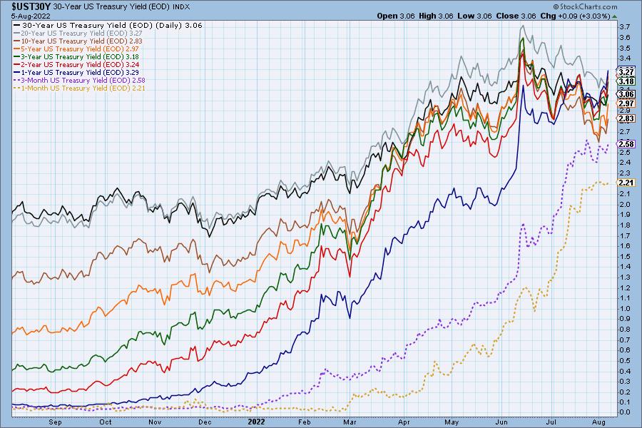
Rates were all over the place this week, but are attempting to break declining trends. They still look toppy, but given the Fed raised its rate 75 basis points, it could translate to higher yields across the board.
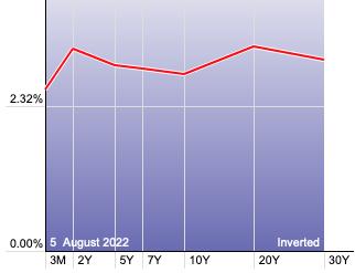
The Yield Curve Chart from StockCharts.com shows us the inversions taking place. The red line should move higher from left to right. Inversions are occurring where it moves downward.
10-YEAR T-BOND YIELD
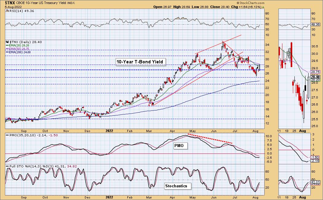
$TNX has been whipping back and forth this week. Right now overhead gap resistance is what we are watching carefully. The 50-day EMA is also providing resistance. The indicators are firming up with the PMO turning up today, the RSI nearly hitting positive territory and Stochastics rising strongly out of oversold territory. Our best guess is that we'll see a breakout.
MORTGAGE INTEREST RATES (30-Yr)**
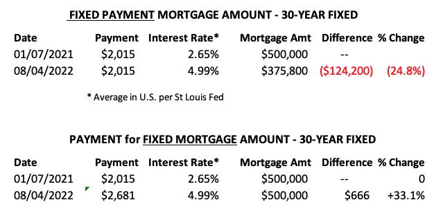
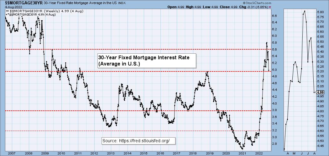
**We watch the 30-Year Fixed Mortgage Interest Rate, because, for the most part, people buy homes based upon the maximum monthly payment they can afford. As rates rise, a fixed monthly payment will carry a smaller mortgage amount. As buying power shrinks, home prices will come under pressure.
--
This week the 30-Year Fixed Rate fell from 5.30 to 4.99.
DOLLAR (UUP)
IT Trend Model: BUY as of 6/22/2021
LT Trend Model: BUY as of 8/19/2021
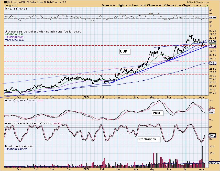
UUP Daily Chart: UUP spent most of July pulling back. Once support was hit on Monday, the Dollar began to rally a bit. This has pulled the RSI into positive territory and has pulled Stochastics out of oversold territory. We will want to see the PMO confirm the bullish reversal.
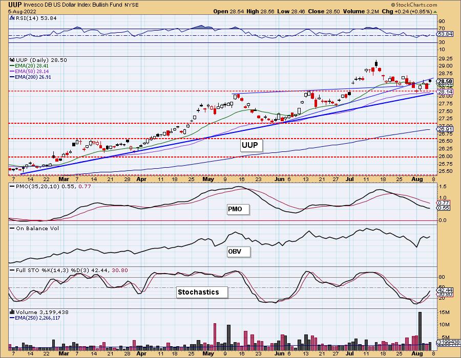
The intermediate-term rising trend is intact with price bouncing off the trendline on Monday.
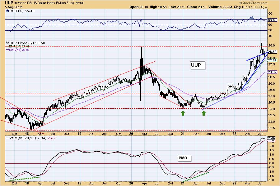
UUP Weekly Chart: When UUP hit overhead resistance, it was turned away. The rising trend is still intact. We had a bearish rising wedge, but it resolved to the upside. The weekly PMO has topped. As with the daily chart, we will want to see the PMO confirm any bounce off this rising trendline by turning back up or flattening more.
GOLD
IT Trend Model: NEUTRAL as of 5/3/2022
LT Trend Model: SELL as of 6/30/2022
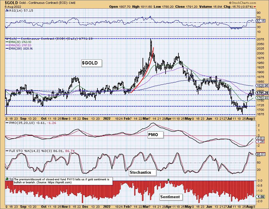
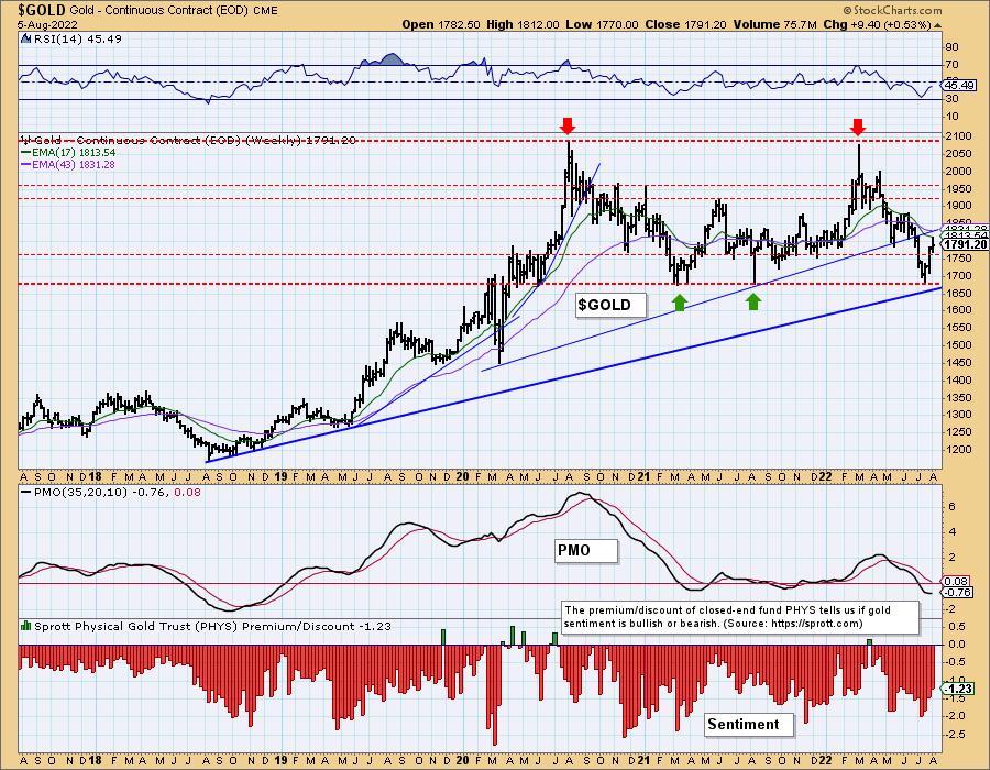
GOLD Daily Chart: Gold rallied in fits and starts this week. Yesterday price began to test overhead resistance and it was turned away. The indicators are very positive so we expect a breakout soon.
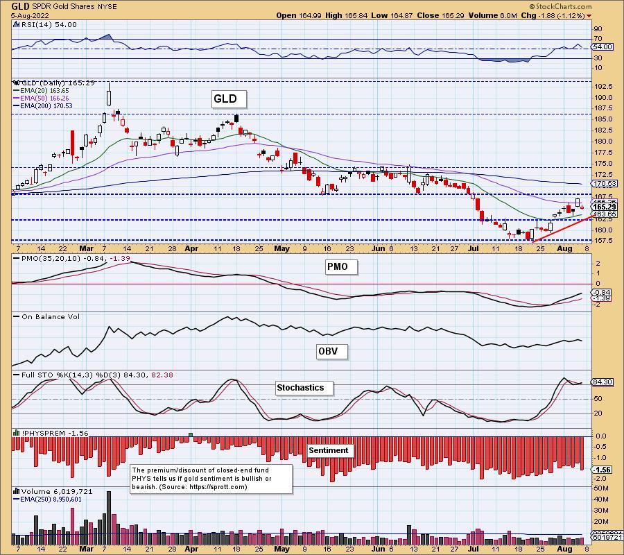
Discounts have been in a declining trend suggesting that investors are getting a bit more bullish on the yellow metal.
GOLD Weekly Chart: The weekly chart shows a strong bounce off support and the long-term rising bottoms trendline. The weekly RSI is rising, but still negative. The weekly PMO has flattened in anticipation of higher prices. We do note overhead resistance at the 17/43-week EMAs.
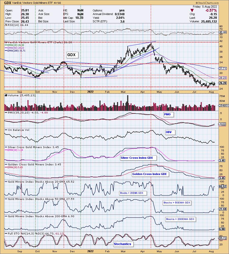
GOLD MINERS Golden and Silver Cross Indexes: Gold Miners broke from the short-term declining trend. Gold's small rally this week helped, but we're still waiting for a solid rally on GDX. Certainly participation is improving under the surface with nearly 2/3rds of the group having price above their 20-day EMA. The PMO is rising on an oversold BUY signal. The RSI is still negative, but the increase in participation and the acceleration of Stochastics tell us we could see this group find favor again. In the meantime, manage Gold Mining positions carefully.
CRUDE OIL (USO)
IT Trend Model: NEUTRAL as of 7/8/2022
LT Trend Model: BUY as of 3/9/2021
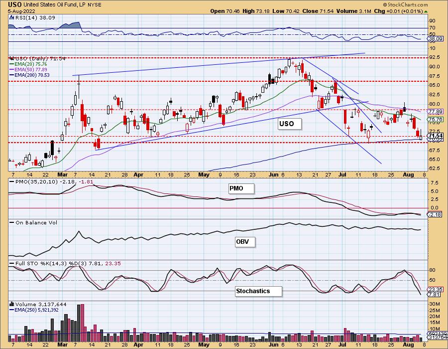
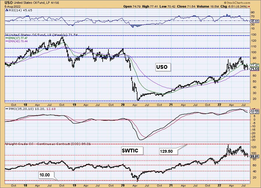
USO Daily Chart: The bearish filled black candlestick last Friday suggested we'd see lower prices on Monday. The gap down was surprising. It was not a good week for Crude Oil. We do believe we will see a bounce off the 200-day EMA and support zone, but we may see some churn and chop along the way.
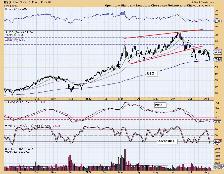
USO/$WTIC Weekly Chart: The weekly chart is not encouraging. The weekly RSI is negative now and the weekly PMO began to accelerate lower. $WTIC has lost support and looks ready to head down to $80/barrel or lower. Supply hasn't improved much and earnings were positive for the big oil companies so we would expect higher prices. The indicators just don't agree.
BONDS (TLT)
IT Trend Model: BUYas of 8/2/2022
LT Trend Model: SELL as of 1/19/2022
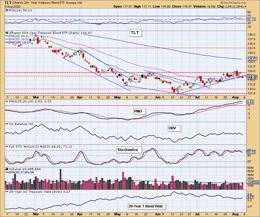
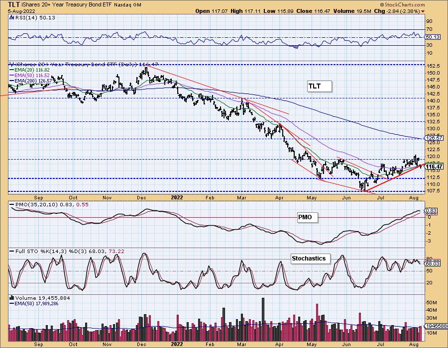
TLT Daily Chart: The short-term rising trend has been broken on TLT as yields surged to finish the week. The RSI is still positive, but the PMO has topped. Stochastics are still positive. This really looks like a nice bottoming formation, but yields are not cooperating.
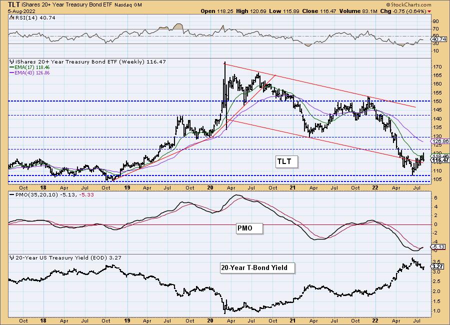
TLT Weekly Chart: Price is bouncing off strong support on the weekly chart and the weekly PMO just printed a crossover BUY signal. The weekly RSI is negative. Bonds should rally, but with the weekly PMO already flattening, we suspect we will see consolidation below resistance.
Good Luck & Good Trading!
Erin Swenlin And Carl Swenlin
Technical Analysis is a windsock, not a crystal ball. --Carl Swenlin
(c) Copyright 2022 DecisionPoint.com
Disclaimer: This blog is for educational purposes only and should not be construed as financial advice. The ideas and strategies should never be used without first assessing your own personal and financial situation, or without consulting a financial professional. Any opinions expressed herein are solely those of the author, and do not in any way represent the views or opinions of any other person or entity.
NOTE: The signal status reported herein is based upon mechanical trading model signals, specifically, the DecisionPoint Trend Model. They define the implied bias of the price index based upon moving average relationships, but they do not necessarily call for a specific action. They are information flags that should prompt chart review. Further, they do not call for continuous buying or selling during the life of the signal. For example, a BUY signal will probably (but not necessarily) return the best results if action is taken soon after the signal is generated. Additional opportunities for buying may be found as price zigzags higher, but the trader must look for optimum entry points. Conversely, exit points to preserve gains (or minimize losses) may be evident before the model mechanically closes the signal.
Helpful DecisionPoint Links:
DecisionPoint Alert Chart List
DecisionPoint Golden Cross/Silver Cross Index Chart List
DecisionPoint Sector Chart List
Price Momentum Oscillator (PMO)
Swenlin Trading Oscillators (STO-B and STO-V)
DecisionPoint is not a registered investment advisor. Investment and trading decisions are solely your responsibility. DecisionPoint newsletters, blogs or website materials should NOT be interpreted as a recommendation or solicitation to buy or sell any security or to take any specific action.
