
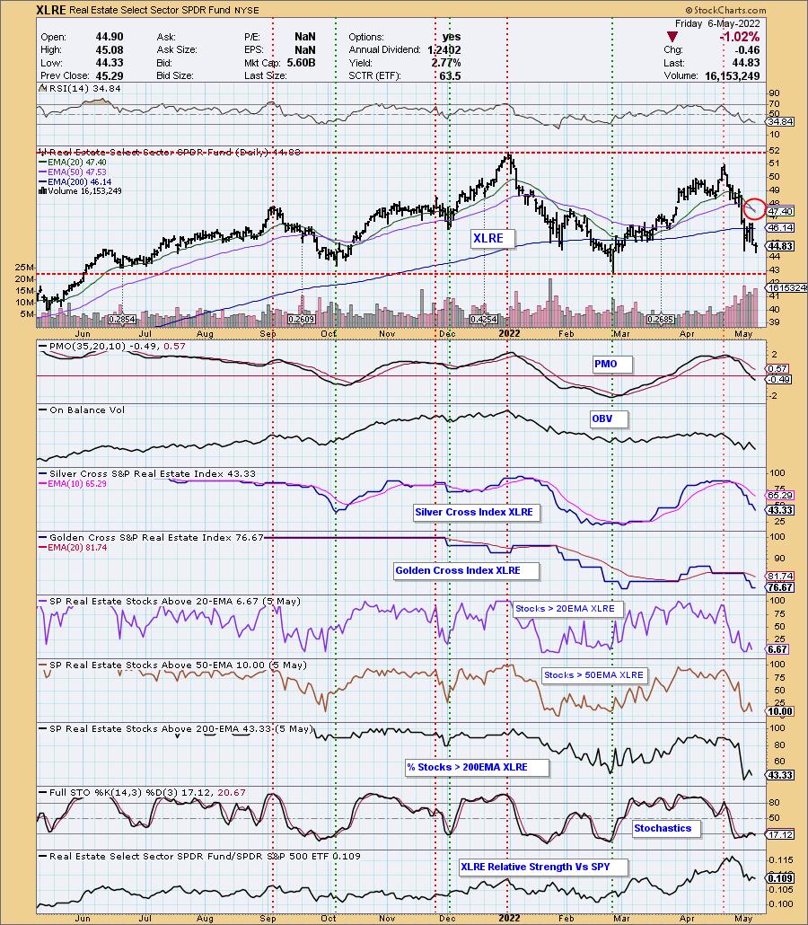
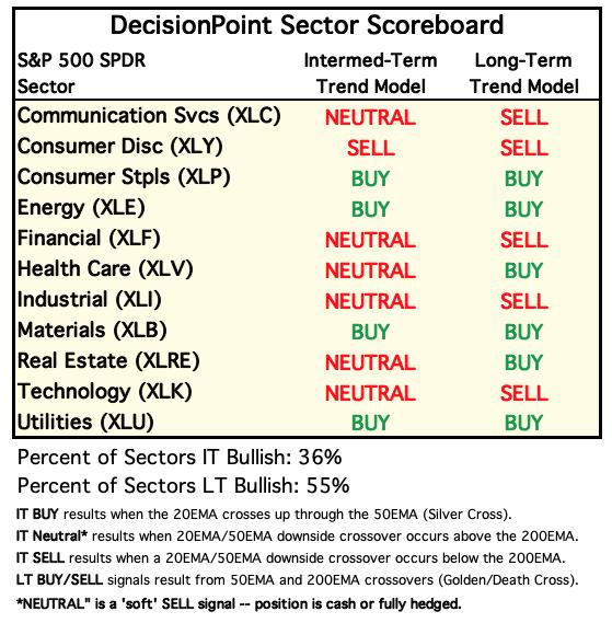
The Real Estate Sector (XLRE) 20-day EMA has crossed down through the 50-day EMA, a "Dark Cross", generating an IT Trend Model NEUTRAL Signal. Currently, only four of the 11 S&P 500 Sectors remain on IT Trend Model "Silver Cross" BUY Signals. At this time, Energy (XLE) is the only sector with a Price Momentum Oscillator (PMO) that is rising.
The DecisionPoint Alert Weekly Wrap presents an end-of-week assessment of the trend and condition of the Stock Market, the U.S. Dollar, Gold, Crude Oil, and Bonds. The DecisionPoint Alert daily report (Monday through Thursday) is abbreviated and gives updates on the Weekly Wrap assessments.
Watch the latest episode of DecisionPoint on StockCharts TV's YouTube channel here!
MAJOR MARKET INDEXES
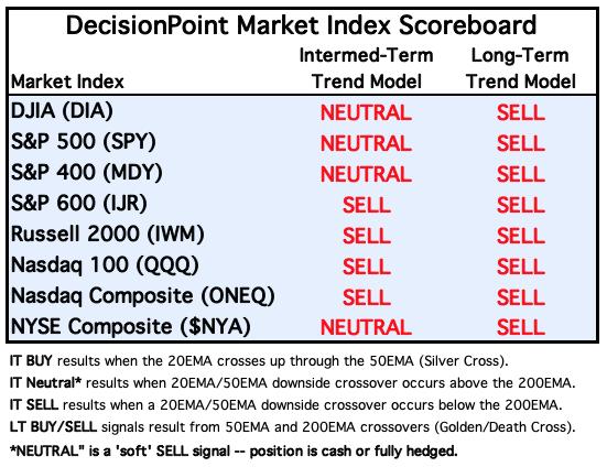
For Today: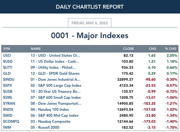
For the Week: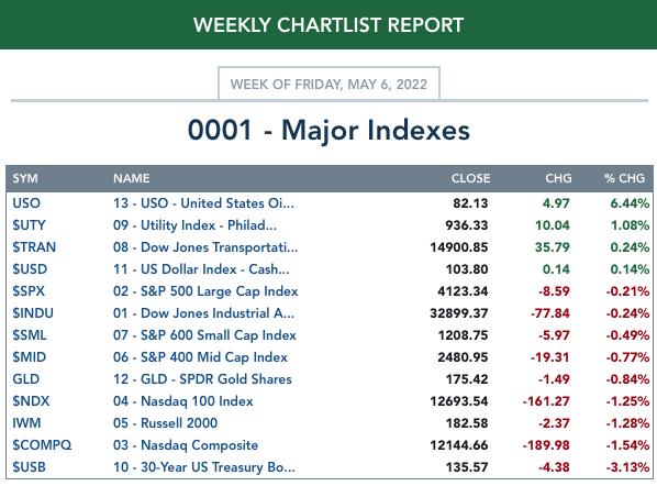
SECTORS
Each S&P 500 Index component stock is assigned to one of 11 major sectors. This is a snapshot of the Intermediate-Term (Silver Cross) and Long-Term (Golden Cross) Trend Model signal status for those sectors.
For Today: 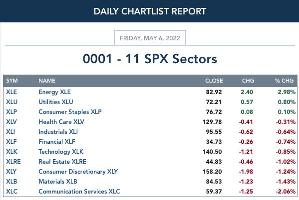
For the Week: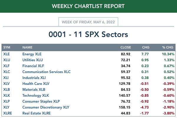
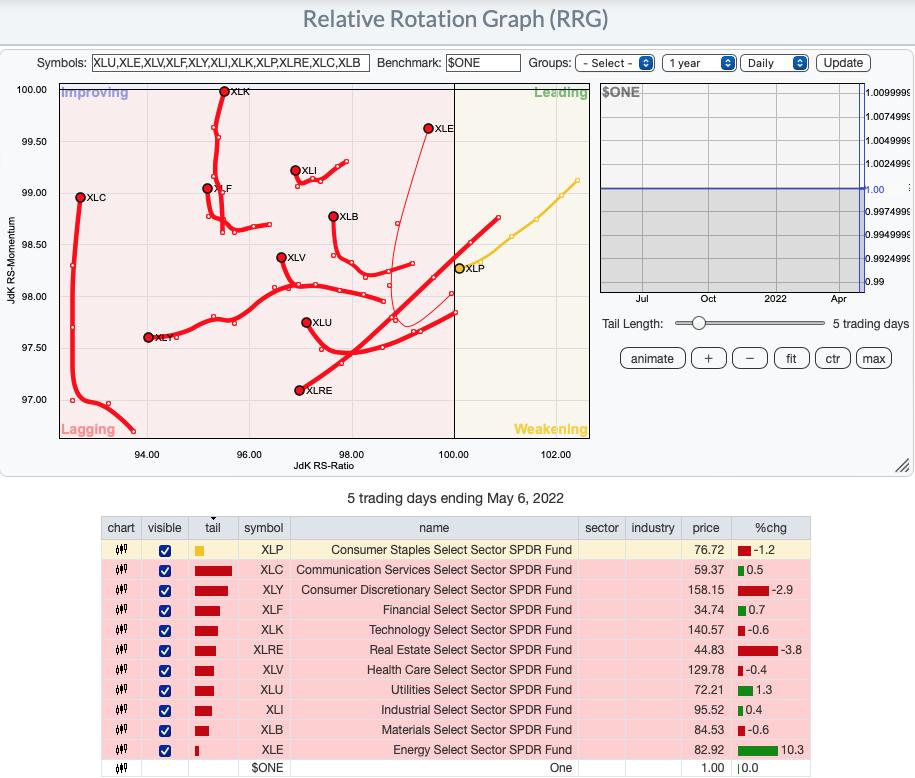
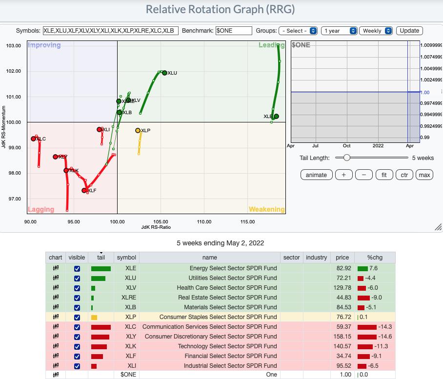
RRG® Chart: In addition to switching to a $ONE benchmark so we can analyze actual price performance of the sectors, we have decided to only use the Weekly version of the RRG.
Note in the difference between the daily and weekly $ONE benchmark RRGs. Sectors are all over the place and somewhat directionless. That isn't helpful. Here's the Daily version:
Intermediate-Term (Weekly) $ONE RRG:
This absolutely the best representation of what is currently happening within the market. The weakest sectors are those in the Lagging quadrant. Not only are they lagging, they all have switched into bearish southwest headings! It is no surprise that the aggressive sectors, XLC, XLK, XLY and XLF are part of this. XLI is a little surprising, but given the breakdown of the Dow Industrials ($INDU), maybe it isn't.
XLP is the only member of the Weakening quadrant. It was headed toward Leading, but it has put on the brakes.
XLE is the most bullish sector by far. It had been headed toward the Weakening quadrant, but has reversed into a bullish northeast heading. It's distance from the center point of the graph tells us it is also the best overall performer.
The remainder of sectors are in the Leading quadrant, but they are starting to show deterioration of their headings which are pulling them toward the Improving or Weakening quadrants. XLU is actually more healthy than all of the sectors based on its location which is distant from the center of the graph and distance away from the Weakening quadrant.
Note the difference between the daily and weekly $ONE benchmark RRGs. The daily version is jumpy with the sectors all over the map.
Intermediate-Term (Weekly) $ONE RRG:
This absolutely the best representation of what is currently happening within the market. The weakest sectors are those in the Lagging quadrant. Not only are they lagging, they all have switched into bearish southwest headings! It is no surprise that the aggressive sectors, XLC, XLK, XLY and XLF are part of this. XLI is a little surprising, but given the breakdown of the Dow Industrials ($INDU), maybe it isn't.
XLP is the only member of the Weakening quadrant. It was headed toward Leading, but it has put on the brakes.
XLE is the most bullish sector by far. It had been headed toward the Weakening quadrant, but has reversed into a bullish northeast heading. It's distance from the center point of the graph tells us it is also the best overall performer.
The remainder of sectors are in the Leading quadrant, but they are starting to show deterioration of their headings which are pulling them toward the Improving or Weakening quadrants. XLU is actually more healthy than all of the sectors based on its location which is distant from the center of the graph and distance away from the Weakening quadrant.

RRG® charts show you the relative strength and momentum for a group of stocks. Stocks with strong relative strength and momentum appear in the green Leading quadrant. As relative momentum fades, they typically move into the yellow Weakening quadrant. If relative strength then fades, they move into the red Lagging quadrant. Finally, when momentum starts to pick up again, they shift into the blue Improving quadrant.
CLICK HERE for an animated version of the RRG chart.
CLICK HERE for Carl's annotated Sector charts.
THE MARKET (S&P 500)
IT Trend Model: NEUTRAL as of 1/21/2022
LT Trend Model: SELL as of 5/5/2022
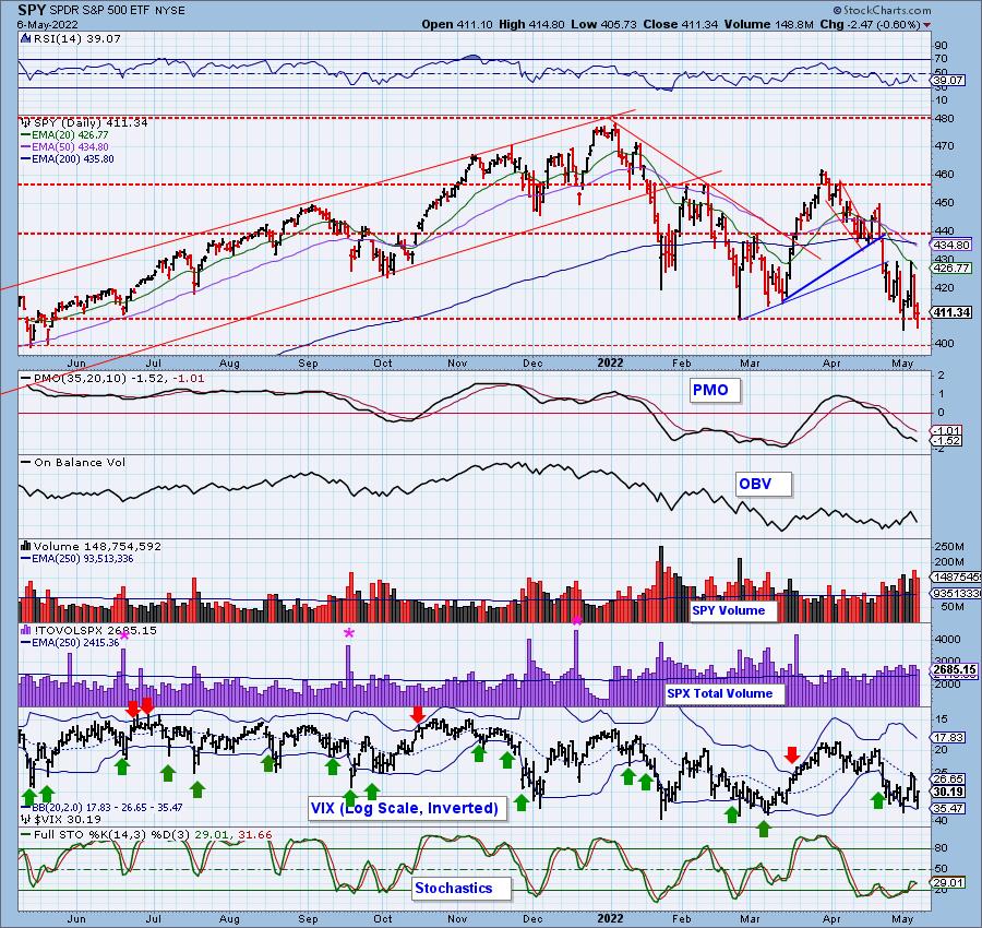
SPY Daily Chart: What a week! And for all the drama, SPY was only down -0.16% for the week. It is holding support, mostly. Intraday lows this week did penetrate support. The big news is the "death cross" experienced by the SPY this week. This is a bear market configuration. So if there was any doubt we are in a bear market, the death cross certainly confirms that we are.
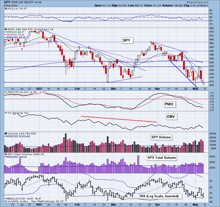
The VIX didn't penetrate the lower Bollinger Band on our inverted scale so that opens us up to more downside with little chance of a major reversal to start next week. The PMO has topped below its signal line and the RSI remains negative. Stochastics have turned down in negative territory.
Free DP Trading Room (5/2/2022) RECORDING LINK:
Topic: DecisionPoint Trading Room
Start Time: May 2, 2022 09:00 AM
Meeting Recording Link.
Access Passcode: May#the2nd
For best results, copy and paste the access code to avoid typos.
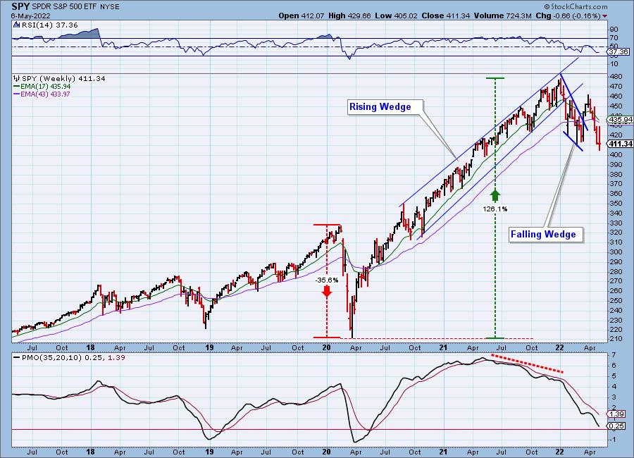
SPY Weekly Chart: Weekly indicators are negative. Note that the PMO at the 2020 bear market bottom was in negative territory. This suggests that the bear market is in force and isn't likely to see a bottom for some time.
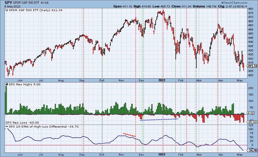
New 52-Week Highs/Lows: New Lows reached oversold levels, but we don't think they are done increasing. New Highs were negligible this week even on the rallies that began the trading week.
Climax Analysis: No climactic activity today. This week saw three climaxes, each of which fulfilled as expected. Tuesday we had an upside initiation climax that saw the huge rally on Wednesday. However, that created an upside exhaustion climax that suggested lower prices ahead. That signal resolved as expected with a decline. The readings were so elevated on yesterday's decline that we had a downside initiation climax. We know that fulfilled today.
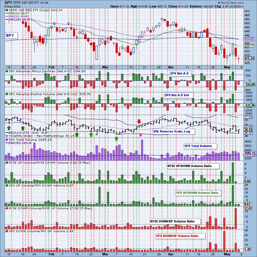
*A climax is a one-day event when market action generates very high readings in, primarily, breadth and volume indicators. We also include the VIX, watching for it to penetrate outside the Bollinger Band envelope. The vertical dotted lines mark climax days -- red for downside climaxes, and green for upside. Climaxes are at their core exhaustion events; however, at price pivots they can be seen to be initiating a change of trend.
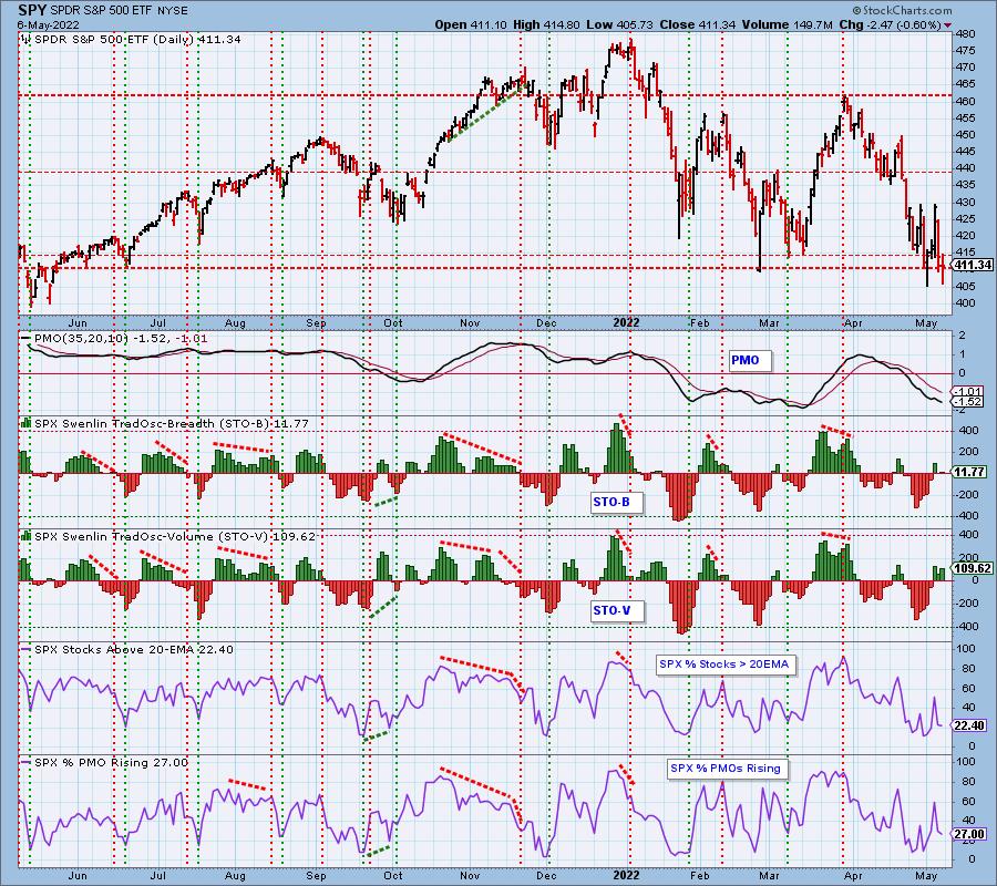
Short-Term Market Indicators: The short-term market trend is DOWN and the condition is NEUTRAL.
STOs are mixed. Ultimately they are in neutral territory as they hover near the zero line. Just over a quarter of the SPX have rising momentum, but that percentage is deteriorating.
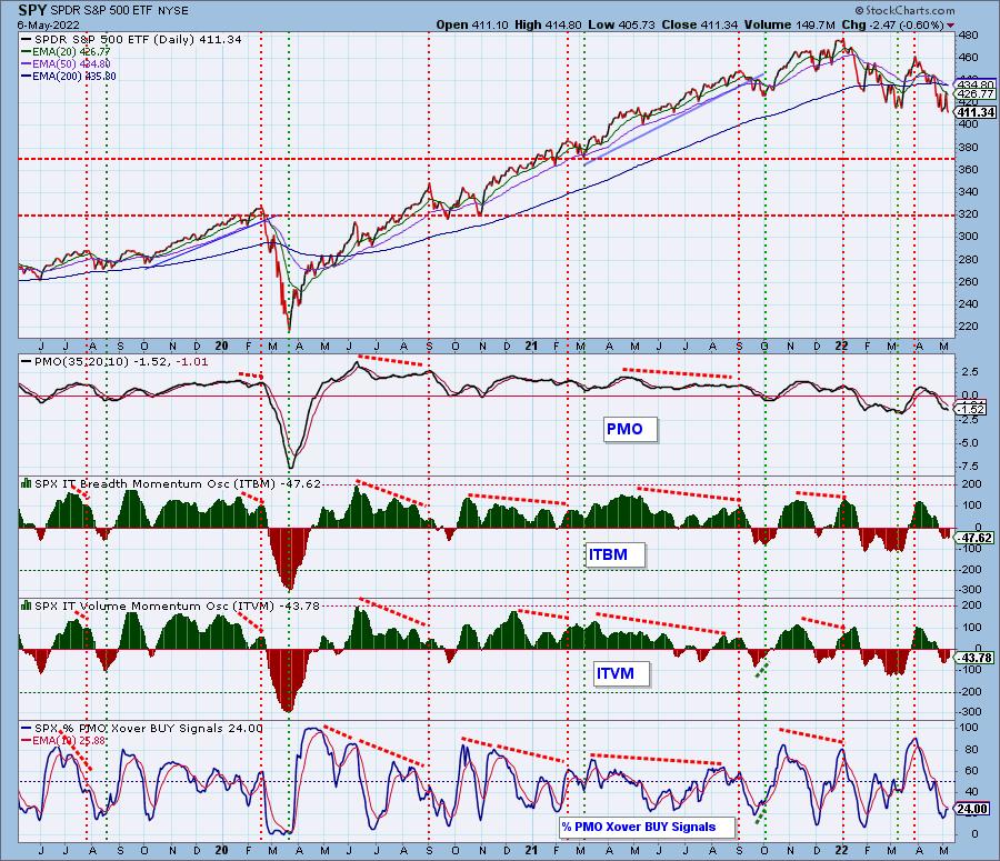
Intermediate-Term Market Indicators: The intermediate-term market trend is DOWN and the condition is SOMEWHAT OVERSOLD.
We've seen the ITBM/ITVM far more oversold than they are now. They aren't in an area where we should expect a longer-term reversal. Less than one quarter of the SPX are on PMO BUY signals.
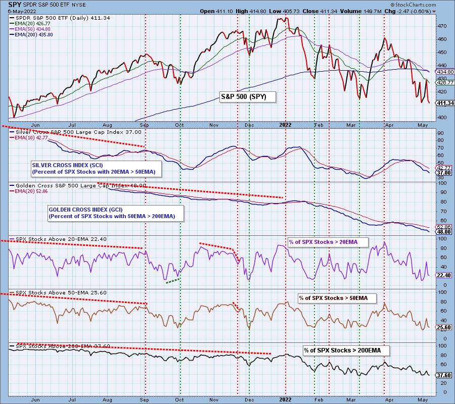
PARTICIPATION and BIAS Assessment: The following chart objectively shows the depth and trend of participation in two time frames.
- Intermediate-Term - the Silver Cross Index (SCI) shows the percentage of SPX stocks on IT Trend Model BUY signals (20-EMA > 50-EMA). The opposite of the Silver Cross is a "Dark Cross" -- those stocks are, at the very least, in a correction.
- Long-Term - the Golden Cross Index (GCI) shows the percentage of SPX stocks on LT Trend Model BUY signals (50-EMA > 200-EMA). The opposite of a Golden Cross is the "Death Cross" -- those stocks are in a bear market.
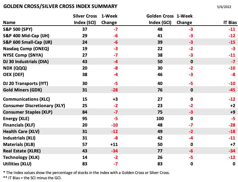
The following table summarizes participation for the major market indexes and sectors. The 1-Week Change columns inject a dynamic aspect to the presentation.
The following table summarizes participation for the major market indexes and sectors. The 1-Week Change columns inject a dynamic aspect to the presentation.
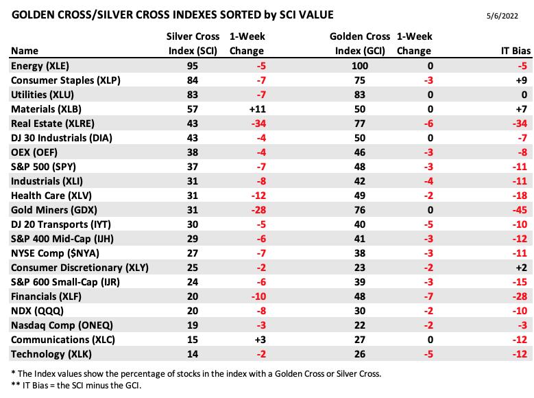
This table is sorted by SCI values. This gives a clear picture of strongest to weakest index/sector in terms of participation.
Weakness abounds on the SCI/GCI tables. The strongest of all sectors and indexes listed are Consumer Staples (XLP), Utilities (XLU) and of course, Energy (XLE). The weakest are also not a surprise, the Nasdaq, Communication Services (XLC) and Technology (XLK).
The bias did get a bit bullish after the mid-week rally, but immediately fell back into bear mode. The declining SCI/GCI, combined with declining participation of stocks above their 20/50/200-day EMAs gives us a bearish bias in all three timeframes.
CONCLUSION: Overall it was an emotionally charged week in the market as we saw huge swings to the upside and downside. In total, the SPY was down a mere -0.16% on the week. Indicators suggest next week will see support broken and lower prices next week. We aren't seeing improvement in participation; in fact, it continues to deteriorate. We are on the lookout for bear market rallies, but conditions aren't ripe enough to expect a big reversal off the current support level on the SPY. There are few places to hide out to weather this storm, but based on participation, Energy (XLE), Consumer Staples (XLP) and Utilities (XLU) are about the best you can do.
Erin is 25% exposed after adding inverse ETFs to her portfolio.
---
You'll be getting a mailing soon, but wed wanted to let you know that Erin has a last minute presentation this Thursday at 11:15a ET. Join her on Traders Corner for a Special Live Trading Event. Erin will be one of the 8 Expert Traders on the panel. They will be sharing a diversity of techniques, software, and trading strategies with you. This information packed seminar is designed to help you hedge inflation, grow your trading account, and make you a consistently profitable trader! Erin's presentation will be on "Under the Hood" Indicators. All registrants will receive a copy of the recording. Register HERE. Thank you for supporting our work.
Have you subscribed the DecisionPoint Diamonds yet? DP does the work for you by providing handpicked stocks/ETFs from exclusive DP scans! Add it with a discount! Contact support@decisionpoint.com for more information!
BITCOIN
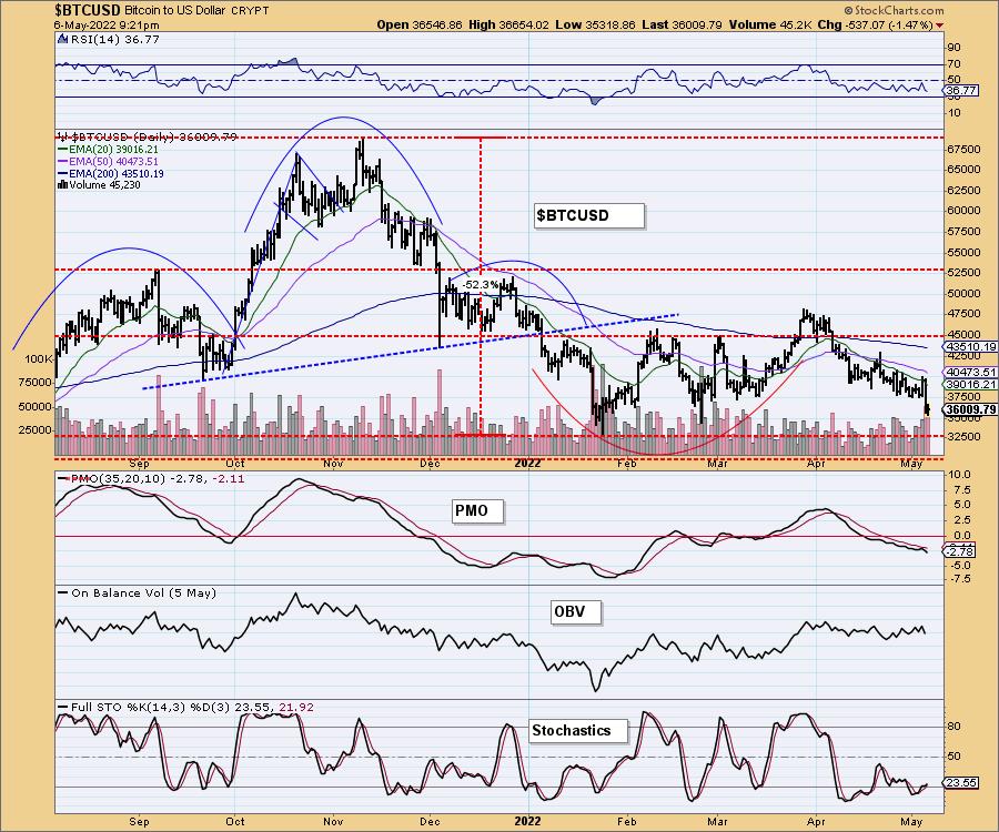
Bitcoin lost support at $37,500 this week. The RSI remains negative and the PMO has topped beneath its signal line. Stochastics are starting to rise, but don't appear bullish given they are well below net neutral (50). We would expect to see Bitcoin test support $32,500 very soon.
INTEREST RATES
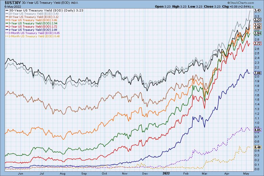
Interest rates continue to soar. To take advantage of the rising rate environment, consider the Interest Rate Hedge ETF (PFIX). Full disclosure, Erin owns that ETF.
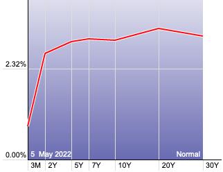
The Yield Curve Chart from StockCharts.com shows us the inversions taking place. The red line should move higher from left to right. Inversions are occurring where it moves downward.
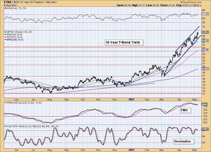
10-YEAR T-BOND YIELD
The rising trend channel is steep on $TNX, but we don't see a breakdown ahead given the PMO is about to trigger a crossover BUY signal again, the RSI is positive and Stochastics are oscillating above 80.
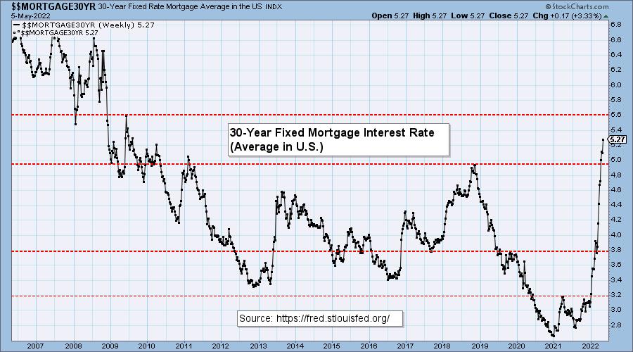
MORTGAGE INTEREST RATES (30-Yr)**
**We watch the 30-Year Fixed Mortgage Interest Rate, because, for the most part, people buy homes based upon the maximum monthly payment they can afford. As rates rise, a fixed monthly payment will carry a smaller mortgage amount. As buying power shrinks, home prices will come under pressure.
--
At 5.27% the 30-Year Fixed Rate Mortgage interest rate is now at the highest level since 2009.

Here is a small and crazy example of not only ridiculous pricing here in California, but also shows us how home prices are going to start seeing deterioration given the parabolic rise in mortgage rates. This home was originally priced at $475,000, but had to decrease the price $50,000. The cost for this house is still outrageous. And let's just say, "Location, location, location" is not good for this house either.

DOLLAR (UUP)
IT Trend Model: BUY as of 6/22/2021
LT Trend Model: BUY as of 8/19/2021
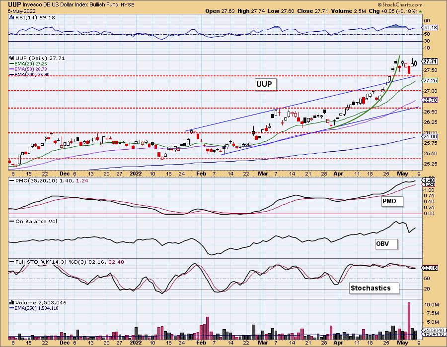
UUP Daily Chart: After the parabolic rally, this week the Dollar consolidated sideways. The indicators are still very favorable so we expect the march upward will resume.
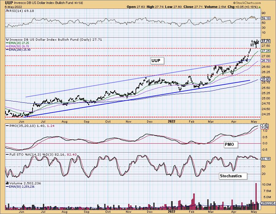
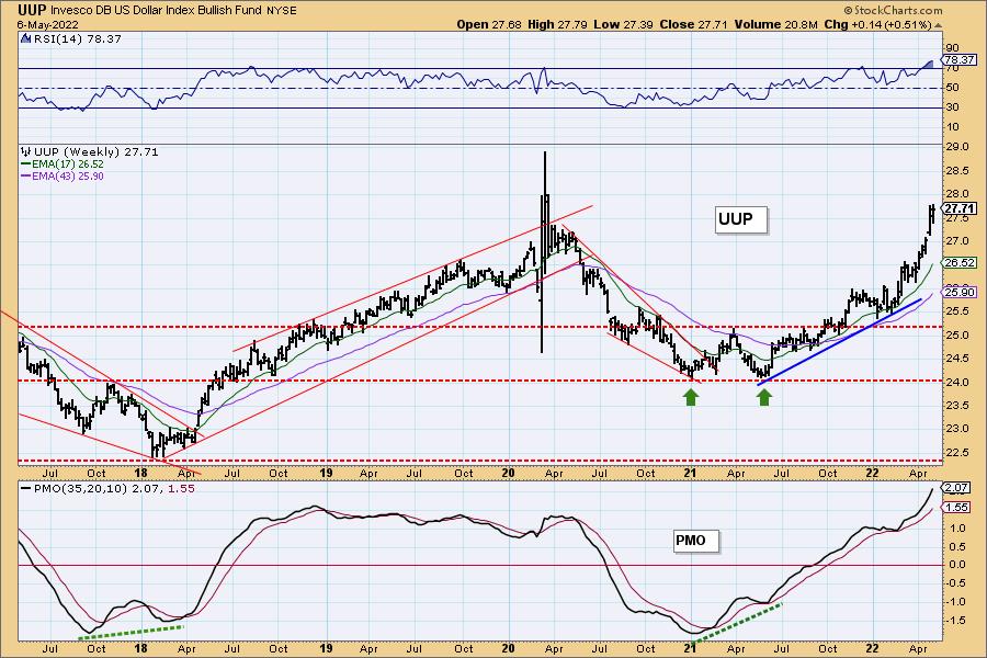
UUP Weekly Chart: The Dollar is at multi-year highs, but given the weekly PMO is rising strongly, we believe price will continue higher. The consolidation this week is arriving right at overhead resistance at $28 which was the high in 2020.
GOLD
IT Trend Model: BUY as of 5/3/2022
LT Trend Model: BUY as of 1/12/2022
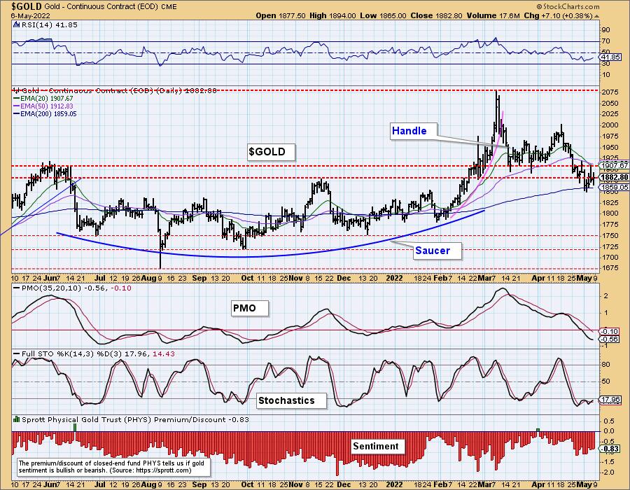
GOLD Daily Chart: The strong rally in the Dollar has put significant downside pressure on Gold. While the Dollar consolidated this week, Gold saw a slight recovery. Price is holding in a strong support zone at the 200-day EMA and the November/January highs.
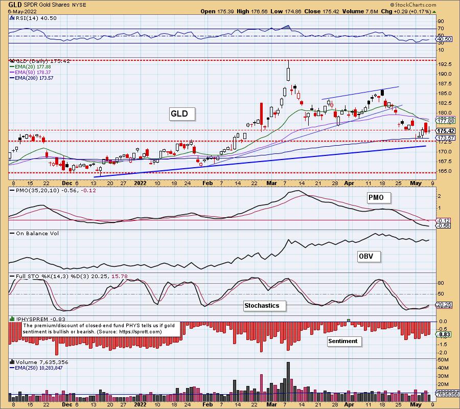
Discounts pared back slightly this week, but overall sentiment remains bearish. Sentiment is contrarian, but it requires sentiment to be very bullish or very bearish before we think about price reversals based on sentiment.
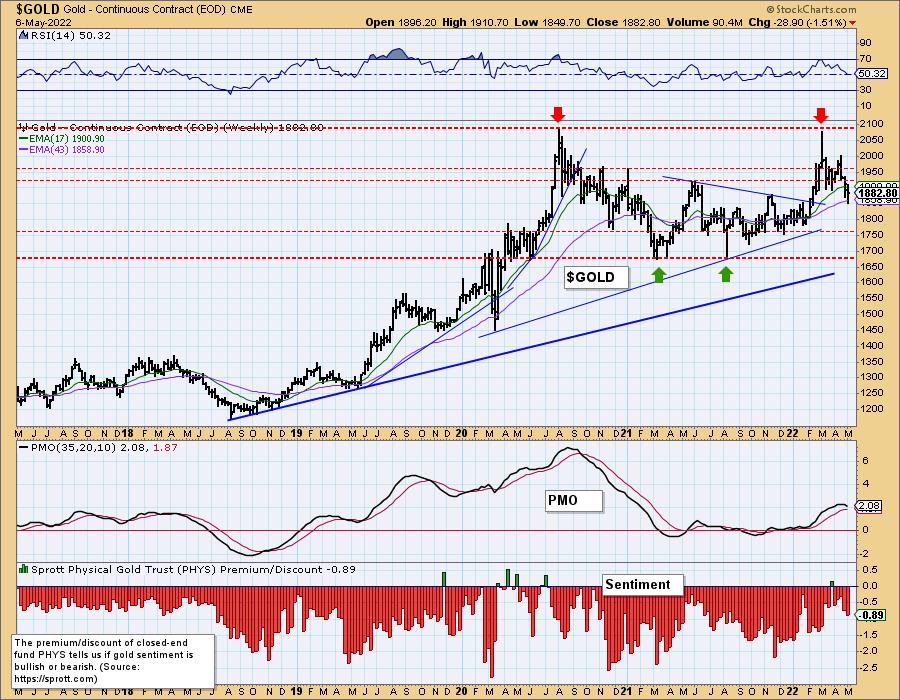
GOLD Weekly Chart: Our concern right now is the long-term double-top that is developing on the weekly chart. However, that isn't the only concern. The weekly RSI is barely holding onto a positive reading above net neutral (50). The weekly PMO is the big problem. It has now topped.
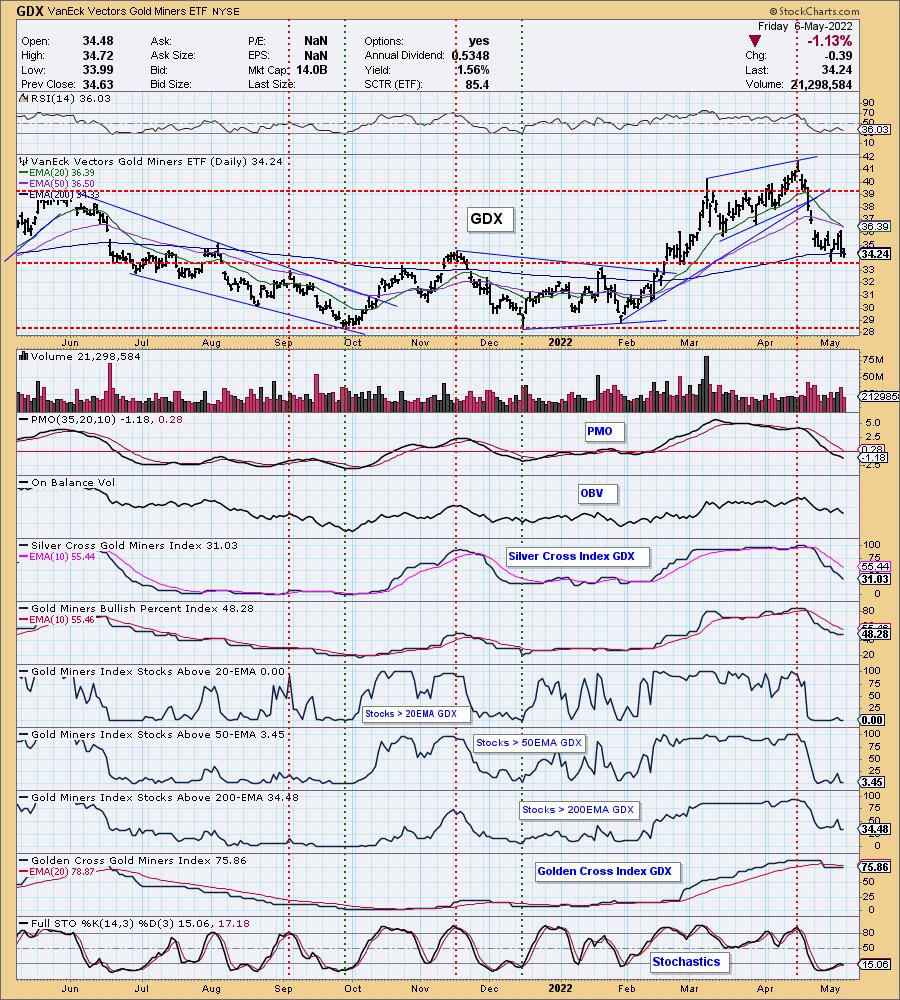
GOLD MINERS Golden and Silver Cross Indexes: Gold Miners are clinging to support at the 200-day EMA and October/January highs. However, today we had a "Dark Cross" of the 20/50-day EMAs. The PMO is falling and below zero. The RSI has spent the last two weeks in negative territory below net neutral (50). Stochastics have turned down below 20. We have no participation given the decline of the SCI and %Stocks greater than their 20-day EMA (zero) and %Stocks greater than their 50-day EMA (3.45%). Long-term participation is still unhealthy. The GCI is flat. While it is reading above 70%, we know only 34% have price above their 200-day EMA. The GCI will begin falling soon.
CRUDE OIL (USO)
IT Trend Model: BUY as of 1/3/2022
LT Trend Model: BUY as of 3/9/2021
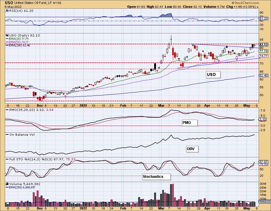
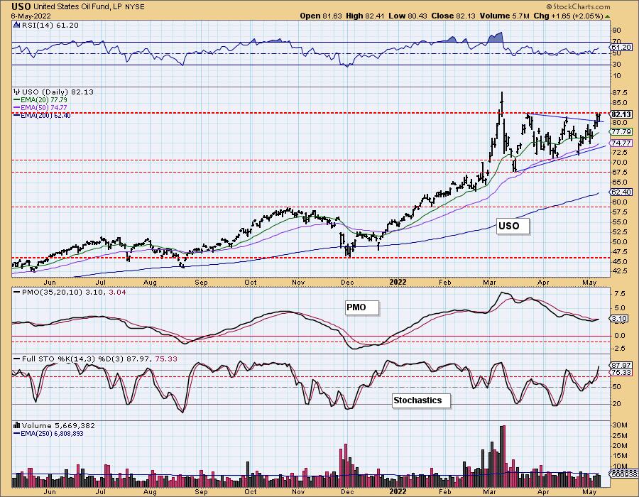
USO Daily Chart: Crude Oil rallied this week fulfilling the symmetrical triangle continuation pattern. Resistance is now holding price back, but today's new PMO crossover BUY signal, a positive and rising RSI and Stochastics rising above 80, that breakout should happen next week.
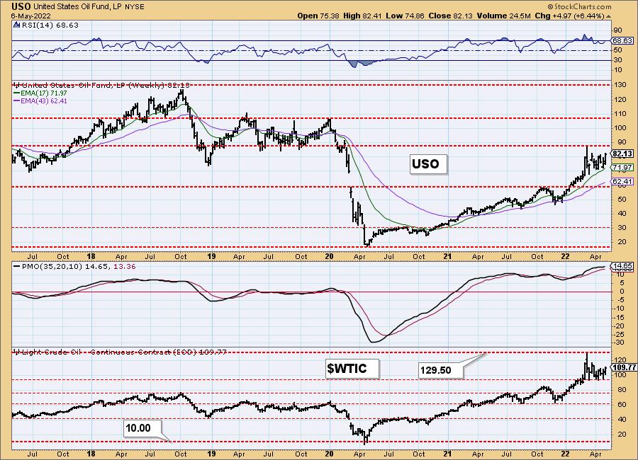
USO/$WTIC Weekly Chart: $90 is a strong area of overhead resistance. The weekly RSI is rising and is positive. The weekly PMO is turning up and there is room for $WTIC to rise. We would look for a test of the 2019 highs.
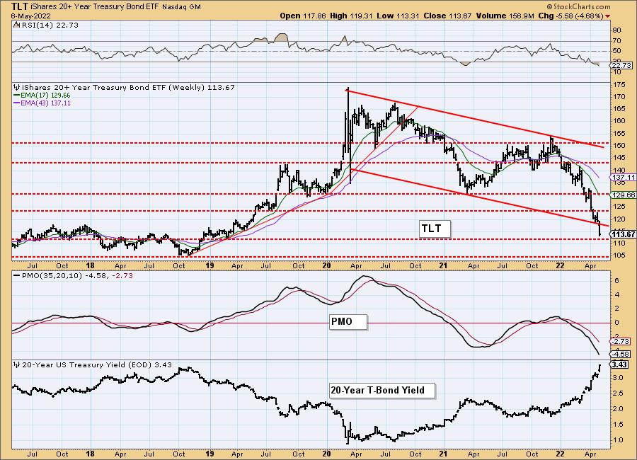
BONDS (TLT)
IT Trend Model: NEUTRAL as of 1/5/2022
LT Trend Model: SELLas of 1/19/2022
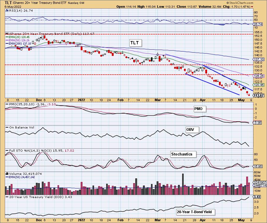
TLT Daily Chart: Bonds continue to languish and with rising rates the norm for some time, we expect prices to continue lower. We may have a bullish falling wedge on the chart, but the very negative RSI, PMO top beneath the signal line and falling Stochastics and OBV, we would not expect a breakout any time soon.
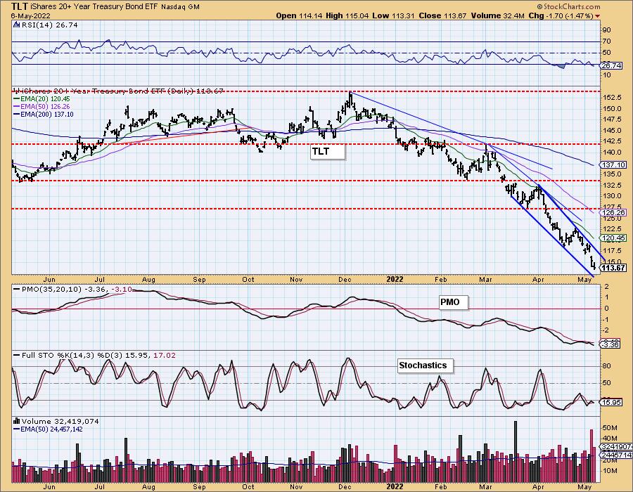
TLT Weekly Chart: Support at the 2019 low is about to be tested. Given the weekly PMO and weekly RSI are negative and falling, we would not expect price to hold there. Look for TLT to reach $105.
Technical Analysis is a windsock, not a crystal ball. --Carl Swenlin
(c) Copyright 2022 DecisionPoint.com
Disclaimer: This blog is for educational purposes only and should not be construed as financial advice. The ideas and strategies should never be used without first assessing your own personal and financial situation, or without consulting a financial professional. Any opinions expressed herein are solely those of the author, and do not in any way represent the views or opinions of any other person or entity.
NOTE: The signal status reported herein is based upon mechanical trading model signals, specifically, the DecisionPoint Trend Model. They define the implied bias of the price index based upon moving average relationships, but they do not necessarily call for a specific action. They are information flags that should prompt chart review. Further, they do not call for continuous buying or selling during the life of the signal. For example, a BUY signal will probably (but not necessarily) return the best results if action is taken soon after the signal is generated. Additional opportunities for buying may be found as price zigzags higher, but the trader must look for optimum entry points. Conversely, exit points to preserve gains (or minimize losses) may be evident before the model mechanically closes the signal.
Helpful DecisionPoint Links:
DecisionPoint Alert Chart List
DecisionPoint Golden Cross/Silver Cross Index Chart List
DecisionPoint Sector Chart List
Price Momentum Oscillator (PMO)
Swenlin Trading Oscillators (STO-B and STO-V)
DecisionPoint is not a registered investment advisor. Investment and trading decisions are solely your responsibility. DecisionPoint newsletters, blogs or website materials should NOT be interpreted as a recommendation or solicitation to buy or sell any security or to take any specific action.
