
From StockCharts.com: "Discovered by Yale Hirsch, founder of the Stock Trader's Almanac, the six-month cycle defines a bullish cycle running from November to April and a bearish cycle running from May to October. This is where the phrase "sell in May and go away" comes from." the article goes on to say that this cycle is not infallible, and that was certainly true of the last 12-month period. During the unfavorable cycle the market gained +11%, and during the favorable cycle it dropped -10%.
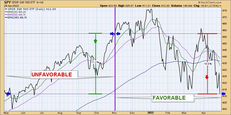
Conclusion: Seasonality pressures are built into the market cycle and more often than not they perform as expected; however, other factors can sometimes overcome seasonality and push the market opposite from way we expect.
___
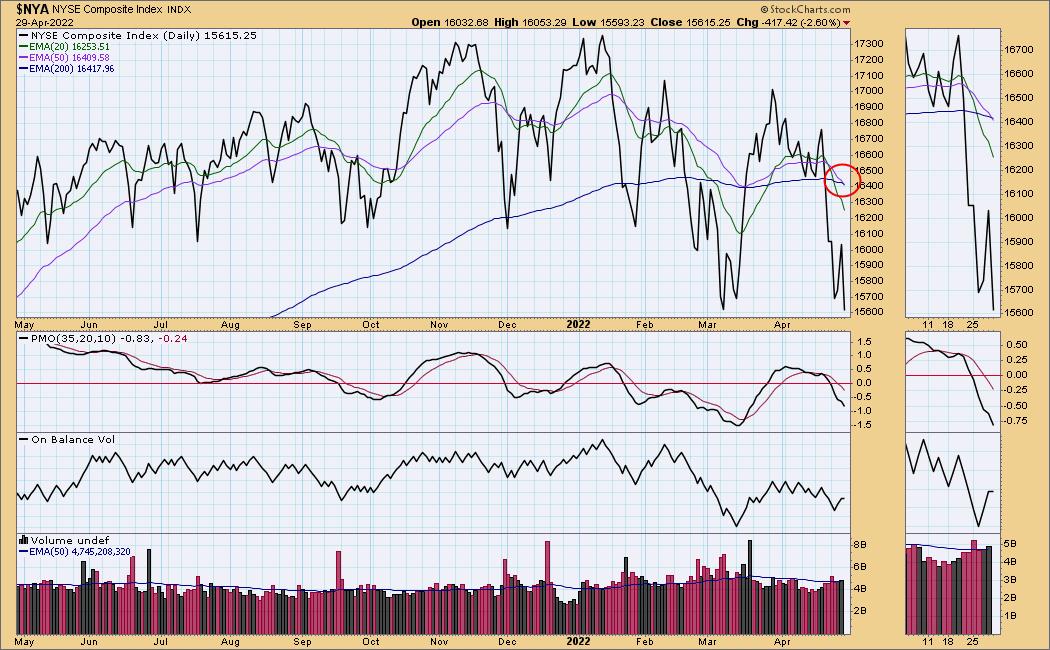
The NYSE Composite 50EMA crossed down through the 200EMA generating an LT Trend Model "Death Cross" SELL Signal. When we see these negative crossovers, it puts that stock or index in a bear market configuration and Bear Market Rules should be applied. We have already been experiencing a bear market so this can be considered a confirmation.
___
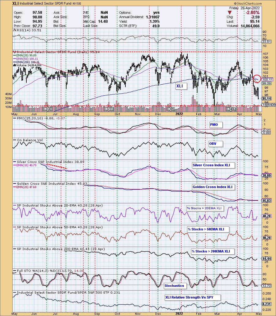
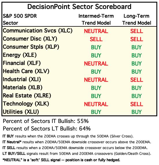
The Industrial Sector (XLI) 50EMA crossed down through the 200EMA generating an LT Trend Model "Death Cross" SELL Signal. None of the sectors have positive momentum, so this is likely the first of many more SELL signals.
The DecisionPoint Alert Weekly Wrap presents an end-of-week assessment of the trend and condition of the Stock Market, the U.S. Dollar, Gold, Crude Oil, and Bonds. The DecisionPoint Alert daily report (Monday through Thursday) is abbreviated and gives updates on the Weekly Wrap assessments.
Watch the latest episode of DecisionPoint on StockCharts TV's YouTube channel here!
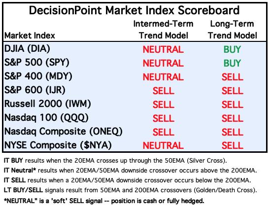
MAJOR MARKET INDEXES
For Today: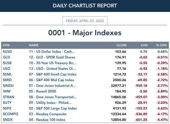
For the Week: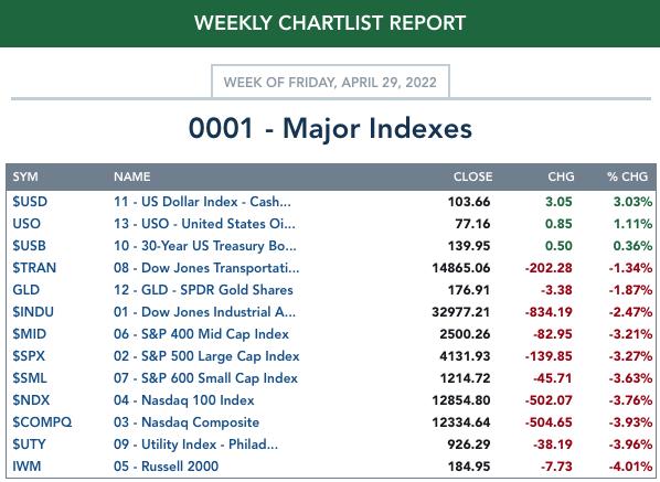
SECTORS
Each S&P 500 Index component stock is assigned to one of 11 major sectors. This is a snapshot of the Intermediate-Term (Silver Cross) and Long-Term (Golden Cross) Trend Model signal status for those sectors.
For Today: 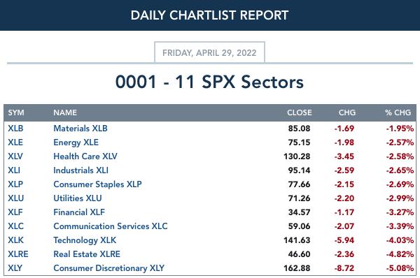
For the Week: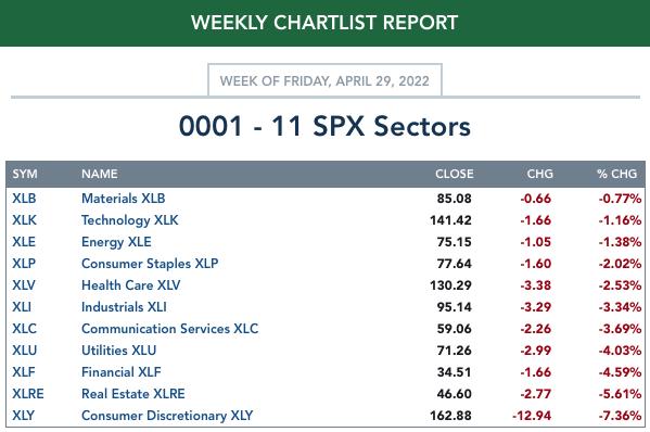
RRG® Charts
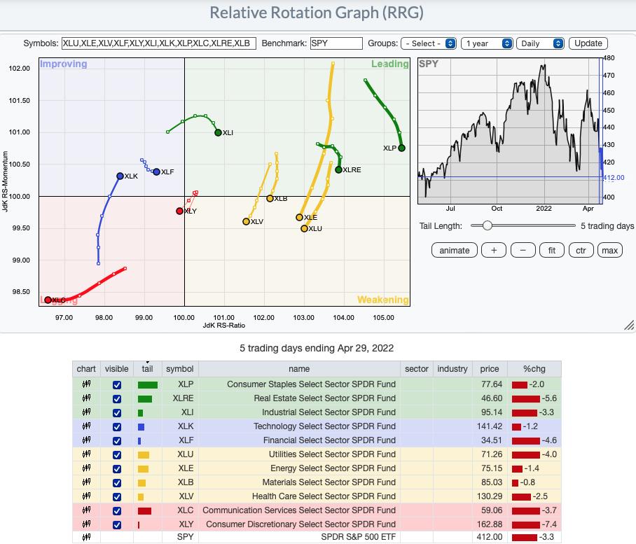
Short-term (Daily) RRG:
One might be shocked, but Technology (XLK) has the most bullish configuration. It is in the Improving quadrant and has a strong bullish northeast heading. This area of the market is still very weak in our estimation and should still be avoided despite its placement on the RRG.
Financials (XLF) is also in the Improving quadrant and is headed toward Leading. This is another sector that is still very weak overall.
The most bearish are Communication Services (XLC)--no surprise here. The other is Consumer Discretionary (XLY) which just entered the Lagging quadrant, bypassing Improving. It is situated the closest to the center point. The center point is the SPY and the sectors rotate based on their relative strength against the SPY. XLY not only has a bearish southwest heading, it is performing in line with the SPY which is in a bear market.
The Leading quadrant sectors, Industrials (XLI), Real Estate (XLRE) and Consumer Staples (XLP) all are moving toward the Weakening quadrant.
All others are in the Weakening quadrant. Healthcare (XLV), Materials (XLB), Energy (XLE) and Utilities (XLU) all have bearish southwest headings.
None of the sectors have healthy participation and none of them have rising momentum so it should be no surprise that all of the sectors look weak.
Intermediate-Term (Weekly) RRG:
XLC continues to oscillate in a tight space within the Improving quadrant. It is far away from the Leading quadrant and we know how weak that sector continues to be.
XLF is the most bearish in the longer-term. It fell from the Leading quadrant and quickly made its way into Lagging.
XLY and XLK are also residents of the Lagging quadrant. They have a somewhat northward heading so they could find themselves in the Improving quadrant, but given what we know about weakness in those sectors, we aren't optimistic.
All sectors in the Leading quadrant with the exception of XLE are traveling further into the Leading quadrant. XLE could hit the Weakening quadrant next week given its southward heading.
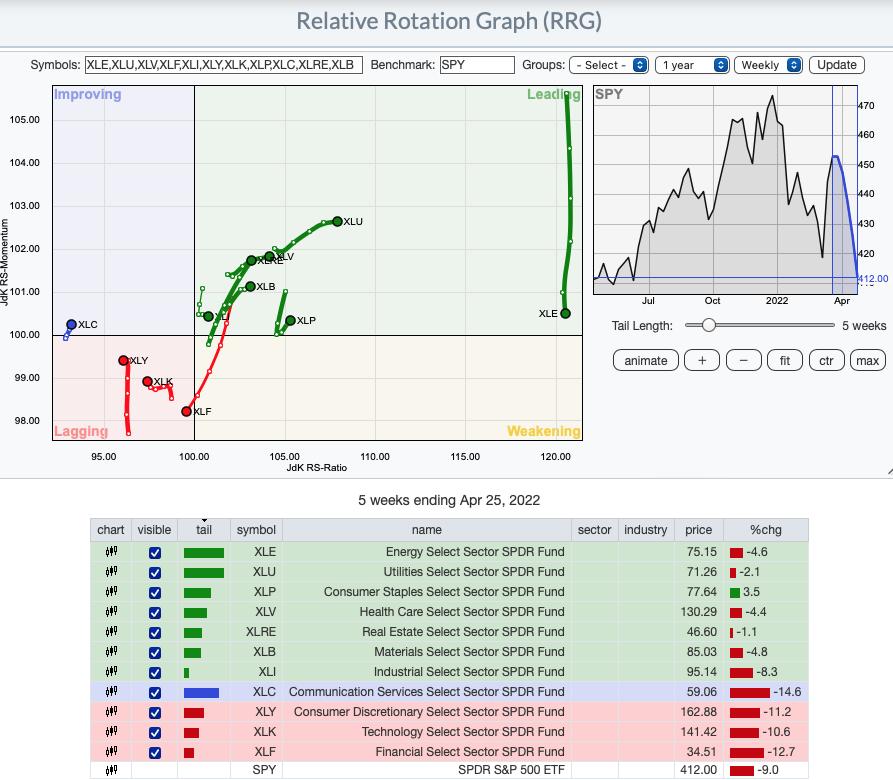
RRG® charts show you the relative strength and momentum for a group of stocks. Stocks with strong relative strength and momentum appear in the green Leading quadrant. As relative momentum fades, they typically move into the yellow Weakening quadrant. If relative strength then fades, they move into the red Lagging quadrant. Finally, when momentum starts to pick up again, they shift into the blue Improving quadrant.
CLICK HERE for an animated version of the RRG chart.
CLICK HERE for Carl's annotated Sector charts.

Free DP Trading Room (4/25/2022) RECORDING LINK:
Topic: DecisionPoint Trading Room
Start Time: Apr 25, 2022 09:00 AM
Meeting Recording Link.
Access Passcode: April@25
For best results, copy and paste the access code to avoid typos.
THE MARKET (S&P 500)
IT Trend Model: NEUTRAL as of 1/21/2022
LT Trend Model: BUY as of 6/8/2020
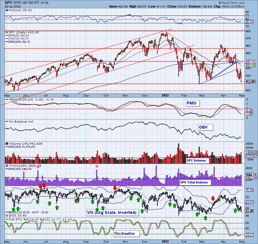
SPY Daily Chart: The market was in free fall most of the day. It is still clinging to support at the February/March lows. Volume was above the annual average on the selling. The VIX closed beneath the lower Bollinger Band on our inverted scale. Typically, we will see some upside after punctures of the lower Band, but clearly the bear market forces are overpowering our "typical" expectations.
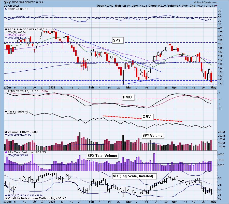
The RSI is negative, the PMO is falling and Stochastics are in the basement. Neither the RSI nor the PMO are oversold yet. The next line of defense/support is at $400 for the SPY.
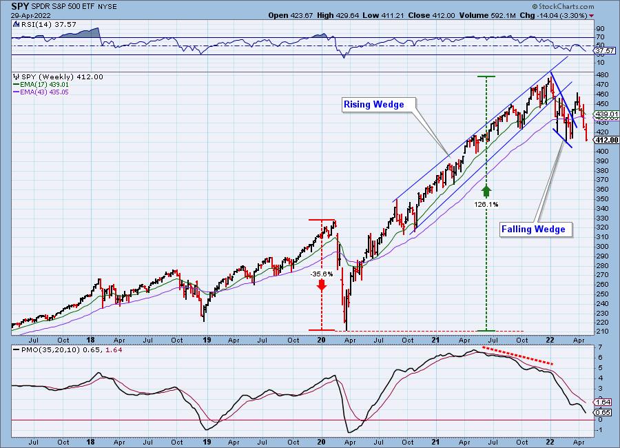
SPY Weekly Chart: After confirming the bullish falling wedge, price failed miserably and is now testing the 2022 lows. The weekly PMO has topped beneath its signal line and is headed for the zero line. The weekly PMO is not oversold. The weekly RSI is negative and also not oversold. An oversold weekly RSI led to the bear market low last time.
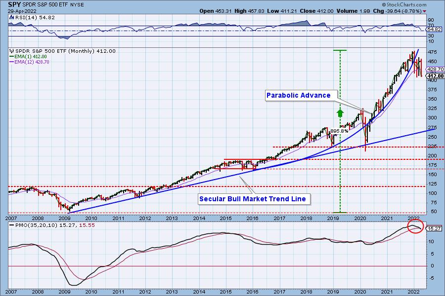
SPY Monthly Chart: We have a new Long-Term PMO SELL signal on the SPY this month, suggesting we probably have more downside to absorb.
New 52-Week Highs/Lows: New Lows continue to hover in oversold territory, but it hasn't resulted in a turnaround. The 10-DMA of the High-Low Differential has now reached negative territory.
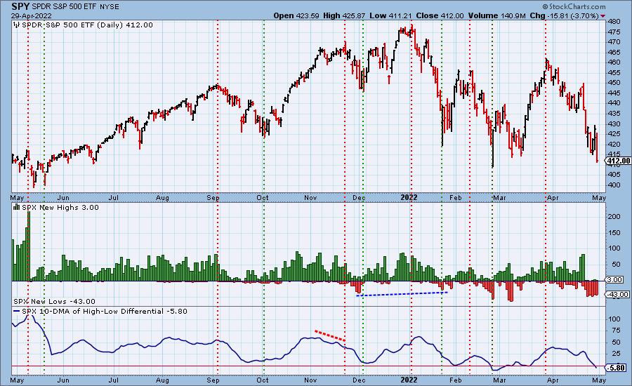
Notice that while New Lows appear oversold on the chart above, when they are compared to the 2020 bear market readings, they aren't even close to being oversold.
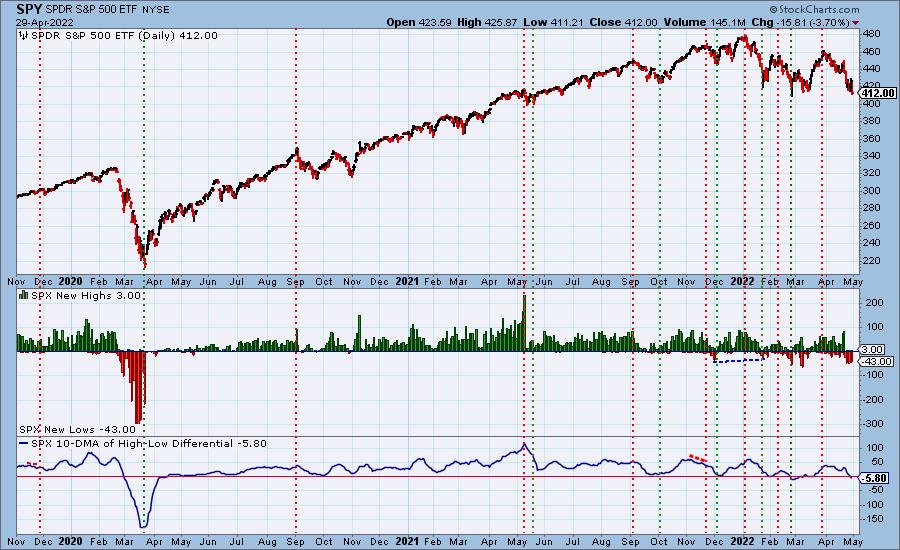
Climax Analysis: While yesterday's upside initiation climax appeared to be launching an up move of at least a few days, today price reversed strongly downward giving us a downside initiation climax. While we try to designate climaxes as initiation or exhaustion events, we must remember that all climaxes are essentially exhaustion events. Their position coming off tops or bottoms adds the potential of their initiating a new trend direction, but we must keep in mind that internals are blowing off, relieving the internal pressures that have built up. Since we are in a bear market, it is likely that more downside will follow today's climax.
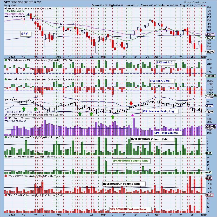
*A climax is a one-day event when market action generates very high readings in, primarily, breadth and volume indicators. We also include the VIX, watching for it to penetrate outside the Bollinger Band envelope. The vertical dotted lines mark climax days -- red for downside climaxes, and green for upside. Climaxes indicate either initiation or exhaustion.
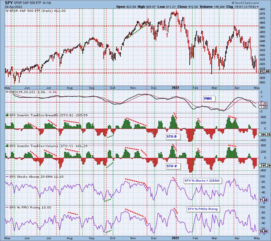
Short-Term Market Indicators: The short-term market trend is DOWN and the condition is OVERSOLD.
STOs continue to contract. Normally that would be a signal that we have upside ahead. However, bear market conditions have changed the dynamic. %Stocks > 20-day EMA and %PMOs Rising are back in very oversold territory. They could still move lower or hover at the same level so we wouldn't put too much emphasis on these oversold conditions.
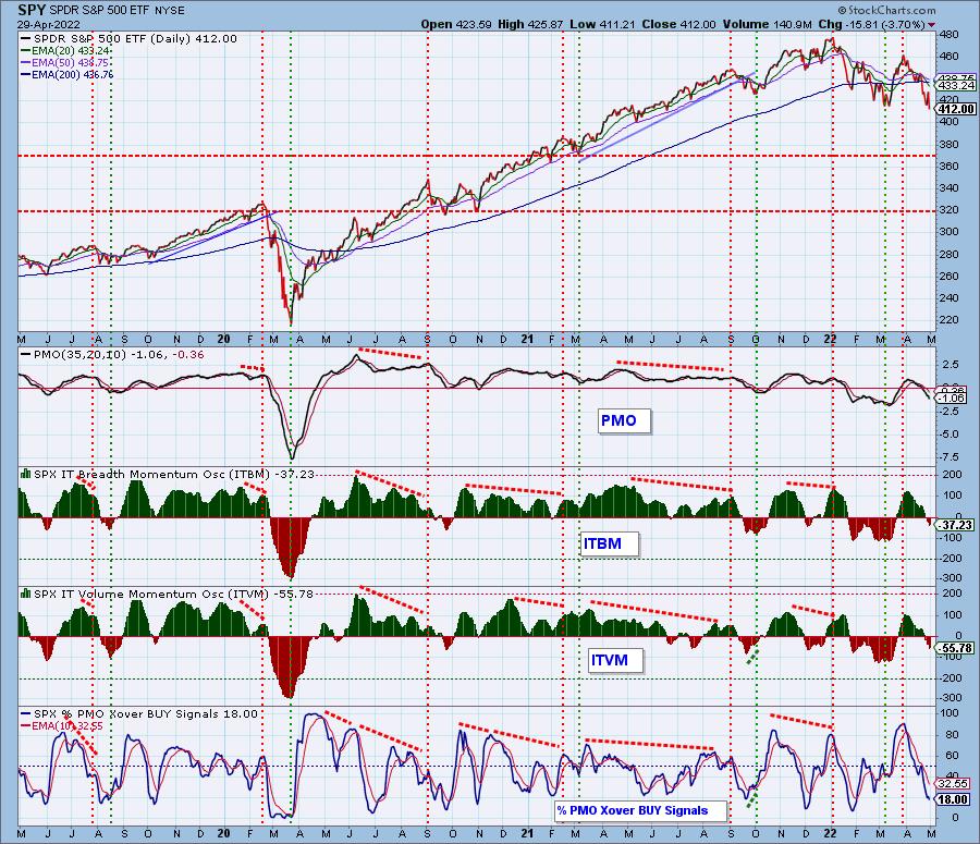
Intermediate-Term Market Indicators: The intermediate-term market trend is DOWN and the condition is NEUTRAL.
The ITBM/ITVM reached negative territory this week, but we can there is plenty of room for them to move lower. If the 2020 bear market is any indication, readings are far from being oversold. %PMO BUY Signals is oversold, but we have seen lower readings. In fact, during the 2020 bear market, we saw this indicator go to 0%.
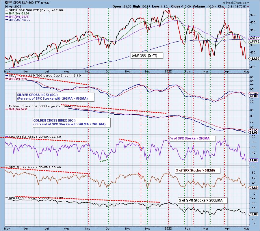
PARTICIPATION and BIAS Assessment: The following chart objectively shows the depth and trend of participation in two time frames.
- Intermediate-Term - the Silver Cross Index (SCI) shows the percentage of SPX stocks on IT Trend Model BUY signals (20-EMA > 50-EMA). The opposite of the Silver Cross is a "Dark Cross" -- those stocks are, at the very least, in a correction.
- Long-Term - the Golden Cross Index (GCI) shows the percentage of SPX stocks on LT Trend Model BUY signals (50-EMA > 200-EMA). The opposite of a Golden Cross is the "Death Cross" -- those stocks are in a bear market.
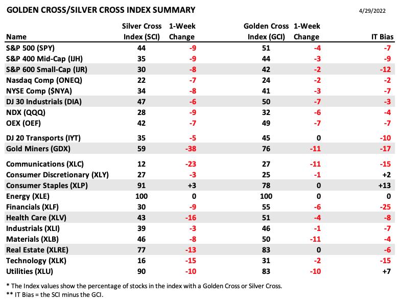
The following table summarizes participation for the major market indexes and sectors. The 1-Week Change columns inject a dynamic aspect to the presentation.
The following table summarizes participation for the major market indexes and sectors. The 1-Week Change columns inject a dynamic aspect to the presentation.
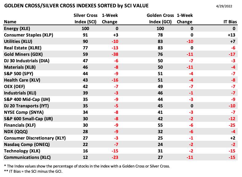
This table is sorted by SCI values. This gives a clear picture of strongest to weakest index/sector in terms of participation.
Based on our 70% bullish threshold, Only four sectors/indexes are bullish in the intermediate term, XLE, XLP, XLU and XLRE. However, one look at those sector charts tells you they are far from being bullishly configured. Still, it is telling that only the defensive sectors are showing leadership.
The market bias in all three timeframes is bearish. It doesn't take a professional analyst to see that participation is extremely weak and not improving.
CONCLUSION: If you look at weekly charts of the major market indexes, you'll see great, rounded tops stretching over most of a year, and it makes us think that the carnage has only just begun. Today's downside initiation climax just adds insult to injury. Indicators are continuing to look weak in all three timeframes with the exception of the STOs which are rising. If the 2020 bear market is a benchmark for oversold indicator readings, they aren't oversold enough. The bias is bearish in all three timeframes. We will be on alert for a bear market rally, but current conditions suggest more downside.
Calendar: The Fed Meets next week, with the announcement on Wednesday. An expected 50 basis point rise will not be conducive for a market rally.
Erin is 15% exposed to the market but is looking to add some inverse ETFs to her portfolio from her recent "Diamonds in the Rough" selections.
Have you subscribed the DecisionPoint Diamonds yet? DP does the work for you by providing handpicked stocks/ETFs from exclusive DP scans! Add it with a discount! Contact support@decisionpoint.com for more information!
BITCOIN
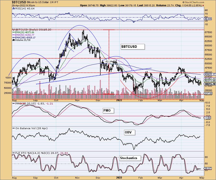
Bitcoin is holding support at $37,500. The RSI is negative, but the PMO and Stochastics are flat. More than likely we will see Bitcoin consolidate sideways on top of that support level. Any breakdown below $37,500 will likely spur prices to move to $32,500.
INTEREST RATES
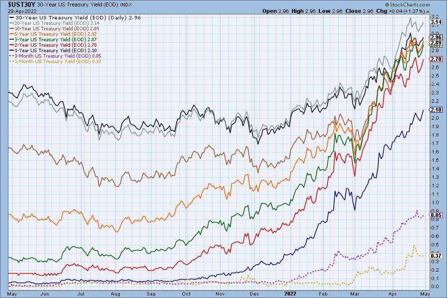
Rates let up earlier in the week, but they have reengaged and are ready to hit new highs next week.
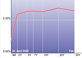
The Yield Curve Chart from StockCharts.com shows us the inversions taking place. The red line should move higher from left to right. Inversions are occurring where it moves downward.
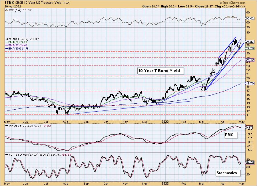
10-YEAR T-BOND YIELD
After the decline earlier in the week, the rally is back on. We now have a very steep rising trend channel. The PMO had a negative crossover this week, but so far it's not posing a problem. The RSI is positive and rising, as are Stochastics. We expect the yields to move even higher. Consider the Interest Rate hedge ETF (PFIX) which is certainly benefiting from this rising rate environment.
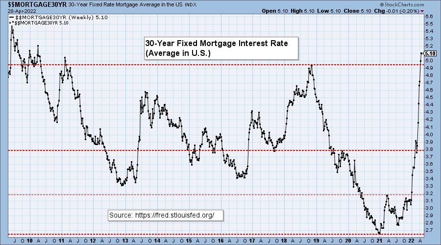
MORTGAGE INTEREST RATES (30-Yr)**
**We watch the 30-Year Fixed Mortgage Interest Rate, because, for the most part, people buy homes based upon the maximum monthly payment they can afford. As rates rise, a fixed monthly payment will carry a smaller mortgage amount. As buying power shrinks, home prices will come under pressure.
--
Virtually no change this week, a 0.01% tick down.
This Bloomberg article says that the top of the housing market is at hand.

DOLLAR (UUP)
IT Trend Model: BUY as of 6/22/2021
LT Trend Model: BUY as of 8/19/2021
UUP Daily Chart: The Dollar had its third down day to finish April. The chatter has been that if countries do not raise rates as the US is, the Dollar will continue to be king. This is a parabolic rally, but given we didn't see a spectacular breakdown, we expect the rising trend to soften, not completely fall apart.
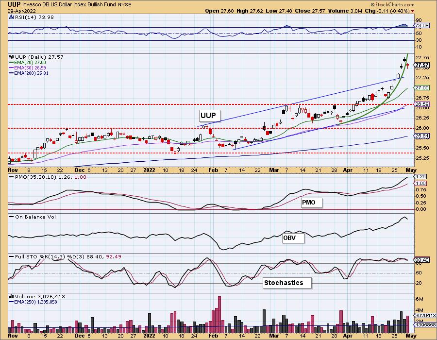
Stochastics are oscillating above 80 and the PMO is still headed to the sky. Both conditions are very bullish.
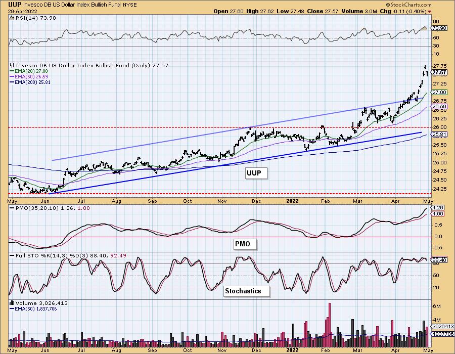
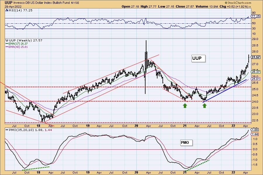
UUP Weekly Chart: The Dollar is headed to test the 2020 highs. Based on the bullish weekly PMO and weekly RSI, we would expect to see the rally continue. We do note that both are overbought. Just remember, overbought conditions can persist in a bull market and the Dollar is definitely enjoying a bull market right now.
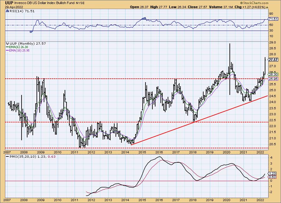
UUP Monthly Chart: The monthly PMO is rising on a crossover BUY signal and the weekly RSI is positive, albeit getting overbought. The weekly PMO is NOT overbought and has plenty of room to move higher. We expect to see the rally continue for the Dollar in all timeframes.
GOLD
IT Trend Model: BUY as of 12/29/2021
LT Trend Model: BUY as of 1/12/2022
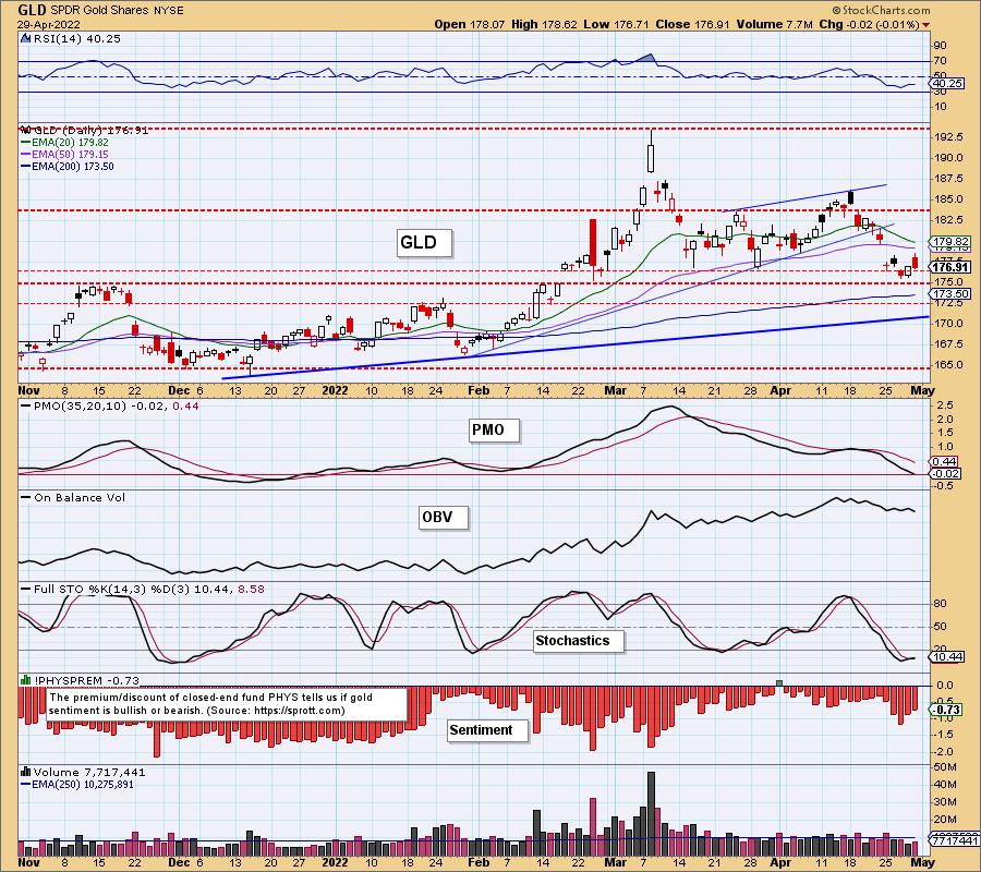
GOLD Daily Chart: Gold found support in the zone between $175 and $176.50. This is positive. Not positive are the RSI and PMO. In fact, the PMO just dropped below the zero line today.
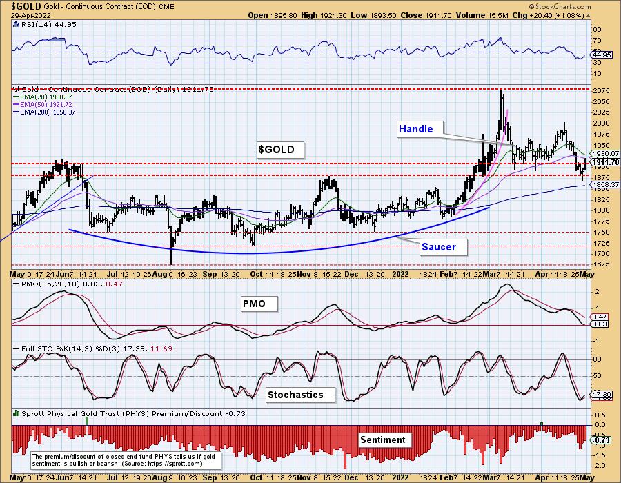
$GOLD looks a bit more bullish given the PMO has decelerated above the zero line. Stochastics and the RSI are rising. The rising Dollar is putting serious downside pressure on Gold, but with indicators firming up and support being held, it should hold its own. We just don't expect a big rally.
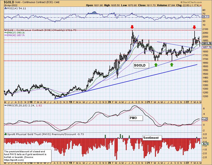
GOLD Weekly Chart: The weekly RSI is still positive, but the weekly PMO has turned lower. Discounts were elevated this week suggesting investors are still bearish on Gold. Discounts are deep enough to say they are VERY bearish on Gold. We need very high discounts before we start looking for a price reversal on bearish sentiment.
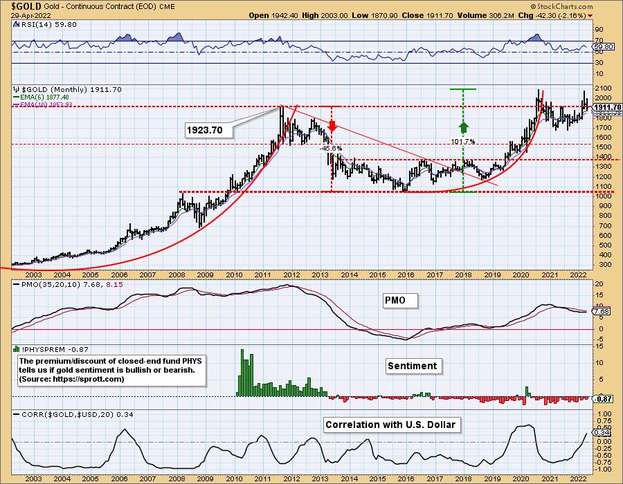
GOLD Monthly Chart: The monthly RSI is positive and the monthly PMO is attempting to turn back up. The best indicator on this chart is the correlation with the Dollar. Typically the Dollar and Gold travel in opposite directions, making the correlation very negative. If the correlation begins to move positive as it is now, downside pressure from the Dollar's rally could be relieved.
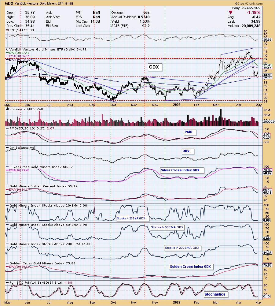
GOLD MINERS Golden and Silver Cross Indexes: Gold Miners have found support at the 200-day EMA at the November high. The SCI and GCI are both falling and participation of stocks > 20/50/200-day EMAs is anemic. The bias is still very bearish. Unlike Gold, Gold Miners are subject to the winds of the market, more so than the metal itself. Knowing how bearish the market looks, we wouldn't count on this level of support to hold.
CRUDE OIL (USO)
IT Trend Model: BUY as of 1/3/2022
LT Trend Model: BUY as of 3/9/2021
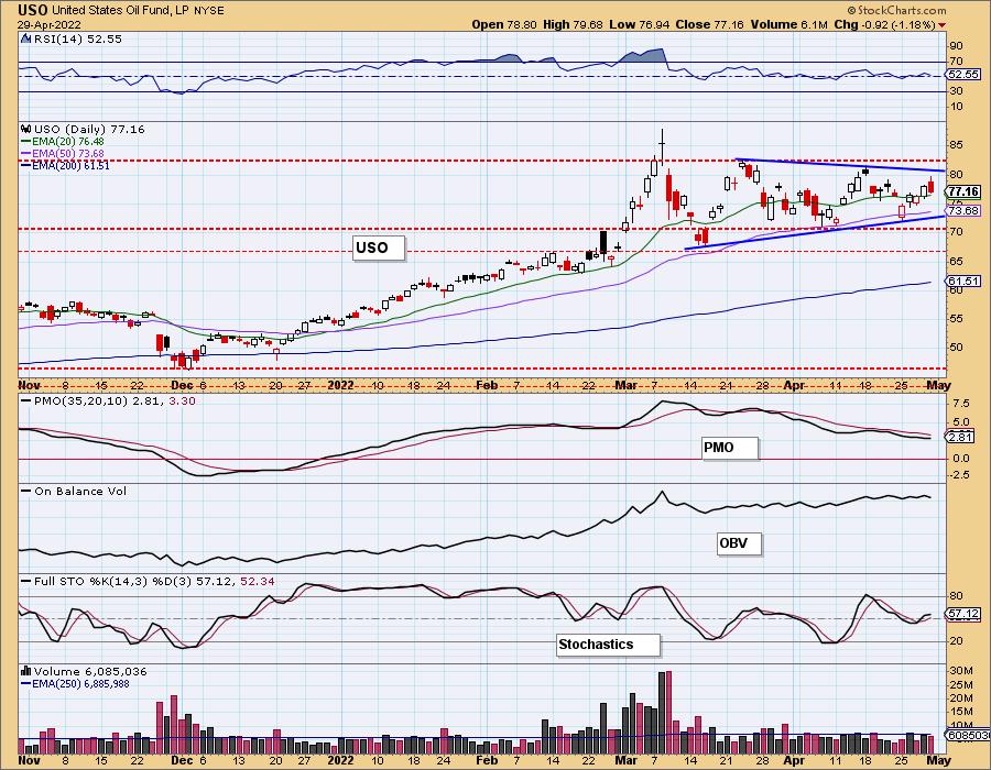
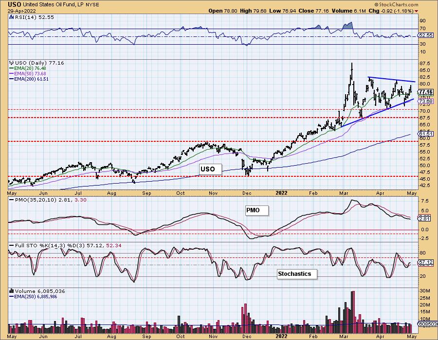
USO Daily Chart: Crude Oil is moving in a symmetrical triangle as it consolidates sideways. These are continuation patterns and imply an upside breakout ahead. Indicators are flat and not flashing the green, but we do expect Oil prices to resume their march higher.
USO/$WTIC Weekly Chart: Interestingly, we can see that USO hit overhead resistance and began forming this symmetrical triangle. $WTIC looks more negative given the declining tops and flat bottoms. That is a bearish descending triangle that would imply a breakdown ahead. The weekly PMO is topping in overbought territory. The weekly RSI remains positive. The weekly chart isn't bearish enough to expect a decline, but it does give us pause.
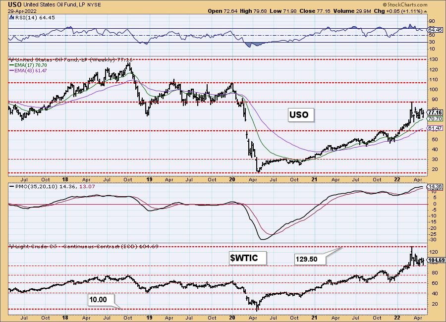
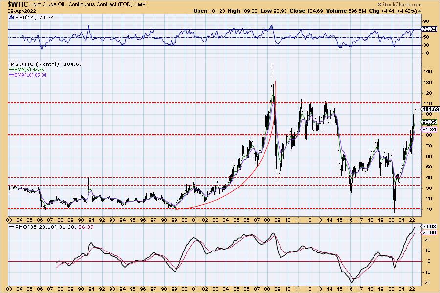
WTIC Monthly Chart: The monthly chart on the other hand for $WTIC is clearly bullish. The only detractor would be the now overbought monthly RSI and overbought monthly PMO. Resistance is strong, but last month we saw a breakout. We expect that breakout to be confirmed next month with a close above $110/barrel.
BONDS (TLT)
IT Trend Model: NEUTRAL as of 1/5/2022
LT Trend Model: SELLas of 1/19/2022
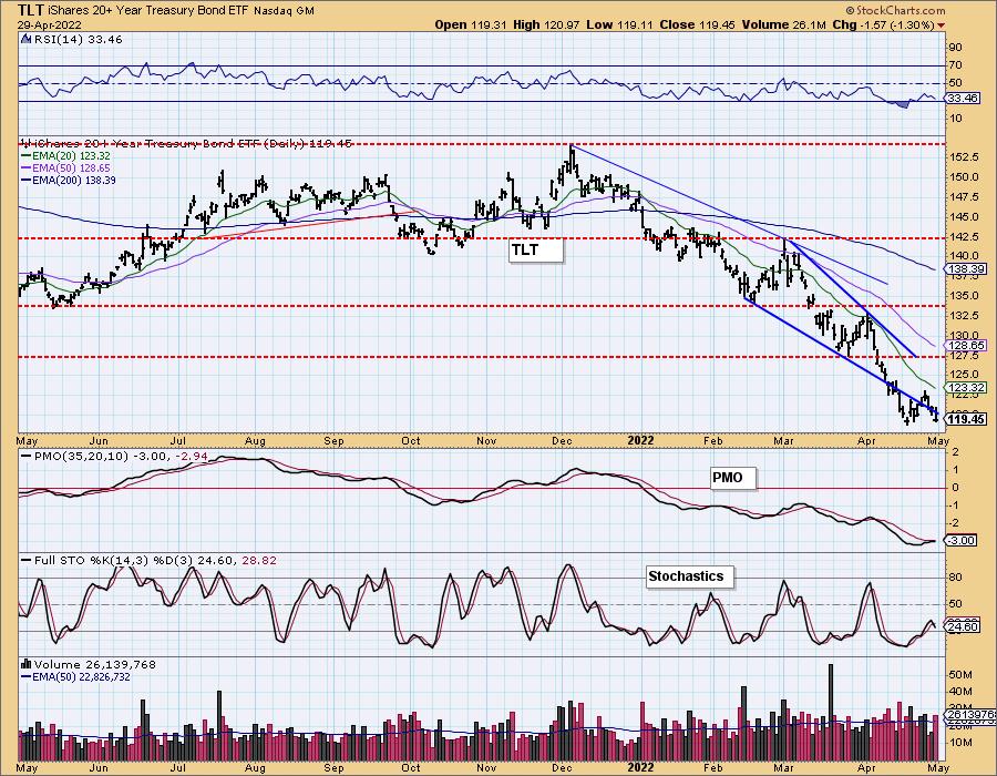
TLT Daily Chart: Bonds continue to languish in the continued rising rate environment. We don't see any relief ahead. Last week's rally did get the PMO to move higher, but it has topped beneath its signal line. The RSI is very negative. Stochastics topped in very negative territory below net neutral (50).
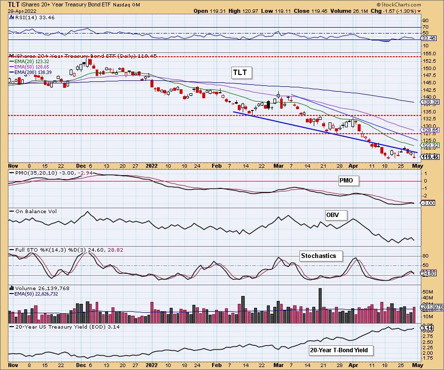
When you see a bullish falling wedge fail to confirm when price and indicators are so oversold, you know it's bad.
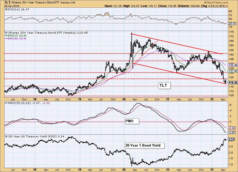
TLT Weekly Chart: Price is now testing mid-2018/early 2019 highs. It is at the bottom of a declining trend channel. Both the weekly RSI and weekly PMO are very oversold. However, the PMO is moving vertically lower. We expect price to test 2018 lows.
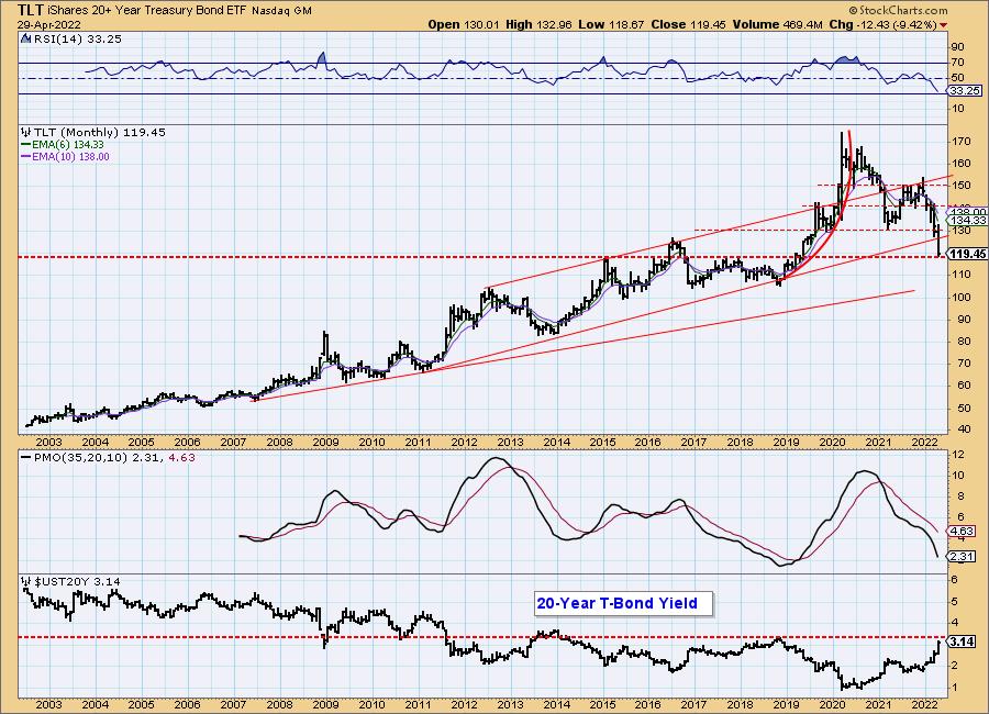
TLT Monthly Chart: The monthly chart is every bit as bearish as the previous ones. The monthly RSI is falling in negative territory and the monthly PMO is also moving vertically downward. The rising bottoms trendline drawn from the 2011 low has been compromised and the longer-term rising bottoms trendline drawn from the 2007 low will likely be tested soon. This support level looks fairly sturdy, but we would look for price to test the 2012 high/2016-2018 lows.
Technical Analysis is a windsock, not a crystal ball. --Carl Swenlin
(c) Copyright 2022 DecisionPoint.com
Disclaimer: This blog is for educational purposes only and should not be construed as financial advice. The ideas and strategies should never be used without first assessing your own personal and financial situation, or without consulting a financial professional. Any opinions expressed herein are solely those of the author, and do not in any way represent the views or opinions of any other person or entity.
NOTE: The signal status reported herein is based upon mechanical trading model signals, specifically, the DecisionPoint Trend Model. They define the implied bias of the price index based upon moving average relationships, but they do not necessarily call for a specific action. They are information flags that should prompt chart review. Further, they do not call for continuous buying or selling during the life of the signal. For example, a BUY signal will probably (but not necessarily) return the best results if action is taken soon after the signal is generated. Additional opportunities for buying may be found as price zigzags higher, but the trader must look for optimum entry points. Conversely, exit points to preserve gains (or minimize losses) may be evident before the model mechanically closes the signal.
Helpful DecisionPoint Links:
DecisionPoint Alert Chart List
DecisionPoint Golden Cross/Silver Cross Index Chart List
DecisionPoint Sector Chart List
Price Momentum Oscillator (PMO)
Swenlin Trading Oscillators (STO-B and STO-V)
DecisionPoint is not a registered investment advisor. Investment and trading decisions are solely your responsibility. DecisionPoint newsletters, blogs or website materials should NOT be interpreted as a recommendation or solicitation to buy or sell any security or to take any specific action. f
