
Today the Technology Sector (XLK) 50-day EMA crossed down through the 200-day EMA, effecting what is widely (and dramatically) known as a Death Cross. In our vernacular we call it a LT Trend Model SELL Signal. In any language it is bad news for this sector that has led the secular bull market. And, unfortunately there doesn't seem to be any strength that can pull this sector out of its nose-dive.
The RSI is negative and falling. The PMO is in negative territory and is accelerating lower on a prior crossover SELL signal. Stochastics have turned down in negative territory as well.
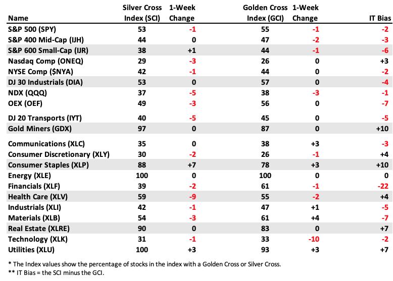
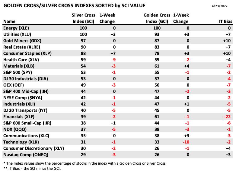
Participation is anemic. The Silver Cross Index (SCI), which tells us how many stocks have a 20-day EMA greater than the 50-day EMA (they hold a "Silver Cross"), is only 31% and getting worse. The SCI has even turned down below its signal line.
The Golden Cross Index (GCI) is showing only 1/3rd of the sector have a 50-day EMA above the 200-day EMA (on "Golden Cross" BUY signals). The GCI is also continuing to fall. %Stocks > 20-day EMA is less than 3%! It's gets a bit better as we look at %Stocks > 50-day EMA, but that is only at 12%. It's a little better from there with 21% having price above the 200-day EMA. The problem is the SCI and GCI will likely continue lower given short-term weakness.
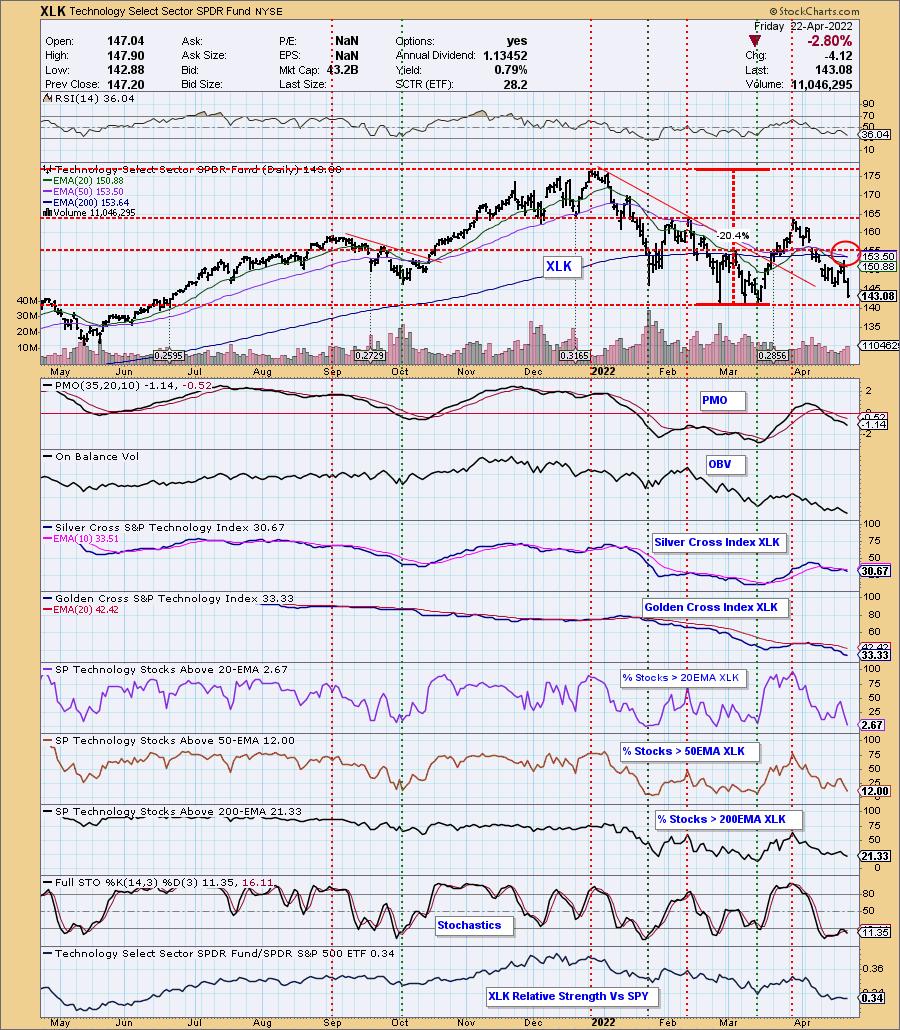
Conclusion: Given the low readings on the SCI and GCI, along with continuing deterioration of %Stocks above their 20-day EMAs which are less than %Stocks above their 50-day EMAs AND %Stocks above their 50-day EMAs being less than %Stocks above their 200-day EMAs, the picture isn't likely to improve. We want to see %Stocks indicators moving higher to lower in each timeframe, NOT lower to higher. That implies serious weakness. This is a leadership sector which tells us the market will continue to be led downward until we start to see improvement in Technology stocks.
The DecisionPoint Alert Weekly Wrap presents an end-of-week assessment of the trend and condition of the Stock Market, the U.S. Dollar, Gold, Crude Oil, and Bonds. The DecisionPoint Alert daily report (Monday through Thursday) is abbreviated and gives updates on the Weekly Wrap assessments.
Watch the latest episode of DecisionPoint on StockCharts TV's YouTube channel here!
MAJOR MARKET INDEXES
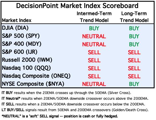
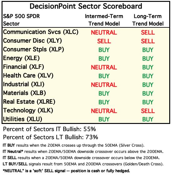
We are adding this signal table to the DPA as a regular feature.
For Today: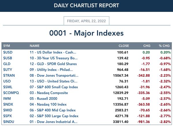
For the Week: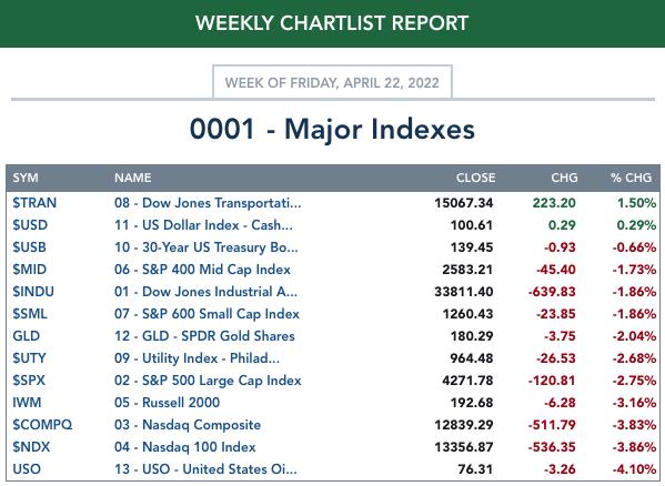
SECTORS
Each S&P 500 Index component stock is assigned to one of 11 major sectors. This is a snapshot of the Intermediate-Term (Silver Cross) and Long-Term (Golden Cross) Trend Model signal status for those sectors.
For Today: 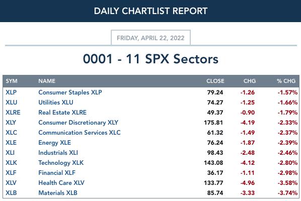
For the Week: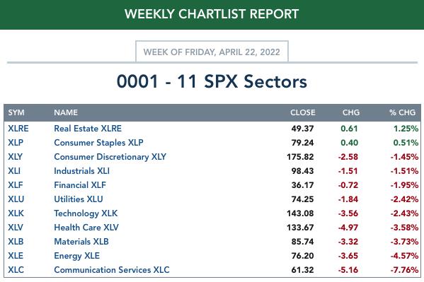
RRG® Charts
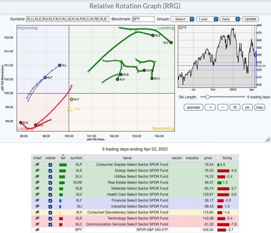
Short-term (Daily) RRG:
"Most Improved" award goes to Industrials (XLI) and Financials (XLF). Both are traveling strongly in the bullish northeast direction and are in the Improving quadrant.
Consumer Discretionary (XLY) has reversed headings and now has a bullish northeast heading as it moves toward Leading out of Weakening quadrant.
Most bearish are Technology (XLK) and Communication Services (XLC). Both are the only residents in the Lagging quadrant. XLK looks slightly better as it is at least trying to hook around toward the Improving quadrant.
The remainder are in the Leading quadrant. Currently Real Estate (XLRE) and Materials (XLB) have the most bullish heading (northeast). However, the others are comfortably seated in the Leading quadrant and don't appear ready to drop into the Weakening quadrant just yet.
Intermediate-Term (Weekly) RRG:
The longer-term RRG doesn't completely agree with the shorter-term, daily RRG.
XLK has a bearish southwest heading in the Lagging quadrant. On the daily version, it has a more bullish heading of northwest. XLC is in the Improving quadrant, not Lagging, but I wouldn't hold out much hope even in the longer term. XLY is healthier on weekly RRG given it is headed north toward the Improving quadrant.
Financials (XLF) is very bearish on the weekly RRG. With its bearish southwest heading, it should hit the Lagging quadrant very soon.
The others are situated in the Leading quadrant, similar to daily RRG. However, all but Energy (XLE) have bullish northeast headings in the longer term. XLE has shown leadership for so long, but it appears it is cooling.
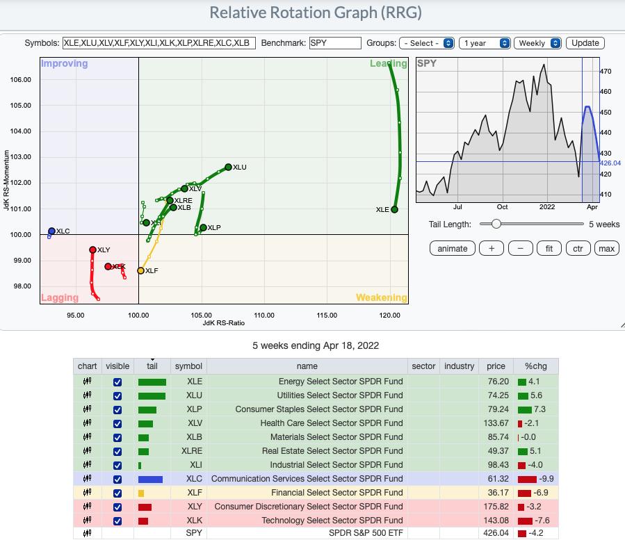
RRG® charts show you the relative strength and momentum for a group of stocks. Stocks with strong relative strength and momentum appear in the green Leading quadrant. As relative momentum fades, they typically move into the yellow Weakening quadrant. If relative strength then fades, they move into the red Lagging quadrant. Finally, when momentum starts to pick up again, they shift into the blue Improving quadrant.
CLICK HERE for an animated version of the RRG chart.
CLICK HERE for Carl's annotated Sector charts.
THE MARKET (S&P 500)
IT Trend Model: NEUTRAL as of 1/21/2022
LT Trend Model: BUY as of 6/8/2020
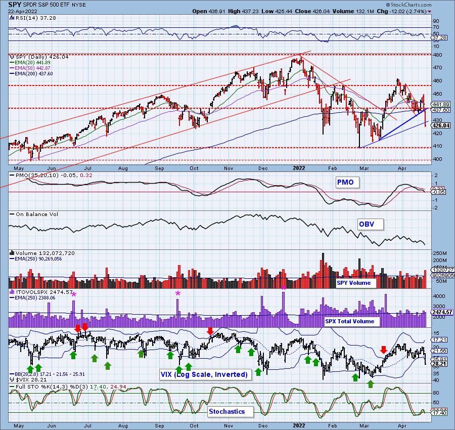
SPY Daily Chart: The decline from yesterday's high to today's low was -5.5%, but after the March price top, a down trend had not been established until today -- a top below a top and a bottom below a bottom. Volume was solid, but nowhere near blowout levels. The PMO has now dropped below the zero line.
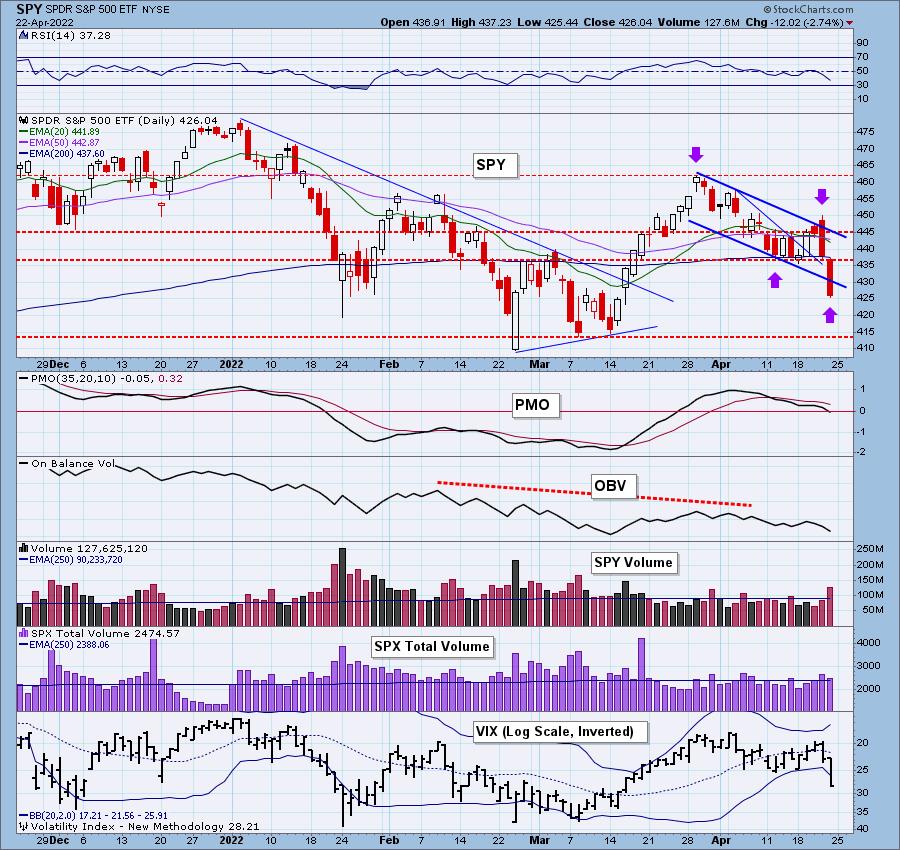
The intermediate-term rising trend was broken along with the short-term rising trend. Stochastics have turned down in negative territory. One bright spot would be the VIX easily penetrating the lower Bollinger Band on our inverted scale. This can many times lead to a rebound--short lived, but a rebound nonetheless. If we do not see that rebound on Monday, the bear market downward pressure will be the culprit.
Free DP Trading Room (4/18/2022) RECORDING LINK:
Topic: DecisionPoint Trading Room
Start Time: Apr 18, 2022 09:00 AM PT
Meeting Recording Link.
Access Passcode: April#18th
For best results, copy and paste the access code to avoid typos.
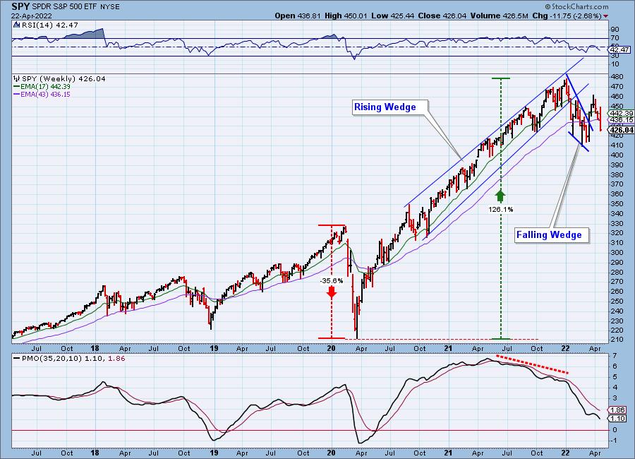
SPY Weekly Chart: The bullish falling wedge was confirmed with the upside breakout. Now we see the bear market rally breaking down quickly and painfully. The weekly PMO topped beneath its signal line and is accelerating downward.
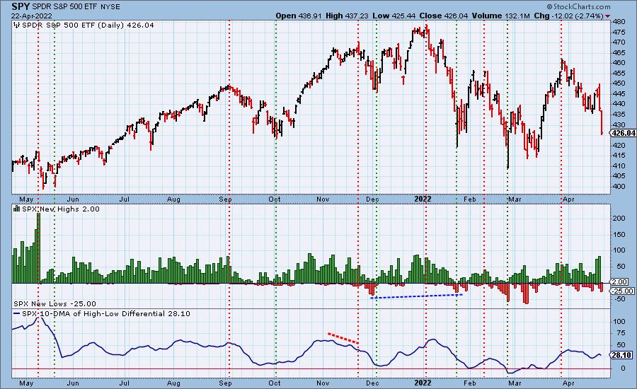
New 52-Week Highs/Lows: Not surprisingly, New Highs basically disappeared and New Lows expanded, although not to oversold levels.
Climax Analysis: Yesterday, we got a downside initiation climax, so today's climactic readings amount to a downside exhaustion climax. The VIX penetration of the lower Bollinger Band does suggest a rebound is possible, but given what we've seen over the past few weeks, bullish climaxes have not seen any real follow-through. We expect the result of this downside exhaustion climax will be some churn next week, but that's probably an optimistic outlook.
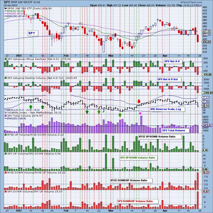
*A climax is a one-day event when market action generates very high readings in, primarily, breadth and volume indicators. We also include the VIX, watching for it to penetrate outside the Bollinger Band envelope. The vertical dotted lines mark climax days -- red for downside climaxes, and green for upside. Climaxes indicate either initiation or exhaustion.
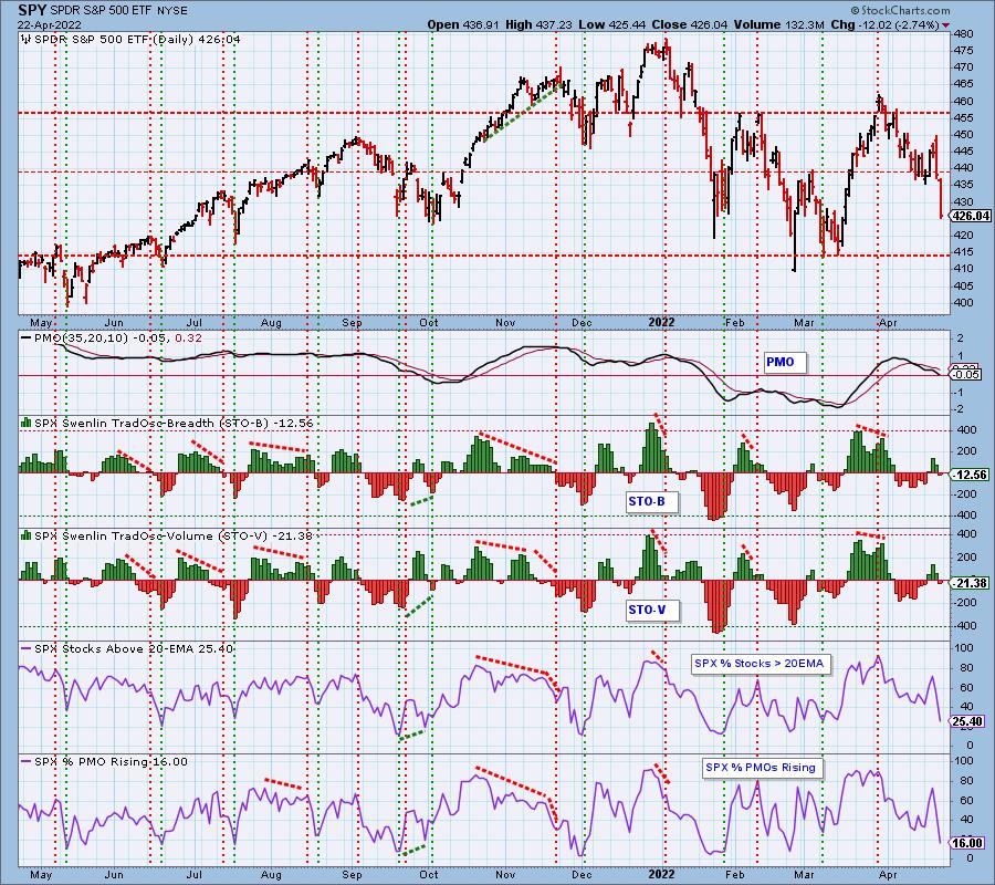
Short-Term Market Indicators: The short-term market trend is DOWN and the condition is NEUTRAL.
The STOs are falling and are in neutral territory which suggests more downside in the short term. However, we do note that %Stocks > 20-day EMA and %PMOs Rising are getting oversold, but let's face it, we've seen them move much lower before reversing.
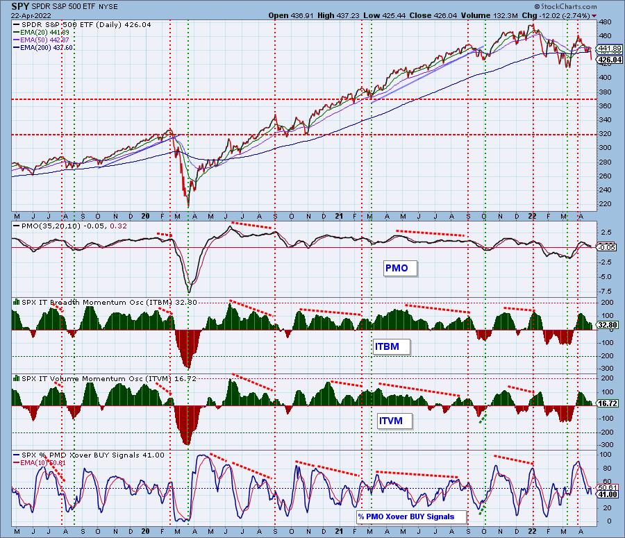
Intermediate-Term Market Indicators: The intermediate-term market trend is DOWN and the condition is NEUTRAL.
The ITBM/ITVM moved higher, but have now resumed their decline. %PMO crossover BUY signals topped at the 50% level and are no where near oversold.
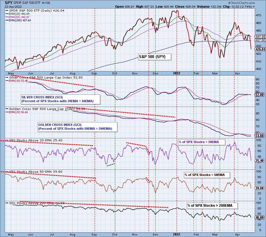
PARTICIPATION and BIAS Assessment: The following chart objectively shows the depth and trend of participation in two time frames.
- Intermediate-Term - the Silver Cross Index (SCI) shows the percentage of SPX stocks on IT Trend Model BUY signals (20-EMA > 50-EMA). The opposite of the Silver Cross is a "Dark Cross" -- those stocks are, at the very least, in a correction.
- Long-Term - the Golden Cross Index (GCI) shows the percentage of SPX stocks on LT Trend Model BUY signals (50-EMA > 200-EMA). The opposite of a Golden Cross is the "Death Cross" -- those stocks are in a bear market.
The following table summarizes participation for the major market indexes and sectors. The 1-Week Change columns inject a dynamic aspect to the presentation.
This table is sorted by SCI values. This gives a clear picture of strongest to weakest index/sector in terms of participation.
The bias is clearly bearish in all three timeframes, we don't need to tell you that. As noted on XLK in the opening, we do not want to see %Stocks > 20-EMA to be less than %Stocks > 50-day EMA. Insult to injury is %Stocks > 200-day EMA is even lower than %Stocks > 50-day EMA. This implies continued weakness ahead. When we see the opposite where %Stocks percentages move higher to lower, that suggests improvement is on the way.
CONCLUSION: This week we saw three climax days. The first was a bullish upside initiation climax that resulted only in a higher intraday high not a higher close. The next climax was a bearish downside initiation climax. That resulted in a spectacular decline today. Therefore, we aren't pinning much hope on today's downside exhaustion climax. The VIX does seem to suggest a rebound ahead, but with bearish results on the climaxes, we aren't so sure. It is time to evaluate all of your positions and see if they can weather the storm ahead. Today, the best performing sector was XLP and it was down -1.57%! There aren't too many places to hide right now.
Erin is 20% exposed to the market, but will be paring that down to 10% or lower next week.
Have you subscribed the DecisionPoint Diamonds yet? DP does the work for you by providing handpicked stocks/ETFs from exclusive DP scans! Add it with a discount! Contact support@decisionpoint.com for more information!
BITCOIN
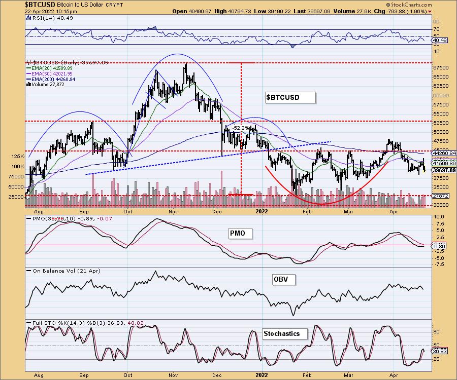
The cup with handle pattern is being busted. The breakout from the "handle" has amounted to a drift sideways rather than a strong rising trend. Indicators have reversed and look very negative which leads us to believe Bitcoin is headed down to test $32,500.
INTEREST RATES
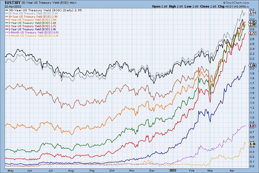
Yields pulled back slightly this week, but hardly enough to notice. The steep rising trends remain.
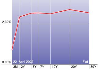
The Yield Curve Chart from StockCharts.com shows us the inversions taking place. The red line should move higher from left to right. Inversions are occurring where it moves downward.
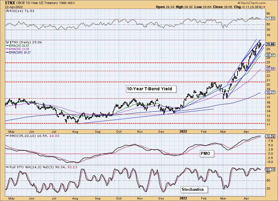
10-YEAR T-BOND YIELD
$TNX is in a rising trend channel, but within it, there is a bearish rising wedge. The RSI is overbought and the PMO is looking a bit toppy in overbought territory. Stochastics remain strong as they oscillate above 80. We don't expect to see a big breakdown, possibly a pause similar to the end of March.
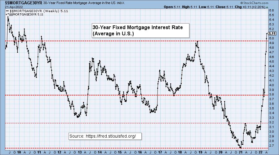
MORTGAGE INTEREST RATES (30-Yr)**
**We watch the 30-Year Fixed Mortgage Interest Rate, because, for the most part, people buy homes based upon the maximum monthly payment they can afford. As rates rise, a fixed monthly payment will carry a smaller mortgage amount. As buying power shrinks, home prices will come under pressure.
--
Every week this chart looks uglier and uglier. So far we haven't seen an appreciable difference in home prices locally in Southern California, possibly due to a shortage in inventory. We expect that to change as home prices will need to come down to attract buyers.

DOLLAR (UUP)
IT Trend Model: BUY as of 6/22/2021
LT Trend Model: BUY as of 8/19/2021
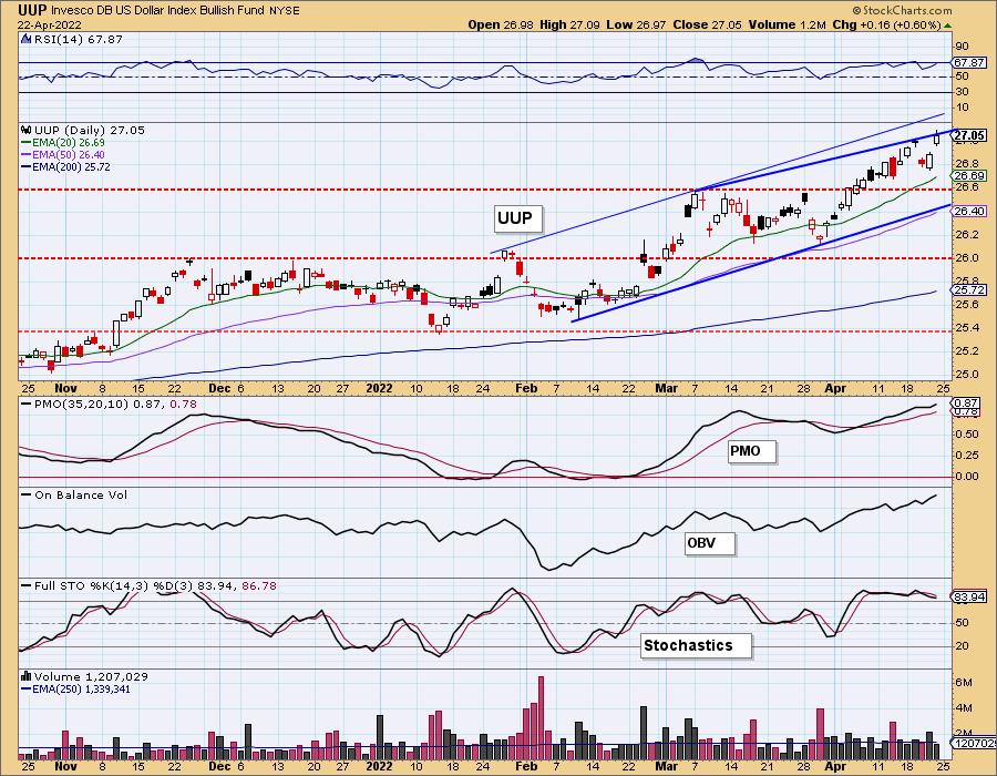
UUP Daily Chart: The Dollar had its second down day this month, last Wednesday, but it is back to rising again. The PMO bottom above the signal line and Stochastics oscillating above 80, suggest to us price will test the top of the short-term rising trend channel. However, we do note price hasn't quite escaped the bearish rising wedge within that rising trend channel.
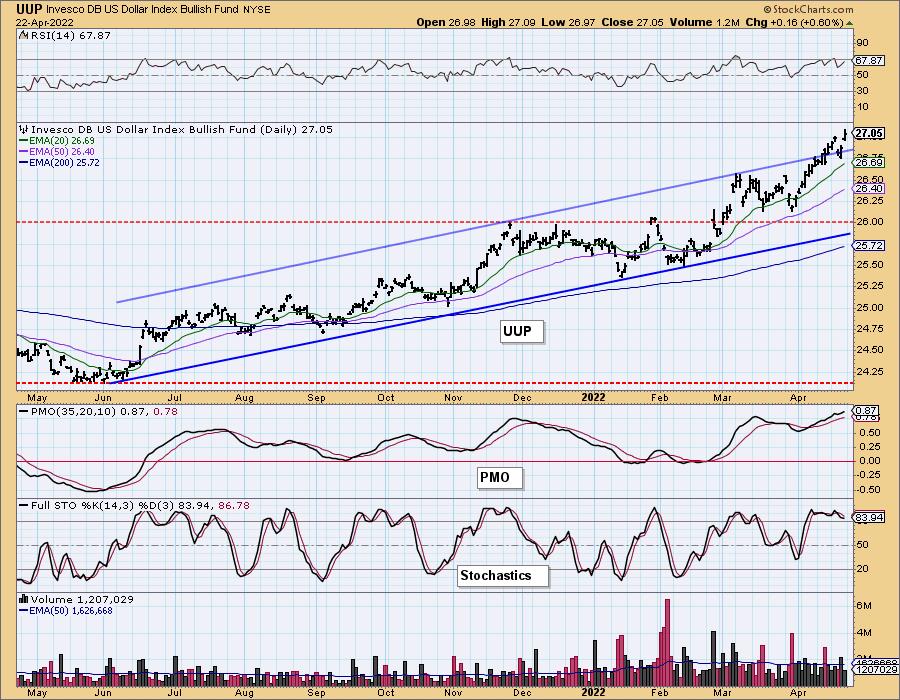
Price bullishly broke through the top of the intermediate-term rising trend channel. This is especially bullish.
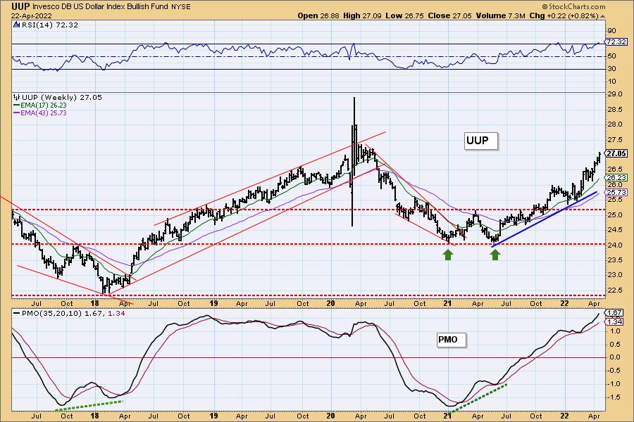
UUP Weekly Chart: The weekly RSI and PMO are overbought, but that's about all that is a problem on the weekly chart. The weekly PMO is rising strongly. We don't see any real overhead resistance until we hit the 2020 highs.
GOLD
IT Trend Model: BUY as of 12/29/2021
LT Trend Model: BUY as of 1/12/2022
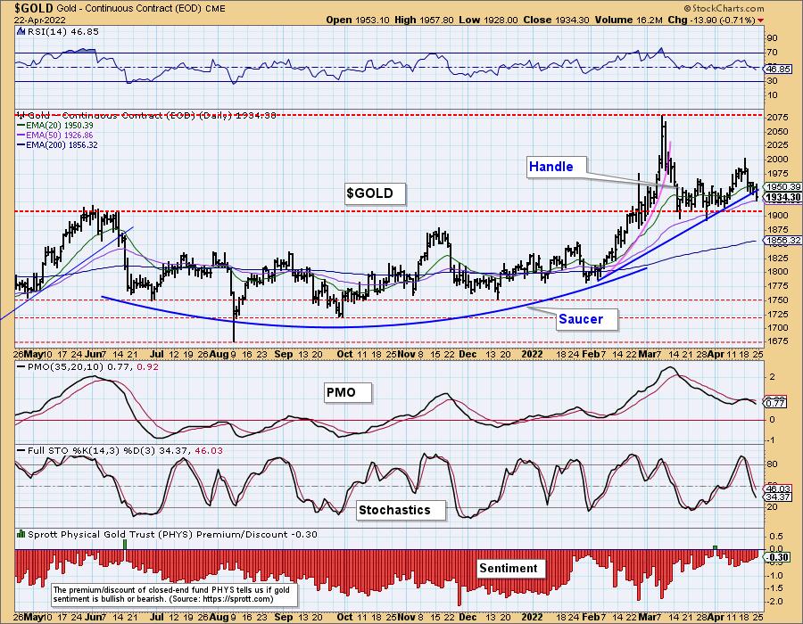
GOLD Daily Chart: With the Dollar rising strongly, Gold has had a hard time. It did manage to rally until this week. The indicators are especially negative with the RSI moving below net neutral (50) and the PMO generating a whipsaw SELL signal. Stochastics aren't encouraging either.
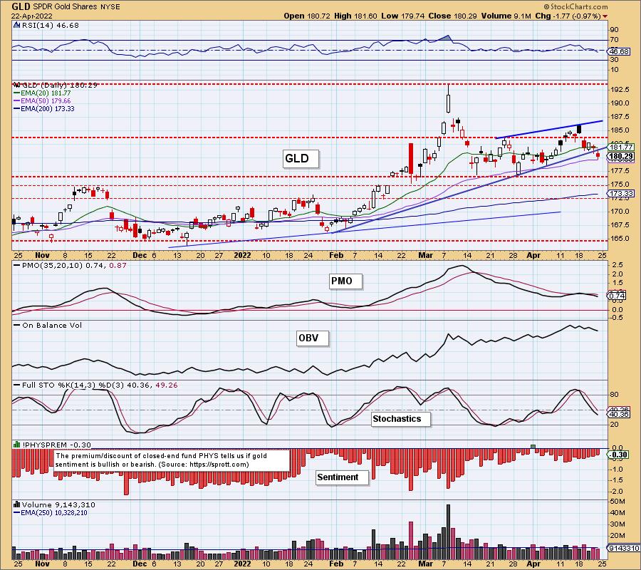
We would like Gold to hold above the 50-day EMA, but it appears support will be tested soon at $1900.
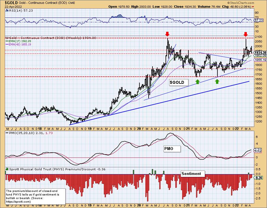
GOLD Weekly Chart: We are concerned when we look at this weekly chart that a bearish double-top might be in the works. It's very early to call it, but it something we should have in the back of our minds. The weekly RSI is still positive and the weekly PMO is still technically rising. Discounts aren't that large so investors aren't that bearish on Gold, but the technicals are suspect.
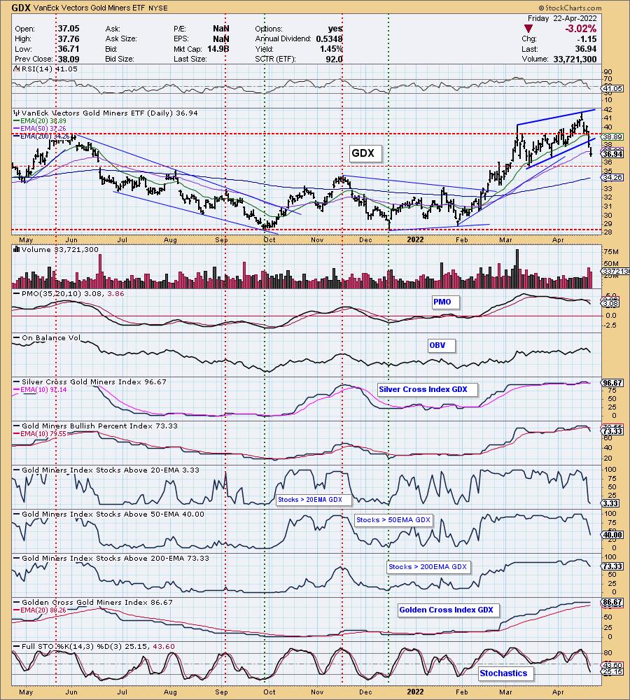
GOLD MINERS Golden and Silver Cross Indexes: Gold Miners enjoyed a stunning rally out of the January low, but the group is beginning to fall apart. The GCI and SCI may be above 70%, but the %Stocks indicators are completely falling apart. We question whether support at $35.50 will hold given the swift decline and close beneath the 50-day EMA. Look out below!
CRUDE OIL (USO)
IT Trend Model: BUY as of 1/3/2022
LT Trend Model: BUY as of 3/9/2021
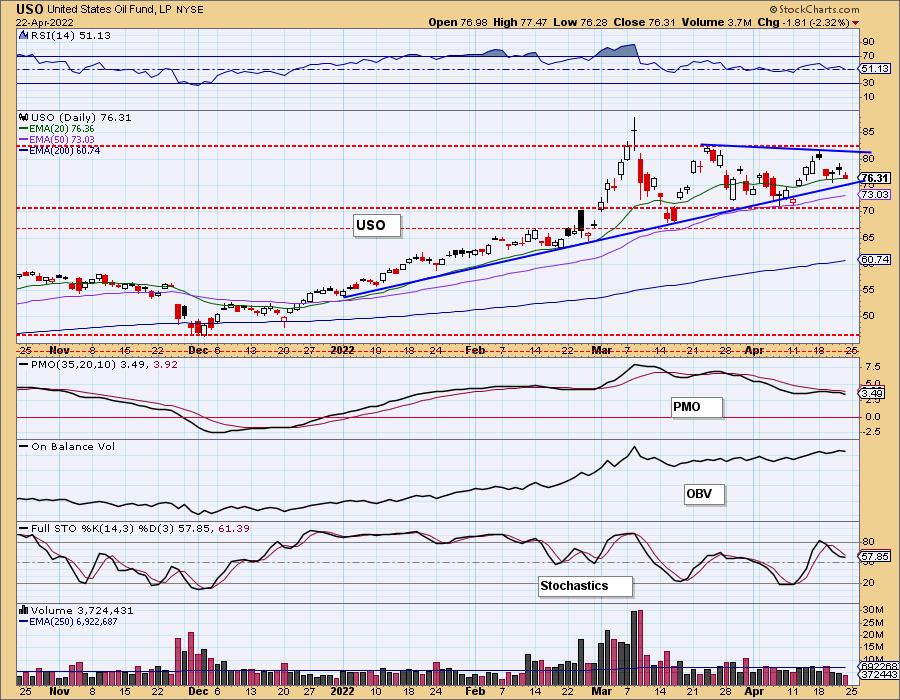
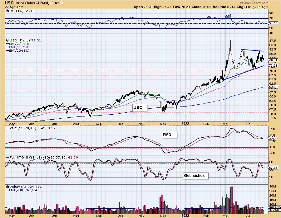
USO Daily Chart: Crude Oil is traveling within a symmetrical triangle pattern. These are continuation patterns and suggest an upside breakout ahead. The indicators don't favor that conclusion given the PMO top beneath the signal line and Stochastics falling.
There is a longer-term symmetrical triangle on the one-year chart, but it does appear that price is ready to test the bottom of the triangle before breaking out.
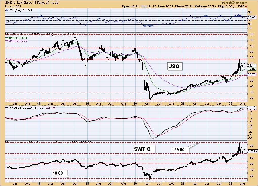
USO/$WTIC Weekly Chart: USO hit overhead resistance and then began forming this symmetrical triangle. The weekly RSI is positive and we didn't really see any damage to the weekly PMO despite an over 4% decline this week. We expect Crude Oil prices to continue higher given the geopolitical economic war with Russia.
BONDS (TLT)
IT Trend Model: NEUTRAL as of 1/5/2022
LT Trend Model: SELLas of 1/19/2022
TLT Daily Chart: Bonds continue to languish. Indicators are still negative or at best flat depending on how you look at it.
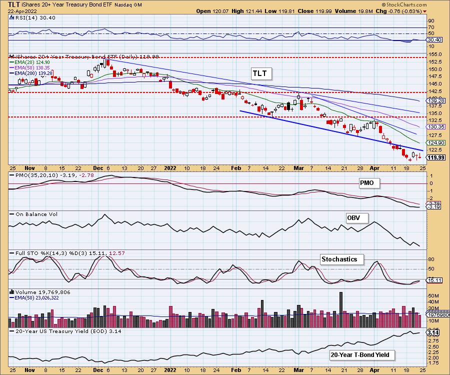
When you see a breakdown from a bullish falling wedge and then failed attempts to reenter the wedge, it can be read as very bearish.
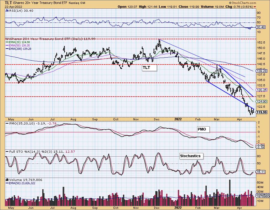
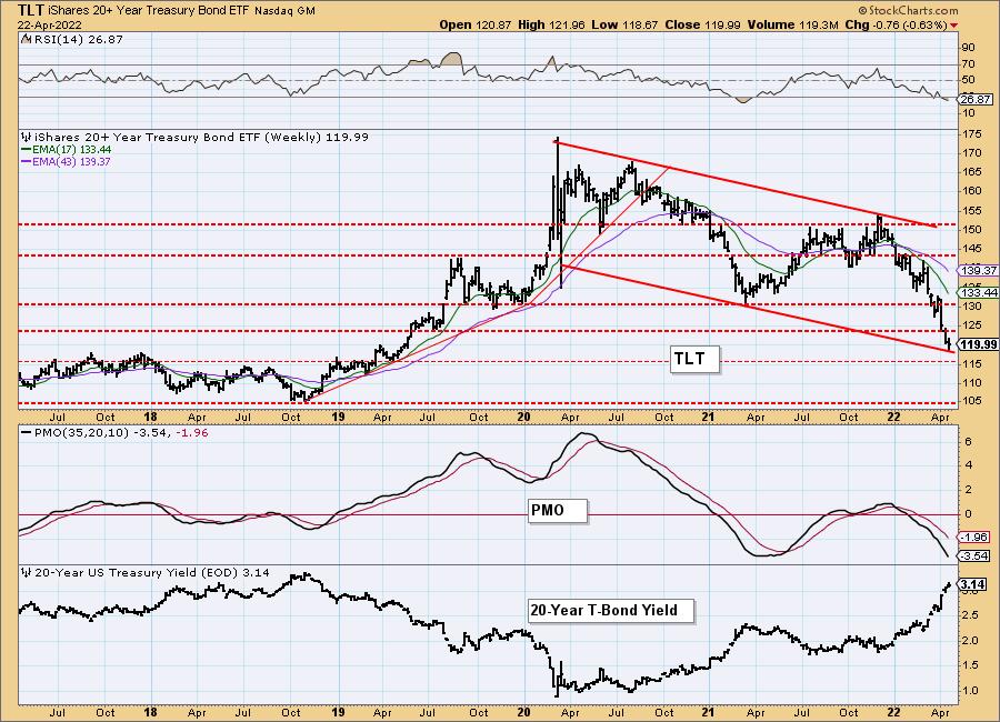
TLT Weekly Chart: Bonds prices are now about to test support near 2017/2018 highs. The strongest support lies at the 2018 low. Given the very negative weekly PMO and weekly RSI, combined with interest rates soaring, we do not expect a rebound here. Prepare for TLT to drop to $105.
Technical Analysis is a windsock, not a crystal ball. --Carl Swenlin
(c) Copyright 2022 DecisionPoint.com
Disclaimer: This blog is for educational purposes only and should not be construed as financial advice. The ideas and strategies should never be used without first assessing your own personal and financial situation, or without consulting a financial professional. Any opinions expressed herein are solely those of the author, and do not in any way represent the views or opinions of any other person or entity.
NOTE: The signal status reported herein is based upon mechanical trading model signals, specifically, the DecisionPoint Trend Model. They define the implied bias of the price index based upon moving average relationships, but they do not necessarily call for a specific action. They are information flags that should prompt chart review. Further, they do not call for continuous buying or selling during the life of the signal. For example, a BUY signal will probably (but not necessarily) return the best results if action is taken soon after the signal is generated. Additional opportunities for buying may be found as price zigzags higher, but the trader must look for optimum entry points. Conversely, exit points to preserve gains (or minimize losses) may be evident before the model mechanically closes the signal.
Helpful DecisionPoint Links:
DecisionPoint Alert Chart List
DecisionPoint Golden Cross/Silver Cross Index Chart List
DecisionPoint Sector Chart List
Price Momentum Oscillator (PMO)
Swenlin Trading Oscillators (STO-B and STO-V)
DecisionPoint is not a registered investment advisor. Investment and trading decisions are solely your responsibility. DecisionPoint newsletters, blogs or website materials should NOT be interpreted as a recommendation or solicitation to buy or sell any security or to take any specific action.
