
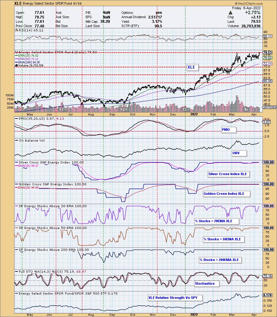
After consolidating for weeks, XLE is finally breaking out. Sure, it could be a fake out breakout, but the indicators are very favorable. The RSI is positive and not overbought, the PMO is rising toward a crossover BUY signal and Stochastics have turned up in positive territory. What's most impressive are the participation numbers. Every participation indicator is reading at 100%! This means that EVERY Energy stock not only has a "Silver Cross" and "Golden Cross" in effect, EVERY stock has price above the 20/50/200-day EMAs. Strength begets strength and that is what we're counting on.
The DecisionPoint Alert Weekly Wrap presents an end-of-week assessment of the trend and condition of the Stock Market, the U.S. Dollar, Gold, Crude Oil, and Bonds. The DecisionPoint Alert daily report (Monday through Thursday) is abbreviated and gives updates on the Weekly Wrap assessments.
Watch the latest episode of DecisionPoint on StockCharts TV's YouTube channel here!
MAJOR MARKET INDEXES
For Today: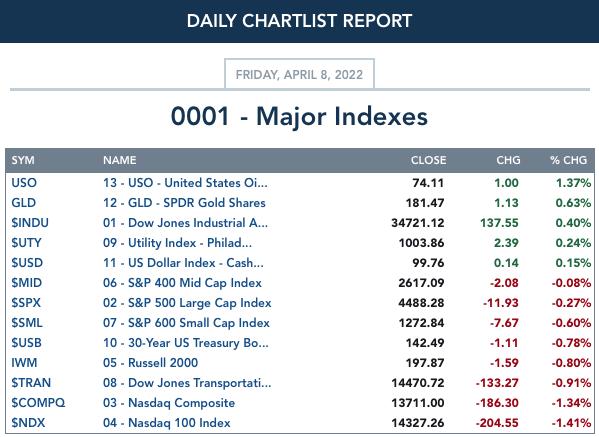
For the Week: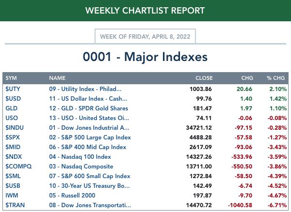
SECTORS
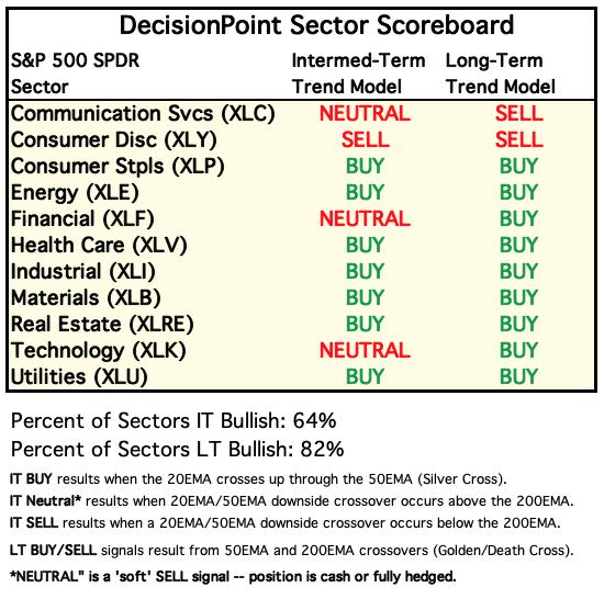
Each S&P 500 Index component stock is assigned to one of 11 major sectors. This is a snapshot of the Intermediate-Term (Silver Cross) and Long-Term (Golden Cross) Trend Model signal status for those sectors.
For Today: 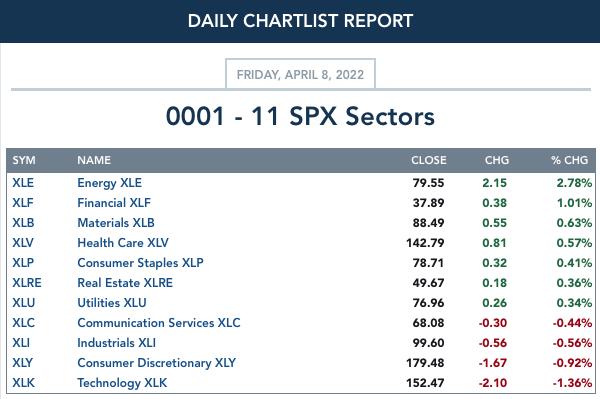
For the Week: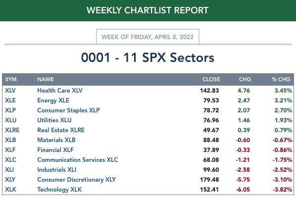
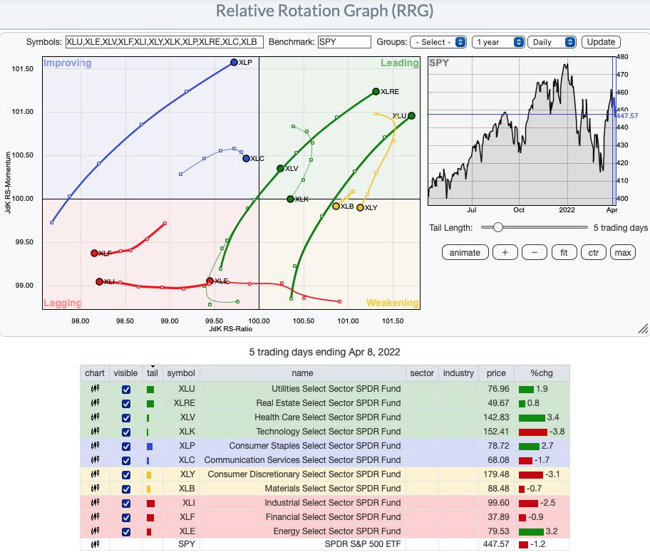
Short-term (Daily) RRG:
What is most remarkable about the short-term RRG is that all of the best relative performers are defensive sectors, Utilities (XLU), Real Estate (XLRE), Healthcare (XLV) and Consumer Staples (XLP). When defensive areas of the market begin leading, that is generally a sign of future broad market decline.
Aggressive sectors, Technology (XLK), Consumer Discretionary (XLY) and Communication Services (XLC) are the most bearish. XLY is particularly bearish given it has entered the Weakening quadrant and XLC isn't as bearish given it still has an eastward heading and is in the Improving quadrant.
XLB was in Leading most of the week, but has reversed and is now in the Weakening quadrant. This could be due to the slight decline in Gold and Gold Miners that we saw this week.
XLF, XLE and XLI are the most bearish given their residence in the Lagging quadrant and bearish westward headings.
Intermediate-Term (Weekly) RRG:
Interestingly when we move the timeframe out, the picture is similar with a change in leadership. We still see Utilities (XLU), Healthcare (XLV) and Real Estate (XLRE) as being the most bullish given their headings are taking them further into the Leading quadrant but we can also add Materials (XLB) in this timeframe.
XLE looks much better on the intermediate term chart as it resides in the Leading quadrant and is very far from the center of the graph (that represents the benchmark SPY). It does have a southward heading and is showing some signs of intermediate-term weakness.
Most bearish are XLC, XLF and XLI, in that order. XLC just dropped back into the Lagging quadrant and has a bearish southwest heading that will take it further into Lagging. XLF has a bearish southwest heading, but it is only in the Weakening quadrant. XLI has a bearish southwest heading, but it is still in the Leading quadrant.
Aggressive sectors XLK and XLY have been Lagging for weeks, but they are showing slight improvement with a more northward heading.
That leaves XLP. It is hanging onto the Leading quadrant, but has a bearish southwest heading that will take it into "Weakening" soon. Still, "Weakening" is better than "Lagging".
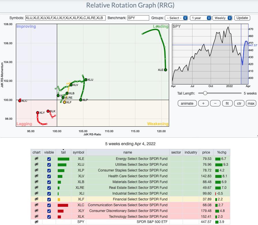
RRG® charts show you the relative strength and momentum for a group of stocks. Stocks with strong relative strength and momentum appear in the green Leading quadrant. As relative momentum fades, they typically move into the yellow Weakening quadrant. If relative strength then fades, they move into the red Lagging quadrant. Finally, when momentum starts to pick up again, they shift into the blue Improving quadrant.
CLICK HERE for an animated version of the RRG chart.
CLICK HERE for Carl's annotated Sector charts.
THE MARKET (S&P 500)
IT Trend Model: NEUTRAL as of 1/21/2022
LT Trend Model: BUY as of 6/8/2020
SPY Daily Chart: We note the OBV negative divergence -- while this month's price highs exceeded the February price highs, OBV is nowhere near confirming. The RSI while positive is nearing negative territory below net neutral (50). The PMO is topping. Total Volume hit its weekly high on the Wednesday decline.
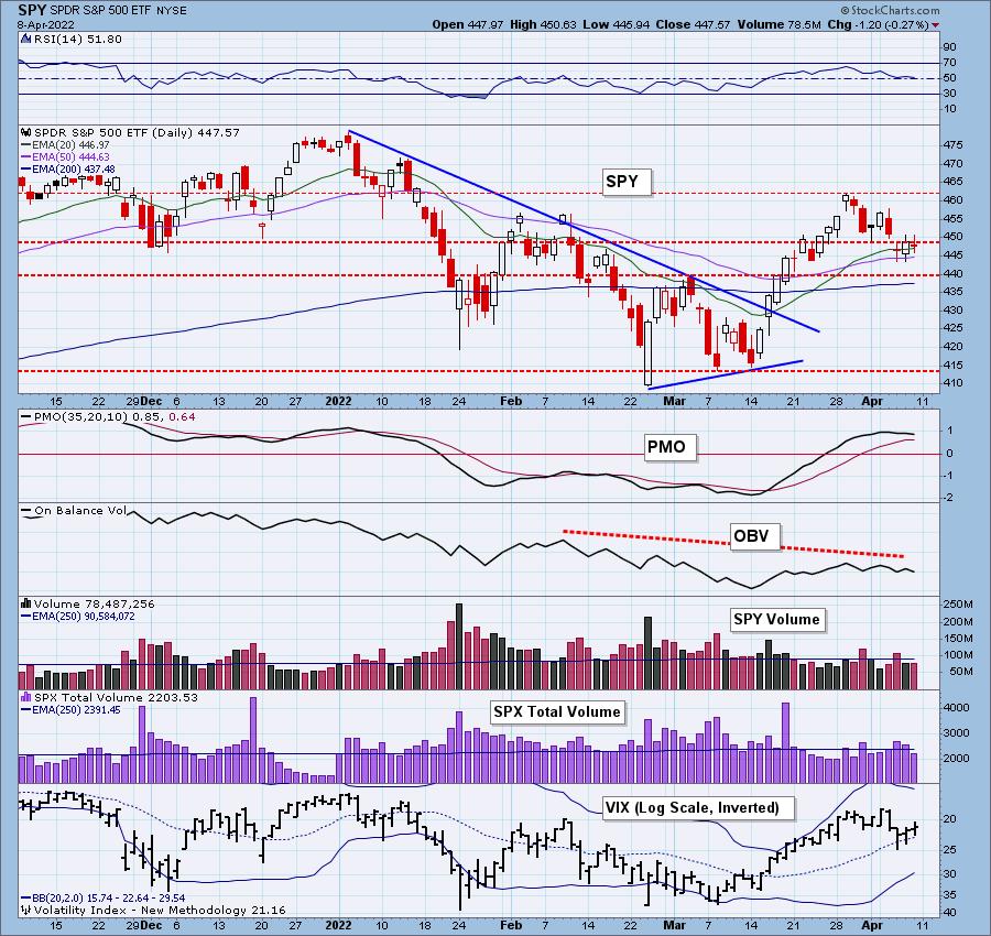
The VIX is holding above its moving average on our inverted scale and that does imply some relative strength, but Stochastics also measure internal strength and they are falling fast in negative territory.
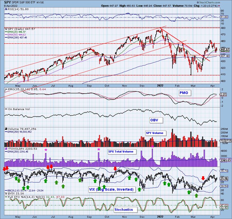
SPY Weekly Chart: This is the first week the SPY has finished lower since breaking out of the bullish falling wedge. We got the expected upside breakout, but it doesn't look like we will get more upside. The weekly RSI is still positive but it is falling and most bearish is the weekly PMO topping well below its signal line.
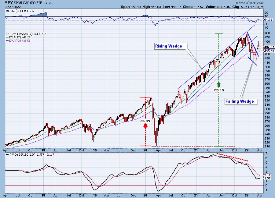
New 52-Week Highs/Lows: Despite today's decline, New Highs expanded. Our best guess is that it is a function of strong stocks continuing to rise rather than new strength.
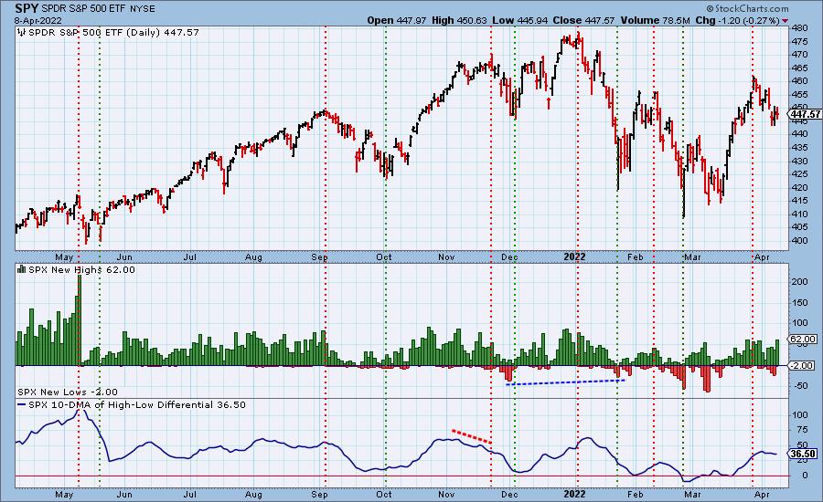
Climax Analysis: No climaxes today. We saw only one climax day this week that we labeled a downside exhaustion climax. We did see an initial drop, but since then it has been consolidating sideways.
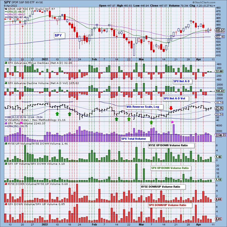
*A climax is a one-day event when market action generates very high readings in, primarily, breadth and volume indicators. We also include the VIX, watching for it to penetrate outside the Bollinger Band envelope. The vertical dotted lines mark climax days -- red for downside climaxes, and green for upside. Climaxes indicate either initiation or exhaustion.
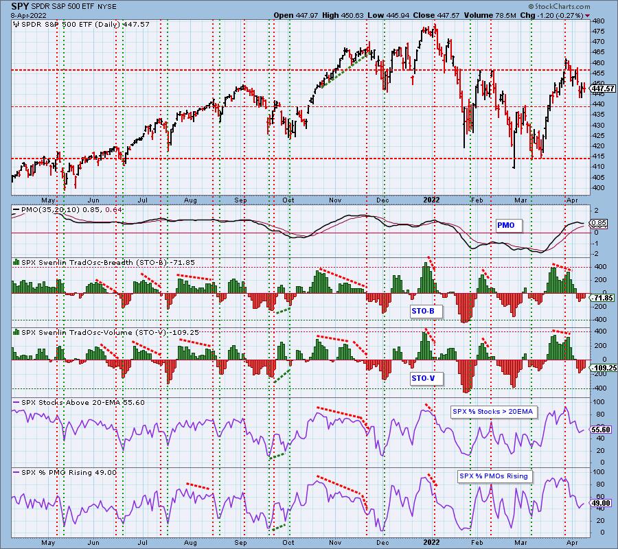
Short-Term Market Indicators: The short-term market trend is DOWN and the condition is NEUTRAL.
STOs have started rising which is positive, but the STO-B didn't move much. Participation of stocks above their 20-day EMA rose, but the reading is well below the 70% bullish threshold. We saw a slight expansion in PMOs Rising but we only have half of the SPX with rising momentum.
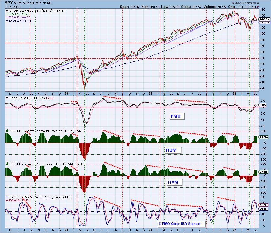
Intermediate-Term Market Indicators: The intermediate-term market trend is DOWN and the condition is OVERBOUGHT.
The ITBM/ITVM are both falling, but remain in overbought territory. They can accommodate plenty of downside in the intermediate term. PMO crossover BUY signals continue to diminish.
PARTICIPATION and BIAS Assessment: The following chart objectively shows the depth and trend of participation in two time frames.
- Intermediate-Term - the Silver Cross Index (SCI) shows the percentage of SPX stocks on IT Trend Model BUY signals (20-EMA > 50-EMA). The opposite of the Silver Cross is a "Dark Cross" -- those stocks are, at the very least, in a correction.
- Long-Term - the Golden Cross Index (GCI) shows the percentage of SPX stocks on LT Trend Model BUY signals (50-EMA > 200-EMA). The opposite of a Golden Cross is the "Death Cross" -- those stocks are in a bear market.
The following table summarizes participation for the major market indexes and sectors. The 1-Week Change columns inject a dynamic aspect to the presentation.
XLP saw a big gain in Silver Crosses among its members while the Dow 20 Transports saw the worst decline in Silver Crosses. You'll note as we discussed in the opening that XLE has 100% of members with Silver Crosses and Golden Crosses. However, we also can see that the DJ 15 Utilities also have 100% of members with Silver and Golden Crosses.
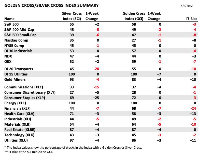
The short-term bias is neutral. We have roughly the same percentage of stocks above their 20/50-day EMAs as the Silver Cross percentage. This tells us that we likely won't see the SCI rise much more, if at all.
The intermediate-term bias is bearish given the SCI is well below the 70% bullish threshold. It did turn back up this week, but it still looks toppy.
The long-term bias is bearish. Not only is the GCI below 70% and falling, we also have a smaller percentage of stocks above their 50/200-day EMAs as compared to the GCI.
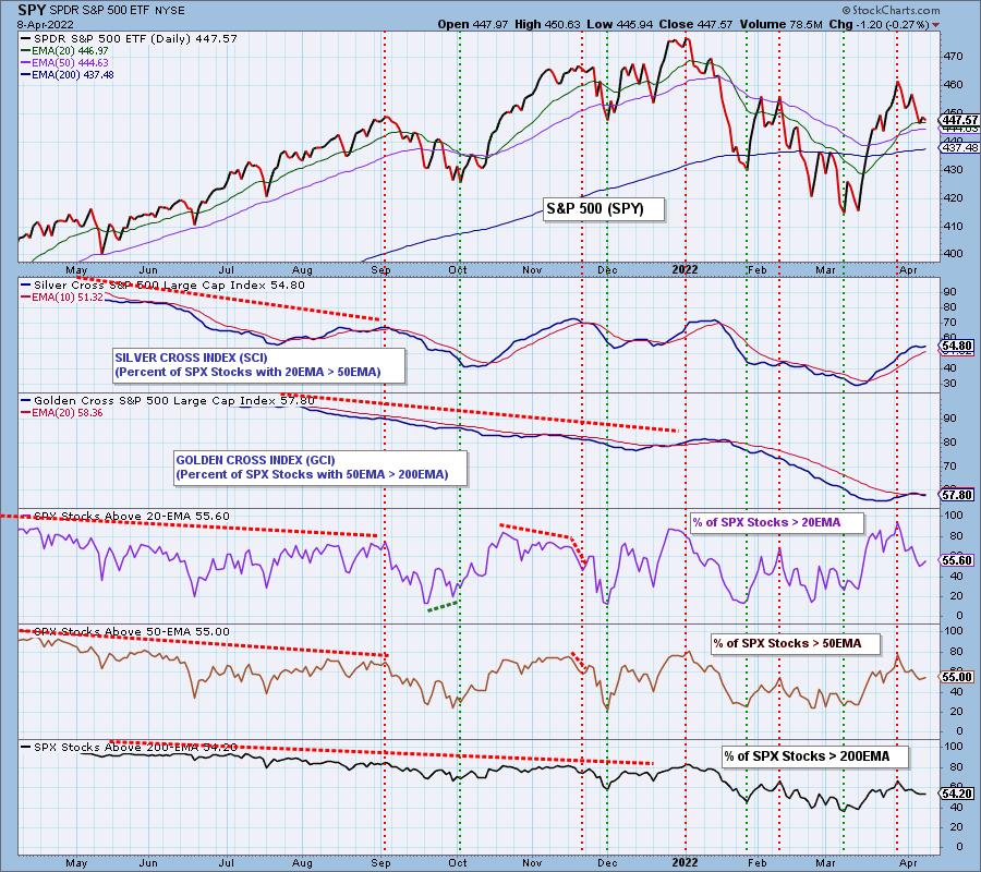
CONCLUSION: Price is holding above key moving averages on the SPY, but we are expecting a breakdown given the bearish bias in all three timeframes and contracting intermediate-term indicators. While the STOs look somewhat bullish as they rise, we need to see more than 50% of the SPX with rising momentum if a new rally is going to begin. Defensive sectors are showing leadership while aggressive sectors are fading fast. Typically when defensive sectors lead, we will see price deterioration in the broad market. Likely want to shrink exposure in aggressive groups and expand in defensive groups. However, less overall exposure is safest. Tighten stops and continue to babysit all of your positions.
Erin is 15% exposed to the market.
Calendar: Next week the market will be closed for Good Friday, so Thursday will be the last day to trade options before monthly expiration. Expect low volatility near the end of the week.
Have you subscribed the DecisionPoint Diamonds yet? DP does the work for you by providing handpicked stocks/ETFs from exclusive DP scans! Add it with a discount! Contact support@decisionpoint.com for more information!
BITCOIN
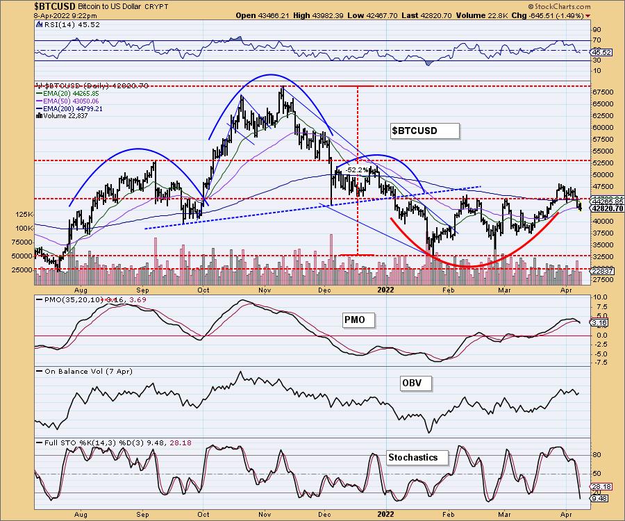
Bitcoin pulled back this week and is currently below its 20/50-day EMAs. This looks like a bullish cup with handle pattern, but given the new PMO SELL signal, negative RSI and vertically falling Stochastics, we expect the handle to extend down a bit further.
INTEREST RATES
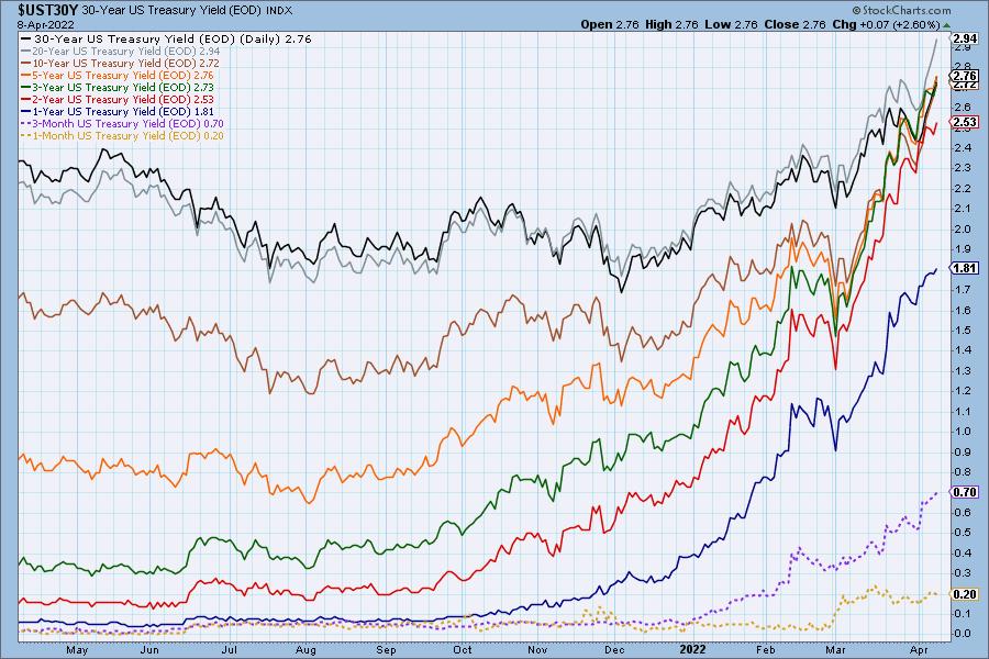
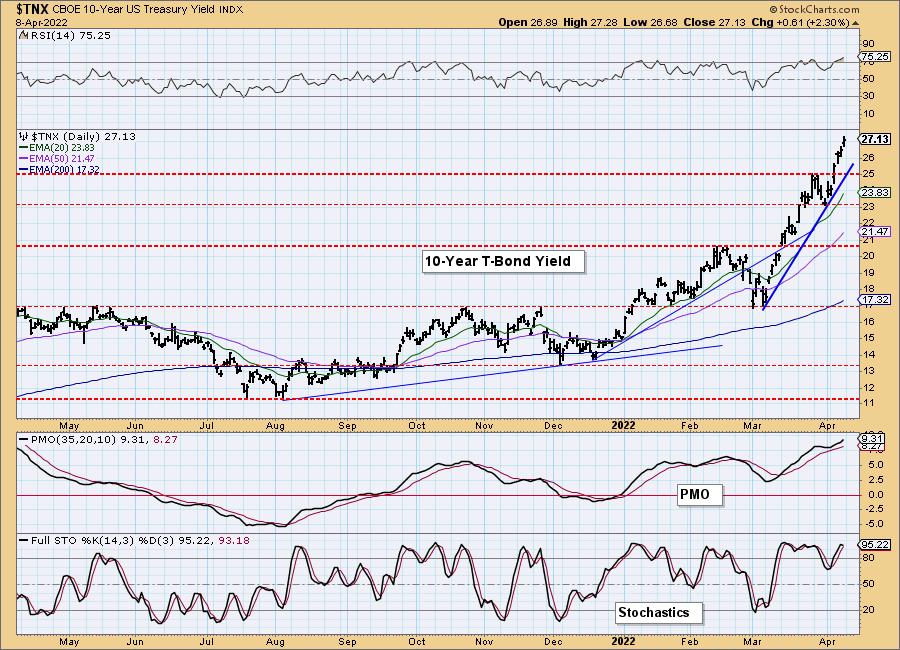
Rates continue to skyrocket and at this point we don't see any relief ahead.
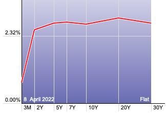
The Yield Curve Chart from StockCharts.com shows us the inversions taking place. The red line should move higher from left to right. Inversions are occurring where it moves downward.
10-YEAR T-BOND YIELD
$TNX continues to rise on a steep rising trendline. The RSI is very overbought, but that condition can and will persist. The PMO has bottomed above the signal line which is very bullish. Stochastics are healthy right now and oscillating above 80.
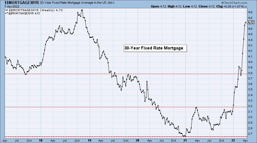
MORTGAGE INTEREST RATES (30-Yr)**
**We watch the 30-Year Fixed Mortgage Interest Rate, because, for the most part, people buy homes based upon the maximum monthly payment they can afford. As rates rise, a fixed monthly payment will carry a smaller mortgage amount. As buying power shrinks, home prices will come under pressure.
--
The 30-year mortgage rate moved a small tick upward -- from 4.67% to 4.72%.

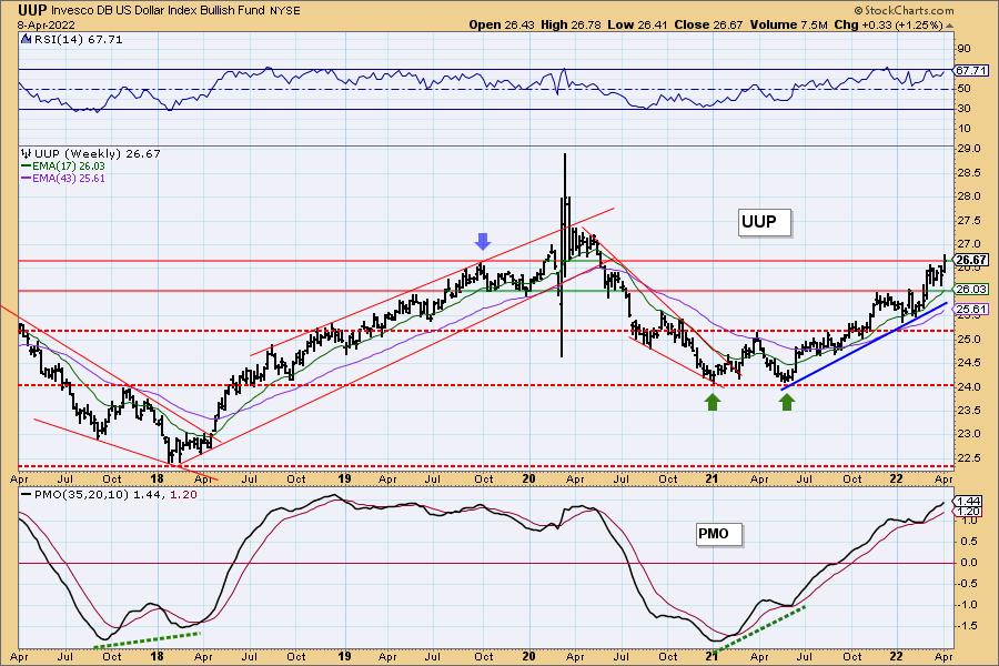
DOLLAR (UUP)
IT Trend Model: BUY as of 6/22/2021
LT Trend Model: BUY as of 8/19/2021
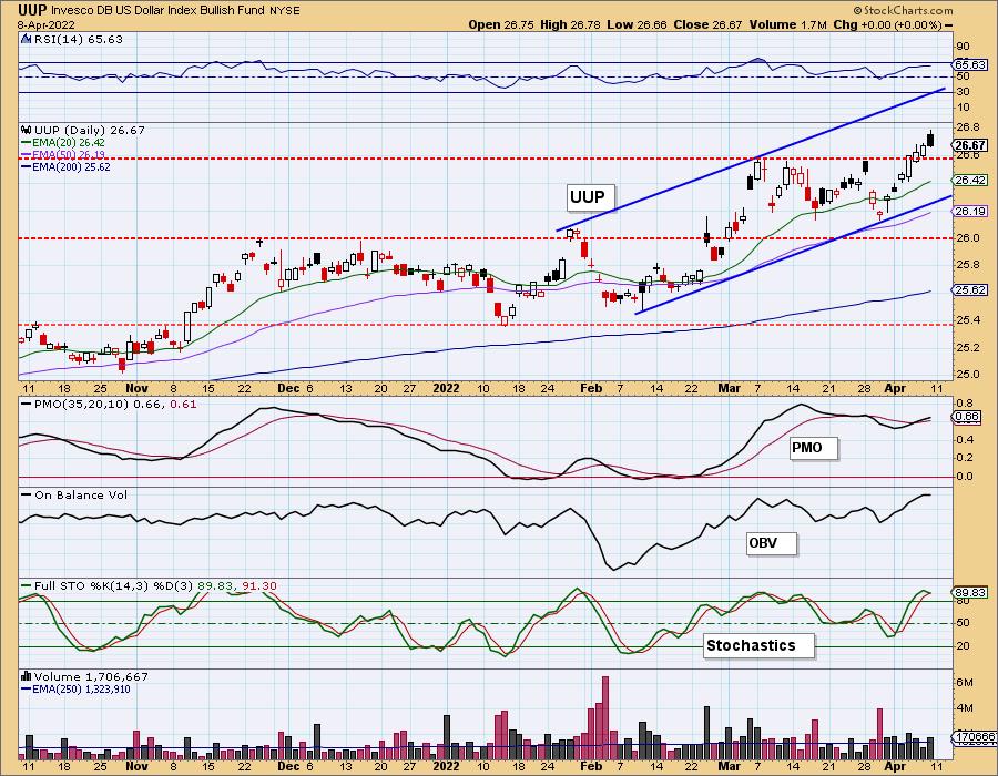
UUP Daily Chart: The Dollar is rising nicely after breaking out above March highs. We've now been able to annotate a short-term rising trend channel. Indicators are favorable with a positive RSI, PMO rising on a BUY signal and Stochastics above 80.
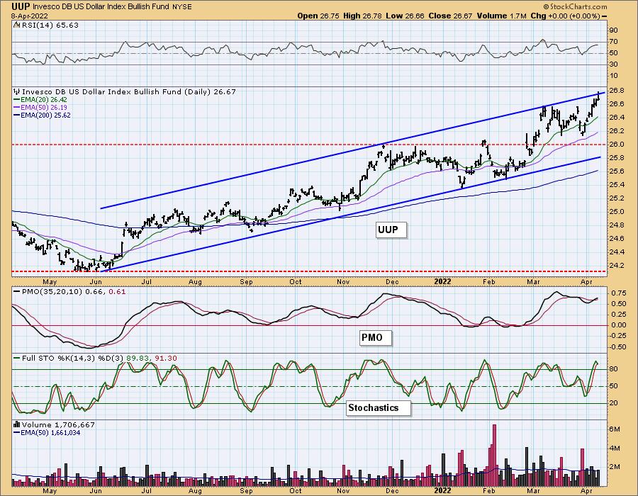
Not only do we have short-term rising trend channel, we've been watching a long-term rising trend channel. Price is hitting the top of the channel, but we're not expecting it to breakdown yet. More likely it will hug the top of the channel and continue to rise.
UUP Weekly Chart: Price is now testing the 2019 high. Given the weekly RSI is positive and rising, and the weekly PMO also rising, we expect a breakout.
GOLD
IT Trend Model: BUY as of 12/29/2021
LT Trend Model: BUY as of 1/12/2022
GOLD Daily Chart: Gold got a boost this week, but it really hasn't made much headway. Given a strong rally in the Dollar this week, it was good to see Gold gain some ground. The RSI is positive and rising. The PMO is beginning to decelerate. Stochastics are rising in positive territory.
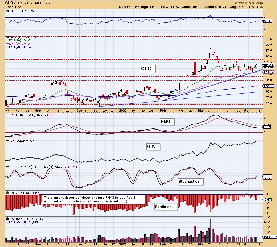
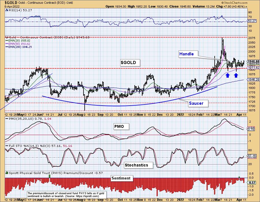
We have saucer bottom combined with a handle which is bullish for Gold. Discounts are increasing, but they are still low suggesting investors are not that bearish on Gold.
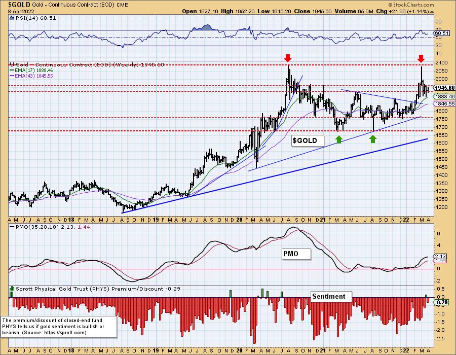
GOLD Weekly Chart: We are monitoring a possible bearish double-top pattern. It's far too early to think of a collapse in price, but it should be monitored. The weekly RSI is positive and the weekly PMO, though decelerating, is still rising on a crossover BUY signal.
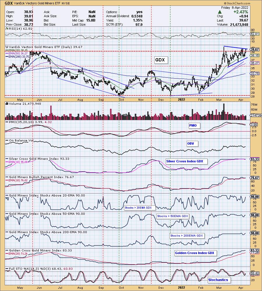
GOLD MINERS Golden and Silver Cross Indexes: We have a symmetrical triangle pattern or pennant on a flagpole. Both are continuation patterns and suggest an upside breakout. The RSI is positive, but the PMO is still on a crossover SELL signal. Stochastics are rising after bottoming in positive territory above net neutral (50). Participation is strong with all participation indicators reading above 70%. We saw a speed bump on %Stocks > 20-day EMA, but it has recovered.
CRUDE OIL (USO)
IT Trend Model: BUY as of 1/3/2022
LT Trend Model: BUY as of 3/9/2021
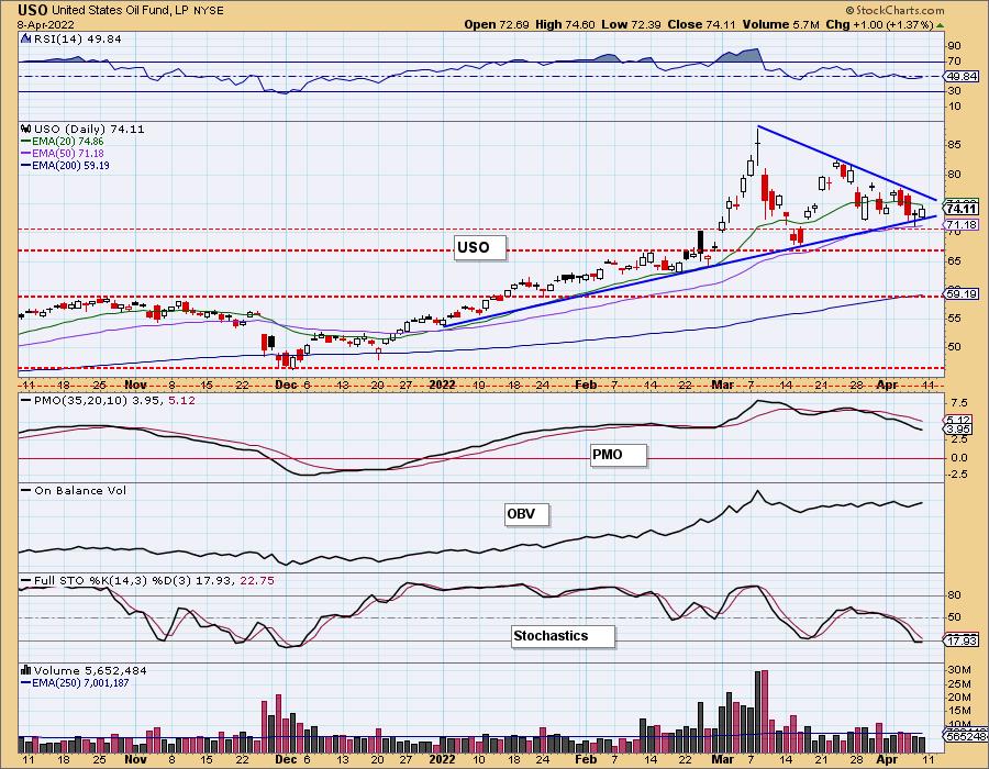
USO Daily Chart: USO was mostly unchanged this week. We have another symmetrical triangle continuation pattern suggesting an upside breakout. Indicators aren't quite positive yet, but we do see that Stochastics are bottoming and the RSI isn't that far from reaching positive territory.
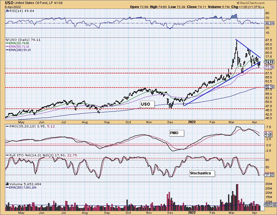
In the longer term, the rising bottoms trendline has been breached, but the 50-day EMA is holding as support.
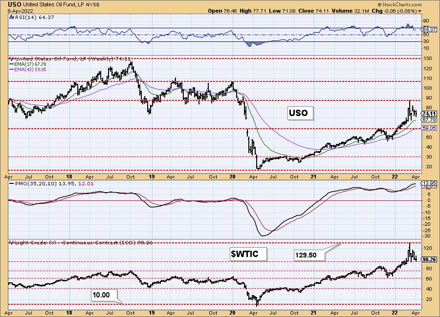
USO/$WTIC Weekly Chart: Price hit turned down when it reached the 2019 lows. The pennant is still visible on the weekly chart. The weekly RSI is positive and the weekly PMO is rising. Momentum does appear to be waning, but we expect an upside breakout soon.
BONDS (TLT)
IT Trend Model: NEUTRAL as of 1/5/2022
LT Trend Model: SELLas of 1/19/2022
TLT Daily Chart: Bonds were in a declining trend channel and then broke below it which is especially bearish. Indicators are all negative and we can see high volume on this week's decline.
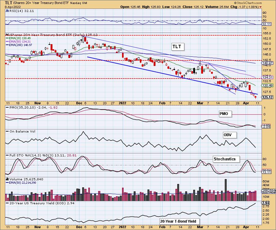
We've annotated a bullish falling wedge pattern, but given vertically rising yields, we aren't optimistic.
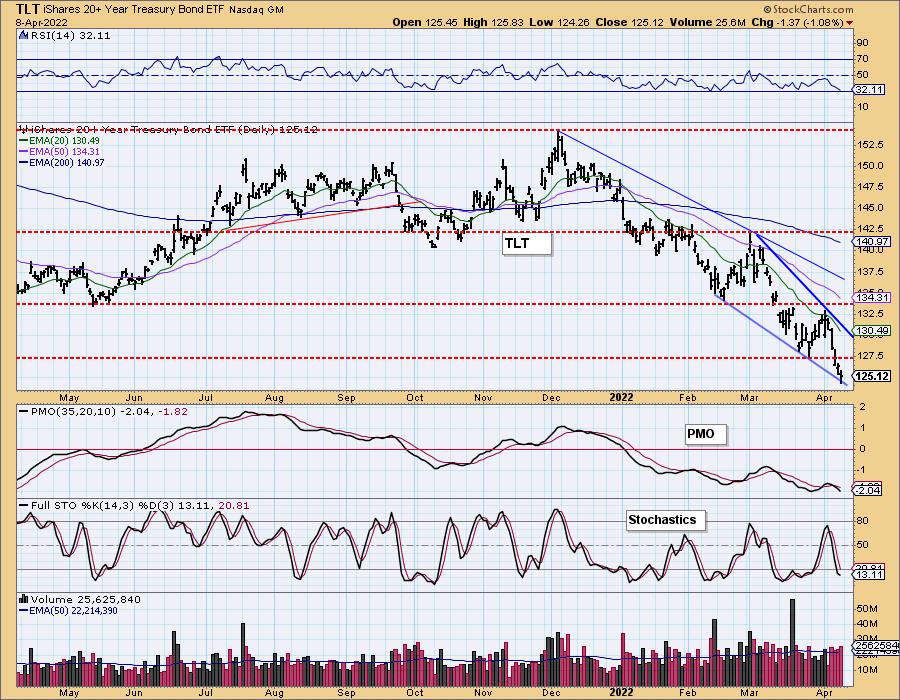
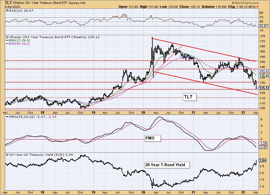
TLT Weekly Chart: Price is now headed to the bottom of a declining trend channel. The weekly RSI is negative and falling and the weekly PMO is accelerating its decline. Bonds will be moving even lower.
Technical Analysis is a windsock, not a crystal ball. --Carl Swenlin
(c) Copyright 2022 DecisionPoint.com
Disclaimer: This blog is for educational purposes only and should not be construed as financial advice. The ideas and strategies should never be used without first assessing your own personal and financial situation, or without consulting a financial professional. Any opinions expressed herein are solely those of the author, and do not in any way represent the views or opinions of any other person or entity.
NOTE: The signal status reported herein is based upon mechanical trading model signals, specifically, the DecisionPoint Trend Model. They define the implied bias of the price index based upon moving average relationships, but they do not necessarily call for a specific action. They are information flags that should prompt chart review. Further, they do not call for continuous buying or selling during the life of the signal. For example, a BUY signal will probably (but not necessarily) return the best results if action is taken soon after the signal is generated. Additional opportunities for buying may be found as price zigzags higher, but the trader must look for optimum entry points. Conversely, exit points to preserve gains (or minimize losses) may be evident before the model mechanically closes the signal.
Helpful DecisionPoint Links:
DecisionPoint Alert Chart List
DecisionPoint Golden Cross/Silver Cross Index Chart List
DecisionPoint Sector Chart List
Price Momentum Oscillator (PMO)
Swenlin Trading Oscillators (STO-B and STO-V)
DecisionPoint is not a registered investment advisor. Investment and trading decisions are solely your responsibility. DecisionPoint newsletters, blogs or website materials should NOT be interpreted as a recommendation or solicitation to buy or sell any security or to take any specific action.
