
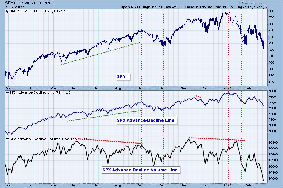
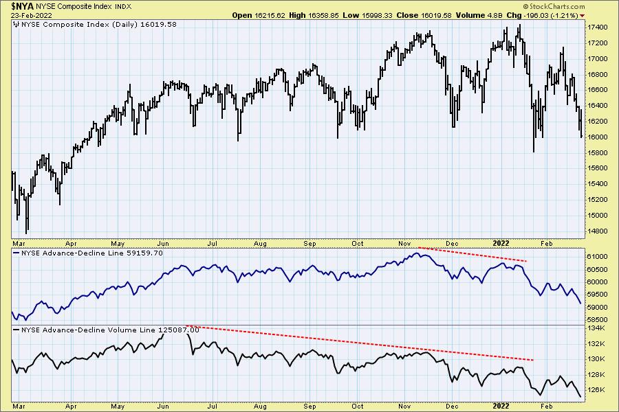
A few of the charts that we don't usually cover in the DP Alert are the Advance/Decline Lines. Carl will often look at during our DecisionPoint Shows. The charts are available to you in the "DPA ChartList". You will find the ChartList links on the upper lefthand side of our "Blogs and Links" page.
The A-D Line on both the SPY and NYSE have been in a declining trend since the January top. What impressed me was the A-D Volume Lines on both charts. Declining volume is increasing very very quickly as more and more investors divest. I look at this as being bearish as investors take to the exits quickly. However, it may turn out to be bullish. When we look for bear market rallies or bottoms we want investors to be exceedingly bearish as sentiment is contrarian. Investors are getting close to capitulation.
The DecisionPoint Alert Weekly Wrap presents an end-of-week assessment of the trend and condition of the Stock Market, the U.S. Dollar, Gold, Crude Oil, and Bonds. The DecisionPoint Alert daily report (Monday through Thursday) is abbreviated and gives updates on the Weekly Wrap assessments.
Watch the latest episode of DecisionPoint on StockCharts TV's YouTube channel here!
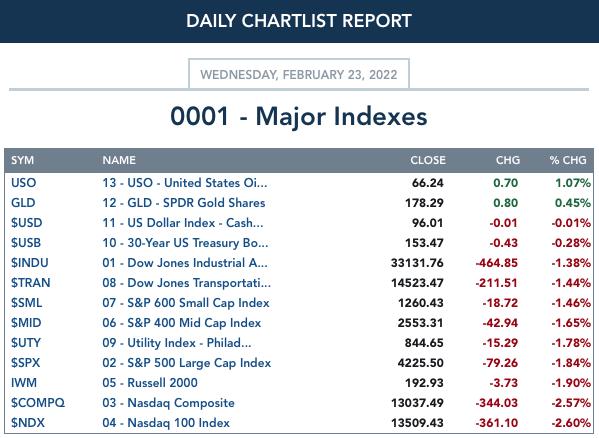
MAJOR MARKET INDEXES
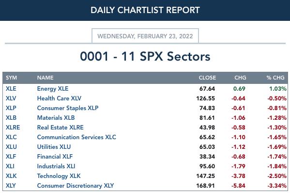
SECTORS
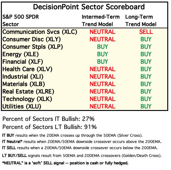
Each S&P 500 Index component stock is assigned to one, and only one, of 11 major sectors. This is a snapshot of the Intermediate-Term (Silver Cross) and Long-Term (Golden Cross) Trend Model signal status for those sectors.
RRG® Chart: RRGs measure relative strength and in this case we are measuring against the SPY. This means that the SPY's performance is the center point and the sectors revolve around it. When sectors are near the center of the RRG it means they are performing mostly in line with the SPY. Based on this, XLK, XLV and XLU are closest to the center and moving in step with the SPY to some degree. XLV is moving back toward Leading, but even if it does, it is close to the center and is therefore only shows slightly good performance.
XLK and XLY look the most bearish given their southwest headings. XLF now has a bearish southwest heading and could find itself in Weakening soon.
Most bullish would be XLB and XLP which are Leading and moving in a northeast direction away from the center.
On the cusp would be XLI which has the bullish heading and should hit Leading, joining XLP and XLB.
We are seeing improvement on XLC, XLRE and XLU but they all remain in Lagging. XLE is starting to move northward toward Leading again. Its performance is far better than the SPY based on its distance from the center.
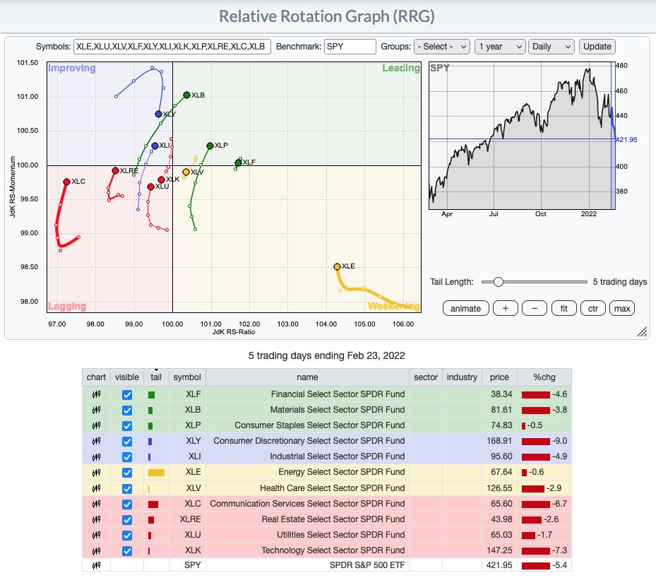
RRG® charts show you the relative strength and momentum for a group of stocks. Stocks with strong relative strength and momentum appear in the green Leading quadrant. As relative momentum fades, they typically move into the yellow Weakening quadrant. If relative strength then fades, they move into the red Lagging quadrant. Finally, when momentum starts to pick up again, they shift into the blue Improving quadrant.
CLICK HERE for an animated version of the RRG chart.
CLICK HERE for Carl's annotated Sector charts.
THE MARKET (S&P 500)
IT Trend Model: NEUTRAL as of 1/21/2022
LT Trend Model: BUY as of 6/8/2020
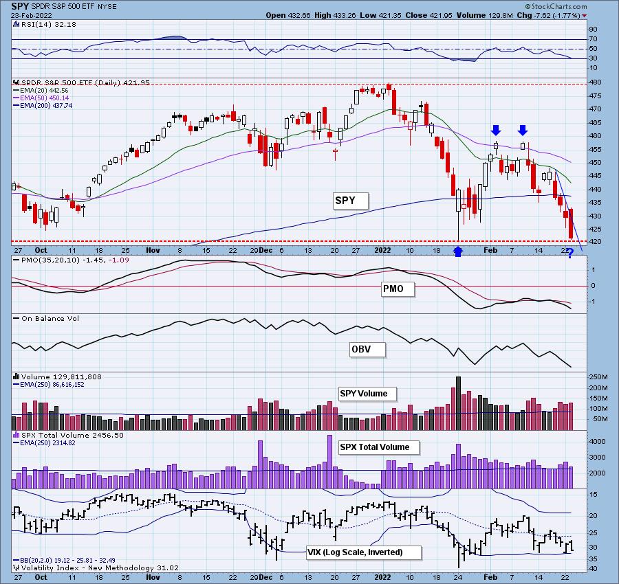
SPY Daily Chart: The short-term declining trend line is so steep that today's candlestick could not help but violate it. Nevertheless, SPY closed below the line, and there is no double bottom yet.
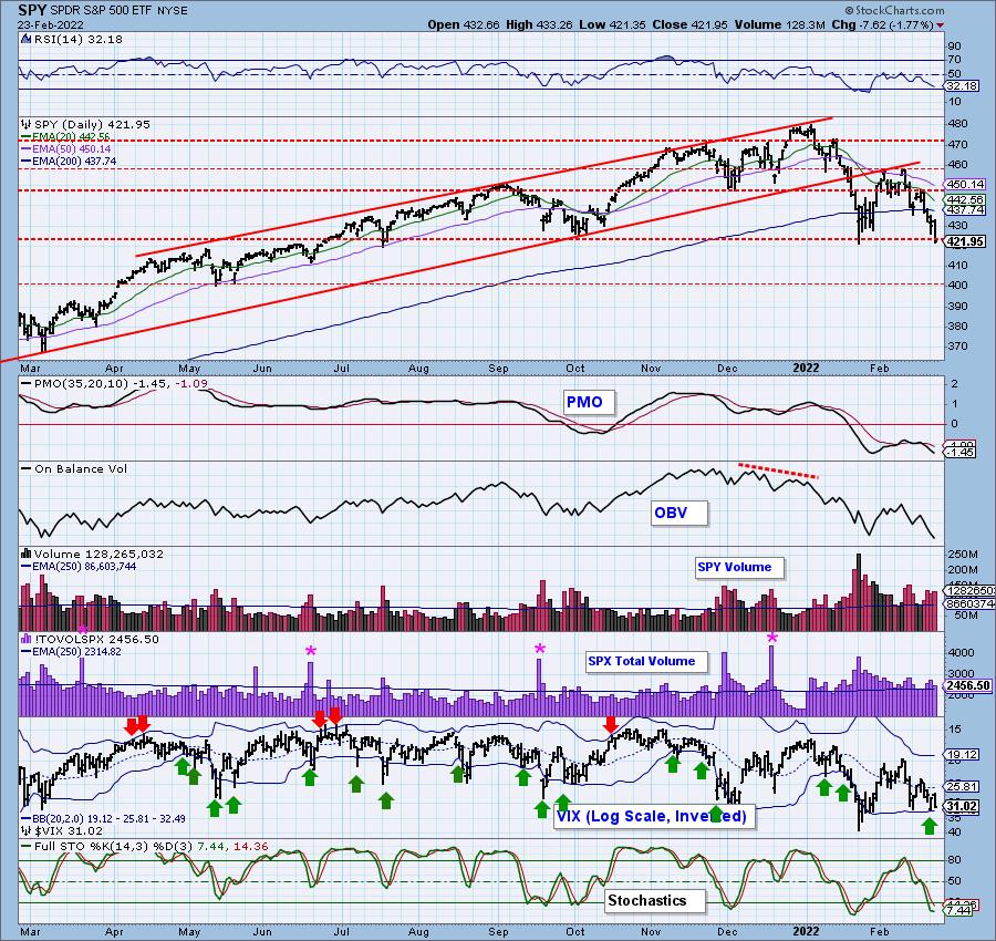
Indicators are still negative with the PMO and RSI continuing lower. Stochastics are attempting to turn back up in oversold territory, so that could be a sign that some short-term relief may arrive soon.
Tuesday's Free Trading Room Recording:
Topic: DecisionPoint Trading Room
Start Time: Feb 22, 2022 09:00 AM
Meeting Recording Link.
Access Passcode: Feb#22nd
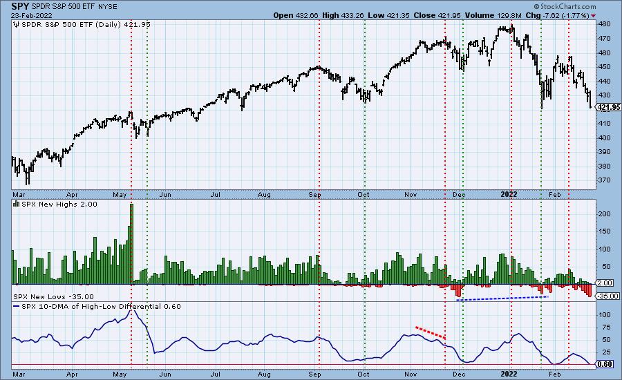
S&P 500 New 52-Week Highs/Lows: New Lows expanded and nearly hit the highest level its seen all year. On December 1st 2021 there were 36 New Lows. Today we have 35. The 10-DMA of the High-Low Differential is nearing zero. We will want to see it begin to bottom as that generally precedes market lows.
Climax* Analysis: We got another day with strong climactic activity, and another downside exhaustion climax like yesterday. We expect to see some kind of bounce, but obviously there is no guarantee... just look at today's action after yesterday's "exhaustion" climax. It may not be obvious on this chart, but we generally do not see this many climaxes in a four month period. This is indicative of the high volatility. Volatility is not our friend.
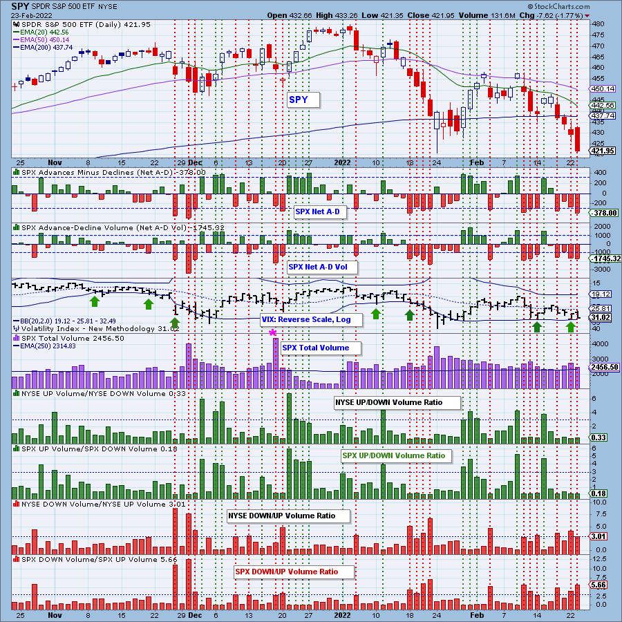
*A climax is a one-day event when market action generates very high readings in, primarily, breadth and volume indicators. We also include the VIX, watching for it to penetrate outside the Bollinger Band envelope. The vertical dotted lines mark climax days -- red for downside climaxes, and green for upside. Climaxes indicate either initiation or exhaustion.
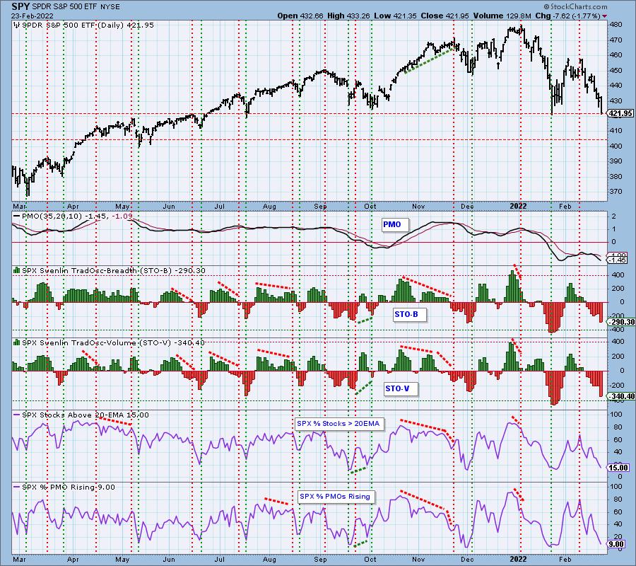
Short-Term Market Indicators: The short-term market trend is DOWN and the condition is SOMEWHAT OVERSOLD.
STOs were climactic today but still haven't reached oversold levels from last month. They may look oversold, but they can move lower. %Stocks > 20-day EMA and %PMOs Rising are now in oversold territory. This could mean an upcoming bounce as suggested by today's downside exhaustion climax.
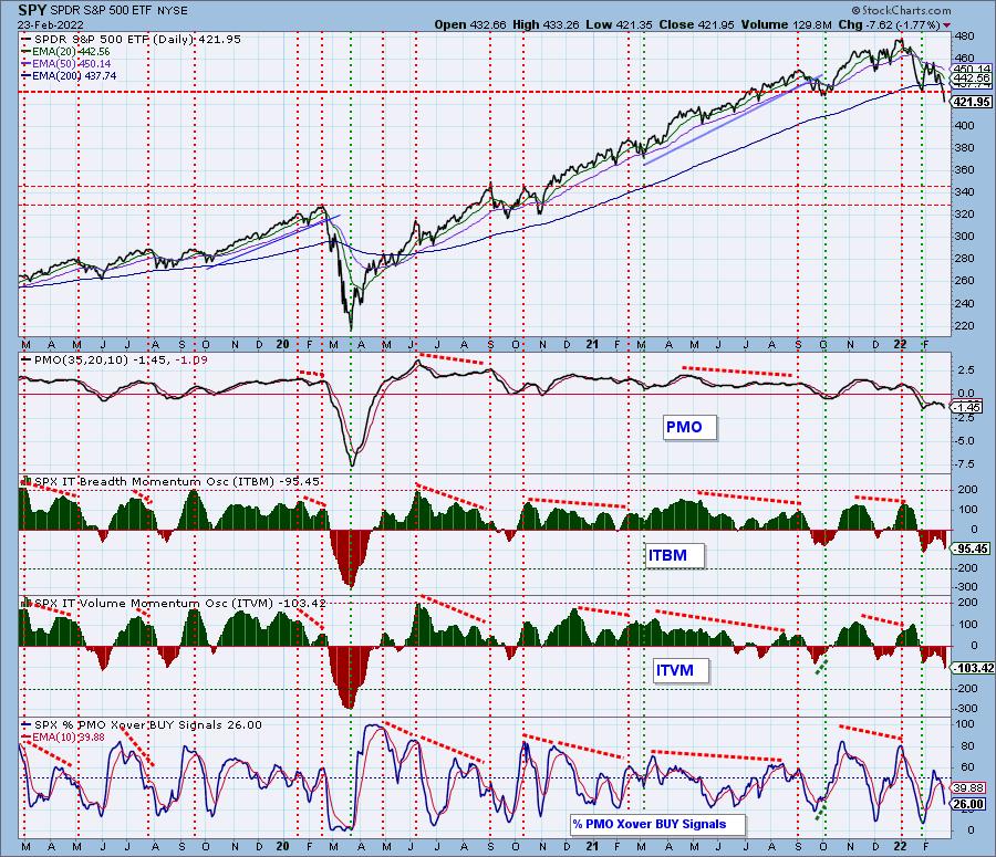
Intermediate-Term Market Indicators: The intermediate-term market trend is DOWN and the condition is NEUTRAL.
The ITBM/ITVM fell sharply today and have hit near-term oversold territory. Of course, we believe we are in a bear market and in 2020 these indicators fell much further. The other issue is that %PMO BUY signals is not oversold.
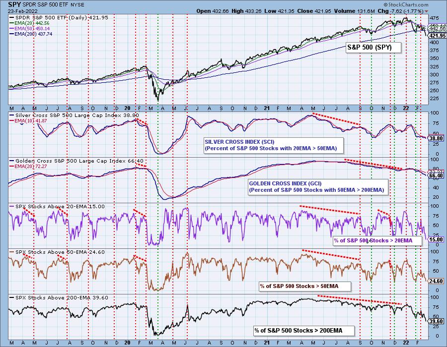
PARTICIPATION and BIAS Assessment: The following chart objectively shows the depth and trend of participation in two time frames.
- Intermediate-Term - the Silver Cross Index (SCI) shows the percentage of SPX stocks on IT Trend Model BUY signals (20-EMA > 50-EMA). The opposite of the Silver Cross is a "Dark Cross" -- those stocks are, at the very least, in a correction.
- Long-Term - the Golden Cross Index (GCI) shows the percentage of SPX stocks on LT Trend Model BUY signals (50-EMA > 200-EMA). The opposite of a Golden Cross is the "Death Cross" -- those stocks are in a bear market.
When I looked at the one-year daily chart that we normally use in this section, I noticed that %Stocks > 200-EMAs had hit an annual low. I decided to make it a three year chart to see how these readings matched up to the 2020 bear market. We saw this indicator nearly hit zero at the bear market low. Also note that we haven't seen this indicator hit this reading since 2020. The SCI and GCI also saw much lower readings during the 2020 bear market.
The current market bias is bearish in all three timeframes given the anemic participation readings that continue to deteriorate.
CONCLUSION: As we have said on several occasions, we are operating on the assumption that a bear market is in progress. We won't know for sure that it is a bear market until we see a decline of more than -20%, but our assumption allows us to operate under bear market rules. If the bear market rules stop working, that will be a clue that we are wrong in our assumption. So far, not a problem.
Indicators are very oversold, but as bear market rules suggest, oversold conditions are "thin ice" and don't provide a solid foundation for a lasting rally. In addition, while they are oversold, none of them are rising or showing improvement. It's time for a rebound as yesterday and today's downside exhaustion climaxes imply; however, we could see a pause or consolidation. Sadly, I expect more volatile churn. This is not a market environment that I want to trade in.
I have 8% exposure to the market.
Have you subscribed the DecisionPoint Diamonds yet? DP does the work for you by providing handpicked stocks/ETFs from exclusive DP scans! Add it with a discount! Contact support@decisionpoint.com for more information!
BITCOIN
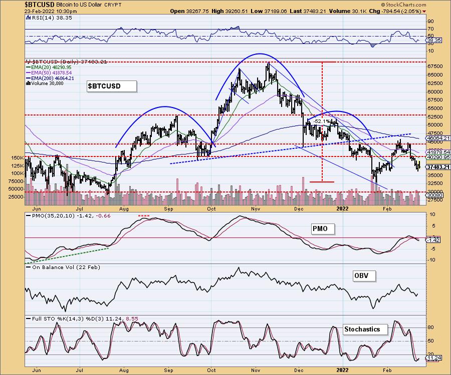
We could be seeing a short-term bottom forming on Bitcoin given the higher low. However, price is still down over 2%. The RSI topped below net neutral (50) in negative territory. The PMO is still falling although it appears to be decelerating somewhat. Stochastics are oversold and have turned up on this recent bottom. I don't think Bitcoin is out of the woods, but there are some improvements.
INTEREST RATES
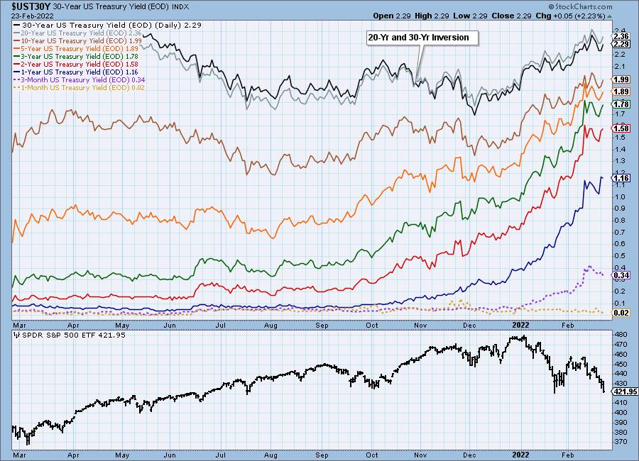
Rates pulled back last week but we didn't see any rising trends broken. Longer-term rates are moving higher once again and holding their rising trends.
10-YEAR T-BOND YIELD
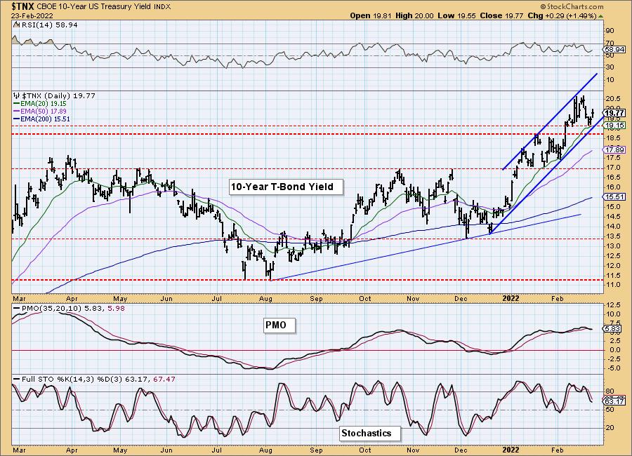
Sometimes I truly am amazed by how technical analysis can nail it. Yesterday we discussed the strong area of support that $TNX had landed on. It also coincided with price testing the rising trend. Today we got the rebound that price suggested we would get. The RSI is positive and while the PMO is on a SELL signal, it is already trying to whipsaw back into a BUY signal. I don't like Stochastics here, but they did decelerate. I'm looking for higher rates.
DOLLAR (UUP)
IT Trend Model: BUY as of 6/22/2021
LT Trend Model: BUY as of 8/19/2021
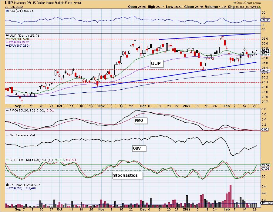
UUP Daily Chart: Yesterday's comments still apply:
"The Dollar isn't doing much except bounce around the 20/50-day EMAs. The PMO did trigger a crossover BUY signal and Stochastics are rising and hit positive territory. Even the RSI has moved above 50. I'm bullish on the Dollar."
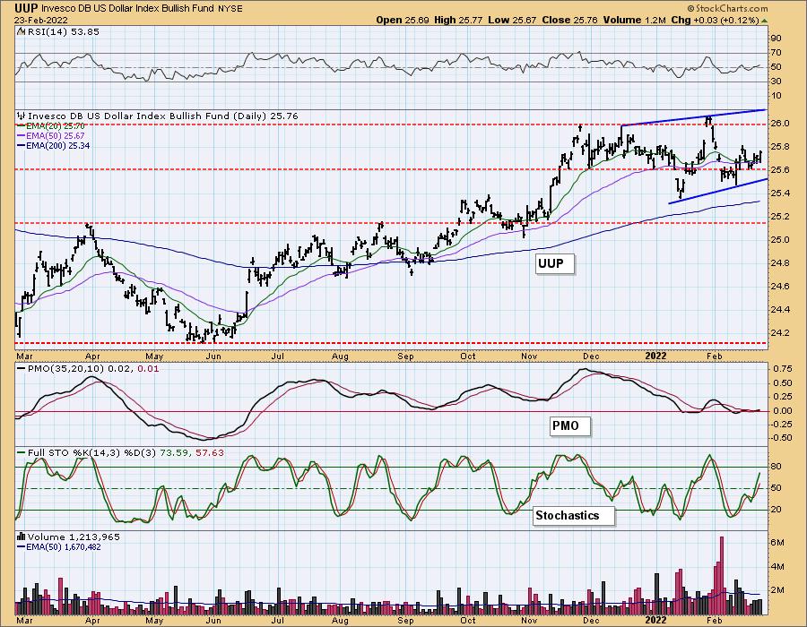
"However, we do have a bearish rising wedge forming."
GOLD
IT Trend Model: BUY as of 12/29/2021
LT Trend Model: BUY as of 1/12/2022
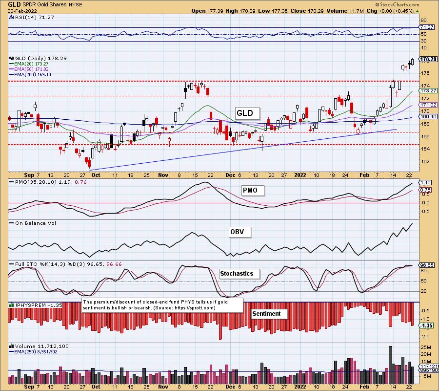
GLD Daily Chart: Thankfully the filled black candlestick didn't lead to lower prices today as they normally do. Instead we see a bullish engulfing candlestick. The RSI just hit overbought territory above 70, but I expect it to get even more overbought given this strong rally accompanied by a strongly rising PMO and Stochastics oscillating above 80. We still have a possible island reversal set up, but again, I like the indicators and don't expect it to end with a gap down...at least not yet.
(Full disclosure: I own GLD)
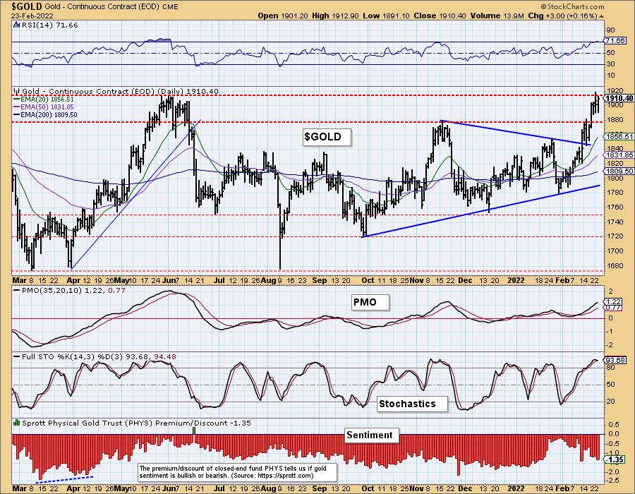
GOLD Daily Chart: Gold is still trying to close above the June highs. We like the indicators as noted on GLD above and expect to see the breakout soon.
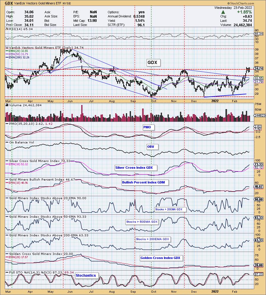
GOLD MINERS Golden and Silver Cross Indexes: Nice rally on GDX today, but price still hasn't broken convincingly above resistance at the November top. Gold looks very bullish and that will benefit GDX. Participation is strong. The SCI is rising strongly and %Stocks > 20/50/200-EMAs are rising. The GCI is also beginning to show slight improvement. I expect the breakout to occur.
CRUDE OIL (USO)
IT Trend Model: BUY as of 1/3/2022
LT Trend Model: BUY as of 3/9/2021
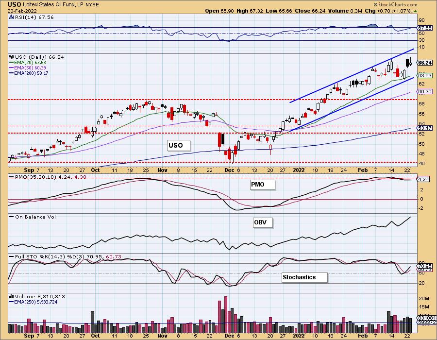
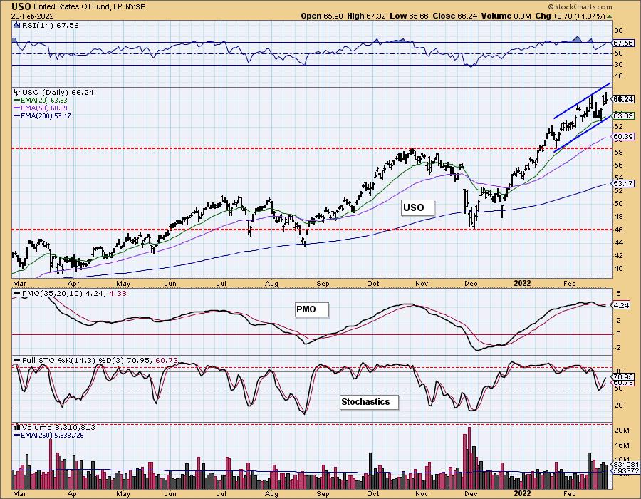
USO Daily Chart: As with GLD, yesterday's filled black candlestick didn't result in lower prices. I expected to see more decline or consolidation before price continued higher. I'm happy I was incorrect. The RSI and Stochastics are rising nicely. The PMO is on an overbought SELL signal, but is already reversing back toward a BUY signal. This is one area of the market that should continue to see strength.
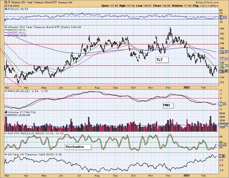
BONDS (TLT)
IT Trend Model: NEUTRALas of 1/5/2022
LT Trend Model: SELL as of 1/19/2022
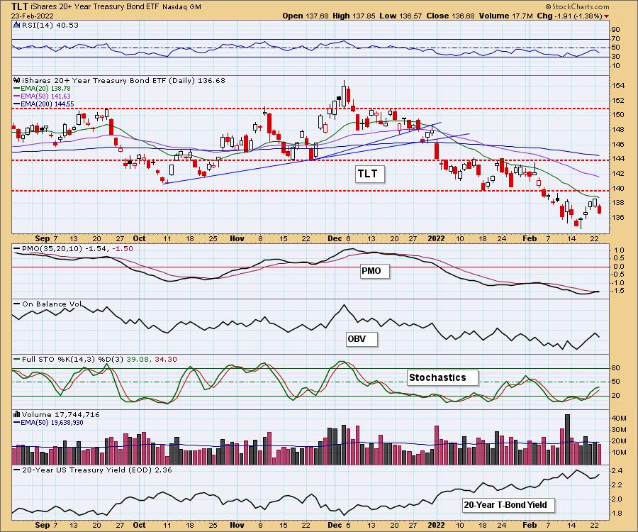
TLT Daily Chart: TLT failed to overcome resistance at the 20-day EMA and didn't even come close to testing resistance at the January low. This has become a popular hideout of late, but as noted previously, upside potential is slim. The RSI is negative and falling now. The PMO is topping beneath its signal line and Stochastics appear ready to top. I think this will continue to be a safe haven for many investors, but not a particularly profitable one.
Good Luck & Good Trading!
Erin Swenlin
Technical Analysis is a windsock, not a crystal ball. --Carl Swenlin
(c) Copyright 2022 DecisionPoint.com
Disclaimer: This blog is for educational purposes only and should not be construed as financial advice. The ideas and strategies should never be used without first assessing your own personal and financial situation, or without consulting a financial professional. Any opinions expressed herein are solely those of the author, and do not in any way represent the views or opinions of any other person or entity.
NOTE: The signal status reported herein is based upon mechanical trading model signals, specifically, the DecisionPoint Trend Model. They define the implied bias of the price index based upon moving average relationships, but they do not necessarily call for a specific action. They are information flags that should prompt chart review. Further, they do not call for continuous buying or selling during the life of the signal. For example, a BUY signal will probably (but not necessarily) return the best results if action is taken soon after the signal is generated. Additional opportunities for buying may be found as price zigzags higher, but the trader must look for optimum entry points. Conversely, exit points to preserve gains (or minimize losses) may be evident before the model mechanically closes the signal.
Helpful DecisionPoint Links:
DecisionPoint Alert Chart List
DecisionPoint Golden Cross/Silver Cross Index Chart List
DecisionPoint Sector Chart List
Price Momentum Oscillator (PMO)
Swenlin Trading Oscillators (STO-B and STO-V)
DecisionPoint is not a registered investment advisor. Investment and trading decisions are solely your responsibility. DecisionPoint newsletters, blogs or website materials should NOT be interpreted as a recommendation or solicitation to buy or sell any security or to take any specific action.
