
One of the tools we use at DecisionPoint to review sector performance and strength is using a CandleGlance with our PMO and key moving averages. It wasn't too long ago that every sector was displaying negative momentum. Now we are seeing broad participation with every sector having a PMO rising except for XLY which pulled back this week.
Other interesting observations from the CandleGlance would be the breakouts of XLK and XLP. These sectors are on the opposite ends of the spectrum in terms of defensive v. aggressive. Seeing both of these sectors breaking out hints that the market could be on track to make new all-time highs.
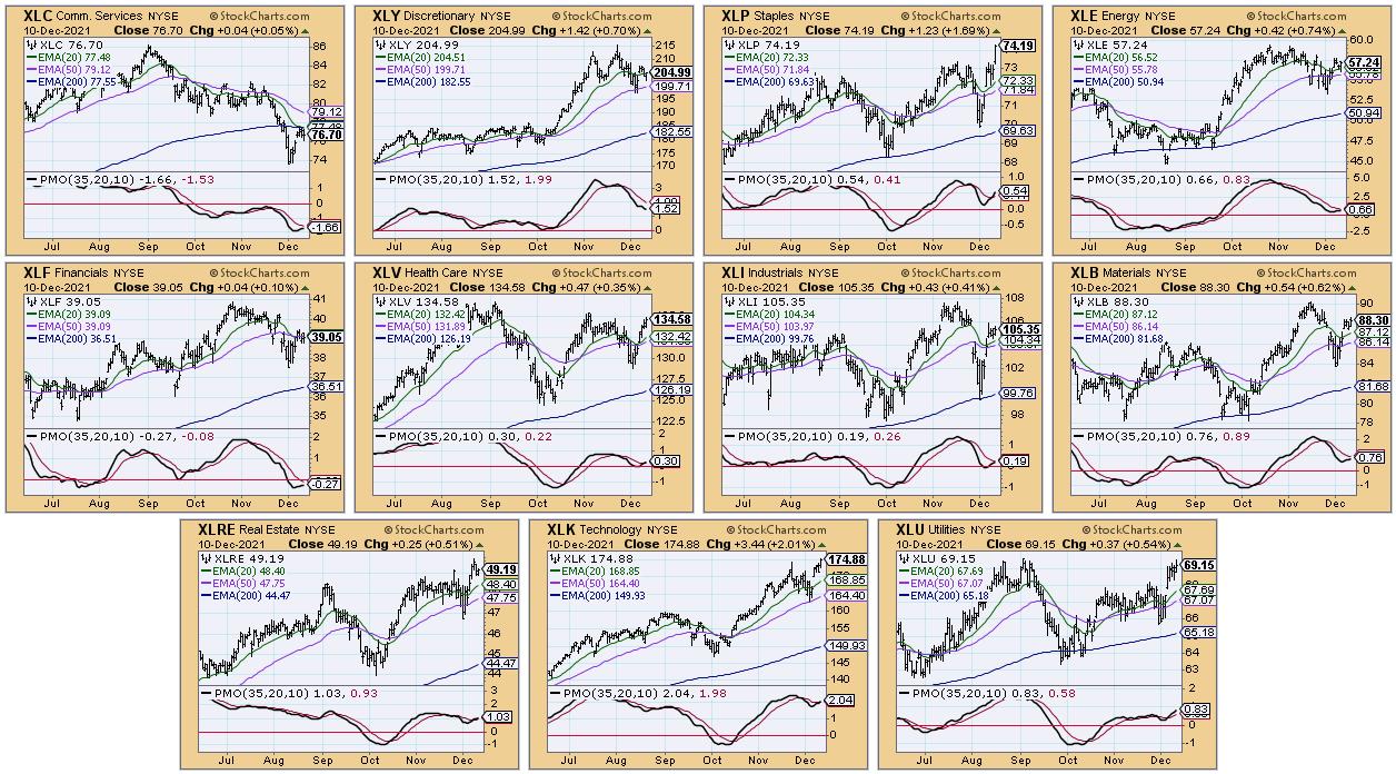
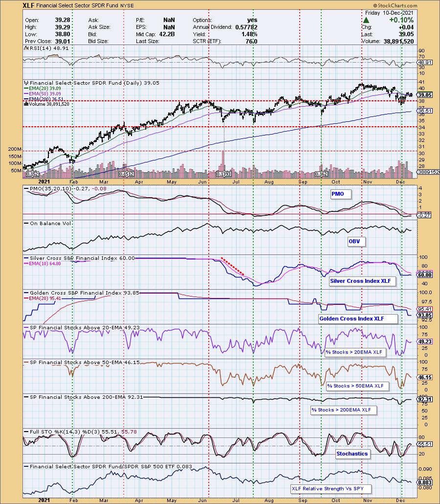
Communication Services (XLC) has been a laggard, holding onto its "dark cross" IT Trend Model Neutral signal (20-EMA < 50-EMA while 50-EMA > 200-EMA) for weeks. We now have another sector with an IT Trend Model "Dark Cross" Neutral signal, Financials (XLF). The PMO is technically rising on XLF, but is ready to turn back down. There is a strong bearish bias given %Stocks > 20/50-EMAs are lower than the SCI reading. This suggests that XLF could find itself falling further.
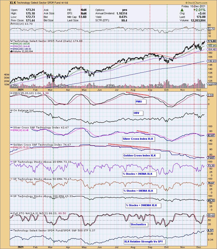
The sectors with the most potential moving into next are XLK and XLP based on their breakouts and participation percentages.
A PMO crossover BUY signal was generated on XLK. The SCI is about to have a positive crossover its signal line as well. I like the positive RSI and improving Stochastics. Participation percentages are above the SCI reading giving it a bullish short-term bias. The breakout is icing on the cake. I like XLK better than XLP based on the relative strength line. XLK has been showing relative strength since May.
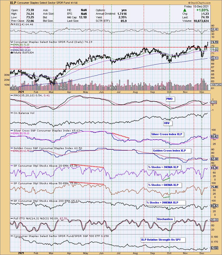
XLP also triggered a PMO crossover BUY signal. The indicators look very much like XLK. Participation is higher than on XLK, but that relative strength line is the issue as it has been flat or trending down this year. If the market decides to turn over next week, I would expect this sector to perform better than XLK. You'll also notice on the RRG that XLK looks the most healthy in the short and intermediate terms.
The DecisionPoint Alert Weekly Wrap presents an end-of-week assessment of the trend and condition of the Stock Market, the U.S. Dollar, Gold, Crude Oil, and Bonds. The DecisionPoint Alert daily report (Monday through Thursday) is abbreviated and gives updates on the Weekly Wrap assessments.
Watch the latest episode of DecisionPoint on StockCharts TV's YouTube channel here!
MAJOR MARKET INDEXES
For Friday: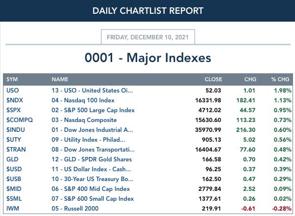
For the week: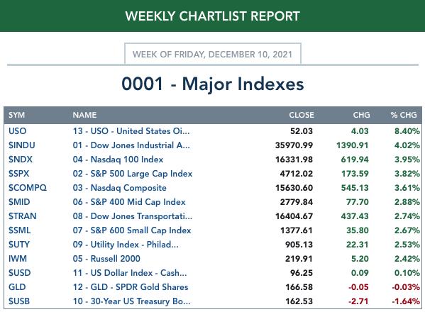
SECTORS
Each S&P 500 Index component stock is assigned to one, and only one, of 11 major sectors. This is a snapshot of the Intermediate-Term (Silver Cross) and Long-Term (Golden Cross) Trend Model signal status for those sectors.
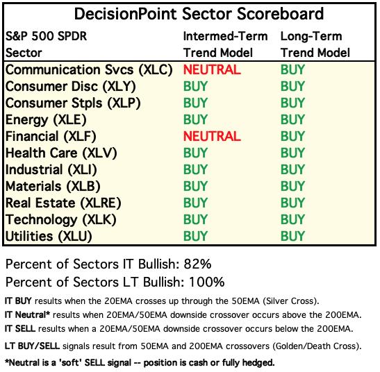
For Today: 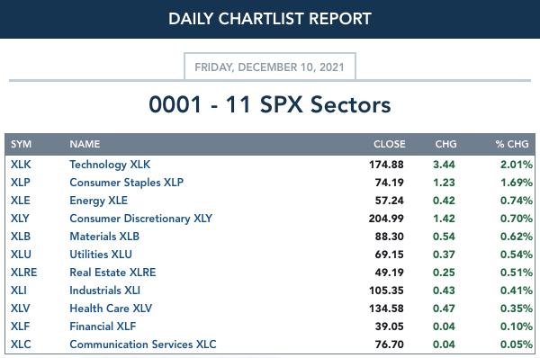
For the Week: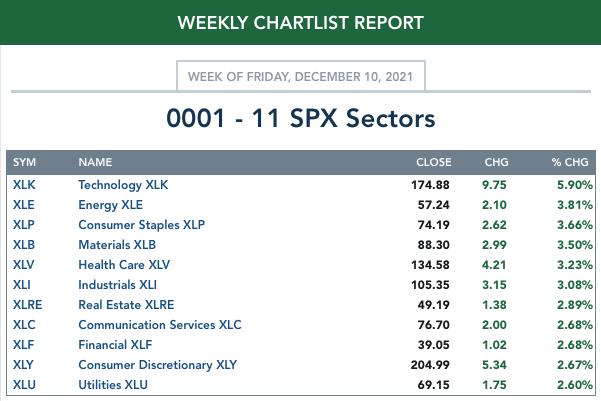
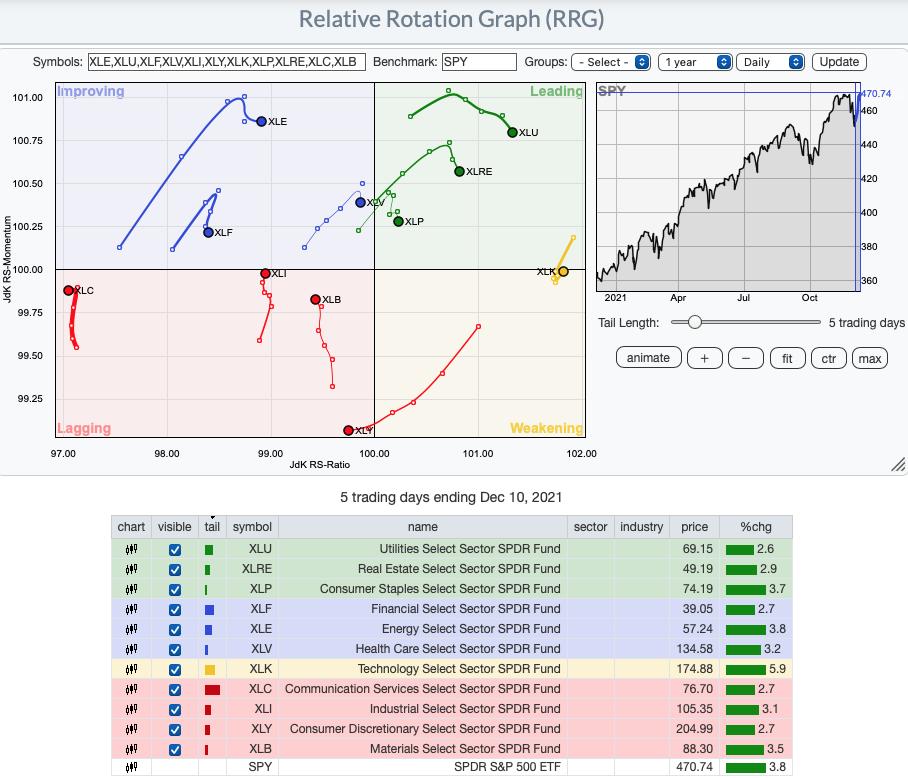
Short-term RRG: While all but XLY have positive momentum, relatively speaking on the daily RRG, the strongest sector is actually XLK. It is Weakening, but has already hooked back around and should hit Leading soon. The defensive XLU, XLRE and XLP are the only residents of Leading. When money rotates into defensive areas of the market, that is usually a last gasp for the market. Technology's outperformance tempers that characterization given it is one of the more aggressive sectors. XLE looks promising as it travels eastward toward Leading. I would avoid Lagging sectors for now, although XLI should hit Improving next week.
Intermediate-Term RRG: The intermediate-term RRG confirms the daily as far as the strength of XLK. Not far behind are XLI and XLB which are pushing toward Leading out of Improving. XLC is the weakest sector by far. XLF is headed toward Lagging so it is a close runner-up. XLE and XLY are turning over, but still are considered Leading.
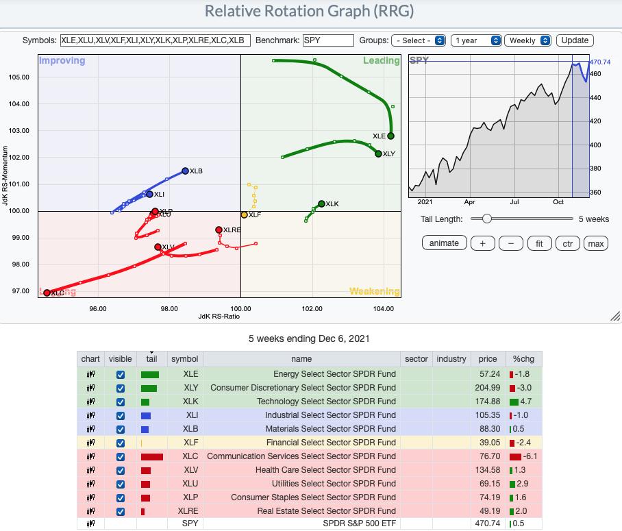
RRG® charts show you the relative strength and momentum for a group of stocks. Stocks with strong relative strength and momentum appear in the green Leading quadrant. As relative momentum fades, they typically move into the yellow Weakening quadrant. If relative strength then fades, they move into the red Lagging quadrant. Finally, when momentum starts to pick up again, they shift into the blue Improving quadrant.
CLICK HERE for an animated version of the RRG chart.
CLICK HERE for Carl's annotated Sector charts.
THE MARKET (S&P 500)
IT Trend Model: BUY as of 10/18/2021
LT Trend Model: BUY as of 6/8/2020
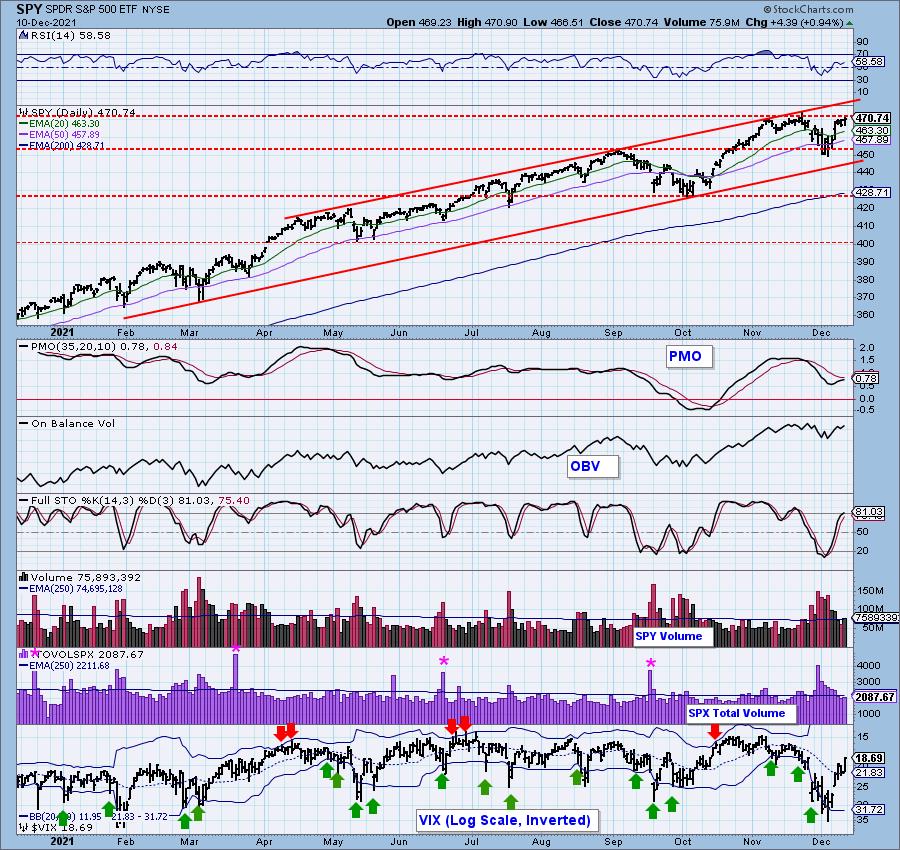
SPY Daily Chart: While we didn't see a new intraday all-time high, the SPY did close on a new all-time high. However, it still remains below strong resistance at prior all-time highs. The 5-month candlestick has certainly changed its stripes. Yesterday we had a PMO top below the signal line, today the PMO is rising again and is nearing a crossover BUY signal. The RSI is positive.
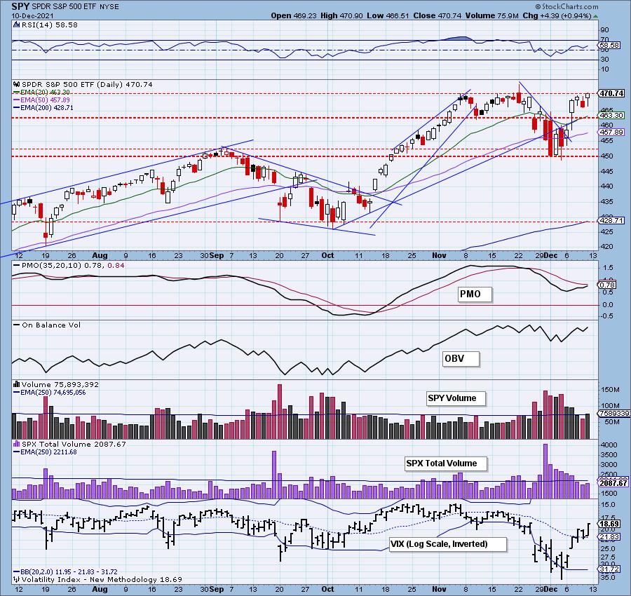
Total Volume was slightly higher, but is still below its annual EMA. Stochastics are very positive. We could see price make another swipe at the top of the rising trend channel.
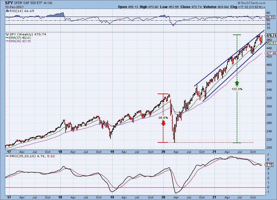
SPY Weekly Chart: Price is reversing off the 17-week EMA without testing the bottom of the bearish rising wedge which is also could suggest we will see higher prices next week. the weekly PMO is rising again after a bearish top below the signal line. The weekly RSI is positive. We still have the bearish rising wedge which does concern us in the longer-term.
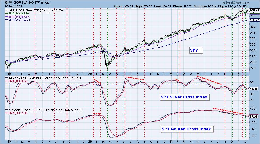
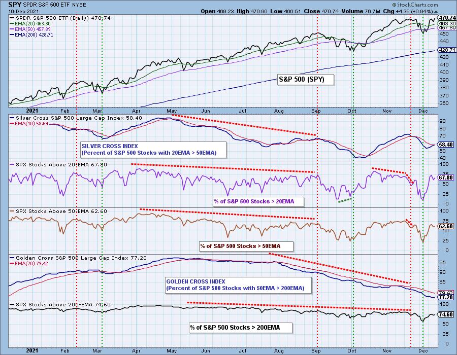
PARTICIPATION: The following chart objectively shows the depth and trend of participation in two time frames.
- Intermediate-Term - the Silver Cross Index (SCI) shows the percentage of SPX stocks on IT Trend Model BUY signals (20-EMA > 50-EMA). The opposite of the Silver Cross is a "Dark Cross" -- those stocks are, at the very least, in a correction.
- Long-Term - the Golden Cross Index (GCI) shows the percentage of SPX stocks on LT Trend Model BUY signals (50-EMA > 200-EMA). The opposite of a Golden Cross is the "Death Cross" -- those stocks are in a bear market.
This is the third day that the GCI has had a 77.2% reading. It seems to want to turn up, but we don't have enough participation to push it upward yet. The SCI is about to cross above its signal line.
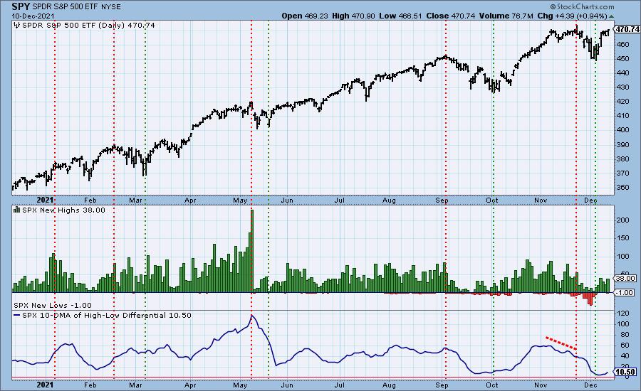
New 52-Week Highs/Lows: We didn't see a climax today, but New Highs did expand. The 10-DMA of the High-Low Differential is now rising. That tends to bode well for the market.
Climax Analysis: Yesterday's downside initiation climax was weak, and it failed to influence today's outcome. Today some indicators are edging toward climactic levels, but didn't quite make it. The VIX is rising above its EMA on the reverse scale. When the VIX moves toward the upper Bollinger Band we usually see higher prices until it gets close to or punctures the upper Bollinger Band. We can't even see the upper Band.
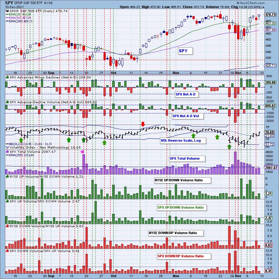
*A climax is a one-day event when market action generates very high readings in, primarily, breadth and volume indicators. We also include the VIX, watching for it to penetrate outside the Bollinger Band envelope. The vertical dotted lines mark climax days -- red for downside climaxes, and green for upside. Climaxes indicate either initiation or exhaustion.
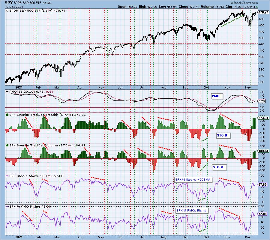
Short-Term Market Indicators: The short-term market trend is UP and the condition is OVERBOUGHT.
STOs are overbought, although mid-October saw higher readings. They are rising which is positive. Participation is inching back up and is only somewhat overbought.
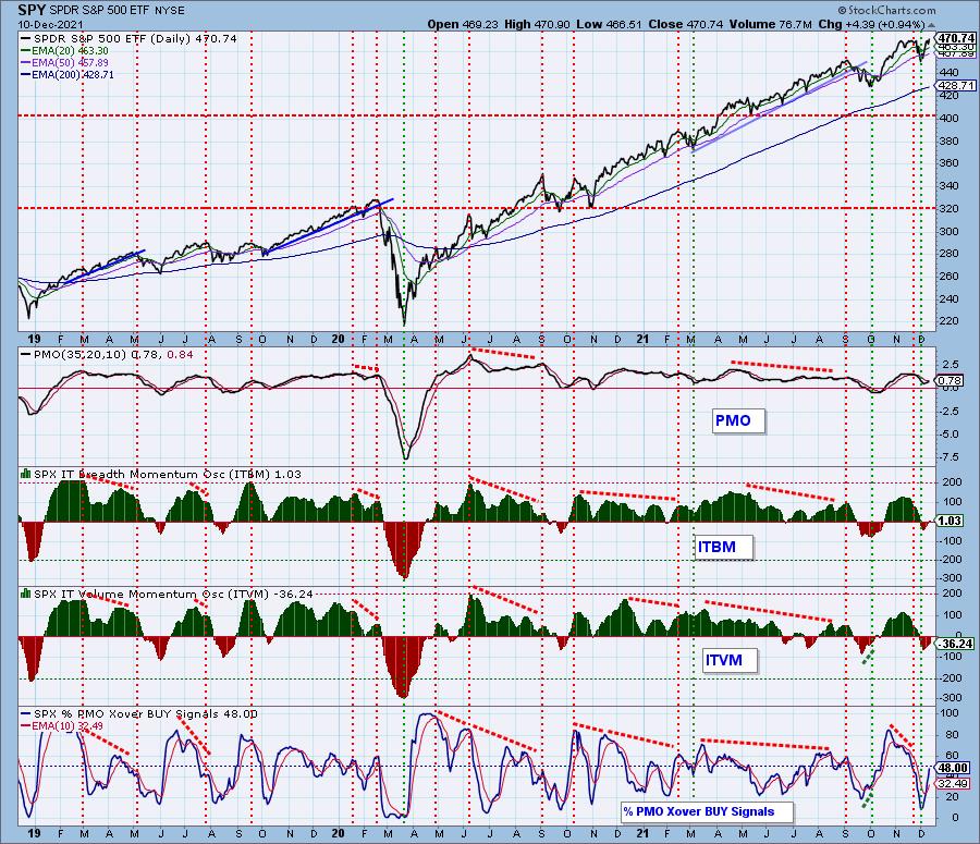
Intermediate-Term Market Indicators: The intermediate-term market trend is UP and the condition is NEUTRAL.
This chart has improved a great deal since last week. All of the indicators are rising and none are overbought. Nearly half of the SPX now have PMO crossover BUY signals.
Bias Assessment: The short and intermediate-term biases are bullish right now. %Stocks > 20/50-EMAs are higher than the SCI reading suggesting the SCI will see that positive crossover and continue rising. The long-term is a bit iffy. Participation of stocks > 200-EMA is lower than the GCI. As noted earlier, the GCI is flat and not rising yet. We would read this as a "neutral" bias for the long term.
CONCLUSION: This week's rally is could continue next week given the improvement on our indicators. STOs are rising and participation continues to improve. The only issue is that the STOs and other short-term indicators are getting or are overbought. The intermediate-term picture is somewhat murky given the neutral indicators and neutral long-term bias, but ultimately the SCI is rising and so are the ITBM/ITVM. Santa Claus may come to town a little early--although the Fed could turn out to be a Grinch and add volatility with its announcement on Wednesday. Erin will likely expand her exposure if we do see a solid breakout and continued strength in Technology. Her current exposure is 10%.
Calendar Next Week: (1) FOMC meeting Tuesday, followed by the announcement on Wednesday; (2) End-of-quarter options expiration should bring low volatility toward the end of the week, and very high volume on Friday.
Have you subscribed the DecisionPoint Diamonds yet? DP does the work for you by providing handpicked stocks/ETFs from exclusive DP scans! Add it with a discount! Contact support@decisionpoint.com for more information!
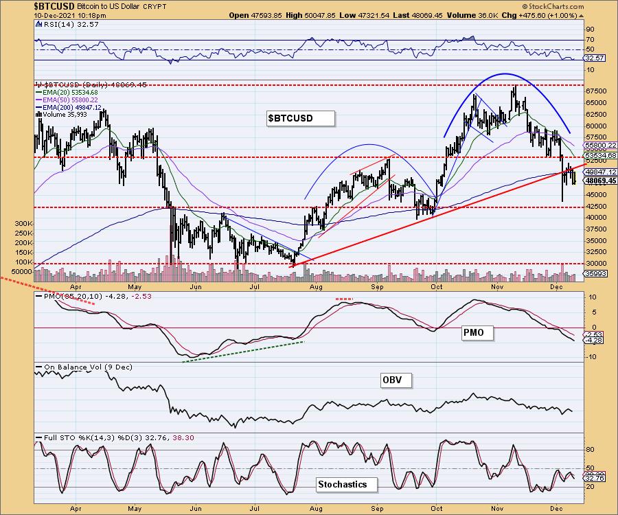
BITCOIN
Bitcoin attempted to right the ship this week but failed to hold the 200-EMA. We would look for a test of $42,500 soon given the falling PMO, negative RSI and very bearish Stochastics.
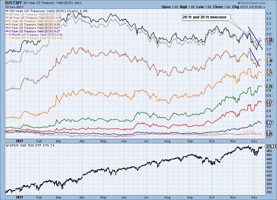
INTEREST RATES
Yields cooled at the end of the week, but the severe declining trend on long-term rates has been broken.
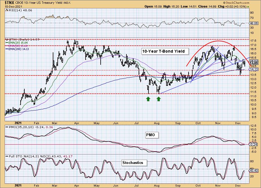
10-YEAR T-BOND YIELD
It appeared that $TNX was about to breakout of the bearish rounded top, but instead pulled back. The PMO is trying to rise, but Stochastics and the RSI are tipping over in negative territory. There is plenty of support available at the 200-EMA and between 13.5 and 14.0.
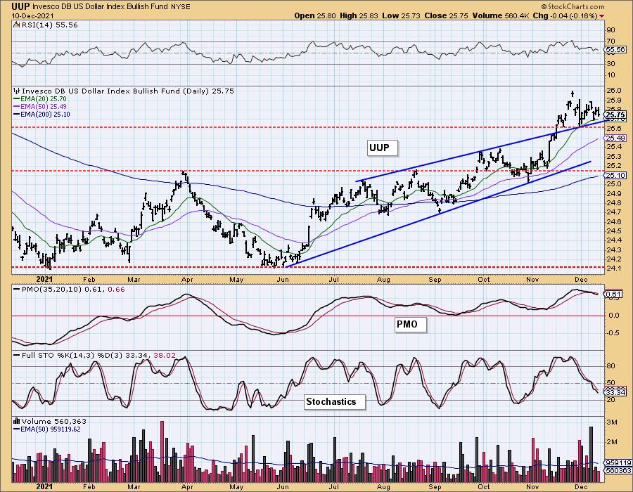
DOLLAR (UUP)
IT Trend Model: BUY as of 6/22/2021
LT Trend Model: BUY as of 8/19/2021
UUP Daily Chart: The Dollar is in a short-term declining trend. Today UUP formed a bearish engulfing candlestick, but it remains safely above support at the 20-EMA and the top of the bearish rising wedge.
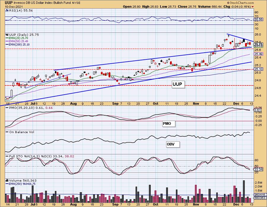
Price looks toppy. The RSI is positive but falling. The PMO is on an overbought SELL signal. Stochastics are very negative and suggest price will continue lower.
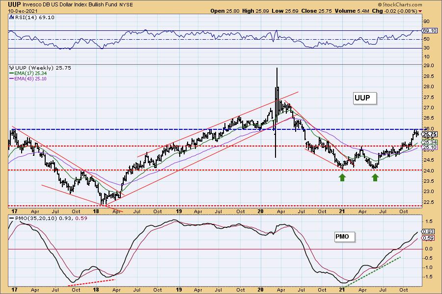
UUP Weekly Chart: The weekly chart looks to have a pennant on a flagpole which is bullish. The RSI is positive and not overbought and the weekly PMO is rising strongly and not overbought. However, UUP is up against strong overhead resistance at $26. Notice all of the price "touches" on that horizontal line. UUP could be consolidating in preparation for a breakout here.
GOLD
IT Trend Model: SELL as of 12/7/2021
LT Trend Model: SELL as of 12/3/2021
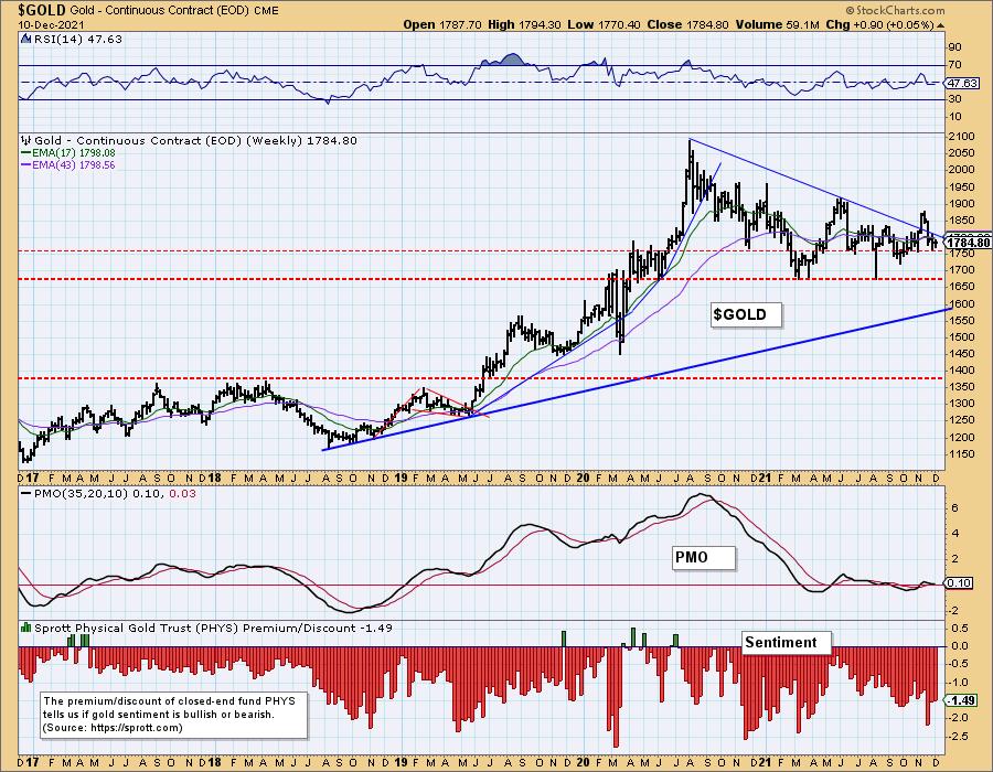
GOLD Daily Chart: Gold continues to frustrate. It is on a rising trend and Stochastics are slowly rising. However, the EMAs are configured negatively and the PMO hasn't actually turned up yet.
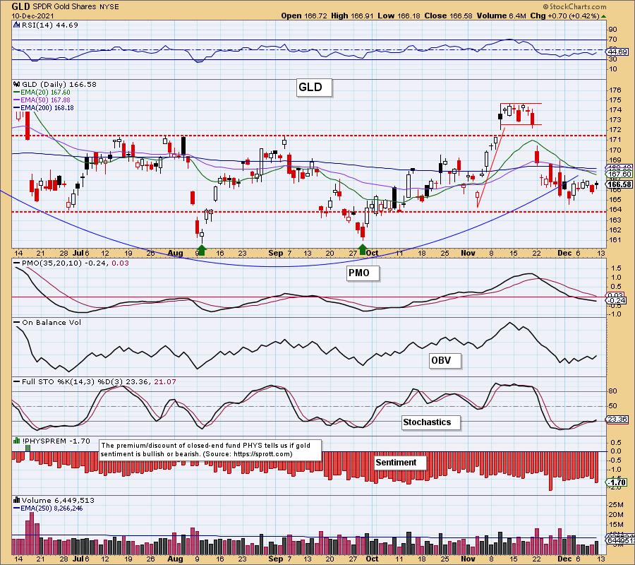
Discounts are expanding but haven't quite reached oversold territory. Expanding discounts means investors are bearish on Gold. Any rally will be slow moving and "tortured" as we often say.
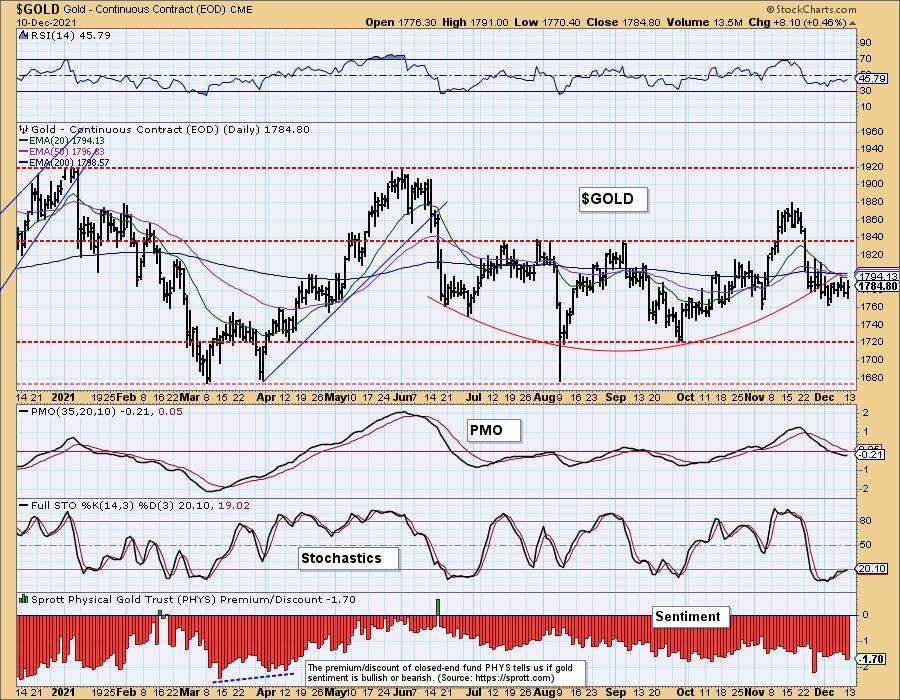
GOLD Weekly Chart: The weekly RSI and PMO aren't telling us much as they are flat. Price is holding above strong support at $1750. However we do have a large bearish descending triangle (flat bottom and declining tops). An attempt was made at a bullish breakout, but price is now back below the declining tops trendline.
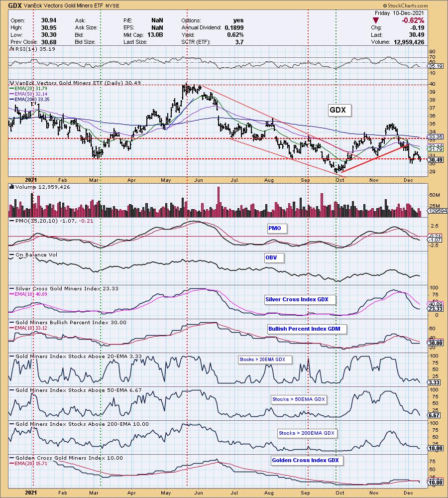
GOLD MINERS Golden and Silver Cross Indexes: Gold Miners are looking weak. They are in a steep declining trend and are struggling to hold support at the March and August lows. The SCI has decelerated, but participation is shrinking. The RSI is negative and the PMO is falling. Look for a test at the September lows.
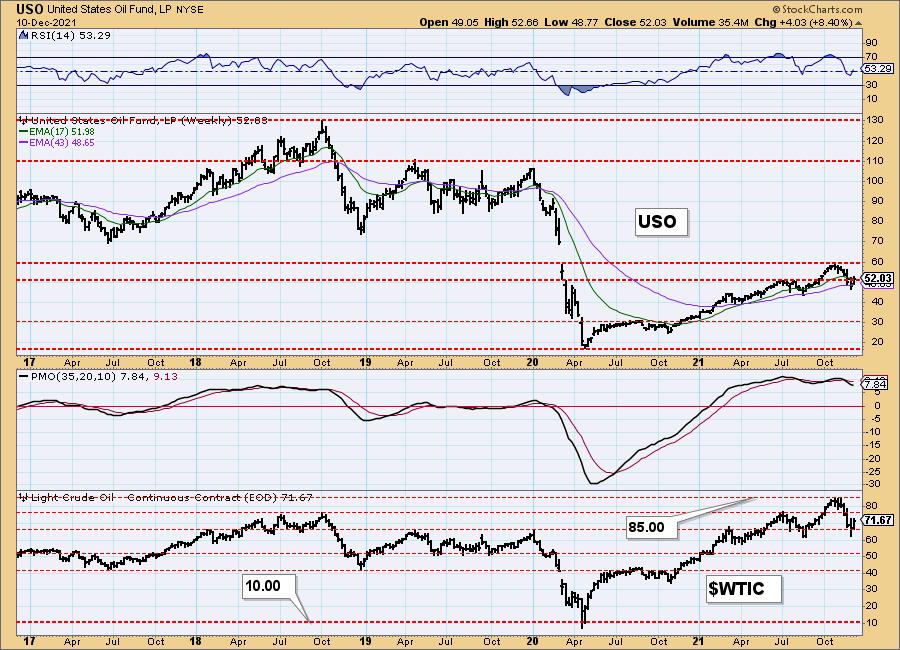
CRUDE OIL (USO)
IT Trend Model: NEUTRAL as of 11/30/2021
LT Trend Model: BUY as of 3/9/2021
USO Daily Chart: Crude Oil rallied strongly to begin the week, but has been stopped at overhead resistance. The indicators are leaning bullish with rising RSI, Stochastics and PMO. Gap resistance is holding tight for now. Mixed signals have come in this week regarding supply/demand globally. There is concern demand will diminish based on COVID restrictions.
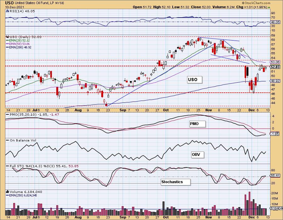
Price does remain above support at the July highs. Until more is known regarding demand for fossil fuels price will likely move sideways with a possible test of the 50-EMA.
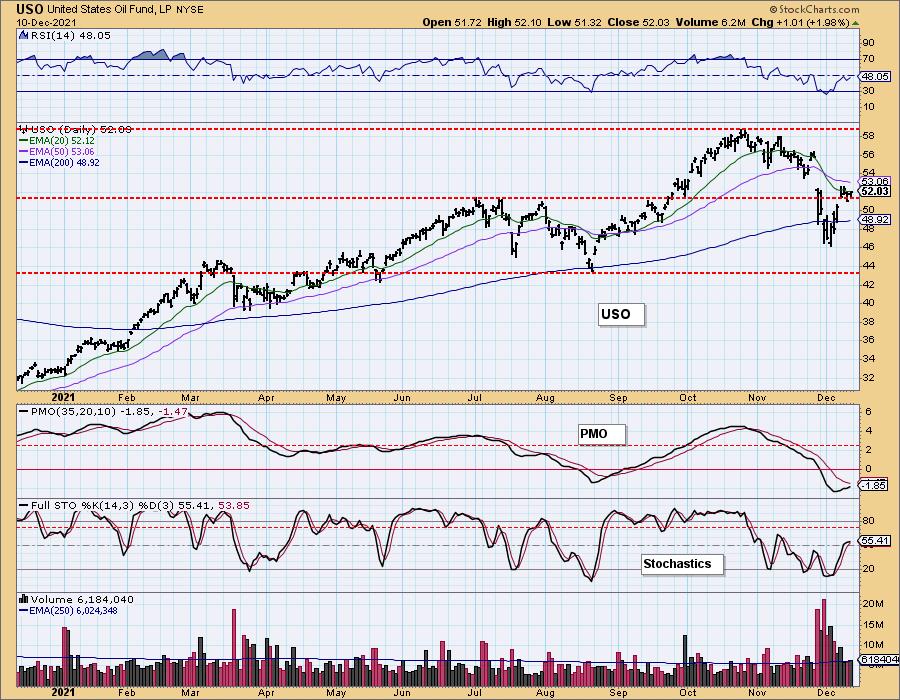
USO/$WTIC Weekly Chart: The weekly PMO is beginning to decelerate and the weekly RSI is back in positive territory. This seems to suggest we will see price resolve upward for a test of $60 on USO.
BONDS (TLT)
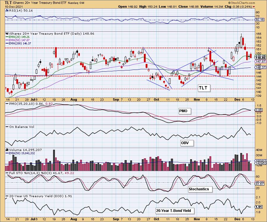
IT Trend Model: BUYas of 11/8/2021
LT Trend Model: BUYas of 11/5/2021
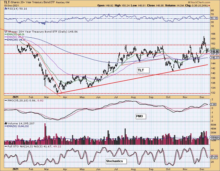
TLT Daily Chart: With the market rallying the flee to the safety of Bonds ended and that caused price to drop heavily. We have a bearish engulfing candlestick and a PMO that is nearing a crossover SELL signal. Additionally, Stochastics are pointed lower and the RSI is working back into negative territory. The $TNX chart didn't look particularly bullish, so we might just see price work its way sideways on the 50-EMA.
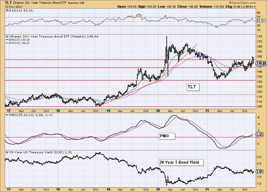
TLT Weekly Chart: The weekly RSI dove lower but remains in positive territory. The weekly PMO is flattening. The daily chart suggests price will move sideways and the weekly chart appears to be in agreement.
Technical Analysis is a windsock, not a crystal ball.
-- Carl & Erin Swenlin
(c) Copyright 2021 DecisionPoint.com
Disclaimer: This blog is for educational purposes only and should not be construed as financial advice. The ideas and strategies should never be used without first assessing your own personal and financial situation, or without consulting a financial professional. Any opinions expressed herein are solely those of the author, and do not in any way represent the views or opinions of any other person or entity.
NOTE: The signal status reported herein is based upon mechanical trading model signals, specifically, the DecisionPoint Trend Model. They define the implied bias of the price index based upon moving average relationships, but they do not necessarily call for a specific action. They are information flags that should prompt chart review. Further, they do not call for continuous buying or selling during the life of the signal. For example, a BUY signal will probably (but not necessarily) return the best results if action is taken soon after the signal is generated. Additional opportunities for buying may be found as price zigzags higher, but the trader must look for optimum entry points. Conversely, exit points to preserve gains (or minimize losses) may be evident before the model mechanically closes the signal.
Helpful DecisionPoint Links:
DecisionPoint Alert Chart List
DecisionPoint Golden Cross/Silver Cross Index Chart List
DecisionPoint Sector Chart List
Price Momentum Oscillator (PMO)
Swenlin Trading Oscillators (STO-B and STO-V)
DecisionPoint is not a registered investment advisor. Investment and trading decisions are solely your responsibility. DecisionPoint newsletters, blogs or website materials should NOT be interpreted as a recommendation or solicitation to buy or sell any security or to take any specific action.
