
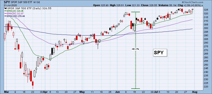
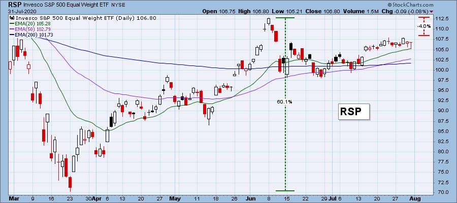
Today I thought I would lead with a (another) quick example of how participation is thinning. The first chart is SPY, which is the cap-weighted S&P 500 ETF. The second chart is RSP, the ETF which is the equal-weighted version of the S&P 500. Note that at the June rally high, RSP had rallied +60% from the bear market low versus +48% for SPY. That was because more of the S&P 500 component stocks were participating in the rally, and typically, the smaller-cap stocks will be better performers at the start of a rally. In July, SPY made a new rally high, whereas RSP topped -4% below its June top, indicating that smaller-cap stocks are fading, and that the rally is being carried by the largest-cap stocks in the index. This is not a healthy situation.
The DecisionPoint Alert Weekly Wrap presents an end-of-week assessment of the trend and condition of the Stock Market, the U.S. Dollar, Gold, Crude Oil, and Bonds. The DecisionPoint Alert daily report (Monday through Thursday) is abbreviated and gives updates on the Weekly Wrap assessments.
Watch the latest episode of DecisionPoint on StockCharts TV's YouTube channel here!
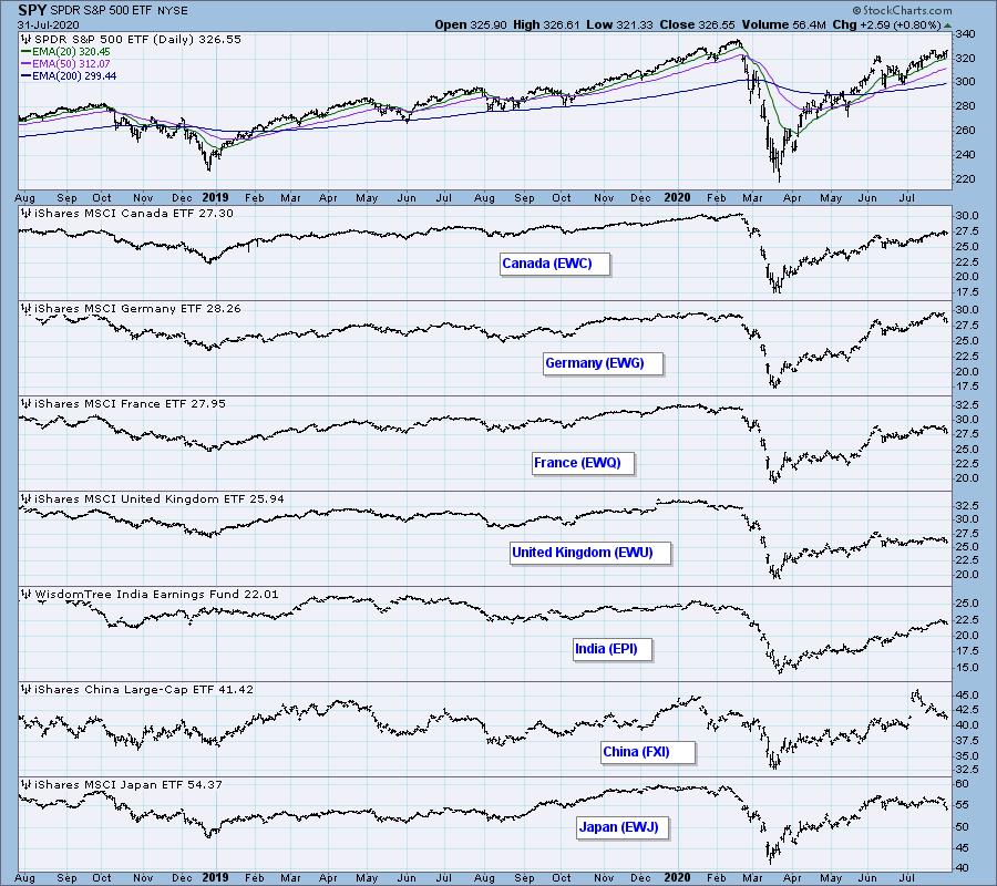
GLOBAL MARKETS
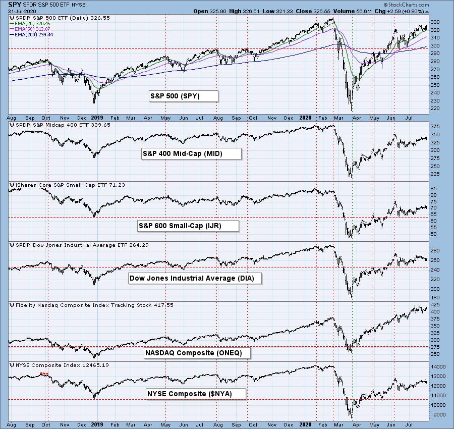
BROAD MARKET INDEXES
SECTORS
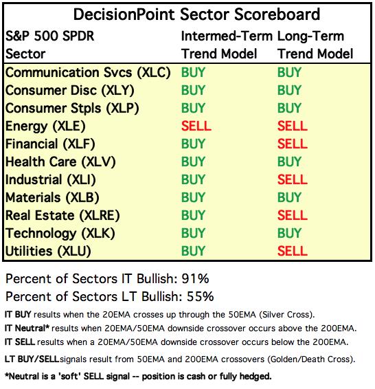
Each S&P 500 Index component stock is assigned to one, and only one, of 11 major sectors. This is a snapshot of the Intermediate-Term (Silver Cross) and Long-Term (Golden Cross) Trend Model signal status for those sectors.
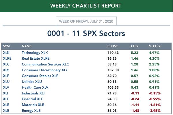
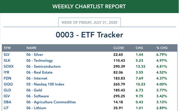
ETF TRACKER: This is a list of about 100 ETFs intended to track a wide range of U.S. market indexes, sectors, global indexes, interest rates, currencies, and commodities. StockCharts.com subscribers can acquire it in the DecisionPoint Trend and Condition ChartPack.
Top 10 . . .
. . . and bottom 10: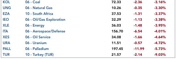
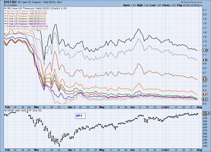
INTEREST RATES
This chart is included so we can monitor rate inversions. In normal circumstances the longer money is borrowed the higher the interest rate that must be paid. When rates are inverted, the reverse is true.
STOCKS
IT Trend Model: BUY as of 5/8/2020
LT Trend Model: BUY as of 6/8/2020
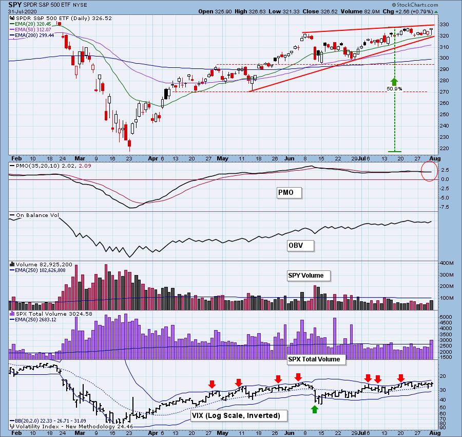
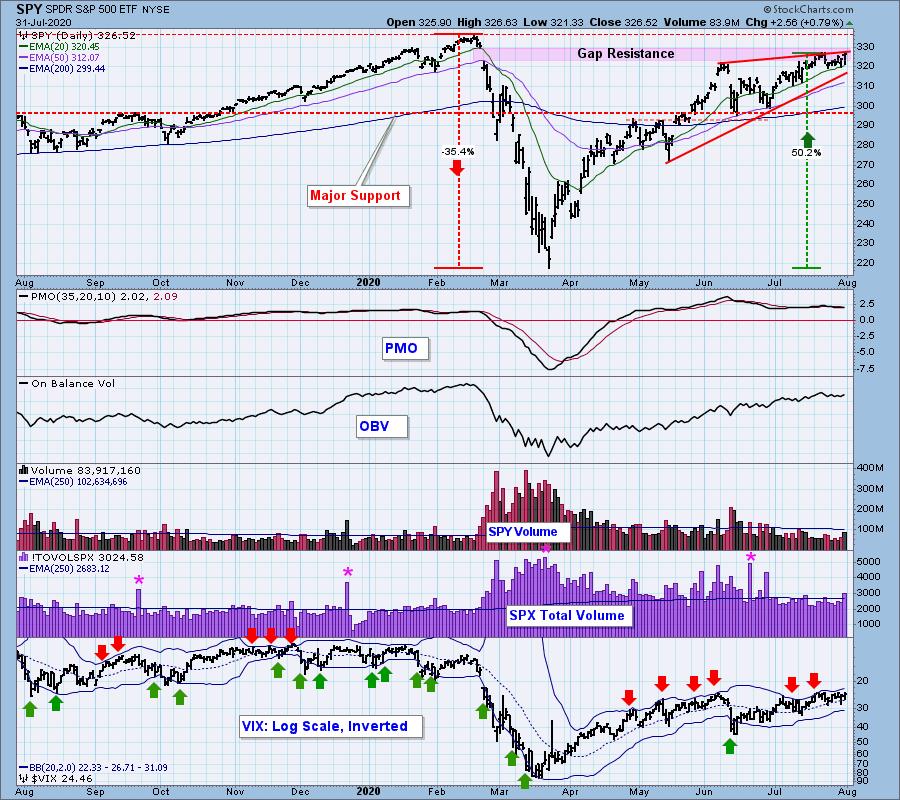
SPY Daily Chart: The rising wedge still dominates the chart, and price has remained within a narrow sideways range for almost three weeks. Friday's rally on expanding SPX Total Volume has the look of a blowoff. The daily PMO is below the signal line.
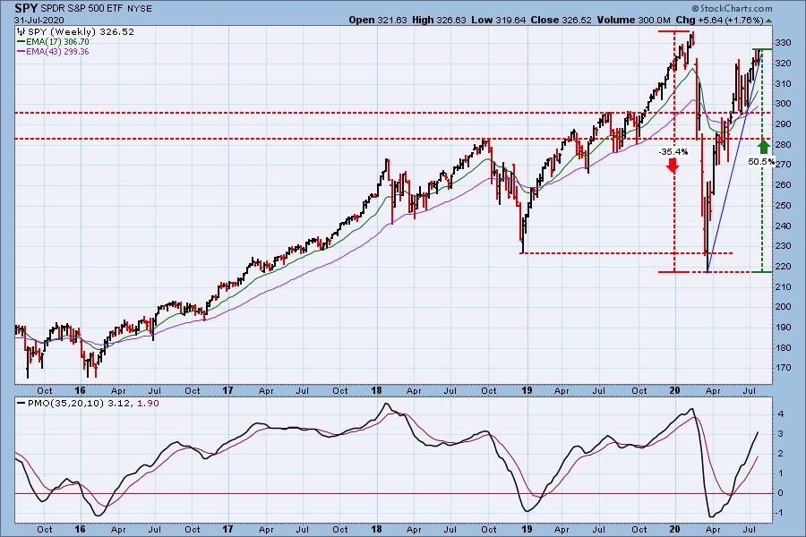
SPY Weekly Chart: The weekly PMO is getting overbought, but not anywhere near the to of the visible range.
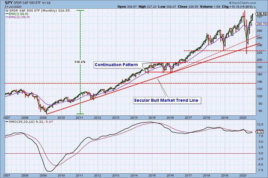
S&P 500 Monthly Chart: The monthly PMO is rising, but it is still below the signal line.
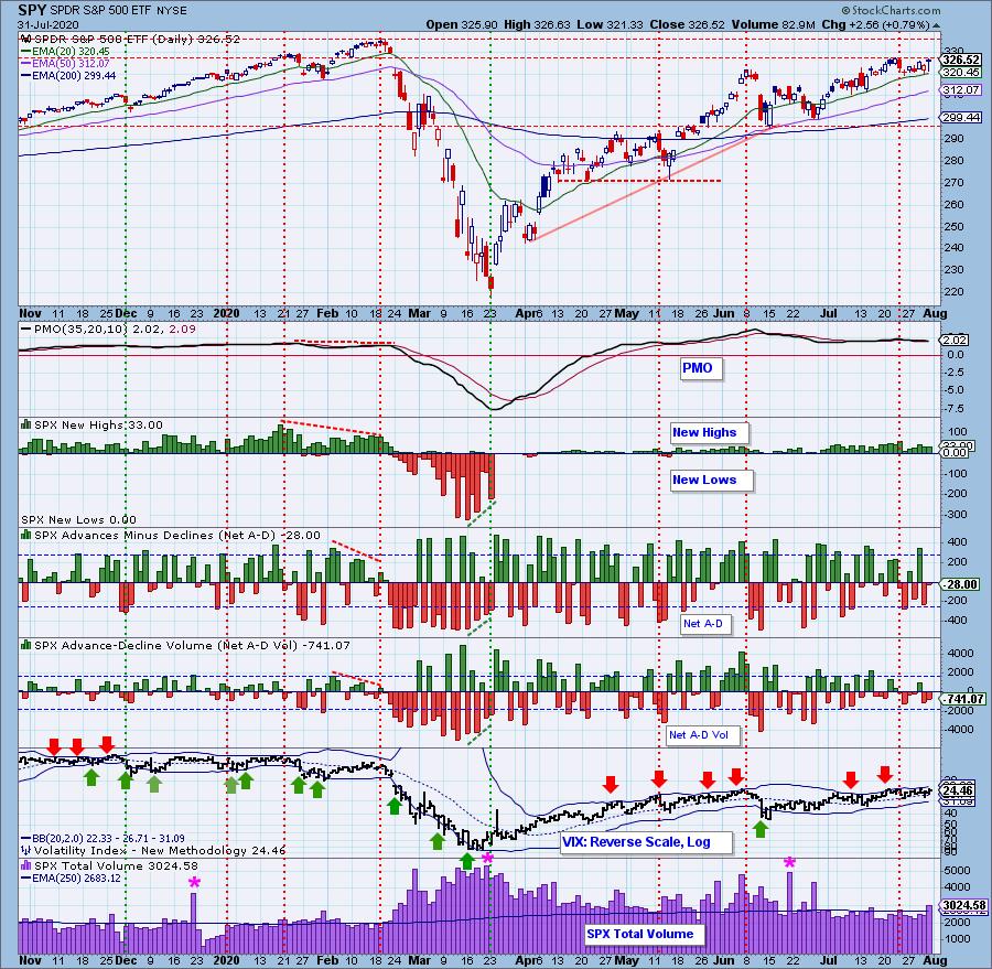
Climactic Market Indicators: Friday's advance on expanding volume looks like a blowoff, because the Net A-D and Net A-D Volume were negative -- fewer stocks pushing the index up than pulling it down.
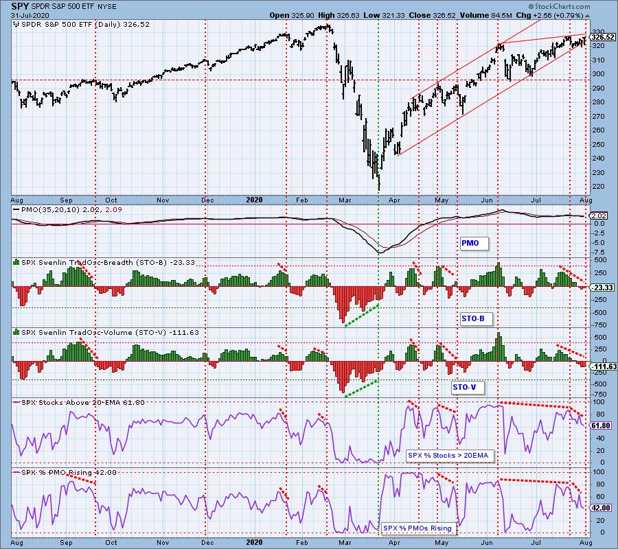
Short-Term Market Indicators: The short-term market trend is UP and the condition is NEUTRAL. The market bias is bullish, but the bottom two indicators are showing severe divergences. SPY was withing one point of making a new rally high, but Stocks Above 20EMA is down -32% fron the top just one week ago, and Prcent PMOs Rising is down -47% in the same period. This is showing severe weakness!
Intermediate-Term Market Indicators: The following chart uses different methodologies for objectively showing the depth and trend of participation for intermediate- and long-term time frames.
- The Silver Cross Index (SCI) shows the percentage of SPX stocks on IT Trend Model BUY signals (20-EMA > 50-EMA).
- The Golden Cross Index (GCI) shows the percentage of SPX stocks on LT Trend Model BUY signals (50-EMA > 200-EMA).
- The Bullish Percent Index (BPI shows the percentage of SPX stocks on Point & Figure BUY signals.
The SCI and BPI negative divergences persist.
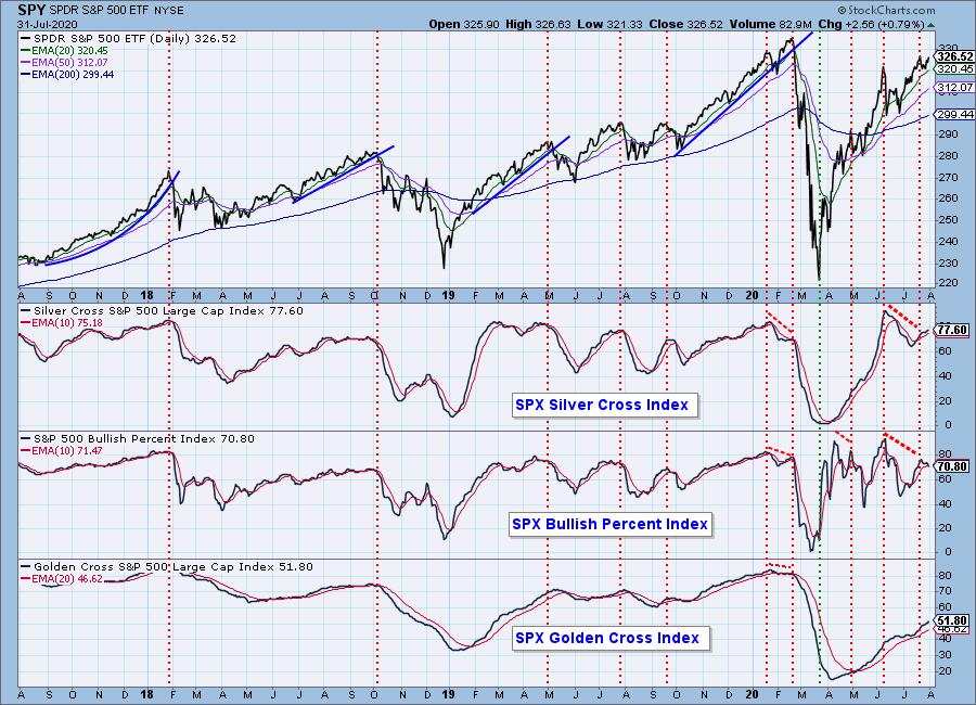
The intermediate-term market trend is UP and the condition is NEUTRAL to somewhat OVERBOUGHT. Market bias remains bullish.
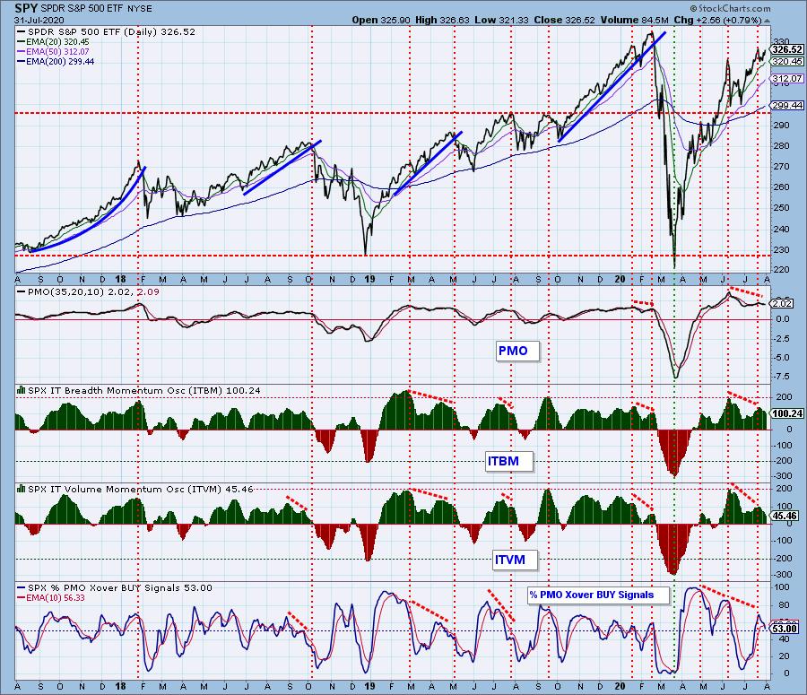
CONCLUSION: Since the early-June top the market has advanced less than two percent, and it's been a three-week grind sideways up to today. I think part of the problem was the waiting for big tech earnings reports this week.
Participation in Friday's rally was extraordinarily thin -- the big tech stocks, AAPL in particular (up +10.5% on Friday), had their usual inordinate influence on the outcome. Negative divergences abound in the short- and intermediate-term time frames, and the ones on the short- and intermediate-term charts above are profound. It is possible for these malignancies to repair themselves internally, that is to say without significant price correction, but that is not the outcome I expect.
Note: AAPL is scheduled for a 4:1 split on August 31.
Have you subscribed the DecisionPoint Diamonds yet? DP does the work for you by providing handpicked stocks/ETFs from exclusive DP scans! Add it with a discount! Contact support@decisionpoint.com for more information!
DOLLAR (UUP)
IT Trend Model: NEUTRAL as of 5/28/2020
LT Trend Model: SELL as of 7/10/2020
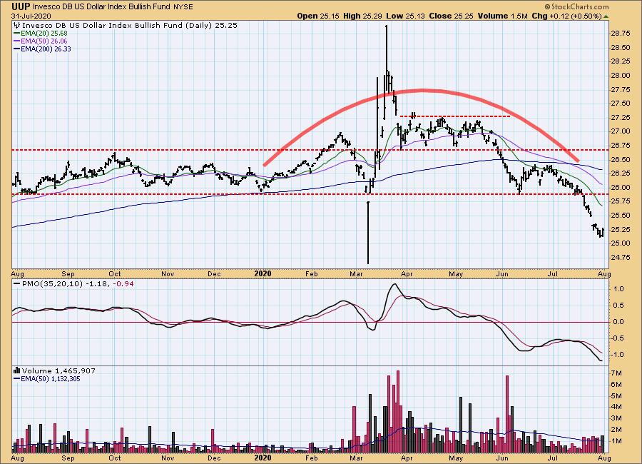
UUP Daily Chart: UUP continued its down trend, beginning with a down gap on Monday. It turned up Friday, so maybe we'll see more bounce next week.
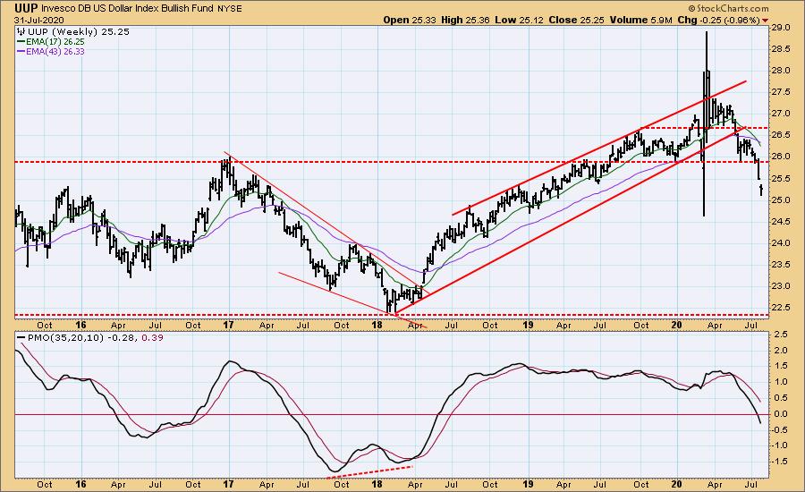
UUP Weekly Chart: The 17EMA crossed down through the 43EMA, and the weekly PMO crossed down through the zero line. The dollar will probably go lower, because there are no fundamentals that would raise our hopes.
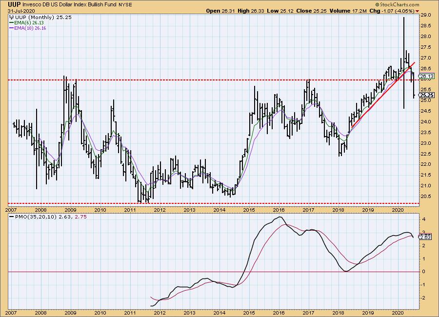
UUP Monthly Chart: Price is well below the long-term support line.
GOLD
IT Trend Model: BUY as of 3/24/2020
LT Trend Model: BUY as of 1/8/2019
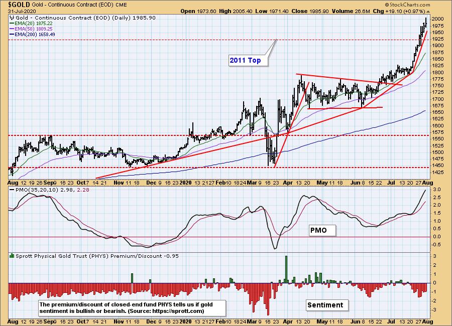
GOLD Daily Chart: On Tuesday I published an article on gold that you may want to check out if you have more than a passing interest in the subject. Gold has broken above the resistance line drawn across the previous all-time high in 2011. Price needs to go to about 1982 for the breakout to be "decisive," meaning it would be unlikely to fail. Note the increasing angle of ascent of the trend lines for the last several months., possibly a bad thing with the daily PMO being overbought; however, our sentiment indicator is slightly bearish, showing that the public is not interested yet.
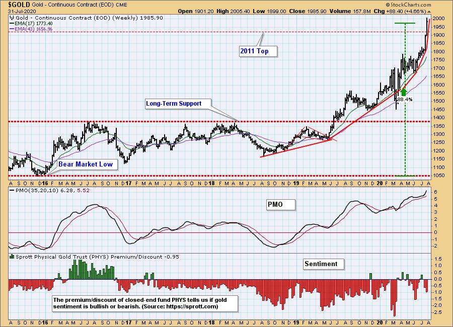
GOLD Weekly Chart: Price is accelerating upward, so I'm concerned for a possible collapse. Because sentiment is still bearish, I believe a consolidation or pullback is more likely.
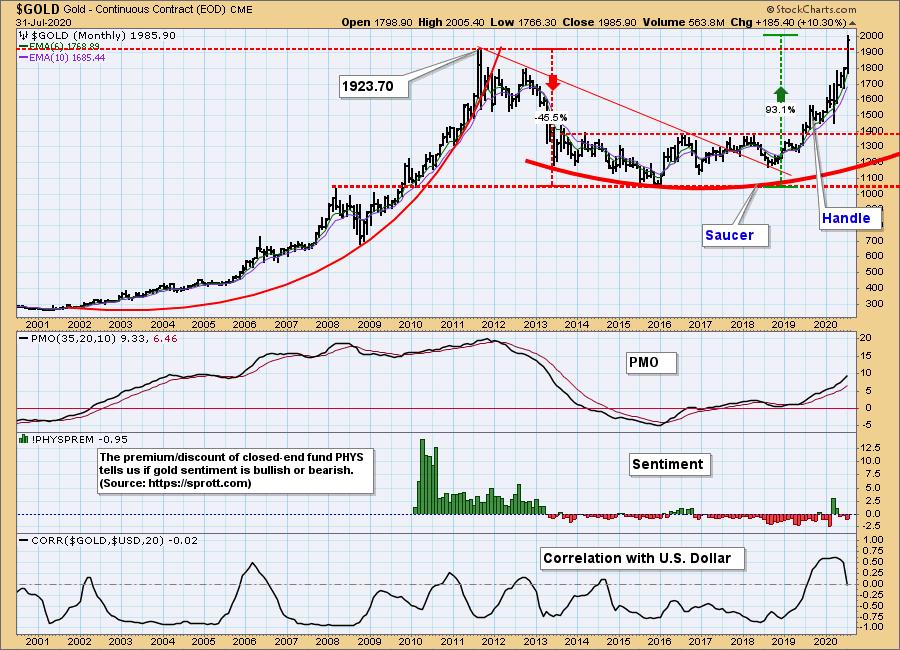
GOLD Monthly Chart: Compared to the 2011 high, the monthly PMO still has more to go before it is really overbought. And, again, sentiment is far from the bullish extremes seen at blowoff tops. I'm very bullish on gold, but I'm going to want to see how it digests the vertical move.
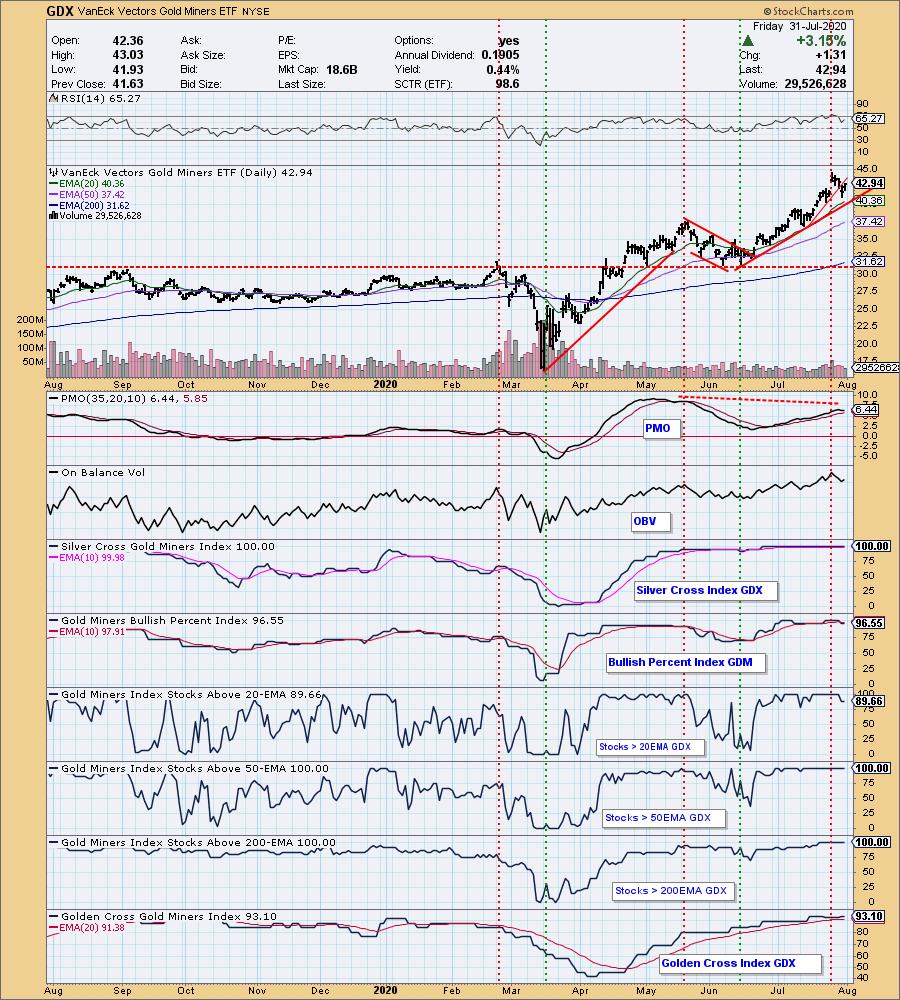
GOLD MINERS Golden and Silver Cross Indexes: GDX broke down through the very short-term rising trend line. This was healthy, because it had departed too far from the rising trend line drawn from the June low, and an OBV negative divergence has developed. All other indicators are overbought. As long as gold doesn't break down, I think the miners will be okay.
CRUDE OIL (USO)
IT Trend Model: NEUTRAL as of 1/27/2020
LT Trend Model: SELL as of 2/3/2020
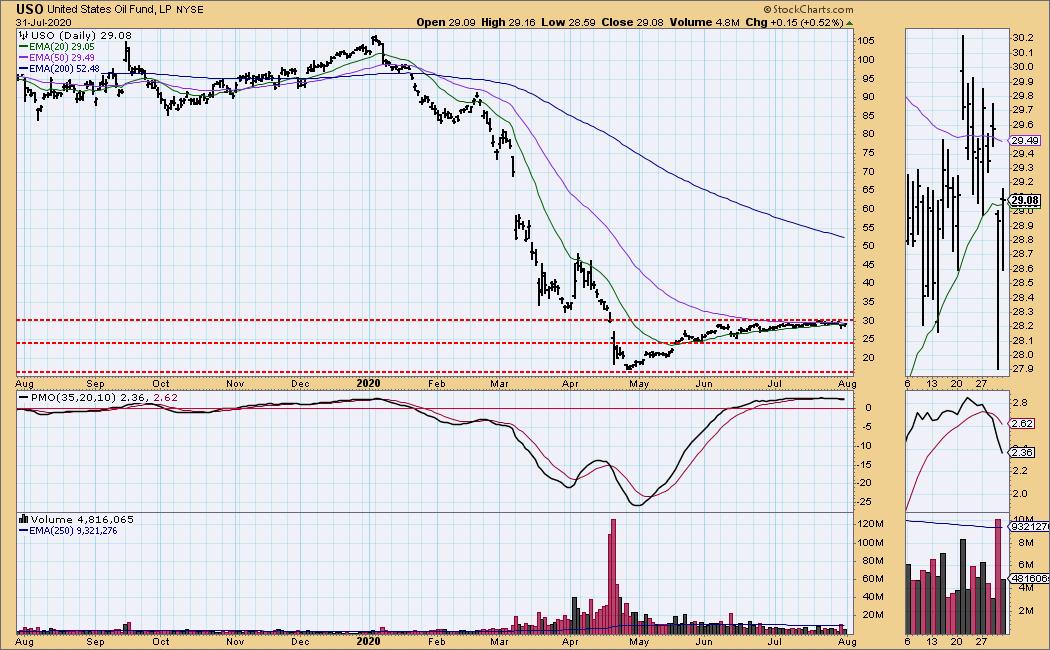
USO Daily Chart: Things have settled down for about three months, and I have decided to switch back to using USO to track crude oil. As we can see, USO has moved into a very narrow range, between 28 and 30 for the last month. I included the thumbnail panel because it shows a break in pattern this week. There seems to be little upside potential at present.
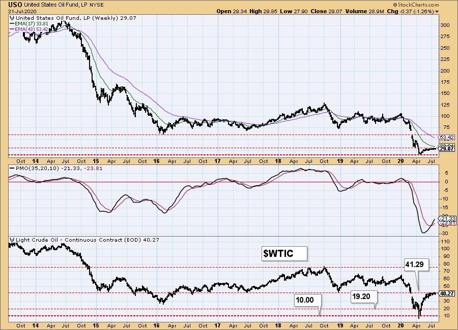
USO Weekly Chart: In this time frame it looks as if USO and WTIC have reached their upside potential.
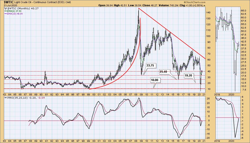
$WTIC Monthly Chart: Because USO historical data isn't very deep, we'll continue to track WTIC for the long term.
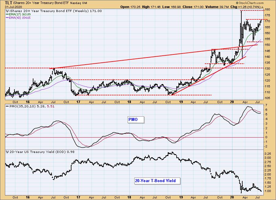
BONDS (TLT)
IT Trend Model: BUY as of 6/26/2020
LT Trend Model: BUY as of 1/2/2019
TLT Daily Chart: It is probable that TLT is at the top of a range that won't be exceeded unless the Fed lowers rates or another panic situation, like March, emerges.
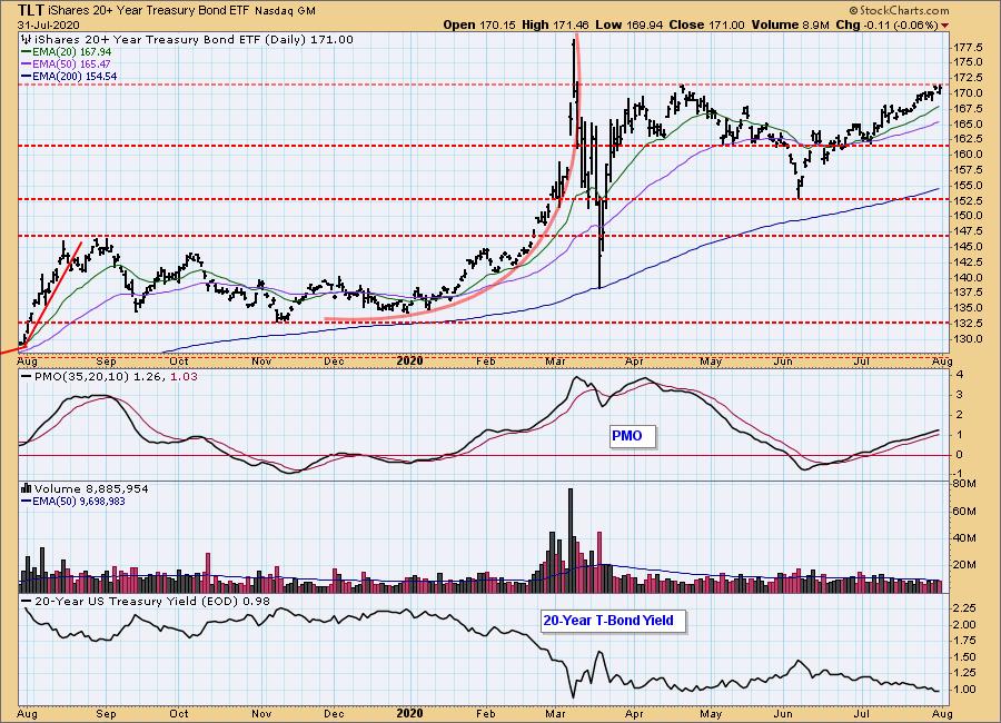
TLT Weekly Chart: Nothing to add in this time frame.
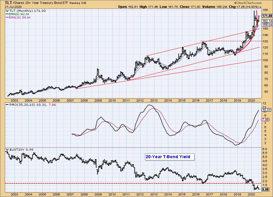
TLT Monthly Chart: The parabolic advance of the last year broke down, but I see no likelyhood of a total collapse without the fundamental situation changing.
Technical Analysis is a windsock, not a crystal ball.
Happy Charting! - Carl
Disclaimer: This blog is for educational purposes only and should not be construed as financial advice. The ideas and strategies should never be used without first assessing your own personal and financial situation, or without consulting a financial professional. Any opinions expressed herein are solely those of the author, and do not in any way represent the views or opinions of any other person or entity.
NOTE: The signal status reported herein is based upon mechanical trading model signals, specifically, the DecisionPoint Trend Model. They define the implied bias of the price index based upon moving average relationships, but they do not necessarily call for a specific action. They are information flags that should prompt chart review. Further, they do not call for continuous buying or selling during the life of the signal. For example, a BUY signal will probably (but not necessarily) return the best results if action is taken soon after the signal is generated. Additional opportunities for buying may be found as price zigzags higher, but the trader must look for optimum entry points. Conversely, exit points to preserve gains (or minimize losses) may be evident before the model mechanically closes the signal.
Helpful DecisionPoint Links:
DecisionPoint Alert Chart List
DecisionPoint Golden Cross/Silver Cross Index Chart List
DecisionPoint Sector Chart List
Price Momentum Oscillator (PMO)
Swenlin Trading Oscillators (STO-B and STO-V)