We decided to take a look at our Silver Cross Index (SCI) and Golden Cross Index (GCI) across the broad markets. They were startling to say the least. As we all debate whether this is the end of the Bear Market of 2022, these two indicators suggest it just might be.
Our SCI measures how many stocks have a 20-day EMA above the 50-day EMA and the GCI measures how many stocks have a 50-day EMA above the 200-day EMA. Those numbers have been steadily increasing and in the case of the SCI, the increase has been nearly vertical.
The SCI has been on a roll as more and more stocks have "silver crosses". Notice how similar their behavior was at the end of the 2020 Bear Market.

Additionally on the improving GCIs, we have an oversold bottom and positive crossover on all of them. The last time the GCIs bottomed in oversold territory, it was the end of the 2020 bear market.

Conclusion: We can't say for sure that the bear market is over, but we are seeing compelling evidence on our DecisionPoint indicators that suggest it just might be. On the flip side, the SCIs are overbought and that could mean a market top ahead.
The DecisionPoint Alert Weekly Wrap presents an end-of-week assessment of the trend and condition of the Stock Market, the U.S. Dollar, Gold, Crude Oil, and Bonds. The DecisionPoint Alert daily report (Monday through Thursday) is abbreviated and gives updates on the Weekly Wrap assessments.
Watch the latest episode of DecisionPoint on StockCharts TV's YouTube channel here!
MAJOR MARKET INDEXES

For Today:
For the Week:
SECTORS
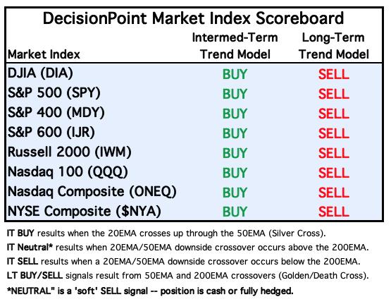
Each S&P 500 Index component stock is assigned to one of 11 major sectors. This is a snapshot of the Intermediate-Term (Silver Cross) and Long-Term (Golden Cross) Trend Model signal status for those sectors.

For Today: 
For the Week:
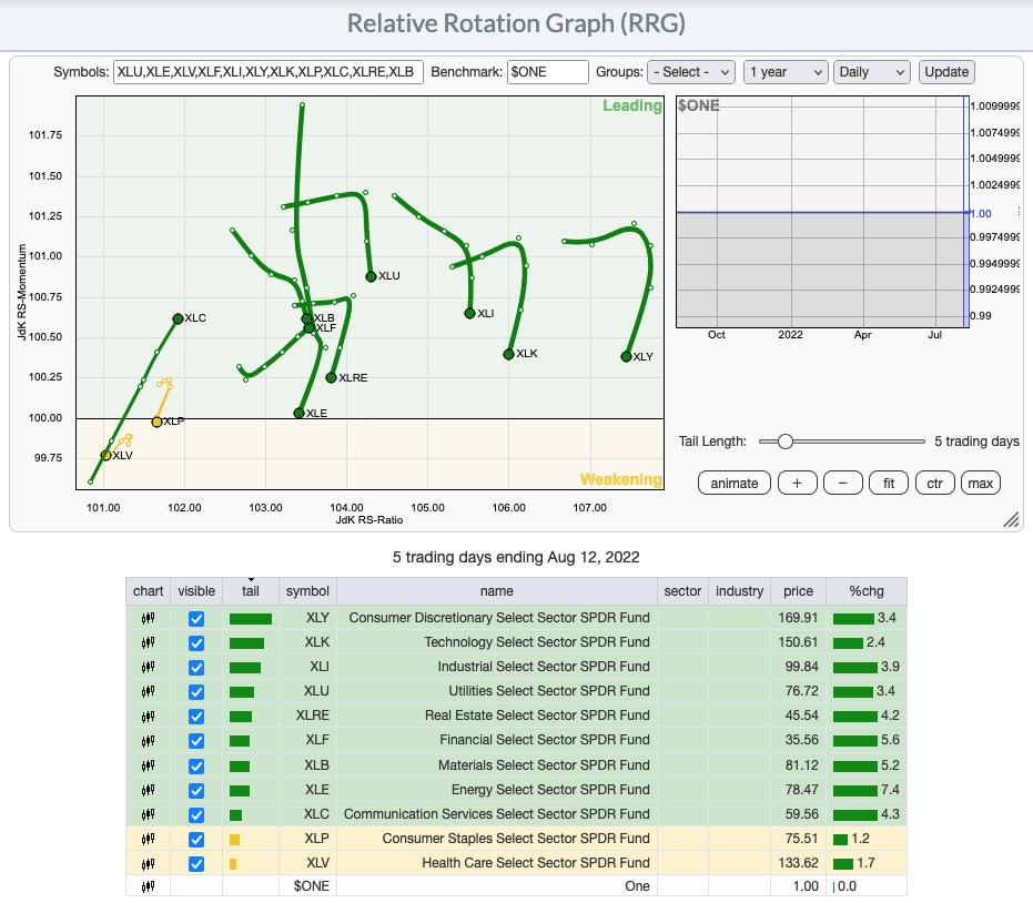
RRG® Daily Chart ($ONE Benchmark):
We see new leadership arising and that is from XLC and XLF. Looking at their charts in the Diamond Mine this morning (Diamond subscriber-only trading room), it isn't surprising that these two are getting renewed strength.
XLP and XLV are the most bearish given their bearish southwest headings and being the only sectors in the Weakening quadrant.
However, we see bullish rotation deteriorating on most of the other sectors. XLE, XLRE, XLI, XLK and XLY all have bearish southwest headings even though they are resident in the Leading quadrant.
More neutral sectors would be XLU and XLB. They looks somewhat bearish as they travel southward, but they still have an eastward component to their heading.

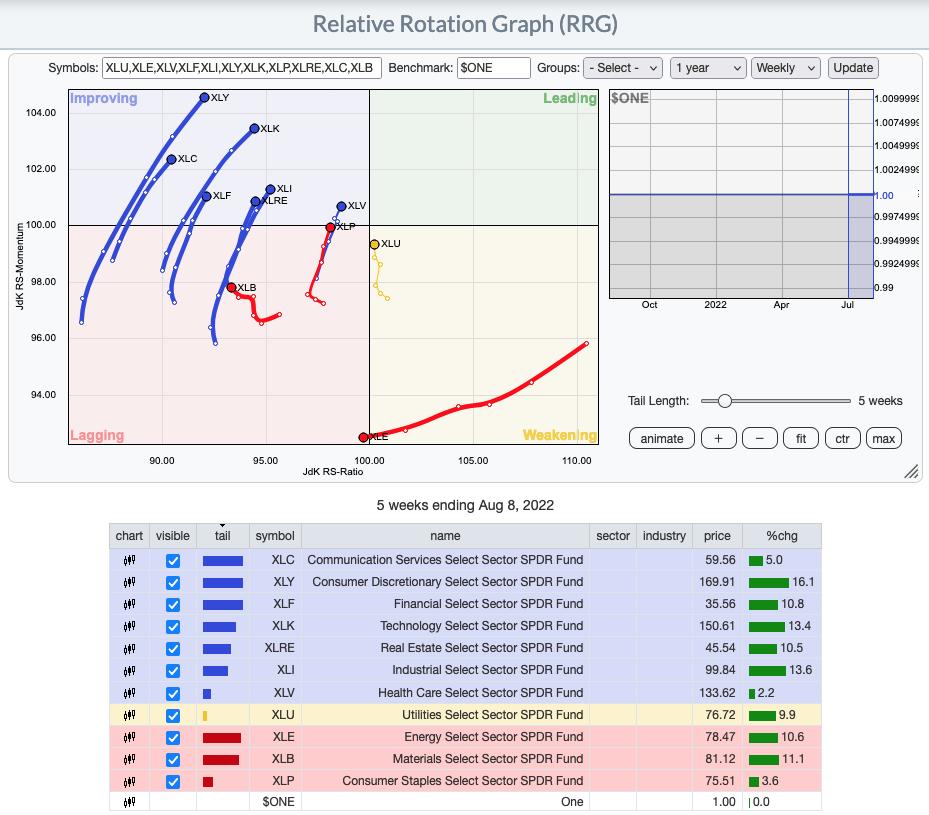
RRG® Weekly Chart ($ONE Benchmark):
The weekly RRG is overall. All sectors with the exception of XLU, XLB and XLE, have bullish northeast headings and are rising strongly. XLP is in the Lagging quadrant, but its bullish northeast heading nearly pushed it into the Leading quadrant to finish the week.
The intermediate-term picture is still bright based on the RRG, but less so on the short-term daily RRG above.

RRG® charts show you the relative strength and momentum for a group of stocks. Stocks with strong relative strength and momentum appear in the green Leading quadrant. As relative momentum fades, they typically move into the yellow Weakening quadrant. If relative strength then fades, they move into the red Lagging quadrant. Finally, when momentum starts to pick up again, they shift into the blue Improving quadrant.
CLICK HERE for an animated version of the RRG charts.
CLICK HERE for Carl's annotated Sector charts.
THE MARKET (S&P 500)
IT Trend Model: BUY as of 8/2/2022
LT Trend Model: SELL as of 5/5/2022
SPY Daily Chart: We now have a clear upside breakout from the bearish rising wedge pattern. A bullish conclusion to a bearish pattern is considered especially bullish. The PMO is getting overbought, but rising steadily. The RSI is overbought and typically that is cause for alarm. However, if we are looking at a new bull market phase, overbought readings can easily persist.

The VIX continues to stay above its moving average on the inverted scale suggesting internal strength. Stochastics are also implying internal strength as they oscillate above 80.

Here is the latest reply from StockChartsTV:
SPY Weekly Chart: This chart tells us the bear market is likely over, but what we'd like to see is a breakout from the longer-term declining trend formed by the bull market top in January and the top of the failed rally later. It's getting close. A failure to move out of the declining trend will signal to us that the bear market may still have hold on the markets. This new print of a weekly PMO crossover BUY signal could also suggest the long-term bear may be ready to hibernate.

New 52-Week Highs/Lows: New Highs trended slightly higher this week. Readings are still mild, but New Lows have mostly vanished. The 10-DMA of the High-Low Differential is gently rising and isn't overbought.

Climax Analysis: As we saw Wednesday, we got very strong and unanimous climax readings today. And as it was Wednesday, today was an upside exhaustion climax. SPX Total Volume did not confirm. That doesn't mean that the rally can't continue next week, but we could see another pause.

*A climax is a one-day event when market action generates very high readings in, primarily, breadth and volume indicators. We also include the VIX, watching for it to penetrate outside the Bollinger Band envelope. The vertical dotted lines mark climax days -- red for downside climaxes, and green for upside. Climaxes are at their core exhaustion events; however, at price pivots they may be initiating a change of trend.
Short-Term Market Indicators: The short-term market trend is UP and the condition is OVERBOUGHT.
STOs did an about-face this week, finally rising with price. The good news is that negative divergences could go away if they rise further. If they don't rise past prior highs and turn over, that would be bad news for bulls. Participation is very overbought but notice %PMOs Rising and %Stocks > 20-day EMAs have been overbought for about a month with no real damage.

Intermediate-Term Market Indicators: The intermediate-term market trend is UP and the condition is EXTREMELY OVERBOUGHT.
We haven't seen readings this high since the bear market reversal in 2020. But even then, overbought conditions eventually meant lower prices. %PMO BUY Signals have maintained in overbought territory a bit longer than usual and they did turn up again today.

PARTICIPATION and BIAS Assessment: The following chart objectively shows the depth and trend of participation in two time frames.
- Intermediate-Term - the Silver Cross Index (SCI) shows the percentage of SPX stocks on IT Trend Model BUY signals (20-EMA > 50-EMA). The opposite of the Silver Cross is a "Dark Cross" -- those stocks are, at the very least, in a correction.
- Long-Term - the Golden Cross Index (GCI) shows the percentage of SPX stocks on LT Trend Model BUY signals (50-EMA > 200-EMA). The opposite of a Golden Cross is the "Death Cross" -- those stocks are in a bear market.
The following table summarizes participation for the major market indexes and sectors. The 1-Week Change columns inject a dynamic aspect to the presentation.
The following table summarizes participation for the major market indexes and sectors. The 1-Week Change columns inject a dynamic aspect to the presentation.

This table is sorted by SCI values. This gives a clear picture of strongest to weakest index/sector in terms of participation.
The biggest improvements were seen by Real Estate (XLRE) (+42 on SCI) and XLC (+27 on SCI). The bias for all of these sectors and indexes is positive. Based on the large difference between the SCI and GCI, Energy (XLE) is by far the weakest.
Utilities (XLU), Industrials (XLI) and Technology (XLK) all have SCIs at or above 80. This suggests plenty of internal strength.

Not much has changed since last week as far as the bias analysis:
The short-term bias is bullish given we have 94.2% of stocks above their 20-day and 90.8% above their 50-day EMAs. These percentages are much higher than the SCI reading of 69%. This implies that the SCI should continue higher.
The intermediate-term bias is bullish. While the SCI reading of 69.0% isn't above the 70% bullish threshold, it might as well be.
The long-term bias is now neutral to bullish in our opinion. We have 64.2% of stocks with price above their 200-day EMA and that is higher than the GCI reading of 32.0%. The GCI has had a positive crossover its signal line and is rising, albeit very slowly.

CONCLUSION: We don't want to appear overly bullish here, but we cannot deny the similarities in 2022 indicator activity to 2020. Today's upside exhaustion climax and negative divergences on the STOs could mean the market will top out here. If it doesn't lose new support and we see a pause or more churn, we would consider that bullish for the intermediate term. At this point, we just need to be careful of a "bull trap" on this breakout.
Calendar: Next week is options expiration, so expect low volatility toward the end of the week.
Erin is 60% exposed and may increase that exposure next week to 65%.
Have you subscribed the DecisionPoint Diamonds yet? DP does the work for you by providing handpicked stocks/ETFs from exclusive DP scans! Add it with a discount! Contact support@decisionpoint.com for more information!
BITCOIN
Bitcoin has formed a bearish rising wedge. Indicators are mixed. Stochastics are oscillating in positive territory as is the RSI. The PMO is mostly flat as Bitcoin oscillates within the wedge. The negative OBV divergence just keeps getting worse. We expect a breakdown from this pattern.

This chart is to show where some of the support/resistance lines come from.

INTEREST RATES
The one-month and five-month yields paused a bit, but the others formed a new rising trend.

The Yield Curve Chart from StockCharts.com shows us the inversions taking place. The red line should move higher from left to right. Inversions are occurring where it moves downward.

10-YEAR T-BOND YIELD
$TNX is attempting to break from a bullish falling wedge pattern. Based on the new PMO crossover BUY signal and rising Stochastics, we would expect the breakout. The RSI is soft, but still above net neutral (50). As noted yesterday, it might be time to scope out the Interest Rate Hedge ETF (PFIX).

MORTGAGE INTEREST RATES (30-Yr)**
**We watch the 30-Year Fixed Mortgage Interest Rate, because, for the most part, people buy homes based upon the maximum monthly payment they can afford. As rates rise, a fixed monthly payment will carry a smaller mortgage amount. As buying power shrinks, home prices will come under pressure.
--
This week the 30-Year Fixed Rate rose from 4.99 to 5.22. The declining trend in rates seems to be helping the Real Estate sector (XLRE), but they have bounced off support and are back up.


DOLLAR (UUP)
IT Trend Model: BUY as of 6/22/2021
LT Trend Model: BUY as of 8/19/2021
UUP Daily Chart: The Dollar finished lower on the week as it flirted with support/resistance at the June high. The PMO and Stochastics are falling and the RSI, while rising, is still in negative territory below net neutral (50). We do note a positive OBV divergence is in play, but for now we will rely on our other more bearish indicators.


UUP Weekly Chart: Price broke out originally from a bearish rising wedge. However, once resistance was hit, price reversed. The weekly RSI is no longer overbought, but the weekly PMO has ominously topped in very overbought territory.

GOLD
IT Trend Model: NEUTRAL as of 5/3/2022
LT Trend Model: SELL as of 6/30/2022
GOLD Daily Chart: GLD has not behaved like $GOLD. Still, the picture is bright for the shiny metal. The RSIs are in positive territory, PMOs are rising and Stochastics are oscillating comfortably above 80. All of this points to a breakout on GLD.

$GOLD had its breakout above the June low and the PMO has moved into positive territory. Discounts are still high so investors aren't quite on board the Gold train, but sentiment being contrarian, this is good.

GOLD Weekly Chart: $GOLD is about to recapture the rising trend drawn from the 2020 low. It bounced right on the long-term rising bottoms trendline as well as support at 2021 lows. If Gold is going to continue in this large trading range, price is still near the lows of that range, so plenty of upside potential is there. The weekly RSI isn't quite positive and the weekly PMO is flat so Gold is at a 'decision point'. Next week's price action will be very revealing.

GOLD MINERS Golden and Silver Cross Indexes: We started singing the praises of this industry group in Monday's DecisionPoint Trading Room. The group as well as Metals & Mining (XME) have been rallying and have formed a very nice basing pattern. The RSI is now positive and the PMO is rising. The SCI and GCI aren't moving anywhere, but most of the miners have EMA configurations that are the same as GDX. It will take a long time before we start seeing improvement on those two indicators. However, %Stocks indicators are showing excellent participation. We remain bullish on Gold and this group.

CRUDE OIL (USO)
IT Trend Model: NEUTRAL as of 7/8/2022
LT Trend Model: BUY as of 3/9/2021
USO Daily Chart: USO has been mostly range-bound, but it is making a third attempt to breakout of this trading channel between $70 and $78. The indicators look a bit more potent with this week's PMO crossover BUY signal and rising Stochastics, but the RSI is a problem and the reversal at the 50-day EMA is also a problem. The chart is neutral.

Neutral because we have a triple-bottom which is bullish, but failure at the 50-day EMA is bearish.

USO/$WTIC Weekly Chart: $WTIC lost support last week and was unable to recapture it. USO is holding on the 43-week EMA, but this looks very toppy. The weekly RSI is negative (but in near-term oversold territory) and the PMO is falling from overbought territory. We don't expect much upside.

BONDS (TLT)
IT Trend Model: BUYas of 8/2/2022
LT Trend Model: SELL as of 1/19/2022
TLT Daily Chart: TLT may have closed higher on the day, but damage was done this week with a breakdown from the rising bottoms trendline. The recent PMO crossover SELL signal also doesn't inspire confidence. The RSI is negative and we have a new short-term declining trend. Stochastics are in the basement and falling further.

This is not a good look, but... this could turn into a complex reverse head and shoulders with the left shoulder being the May low, the head being the June low and the right shoulder could be forming on this breakdown.

TLT Weekly Chart: The idea of a reverse head and shoulders seems supported by the weekly chart. In the case of the weekly chart, we have a new weekly PMO crossover BUY signal rather than a SELL signal as on the daily chart. We aren't bullish on bonds, but the weekly PMO is looking good.

Good Luck & Good Trading!
Erin Swenlin And Carl Swenlin
Erin is 60% exposed and is considering expanding to 65% next week.
Technical Analysis is a windsock, not a crystal ball. --Carl Swenlin
(c) Copyright 2022 DecisionPoint.com
Disclaimer: This blog is for educational purposes only and should not be construed as financial advice. The ideas and strategies should never be used without first assessing your own personal and financial situation, or without consulting a financial professional. Any opinions expressed herein are solely those of the author, and do not in any way represent the views or opinions of any other person or entity.
NOTE: The signal status reported herein is based upon mechanical trading model signals, specifically, the DecisionPoint Trend Model. They define the implied bias of the price index based upon moving average relationships, but they do not necessarily call for a specific action. They are information flags that should prompt chart review. Further, they do not call for continuous buying or selling during the life of the signal. For example, a BUY signal will probably (but not necessarily) return the best results if action is taken soon after the signal is generated. Additional opportunities for buying may be found as price zigzags higher, but the trader must look for optimum entry points. Conversely, exit points to preserve gains (or minimize losses) may be evident before the model mechanically closes the signal.
Helpful DecisionPoint Links:
DecisionPoint Alert Chart List
DecisionPoint Golden Cross/Silver Cross Index Chart List
DecisionPoint Sector Chart List
Price Momentum Oscillator (PMO)
Swenlin Trading Oscillators (STO-B and STO-V)
DecisionPoint is not a registered investment advisor. Investment and trading decisions are solely your responsibility. DecisionPoint newsletters, blogs or website materials should NOT be interpreted as a recommendation or solicitation to buy or sell any security or to take any specific action.
