It occurred to us after Erin discussed the "Death Crosses" (50-day EMA dropping below the 200-day EMA) on the NDX and Nasdaq 100 yesterday that we should investigate the actual damage done. The tech-heavy NDX and Nasdaq 100 are in bear markets (20%+ decline), and XLK is too.
We've been questioned about our discussion of the SPY being in a bear market because we don't have a 20%+ decline yet. Well, if you go by that "official" 20% number, XLK, NDX and Nasdaq are all in "official" bear markets.
XLK looks particularly bearish right now. Price has failed at the 200-day EMA and the PMO has topped beneath its signal line. It just had a short bear market rally, but it is back to declining. From its high to its recent low, it is a slightly more than 20% decline.

The Nasdaq ($COMPQ) had its "Death Cross" a few weeks ago. It is down over 22% from top to bottom.

The NDX had a Death Cross yesterday. It was down a little over 22% from all-time high to the last low.

Conclusion: Aggressive sectors like Technology continue to be very weak. You'll be able to visualize this in the RRG analysis further down. There are wartime beneficiaries out there like Crude Oil, Gold, Specialty Chemicals, Metals and Mining to name a few. Erin has been following these closely in DecisionPoint Diamonds reports. She had some very successful stock picks from these areas which had "Diamonds in the Rough" finishing this week in the green.
The DecisionPoint Alert Weekly Wrap presents an end-of-week assessment of the trend and condition of the Stock Market, the U.S. Dollar, Gold, Crude Oil, and Bonds. The DecisionPoint Alert daily report (Monday through Thursday) is abbreviated and gives updates on the Weekly Wrap assessments.
Watch the latest episode of DecisionPoint on StockCharts TV's YouTube channel here!
MAJOR MARKET INDEXES
For Today:
For the Week:
SECTORS
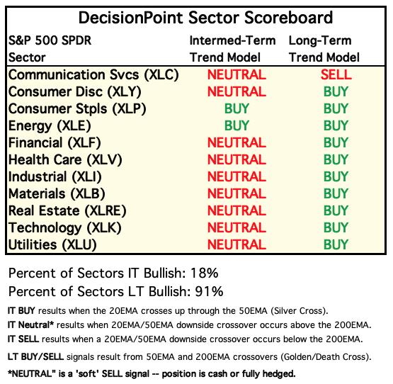
Each S&P 500 Index component stock is assigned to one, and only one, of 11 major sectors. This is a snapshot of the Intermediate-Term (Silver Cross) and Long-Term (Golden Cross) Trend Model signal status for those sectors.

For Today: 
For the Week:
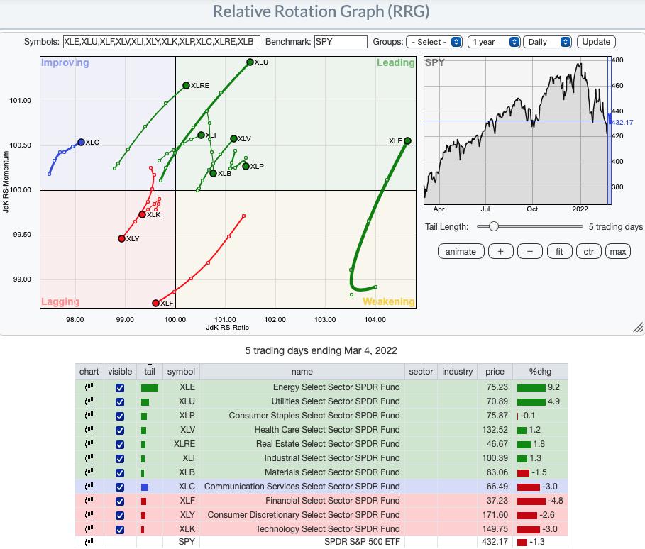
Short-term (Daily) RRG:
The most bearish sectors are not surprising. XLY, XLK and XLF are pushing further into Lagging. The war seems to be shaving investors' interest in more aggressive areas of the market. Erin is sticking to more defense picks in DP Diamonds report.
XLU, XLRE and XLE are showing the most relative strength and it is just getting better as they move in the bullish northeast direction. Not far behind are XLI and XLV which are closer to the center (so not outperforming the SPY as much) and they also have bullish northeast headings.
XLB and XLP are showing some weakness despite being in Leading. XLB is hit and miss as far as relative strength within its industry groups and she believes that explains the southward heading. XLP was looking pretty good this week, but today it has reversed into a bearish southwest heading.
XLC is out on its own in Improving. It also has a bullish northeast heading. The bullish/bearish diversity within its industry groups (most of which are failing) makes us less confident investing in that sector. If you do, make sure the industry group is outperforming.

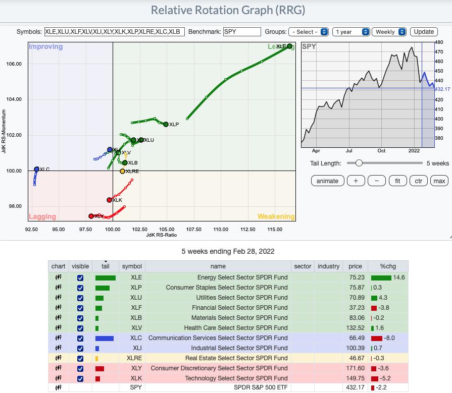
Intermediate-Term (Weekly) RRG:
XLE continues to be the strongest performer. Erin doesn't see this sector slowing down anytime soon. The most bearish in the intermediate term are XLK, XLY and interestingly XLRE which looks good on the short-term daily RRG above.
XLC just moved into Improving on the weekly RRG. As noted above she's not fan of the sector. XLI which is in Improving currently should enter Leading very soon. XLF and XLU are moving away from the center (SPY) in a bullish northeast direction.
XLB is hooking back around unlike on the daily RRG. XLP looks strong even though it is traveling southeast. It's firmly within Leading. It will take some serious underperformance against the SPY before it reaches Weakening.

RRG® charts show you the relative strength and momentum for a group of stocks. Stocks with strong relative strength and momentum appear in the green Leading quadrant. As relative momentum fades, they typically move into the yellow Weakening quadrant. If relative strength then fades, they move into the red Lagging quadrant. Finally, when momentum starts to pick up again, they shift into the blue Improving quadrant.
CLICK HERE for an animated version of the RRG chart.
CLICK HERE for Carl's annotated Sector charts.
THE MARKET (S&P 500)
IT Trend Model: NEUTRAL as of 1/21/2022
LT Trend Model: BUY as of 6/8/2020
SPY Daily Chart: The rising trend established out of the February low was broken. Support is holding at January lows, but we aren't optimistic given the negative RSI and PMO that is preparing to top below its signal line. Stochastics are rising slightly, but another down day and we will see them reverse too.

Normally punctures of the lower Bollinger Band by the VIX lead into rallies. We saw a very small bear market rally, but that is already fading away on the SPY. That will lead to the VIX readings being even higher.

SPY Weekly Chart: We do see a bullish falling wedge on the weekly chart, but the weekly PMO and weekly RSI are very negative and falling. Notice this week that just as price reached the top of the wedge, it failed. This is a bullish formation but Bear Market Rules tell us not to expect bullish conclusions from bullish chart patterns.

New 52-Week Highs/Lows: We saw more New Highs, but we also saw an expansion of New Lows--signs of volatility. The 10-DMA of the High-Low Differential is rising and just moved above the zero line. Typically that is a good sign.

Climax Analysis: We had two climax days this week. None today. The first was a downside exhaustion climax. It resulted in one day of higher prices. Then we had an upside initiation climax on Wednesday. There was no follow-through. This is indicative of a bear market. Bullish conclusions should always be tempered in a bear market.

*A climax is a one-day event when market action generates very high readings in, primarily, breadth and volume indicators. We also include the VIX, watching for it to penetrate outside the Bollinger Band envelope. The vertical dotted lines mark climax days -- red for downside climaxes, and green for upside. Climaxes indicate either initiation or exhaustion.
Short-Term Market Indicators: The short-term market trend is DOWN and the condition is NEUTRAL.
STOs have continued to rise but we aren't seeing follow-through on price. For days they have risen as the market has floundered. Another indication we are in a bear market despite not seeing a 20% decline yet on the SPY. Participation of stocks with price above their 20-day EMA and %PMOs Rising were mostly flat this week.

Intermediate-Term Market Indicators: The intermediate-term market trend is DOWN and the condition is OOVERSOLD.
The ITBM and ITVM both reversed this week and began to contract out of negative territory. Take this with a grain of salt. We only have about half of the index with PMO BUY signals.

PARTICIPATION and BIAS Assessment: The following chart objectively shows the depth and trend of participation in two time frames.
- Intermediate-Term - the Silver Cross Index (SCI) shows the percentage of SPX stocks on IT Trend Model BUY signals (20-EMA > 50-EMA). The opposite of the Silver Cross is a "Dark Cross" -- those stocks are, at the very least, in a correction.
- Long-Term - the Golden Cross Index (GCI) shows the percentage of SPX stocks on LT Trend Model BUY signals (50-EMA > 200-EMA). The opposite of a Golden Cross is the "Death Cross" -- those stocks are in a bear market.
The following table summarizes participation for the major market indexes and sectors.
We have added 1-Week Change columns for each Index so that there is a dynamic aspect to the presentation.

With %Stocks > 20/50-EMAs dwindling, the SCI has topped beneath its signal line which we find especially bearish. On the bright side, the GCI turned up today. While that is positive, the reading is below 70% and is therefore neutral to bearish. Summing up the bias in all three timeframes:
Long-term the GCI has turned up but remains below 70%. There are only 46% of stocks with price above their 200-day EMAs which tells us the GCI won't likely continue higher.

CONCLUSION: We are in a bear market. It may not be official on the SPX, but it is official on XLK, NDX and COMPQ. What we have here is a bifurcated market. Wartime industry groups and sectors are rallying while growth stocks that do well in bull markets are falling apart. This could explain the divergence of the STOs and ITBM/ITVM which are rising as the market is churning. If we learned anything this week, it was that bear market rules are in effect. Failed rallies, wobbly indicators, bullish indicators not leading to expected rallies...the list goes on. We will leave you with this final bear market rule as we move into next week: Manage ALL timeframe investments in the short term.
Erin is 10% exposed to the market.
Have you subscribed the DecisionPoint Diamonds yet? DP does the work for you by providing handpicked stocks/ETFs from exclusive DP scans! Add it with a discount! Contact support@decisionpoint.com for more information!
BITCOIN
Bitcoin's rally this week failed spectacularly. Price hit overhead resistance at the 200-day EMA and December lows and reversed. The indicators were very positive, but Bitcoin is in a bear market and not surprisingly failed. The RSI is now negative, the PMO has topped and will likely drop below the zero line. Stochastics are falling fast. We would look for a test of support at $32500 again.

INTEREST RATES
Volatile week for yields but ultimately they did finish much lower on the week.

10-YEAR T-BOND YIELD
The 10-year yield was down an astounding 13.19% this week. It is holding strong support currently, but the indicators are very bearish. The RSI is below net neutral (50) and falling. The PMO is accelerating its decline. Stochastics are already flattening before leaving negative territory.

DOLLAR (UUP)
IT Trend Model: BUY as of 6/22/2021
LT Trend Model: BUY as of 8/19/2021
UUP Daily Chart: Big upside breakout from a bearish rising wedge. A bullish conclusion to a bearish pattern is especially bullish. The RSI is somewhat overbought and we do see a filled black candlestick that might be signaling a bearish reverse island. However, the PMO is rising strongly and Stochastics are now above 80 and oscillating implying internal strength in the short term.


UUP Weekly Chart: The weekly PMO has bottomed above the signal line and the weekly RSI is positive and not overbought. We are bullish on the Dollar.

GOLD
IT Trend Model: BUY as of 12/29/2021
LT Trend Model: BUY as of 1/12/2022
GOLD Daily Chart: With the dollar being up so much today, we would normally expect that gold would be down. But gold was also up strongly, meaning that there is a lot of interest in gold now. The only negative we see on the daily charts would be the RSI moving into overbought territory above 70. However, we know if a stock or ETF is in a strong bull market, it can remain overbought not just for days, but for weeks.

We usually think of gold and the dollar being inversely correlated, but we can see that they periodically become positively correlated (see the bottom panel). As gold investors we would hope that the next negative correlation is due to the dollar heading south while gold continues to rally. We shall see.

GOLD Weekly Chart: The weekly chart also shows a positive correlation with the Dollar. Gold is now headed to its highs at $2100. The weekly PMO and RSI are very positive.

GOLD MINERS Golden and Silver Cross Indexes: Gold Miners and Miners in general are rallying strongly as Gold soars higher. Participation indicators are very bullish with 100% of members having price above their 20-day EMA. 93% have a 20-EMA above their 50-EMA. If you're worried about overbought participation numbers, remember that overbought conditions can persist in a bull market. GDX is definitely in a bull market now.

CRUDE OIL (USO)
IT Trend Model: BUY as of 1/3/2022
LT Trend Model: BUY as of 3/9/2021
USO Daily Chart: USO accelerated its move higher and we don't think it is done. The RSI is very overbought, but given the strong rally, we should see those overbought conditions continue. This isn't a parabolic move, it is an adjustment of the rising trend from gentle to steep. Analysts are predicting Oil will go to $200/barrel.

Based on our indicators, we certainly could see higher and higher prices on USO.

USO/$WTIC Weekly Chart: Crude Oil was up over 20% this week! $WTIC is selling at $116/barrel. With the war and the intricate network of imports and exports of Oil with Russia and Ukraine, it isn't out of the question that we will see $200/barrel.

BONDS (TLT)
IT Trend Model: NEUTRAL as of 1/5/2022
LT Trend Model: SELLas of 1/19/2022
TLT Daily Chart: We have a bearish megaphone pattern on TLT. It tells us that volatility is increasing. Volatility is rarely our friend. The RSI and PMO are looking positive, but Stochastics have moved below net neutral (50) and are continuing to decline.


TLT Weekly Chart: The weekly chart is looking less bearish given the reversal, but the long-term rising trend has not yet been recaptured. Additionally price is below the 17/43-week EMAs. The weekly PMO is declining. The weekly RSI is improving but is still negative. We expect that we will continue to see choppy trading on TLT.

Good Luck & Good Trading,
Carl & Erin Swenlin
Technical Analysis is a windsock, not a crystal ball. --Carl Swenlin
(c) Copyright 2022 DecisionPoint.com
Disclaimer: This blog is for educational purposes only and should not be construed as financial advice. The ideas and strategies should never be used without first assessing your own personal and financial situation, or without consulting a financial professional. Any opinions expressed herein are solely those of the author, and do not in any way represent the views or opinions of any other person or entity.
NOTE: The signal status reported herein is based upon mechanical trading model signals, specifically, the DecisionPoint Trend Model. They define the implied bias of the price index based upon moving average relationships, but they do not necessarily call for a specific action. They are information flags that should prompt chart review. Further, they do not call for continuous buying or selling during the life of the signal. For example, a BUY signal will probably (but not necessarily) return the best results if action is taken soon after the signal is generated. Additional opportunities for buying may be found as price zigzags higher, but the trader must look for optimum entry points. Conversely, exit points to preserve gains (or minimize losses) may be evident before the model mechanically closes the signal.
Helpful DecisionPoint Links:
DecisionPoint Alert Chart List
DecisionPoint Golden Cross/Silver Cross Index Chart List
DecisionPoint Sector Chart List
Price Momentum Oscillator (PMO)
Swenlin Trading Oscillators (STO-B and STO-V)
DecisionPoint is not a registered investment advisor. Investment and trading decisions are solely your responsibility. DecisionPoint newsletters, blogs or website materials should NOT be interpreted as a recommendation or solicitation to buy or sell any security or to take any specific action.
